This article is brought to you by Datawrapper, a data visualization tool for creating charts, maps, and tables. Learn more.
Data Vis Dispatch,
December 7
The best of last week’s big and small data visualizations
Welcome back to the 25th edition of Data Vis Dispatch! Every week, we’ll be publishing a collection of the best small and large data visualizations we find, especially from news organizations — to celebrate data journalism, data visualization, simple charts, elaborate maps, and their creators. (This time, on a Wednesday because of some cloud problems.)
Recurring topics this week include democracy, California, and the omicron variant.
In COVID — and in general — there’s no doubt that the spread of the omicron variant has been the news of the week:
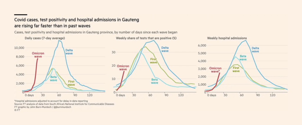
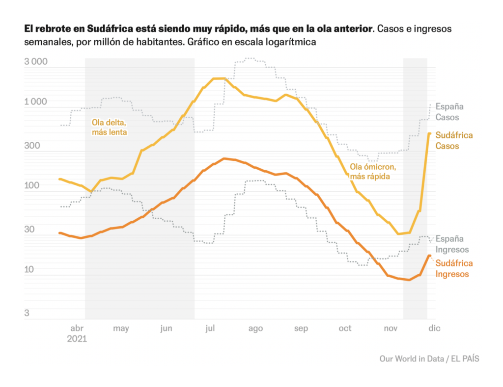
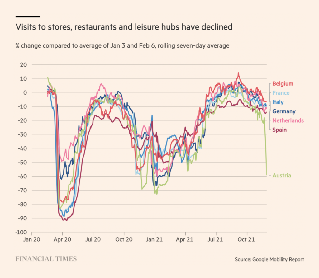
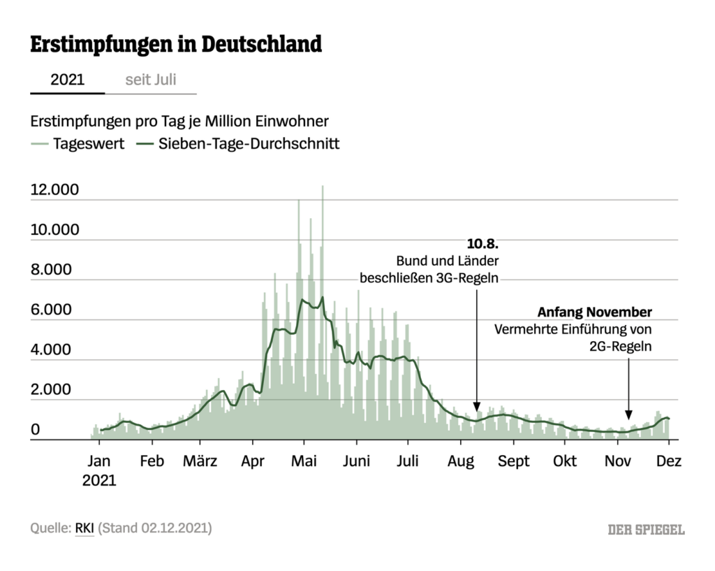
Although scientists don’t know much yet about this new variant, pressing forward with vaccination campaigns is still the best tool we have to fight the pandemic:
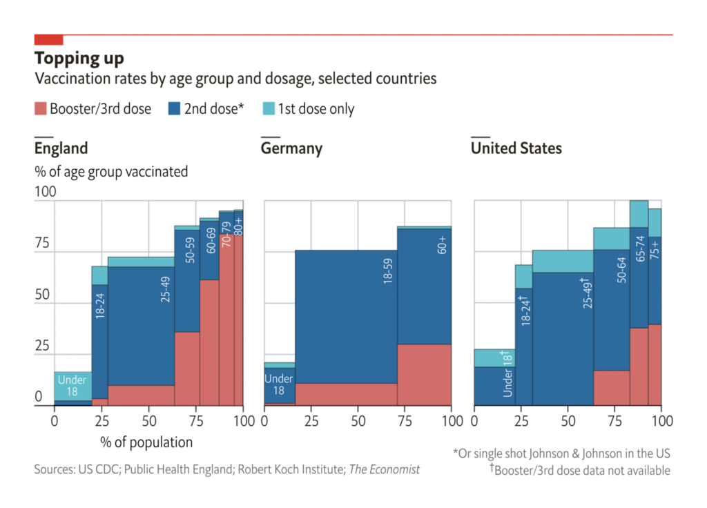
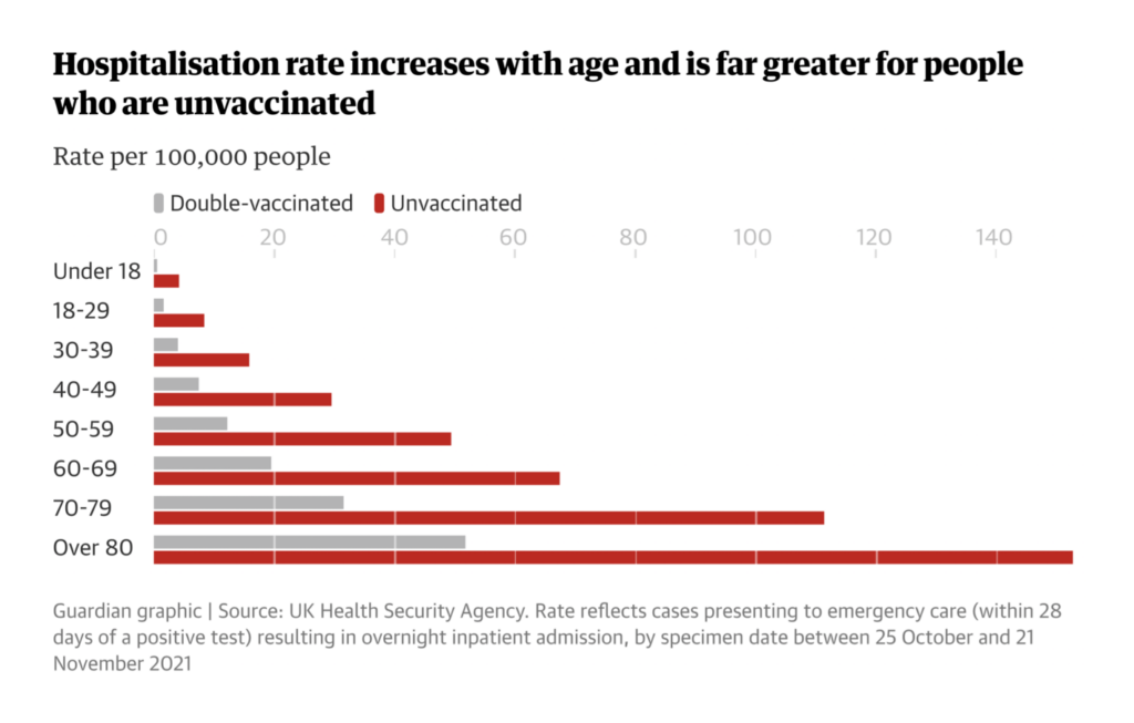
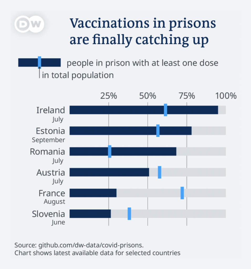
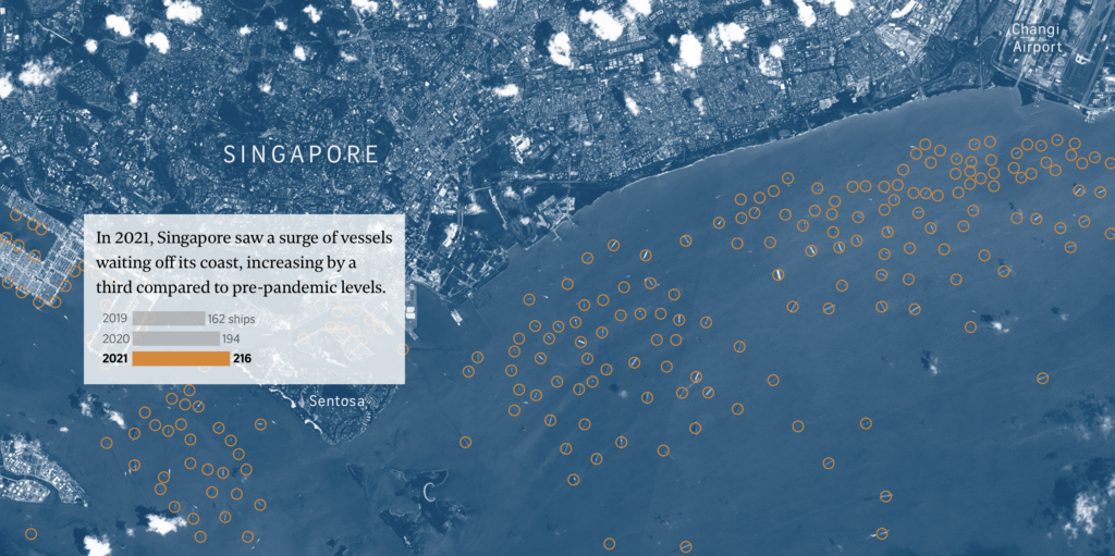
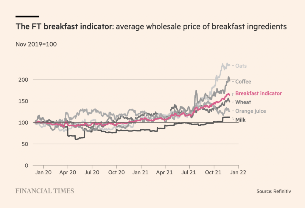
Do charts about supply chain disruptions belong in the “Pandemic” section? An ongoing debate here at the Data Vis Dispatch received some strong new evidence:

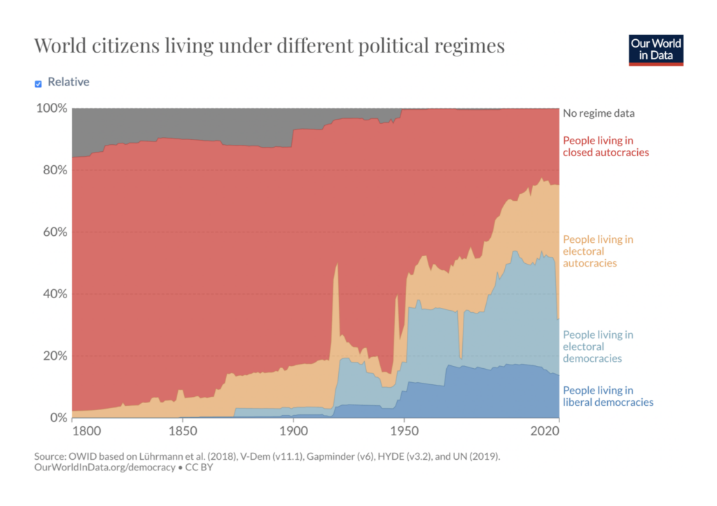
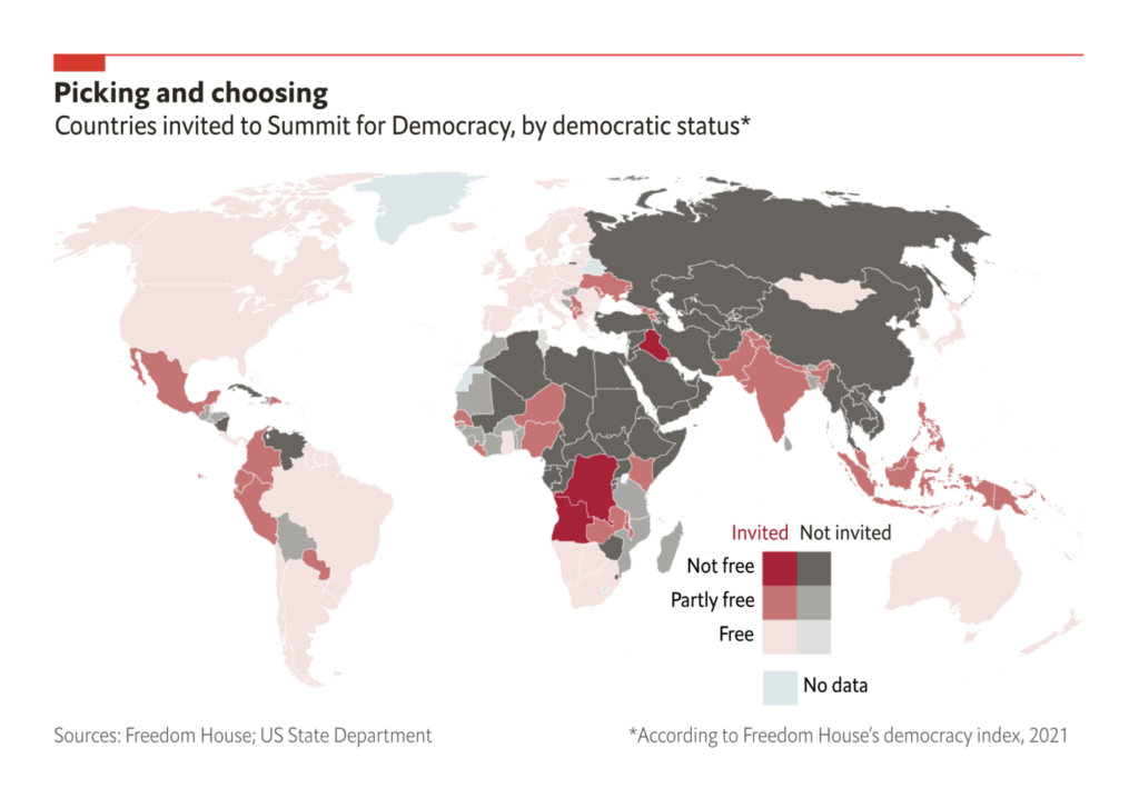
Political charts this week took a very abstract tone. On one hand, more people live in democracies than ever before. On the other hand, some of those democracies aren’t particularly democratic:
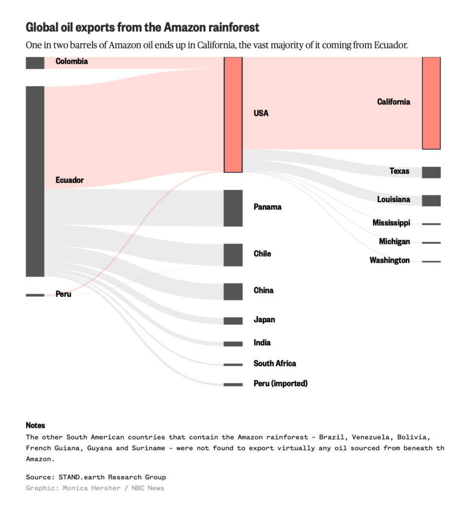
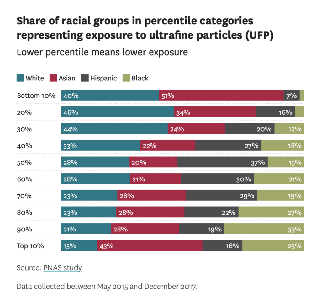
It’s not every week that the Dispatch has a California section, but let’s check on how things are going out there. The bad news — California consumes half of the oil originating in the Amazon rainforest, and some of it turns into air pollution with a very unequal impact:
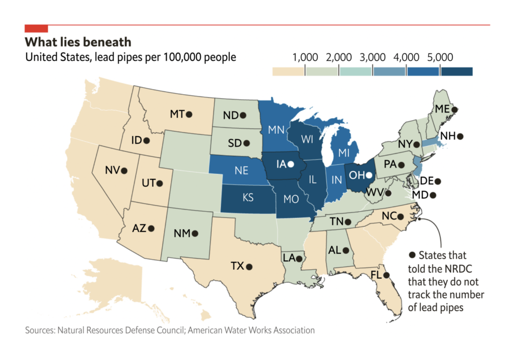
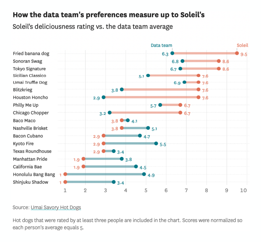
The good news — California has one of the lowest concentrations of lead pipes in the U.S., not to mention a crack data team at the San Francisco Chronicle to investigate their hot dog situation:
Another section we don’t run every week: big mammals. Enjoy it while it lasts:
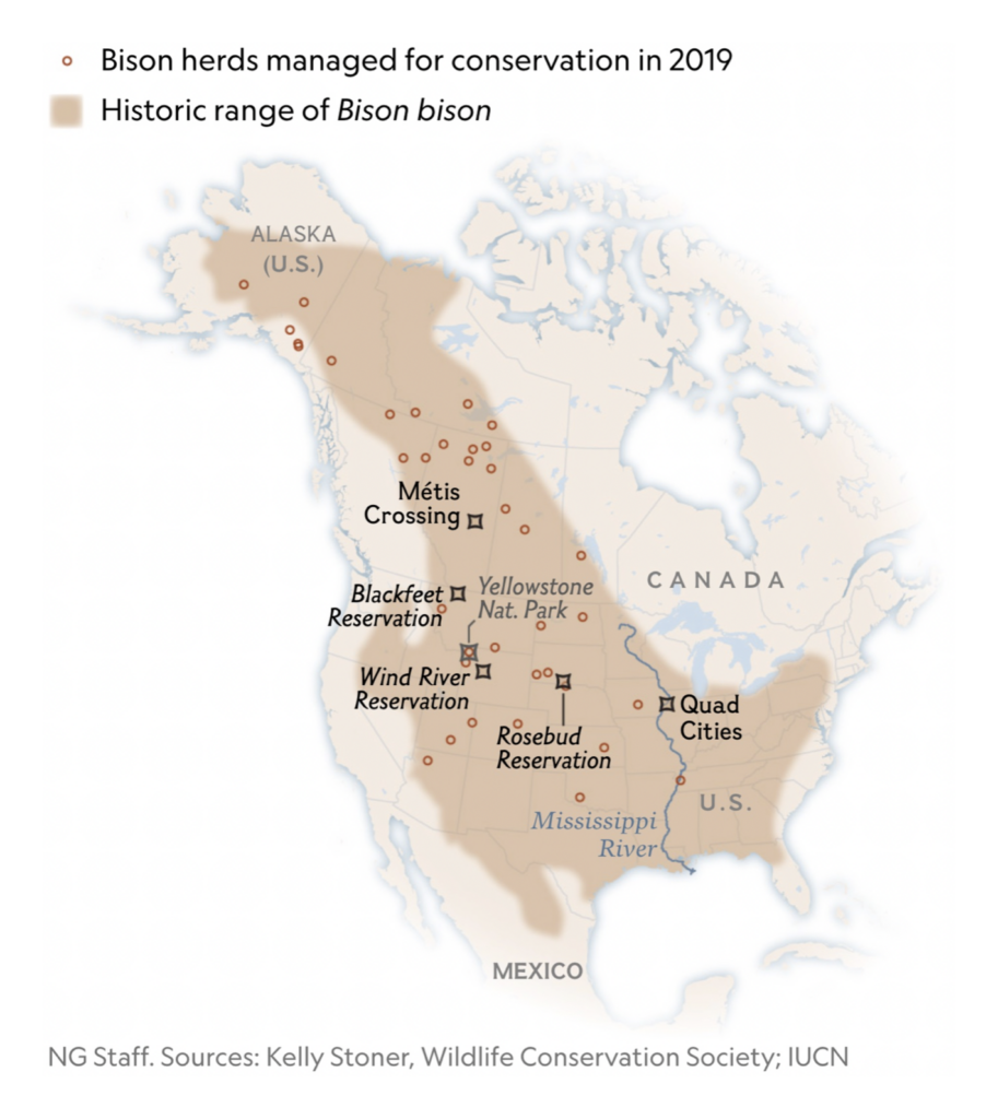
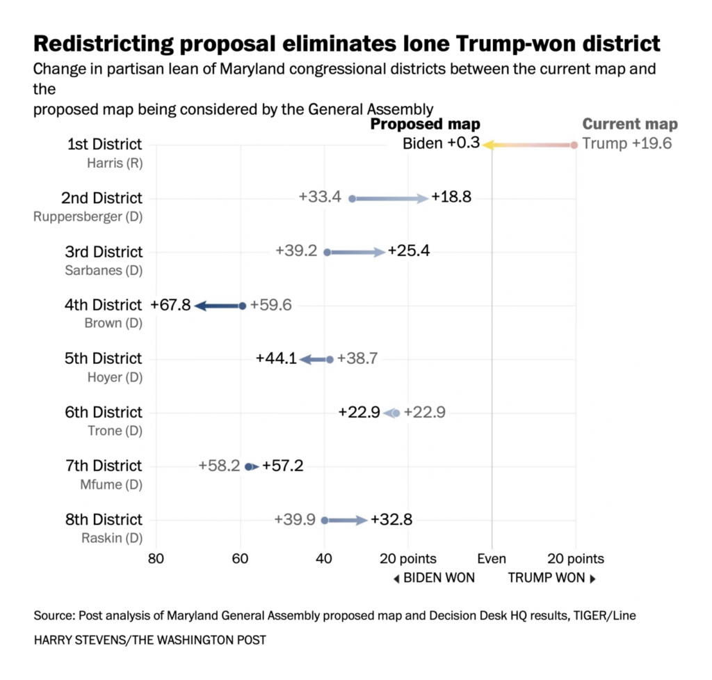
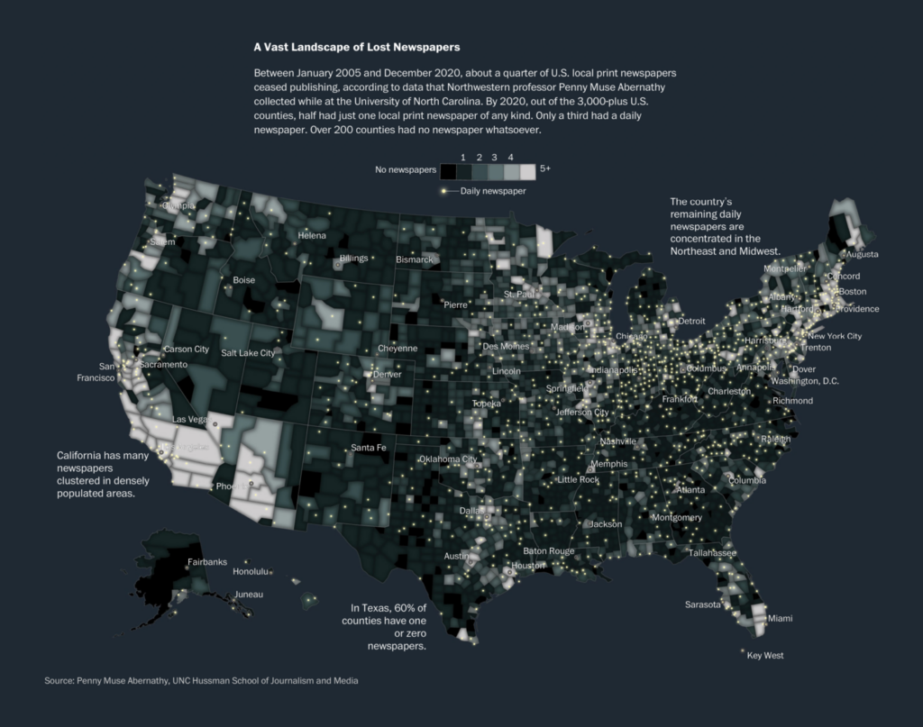
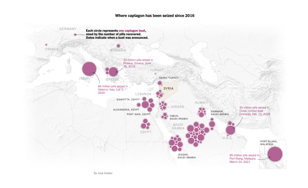
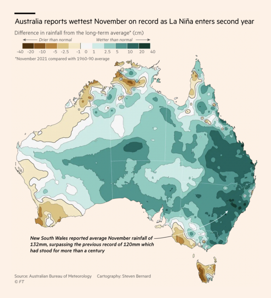
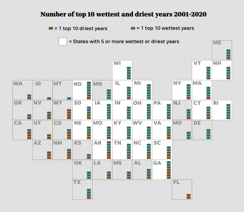
It was another excellent week for maps, with great contributions from Le Monde, Axios, and the Washington Post:
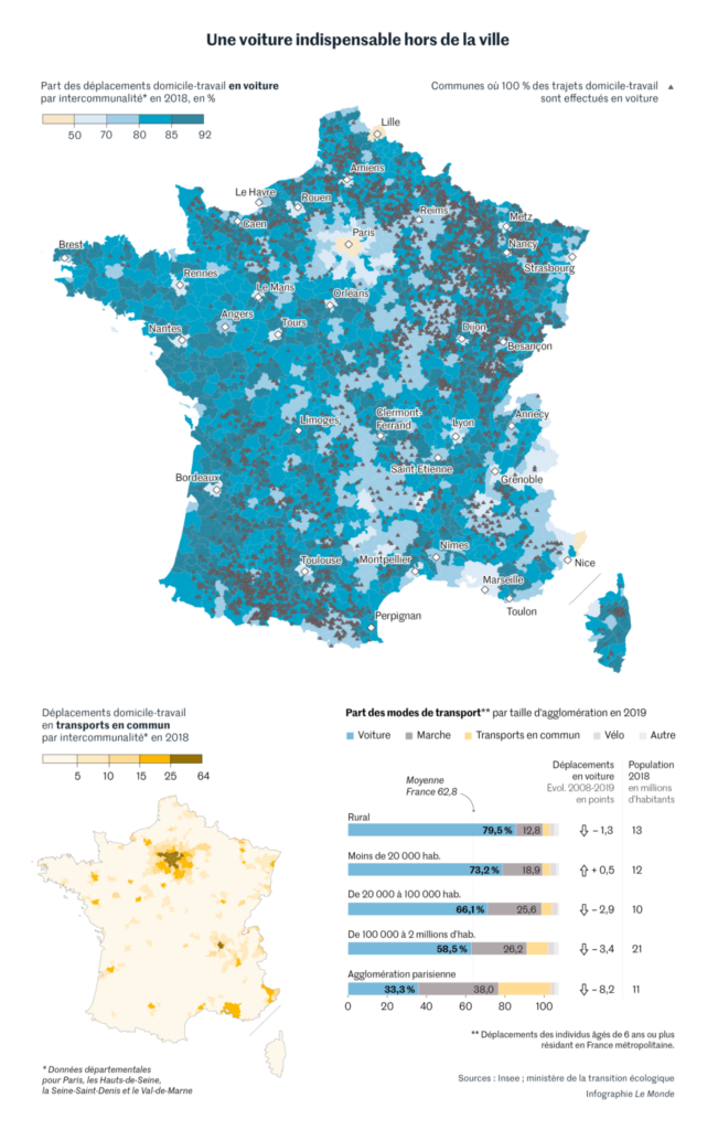
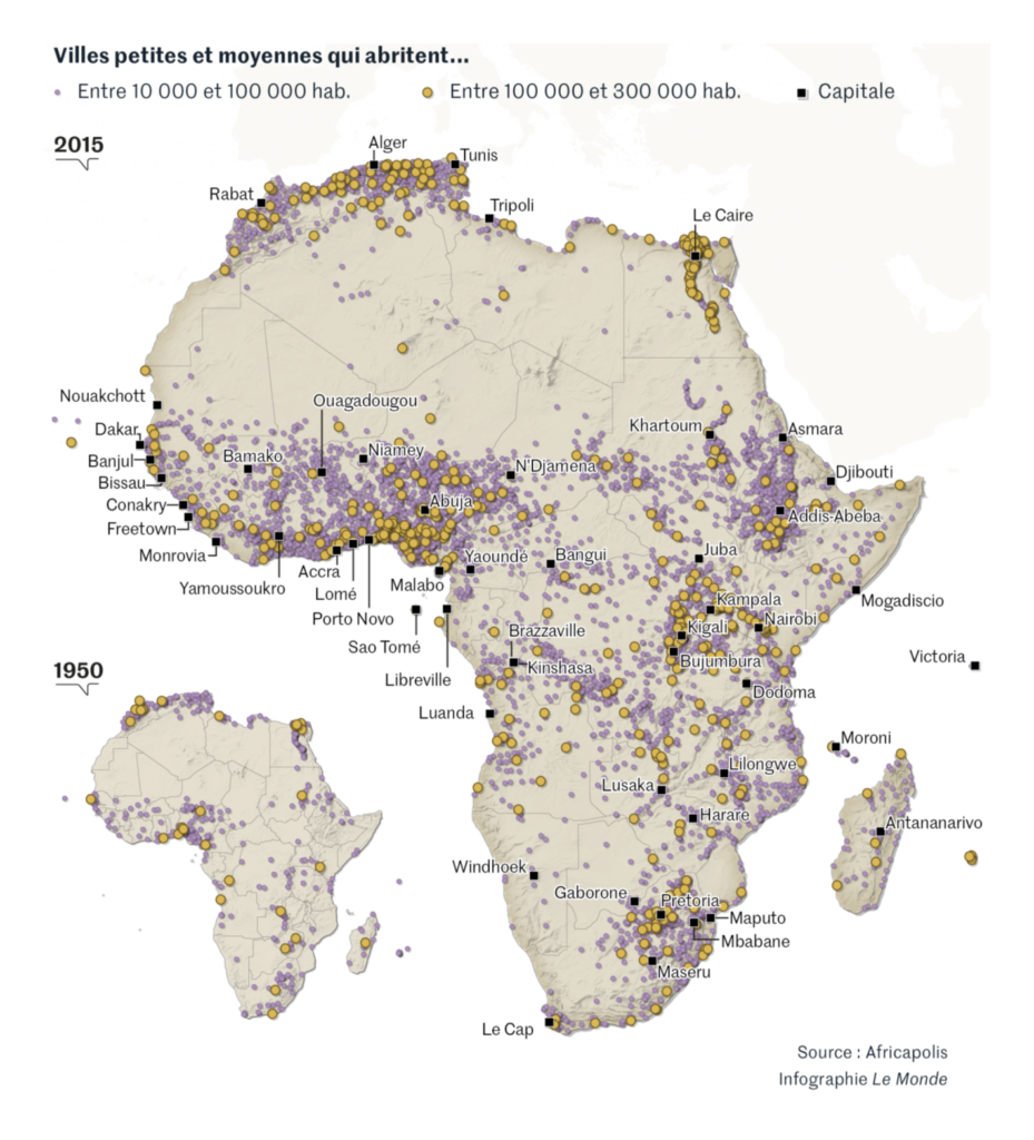
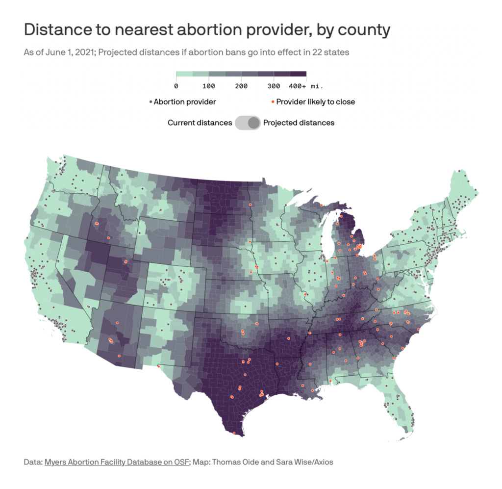

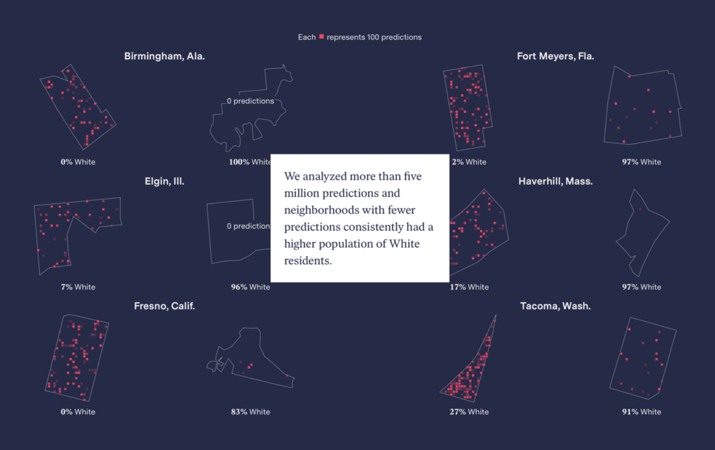
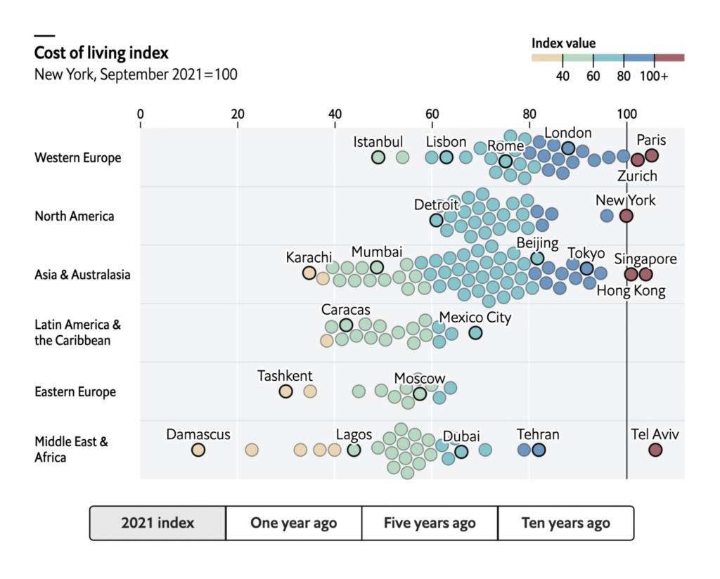
What else we found interesting
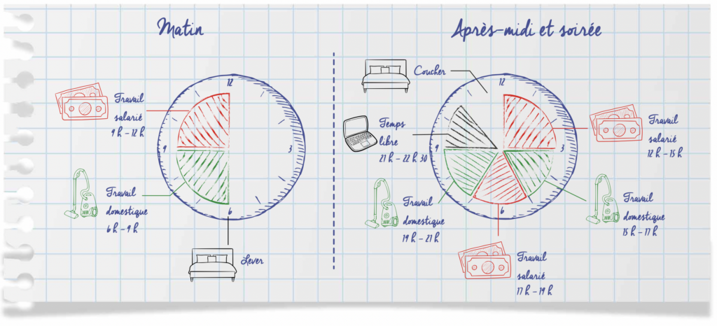
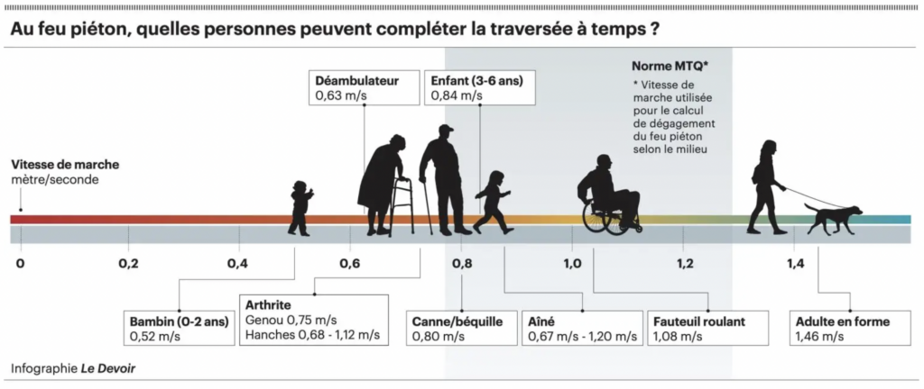

- Hiring this week: a data journalist at De Tijd, a front-end developer/designer at Media Hack, and a managing editor for data and graphics at CNN Digital.
Help us make this dispatch better! We’d love to hear which newsletters, blogs, or social media accounts we need to follow to learn about interesting projects, especially from less-covered parts of the world (Asia, South America, Africa). Write us at hello@datawrapper.de or leave a comment below.


Comments