This article is brought to you by Datawrapper, a data visualization tool for creating charts, maps, and tables. Learn more.
Data Vis Dispatch,
February 1
The best of last week’s big and small data visualizations
Welcome back to the 31st edition of Data Vis Dispatch! Every week, we’ll be publishing a collection of the best small and large data visualizations we find, especially from news organizations — to celebrate data journalism, data visualization, simple charts, elaborate maps, and their creators.
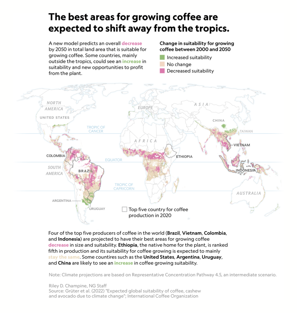
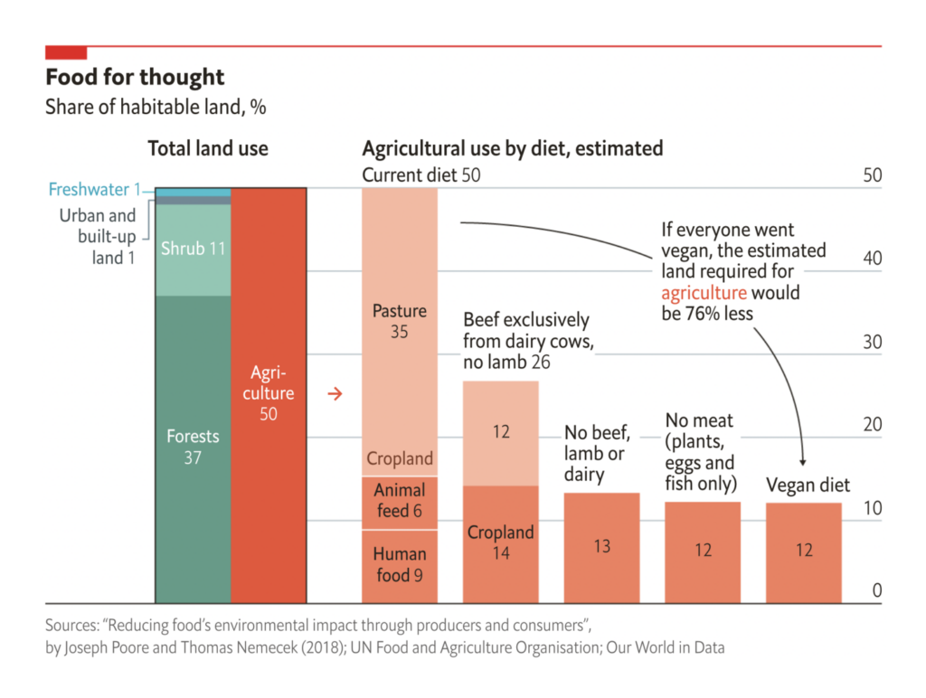
Recurring topics this week include democratic institutions, conflict in and over Ukraine, and the intersection of climate and agriculture.
Once again, Ukraine was the topic on everyone’s mind. Several maps showed the positions of Russian and NATO troops near its borders:

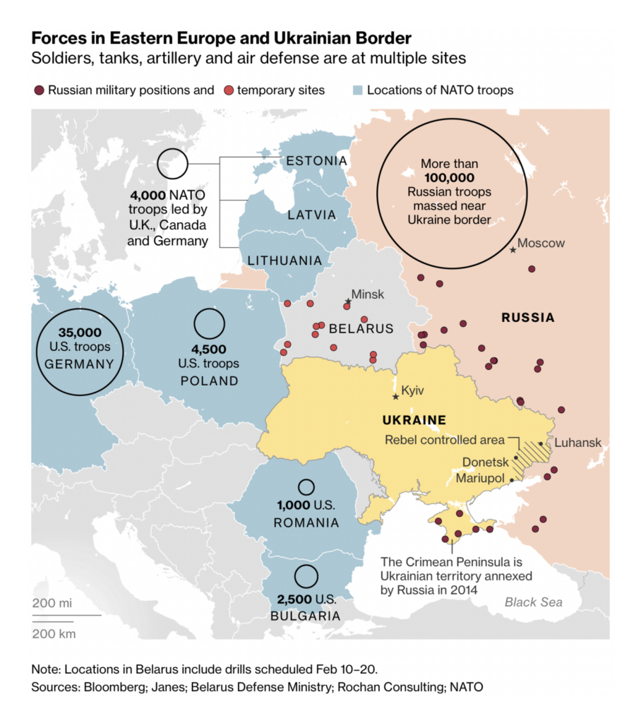
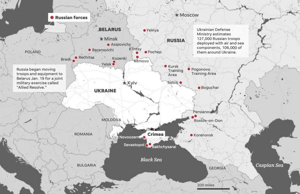
Others clarified the history of the conflict:
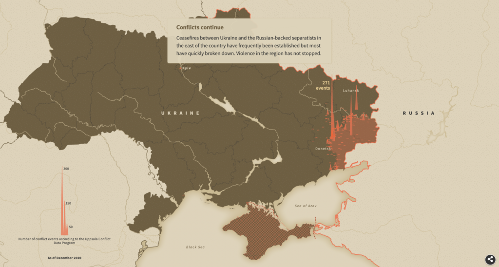
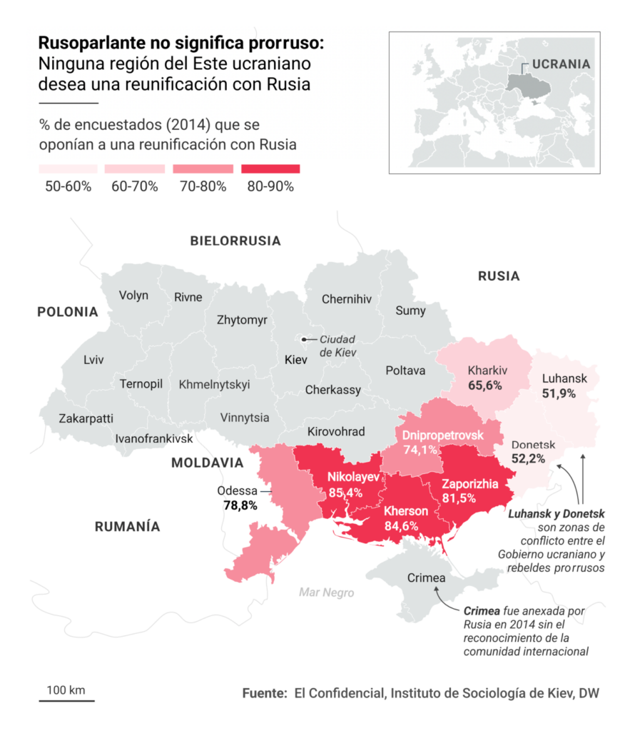
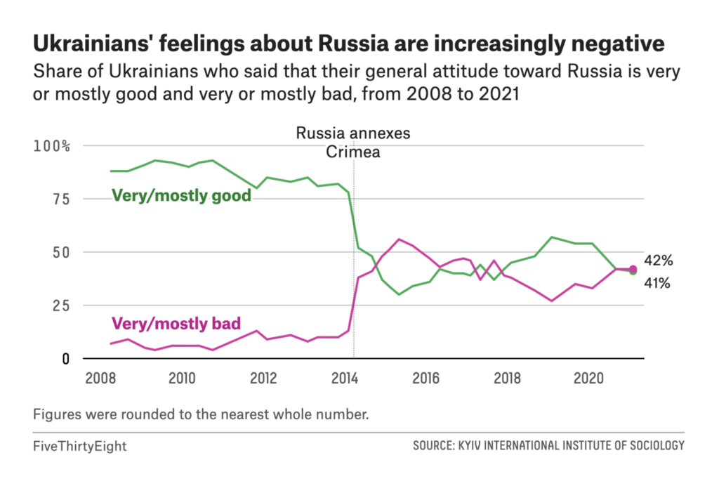
And still others examined the economic stakes of war:
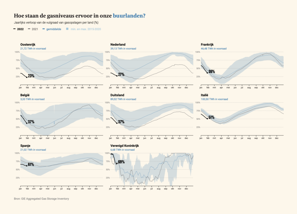
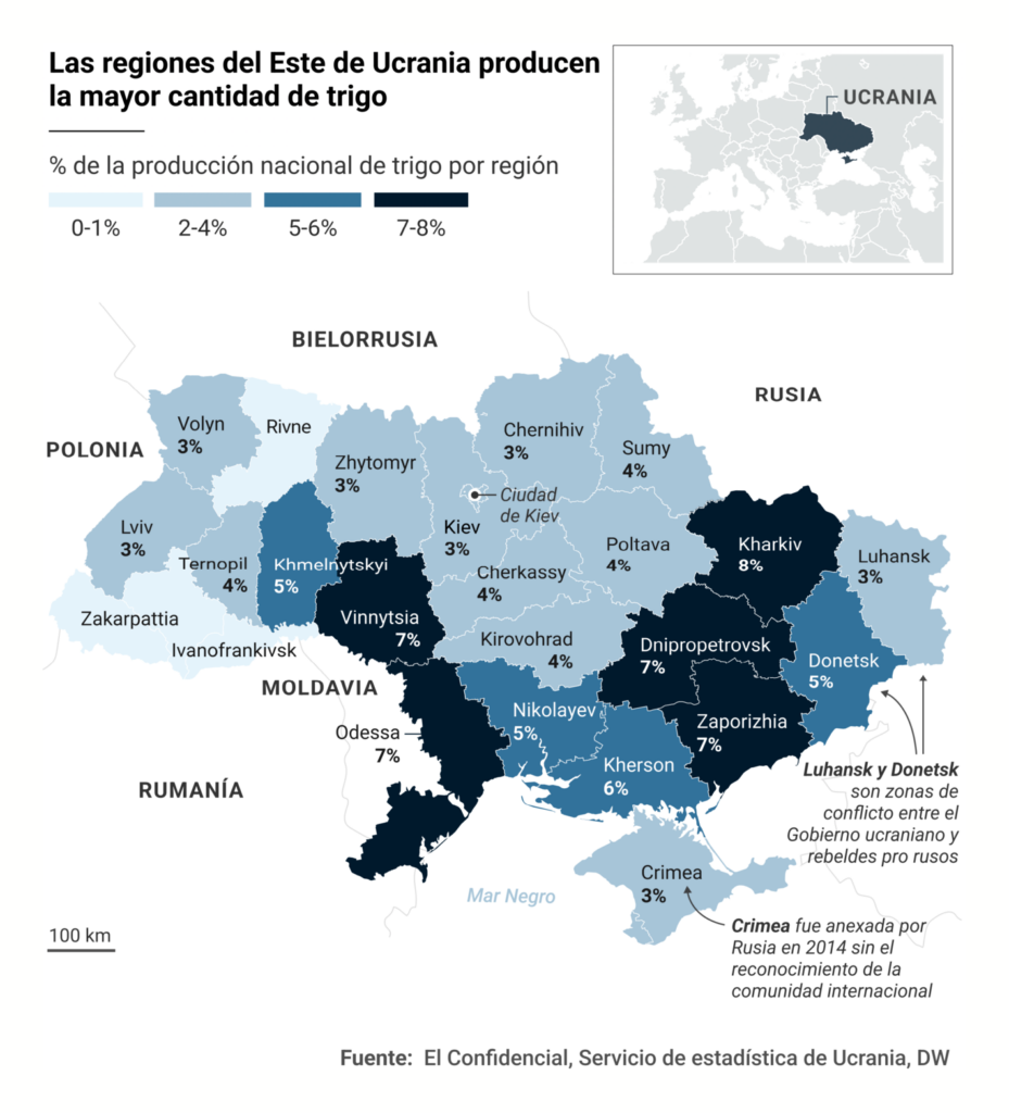
The release of the 2021 Corruption Perceptions Index didn’t make for flattering news in much of the world:


And U.S. political charts also took on fundamental issues — fair elections and the federal court system:
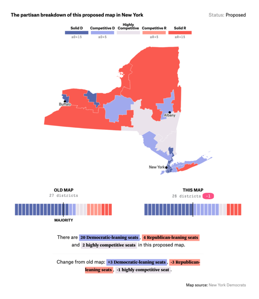
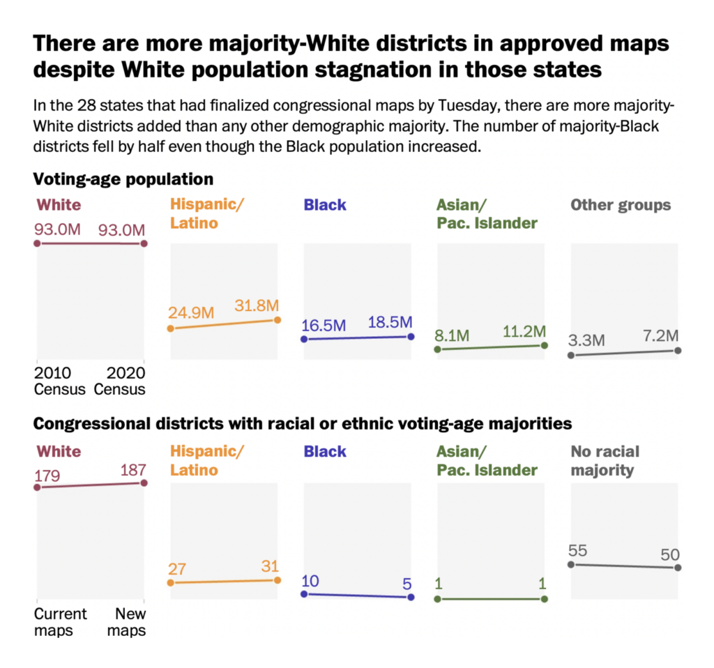

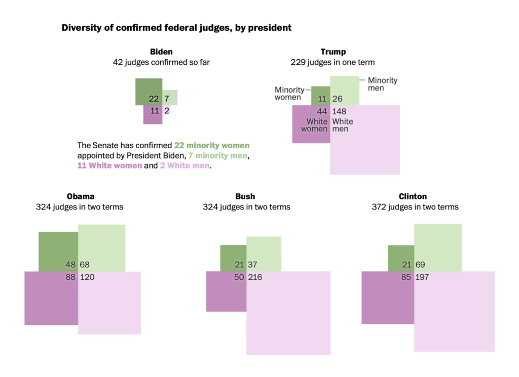

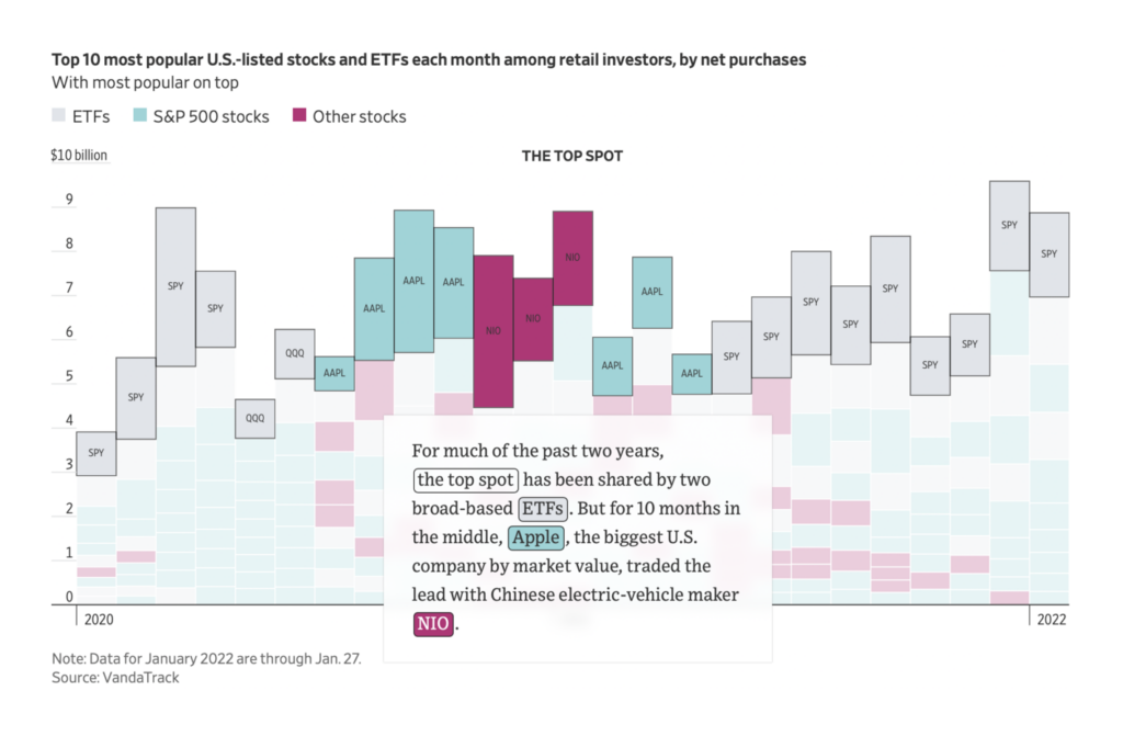
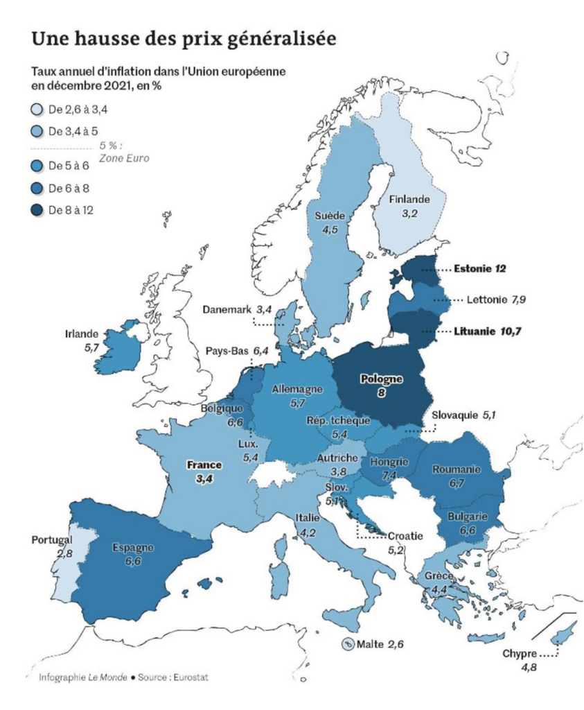
Economic topics this week were as abstract as cryptocurrency and as concrete as the price of food:
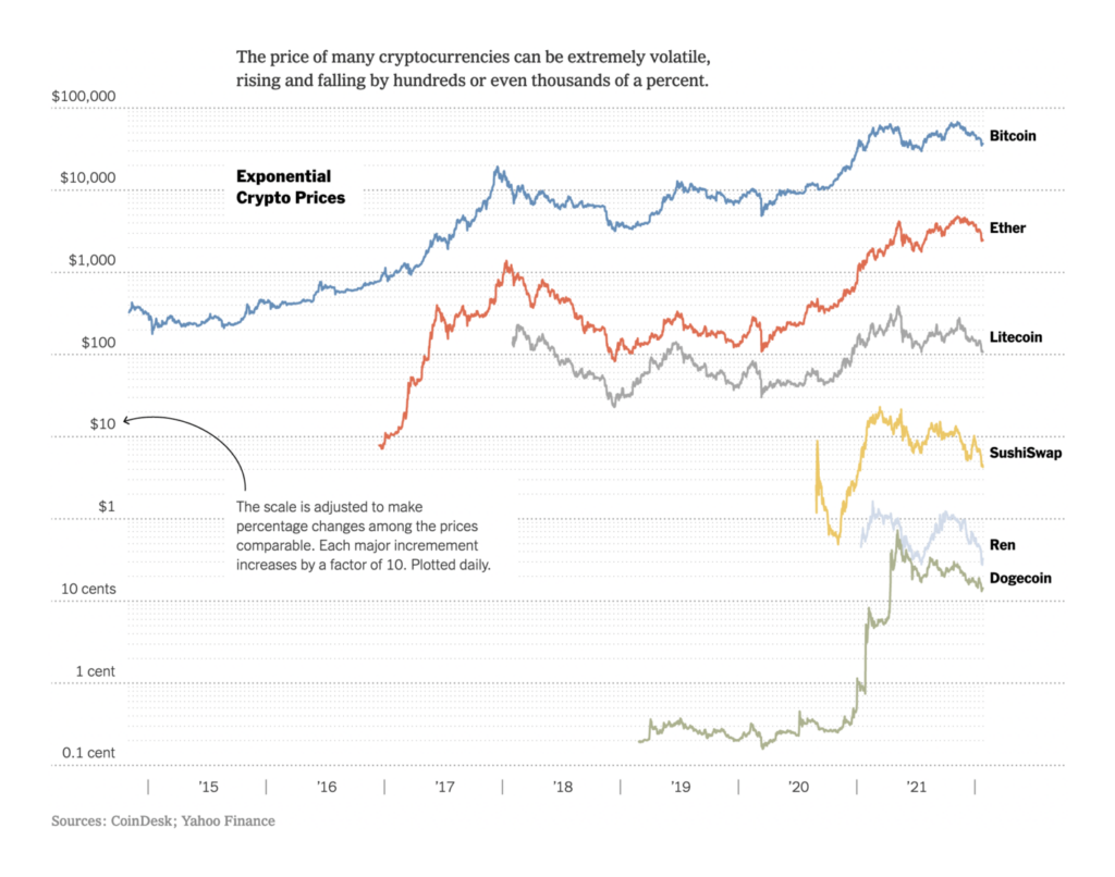
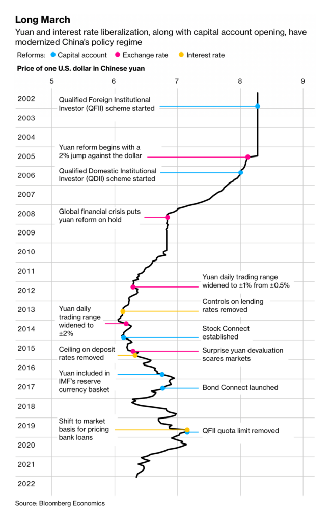
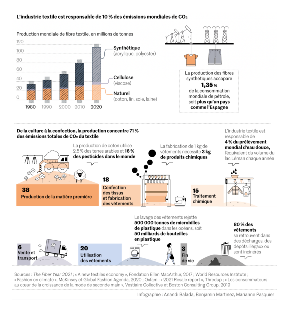
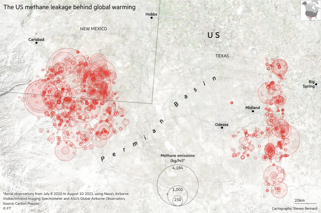
The environmental spotlight fell on food and clothing — but don’t forget massive methane leaks as well:
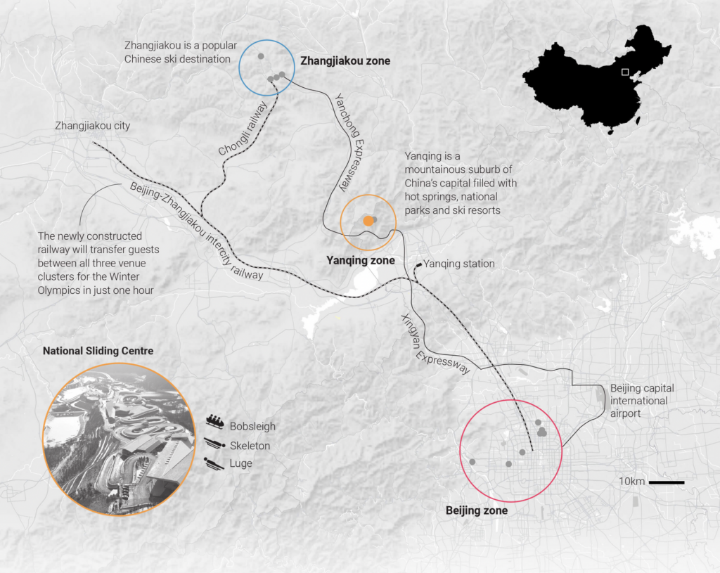
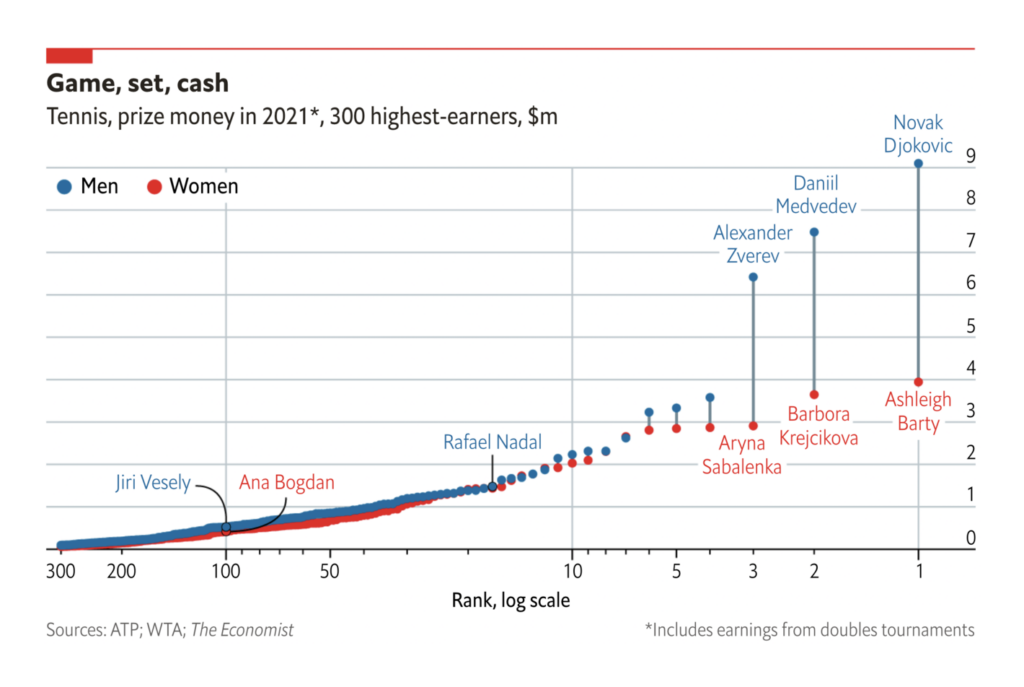
With the Australian Open just finished and the Winter Olympics about to start, it was a great week for sports — and don’t miss the Folha de S.Paulo’s chart of Brazil’s incredibly hardworking football teams:


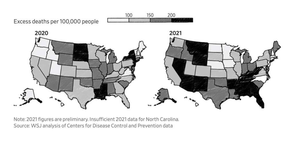
Of course, we haven’t forgotten the pandemic. A lagging vaccine campaign has changed the geography of deaths in the U.S.:
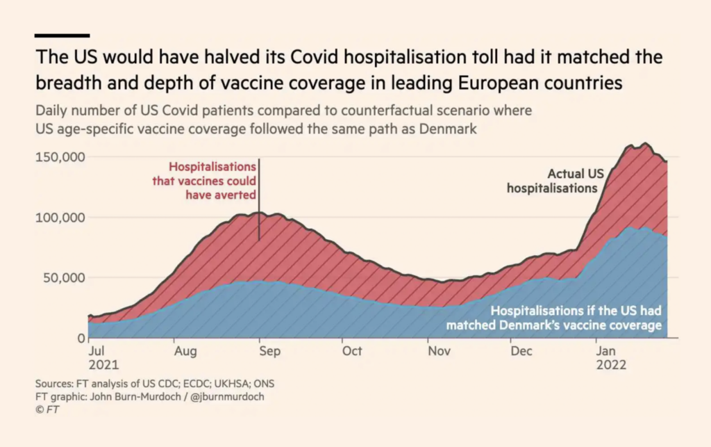
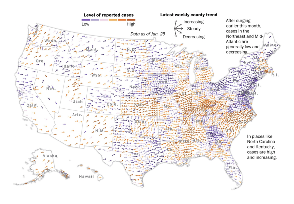
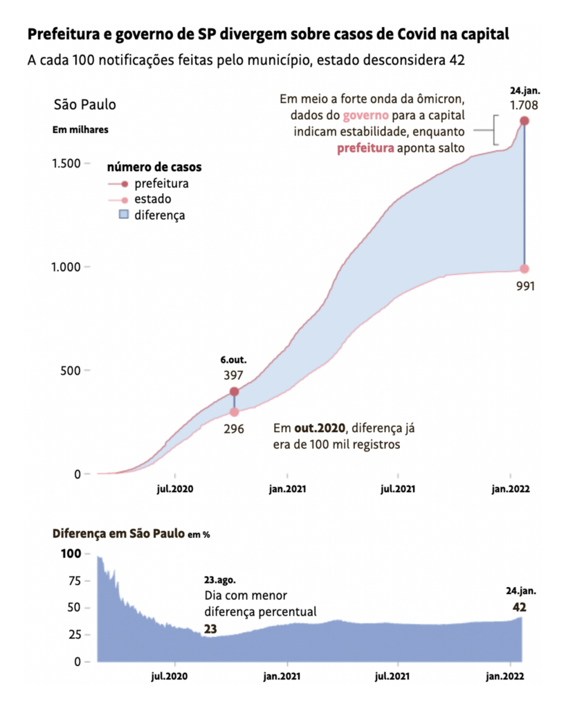
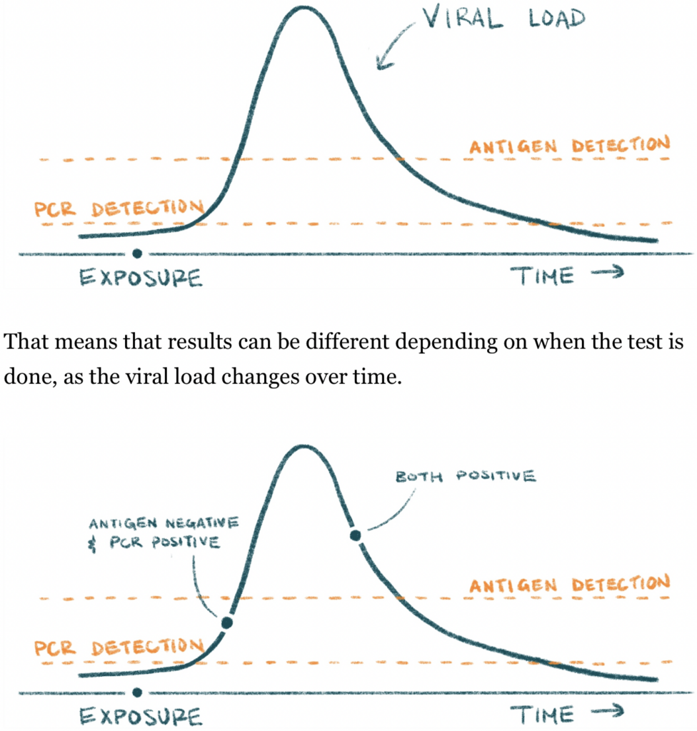
But with such a fast-moving variant, tracking the real numbers can get tricky:
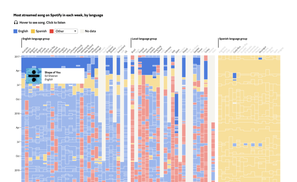
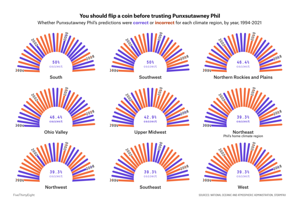
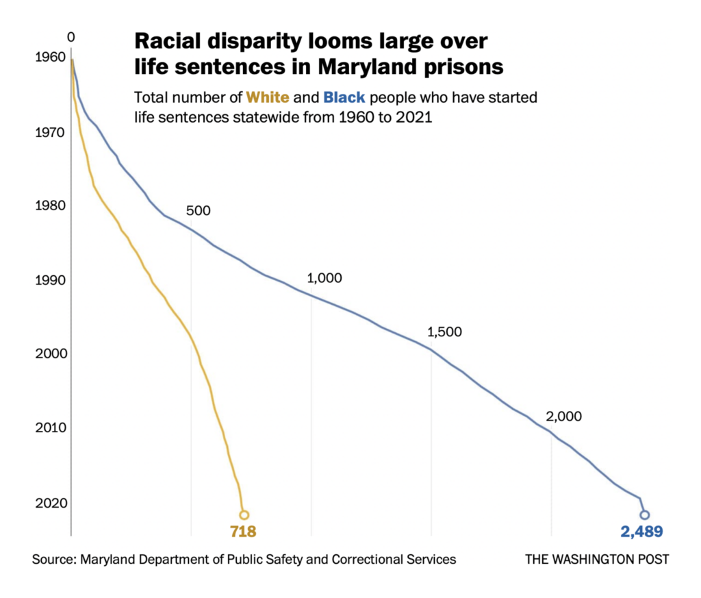
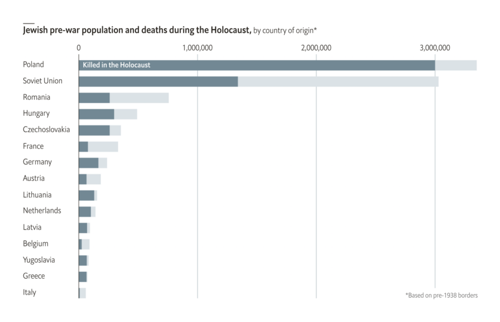
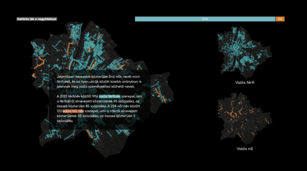
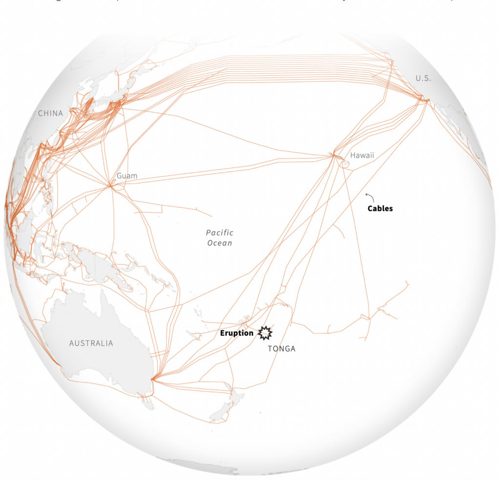
Miscellaneous charts this week can only be split into two groups — first the fun ones, then the grim ones:
What else we found interesting


- Hiring: an assistant editor for visual enterprise at the Washington Post; a Python programmer/analyst at NASA Earth Observations; a data analyst at Our World in Data; a summer intern at CNN Data and Graphics; and a senior engineer and editorial data scientist on the data journalism desk of the Financial Times.
Help us make this dispatch better! We’d love to hear which newsletters, blogs, or social media accounts we need to follow to learn about interesting projects, especially from less-covered parts of the world (Asia, South America, Africa). Write us at hello@datawrapper.de or leave a comment below.


Comments