Welcome back to the 31st edition of Data Vis Dispatch! Every week, we’ll be publishing a collection of the best small and large data visualizations we find , especially from news organizations — to celebrate data journalism, data visualization, simple charts, elaborate maps, and their creators.
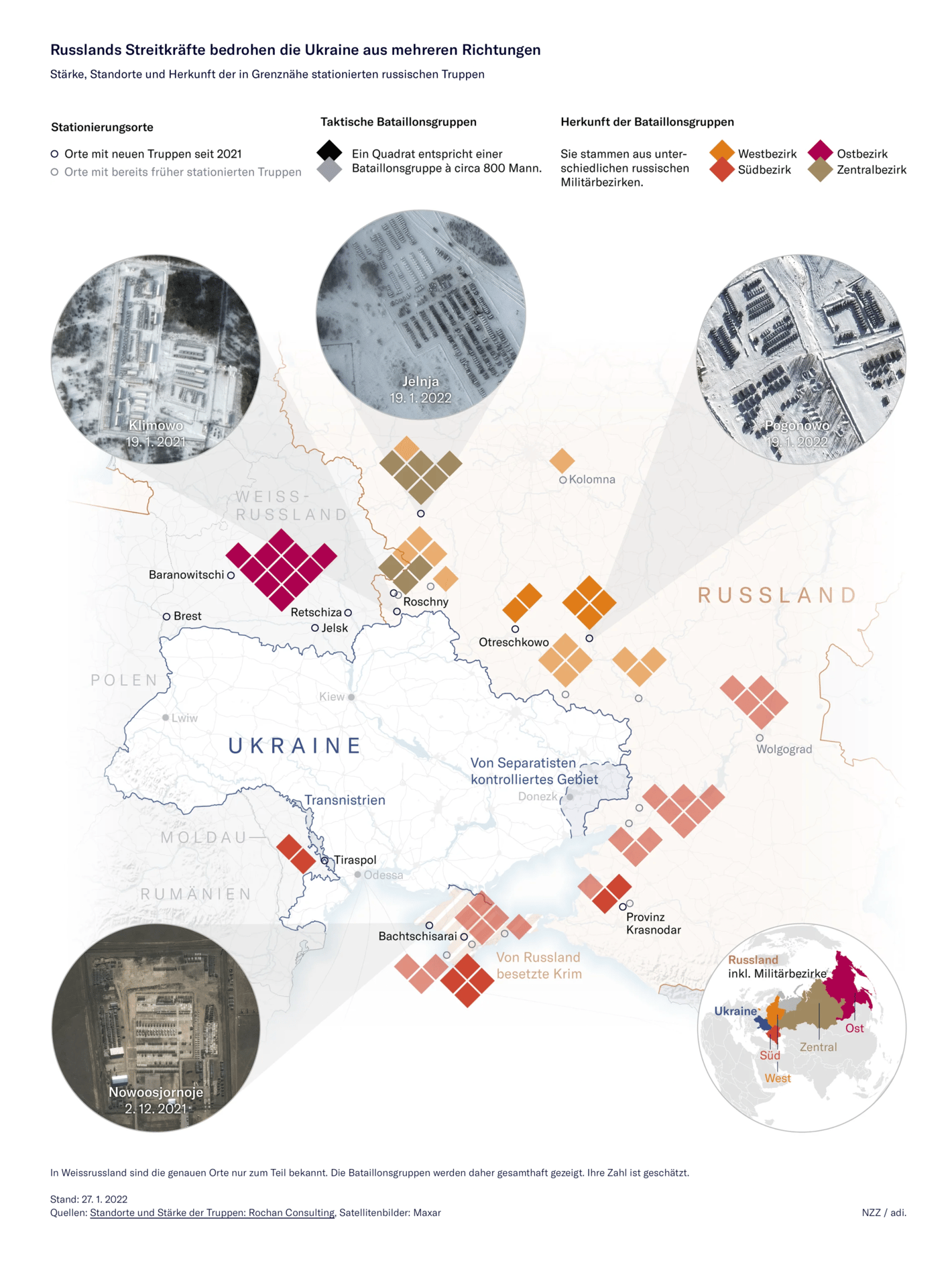
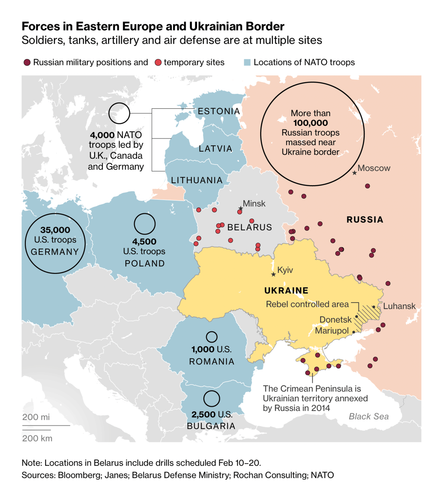
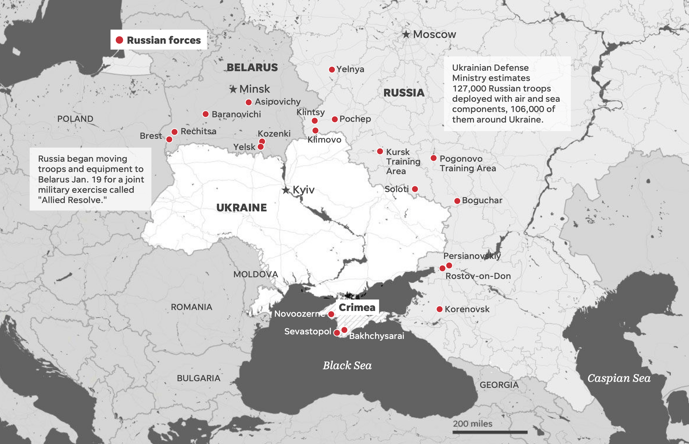
Once again, Ukraine was the topic on everyone's mind. Several maps showed the positions of Russian and NATO troops near its borders:
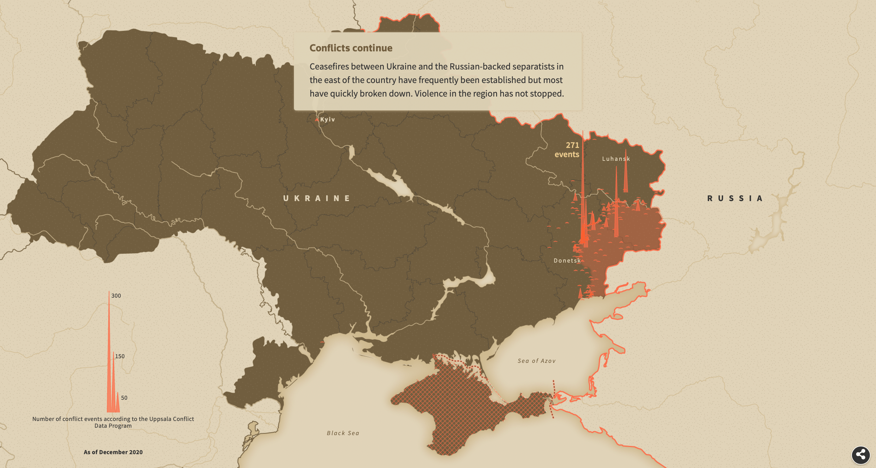
Neue Zürcher Zeitung: Krise um die Ukraine: Russland sendet USA Antwortschreiben, Familienangehörige von US-Diplomaten sollen Weissrussland verlassen Bloomberg: Where Military Forces Are Assembling Around Russia and Ukraine USA Today: How US and its allies could respond to Russian invasion of Ukraine Others clarified the history of the conflict :
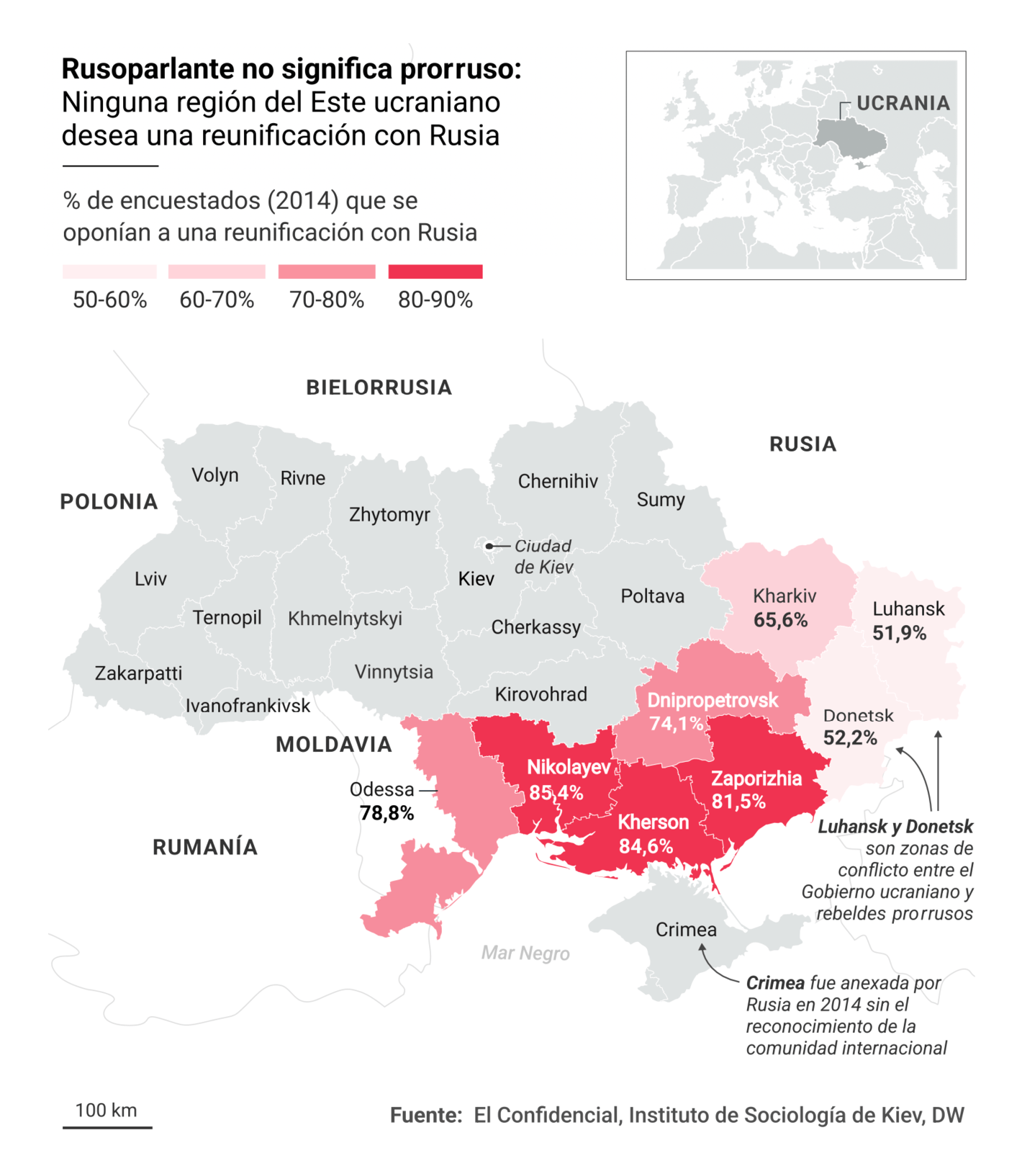
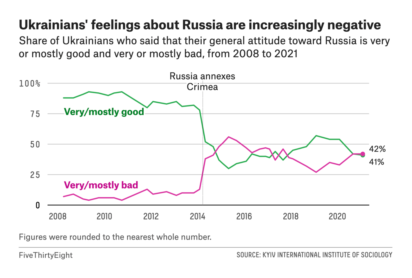
Reuters: On the edge of war El Confidencial: Cinco mapas para entender el tablero ucraniano mientras Rusia mueve sus fichas FiveThirtyEight: War With Russia Has Pushed Ukrainians Toward The West , January 28 And still others examined the economic stakes of war:
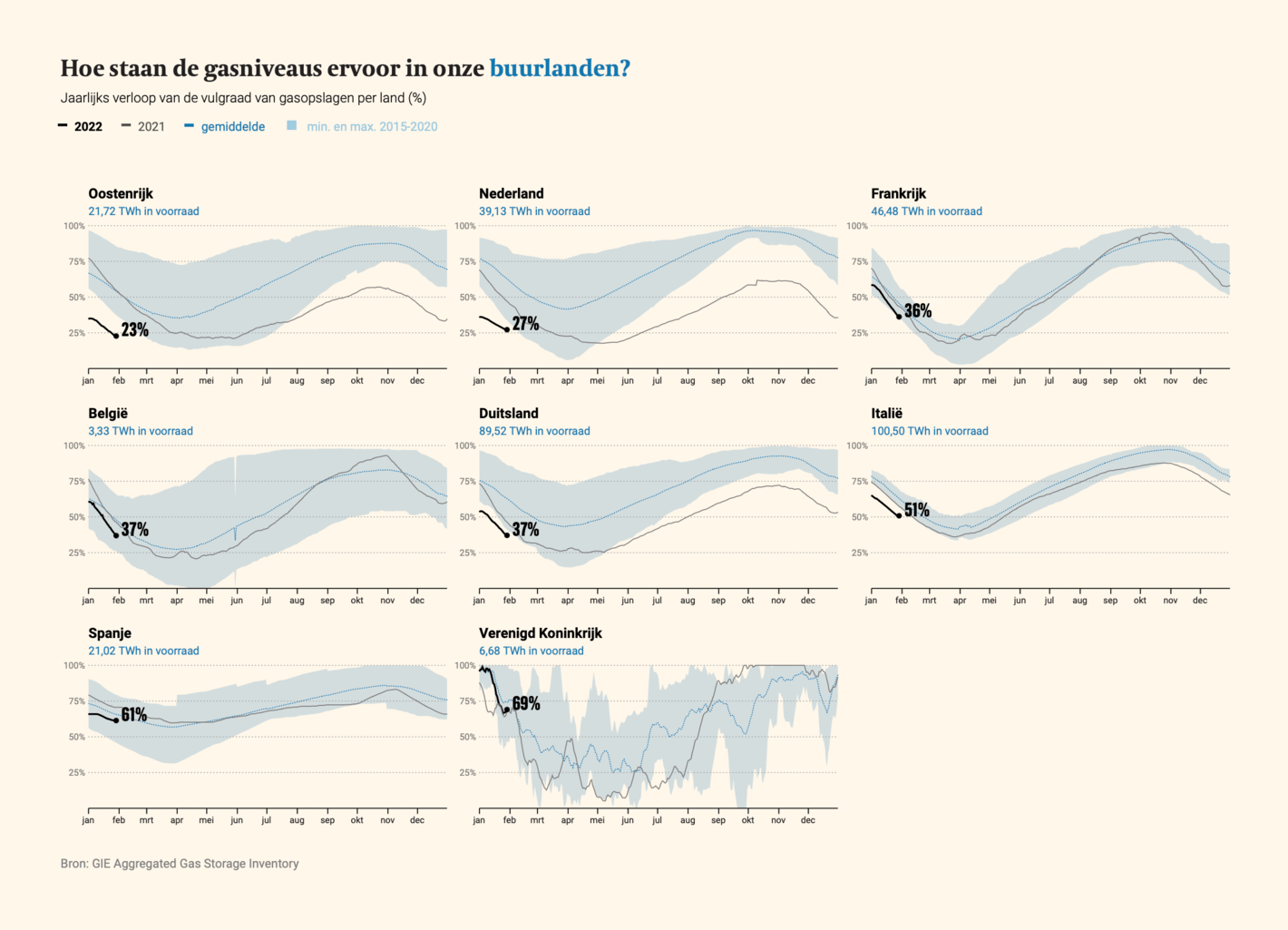
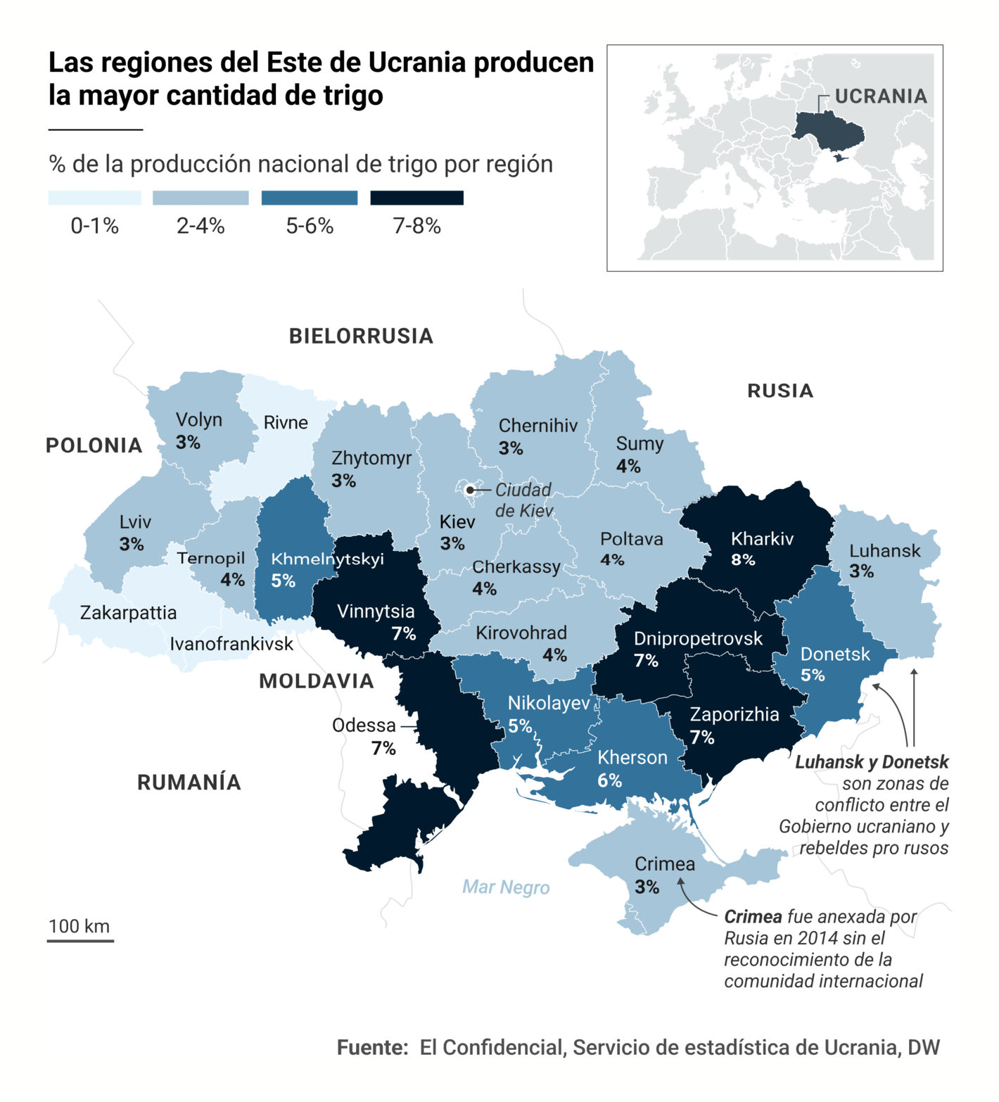
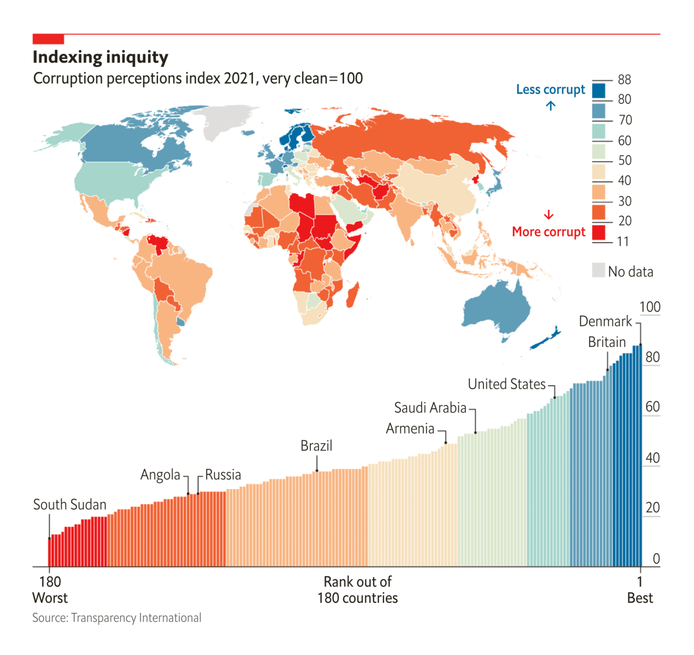
De Tijd: Europese gasvoorraden nog nooit zo vroeg halfleeg El Confidencial: El granero de Europa, en llamas: el riesgo global de una invasión de Ucrania The release of the 2021 Corruption Perceptions Index didn't make for flattering news in much of the world:
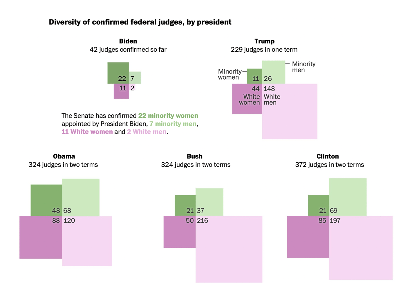
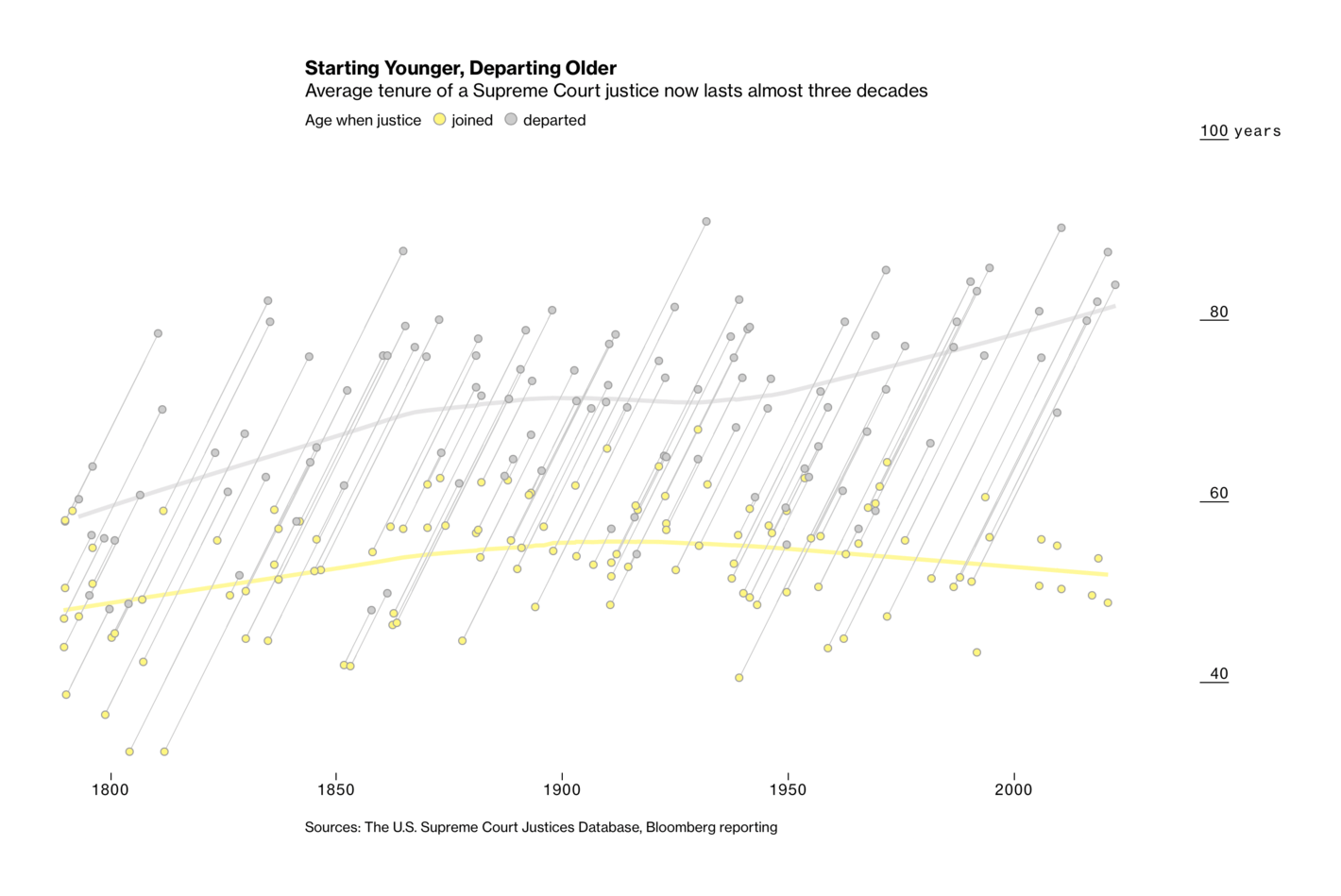
The Economist: Corruption is getting worse in many poor countries Átlátszó: Magyarország az EU második legkorruptabb országa, egyre lejjebb csúszunk a Transparency International rangsorán And U.S. political charts also took on fundamental issues — fair elections and the federal court system :
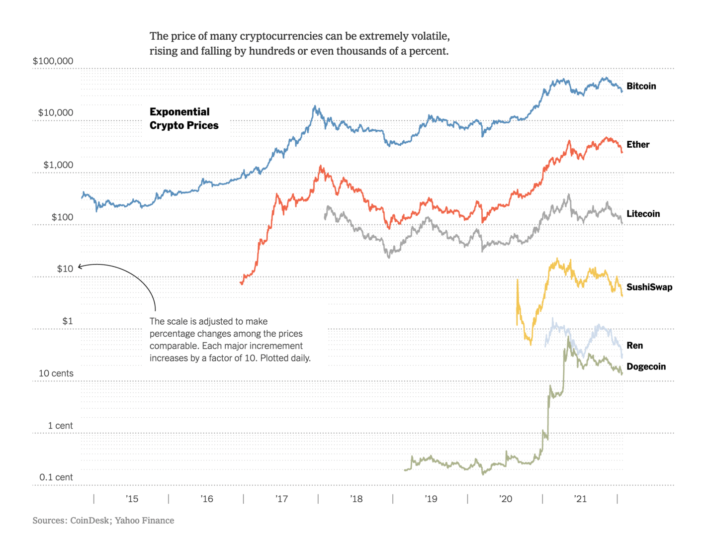
FiveThirtyEight: New York’s Proposed Congressional Map Is Heavily Biased Toward Democrats. Will It Pass? The Washington Post: Black and Latino voters have been shortchanged in redistricting, advocates and some judges say FiveThirtyEight: What Biden’s Appointees Can Tell Us About His Supreme Court Nominee , February 1 The Washington Post: Biden, who pledged to diversify the Supreme Court, has already made progress on lower courts Bloomberg: Biden’s Supreme Court Nominee Could Serve for Decades With a Conservative Majority Economic topics this week were as abstract as cryptocurrency and as concrete as the price of food :
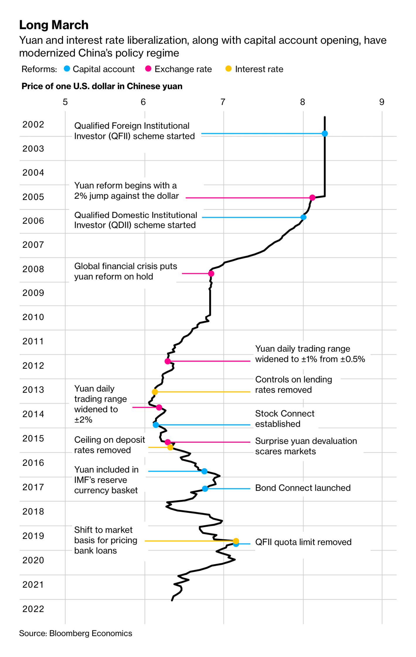
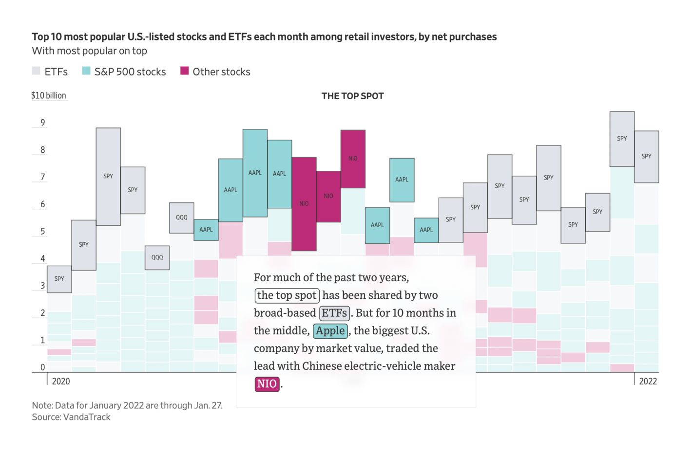
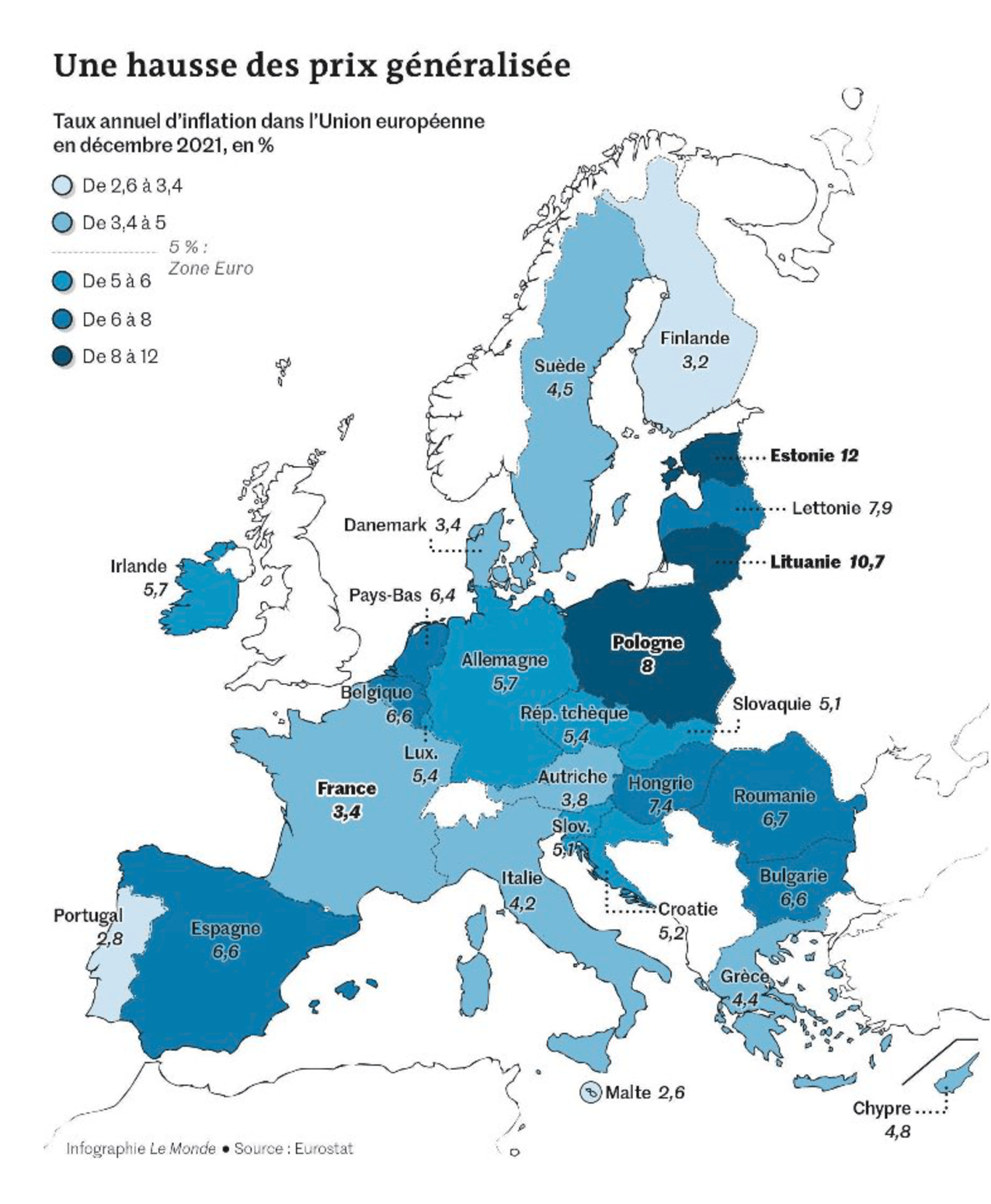
The New York Times: It’s Hard to Tell When the Crypto Bubble Will Burst, or If There Is One Bloomberg: As the Fed Hikes, China’s Central Bank Seizes the Moment for Stimulus The Wall Street Journal: Move Over, Meme Stocks: Retail Investors Go Back to the Blue Chips Le Monde: "L’Europe et le choc de l’inflation Energie, logement, alimentation… Les prix ont augmenté de 5 % en décembre 2021 dans la zone euro. Les plus touchés sont les ménages les moins riches et les petites entreprises," January 28 (Tweet Article The environmental spotlight fell on food and clothing — but don't forget massive methane leaks as well:
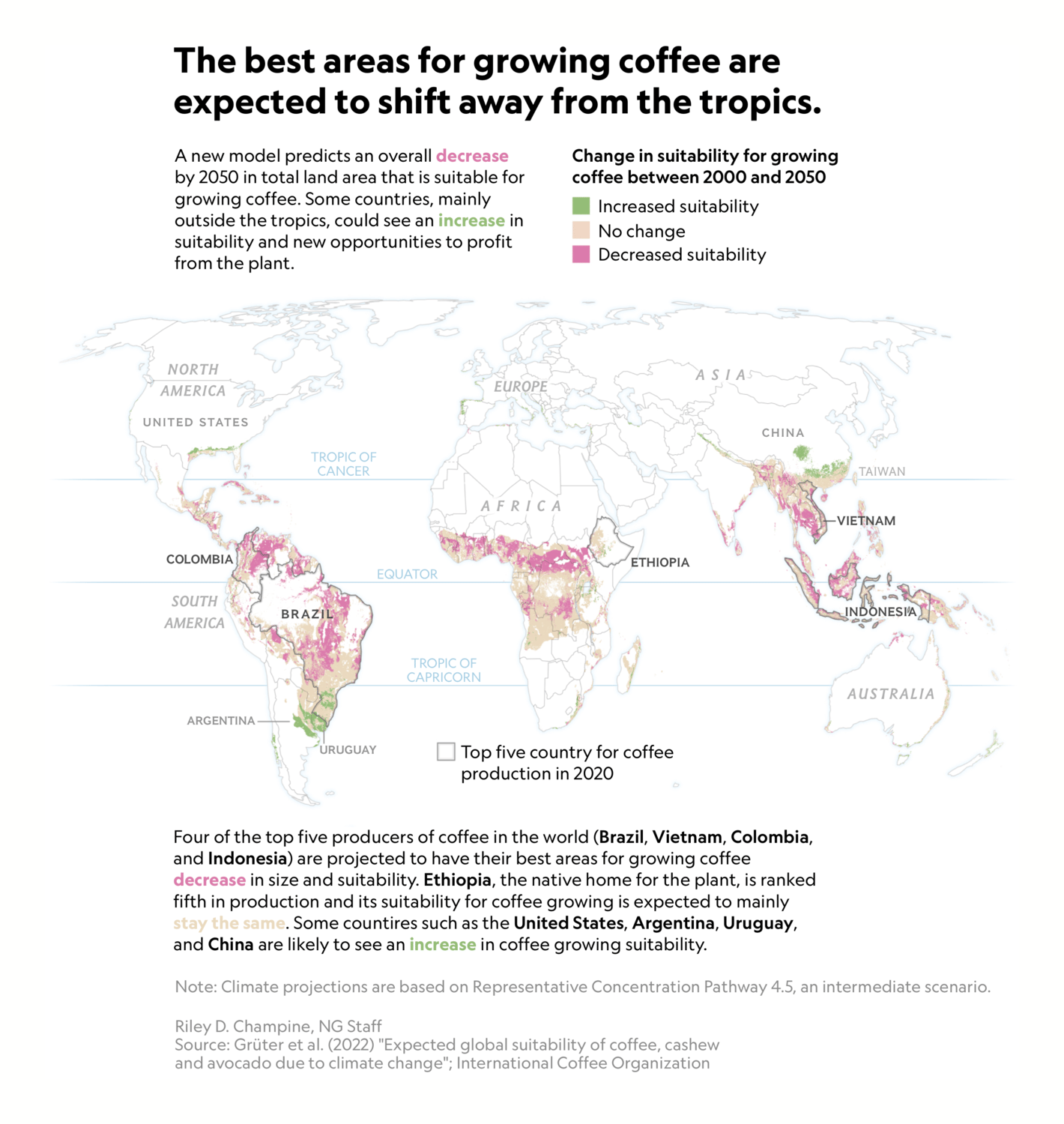
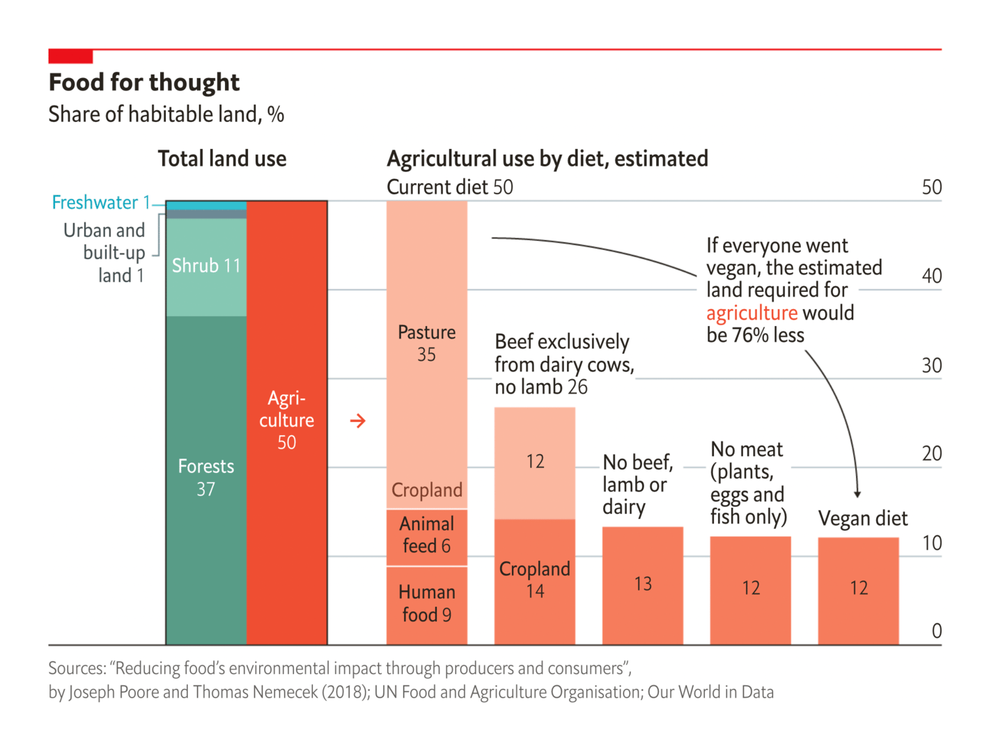
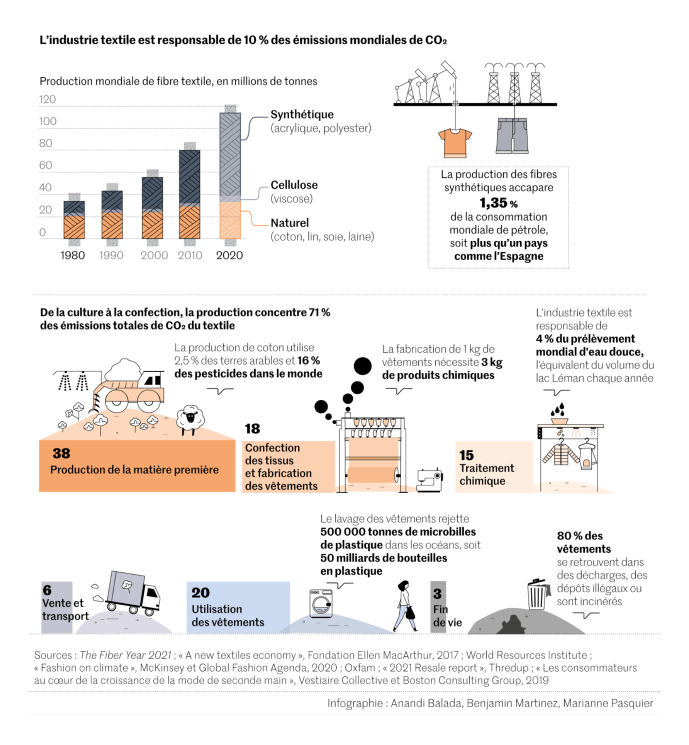
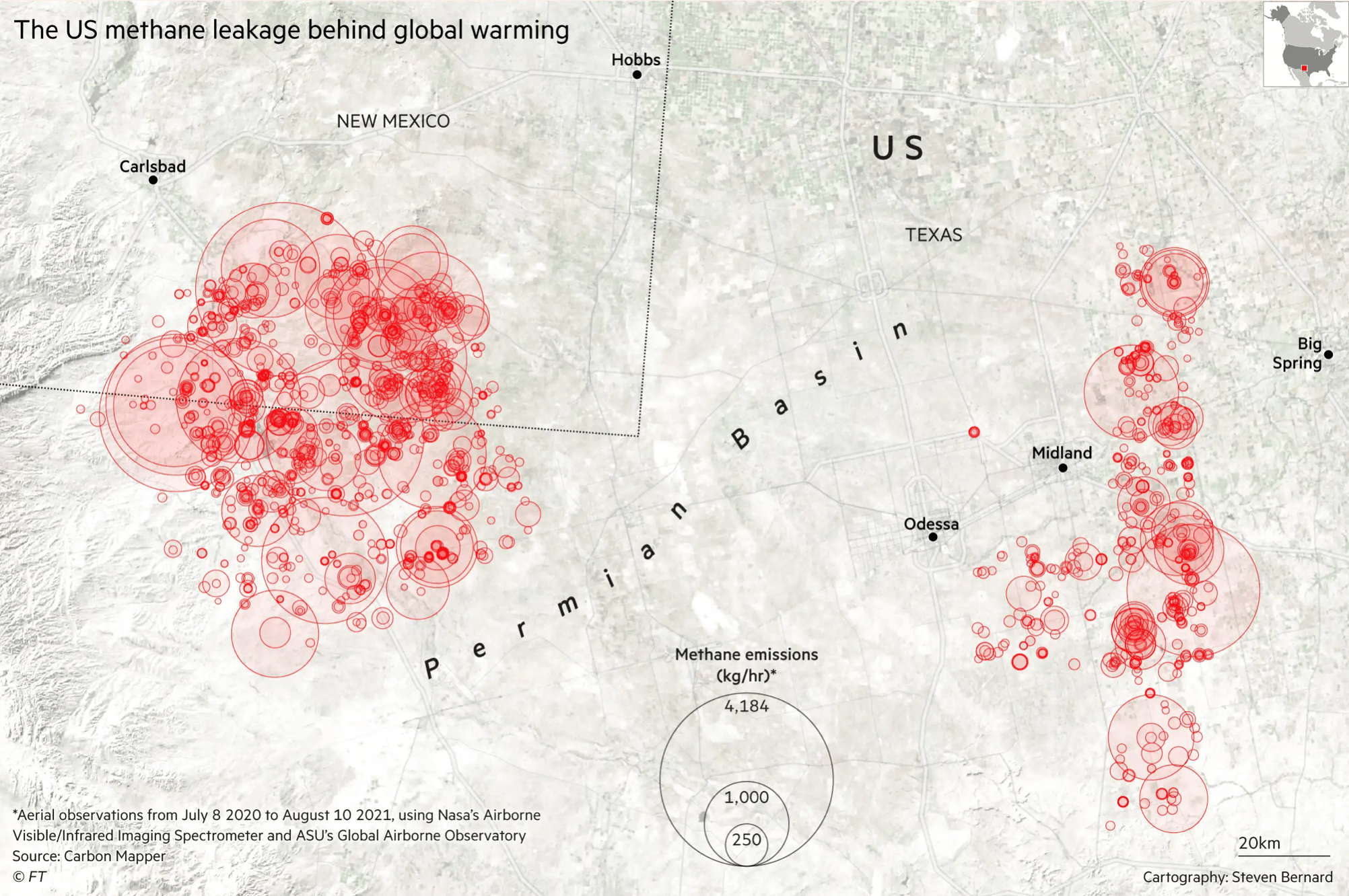
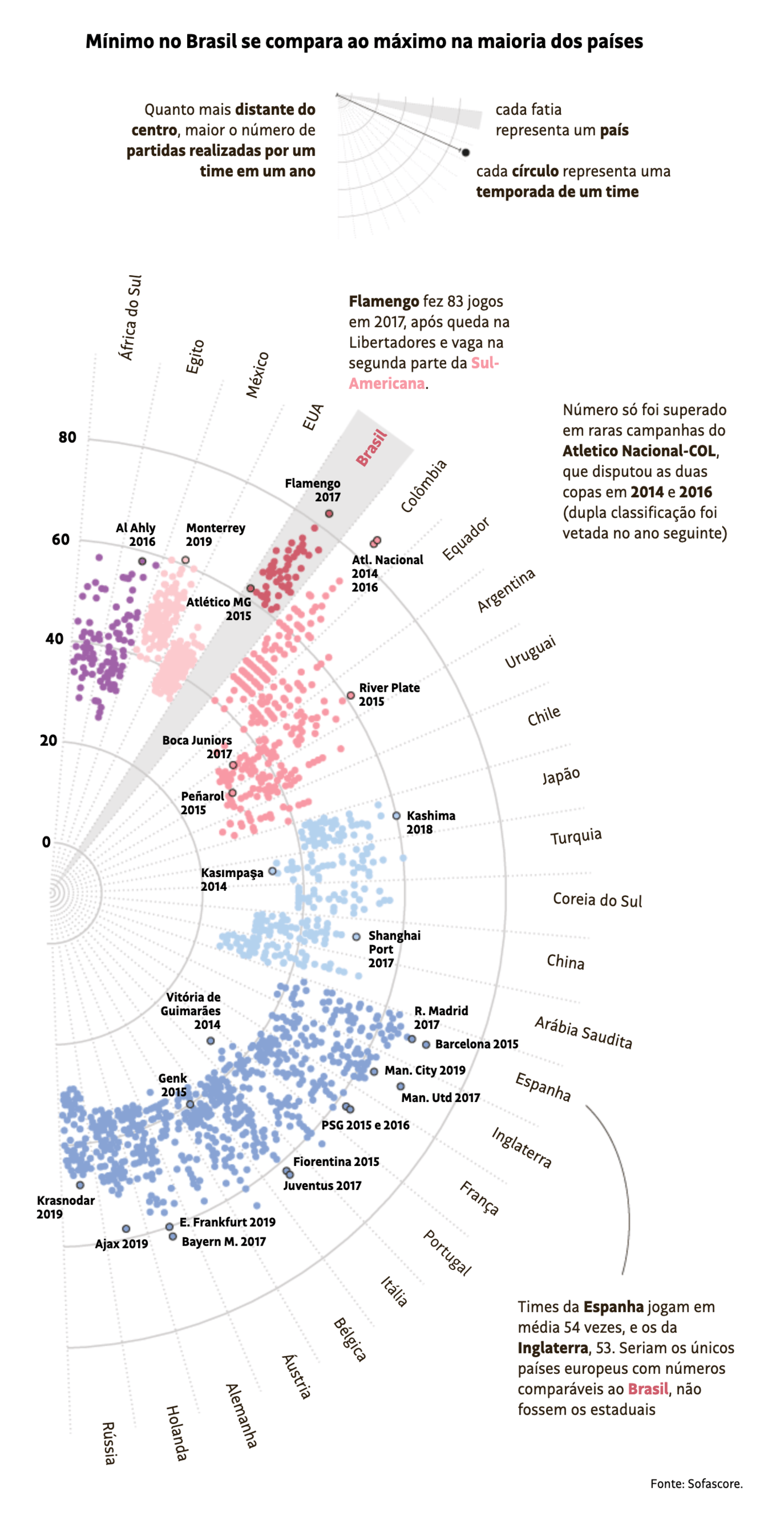
National Geographic: What climate change means for the future of coffee and other popular foods The Economist: If everyone were vegan, only a quarter of current farmland would be needed Le Monde: Coton bio, « made in France » et vêtements recyclés… L’utopie de la mode durable Financial Times: Global warming effect of methane from US Permian draws fresh scrutiny With the Australian Open just finished and the Winter Olympics about to start, it was a great week for sports — and don't miss the Folha de S.Paulo's chart of Brazil's incredibly hardworking football teams :
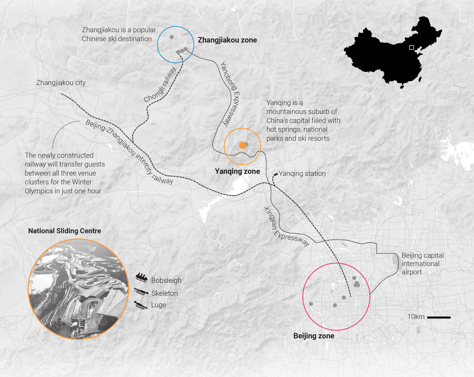
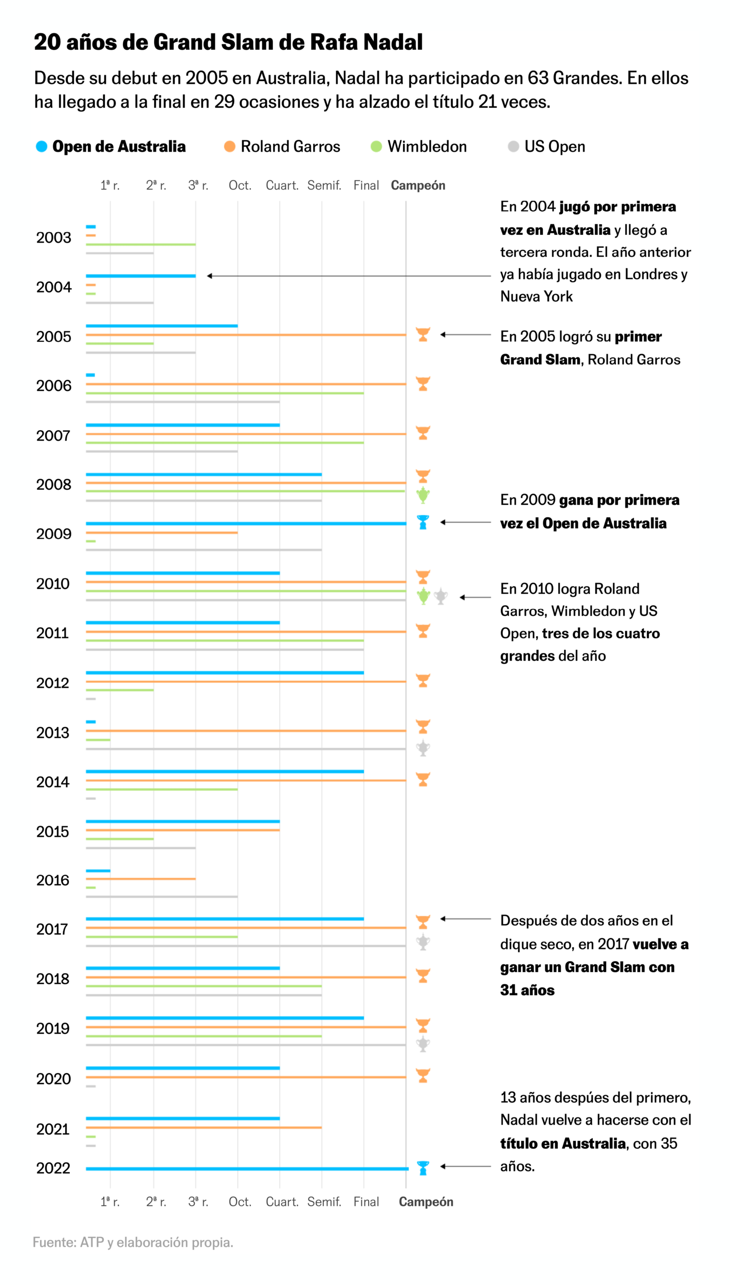
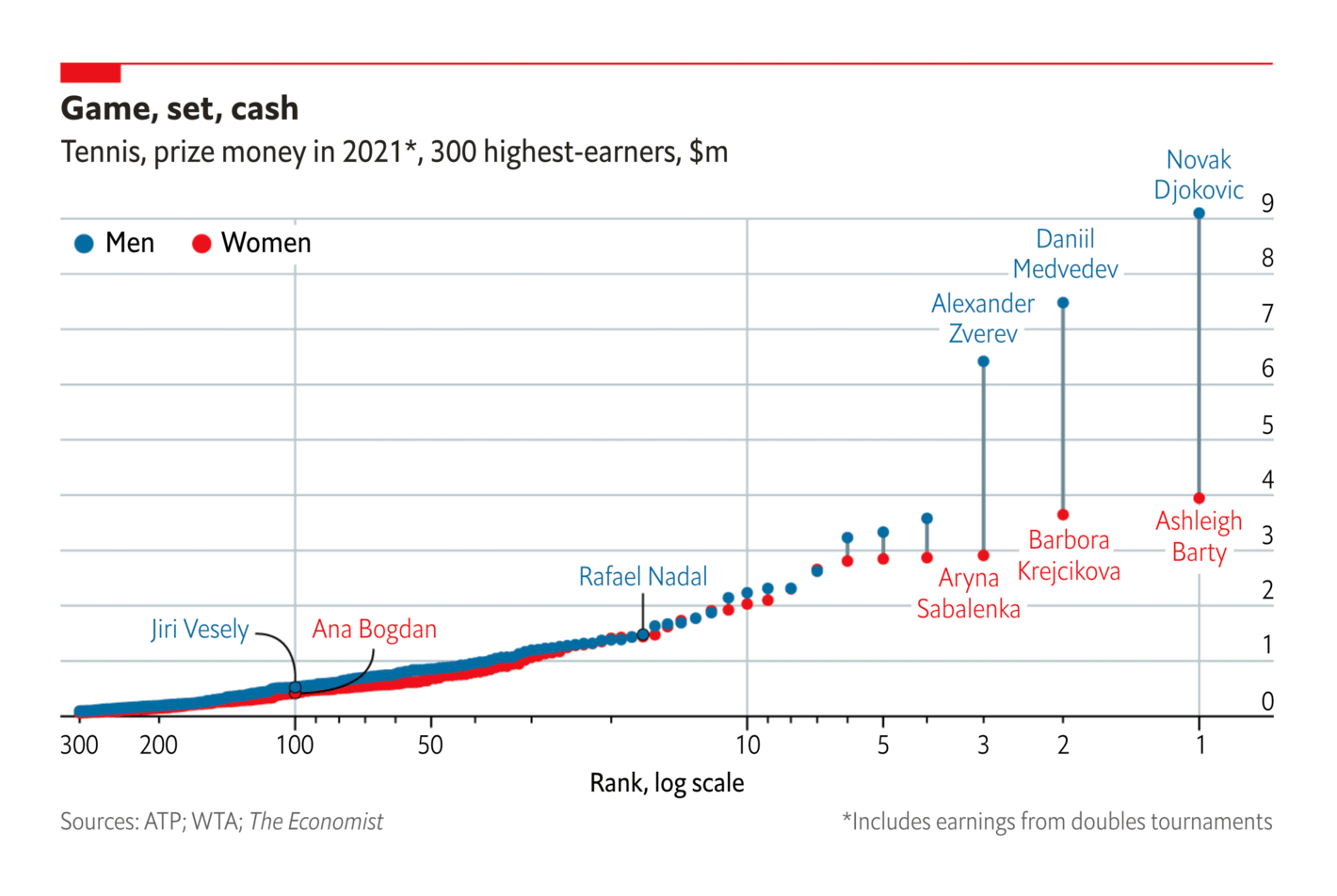
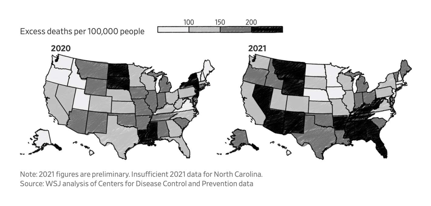
South China Morning Post: Olympic Winter Games Beijing 2022 El País: Los 21 Grand Slam de Rafa Nadal: 17 años de rivalidad contra Federer y Djokovic The Economist: In tennis, the elite capture the glory—and most of the money Folha de S.Paulo: Times brasileiros jogam 20 partidas a mais por ano que europeus Of course, we haven't forgotten the pandemic. A lagging vaccine campaign has changed the geography of deaths in the U.S.:
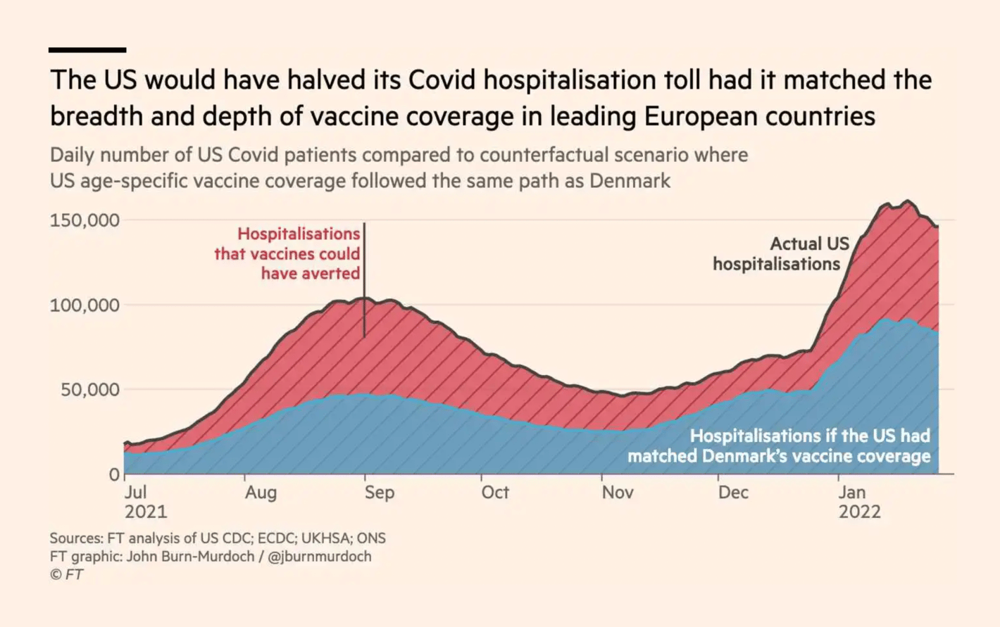
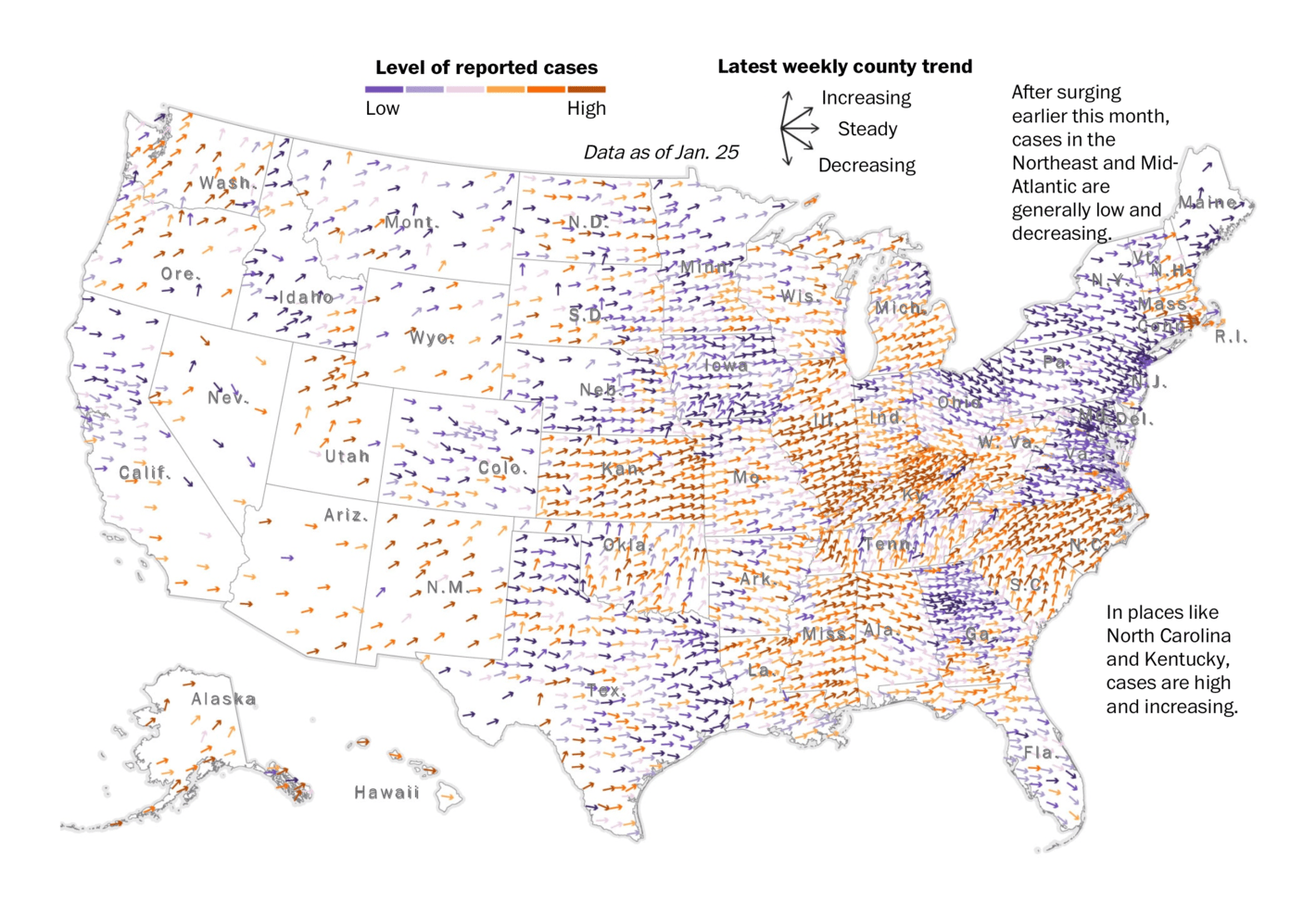
The Wall Street Journal: One Million Deaths: The Hole the Pandemic Made in U.S. Society Financial Times: ‘Pandemic of the unboosted’: low US Covid jab uptake piles pressure on hospitals The Washington Post: Visualizing the omicron wave striking and rolling across the country But with such a fast-moving variant , tracking the real numbers can get tricky:
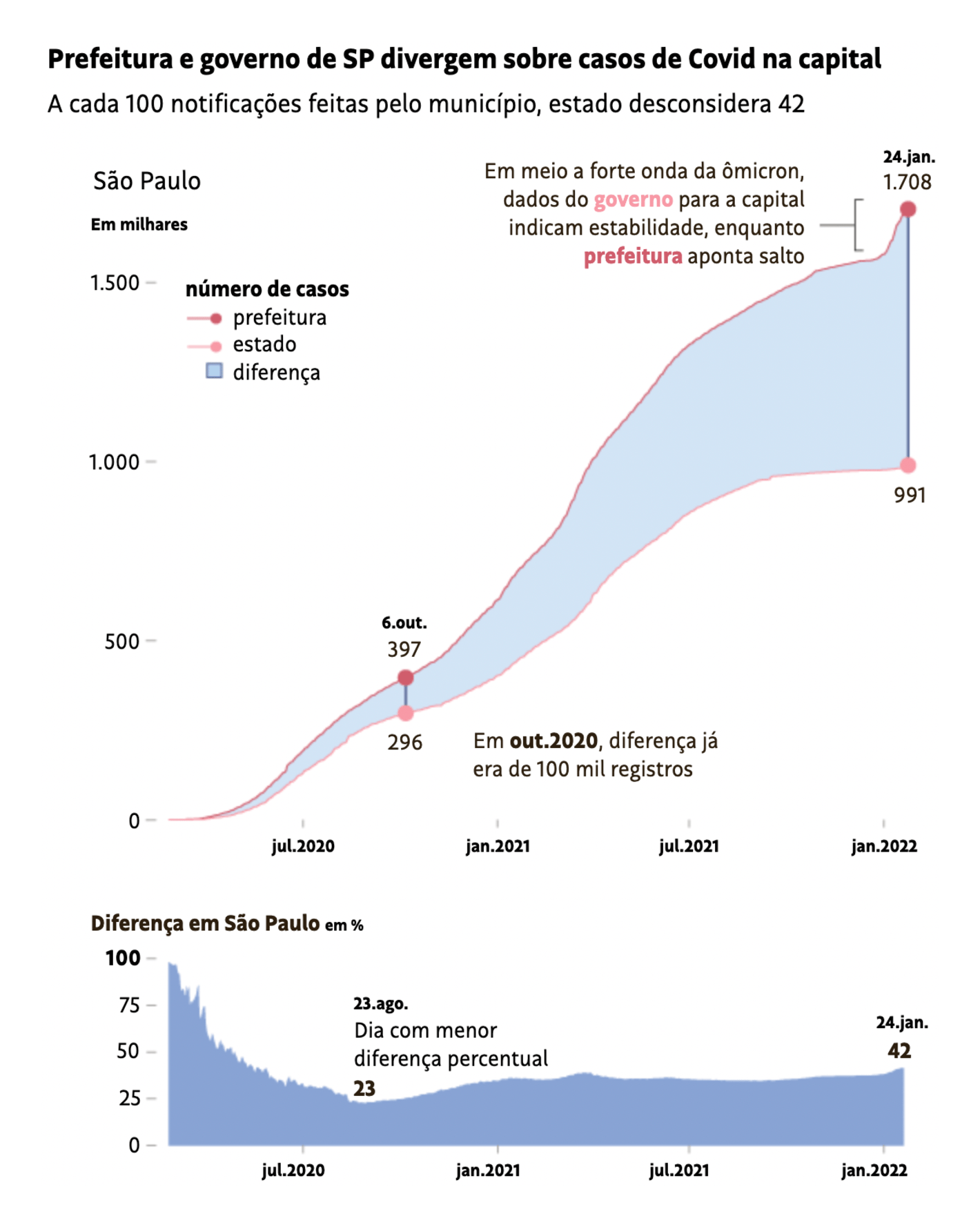
Sorry, your browser doesn't support embedded videos. El Mundo: La tormenta perfecta de los contagios Ómicron, terceras dosis y pasaporte Covid: claves para entender el pico de contagios , January 25 Folha de S.Paulo: Cidade de SP registra 700 mil casos de Covid a mais do que o estado aponta para capital Miscellaneous charts this week can only be split into two groups — first the fun ones, then the grim ones:
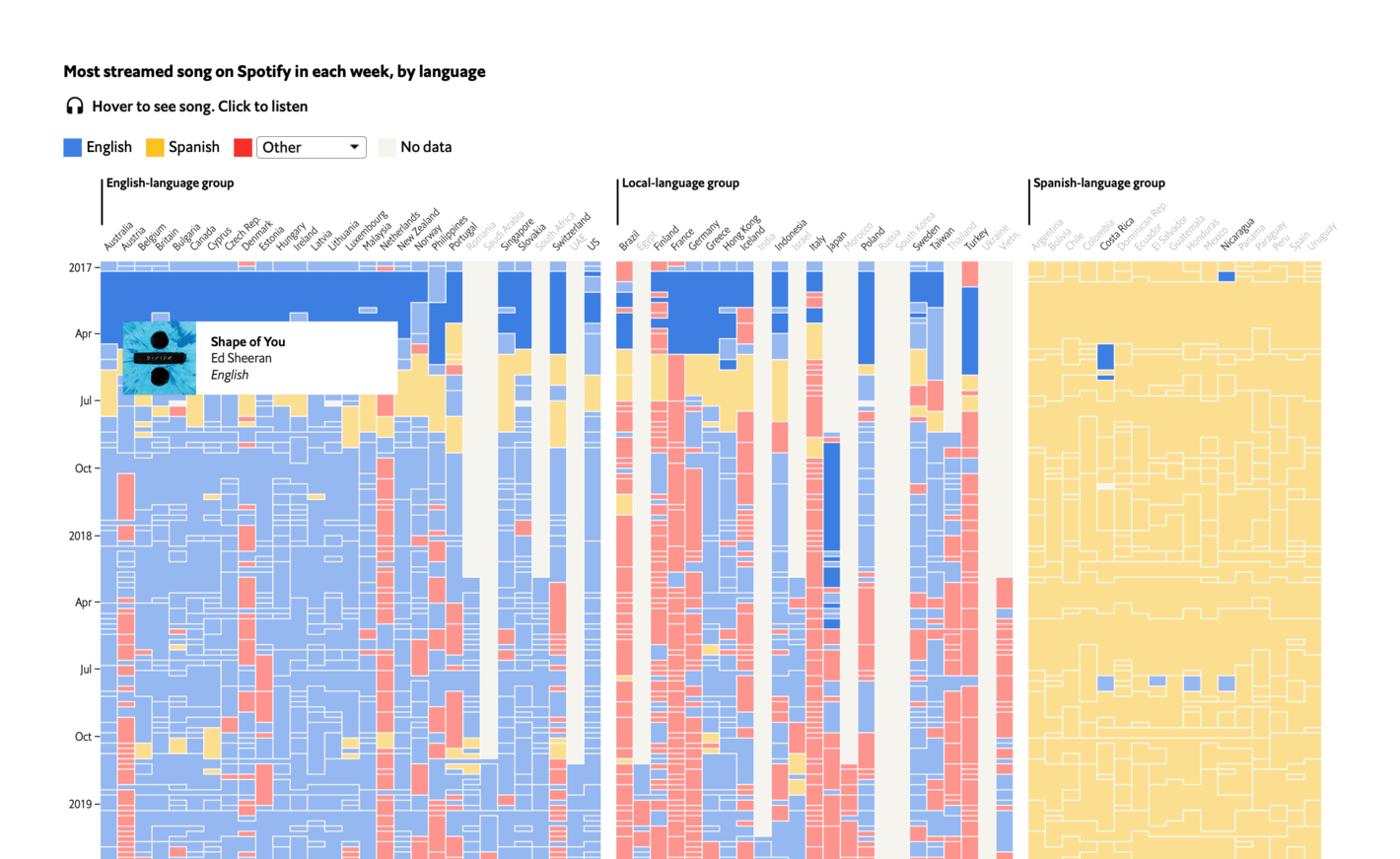
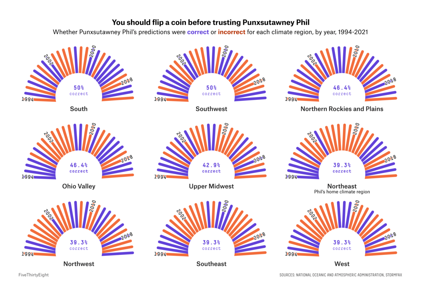
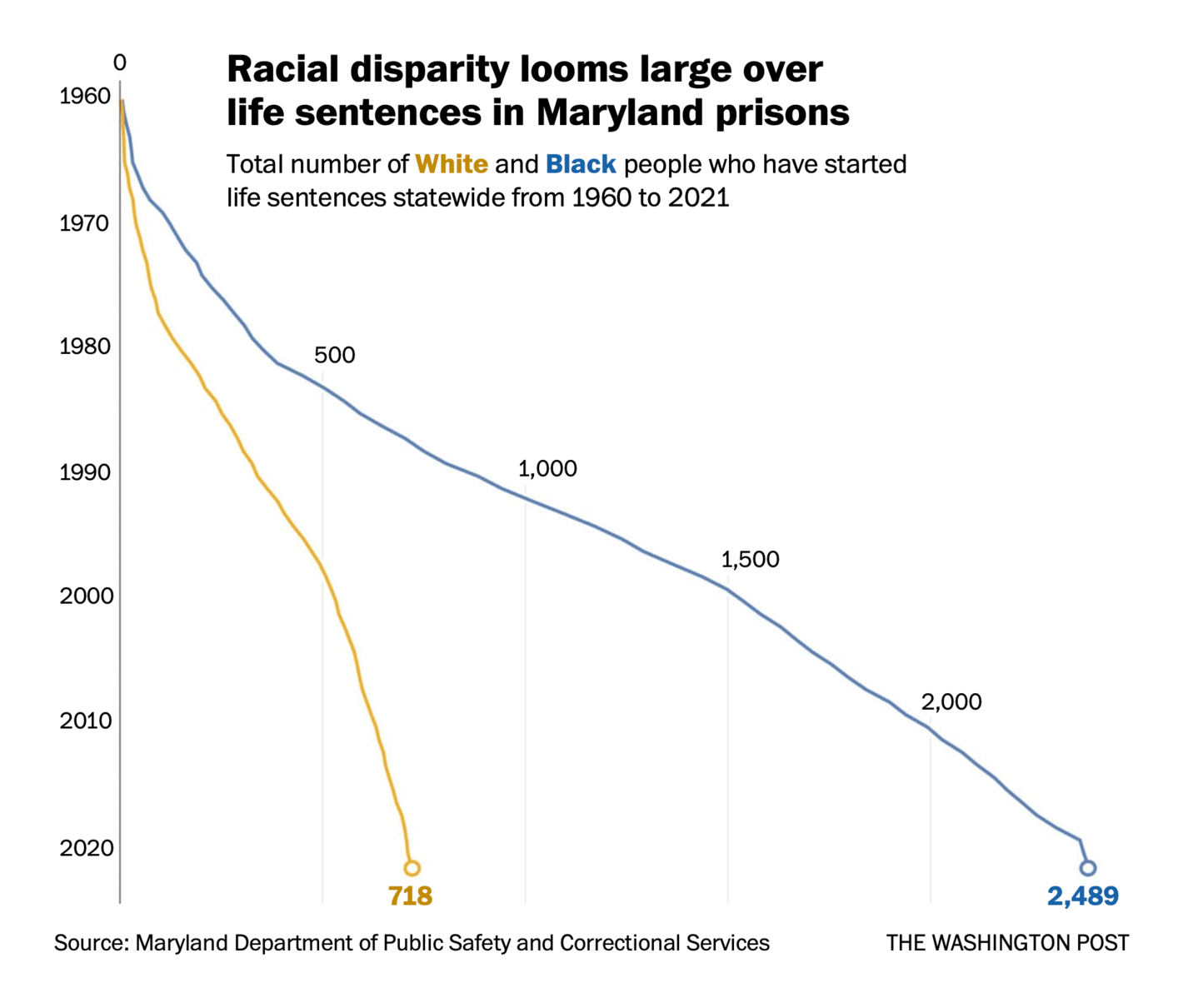
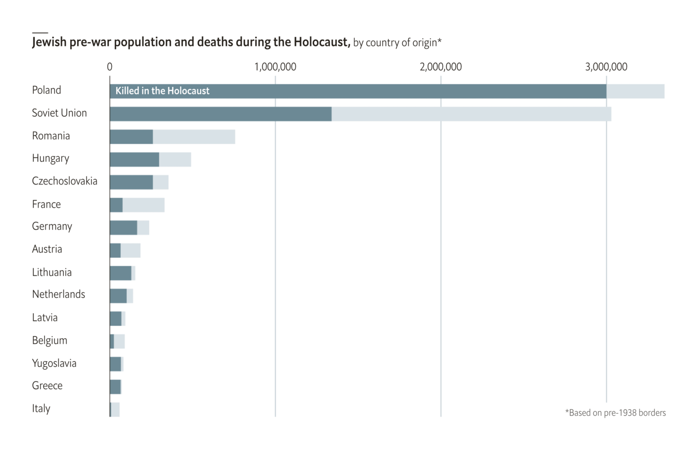
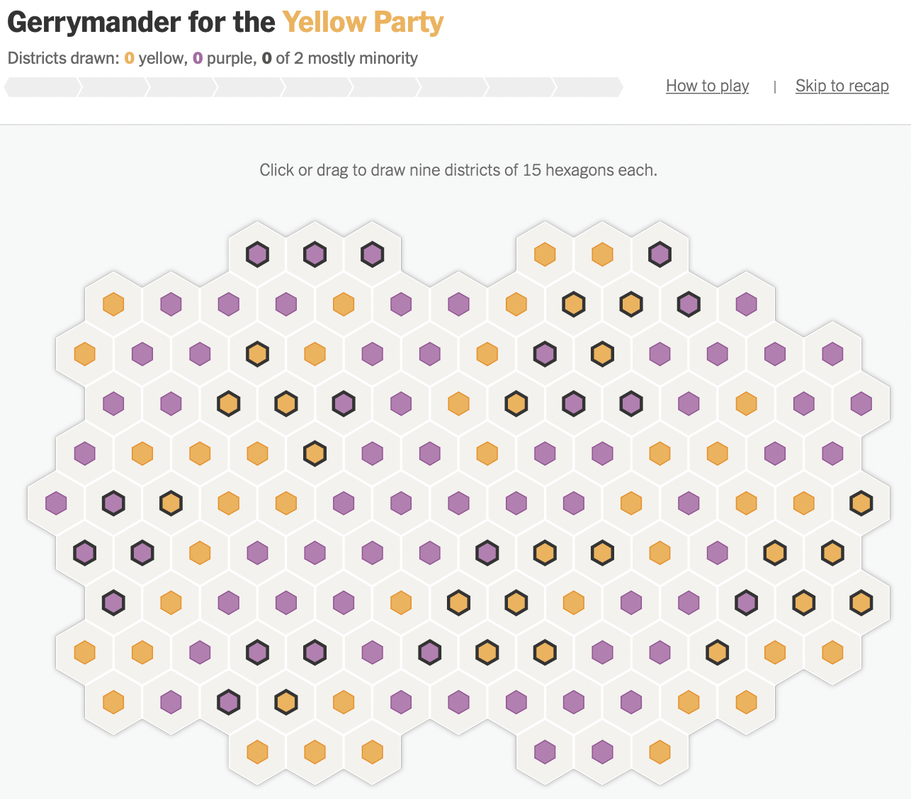
The Economist: What Spotify data show about the decline of English FiveThirtyEight: Groundhogs Do Not Make Good Meteorologists The Washington Post: They were sentenced to life in prison. Who should decide if they get a second chance? The Economist: Archivists are racing to identify every Jewish Holocaust victim , January 25 What else we found interesting Reuters: Gender and language The New York Times: Can You Gerrymander Your Party to Power? The Washington Post: Confused about rapid tests? Here’s what to know Átlátszó: Nevek és terek – Budapest utcanevei Reuters: The race to reconnect Tonga Help us make this dispatch better! We'd love to hear which newsletters, blogs, or social media accounts we need to follow to learn about interesting projects, especially from less-covered parts of the world (Asia, South America, Africa). Write us at hello@datawrapper.de or leave a comment below.
