Data Vis Dispatch, February 11: Super Bowl, minerals, and Baltic states

The best of last week’s big and small data visualizations

Welcome back to the 180th edition of the Data Vis Dispatch! Every week, we publish a collection of the best small and large data visualizations we find, especially from news organizations — to celebrate data journalism, data visualization, simple charts, elaborate maps, and their creators.

Recurring topics this week include the Super Bowl, minerals in Africa, and affairs in countries around the Baltic Sea.


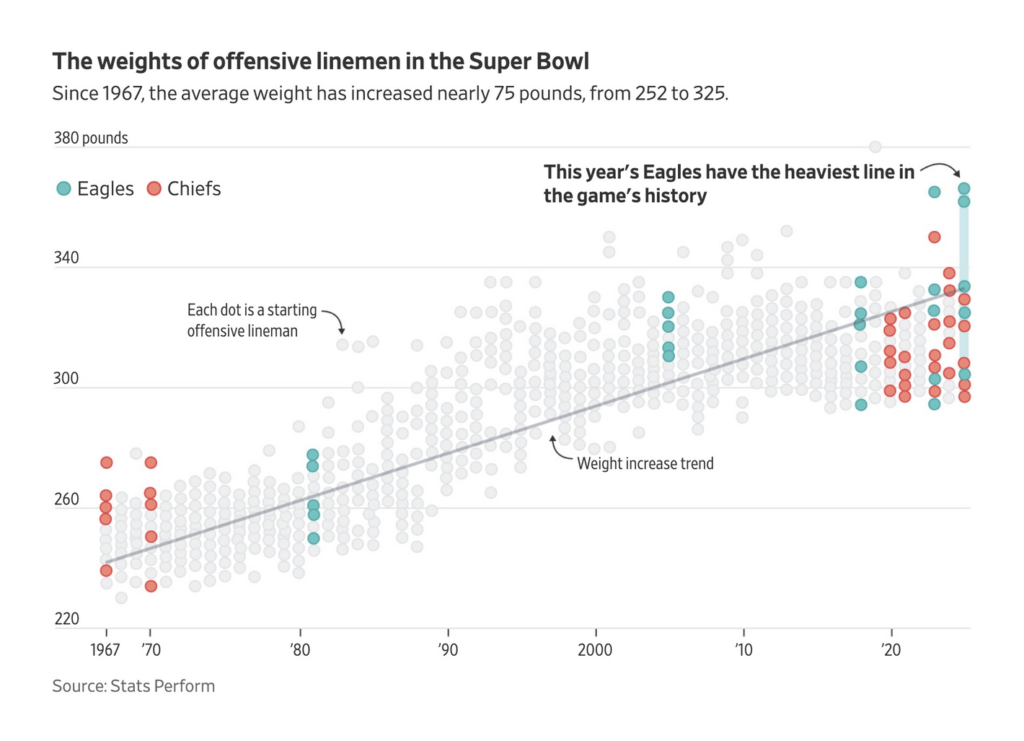
On Sunday, the Super Bowl had a large part of the U.S. population and beyond under its spell. The world of data visualization was not left untouched. Visualizations depicted the size of the players and cleaned-up lyrics in the halftime show:

The Wall Street Journal: The Super Bowl Has Never Seen Anything Like These Five Gigantic Humans, February 4
The Washington Post: You cannot say that in the $%@! Super Bowl halftime show!, February 8

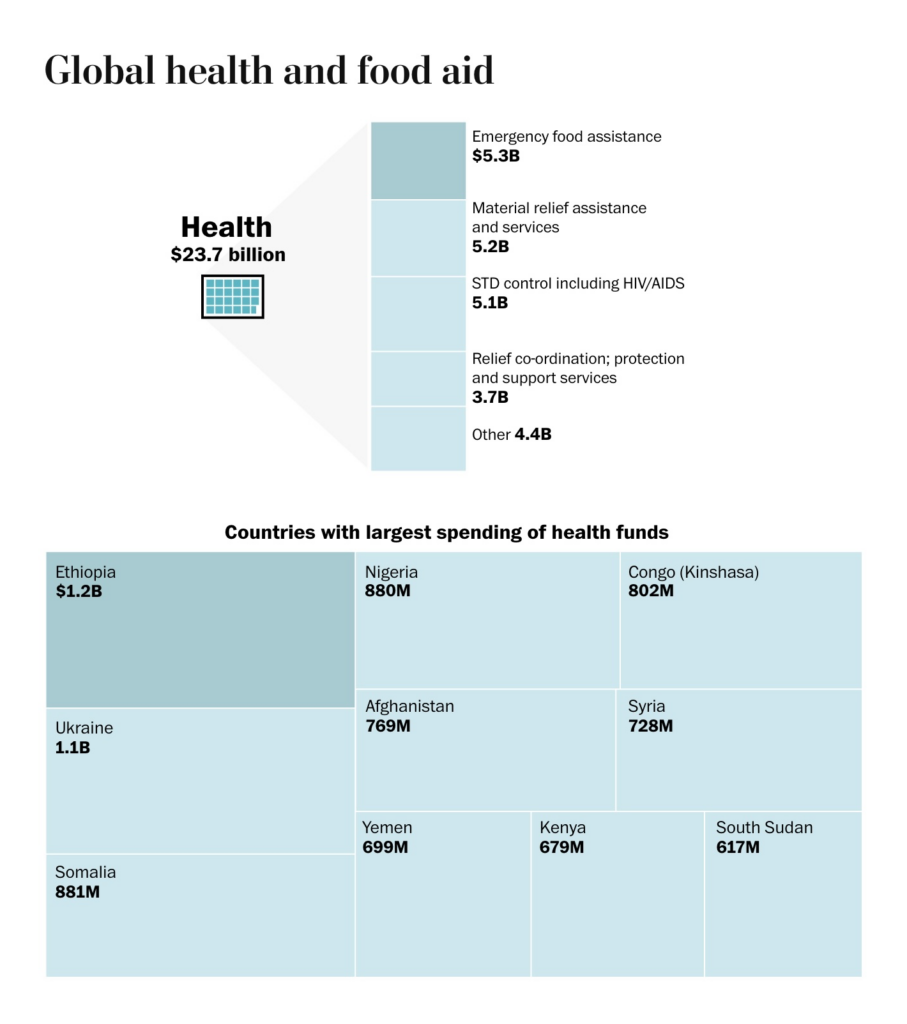
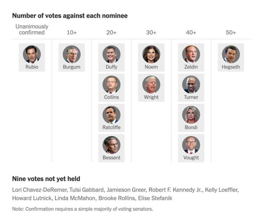
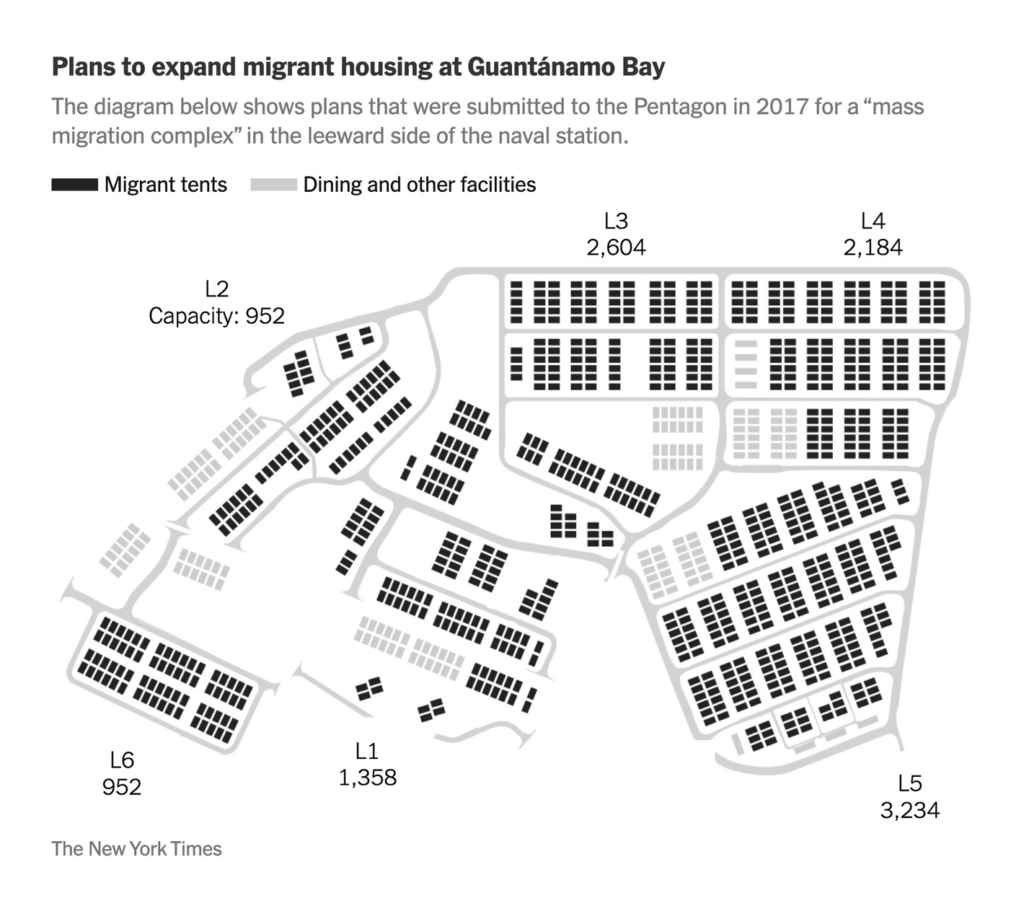
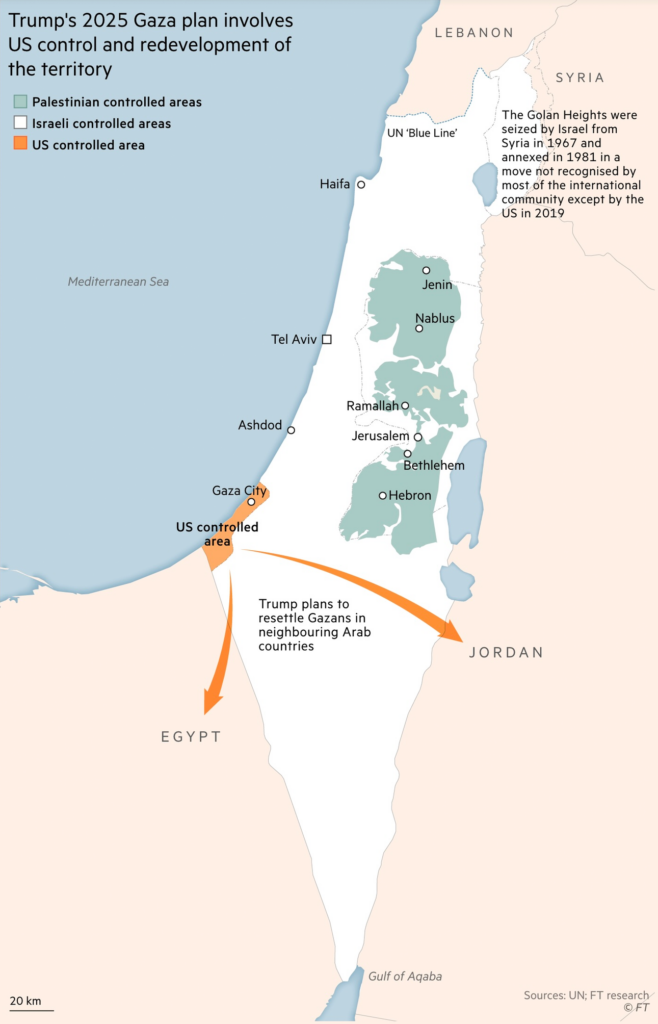
Three weeks into the Trump administration, data journalists focus their attention on cuts to U.S. foreign aid, the detention of immigrants at Guantánamo Bay, and different ways to measure how the country is faring:

The Washington Post: Visualizing the international reach of U.S. funding cut by Trump, February 9
The New York Times: How Each Senator Has Voted on Trump’s Nominees So Far, February 6
The New York Times: See Where Trump Is Expanding Immigrant Detention at Guantánamo, February 5
The New York Times: The U.S. Economy Is Racing Ahead. Almost Everything Else Is Falling Behind, February 4

Trump’s calls for the ethnic cleansing of Gaza have provided a fresh occasion to highlight the enormous destruction there:

Bloomberg: Trump Call for Gazan Exit Echoes in Their Destroyed Homes, February 10
The Washington Post: What is making Gaza ‘uninhabitable’? Unexploded bombs and more, January 6
Financial Times: Donald Trump’s Gaza plan resurrects grandiose Middle East playbook, February 5

It’s a good moment to remember the ongoing war and war crimes in Europe too:

The Wall Street Journal: ‘Be Cruel’: Inside Russia’s Torture System for Ukrainian POWs, February 10

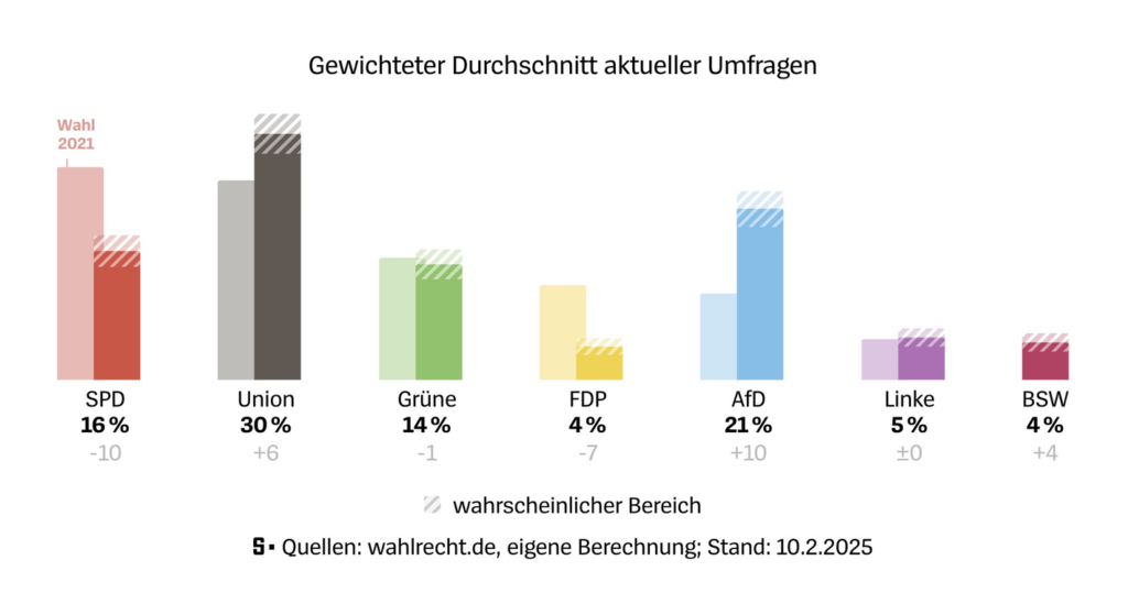
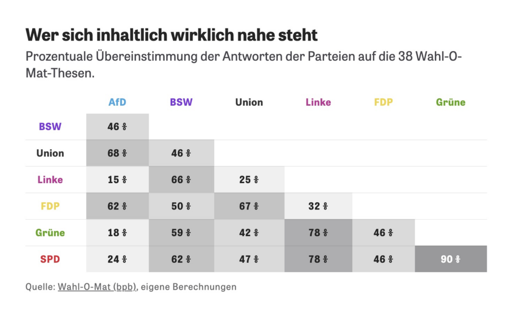
Just two weeks until Germans cast their votes. Here’s the current state of the polls (you can now create such comparison column charts in Datawrapper, too!):

Der Spiegel: So würde Deutschland heute wählen [How Germany would vote today], February 10
Zeit Online: Friedrich Merz: Das wären seine Koalitionen [Friedrich Merz: These would be his coalitions], February 4

Zeit Online: Wer passt zu wem? [Chart description: Percentage agreement between the parties’ answers to the 38 Vote-O-Mat proposals.], February 8

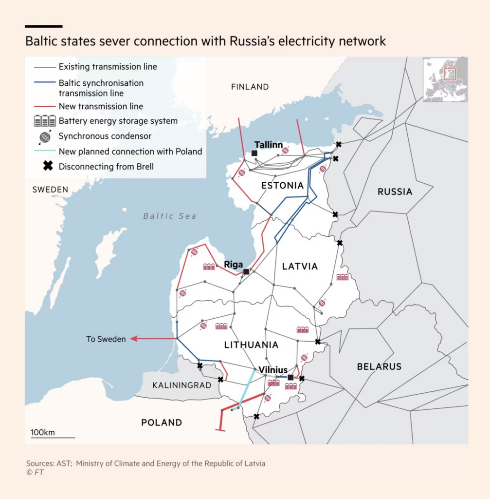
Moving north to the Baltic Sea — Sweden and Finland are privatizing forests, while Estonia, Latvia, and Lithuania are cutting their electricity links with Russia:

Bloomberg: Climate Rules Threaten the Money Growing in Nordic Trees, February 7
Financial Times: Baltic states sever last power links to Russia, February 7

This week in cities — how to improve walkability, and how Los Angeles is recovering from its recent wildfires:

The Economist: What can the world’s most walkable cities teach other places?, February 7
Bloomberg: Inside the LA Fire Cleanup’s Rush to Remove Tons of Toxic Rubble, February 6
The Wall Street Journal: How Botched Alerts Turned This L.A. Neighborhood Into a Fiery Death Trap, February 5
Peter Atwood: “Fighting a massive and rapidly spreading wildfire from the air is a truly mind boggling logistical effort. I used flight data from FlightAware, and wildfire data for NASA and the ArcGIS Living Atlas to animate a single 24 hour period of firefighting activity over the Palisades fire […],” February 5 (LinkedIn)

Last week, Le Monde published a fascinating series on the politics of minerals in Africa:

Le Monde: La course mondiale aux métaux « stratégiques » dans les sous-sols encore inexploités de l’Afrique [The global race for “strategic” metals in Africa’s still unexploited subsoils], February 8
Le Monde: De l’Angola à la République démocratique du Congo, le mirage du corridor ferroviaire de Lobito [From Angola to the Democratic Republic of Congo, the mirage of the Lobito railway corridor], February 8

Le Monde: En RDC, la mine de coltan de Rubaya condense les problèmes de la région [In the DRC, the Rubaya coltan mine condenses the region’s problems], February 8

We came across several rising line charts this week:

e15: Fígl makléřů na nákup drahého bytu v Praze? Hypotéka hned po škole a pár let skromnosti [Chart title: How housing has become more expensive in the Czech Republic compared to other European countries], February 4
La Nación: Fuga de presos. Con 60 detenciones diarias, colapsan comisarías porteñas y los vecinos advierten sobre el impacto en sus barrios [Chart title: Evolution of the prison population in police stations, jails, or waiting for accommodation], February 5
Nexo Jornal: Por que o preço do café disparou em 2024 no Brasil [Why the price of coffee soared in 2024 in Brazil], February 6

Want to explore something on your own? Here are two interactive data visualizations on alcohol consumption and pensions in Germany:

The Wall Street Journal: How Much Alcohol Are You Really Drinking? Take Our Quiz to Find Out, February 10
Zeit Online: So groß ist Ihre Rentenlücke [How big is your pension gap], February 7

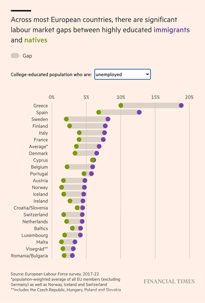
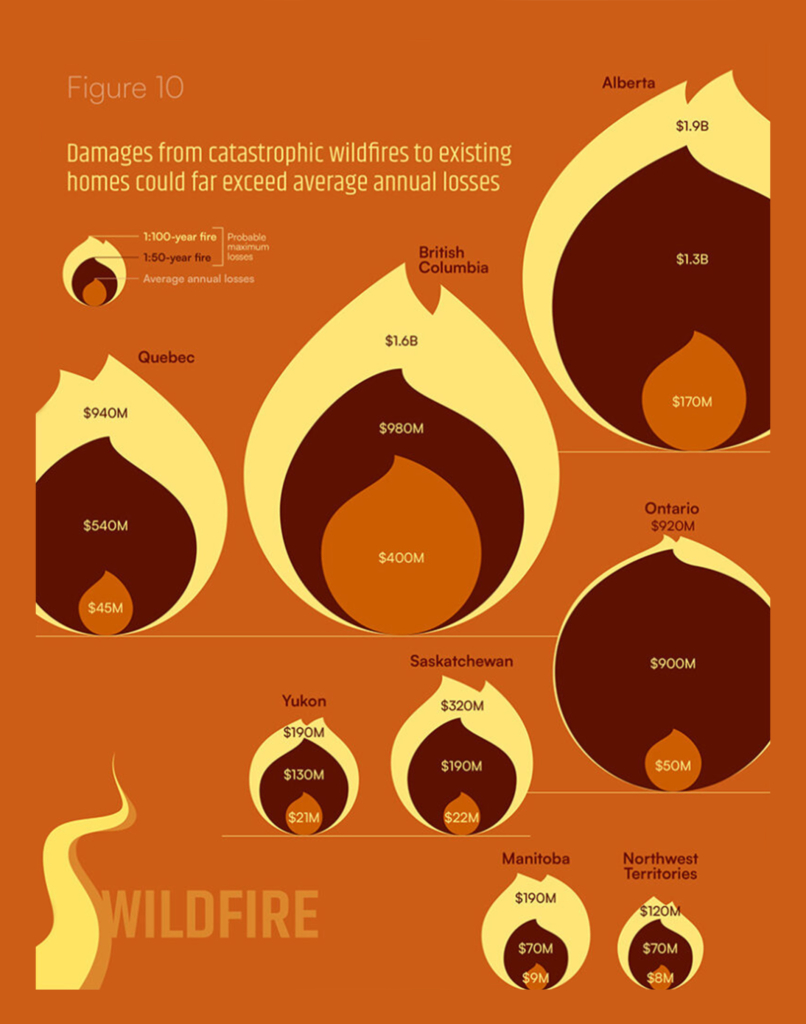
Finally, two charts we couldn’t pass up — the labor market gap between immigrants and natives in Europe, and wildfire risk in Canada:

Financial Times: Hongkongers in UK struggle to make skills pay in jobs market, February 5
Voilà / Francis Gagnon: “Big day for Voilà: and the @climateinstitute.bsky.social with the publication of CLOSE TO HOME, a report about the costs of climate-related damages to housing. Quite the timing with the LA fires,” February 6 (Bluesky)

What else we found interesting

The Washington Post: A sample of the government webpages Trump doesn’t want you to see, February 7
FlowingData: Data bead bracelets, February 4 (Project website)

Applications are open for…


Help us make this dispatch better! We’d love to hear which newsletters, blogs, or social media accounts we need to follow to learn about interesting projects, especially from less-covered parts of the world (Asia, South America, Africa). Write us at hello@datawrapper.de or leave a comment below.

Want the Dispatch in your inbox every Tuesday? Sign up for our Blog Update newsletter!

Comments