Data Vis Dispatch, February 18: German election polls, corruption, and tariffs
February 18th, 2025
9 min
Datawrapper lets you show your data as beautiful charts, maps or tables with a few clicks. Find out more about all the available visualization types.
Our mission is to help everyone communicate with data - from newsrooms to global enterprises, non-profits or public service.
We want to enable everyone to create beautiful charts, maps, and tables. New to data visualization? Or do you have specific questions about us? You'll find all the answers here.
Data vis best practices, news, and examples
250+ articles that explain how to use Datawrapper
Answers to common questions
An exchange place for Datawrapper visualizations
Attend and watch how to use Datawrapper best
Learn about available positions on our team
Our latest small and big improvements
Build your integration with Datawrapper's API
Get in touch with us – we're happy to help
This article is brought to you by Datawrapper, a data visualization tool for creating charts, maps, and tables. Learn more.
The best of last week’s big and small data visualizations
Welcome back to the 129th edition of Data Vis Dispatch! Every week, we’ll be publishing a collection of the best small and large data visualizations we find, especially from news organizations — to celebrate data journalism, data visualization, simple charts, elaborate maps, and their creators.
Recurring topics this week include war, football, and Valentine’s Day.
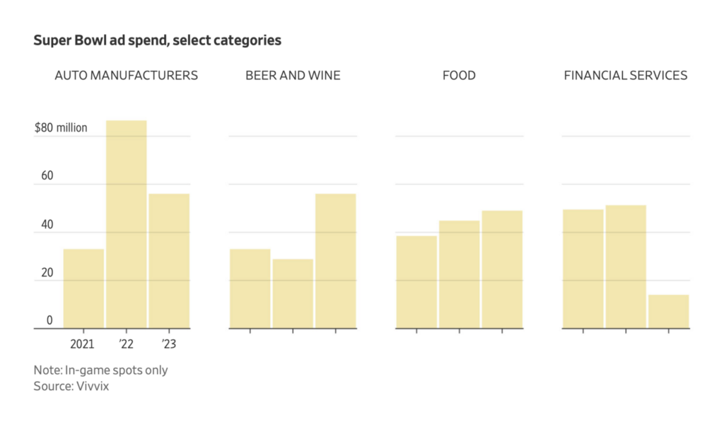
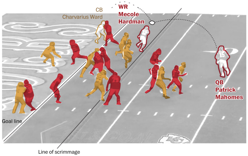
Unsurprisingly, football — both kinds — was the subject of many charts this week:
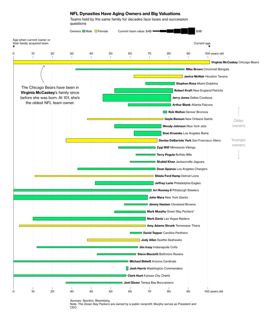
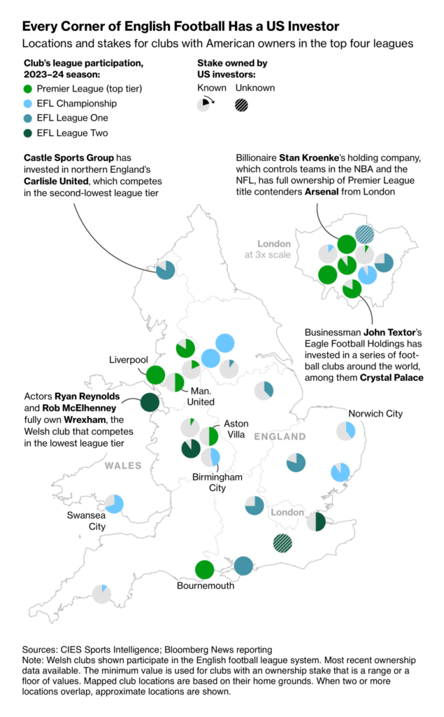
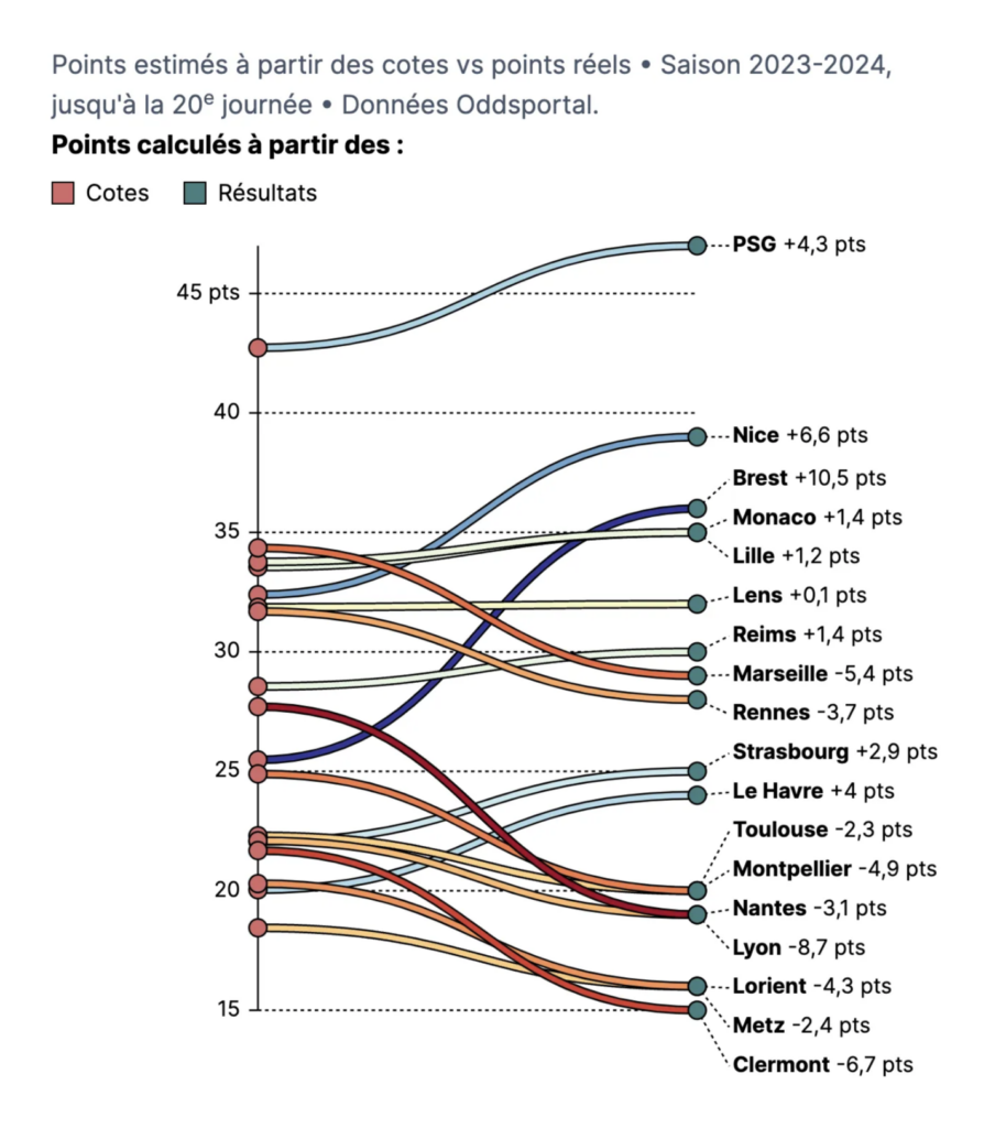
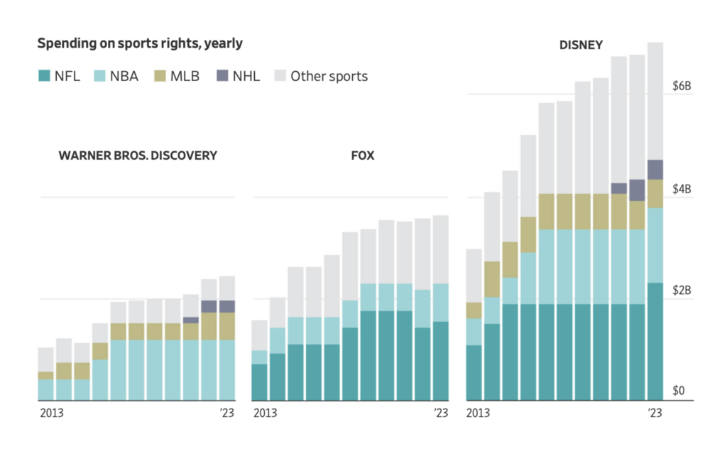
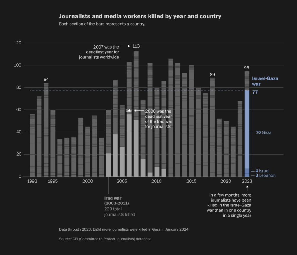
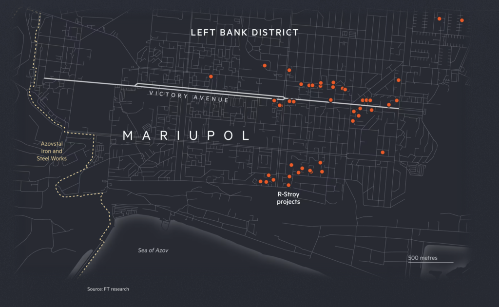
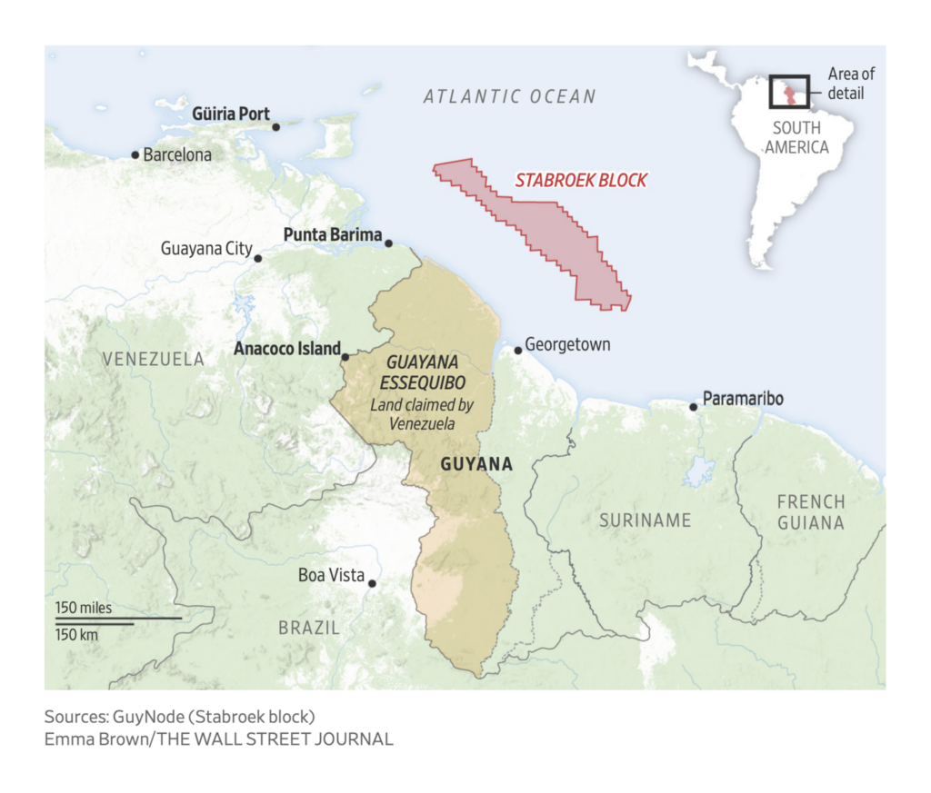
But the fun pretty much stops there. This week also saw visualizations of killing, displacement, and destruction in Gaza and Ukraine, as well as simmering conflict over oil in Iran and Guyana:


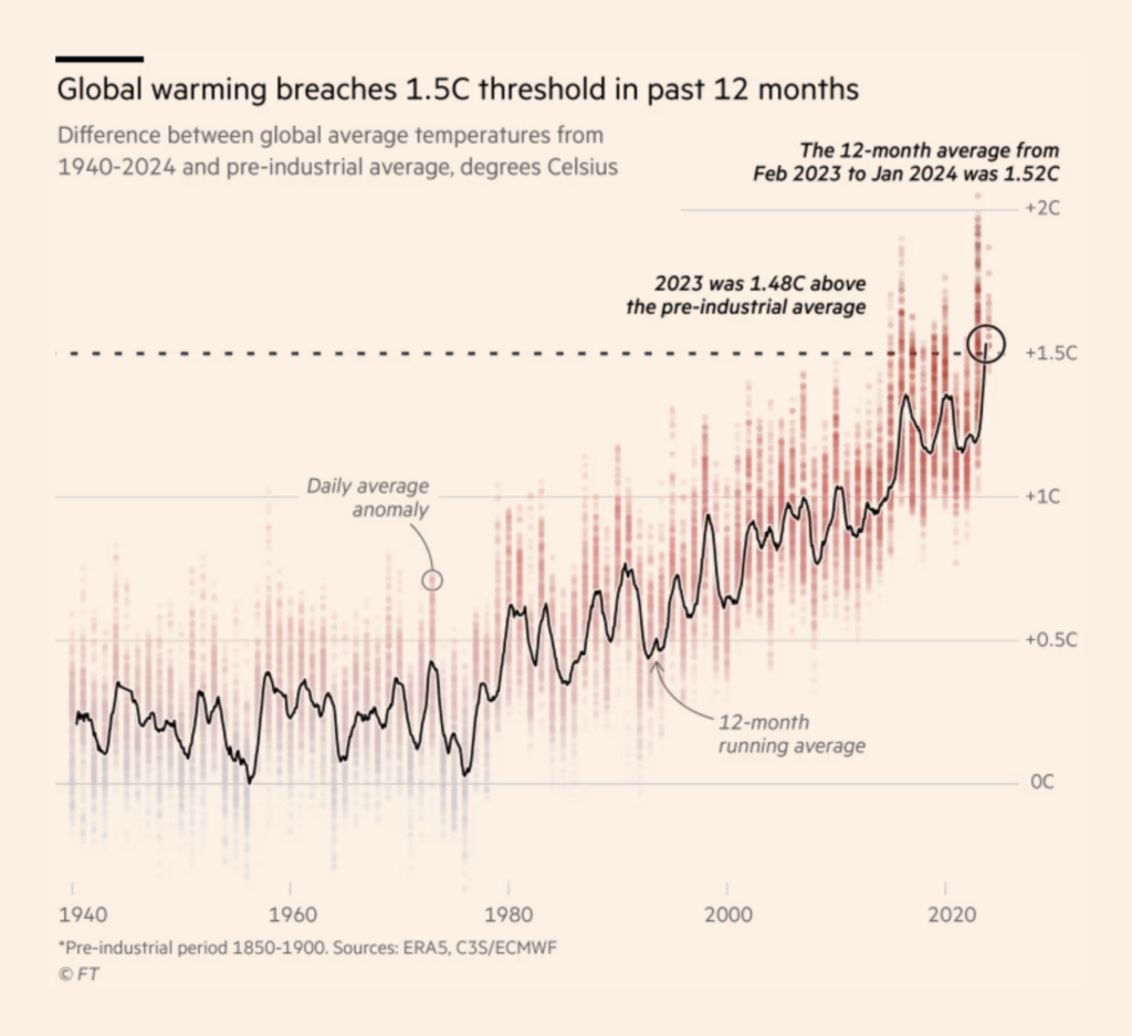
The past twelve months were the first ever to register 1.5 degrees of warming from global pre-industrial averages. Avoiding that threshold is the basis of the 2015 Paris Agreement:
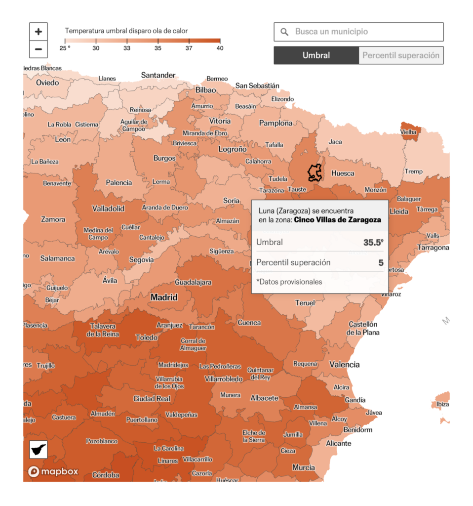
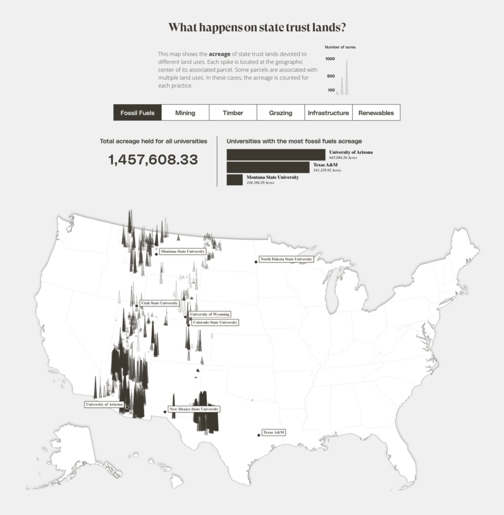
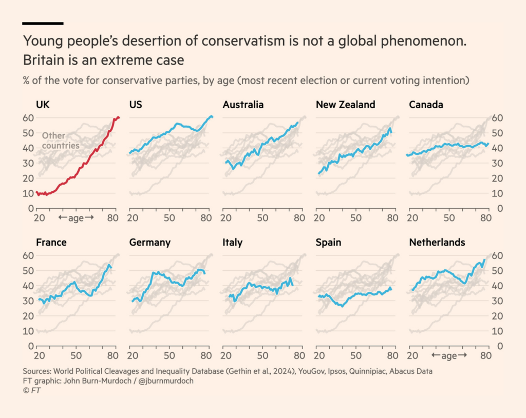
Around the world, climate politics are often seen as a young person’s issue. But young voters don’t reject conservative parties so much as they do one Conservative Party:
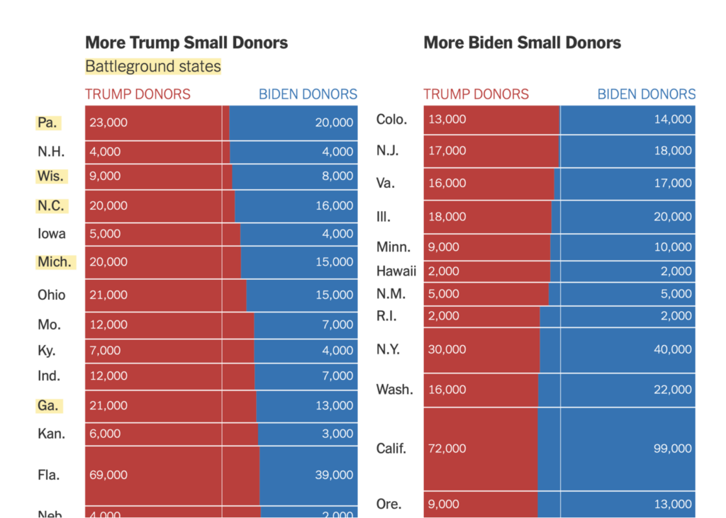
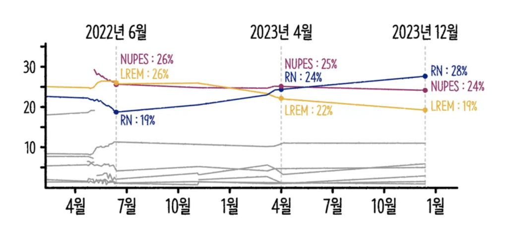
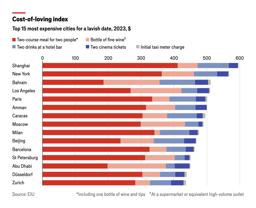
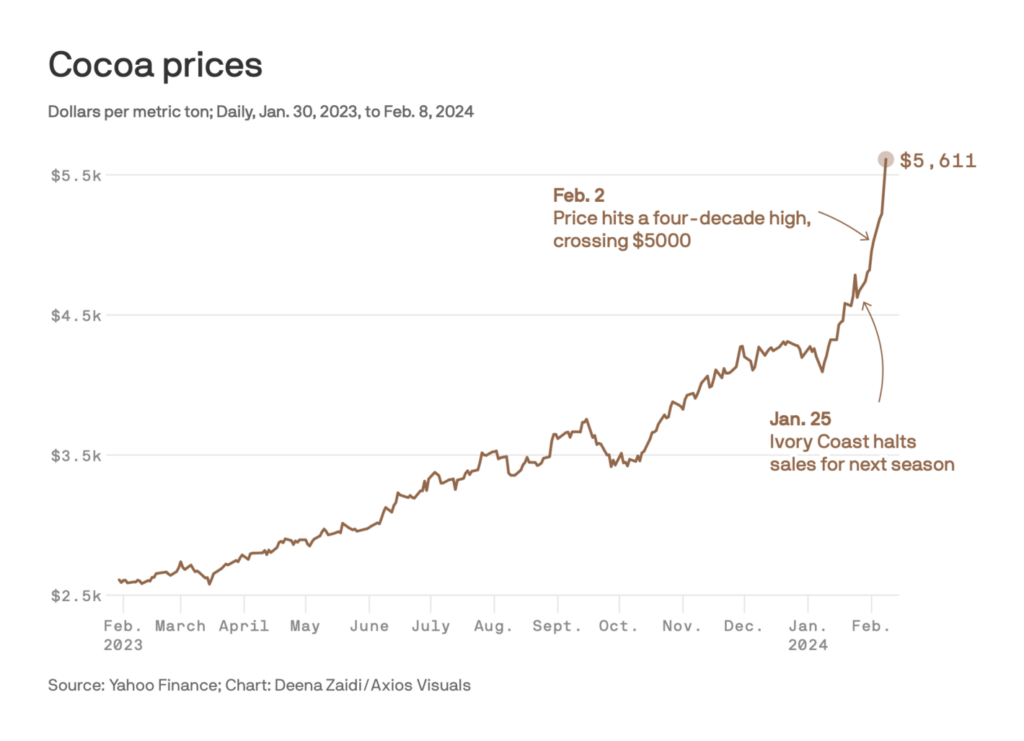
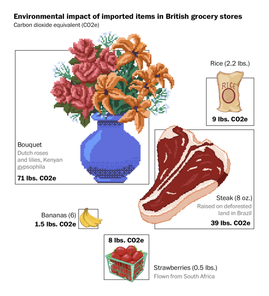
Economic charts this week covered corporate strategy and cost of living issues:
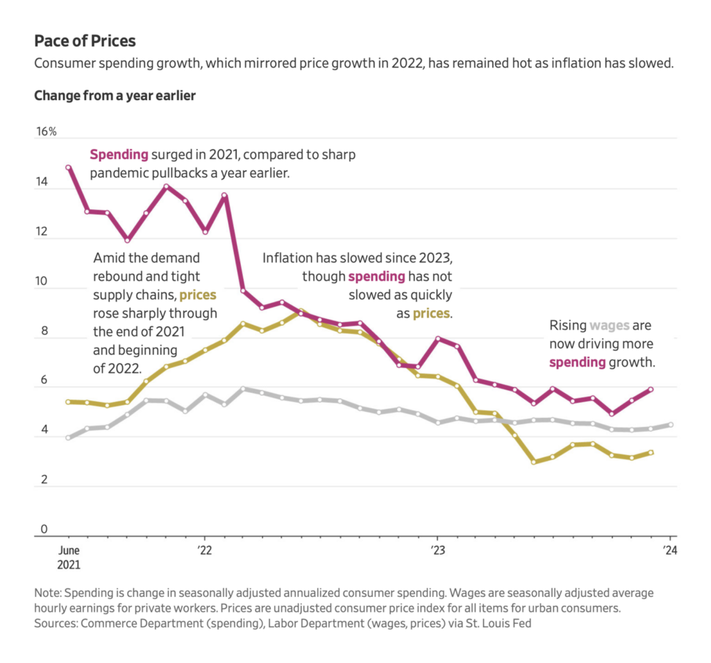
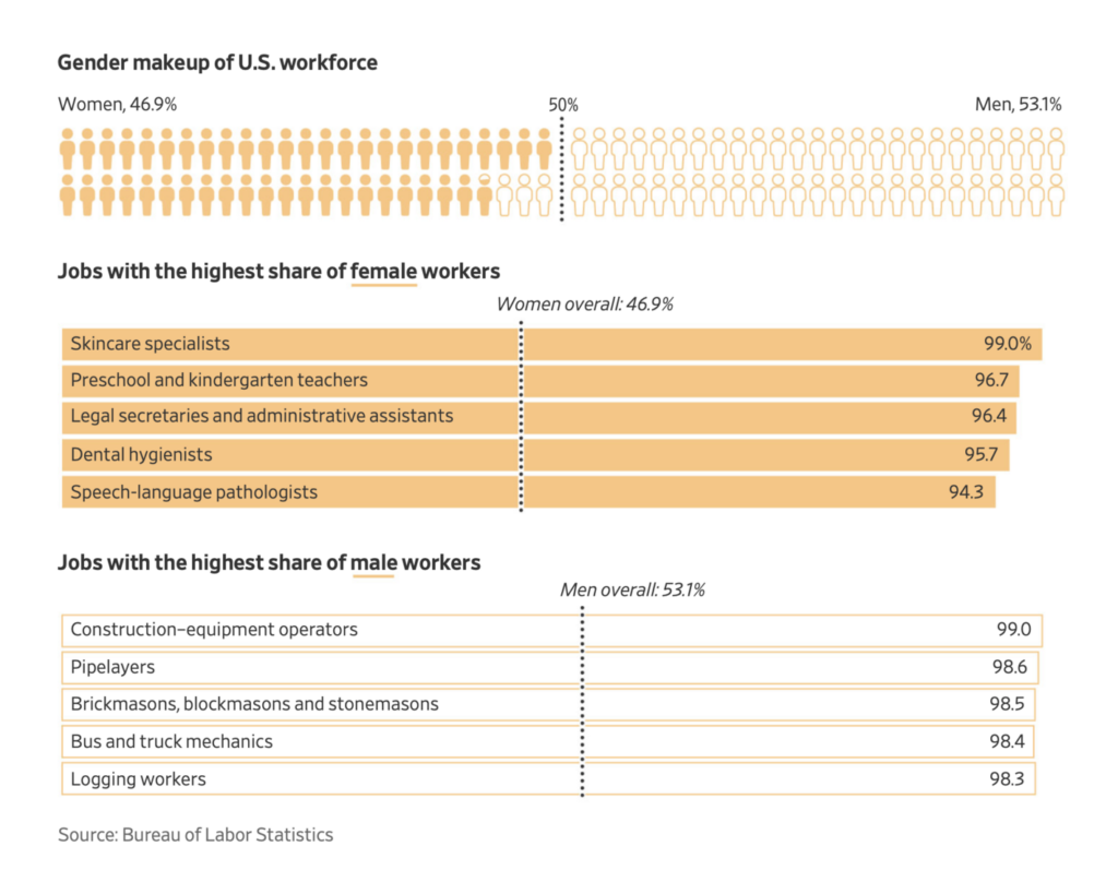

Including not one, but three visualizations on the costs of Valentine’s Day:

Applications are open for…
Help us make this dispatch better! We’d love to hear which newsletters, blogs, or social media accounts we need to follow to learn about interesting projects, especially from less-covered parts of the world (Asia, South America, Africa). Write us at hello@datawrapper.de or leave a comment below.
Want the Dispatch in your inbox every Tuesday? Sign up for our Blog Update newsletter!
Comments