Data Vis Dispatch,
February 15

The best of last week’s big and small data visualizations

Welcome back to the 33rd edition of Data Vis Dispatch! Every week, we’ll be publishing a collection of the best small and large data visualizations we find, especially from news organizations — to celebrate data journalism, data visualization, simple charts, elaborate maps, and their creators.

Recurring topics this week include global democracy, secondary effects of the pandemic, and the possibility of an invasion of Ukraine.

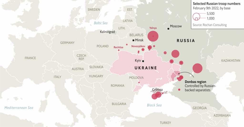
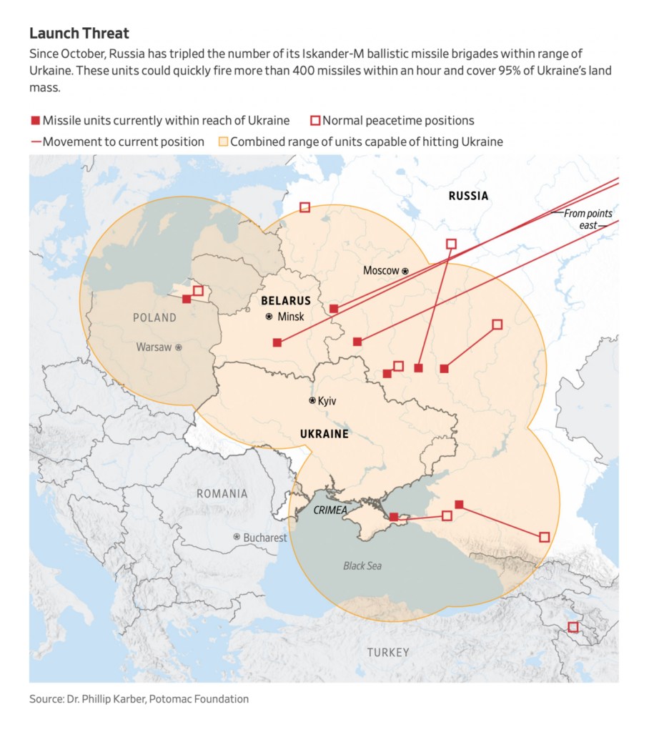
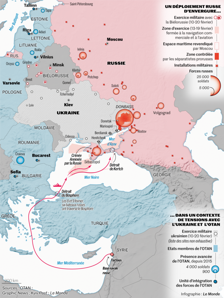
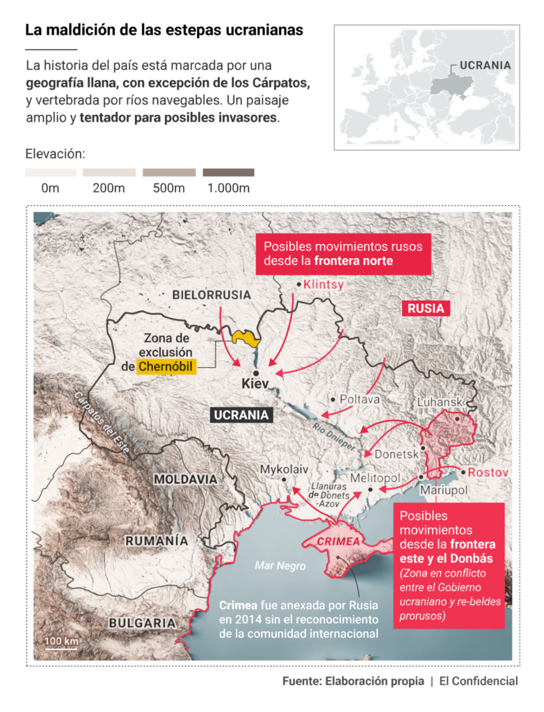
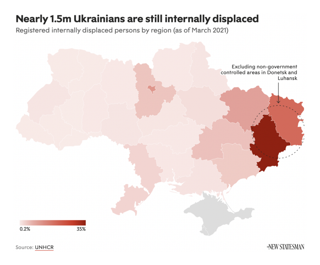
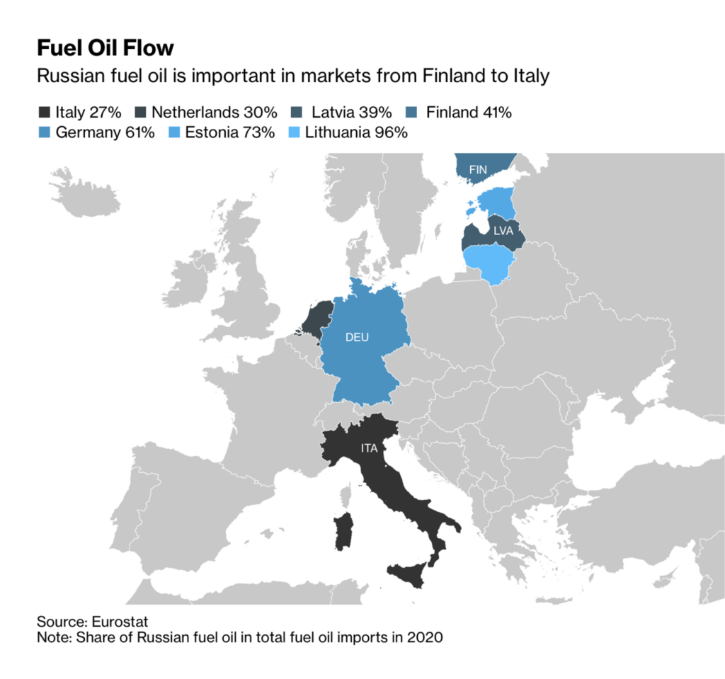
Russia’s military buildup around Ukraine dominated maps again this week:

The Economist: Russia’s military build-up enters a more dangerous phase, February 11
The Wall Street Journal: Russian Buildup Near Ukraine Features Potent Weapons Systems, Well-Trained Troops, February 13
Le Monde: L’Ukraine en alerte après le début d’exercices militaires russo-biélorusses, February 11

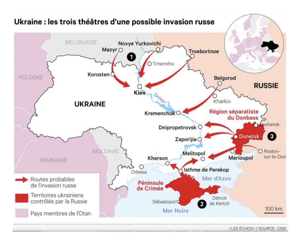
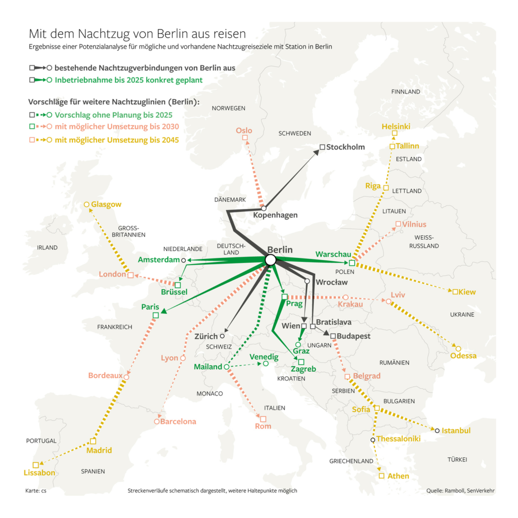
Other maps showed the routes of a possible invasion, Ukraine’s existing internal displacement crisis, and the continuing flow of Russian oil into Europe:

Les Echos: Les menaces de guerre s’intensifient en Ukraine, February 13
El Confidencial: La maldición de las estepas salvajes: ¿por qué es tan fácil invadir Ucrania?, February 10
The New Statesman: Will Ukraine be the source of Europe’s next migrant crisis?, February 10
Bloomberg: Russia and Europe Are Vital to Each Other When It Comes to Oil, February 10

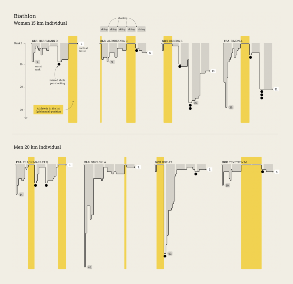
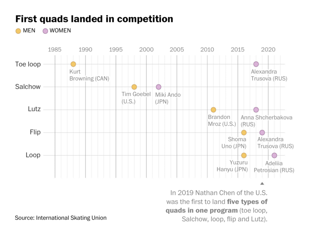
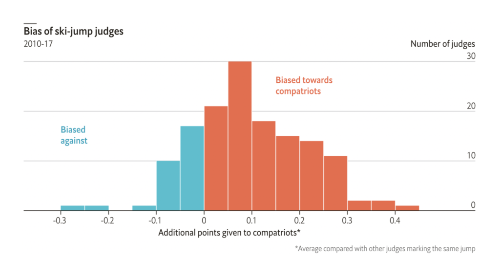
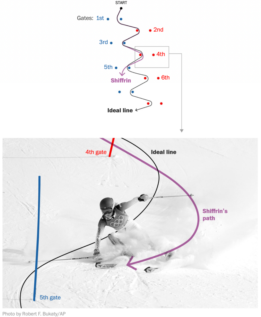
The Winter Olympics were somewhat overshadowed, but still made for a second great week of charts. (Scroll down to “What else we found interesting” for more Olympics-related visuals!)

Krisztina Szűcs: “New project! Biathlon is always super fun to watch and I love how rankings can change any second. I visualized how athletes miss shots and shift positions in rankings,” February 14 (Tweet)
The Washington Post: How Yuzuru Hanyu nearly landed a quadruple axel, February 10
Krisztina Szűcs: “Men’s ice hockey match results are coming!” February 10 (Tweet)
The Economist: How to detect nationalism in winter-sport judges, February 12

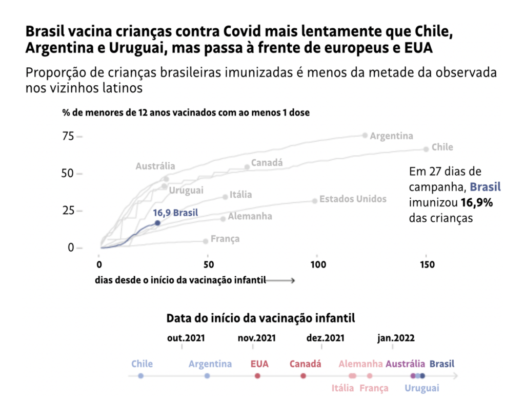
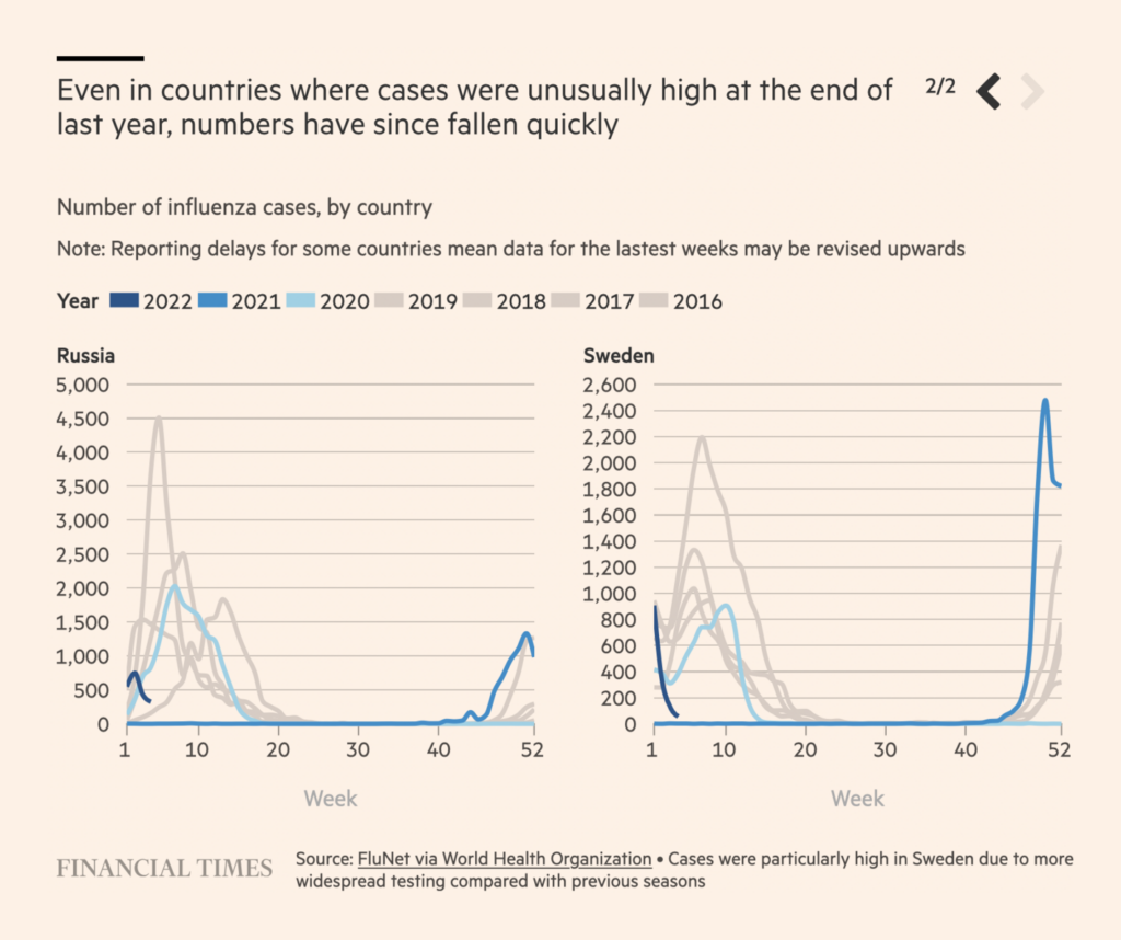
Several COVID charts this week compared different countries’ pandemic policies and outcomes:

Folha de S.Paulo: Brasil leva triplo do tempo da Argentina para vacinar 15% das crianças contra Covid, February 12
Financial Times: Did Scotland’s cautious coronavirus approach yield results?, February 14
Neue Zürcher Zeitung: So viele Patienten liegen wirklich wegen Corona im Spital, February 11

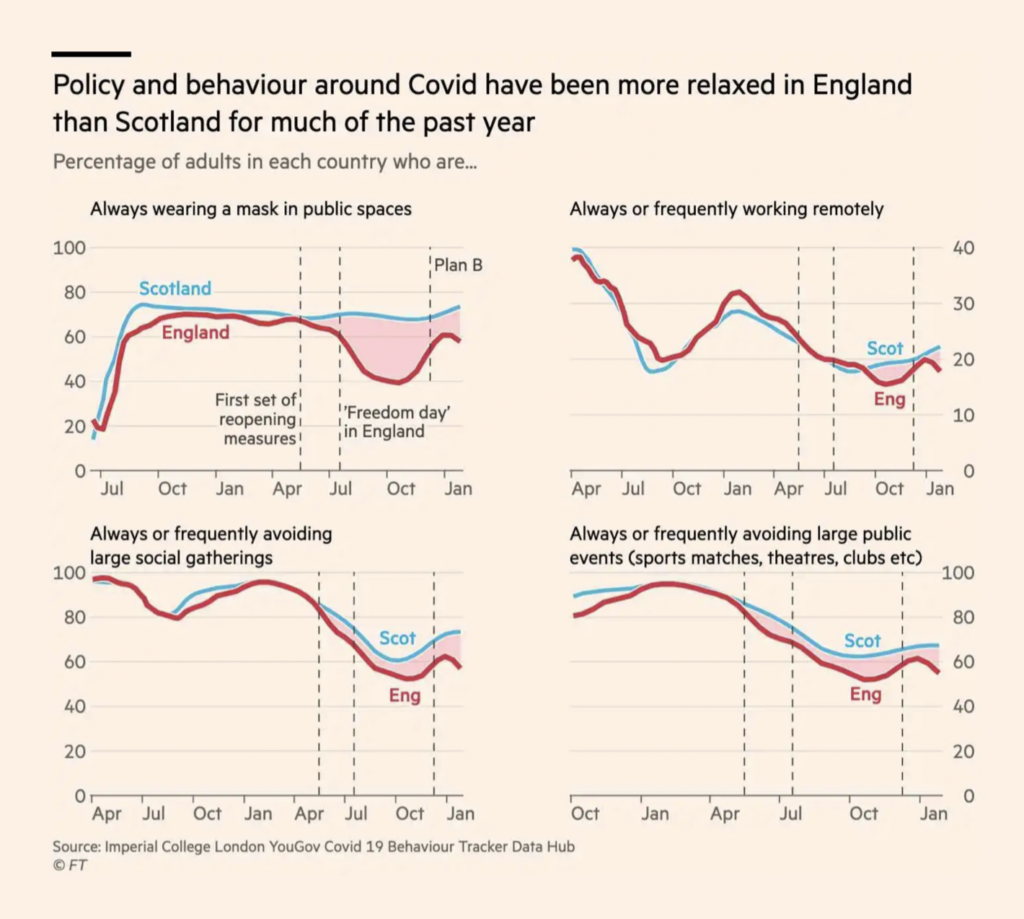
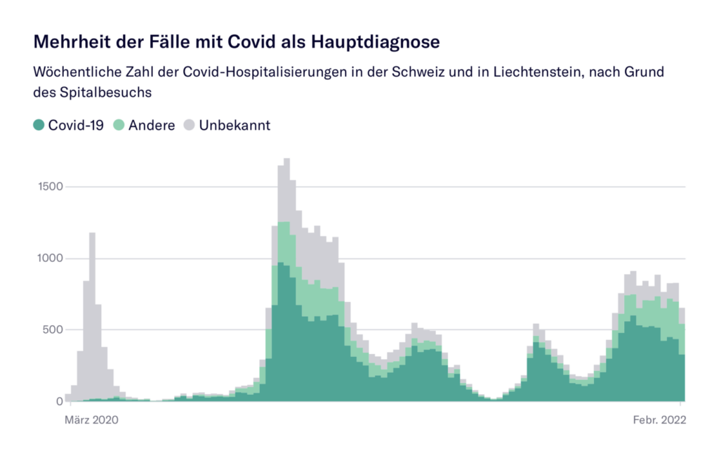
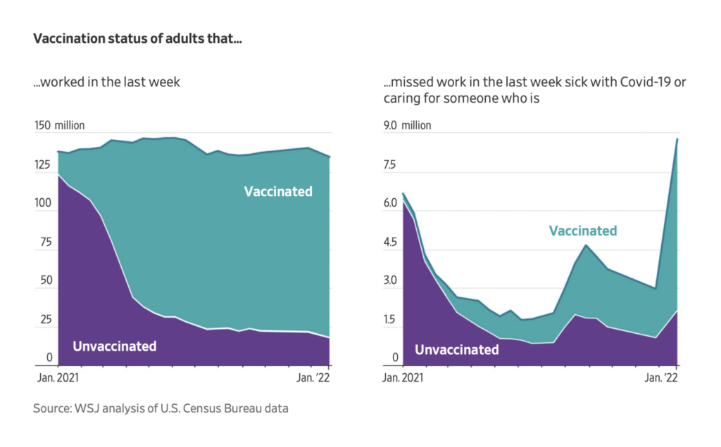
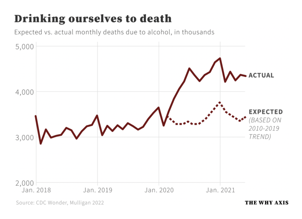
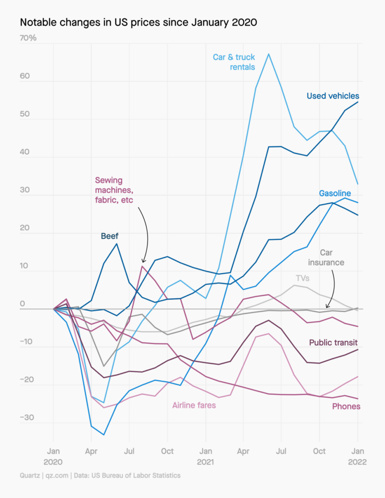
While others looked at the secondary effects of the pandemic:

The Wall Street Journal: Even Among the Vaccinated, Covid-19 Prompted a Surge of Sick Days, February 11
Financial Times: Health experts braced for flu surge after Covid curbs suppress infections, February 13
The Why Axis: New data on how Americans drank themselves to death during the pandemic, February 8

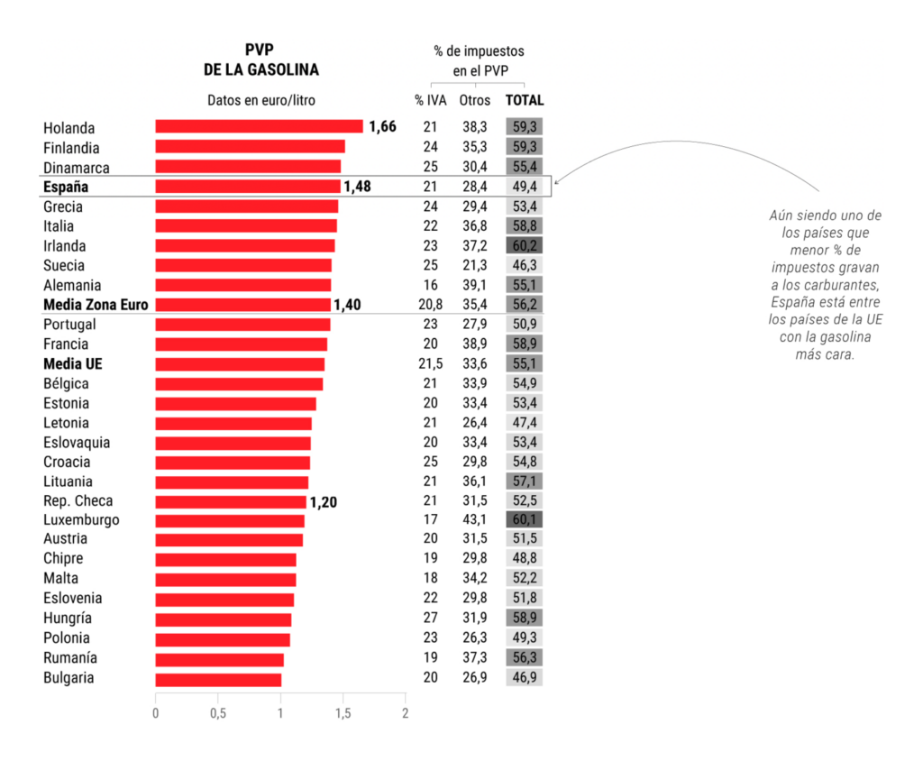
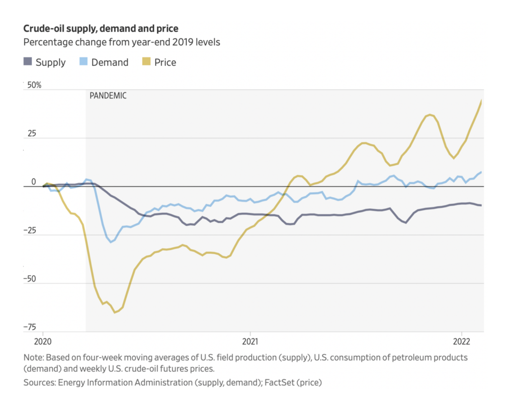
One side effect that gets a lot of attention is inflation and unstable energy prices:

El Mundo: Por qué pagamos un 23% más de gasolina que hace un año, February 11
The Wall Street Journal: Why High Gasoline Prices Could Stick Around for a While, February 10
The Washington Post: Does everything really cost more? Find out with our inflation quiz, February 10
Quartz: The products where inflation is staying hot—and cooling off, February 10

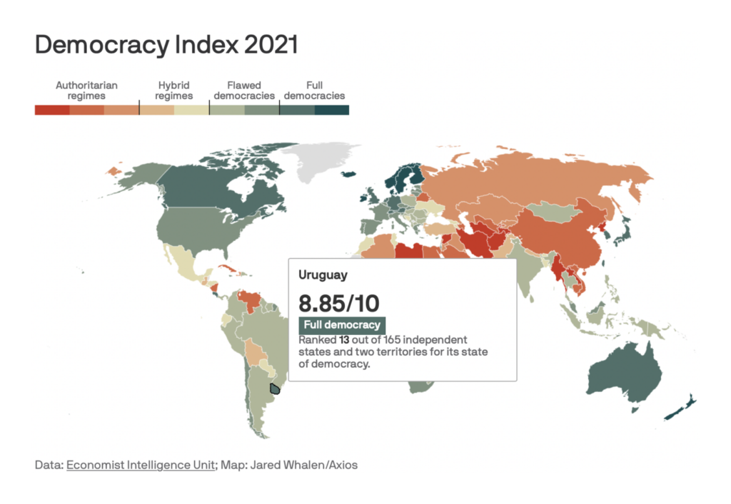
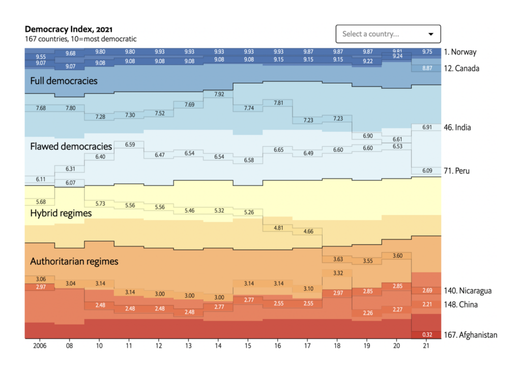
The Economist Intelligence Unit declared 2021 a new low for global democracy:

Axios: Global democracy rating hits new low, February 13
The Economist: A new low for global democracy, February 9
The Economist: Americans want reforms to curb gerrymandering, our new poll shows, February 10

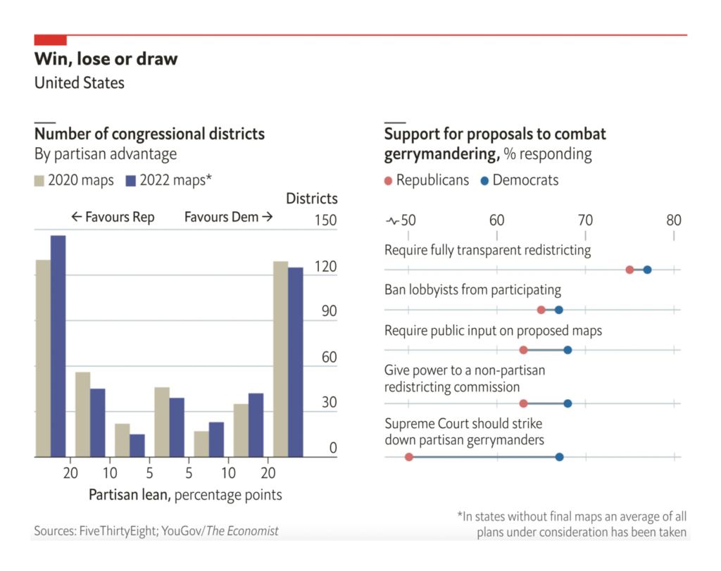
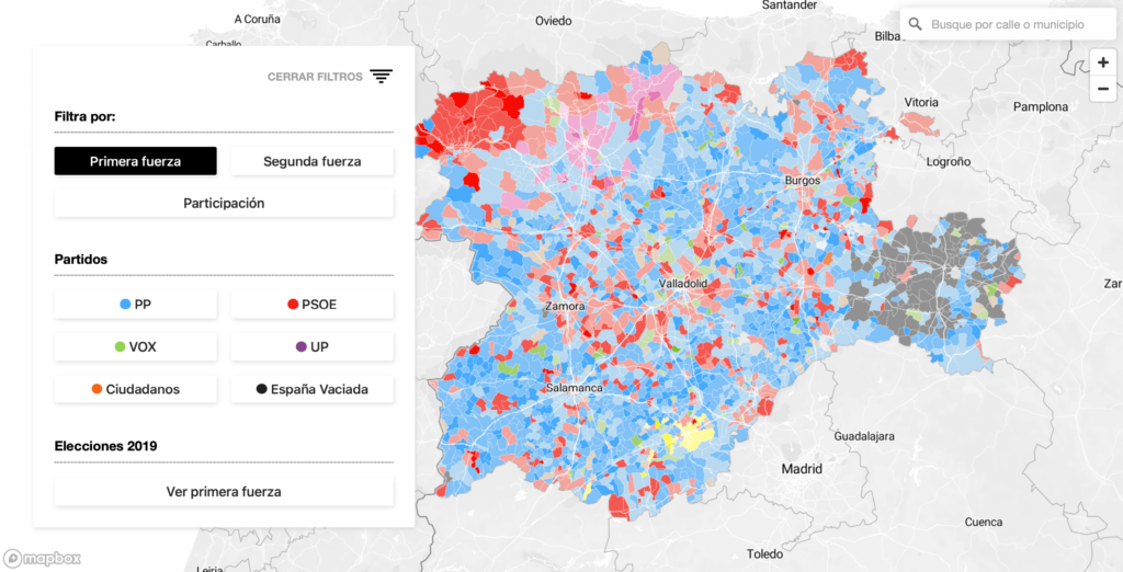
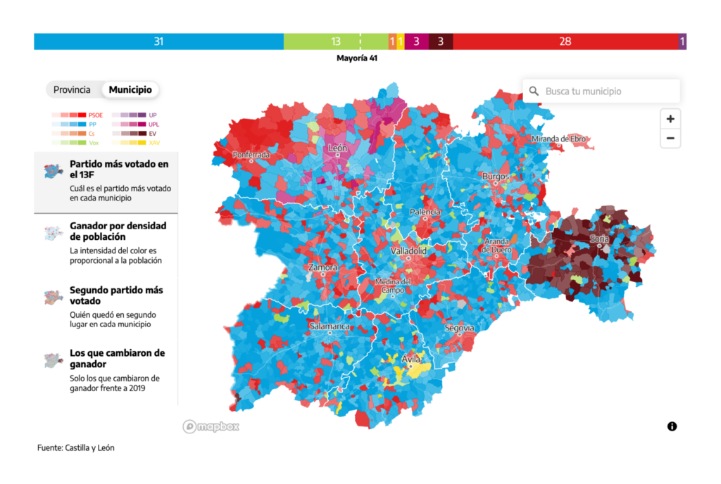
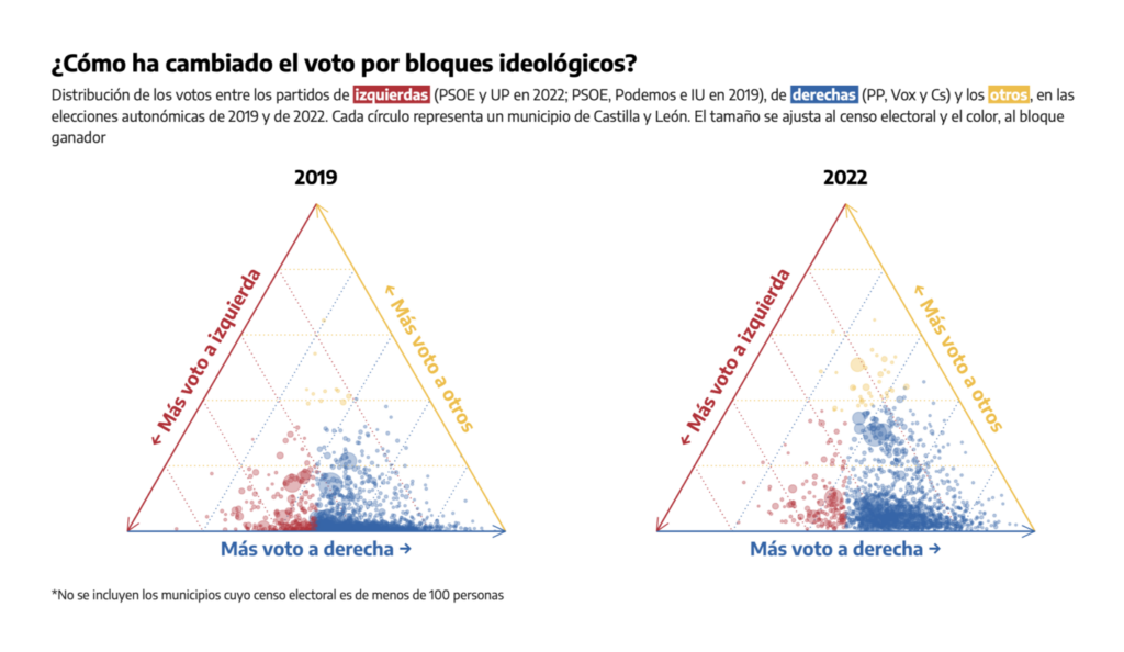
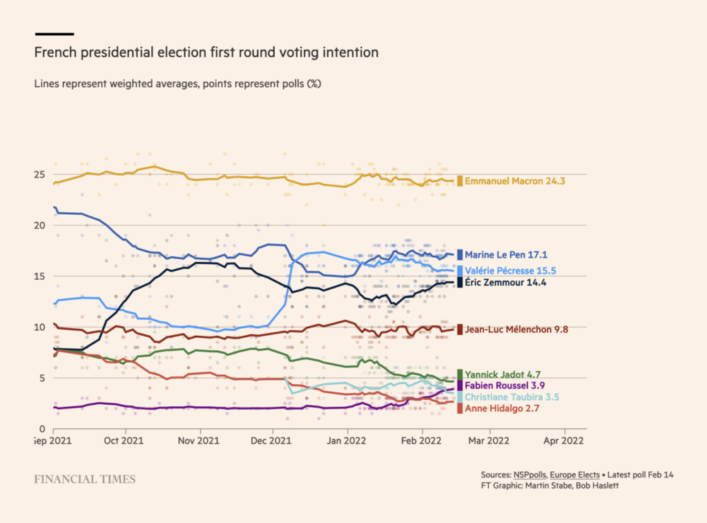
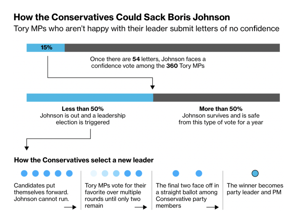
Elections news included regional voting in Spain, more presidential polling in France, and the still-uncertain political fate of Boris Johnson:

El Confidencial: Los resultados de las elecciones en Castilla y León, calle a calle: ¿a quién han votado en tu barrio?, February 14
El Diario: Los resultados de las elecciones del 13F en Castilla y León, por municipios y provincias, February 13
El Diario: Resultados del 13F: el mapa del voto a izquierda y derecha en Castilla y León, February 13
Financial Times: French election polls: the race for the presidency, February 14
Bloomberg: Tory Vote on Boris Johnson Could Be Sudden: Just Ask Theresa May, February 9

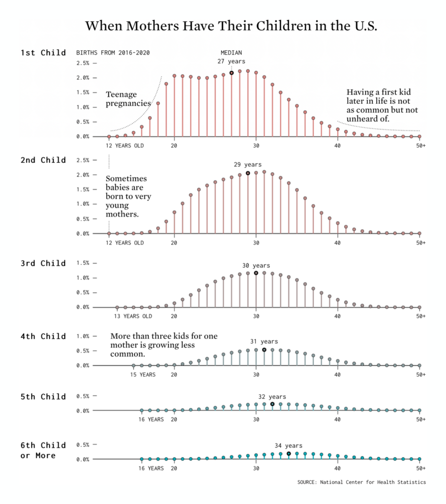
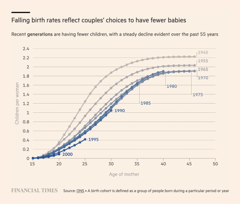
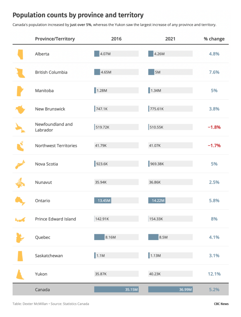
These charts showed demographic trends in the U.S., U.K., and Canada:

FlowingData: Age of Moms When Kids are Born, February 11
Financial Times: Population changes provide UK with unexpected boost to public finances, February 14
CBC News: Despite pandemic, Canada’s population grows at fastest rate in G7: census, February 9

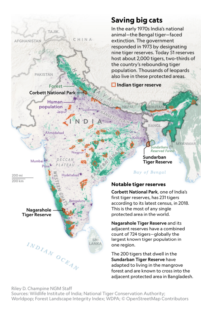
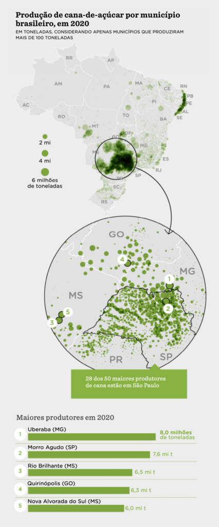
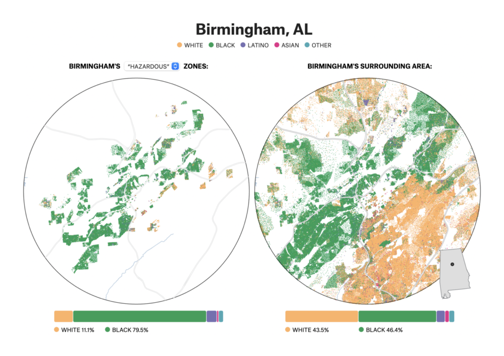
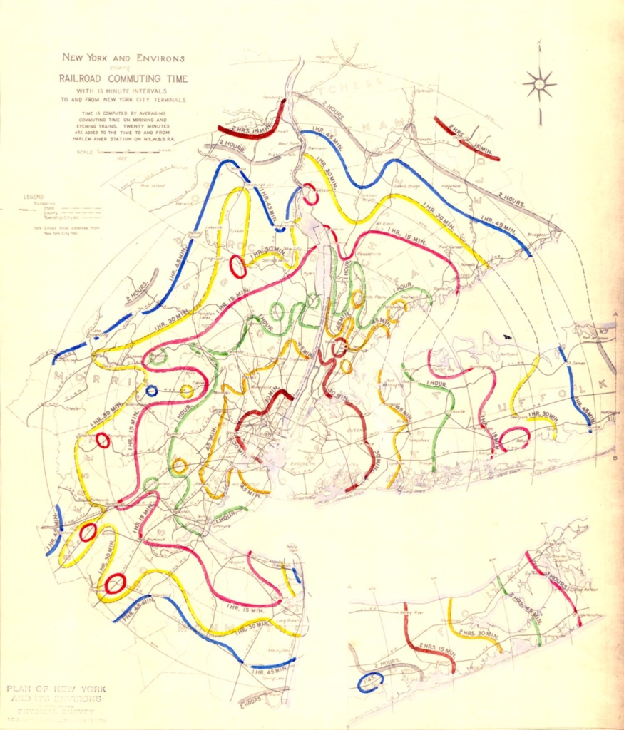
Other maps this week pictured everything from tiger conservation to sugarcane farms to the legacy of redlining:

National Geographic: In this dense Indian forest, tigers and leopards are thriving, February 10
Nexo Jornal: De onde vem a cana-de-açúcar e onde ela é produzida, February 9
FiveThirtyEight: The Lasting Legacy Of Redlining, February 9
Berliner Morgenpost: Diese Nachtzüge könnten ab Berlin fahren, February 9

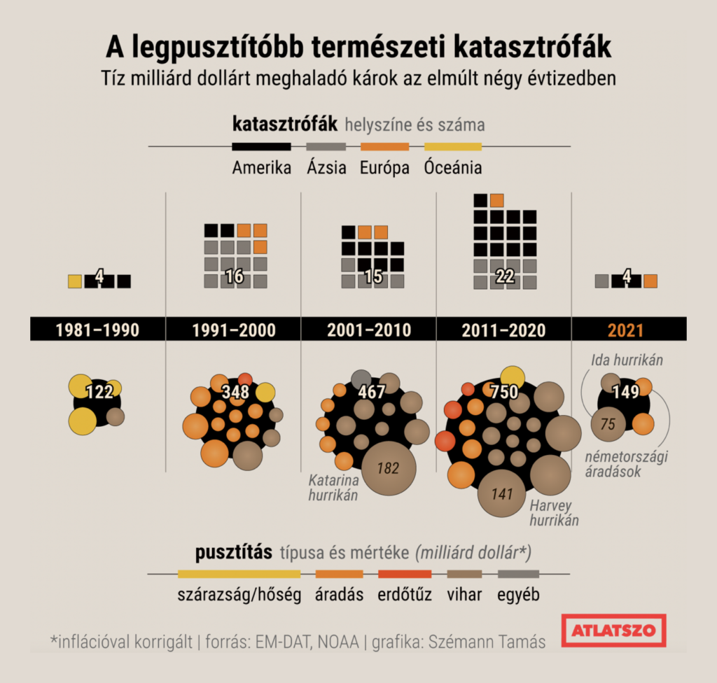
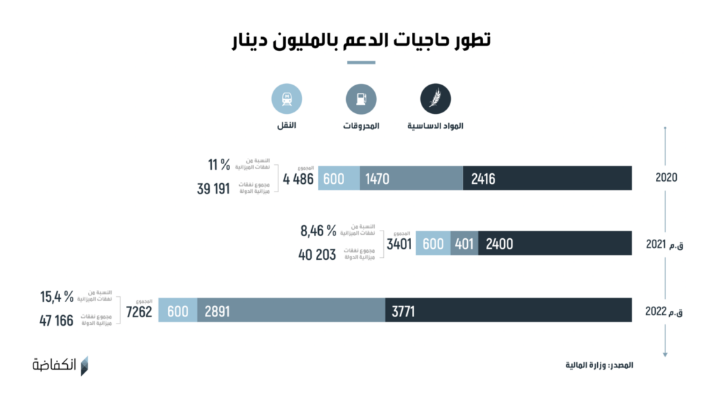
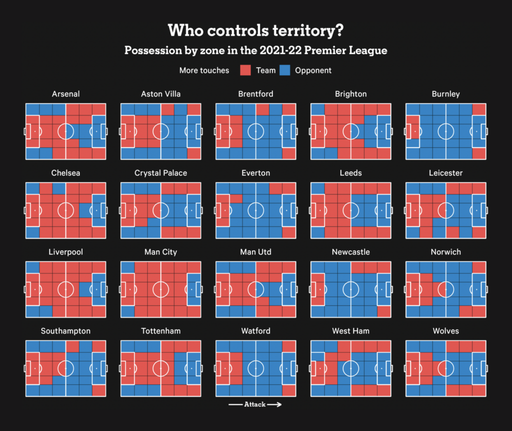
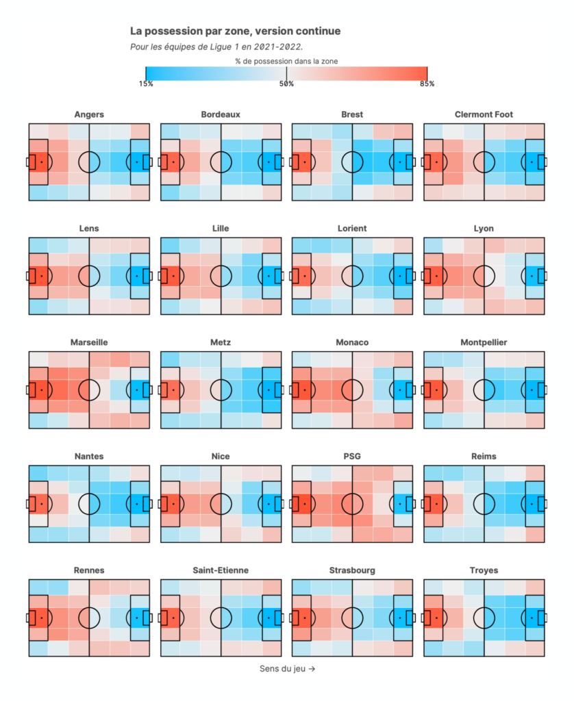
And other charts covered natural disasters, the Tunisian budget, and possession in the Premier League and Ligue 1:

Átlátszó: Egyre több és költségesebb természeti katasztrófával kell megbirkóznunk, February 8
Inkyfada: قانون المالية 2022: ميزانية الملاذ الأخير ومواصلة الخيارات السابقة, February 14
John Muller: “Who controls territory in the Premier League?,” February 8 (Tweet)
Serac: Une adaptation pour la Ligue 1 d’une data visualisation de John Muller, February 12

What else we found interesting

SBS News: 앞으로 동계 올림픽이 열릴 수 있을까?, February 10
Star Tribune: How to watch curling at the Olympics (and actually know what’s going on), February 9
The New York Times: How Eileen Gu Won Gold in Big Air With Two Giant Jumps, February 8
Le Devoir: Athlète olympique contre amateur : une course en données, February 9
The Washington Post: What went wrong in Mikaela Shiffrin’s slalom, February 9
Reuters: The perfect storm, February 14
Daniel Wortel-London: “Beautiful 1929 map of railroad commuting times from the @RegionalPlan,” February 14 (Tweet)

Help us make this dispatch better! We’d love to hear which newsletters, blogs, or social media accounts we need to follow to learn about interesting projects, especially from less-covered parts of the world (Asia, South America, Africa). Write us at hello@datawrapper.de or leave a comment below.

Comments