We want to enable everyone to create beautiful charts, maps, and tables. New to data visualization? Or do you have specific questions about us? You'll find all the answers here.
Data Vis Dispatch, February 18: German election polls, corruption, and tariffs
The best of last week’s big and small data visualizations
Vivien Serve
Welcome back to the 181st edition of the Data Vis Dispatch! Every week, we publish a collection of the best small and large data visualizations we find, especially from news organizations — to celebrate data journalism, data visualization, simple charts, elaborate maps, and their creators.
Recurring topics this week include the upcoming German elections, Trump’s tariffs, and the freshly released Corruption Perceptions Index:
Voters care about inflation, as well as social and financial justice:
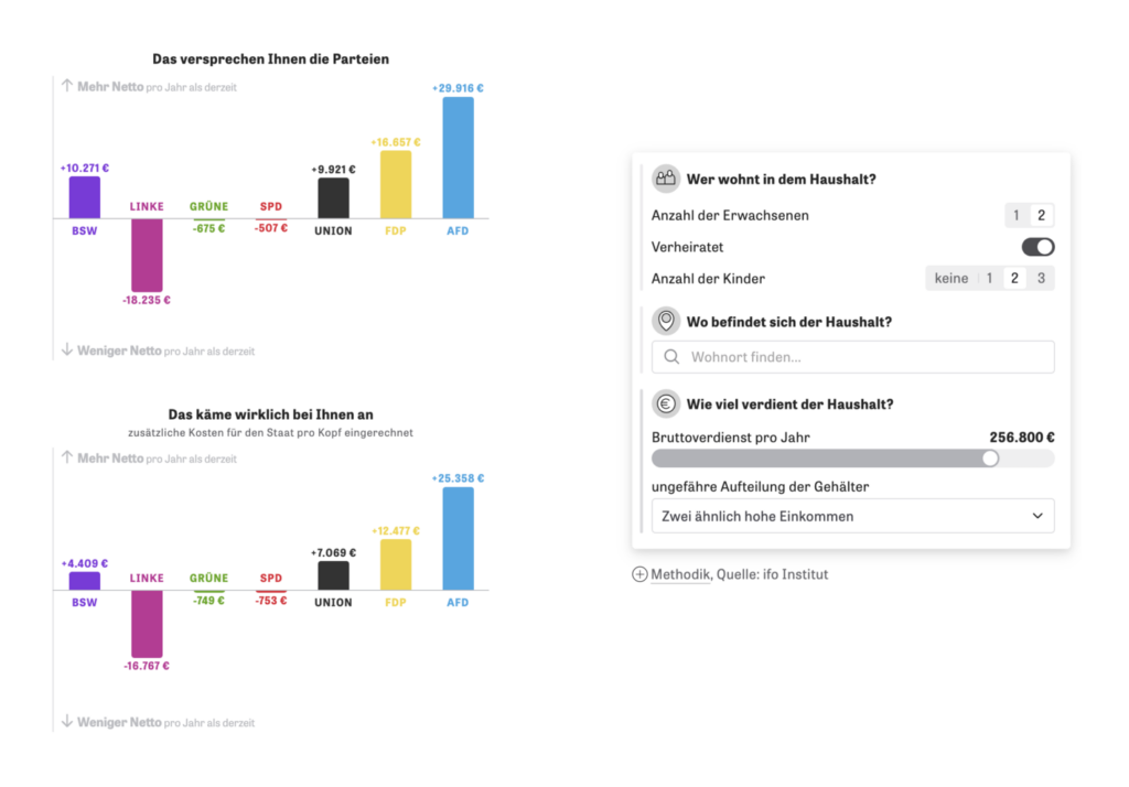
Zeit Online: Für AfD-Wähler fühlt sich alles viel teurer an [Chart description:The further to the right the dots, the higher the respondents’ estimate of the inflation rate], February 12Zeit Online: Bekomme ich was raus? [Article description: Our interactive calculator shows whether you benefit from the tax plans of the parties with your income – but also where the programs may promise too much], February 13
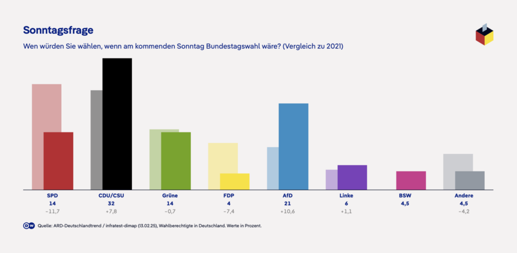
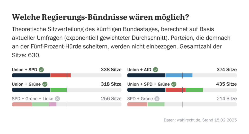
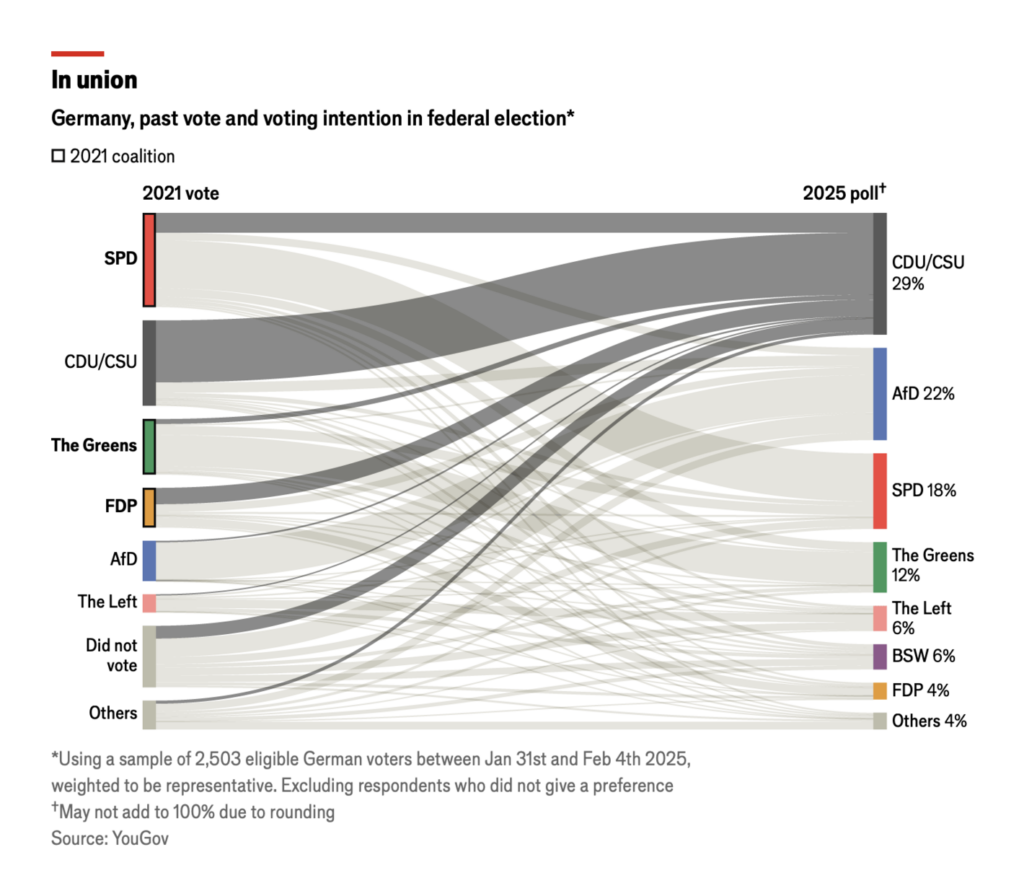
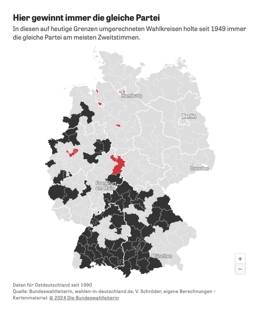
Other visualizations concerning the German elections explore election system reforms and constituencies that have voted the same way since 1949 (?!):
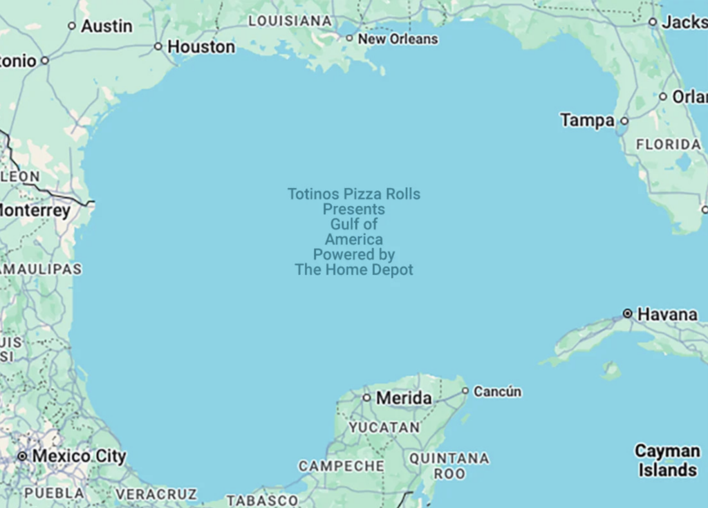
That’s it for now on the German election! Get ready for lots more next week. Now, let’s dive into maps inspired by recent remarks from U.S. President Trump:
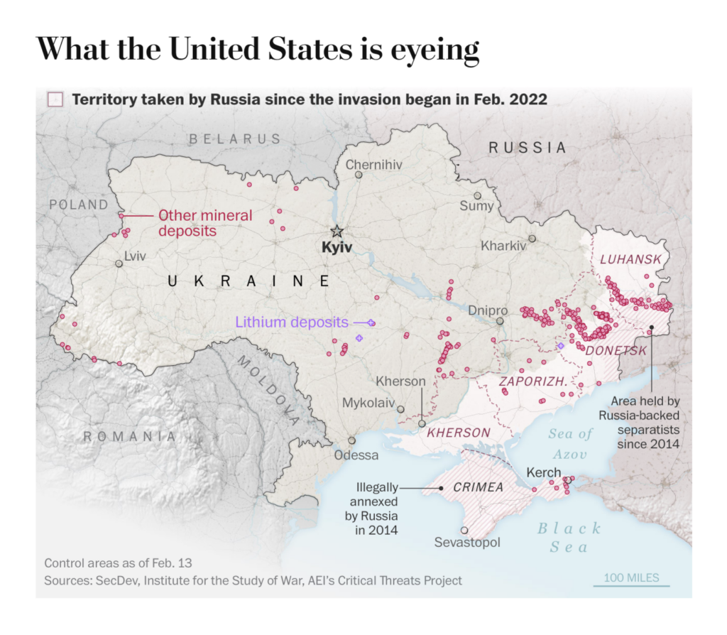
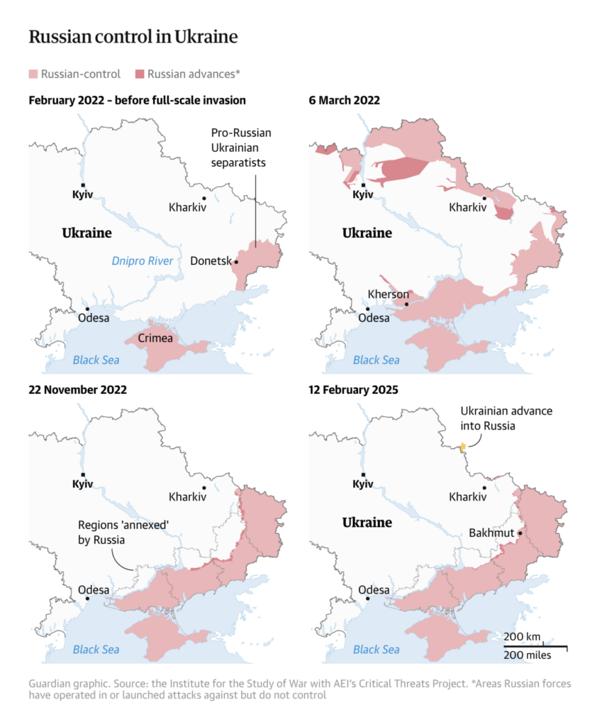
And there are more “maps related to Trump”: Following the Munich Security Conference and a call between Trump and Putin – where the two of them agreed to start negotiations to end the war – new maps of the Russian invasion of Ukraine have been released:
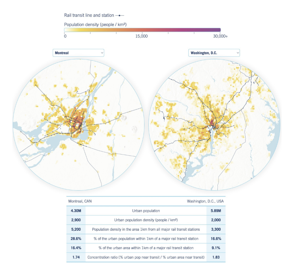
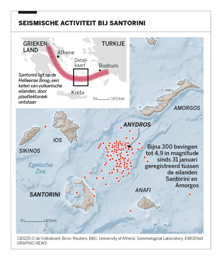
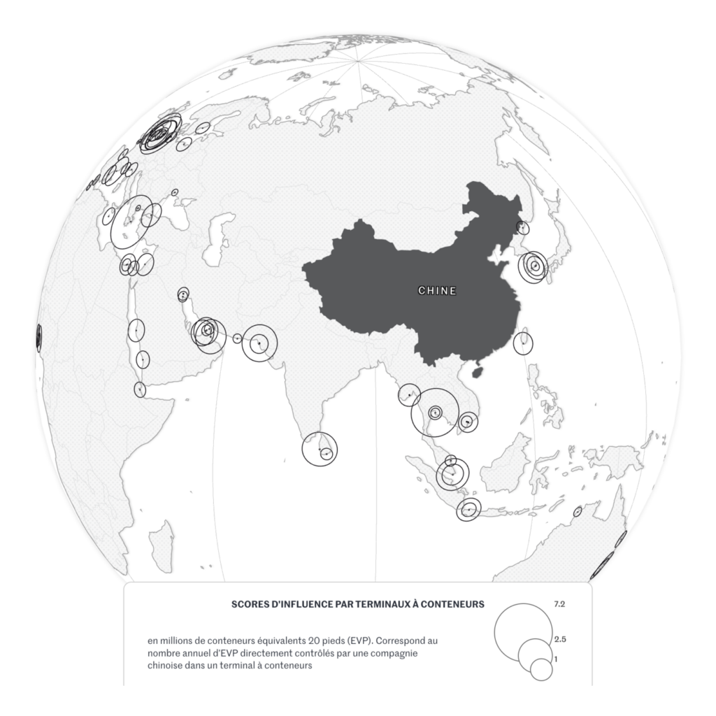
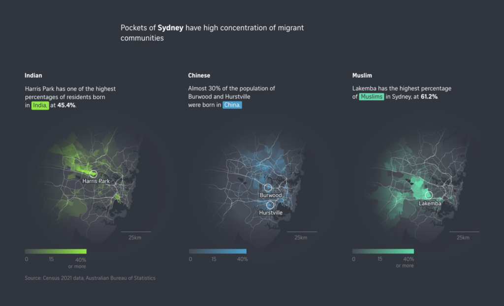
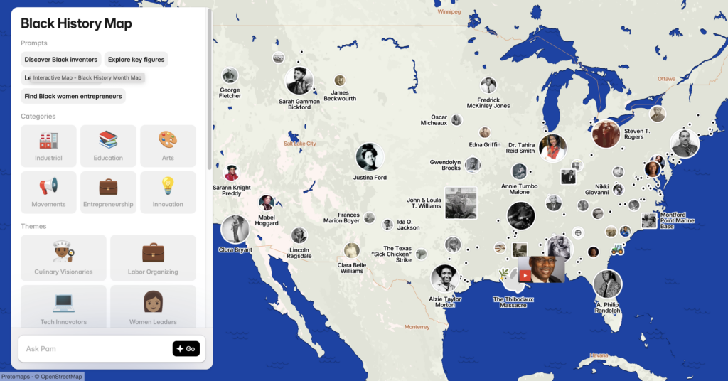
You’d like more maps? Here are some we found beautiful, interesting, or both this past week, covering transportation, earthquakes, China’s port network, Black History month, and migrant communities:
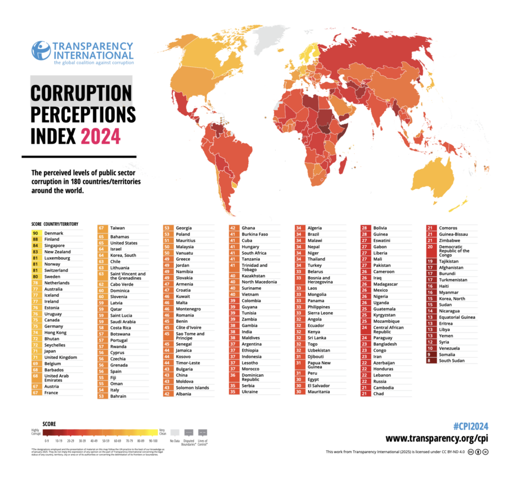
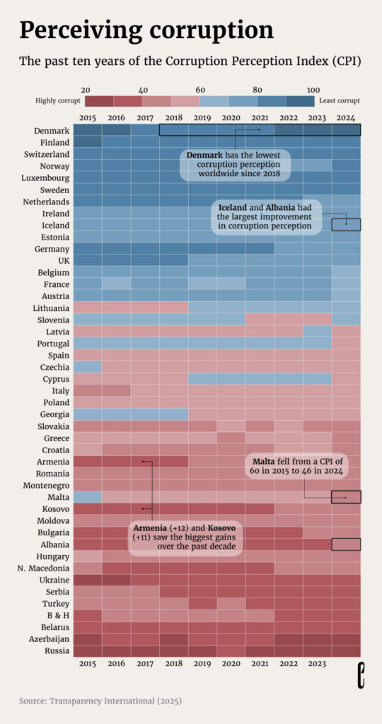
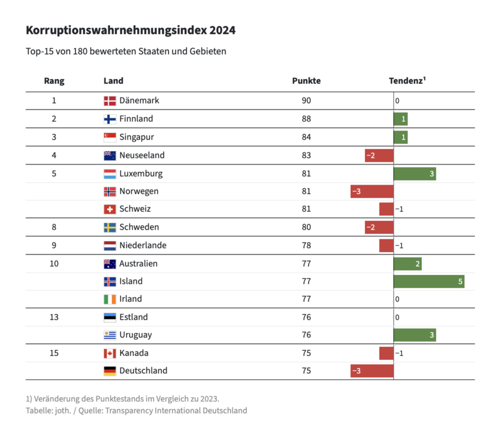
Last week, Transparency International released its 2024 Corruption Perceptions Index. Here’s how different people have used the data to create visualizations:
Transparency International EU: “The 2024 Corruption Perceptions Index is OUT! And the results are alarming: the EU’s average score has fallen to 62. With the rule of law being eroded in multiple member states, it’s not surprising that we’re seeing country scores decline across the EU. How did your country do?,” February 11 (Bluesky, Report)The European Correspondent: When animals beat humans, February 12 Frankfurter Allgemeine Zeitung: Wie intransparente Parteispenden das Vertrauen in die Politik schwächen[Chart description: Corruption Perceptions Index 2024], February 11
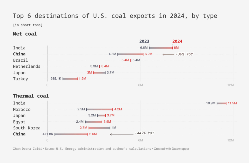
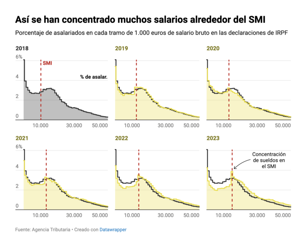
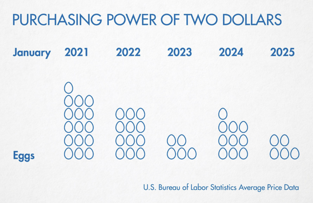
Let’s continue with some money-related visualizations! They couldn’t be more diverse: From minimum wage in Spain to better pay in women’s sports, and cryptocurrency:
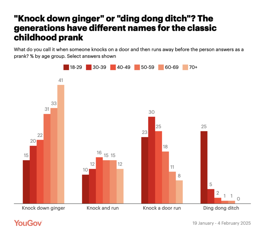
Finally, our beloved “visualizations that didn’t quite fit anywhere, but we liked too much to leave out” section. Today: children’s prank and a weekly life tracker:
YouGov: Is it “knock down ginger” or “knock a door run”?, February 12dame: “i’ve been slowly working on a timeline of my life over the past 4 years that i’ve wanted to visualize as a page on my website, and today i stumbled upon this amazing example of something similar by @ginatrapani.org,” February 17 (Bluesky, Website)
What else we found interesting
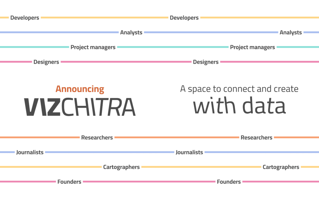
FlowingData: Defense Against Dishonest Charts, February 14 The Wall Street Journal: The Trump Tracker:36 Notable Moves in 24 Days, February 12VizChitra: “India’s first #dataviz community is here! @VizChitra brings together design & data lovers across the country — this is where numbers meet narratives & individuals become a community,” February 15 (Tweet)
Help us make this dispatch better! We’d love to hear which newsletters, blogs, or social media accounts we need to follow to learn about interesting projects, especially from less-covered parts of the world (Asia, South America, Africa). Write us at hello@datawrapper.de or leave a comment below.
(she/her) is a working student on Datawrapper’s Communications team. She creates the Data Vis Dispatch to keep data visualization enthusiasts up to date on exciting new projects. When she’s not working, she studies interface design, and when she’s not studying, she’s planning a festival stage or soldering light installations. Vivien lives in Potsdam.


Comments