This article is brought to you by Datawrapper, a data visualization tool for creating charts, maps, and tables. Learn more.
Data Vis Dispatch, February 21
The best of last week’s big and small data visualizations

Welcome back to the 82nd edition of Data Vis Dispatch! Every week, we’ll be publishing a collection of the best small and large data visualizations we find, especially from news organizations — to celebrate data journalism, data visualization, simple charts, elaborate maps, and their creators.
Recurring topics this week include a year of war in Ukraine, the earthquake aftermath, and living in a warming world.
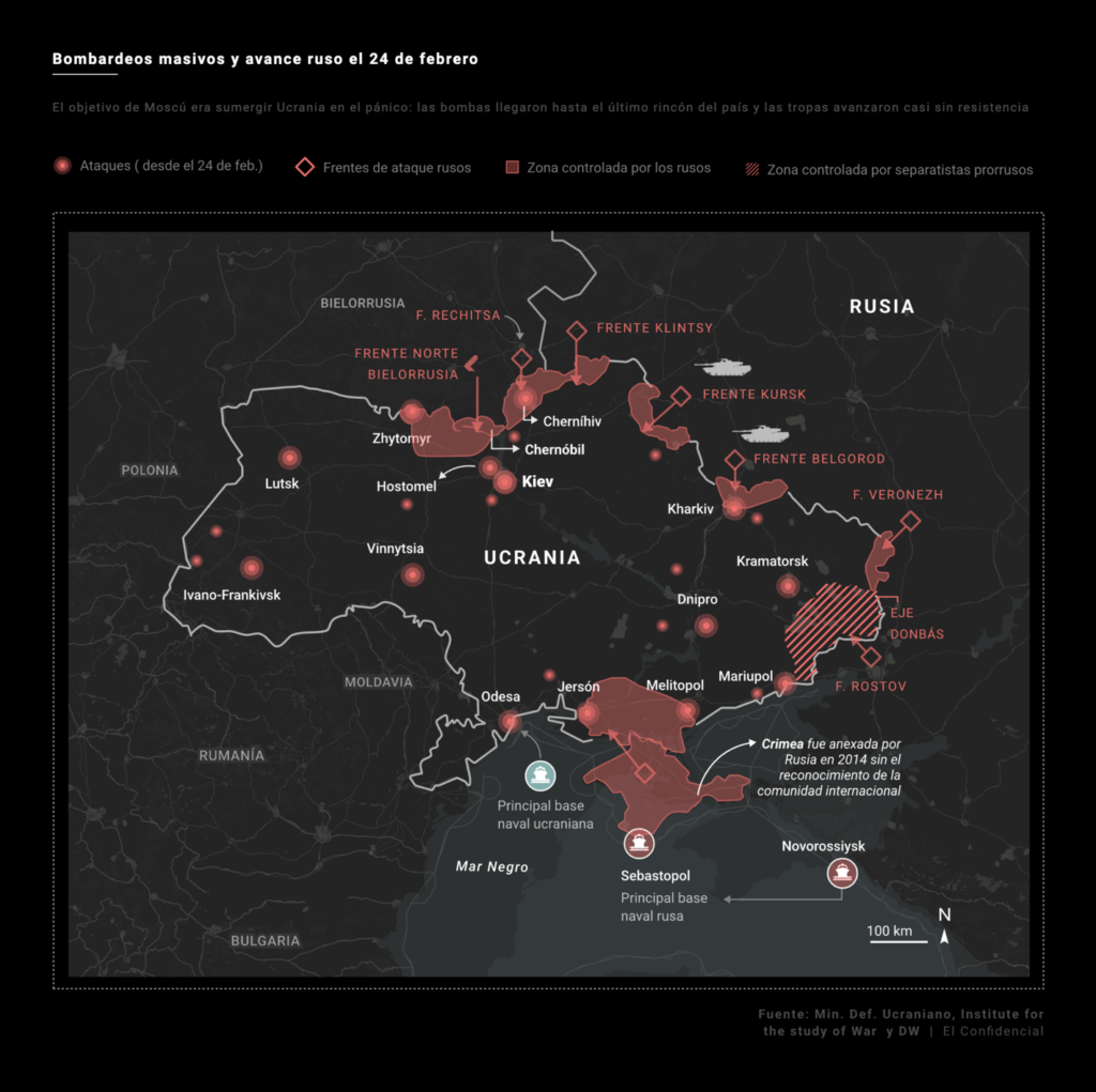
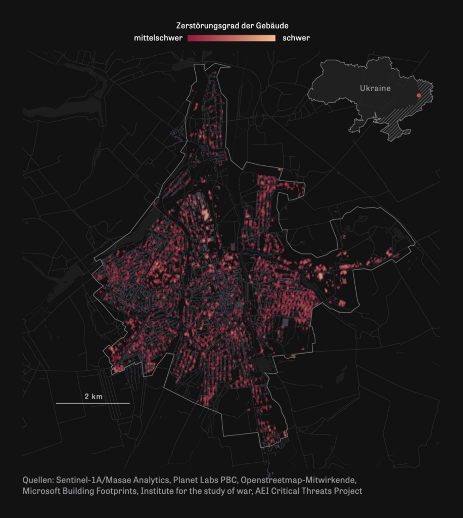
This week marks a sad anniversary — one year since Russia’s invasion of Ukraine on February 24th, 2022.
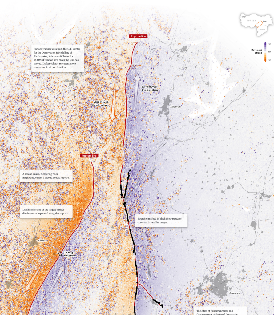
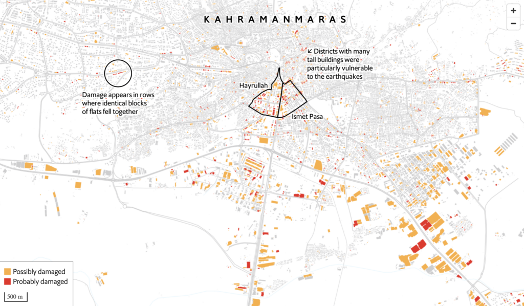
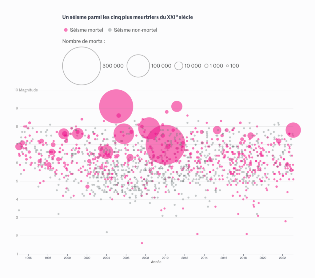
The south of Turkey was hit by another earthquake on Monday, only two weeks after the original disaster, both attracting international coverage.
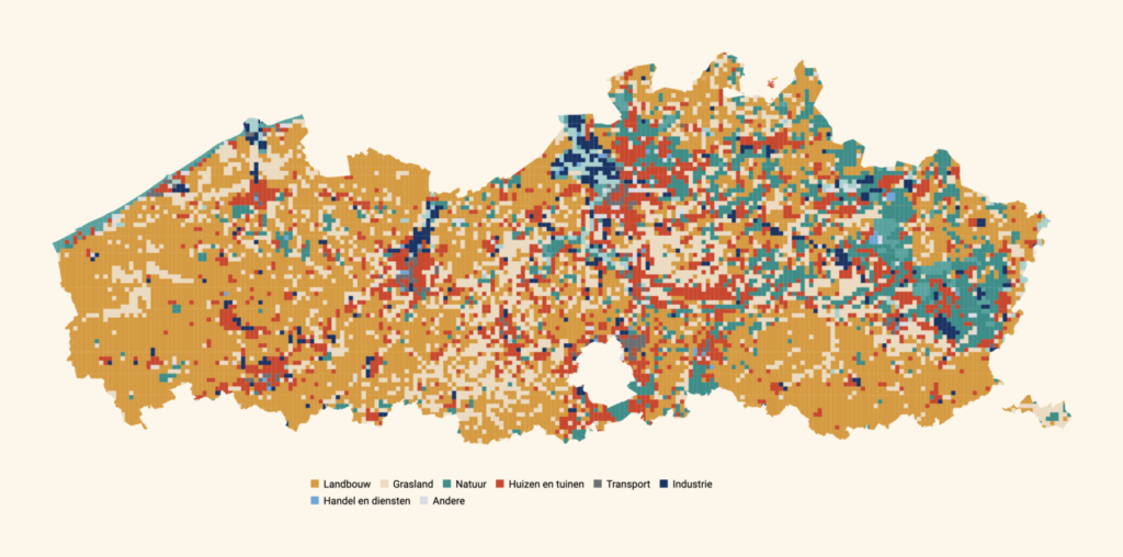
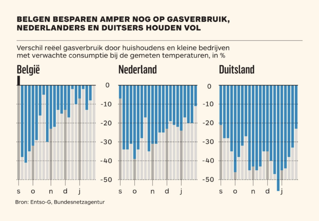
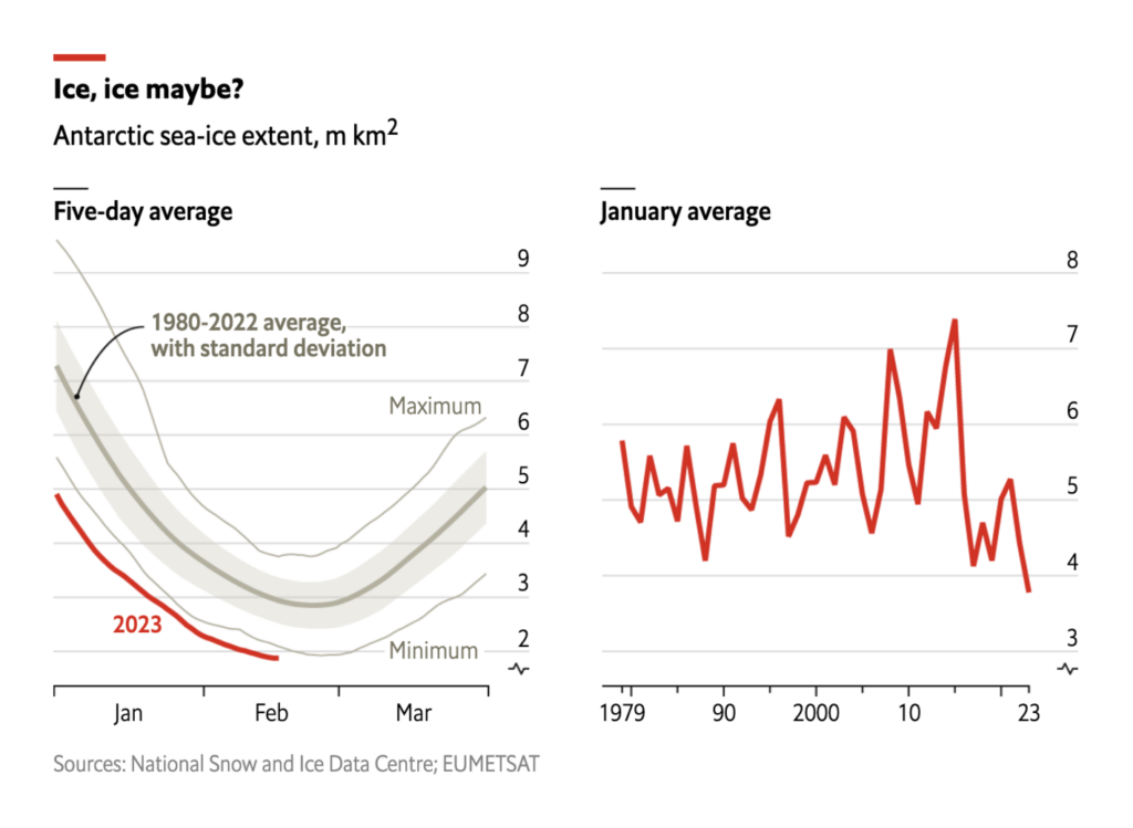
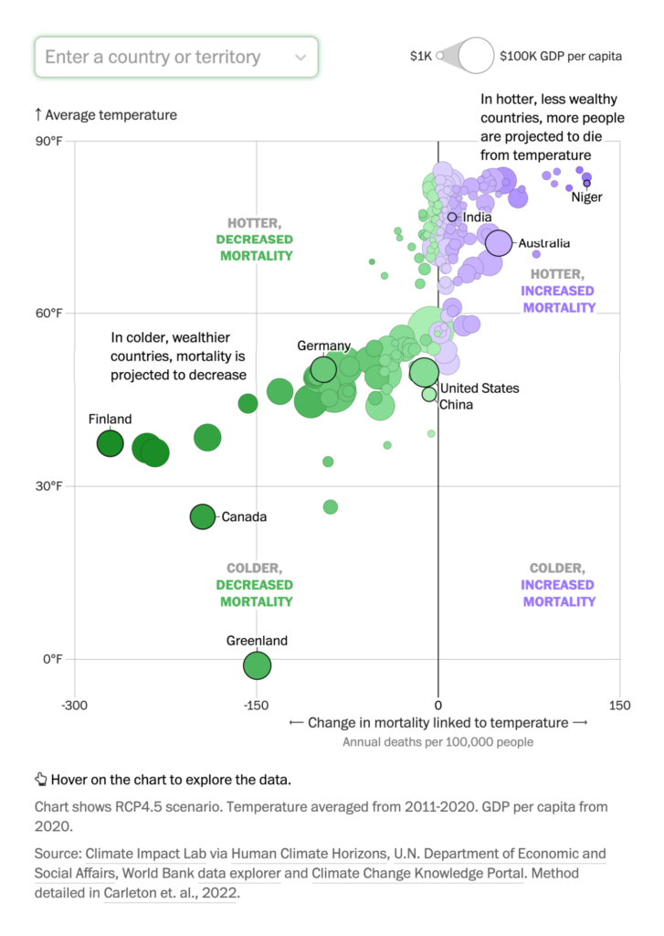
On the climate front, news revolves around land and energy use in Belgium, melting glaciers in Antarctica, and the mixed effects of warming on mortality around the world.

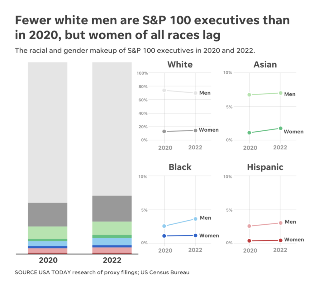
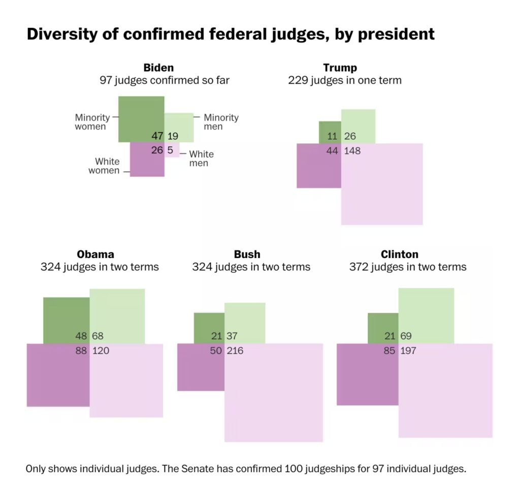
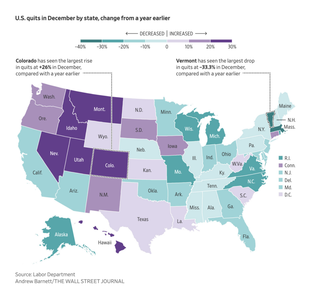
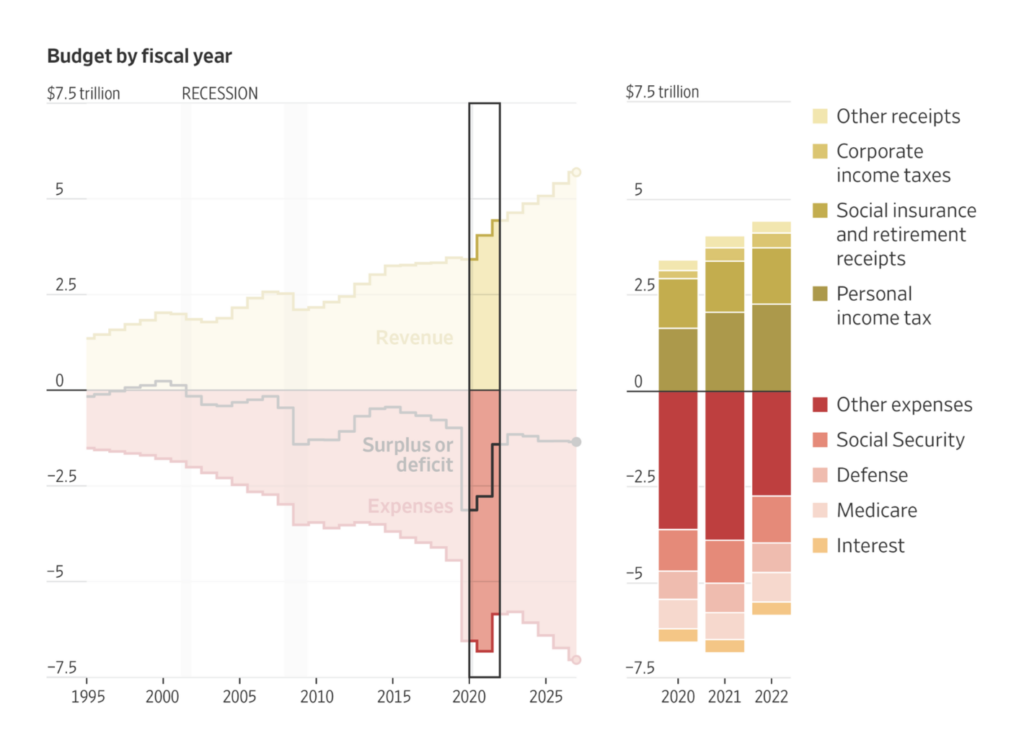
In the United States, the data journalists’ eyes were on the diversity of corporate leaders and federal judges, an increase in employees quitting their jobs last year, and a breakdown of the government budget.
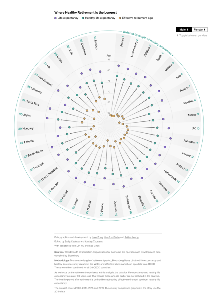
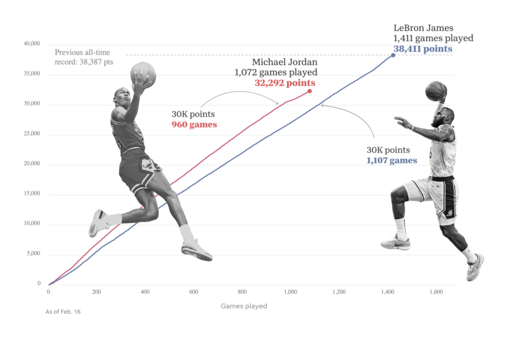
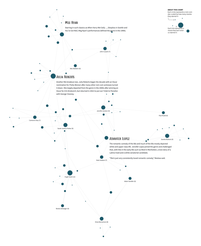
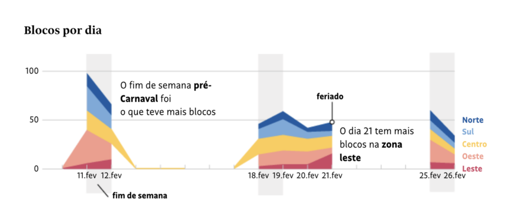
Other charts of the week covered the length of retirement, basketball records, romantic movies, and the carnival in Brazil.
Reuters: Box Office Breakup, February 14
What else we found interesting

Applications are open for…
- Data Visualization Analyst at Global Energy Monitor (remote)
- Graphics Editor – Visual Journalism at Reuters (London)
Help us make this dispatch better! We’d love to hear which newsletters, blogs, or social media accounts we need to follow to learn about interesting projects, especially from less-covered parts of the world (Asia, South America, Africa). Write us at hello@datawrapper.de or leave a comment below.
Want the Dispatch in your inbox every Tuesday? Sign up for our Blog Update newsletter!


Comments