Data Vis Dispatch,
February 22

The best of last week’s big and small data visualizations

Welcome back to the 34th edition of Data Vis Dispatch! Every week, we’ll be publishing a collection of the best small and large data visualizations we find, especially from news organizations — to celebrate data journalism, data visualization, simple charts, elaborate maps, and their creators.

Recurring topics this week include figure skating, midterm elections, and Russia’s economic ties to Europe.

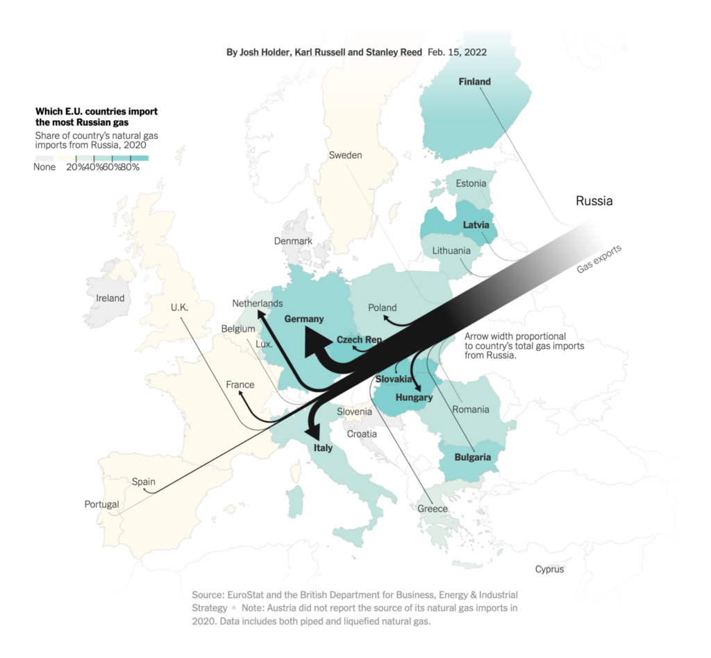
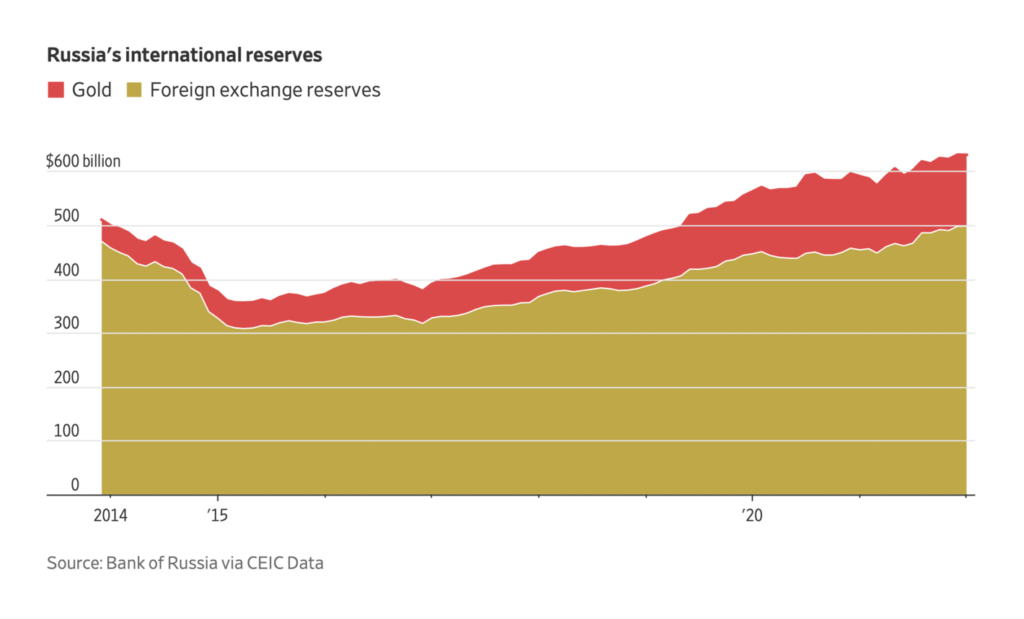
The situation in Ukraine continued to deteriorate this week, as Russia ordered troops into separatist regions. Several charts and maps focused on the economic sanctions that western countries have threatened in response:

The New York Times: How a Ukraine Conflict Could Reshape Europe’s Reliance on Russia, February 15
Reuters: Russian gas threat in Europe, February 16
The Wall Street Journal: How Well Could Russia’s Economy Withstand Sanctions?, February 17

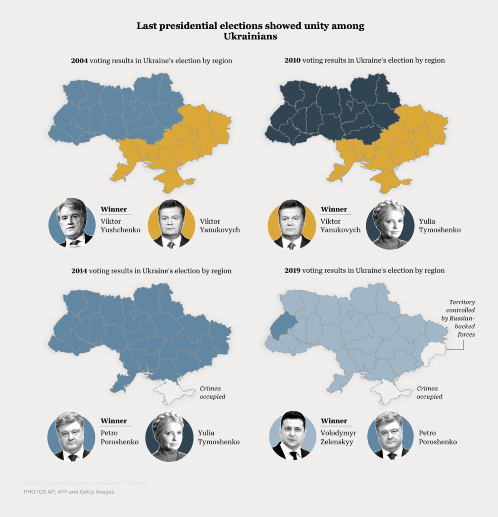
Others visualized the domestic political landscape in Ukraine:

USA Today: How Ukraine became the independent democracy it is today: A visual perspective of the country’s history, February 17

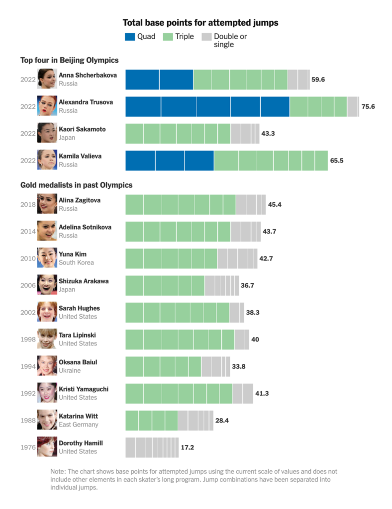
The Winter Olympics ended this weekend, with more drama in women’s figure skating:

The New York Times: How the Quad Jump Is Changing Women’s Figure Skating, February 16
The New York Times: How Kamila Valieva Fell to Fourth as Russian Teammate Took Gold, February 17

Plus — an athletic feat that will never make the Games, because only one person has ever attempted it:

The Washington Post: 3,134 miles, 18 pairs of sneakers, multiple cartel checkpoints: A run across Mexico, February 18

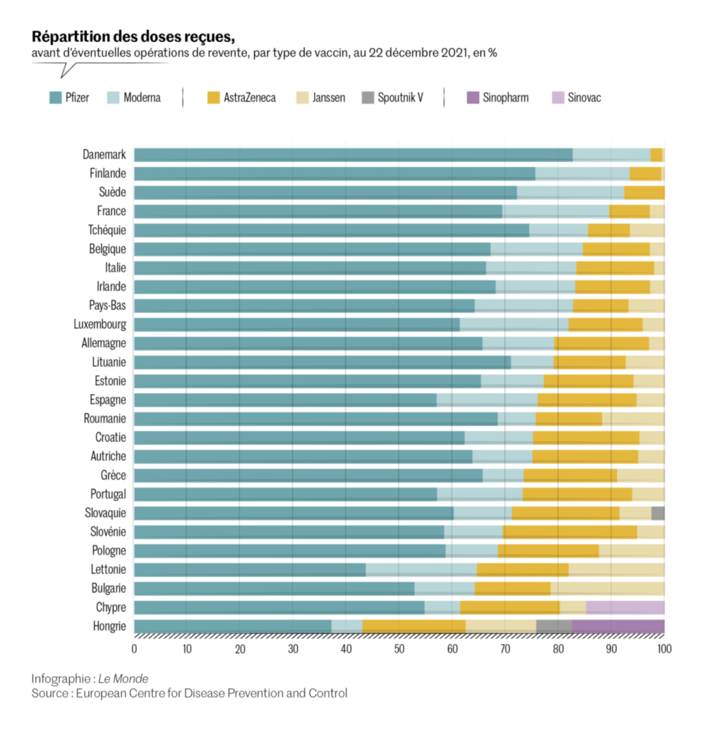
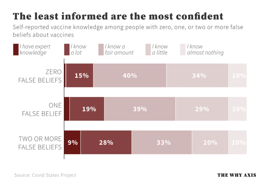
With a calm week in COVID news, there was time to look back at the big picture — vaccine distribution, the challenges of misinformation, and the pandemic’s disruption to other medical research:

Le Monde: Covid-19 : une inégale répartition des vaccins dans l’Union européenne, February 16
The Why Axis: A pandemic of the overconfident, February 16
Scientific American: COVID’s Uneven Toll Captured in Data, February 15

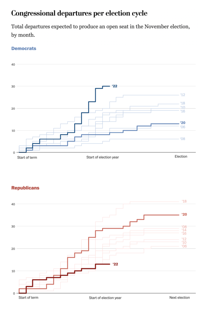
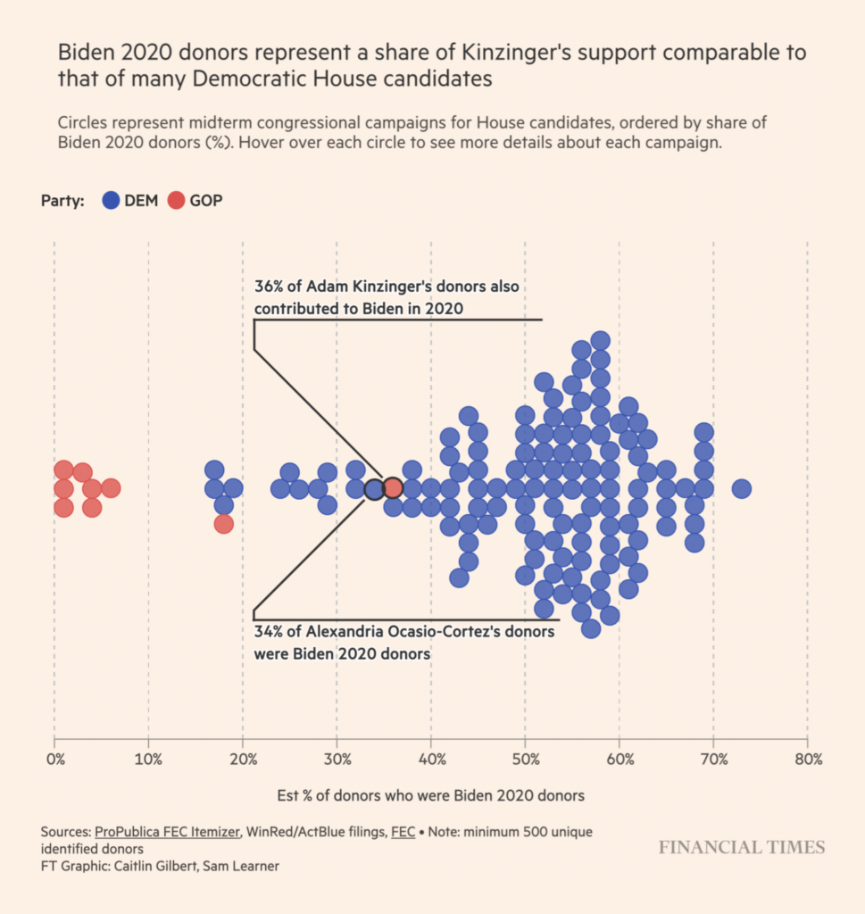
We’re still over eight months out, but the first charts looking ahead to U.S. midterm elections have started to appear:

The Washington Post: Here’s every House member retiring from Congress, February 16
Financial Times: Democratic donors cross party lines to support anti-Trump Republicans, February 15

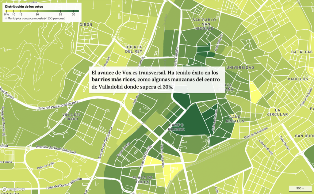
Other political topics included the recent electoral gains of Spain’s right-wing Vox party, and prospect of a Supreme Court nomination in the U.S.:

El País: La transversalidad de Vox: le votan en pueblos y ciudades, en barrios ricos y pobres, February 20
The Economist: America’s Supreme Court confirmations are more arduous than ever, February 16

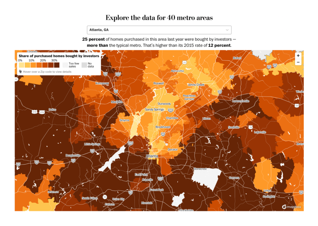
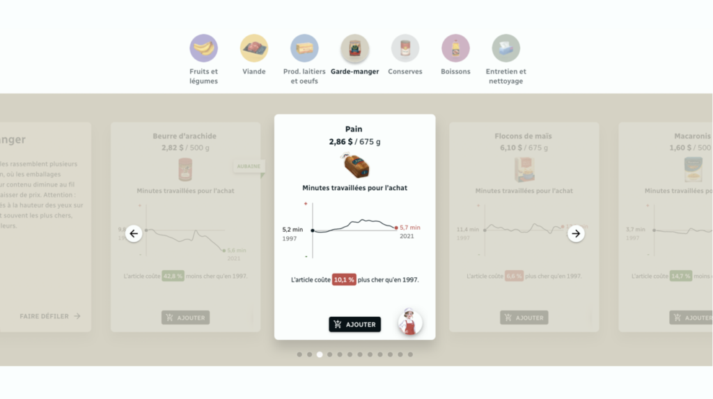
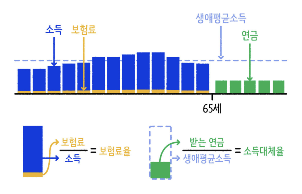
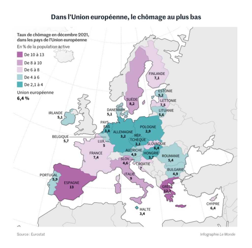
All the economic basics were covered this week, with visualizations on housing, food costs, pensions, and employment:

The Washington Post: Investors bought a record share of homes in 2021. See where, February 16
Radio-Canada: Les aliments vous coûtent-ils vraiment plus cher qu’avant?, February 21
SBS News: 정말 90년생부터는 국민연금 한 푼도 못 받을까?, February 18
Le Monde: Les pays européens en proie à la pénurie de profils qualifiés, February 15

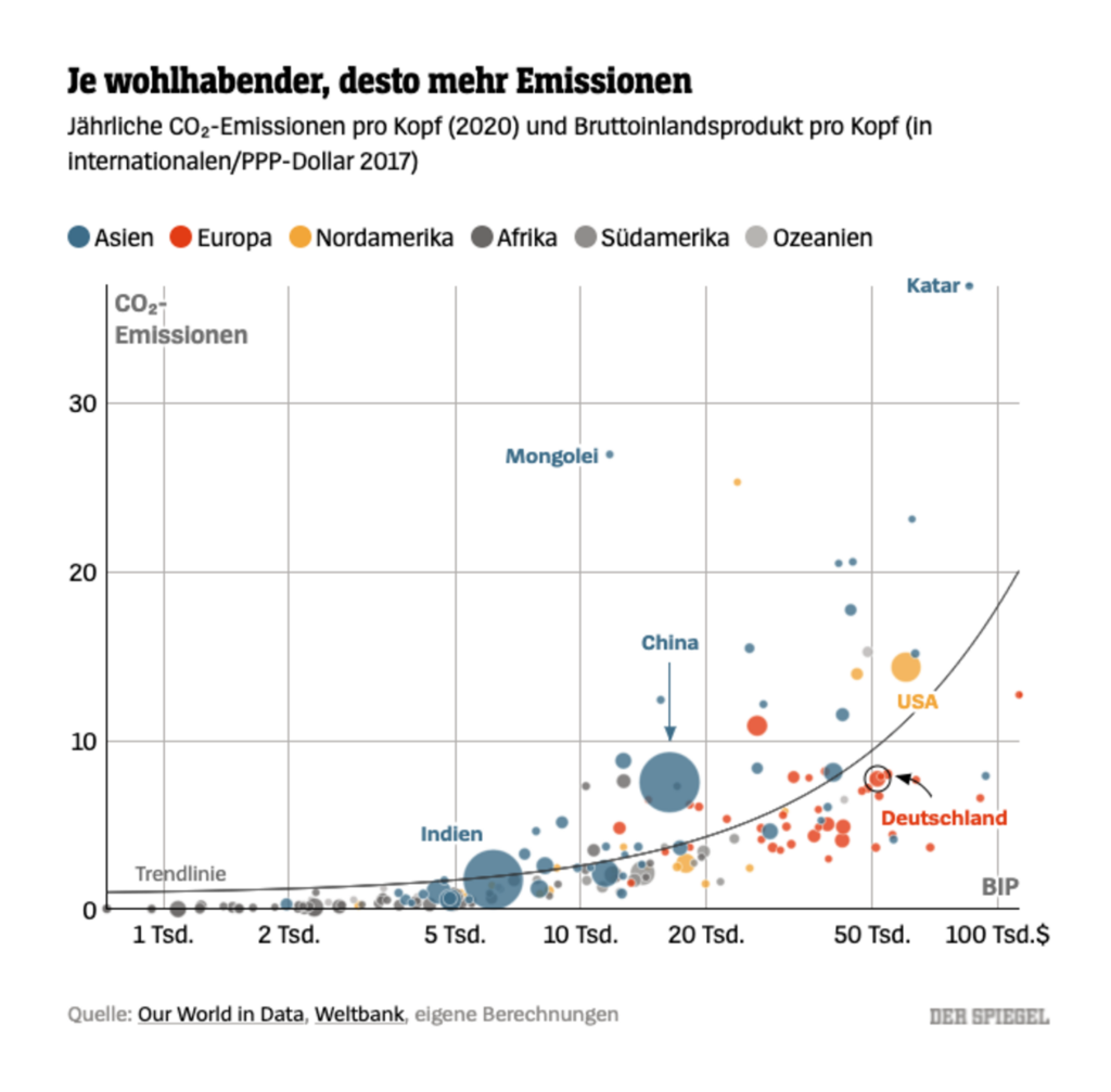
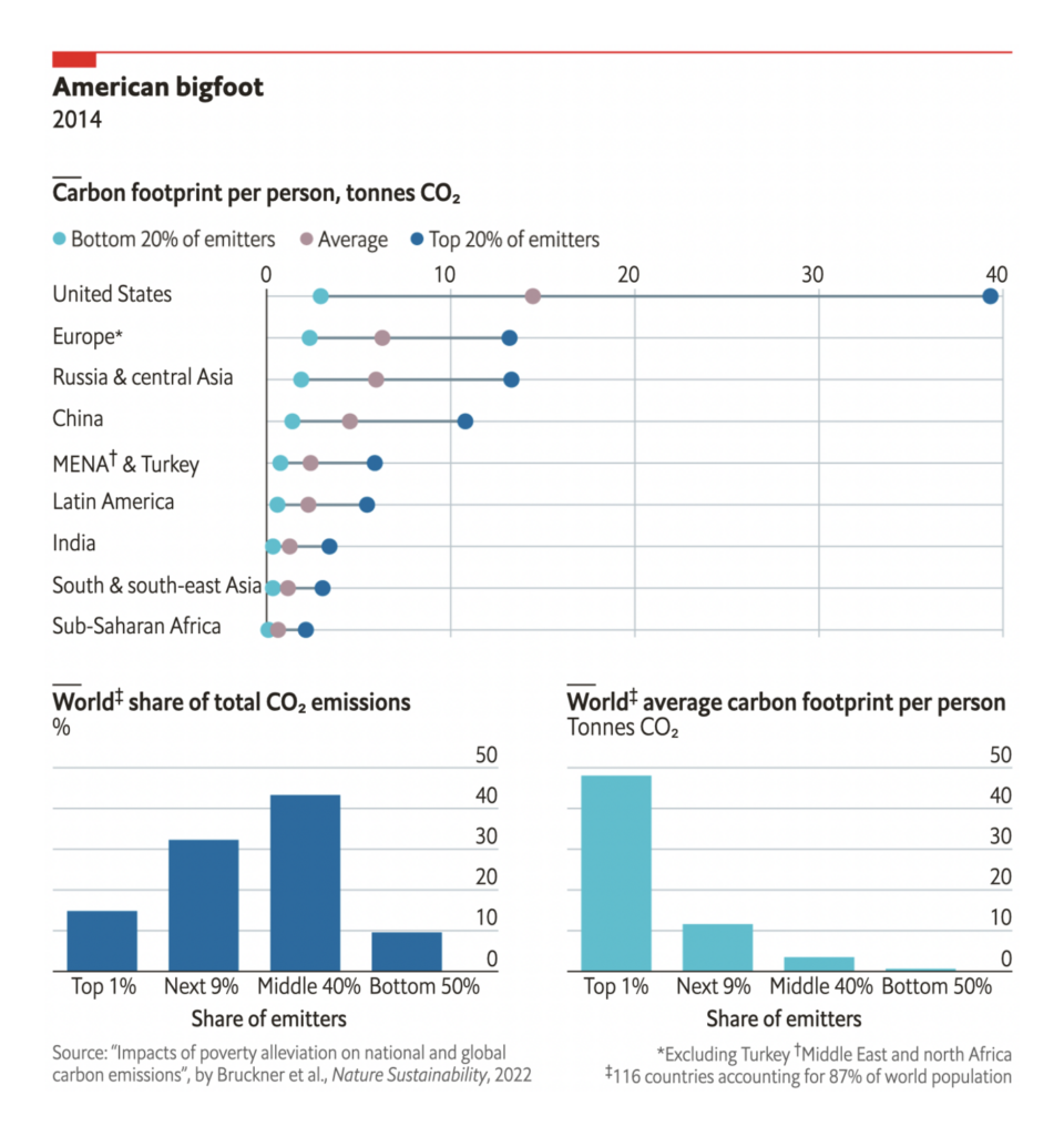
Climate charts focused on international disparities:

Patrick Stotz: “Insgesamt gilt: Je wohlhabender ein Land ist, desto höher sind die Treibhausgasemissionen pro Einwohner,” February 21 (Tweet, Article)
The Economist: Are climate goals compatible with reducing poverty?, February 18
Financial Times: Wind groups wrestle with ‘perfect storm’ of supply woes and rising material costs, February 17

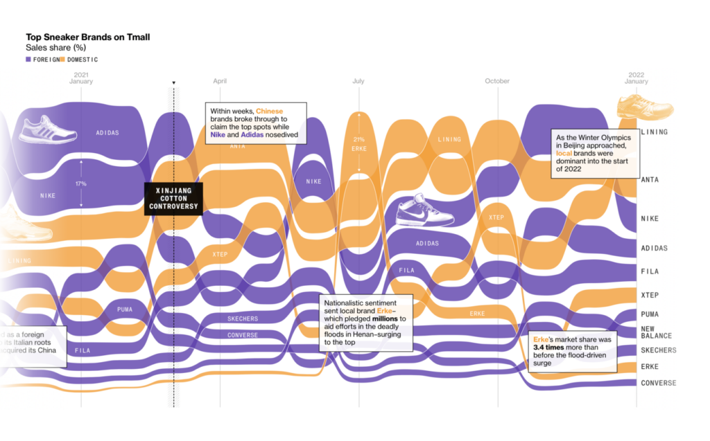
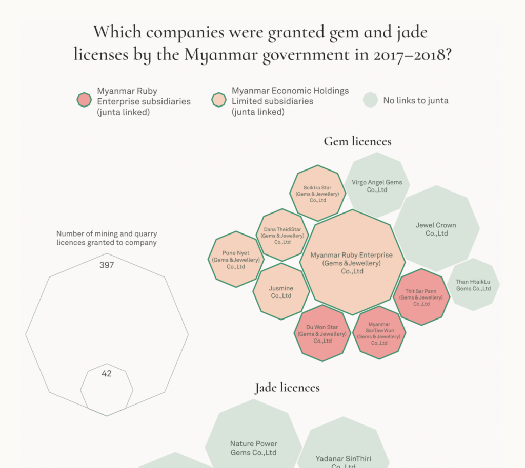
And other topics included everything from “sneaker nationalism” in China to the gem trade in Myanmar:

Bloomberg: How Nationalism in China Has Dethroned Nike, Adidas, February 15
The Economist: Private equity is buying up America’s newspapers, February 17
The Guardian: Credit Suisse leak unmasks criminals, fraudsters and corrupt politicians, February 20
Kontinentalist: Miners in the rough: The hidden journey of your jewels, February 18

What else we found interesting

The New York Times: Moments From the Beijing Winter Games, Frame by Frame, February 19
Clara Dealberto: “Que recherchent les parents sur leurs enfants ? @we_do_data avait proposé la réponse avec cet incroyable graphe en barres empilées / bande dessinée sur les requêtes Google par âge et par sexe et je trouve ça tout bonnement génial,” February 21 (Tweet, Link)
Jason Forrest: “I will scan and share as they are so unique, but here’s an example- stacked bar isotype? This period of Marie Neurath’s work is easily the most creative!” February 19 (Tweet)
xkcd: Data Trap, February 17

Applications are open for…


Help us make this dispatch better! We’d love to hear which newsletters, blogs, or social media accounts we need to follow to learn about interesting projects, especially from less-covered parts of the world (Asia, South America, Africa). Write us at hello@datawrapper.de or leave a comment below.

Comments