Data Vis Dispatch, February 25: German elections and three years of war in Ukraine

The best of last week’s big and small data visualizations

Welcome back to the 182 edition of the Data Vis Dispatch! Every week, we publish a collection of the best small and large data visualizations we find, especially from news organizations — to celebrate data journalism, data visualization, simple charts, elaborate maps, and their creators.

Recurring topics this week include the results of Sunday’s federal elections in Germany and the third anniversary of full-scale war in Ukraine.

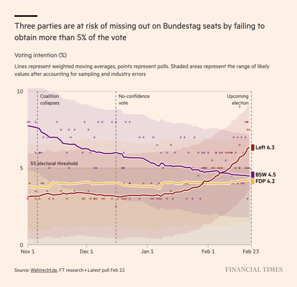
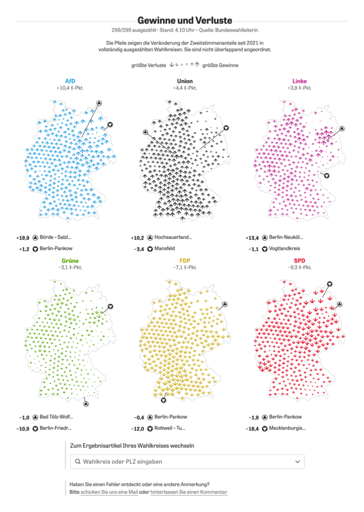
Last Sunday, German voters went to the polls. In the days leading up to the election, several parties worried whether they would even reach the 5% threshold to enter the Bundestag:

Financial Times: German federal election 2025: what’s at stake?, February 21

How did it turn out? Here are the results:

Zeit Online: Diese 630 Menschen wurden in den Bundestag gewählt [These 630 people were elected to the Bundestag], February 24
Der Spiegel: So sieht der neue Bundestag aus [This is what the new Bundestag looks like], February 24
Tagesspiegel: Bundestagswahl 2025: Alle Wahlergebnisse in Deutschland auf einer Karte [Federal election 2025: All election results in Germany on a map], February 24
Bloomberg: German Federal Election Results, February 24
zdfheute: So haben die Wahlkreise gestimmt [Chart title: Direct votes: results in the constituencies], February 24
Tagesspiegel: Bundestagswahl 2025: Alle Wahlergebnisse und Koalitions-Optionen [Federal Election 2025: All election results and coalition options], February 24

We’ve already spotted the first very detailed map of election results in Berlin and expect more in the coming week:

Berliner Morgenpost: Bundestagswahl 2025 in Berlin: So hat Ihre Nachbarschaft gewählt [Bundestag election 2025 in Berlin: This is how your neighborhood voted], February 24

Other visualizations looked at changes in party results since the last election in 2021… and before:

Zeit Online: Alle Ergebnisse aus den Wahlkreisen [Chart title: Gains and losses], February 24
The New York Times: Germany Election Maps: How Conservatives Regained Power, February 23
Zeit Online: Alle Wahlergebnisse in Berlin-Mitte [Chart title: Historical results (in Berlin-Mitte)], February 21

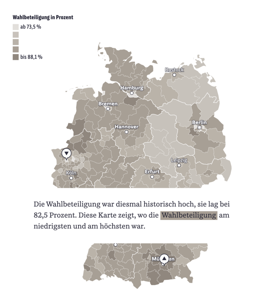
And something else has changed (for the better). Voter turnout was very high this year:

Süddeutsche Zeitung: Die Wahlergebnisse in Daten und Grafiken [Chart description: Voter turnout was historically high this time, at 82.5 percent. This map shows where voter turnout was lowest and highest], February 24

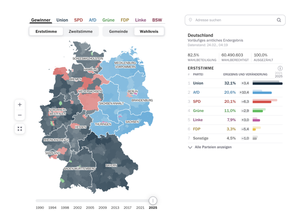
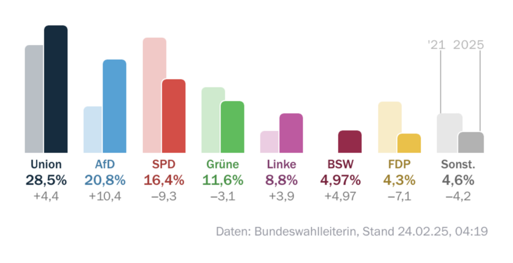
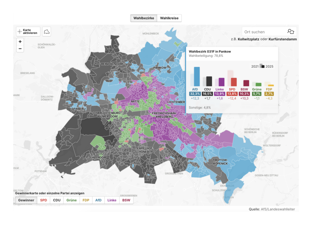
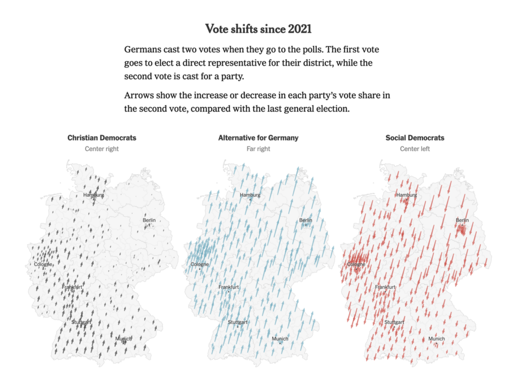
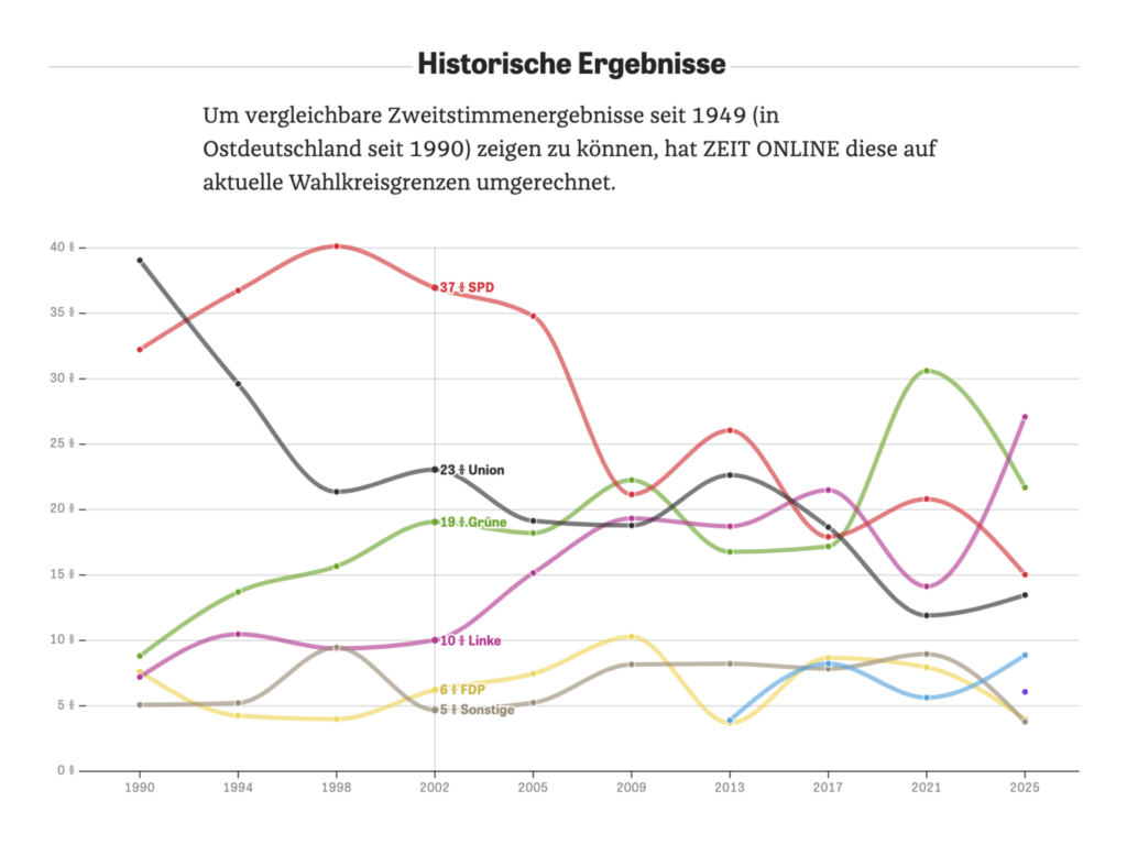
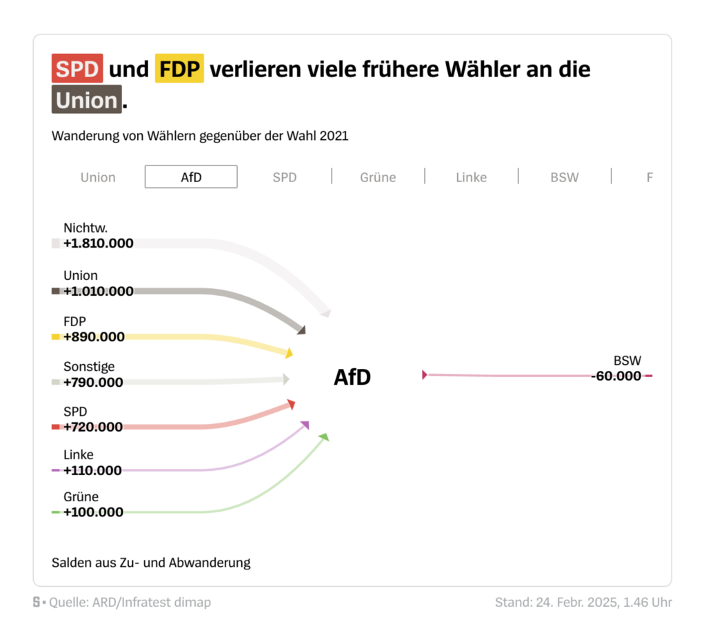
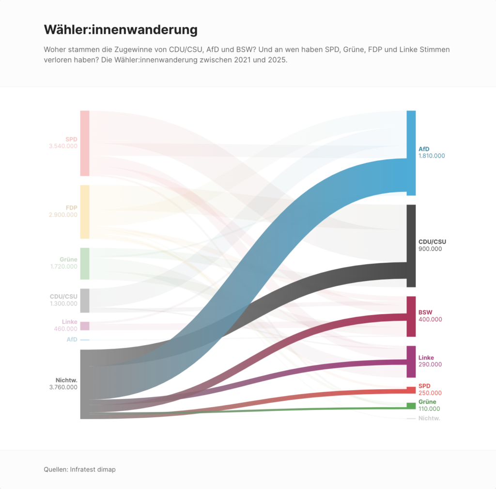
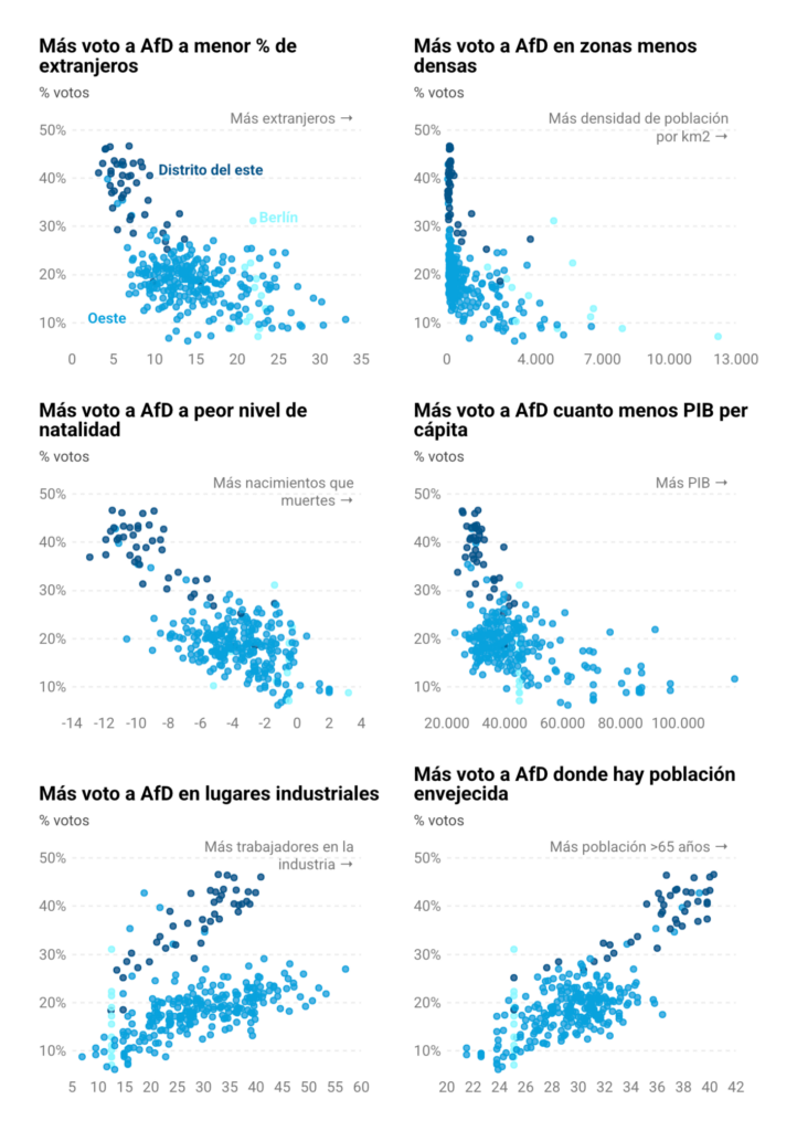
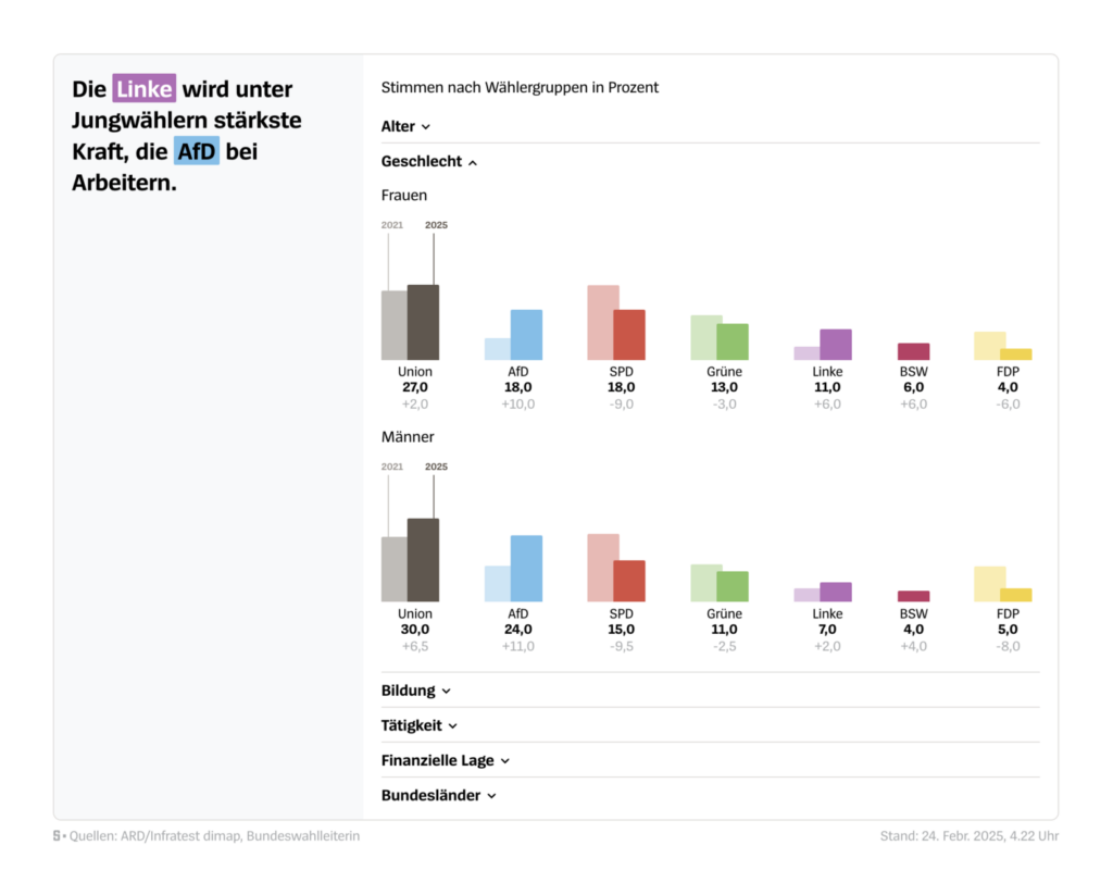
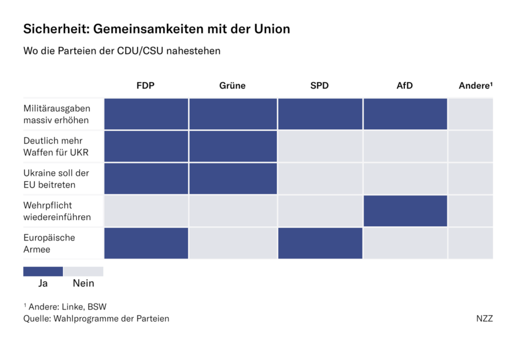
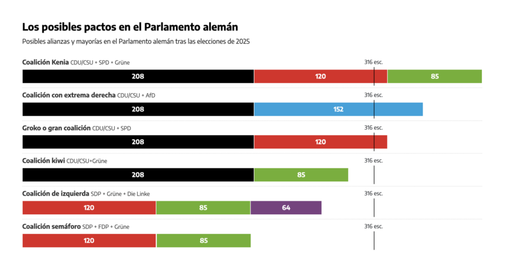
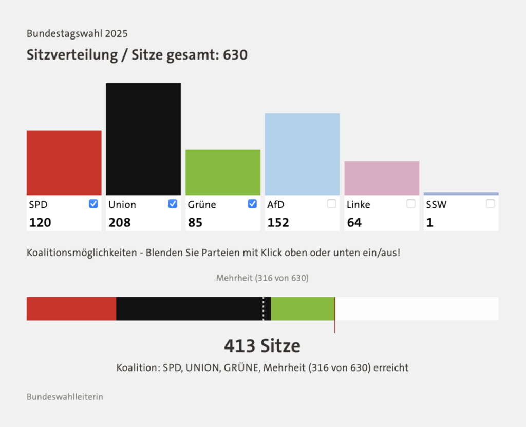
And speaking of change, these charts visualized which parties won over each others voters:

Neue Zürcher Zeitung: Historisch schwaches Ergebnis: Die Sozialdemokraten verlieren ihre Wähler an die Union [Chart description: Voter movement in the 2025 federal election, in thousands], February 23
Der Spiegel: Bundestagswahl 2025 [Chart description: Voter movement compared to the 2021 election], February 24
Berliner Morgenpost: So hat Deutschland gewählt [Chart title: Voter movement], February 24

Who voted for whom? We found demographic data about voters — and also their representatives:

elDiario.es: Quién votó a cada partido en Alemania: diez gráficos del voto por edad, género, geografía o clase social [Who voted for each party in Germany: ten charts showing voting by age, gender, geography or social class], February 25
Der Spiegel: Bundestagswahl 2025 [Chart description: Votes by voter group in percent], February 24
Der Spiegel: So sieht der neue Bundestag aus [This is what the new Bundestag looks like], February 24

What’s next? Coalition building:

Neue Zürcher Zeitung: Mit diesen Parteien könnte die Union die meisten Wahlversprechen umsetzen [Chart description: Where the parties are close to the CDU/CSU], February 23
elDiario.es: MAPA | Los resultados de las elecciones en Alemania, distrito por distrito [Chart description: Possible alliances and majorities in the German Parliament after the 2025 elections], February 23
tagesschau: Welche Koalition könnte Deutschland regieren? [Which coalition could govern Germany?], February 23
taz: Regieren ohne Mehrheit [Chart title: coalition calculater], February 24
Der Spiegel: So realistisch sind die Steuerversprechen der Parteien [Chart title: Who the parties want to relieve], February 19
The New York Times: Germany’s Economy Was Once the Envy of Europe. Not Anymore, February 21

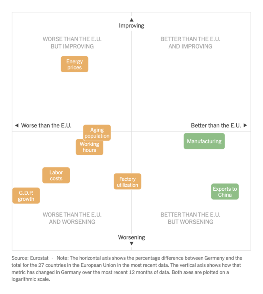
Phew, that’s it from the German election. Let’s move on to the economic situation of… the United States:

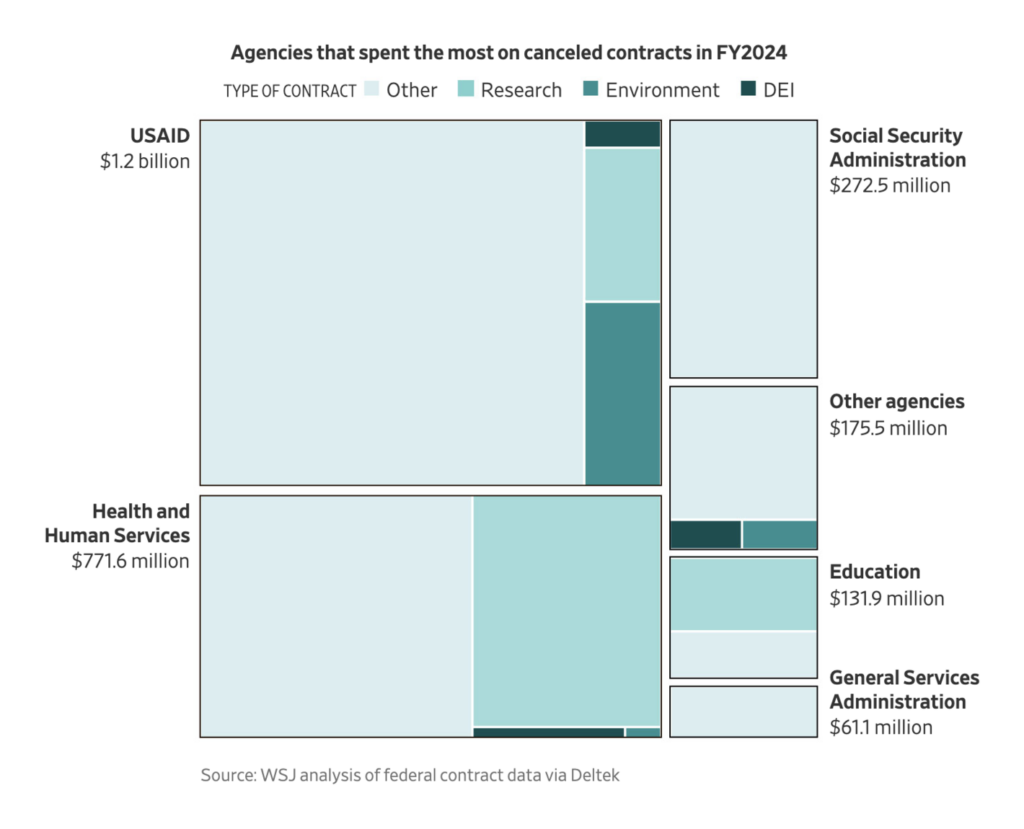
The Wall Street Journal: DOGE Claims It Has Saved Billions. See Where, February 22
Joey Cherdarchuk – Obumbratta: “You can explore *and search* the US budget in this interactive visual I made with the phenomenal @amberthomas.bsky.social,” February 18 (Bluesky)

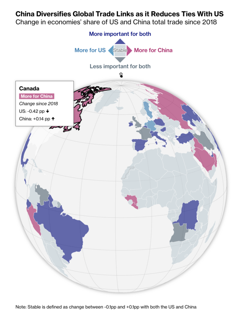
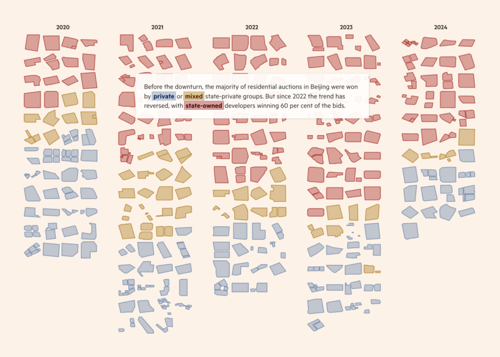
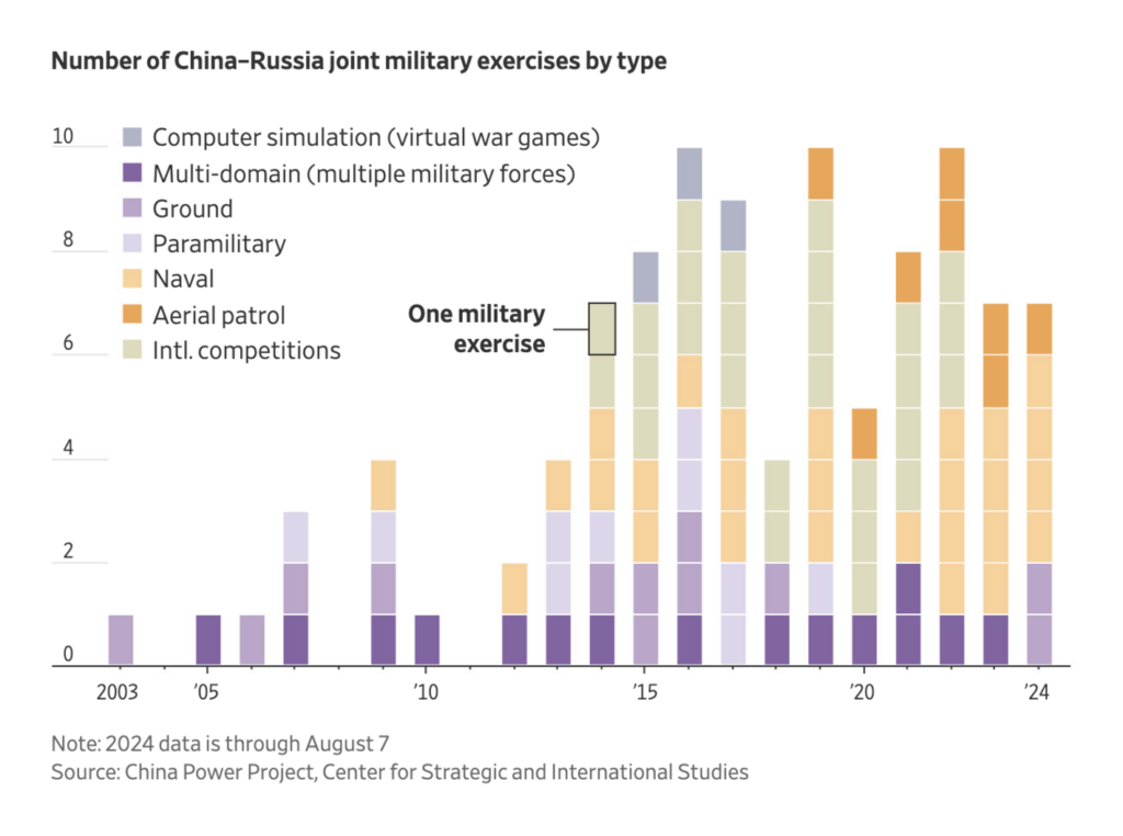
And another country that has stimulated economic visualizations within the past seven days — China:

Bloomberg: How Trump’s First Trade War With China Gave Rise to New Targets, February 21
Financial Times: How the state is propping up China’s housing market, February 25

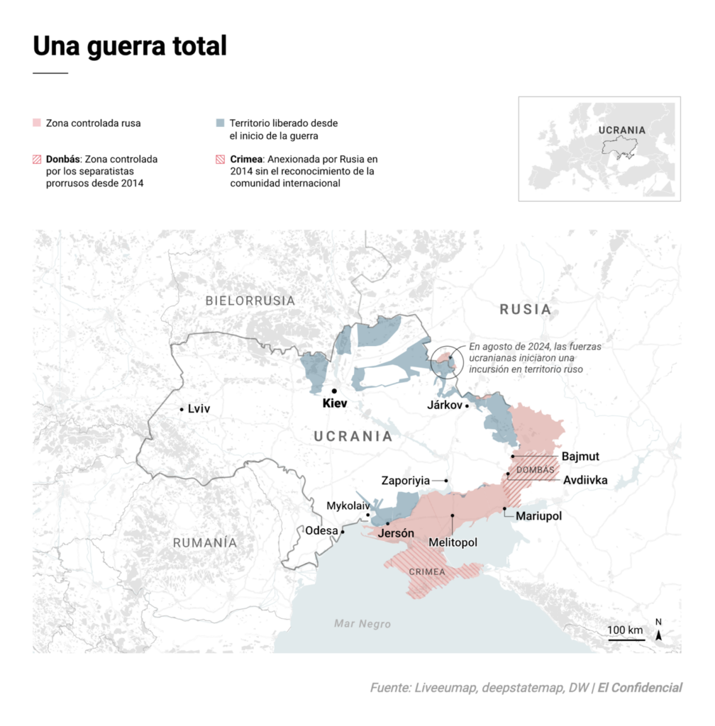
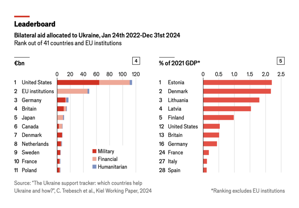
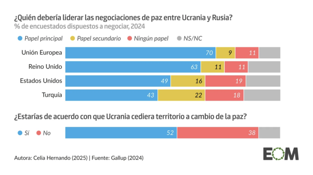
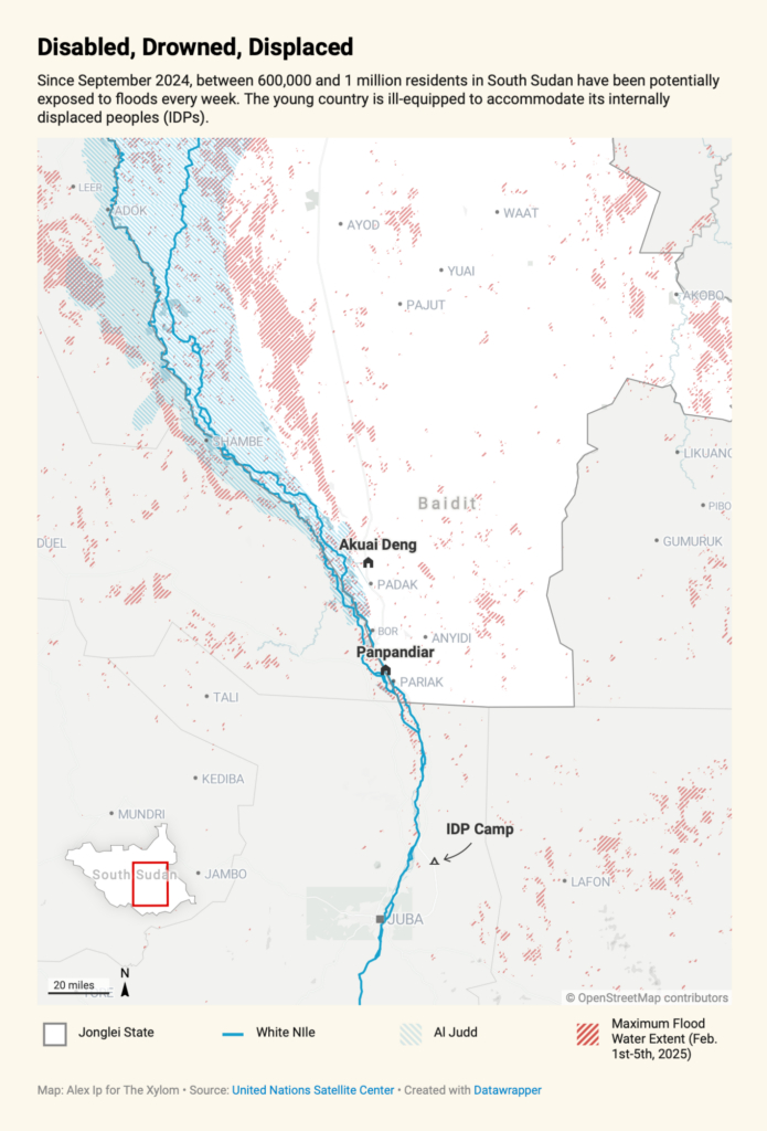
Yesterday, February 24th, marked the third anniversary of Russia’s invasion of Ukraine. Visual journalists covered the current state of the war, donations to Ukraine, and people’s wishes for peace:

El Confidencial: El verdadero coste de un misil [The true cost of a missile], February 24 Emotional story
Nexo Jornal: O território ucraniano tomado pela Rússia em 3 anos de guerra [The Ukrainian territory taken by Russia in 3 years of war], February 20
The Economist: Which countries provide the most, and least, support to Ukraine?, February 18
El Orden Mundial: Una paz negociada por la UE y abiertos a ceder territorio: así opinan los ucranianos de la guerra [Chart title: Who should lead peace negotiations between Ukraine and Russia?], February 23
The Wall Street Journal: See How Xi and Putin Are Ramping Up Joint Military Drills, February 22

Other “bad news but good visualizations” this week included topics such as U.S. school shootings, risk awareness in Europe, and the environment:

Mohamad Waked: “Thrilled to share that my first project with @cablesgl.bsky.social has been featured on ‘Made with cables’ page!,” February 19 (Bluesky, Story)
Sergio Fernandez Gallardo: “[…] I think it’s a very interesting story to see how southern European countries fear climate risks more, northern European countries fear political and social risks, and eastern European countries fear Russian interference […],” February 19 (LinkedIn)
The Xylom: Fragile, Flooded South Sudan Asks: What About Those With Disabilities?, February 20
The Guardian: Two-thirds of the Earth’s surface experienced record heat in 2024. See where and by how much – visualised, February 20

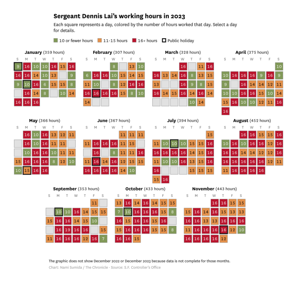
Let’s stop and appreciate trying something new! These charts use a train line as a location index and a literal calendar to emphasize extreme overtime:

La Nación Data: “Los 100 km del tren Sarmiento que muestran la disparidad del conurbano” [The 100 km of the Sarmiento train showing the disparity of the metropolitan area], February 19 (Tweet, Article)
San Francisco Chronicle: SFPD sergeant’s extreme overtime shows grueling schedules some police are working, February 24

Though we still love the classics — like small multiple lines:

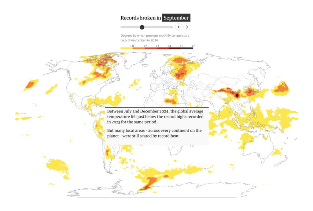
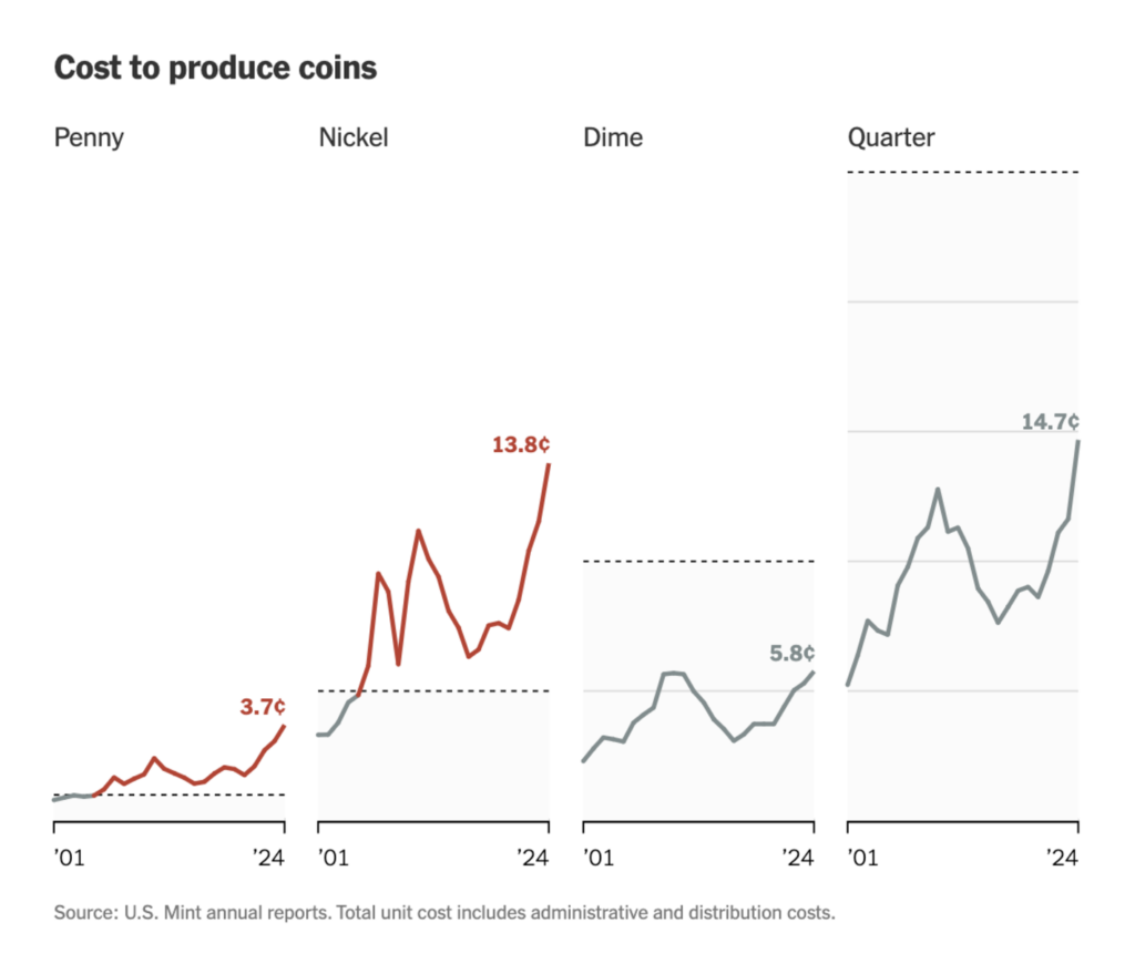
The Washington Post: “I also rec. This data may vanish under Trump, so we charted it. When some of the most valuable datasets in human history briefly vanished from U.S. government websites, it felt like watching the Library of Alexandria go up in smoke,” February 21 (Bluesky, Article)
The New York Times: So, You Want to Get Rid of the Penny. Do You Have a Plan for the Nickel?, February 19

It wouldn’t be a Data Vis Dispatch without a section of “too pretty to miss” visualizations. Today, from baby boomers to bacterial biomass to the center of a country:

Our World in Data: The baby boom in seven charts, February 24
Information Is Beautiful: “Interesting interactive visualisation of the weight of all the bacteria, fungi, humans etc on the Earth”, February 21 (Tweet, Website)
maps.com: Mapping the Middles of the United States, February 18

What else we found interesting

David Ho: “Hey font nerds, this is for you. Gorton — The hardest working font in Manhattan,” February 17 (Bluesky, Article)

Applications are open for…


Help us make this dispatch better! We’d love to hear which newsletters, blogs, or social media accounts we need to follow to learn about interesting projects, especially from less-covered parts of the world (Asia, South America, Africa). Write us at hello@datawrapper.de or leave a comment below.

Want the Dispatch in your inbox every Tuesday? Sign up for our Blog Update newsletter!

Comments