Data Vis Dispatch, February 27

The best of last week’s big and small data visualizations

Welcome back to the 131st edition of Data Vis Dispatch! Every week, we’ll be publishing a collection of the best small and large data visualizations we find, especially from news organizations — to celebrate data journalism, data visualization, simple charts, elaborate maps, and their creators.

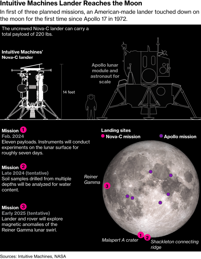
Recurring topics this week include the two-year mark of the Russian-Ukrainian war, urban planning, and the moon.

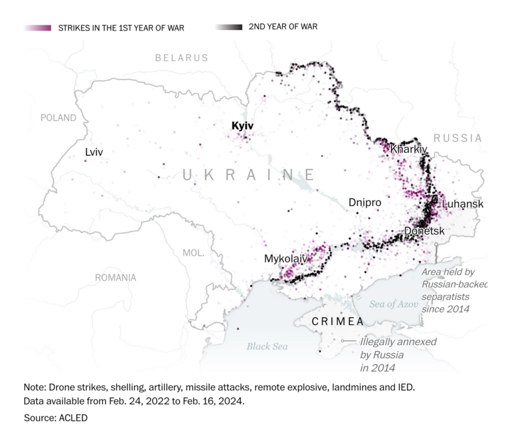
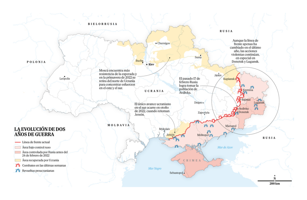
On February 24, 2022, Russia began a full-scale invasion of Ukraine. We’re now at the two-year mark of this war:

South China Morning Post: Trench warfare: Ukraine and Russia dig in as fighting grinds into third year, February 22
La Vanguardia: Sin estrategia para romper el frente, February 24

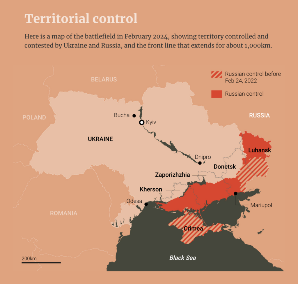
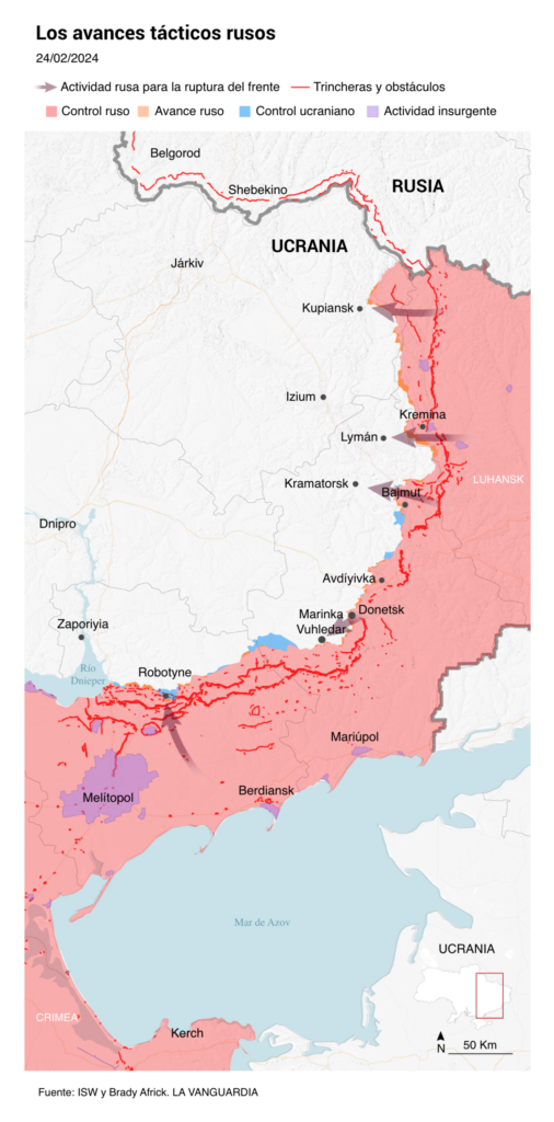
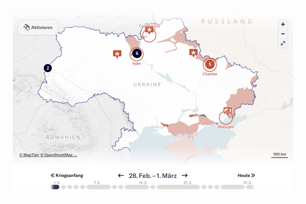
These maps showed the evolution of the conflict:

The Washington Post: Five maps show where the war in Ukraine stands after two years, February 23
El Mundo: Tres gráficos que explican los dos años de profundo desgaste bélico en Ucrania, February 25
Le Figaro: Deux ans après l’invasion de l’Ukraine, la Russie rattrapée par la guerre, February 24
Neue Zürcher Zeitung: So entwickelt sich der Ukraine-Krieg – klicken Sie sich Tag für Tag durch unsere Karte, February 26

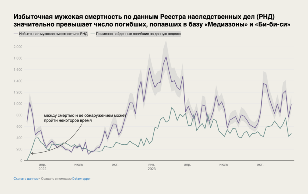
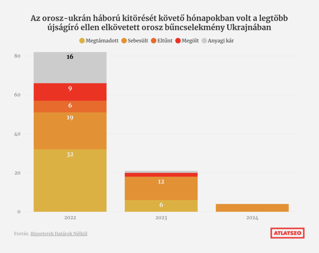
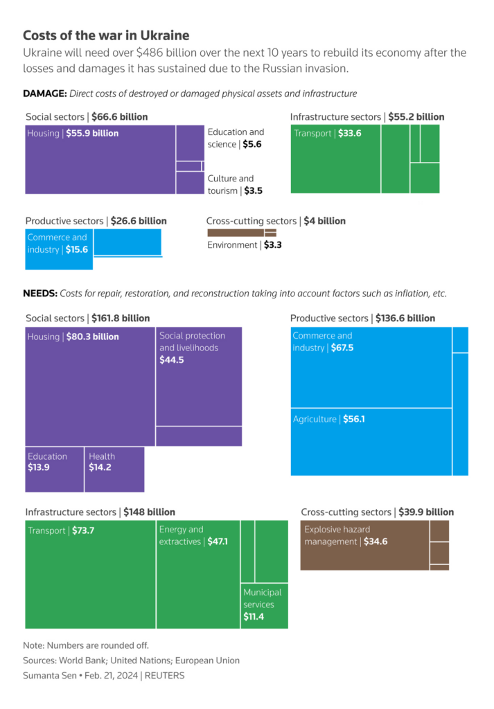
And other visualizations dealt with Russian deaths, Russian crimes against journalists, and the cost of the war:

Meduza: 75 тысяч погибших российских солдат 120 смертей в день — вот цена, которую платит Россия за нападение на соседнюю страну. Новое большое исследование «Медузы» и «Медиазоны» о потерях, February 24
Átlátszó: Több mint 100 újságíró lett orosz bűncselekmények áldozata az ukrajnai háborúról való tudósítás két éve alatt, February 22
Reuters: Take Five: Inflation pain over?, February 26

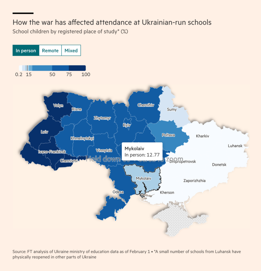
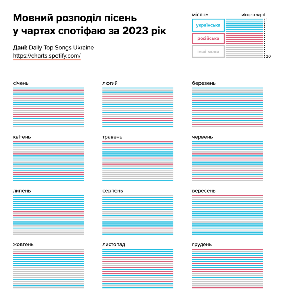
Finally, two visualizations depicted everyday life in Ukraine. How have pupils been learning in school and what music are people listening to?

Financial Times: How Ukraine is trying to help its ‘lost generation’, February 23
Texty: В українських чартах і досі лишається російська музика. Це пісні з матюками, а українською таких вкрай мало, February 22

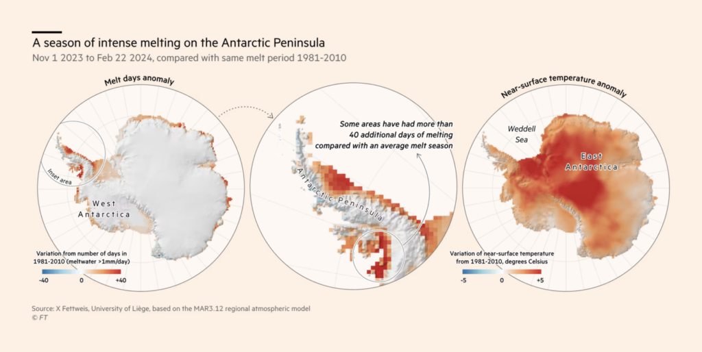
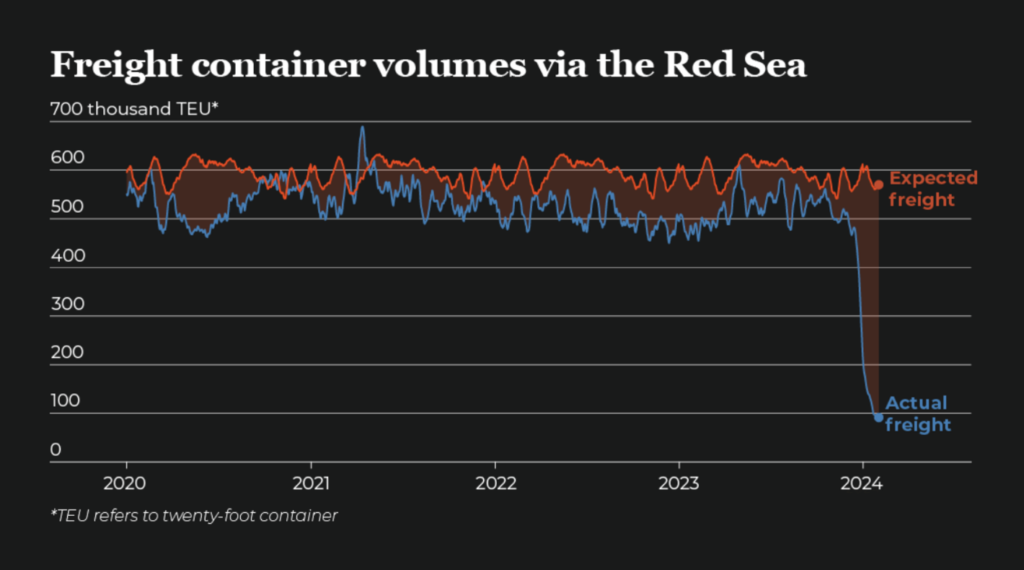
We wish we could move on to better news, but instead it’s been a season of intense ice melt in Antarctica, Houthi attacks in the Red Sea continue, and the murder of women in South Africa is on the rise:

Financial Times: Climate graphic of the week: huge ice loss risks Antarctica’s ‘destabilisation, February 24
Al Jazeera: Mapping the Red Sea attacks, February 22
The Outlier: #54 Murder in the media, February 23

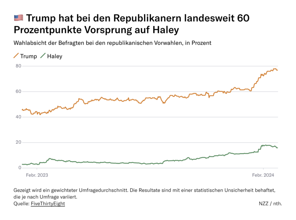
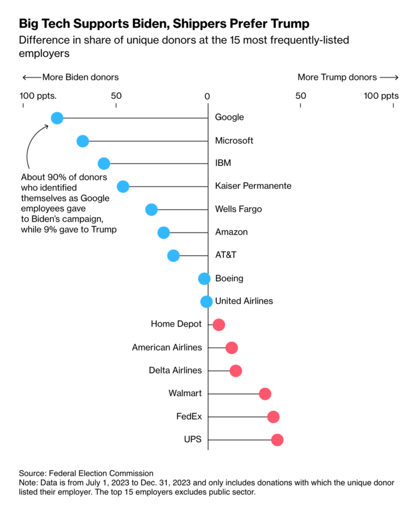
Let’s go to the U.S. elections. Donald Trump won the Republican primary in South Carolina — guess where his supporters tend to work:

Neue Zürcher Zeitung: So hat South Carolina bei der republikanischen Vorwahl gewählt – die wichtigsten Grafiken zur US-Wahl 2024, February 25
Bloomberg: Biden Stakes Reputation on Blue-Collar Workers. Turns Out They’re Trump Donors, February 23

We found two special uses of scatterplots this week:

LKK MAP: Running My First Marathon in Hong Kong, February 24
Inkyfada: “C’est là que va l’argent public” : quel coût pour la campagne de l’ISIE ?, February 20

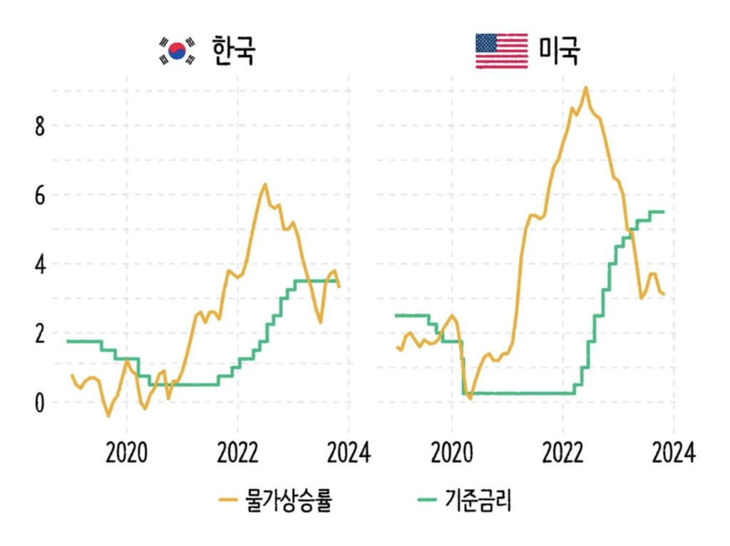
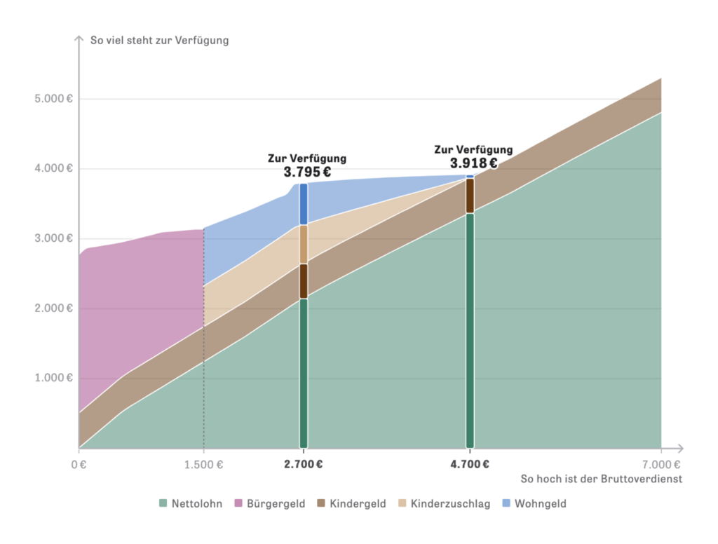
From stock prices to inflation, it’s this week’s economic visualizations:

Bloomberg: How Japan’s Nikkei 225 Got Its Mojo Back, February 22
SBS News: 사과 하나에 만 원? 고물가 시대를 살아가는 법, February 22
Zeit Online: Lohnt es sich für Sie, mehr zu arbeiten?, February 21

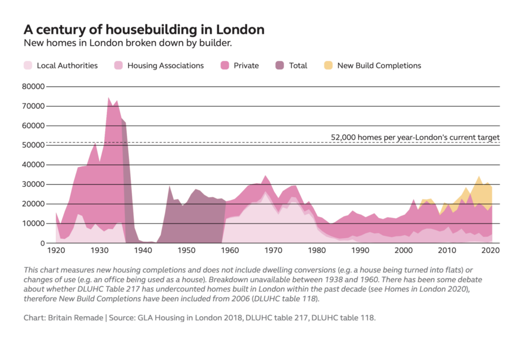
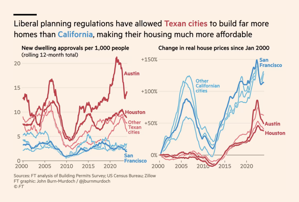
Two charts depicted housebuilding and city planning over time in London and the U.S.

Britain Remade: Let’s get London Building, February 23 (PDF version)
Financial Times: What Texas can teach San Francisco and London about building houses, February 23

Let’s wrap up this Dispatch with two nice and smooth scrollytellings:

Bloomberg: Biden’s EV Dreams Are a Nightmare for Tesla and the US Car Industry, February 21
Les Echos: Cinéma : Le bouche‑à‑oreille, maître tout‑puissant du box‑office, Februray 21

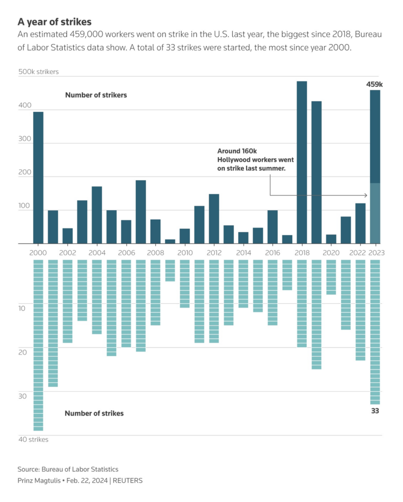
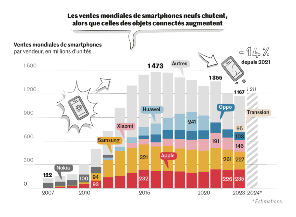
And last but not least, the section of cool charts that didn’t really fit into a cluster, from labor strikes to cell phone sales:

Reuters/Prinz Magtulis: “The U.S. saw the largest number of labor strikes last year since 2000, while the number of strikers reached a five-year high,” February 24 (Tweet)
The Wall Street Journal: Half of College Grads Are Working Jobs That Don’t Use Their Degrees, February 22
The Washington Post: Come rain or shine, the eclipse is on its way. Will you have fair skies?, February 22
Le Monde: Les smartphones actuels seront-ils bientôt obsolètes ?, February 23

What else we found interesting

Bloomberg: Lunar Lander Feared to Have Tipped While Reaching the Moon, February 24
Financial Times: Chinese research ships increase activity near Taiwan, February 27

Applications are open for…


Help us make this dispatch better! We’d love to hear which newsletters, blogs, or social media accounts we need to follow to learn about interesting projects, especially from less-covered parts of the world (Asia, South America, Africa). Write us at hello@datawrapper.de or leave a comment below.

Want the Dispatch in your inbox every Tuesday? Sign up for our Blog Update newsletter!

Comments