This article is brought to you by Datawrapper, a data visualization tool for creating charts, maps, and tables. Learn more.
Data Vis Dispatch, February 28
The best of last week’s big and small data visualizations

Welcome back to the 83rd edition of Data Vis Dispatch! Every week, we’ll be publishing a collection of the best small and large data visualizations we find, especially from news organizations — to celebrate data journalism, data visualization, simple charts, elaborate maps, and their creators.
Recurring topics this week include climate forecasts and one year of war in Ukraine.
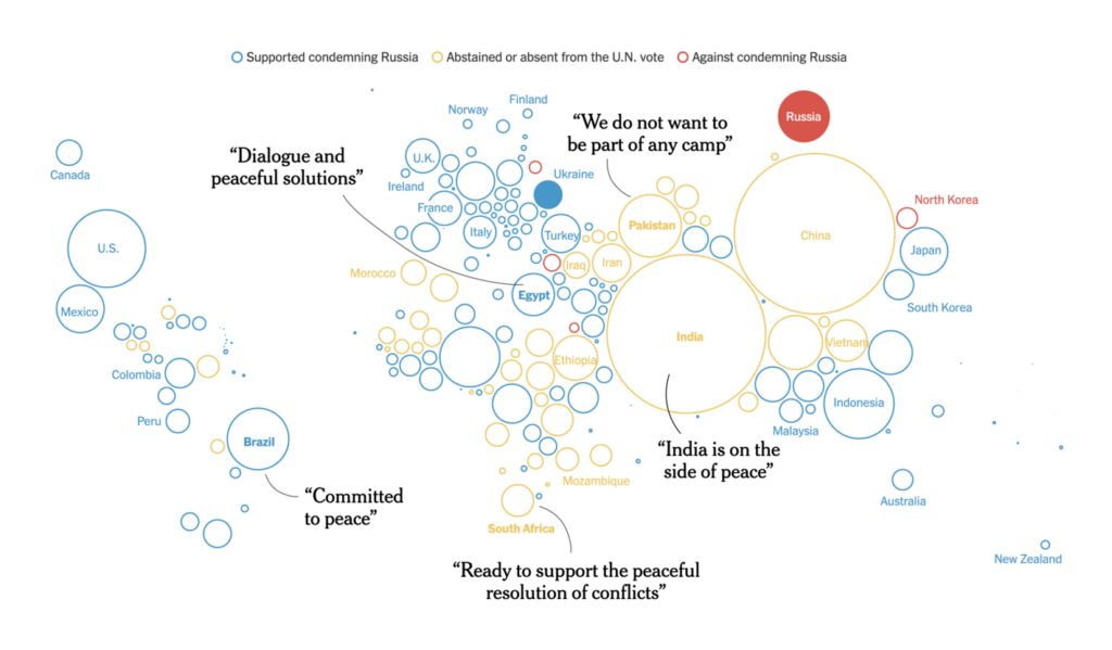
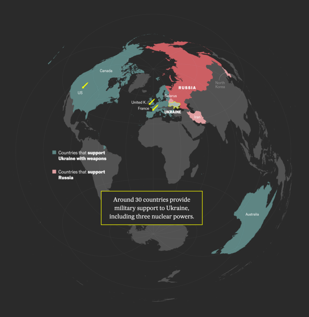
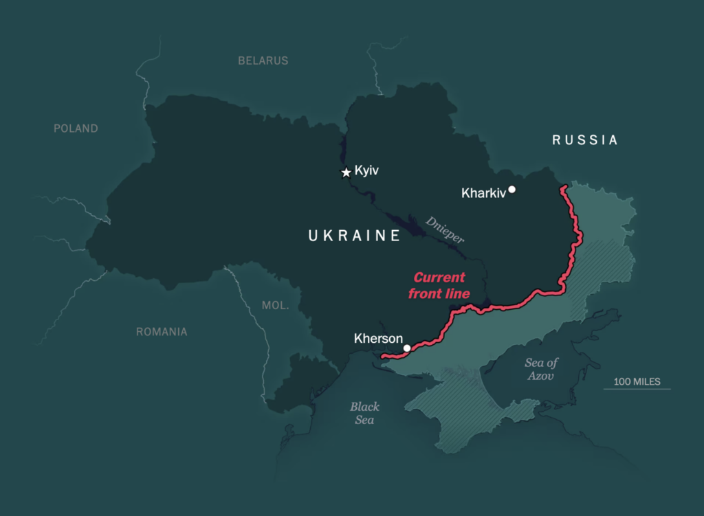
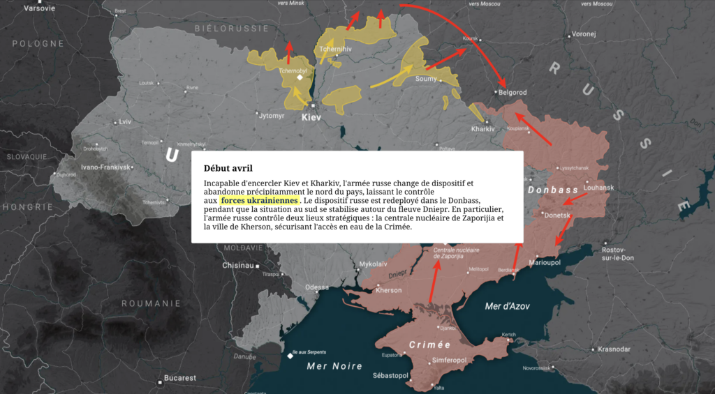
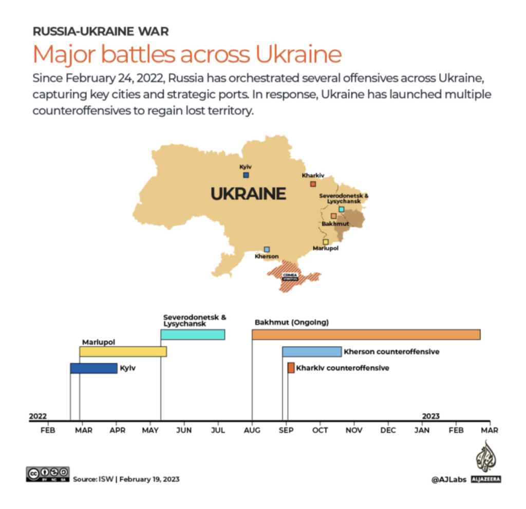
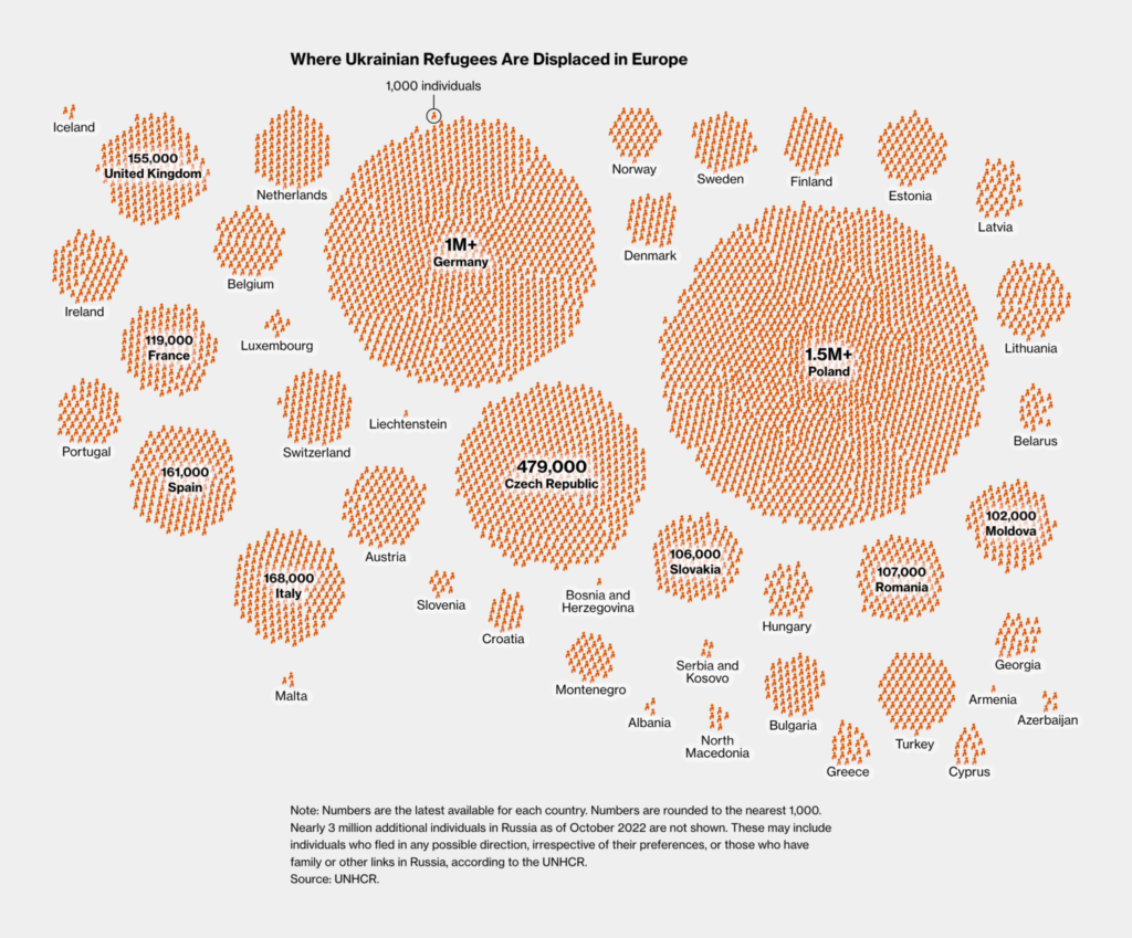
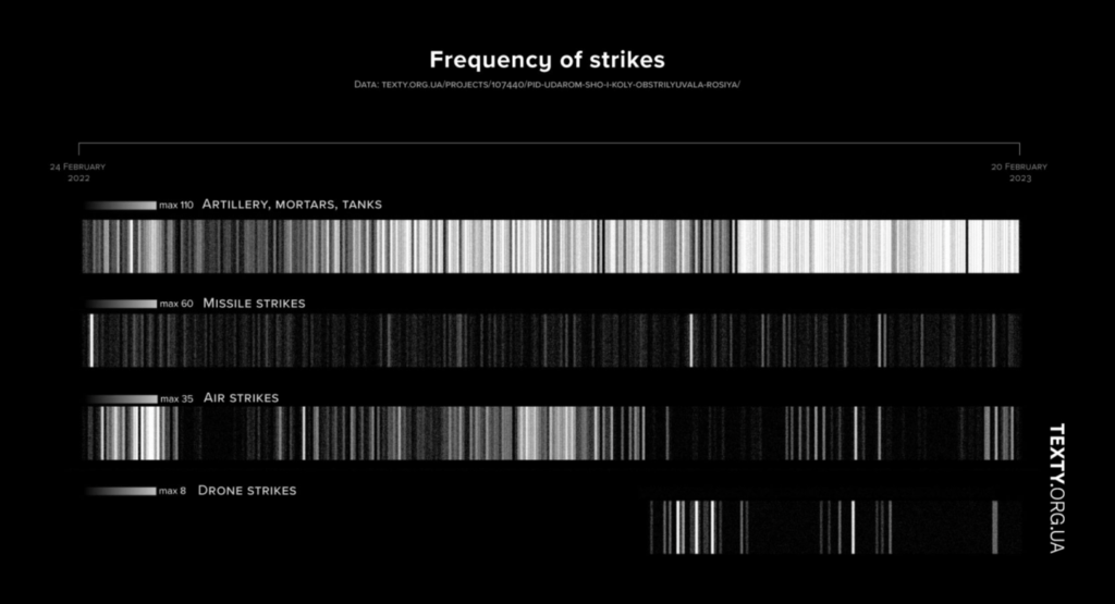
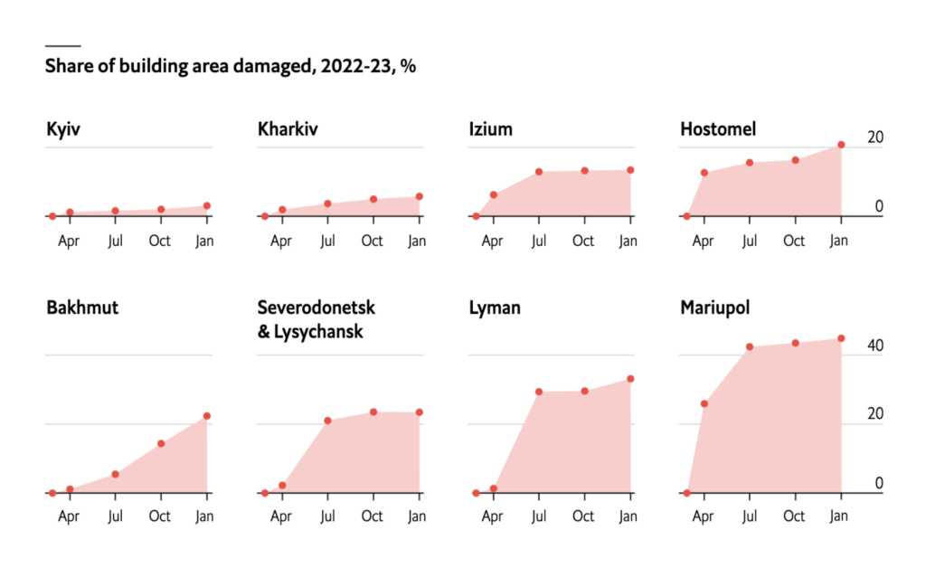
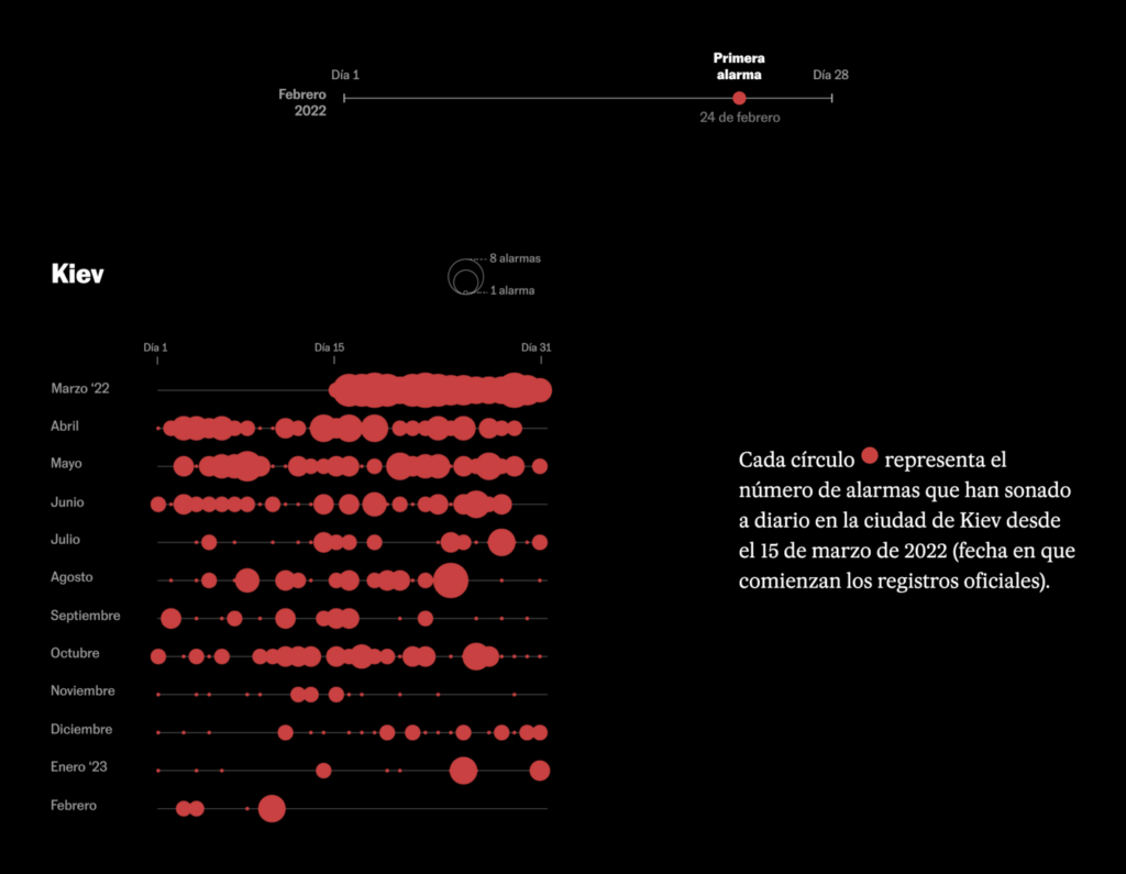
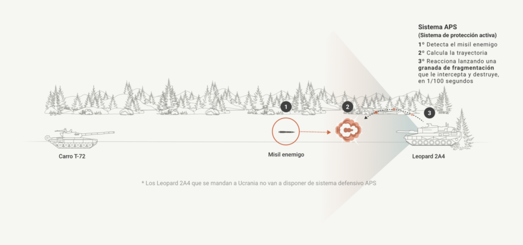
Last Friday, February 24th, marked one year since the beginning of Russia’s war in Ukraine. How has the past year changed Ukraine and the rest of the world? Here’s what data journalists found.

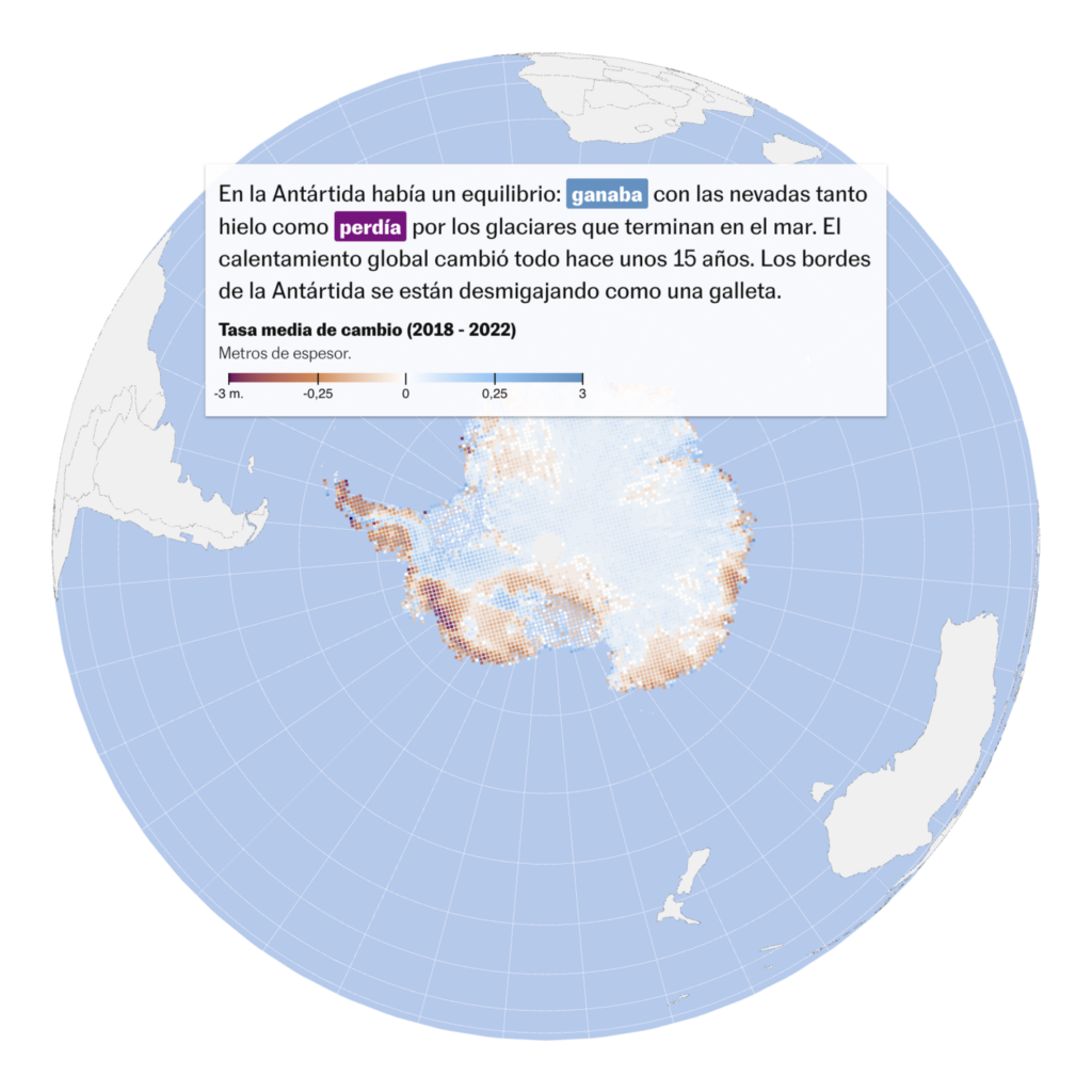
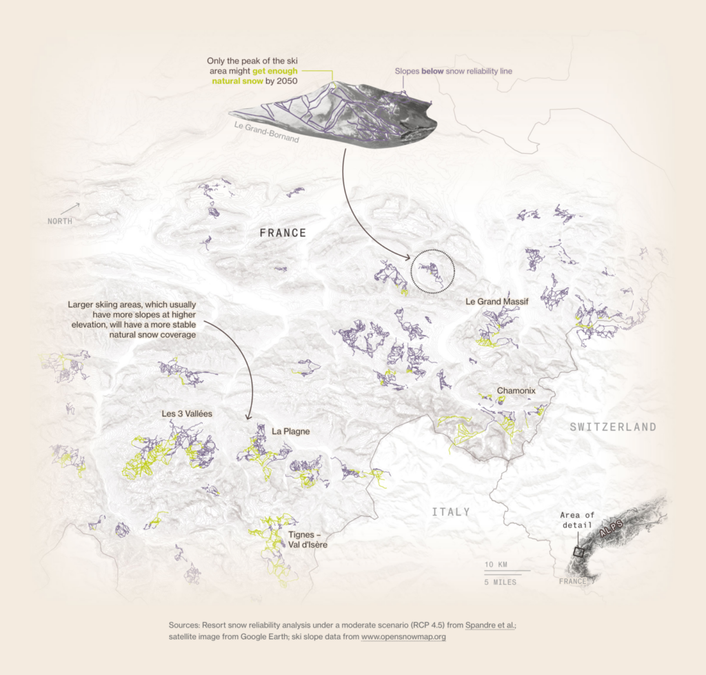
Next up: climate data vis. This week, we look at three maps that show the current effects and the forecasted future of our heating climate. What can we expect in Antarctica, Europe, and the U.S.?
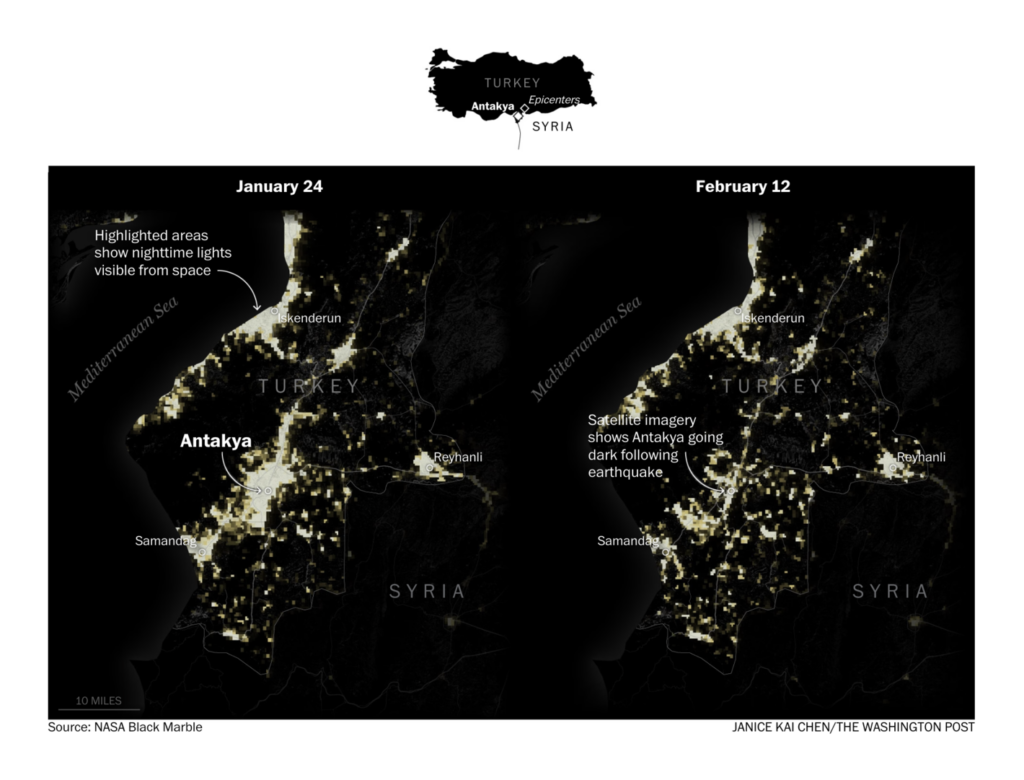
Hurricane winds aren’t the only natural disasters causing destruction. The before-and-after map below shows the darkening of a Turkish city after being hit by an earthquake earlier this month.
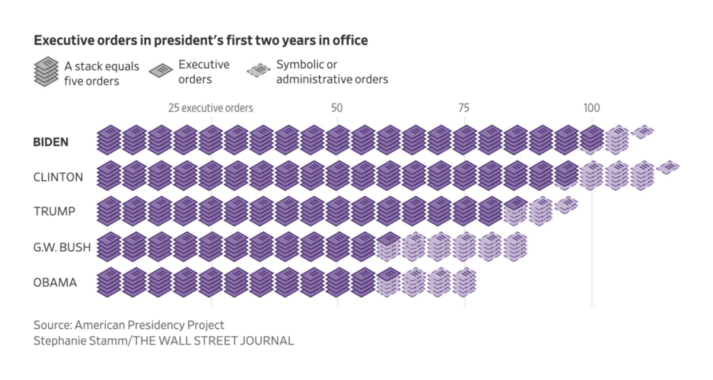
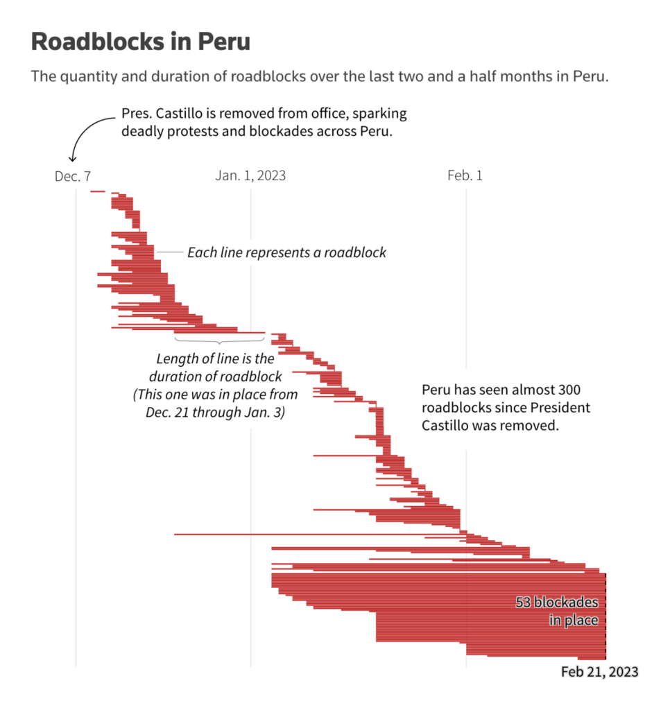
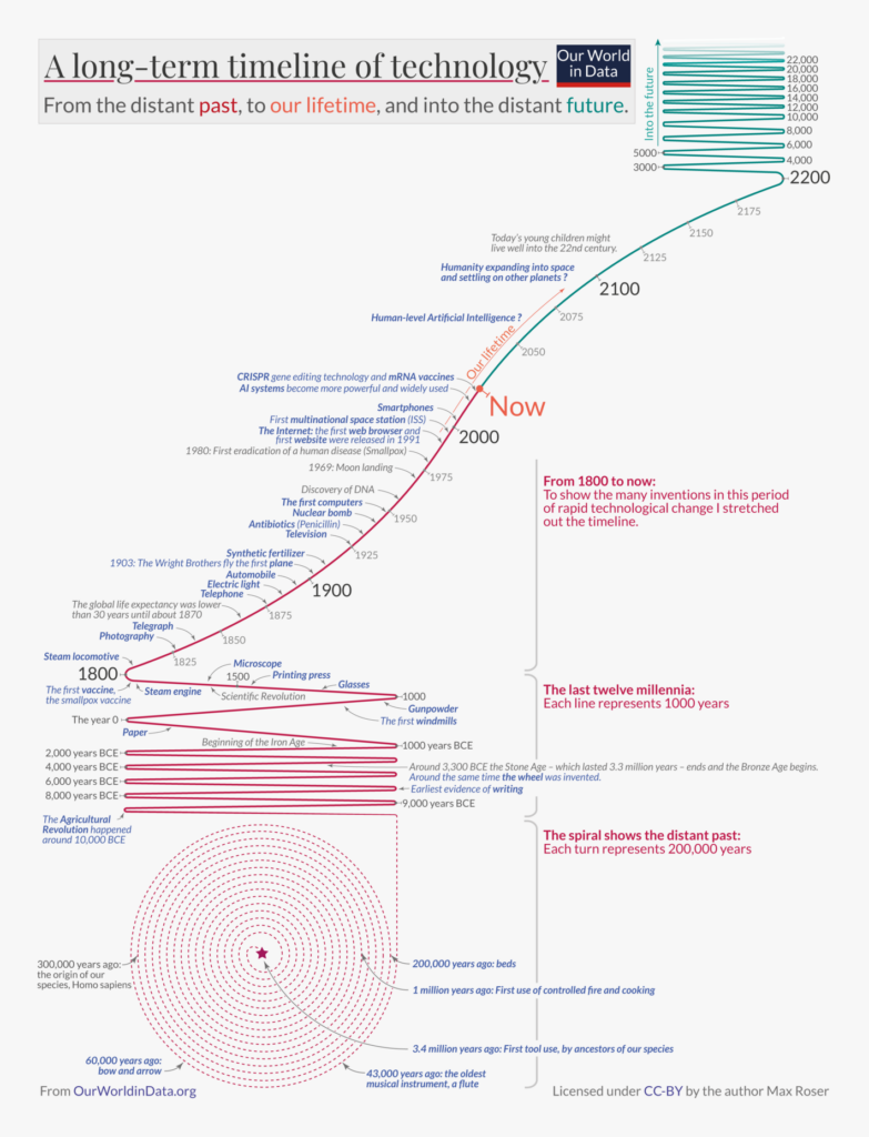
Other fascinating visualizations of the week cover the journey of a Chinese balloon, the U.S. presidents’ executive orders, protest-related roadblocks in Peru, or a timeline of technological progress.
What else we found interesting

Applications are open for…
- Praktikant:in at SRF Data (Zürich)
- Data Visualization Analyst at Global Energy Monitor (remote)
- Graphics Editor – Visual Journalism at Reuters (London)
Help us make this dispatch better! We’d love to hear which newsletters, blogs, or social media accounts we need to follow to learn about interesting projects, especially from less-covered parts of the world (Asia, South America, Africa). Write us at hello@datawrapper.de or leave a comment below.
Want the Dispatch in your inbox every Tuesday? Sign up for our Blog Update newsletter!


Comments