This article is brought to you by Datawrapper, a data visualization tool for creating charts, maps, and tables. Learn more.
Data Vis Dispatch, February 7
The best of last week’s big and small data visualizations
Welcome back to the 80th edition of Data Vis Dispatch! Every week, we’ll be publishing a collection of the best small and large data visualizations we find, especially from news organizations — to celebrate data journalism, data visualization, simple charts, elaborate maps, and their creators.
Recurring topics this week include earthquakes, climate, and outer space.
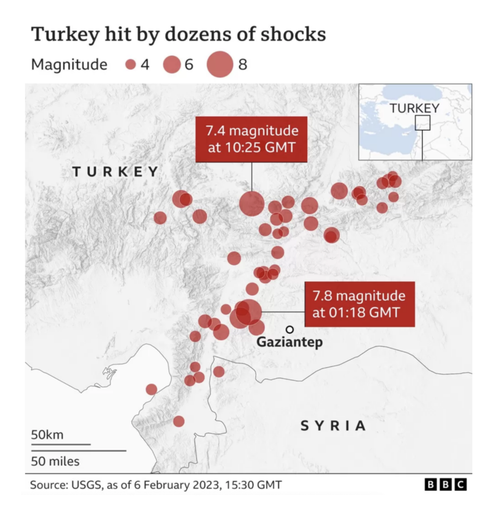
This week started with the tragic news of two earthquakes hitting Turkey and Syria, with aftershocks felt across the region.
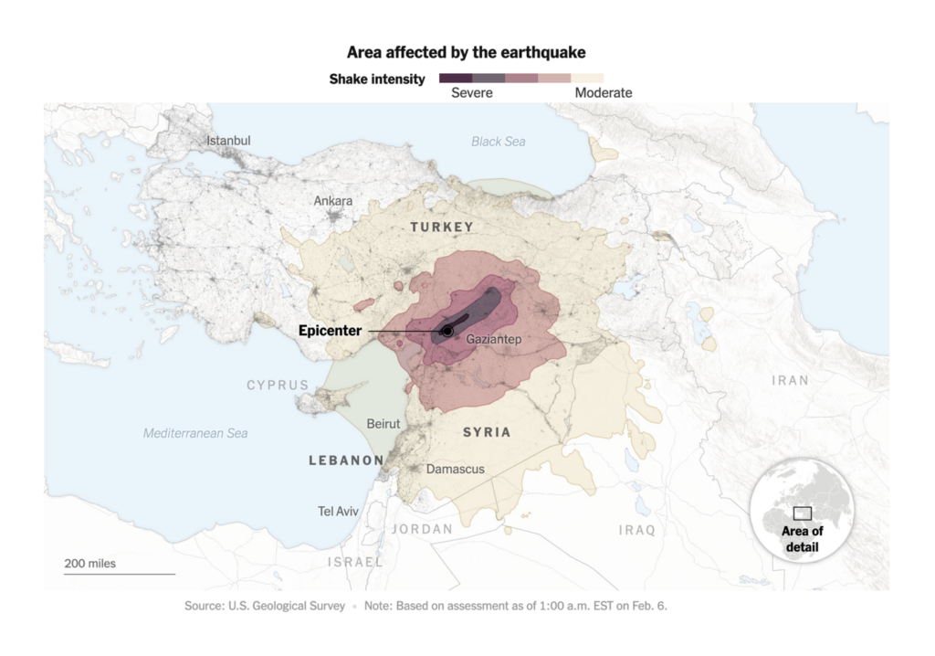
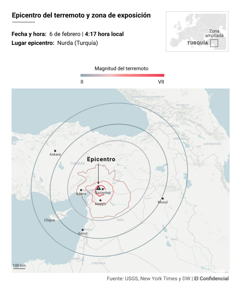
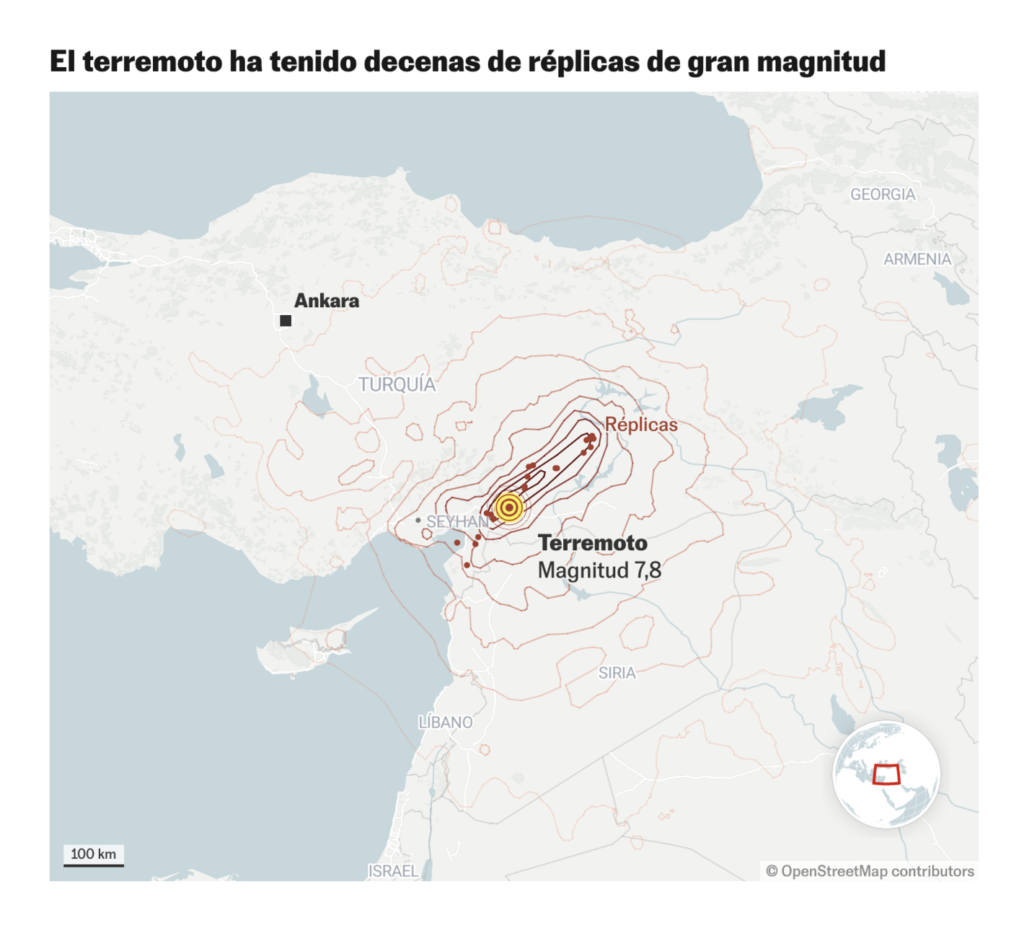
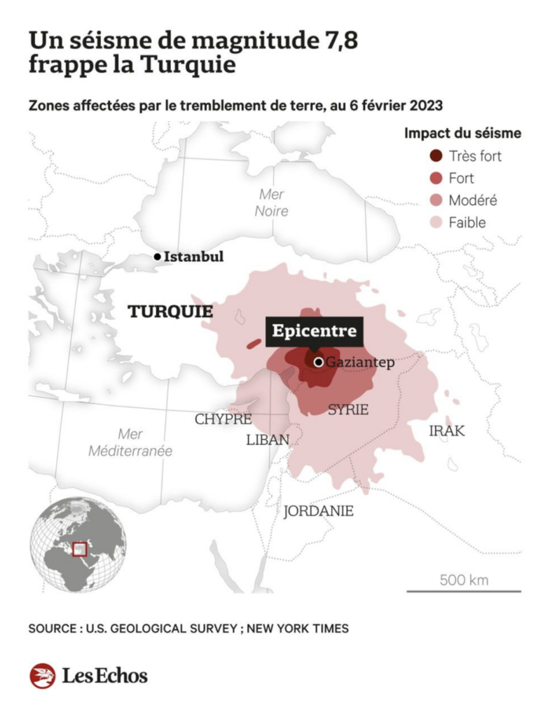
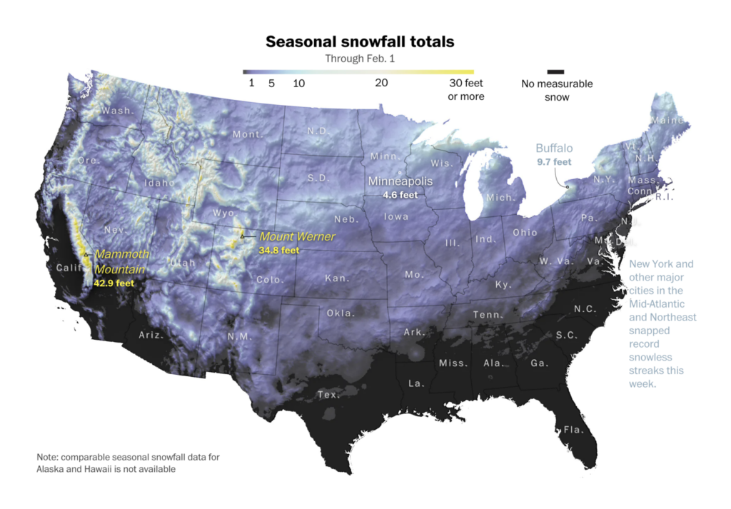
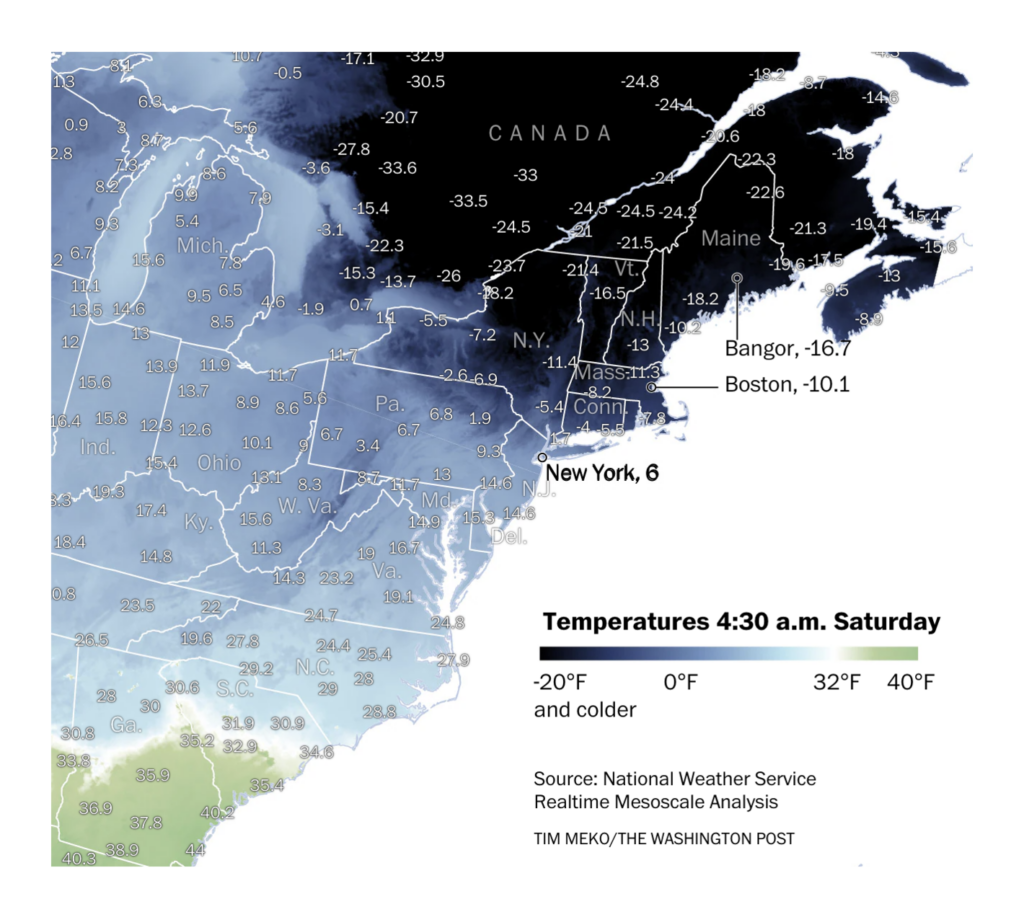
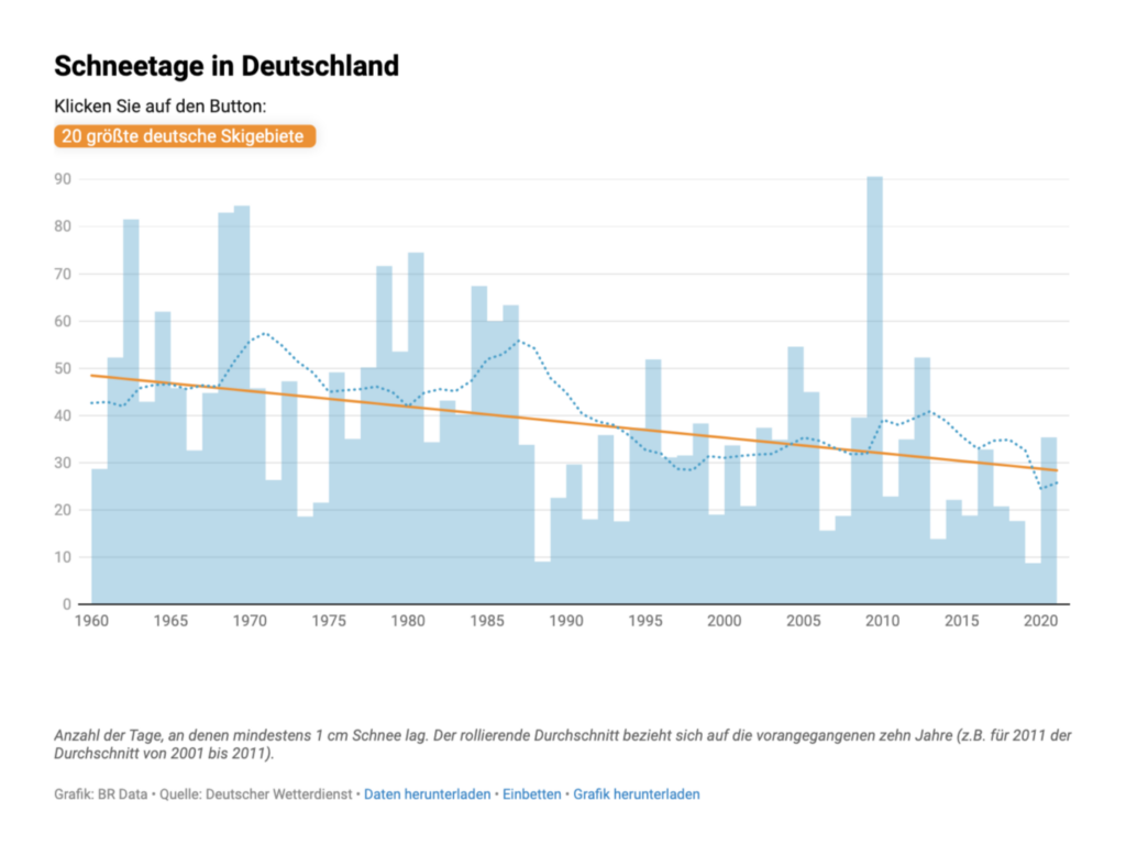
Snowfall data and low temperatures make headlines as winter continues in the Northern Hemisphere.
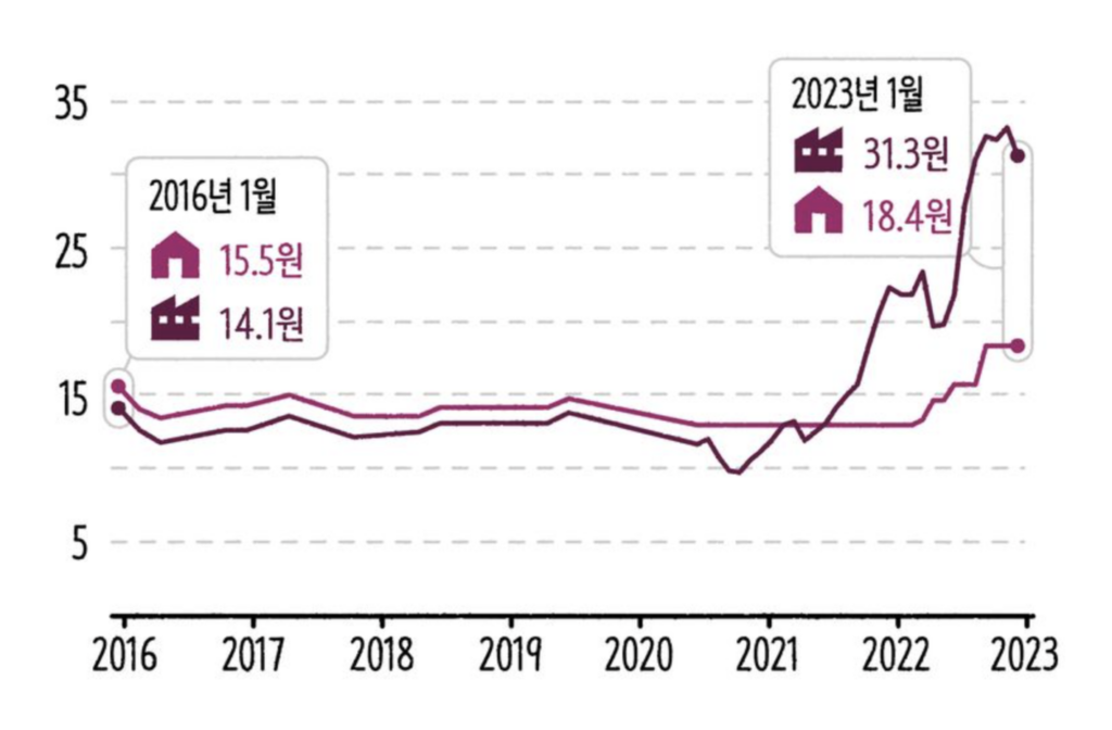
Meanwhile, the rising prices of gas heating, both for residential and industrial use, can be felt throughout the world, including in South Korea.
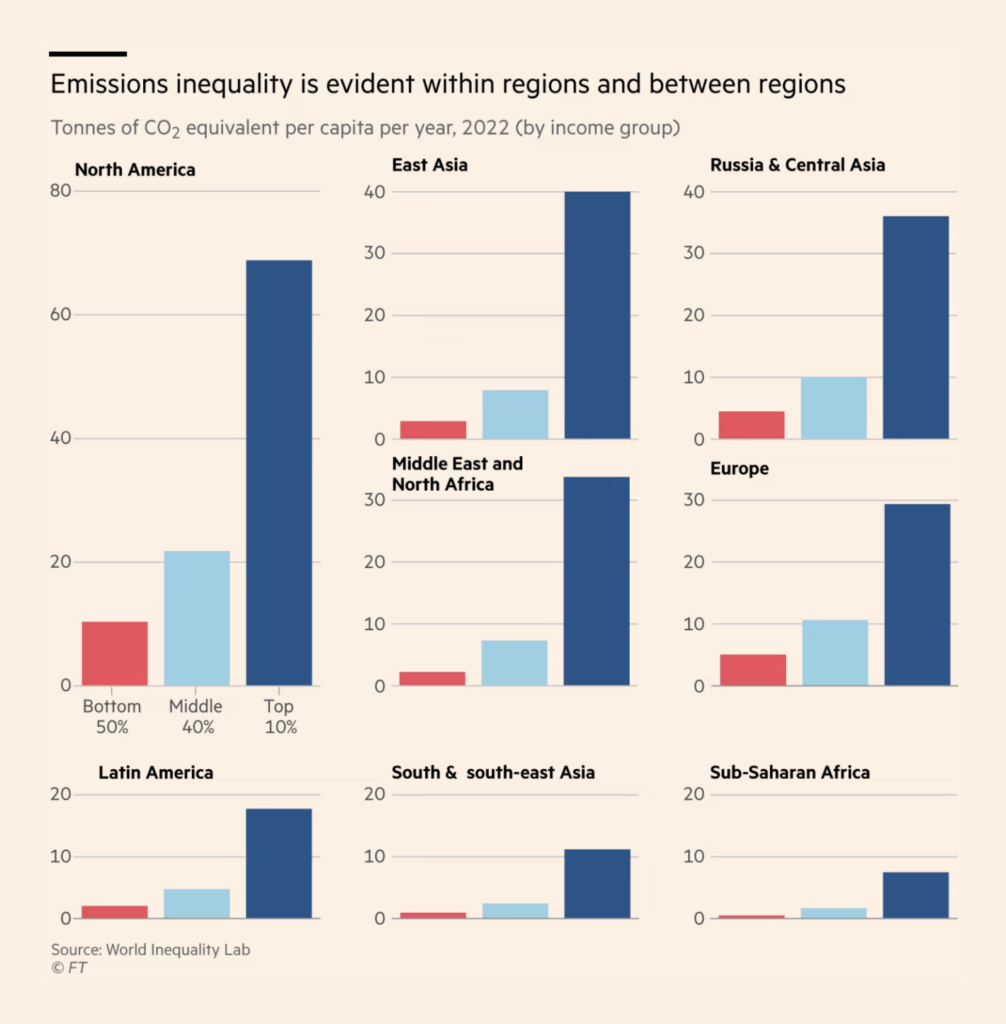
The world’s elite proves to be responsible for nearly half of greenhouse gas emissions, and this polluter gap is clear both between and within regions.
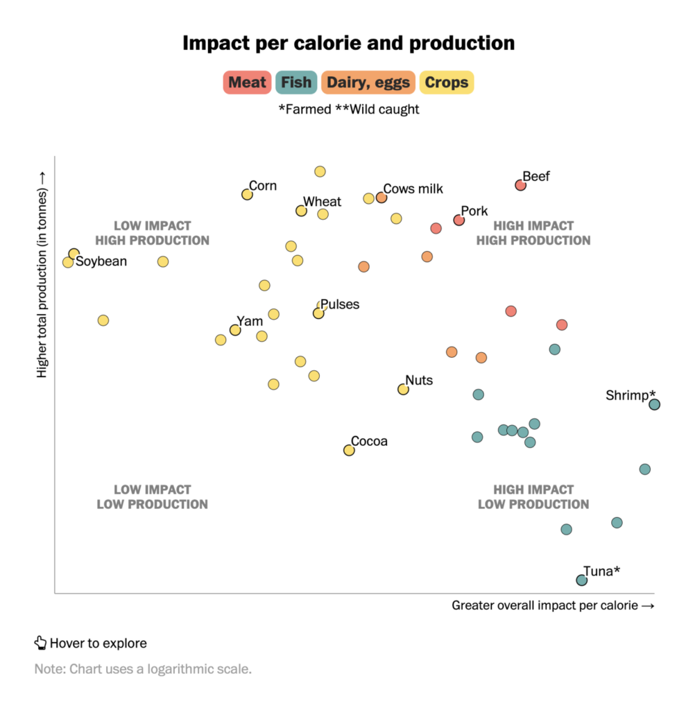
Similarly, different food groups also have different impact on the climate — with soybeans on one end and beef and seafood on the other.
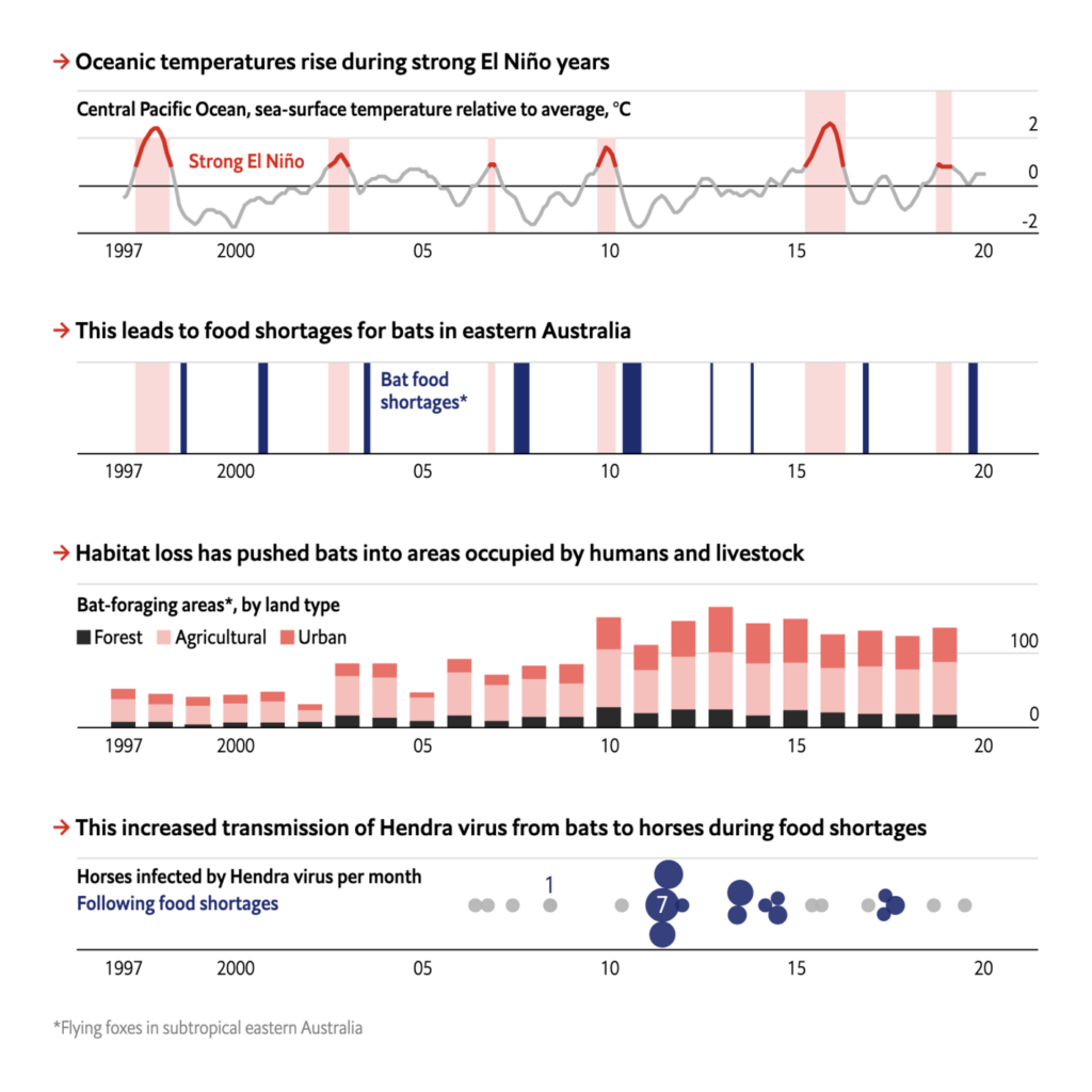
And, in turn, the effects of climate change increase the risk of new diseases.
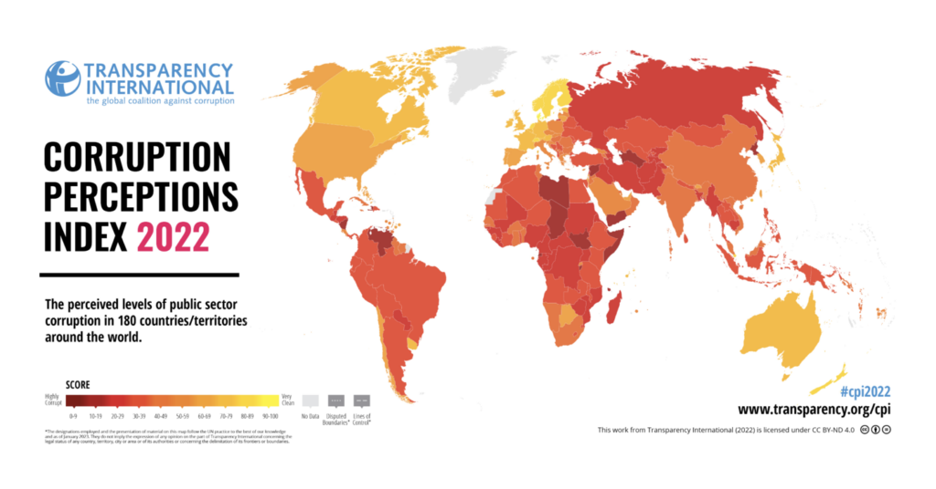
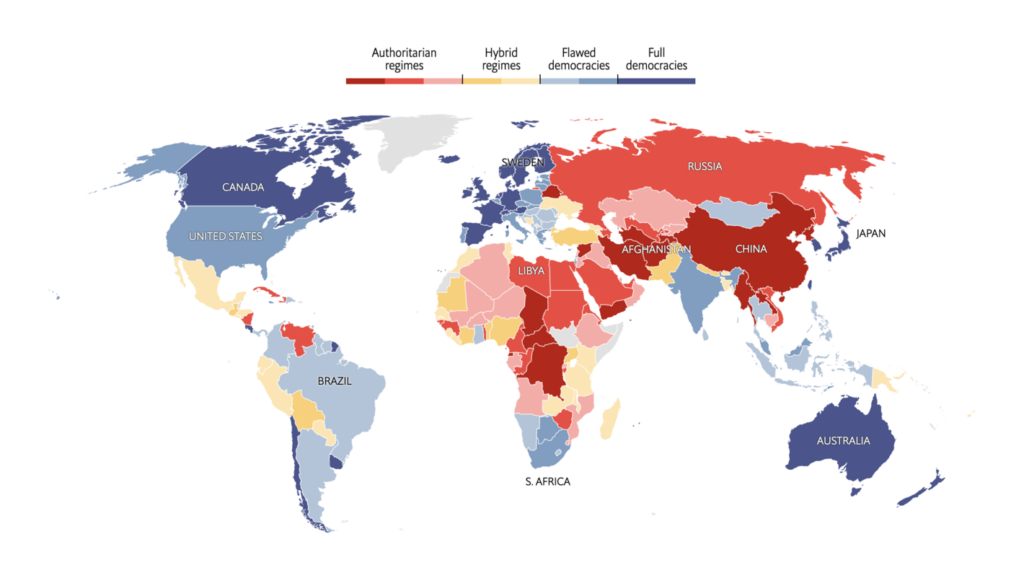
Last week, new updates of two indices shone a light on the state of public affairs around the world — the Corruption Perceptions Index 2022 and the Democracy Index 2022.
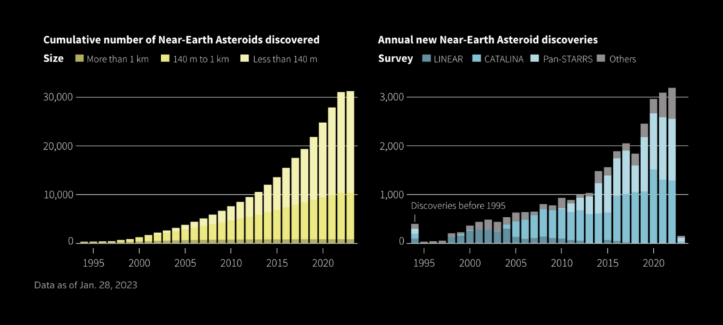
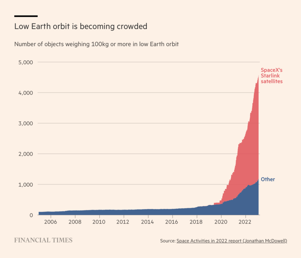
Outer space is looking busier the more we find out about it — and of course, the more objects we send there.
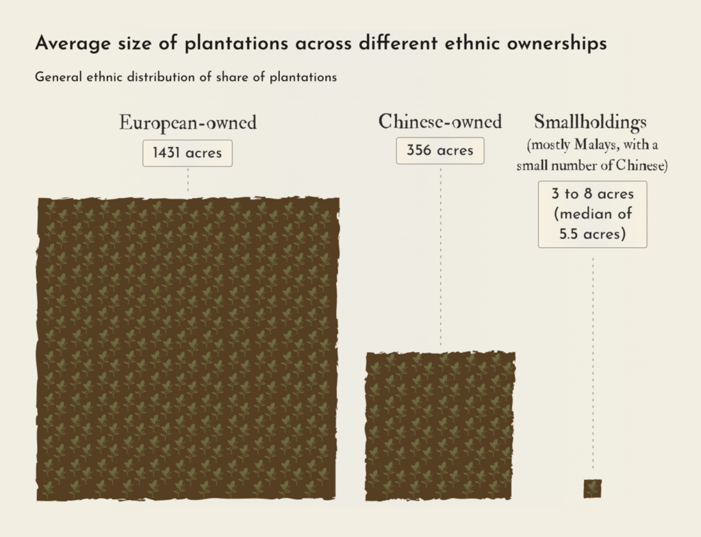
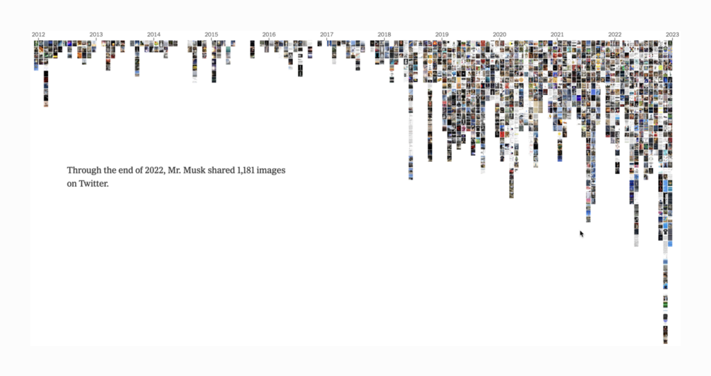
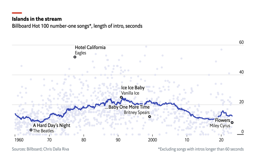
Other eternal stories that have captured the attention of data journalists lately: Pelé’s goals, colonial inequality, Elon Musk’s tweets, and what it takes to write a hit song.

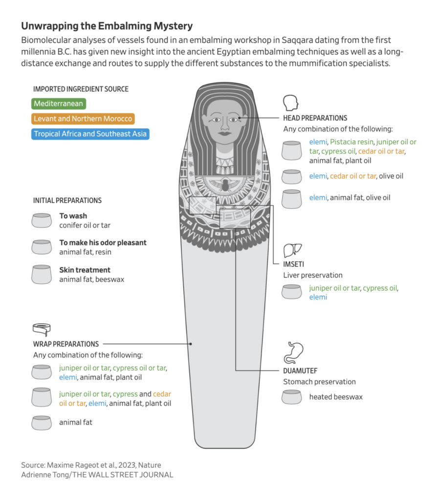
What else we found interesting

Applications are open for…
- US Data Journalist at Financial Times (New York)
Help us make this dispatch better! We’d love to hear which newsletters, blogs, or social media accounts we need to follow to learn about interesting projects, especially from less-covered parts of the world (Asia, South America, Africa). Write us at hello@datawrapper.de or leave a comment below.
Want the Dispatch in your inbox every Tuesday? Sign up for our Blog Update newsletter!


Comments