This article is brought to you by Datawrapper, a data visualization tool for creating charts, maps, and tables. Learn more.
Data Vis Dispatch,
February 8
The best of last week’s big and small data visualizations

Welcome back to the 32nd edition of Data Vis Dispatch! Every week, we’ll be publishing a collection of the best small and large data visualizations we find, especially from news organizations — to celebrate data journalism, data visualization, simple charts, elaborate maps, and their creators.
Recurring topics this week include the presidential election in France, poverty in the U.K., and the start of the Winter Olympics.
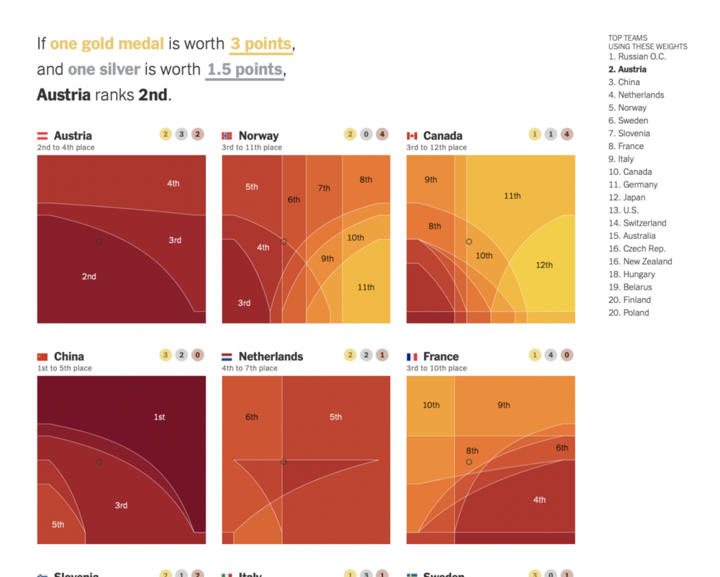
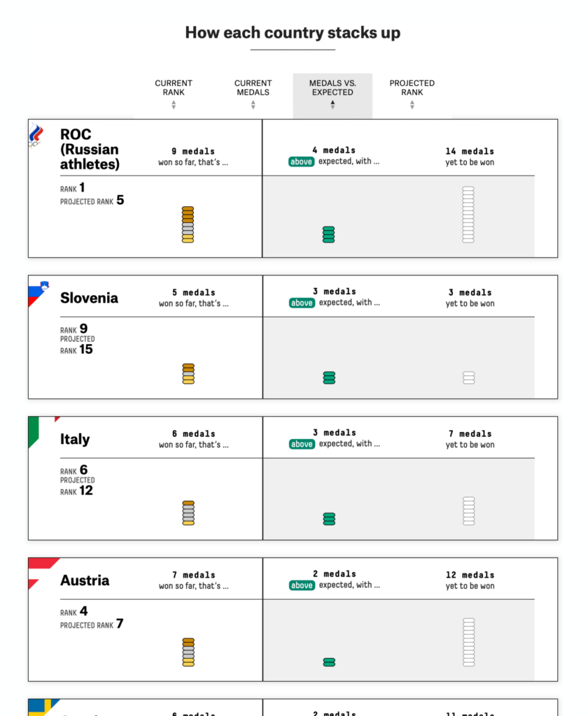
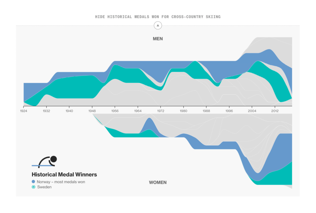
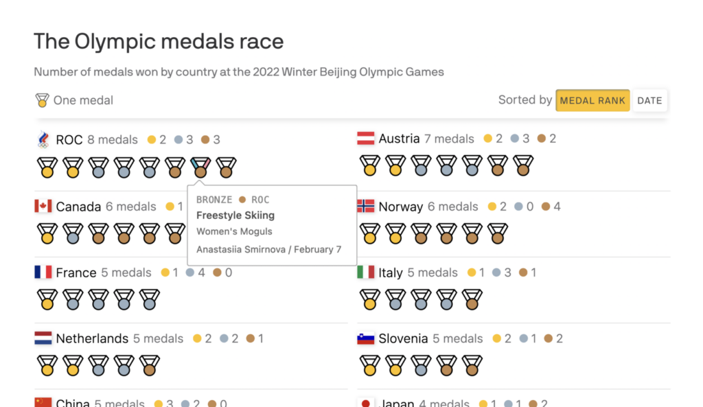
It’s the Olympics again? It’s the Olympics again!

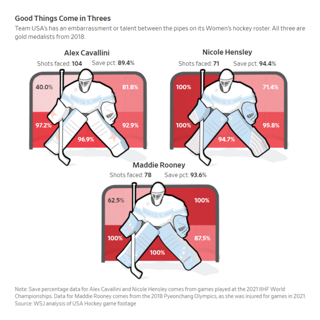
Of course, the biggest event in both seasons is medal count visualization:
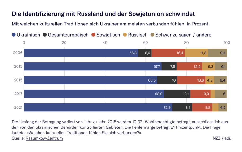
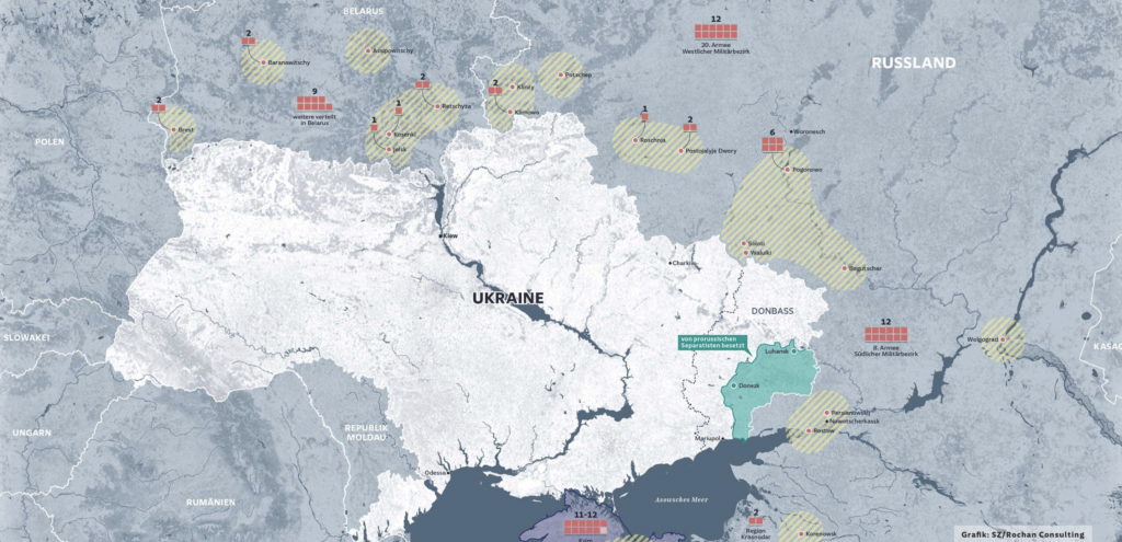
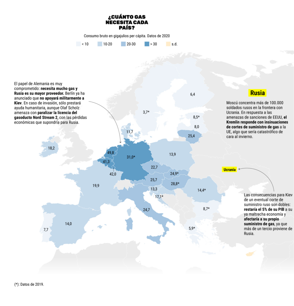
Meanwhile, the situation in Ukraine remains tense:

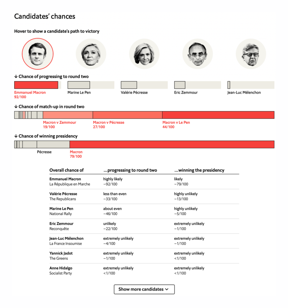
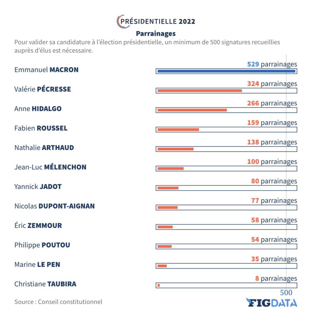
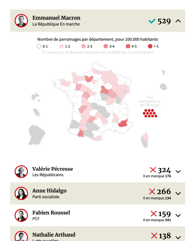
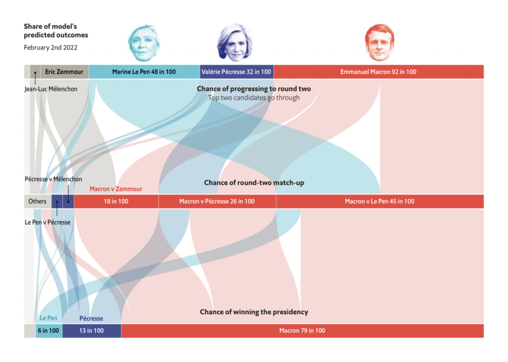
The upcoming French presidential election was this week’s major political topic. Candidates are racing to secure the 500 signatures needed to appear on the ballot:
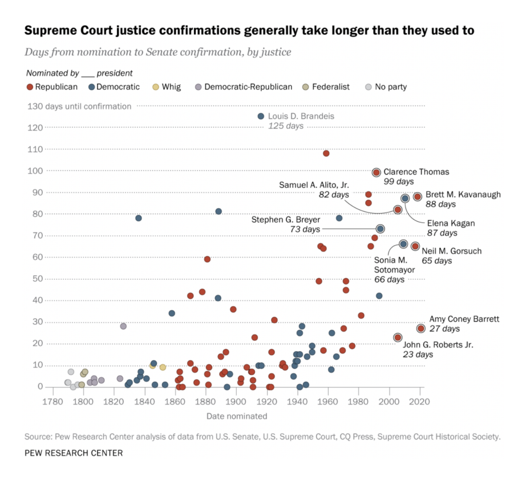
The U.S. needs to fill a seat on its Supreme Court, a process which seems to be breaking down:

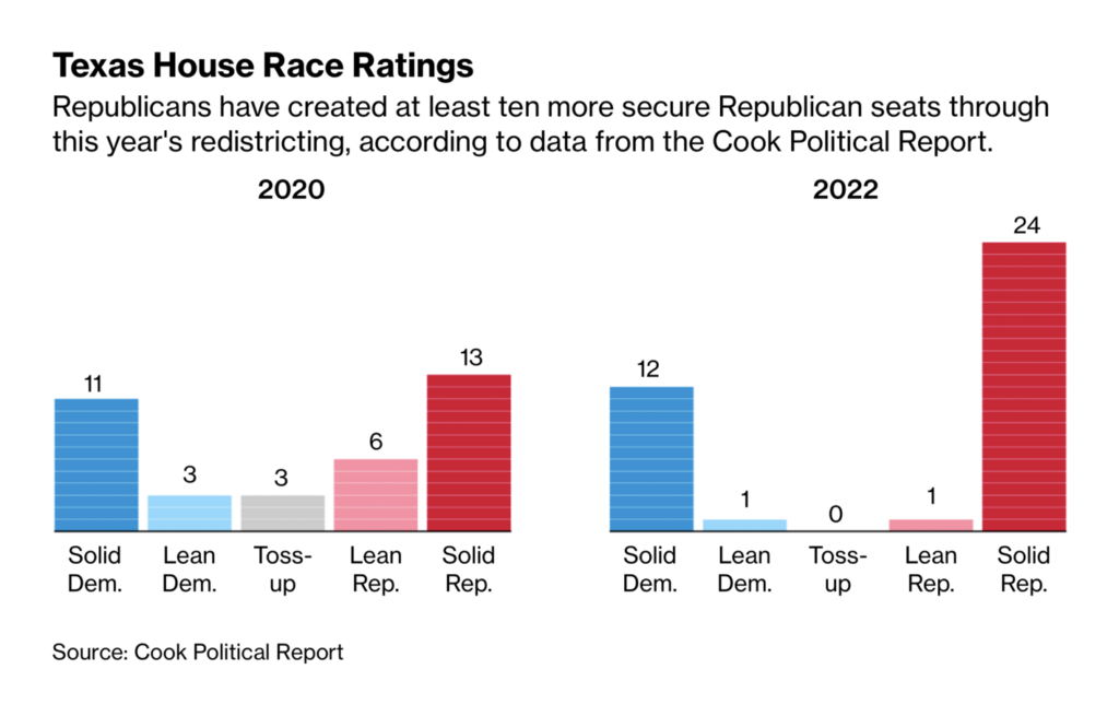
And congressional redistricting continues as well:
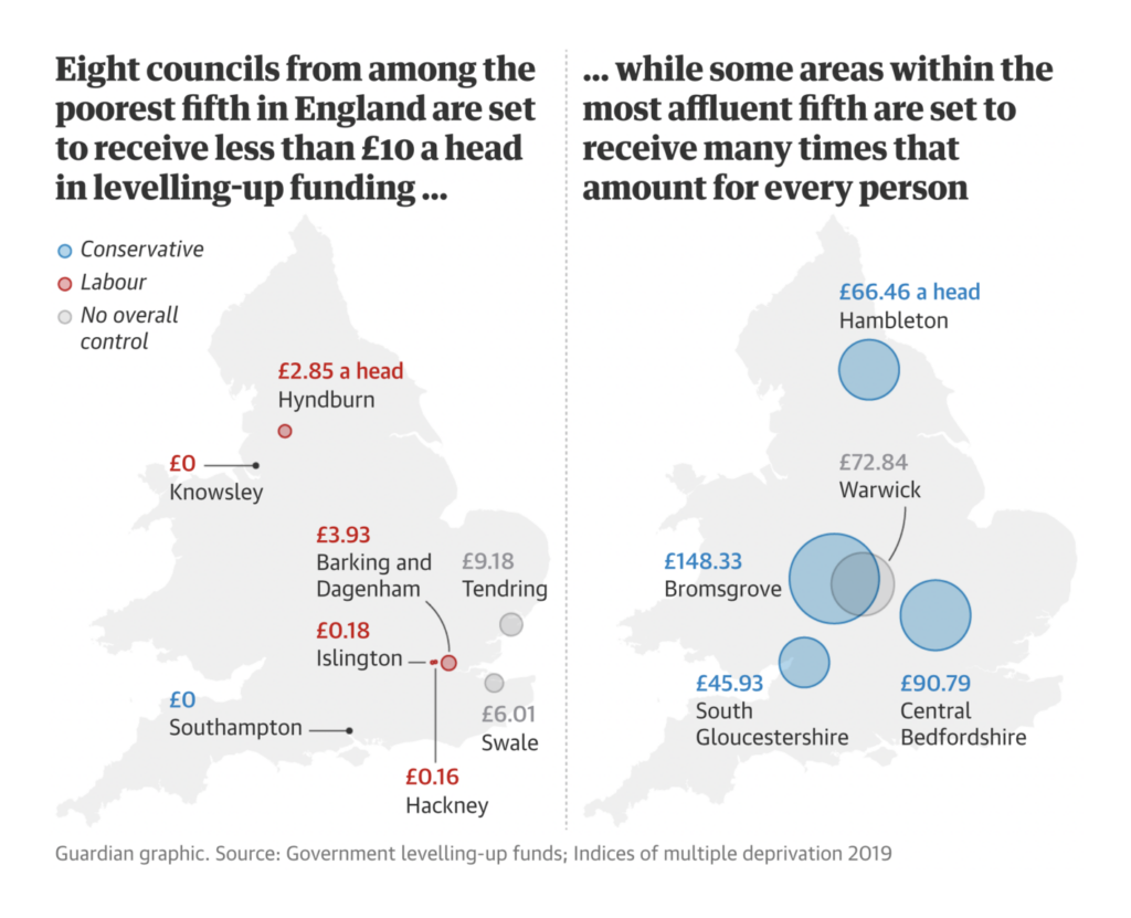
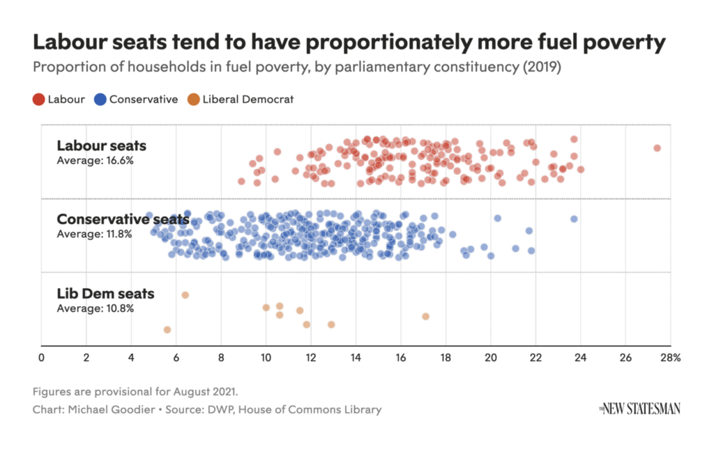
In economic charts, this week’s spotlight shone on poverty in England:
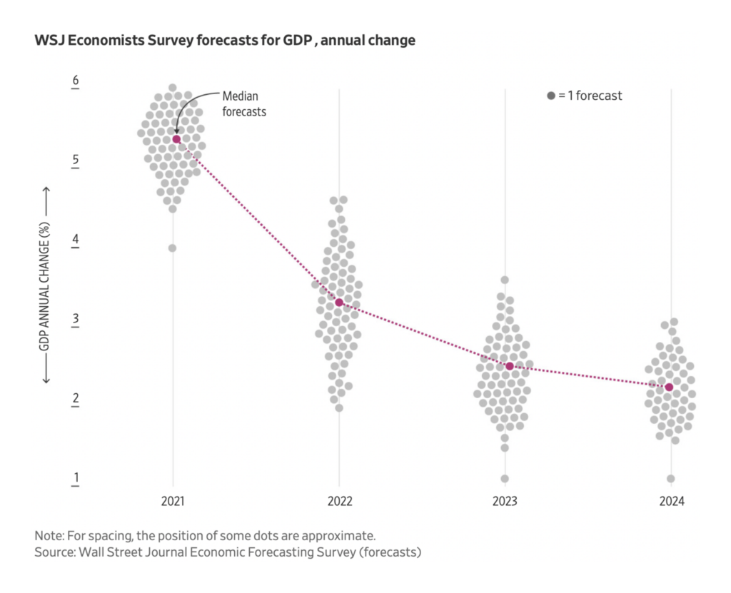
And economic forecasts in the U.S.:
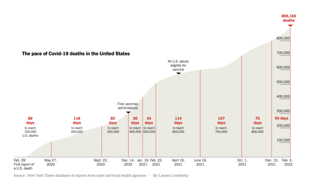
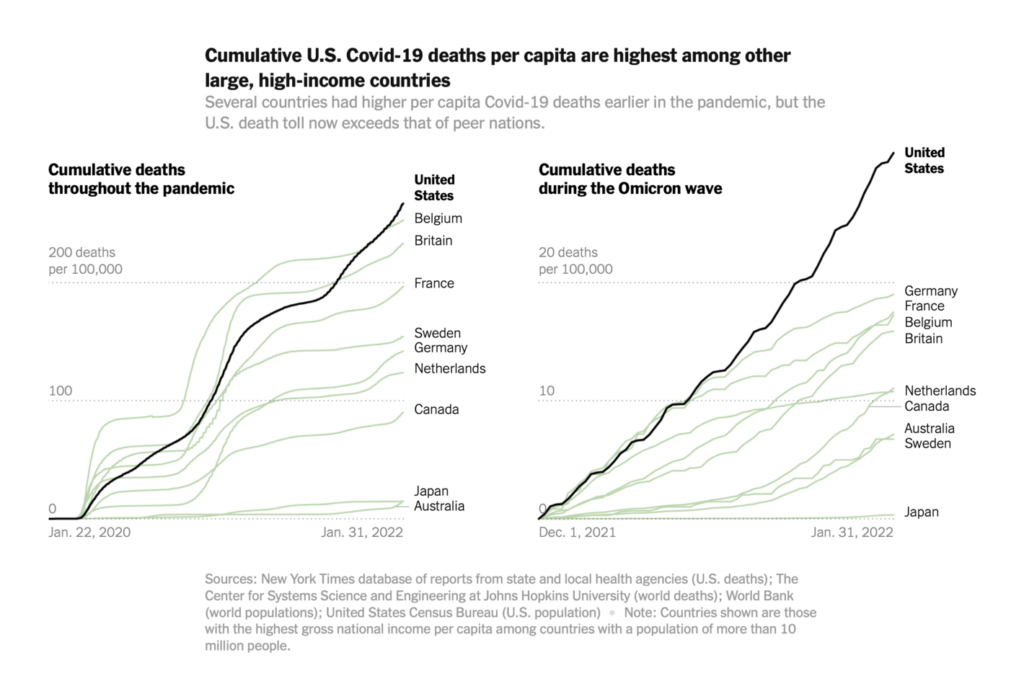
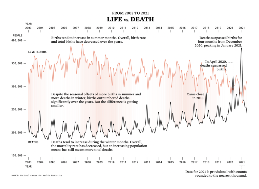
Behind it all is still the pandemic. The U.S. death toll is rising faster than any time since last winter:
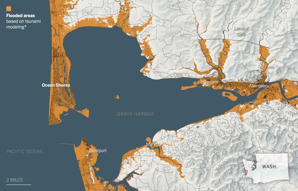
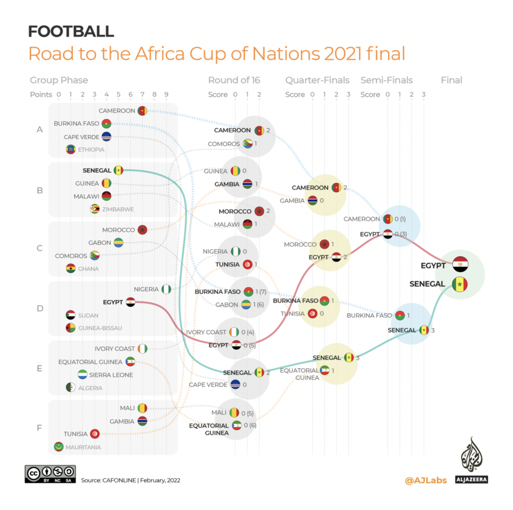
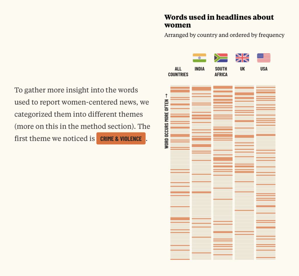
Finally, other charts and maps covered everything from tsunamis to the Africa Cup to headlines about women:

What else we found interesting
Applications open for…
- a data and digital graphics developer at the Times of London,
- a graphics editor at Bloomberg Businessweek,
- an accessibility visuals editor at the New York Times,
- a data journalist at the Marshall Project,
- two graphics editors at National Geographic,
- a visual and data journalism intern at the Financial Times,
- and a news engineering intern at the Washington Post.
Help us make this dispatch better! We’d love to hear which newsletters, blogs, or social media accounts we need to follow to learn about interesting projects, especially from less-covered parts of the world (Asia, South America, Africa). Write us at hello@datawrapper.de or leave a comment below.


Comments