This article is brought to you by Datawrapper, a data visualization tool for creating charts, maps, and tables. Learn more.
Data Vis Dispatch,
January 11
The best of last week’s big and small data visualizations

Welcome back to the 28th edition of Data Vis Dispatch! Every week, we’ll be publishing a collection of the best small and large data visualizations we find, especially from news organizations — to celebrate data journalism, data visualization, simple charts, elaborate maps, and their creators.
Recurring topics this week include real estate, international conflict, and both kinds of football.
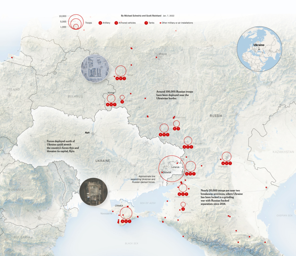
Two maps of international conflict stood out this week, especially this New York Times view of Russian deployments near the Ukrainian border:
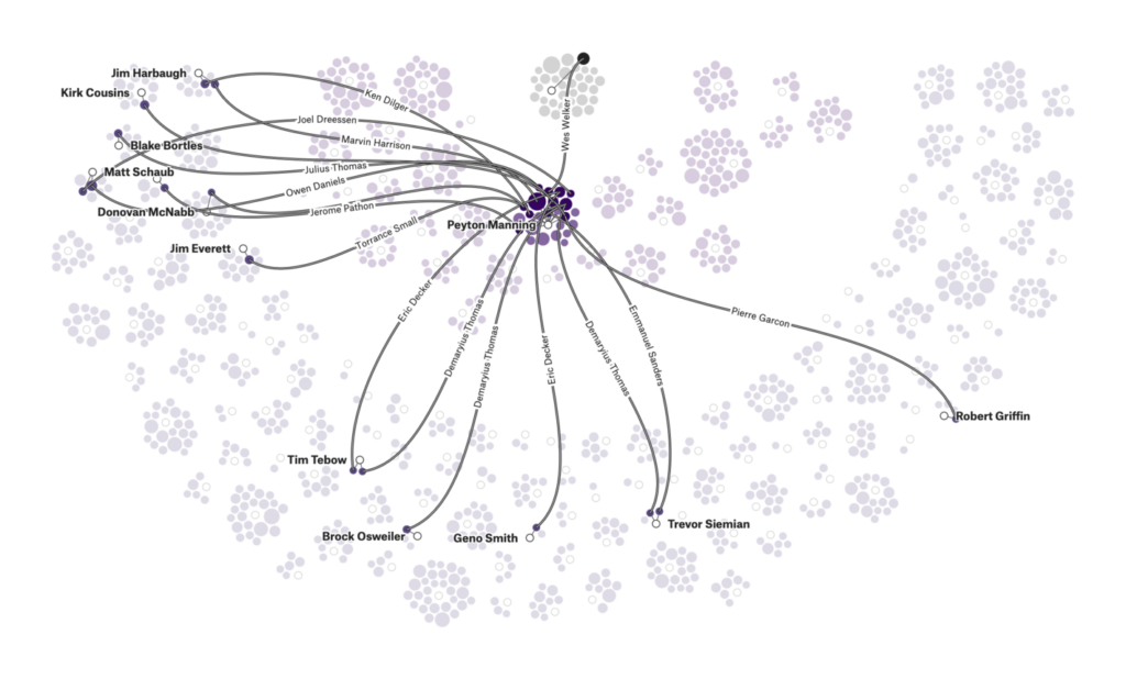
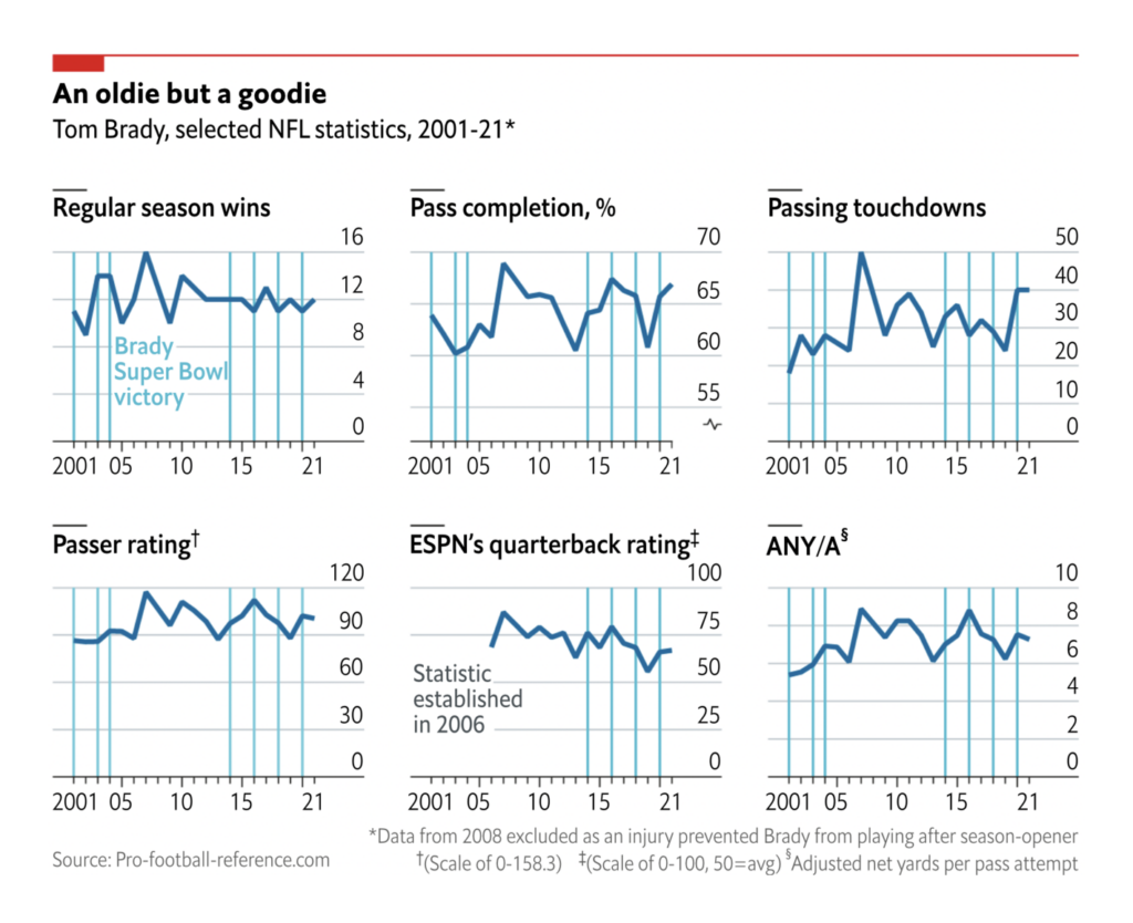
The NFL playoffs inspired several charts, including this map of quarterback networks from FiveThirtyEight:
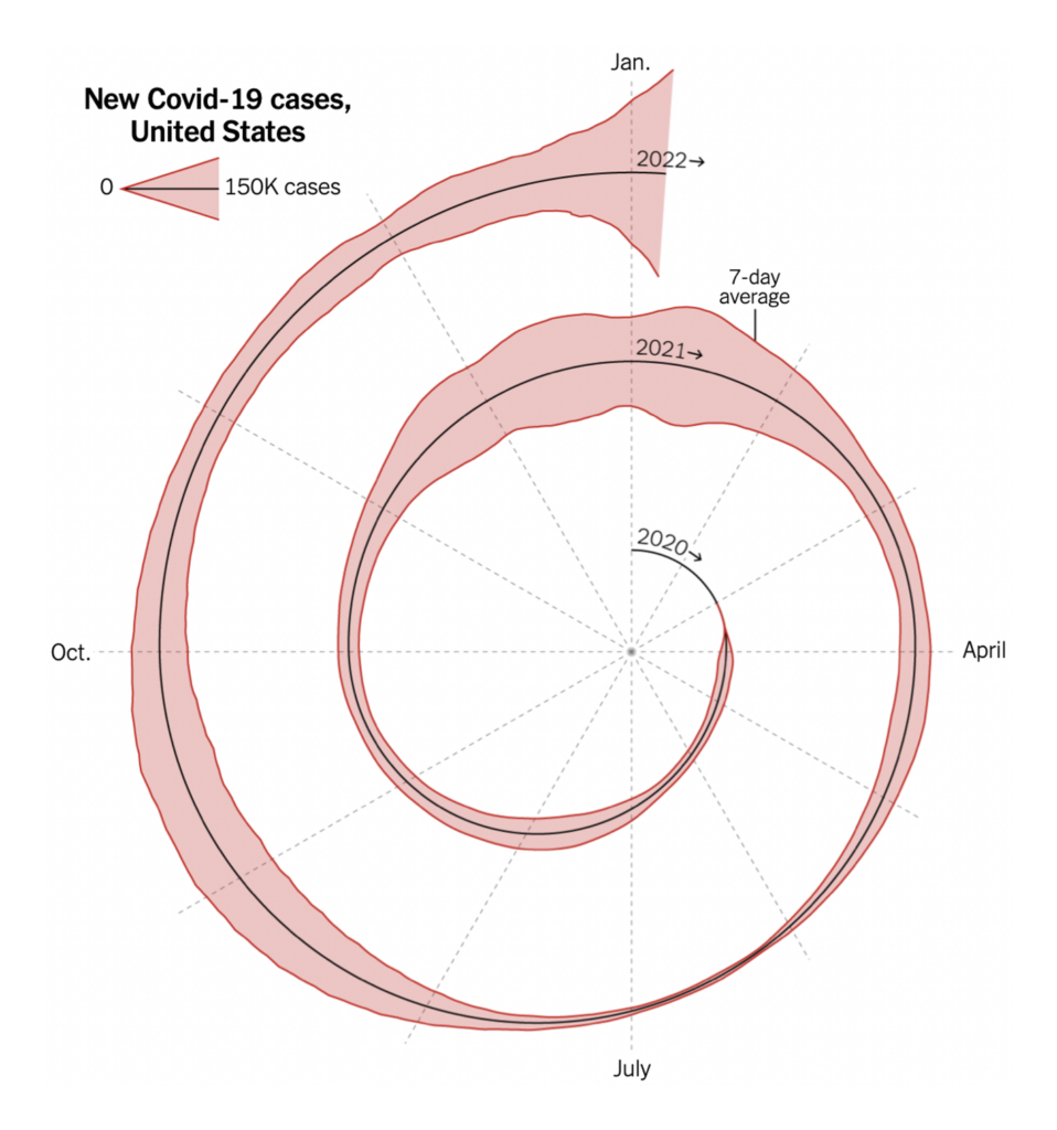
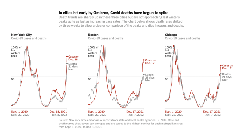
This chart of spiraling COVID cases caused some controversy on Twitter — but there’s no debating the fact that a new wave is here:
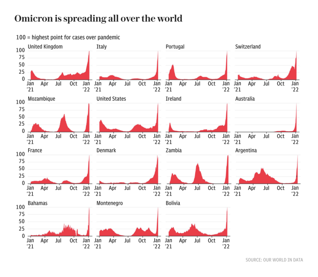
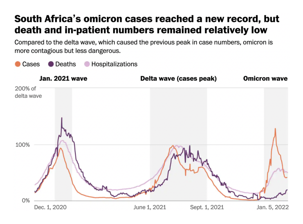
Omicron spreads more rapidly than previous variants, but seems in many places to cause less severe disease:


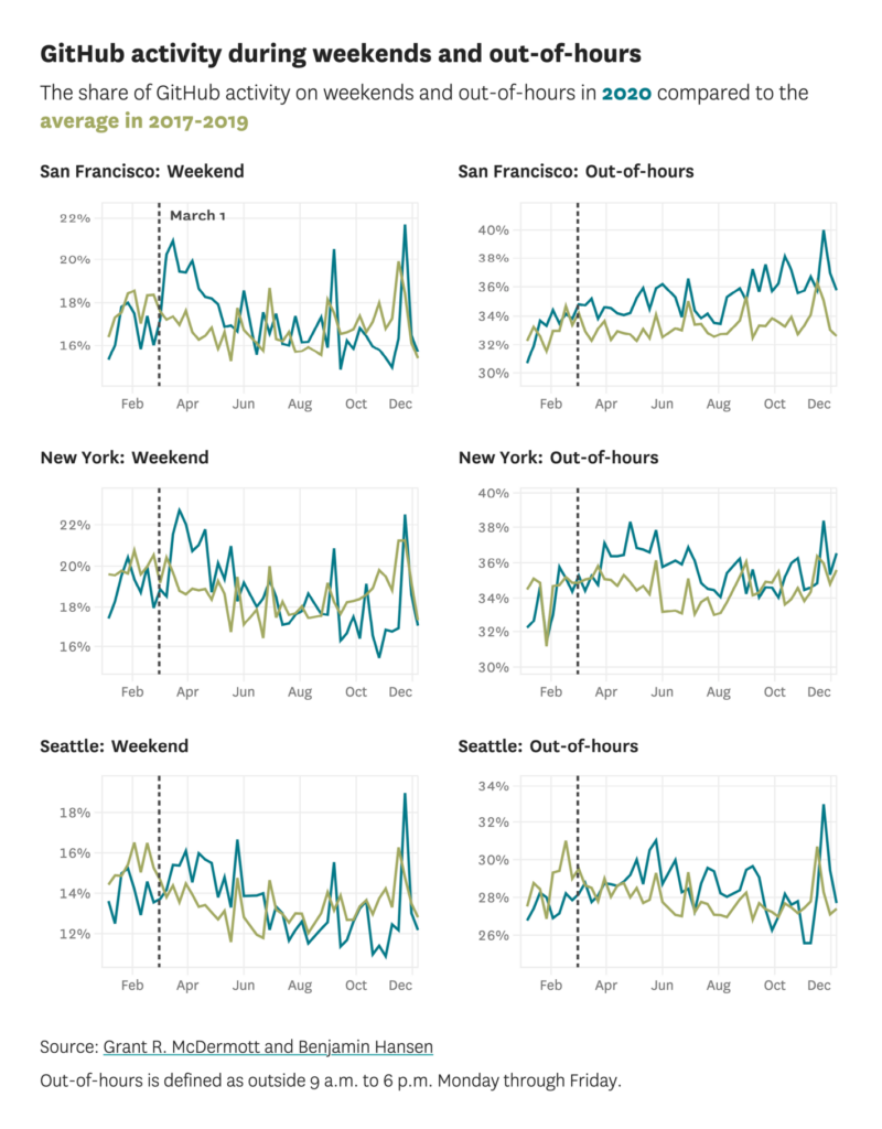
Throughout the pandemic, we’ve seen COVID’s effect on unexpected parts of life. These two charts found changes in Github usage and elite soccer:
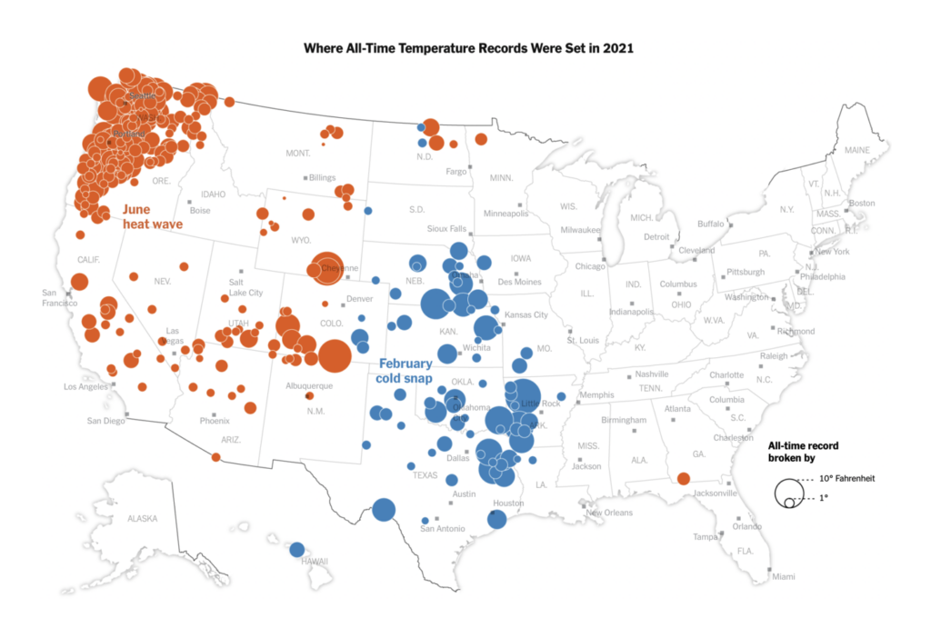
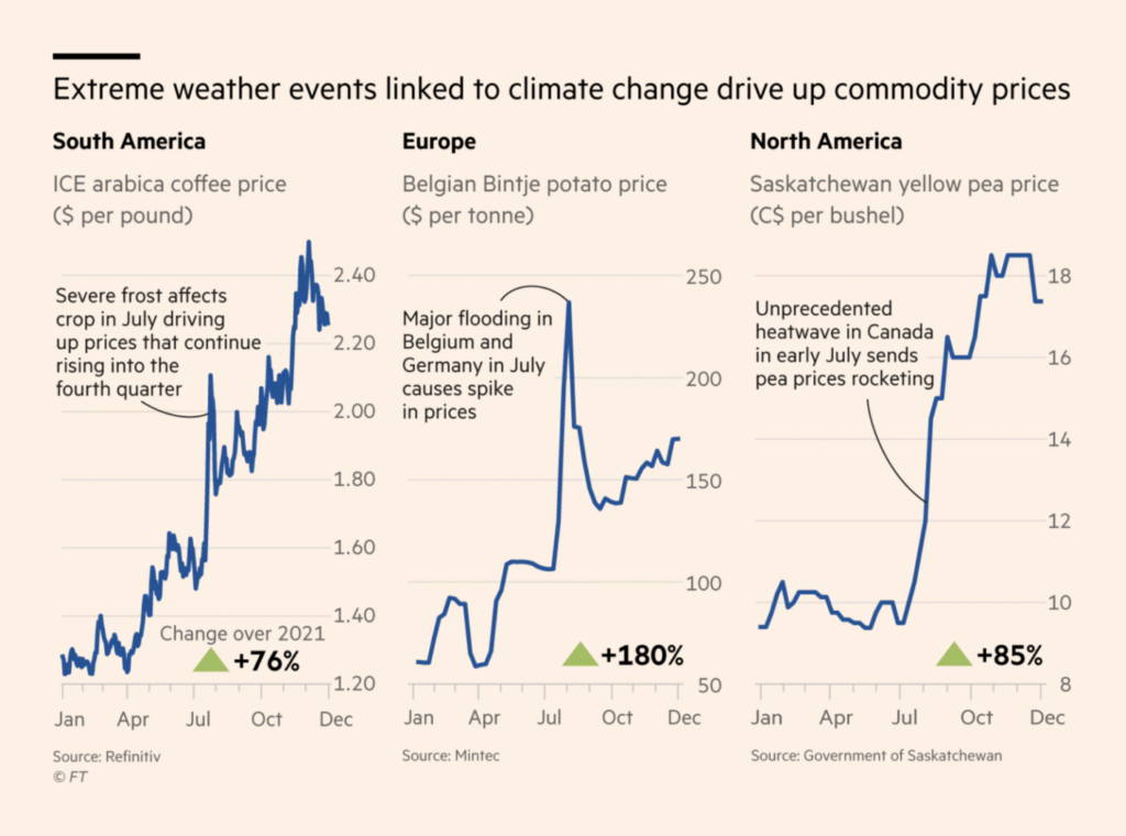
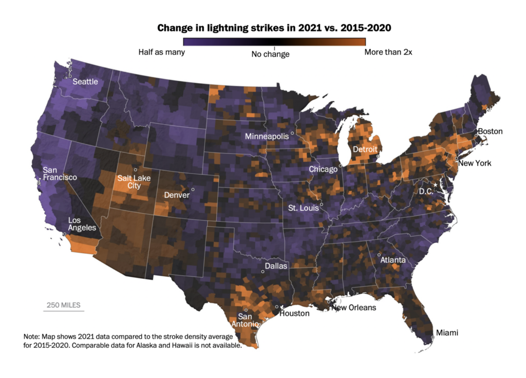
This week’s round of New Year’s retrospectives emphasized the changing climate:
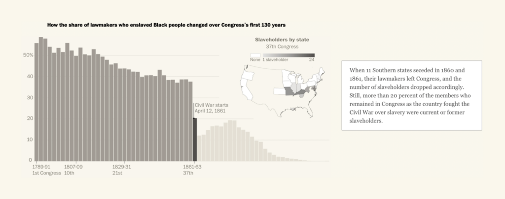
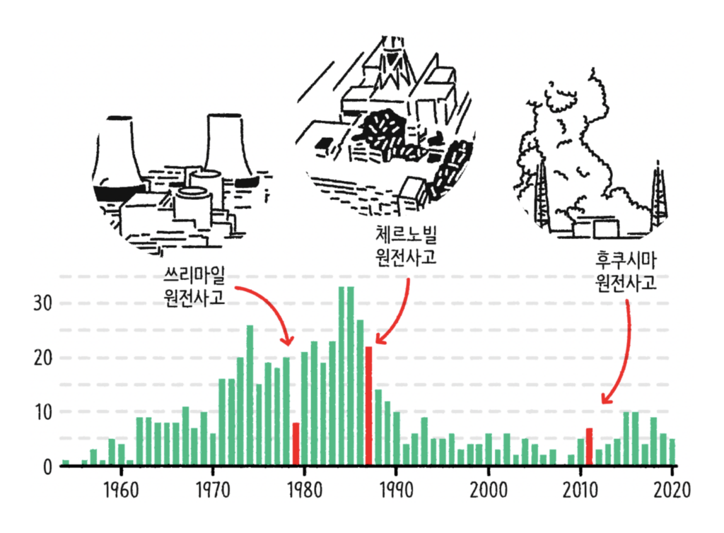
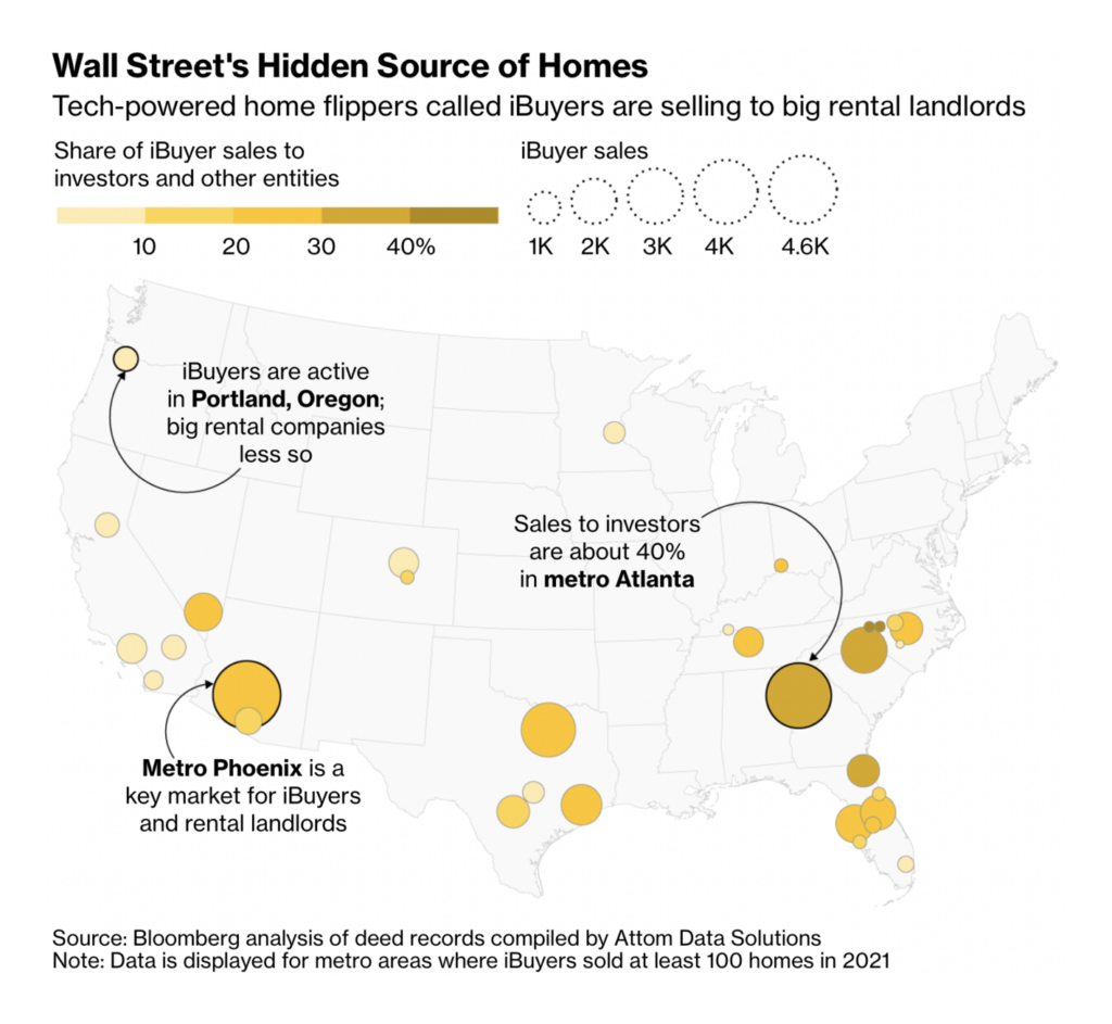
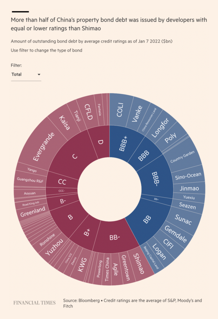
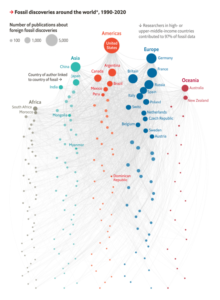
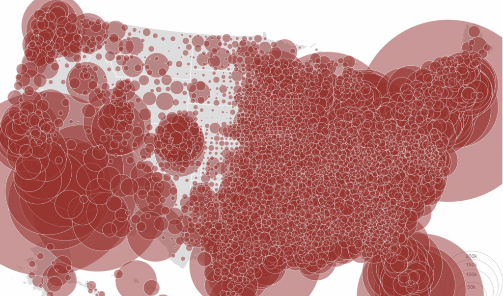
Finally, other visualizations included historical bar charts on slavery and nuclear power; a look at real estate in the U.S. and China; and a network of fossils and fossil-hunters:
What else we found interesting


- Applications are open for: summer interactive news internships at the New York Times, fellowships at the Los Angeles Times, and a news developer at the Star Tribune.
Help us make this dispatch better! We’d love to hear which newsletters, blogs, or social media accounts we need to follow to learn about interesting projects, especially from less-covered parts of the world (Asia, South America, Africa). Write us at hello@datawrapper.de or leave a comment below.


Comments