We want to enable everyone to create beautiful charts, maps, and tables. New to data visualization? Or do you have specific questions about us? You'll find all the answers here.
Data Vis Dispatch, January 14: Fire, congestion, and Greenland
The best of last week’s big and small data visualizations
Vivien Serve
Welcome back to the 176th edition of the Data Vis Dispatch! Every week, we publish a collection of the best small and large data visualizations we find, especially from news organizations — to celebrate data journalism, data visualization, simple charts, elaborate maps, and their creators.
Newsrooms and other creators of data visualizations are back in full swing after the winter break. Recurring topics this week include fires in California, congestion, and Greenland.
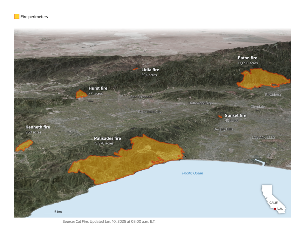
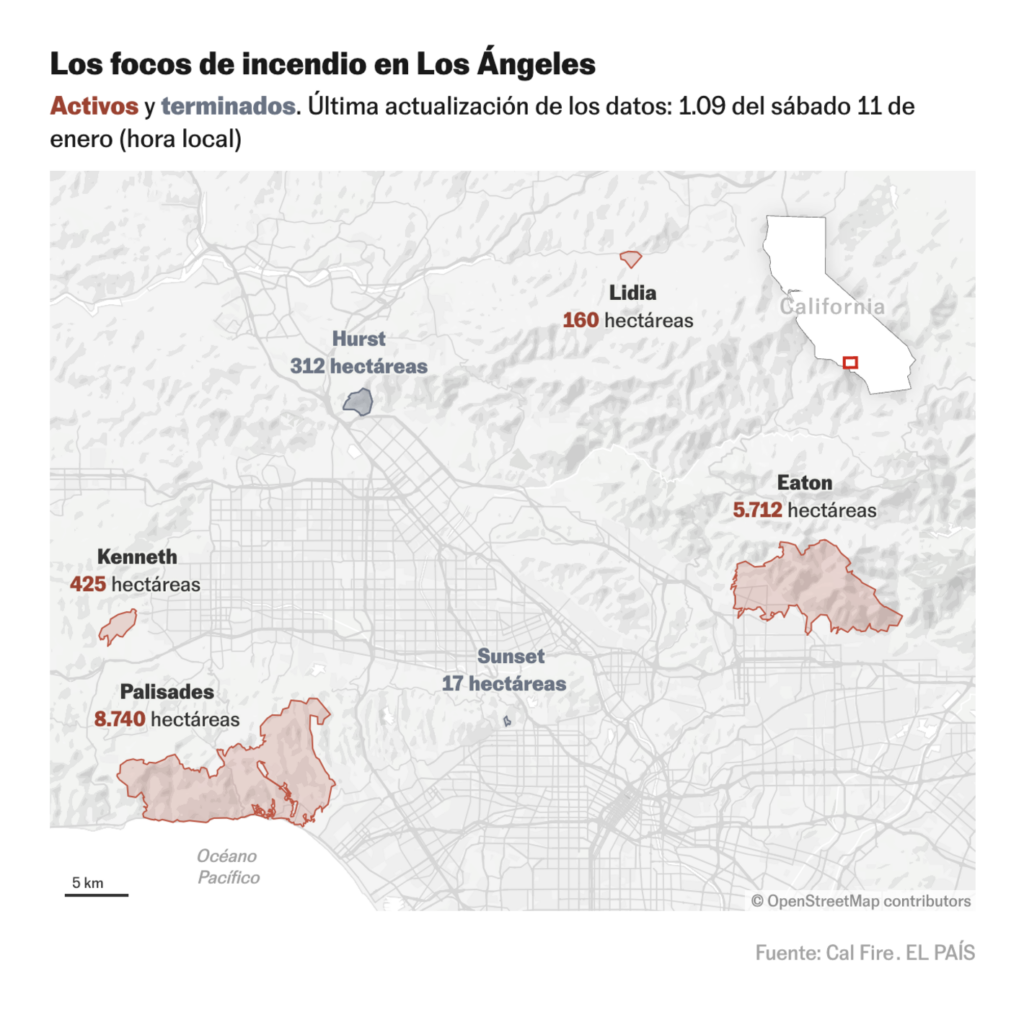
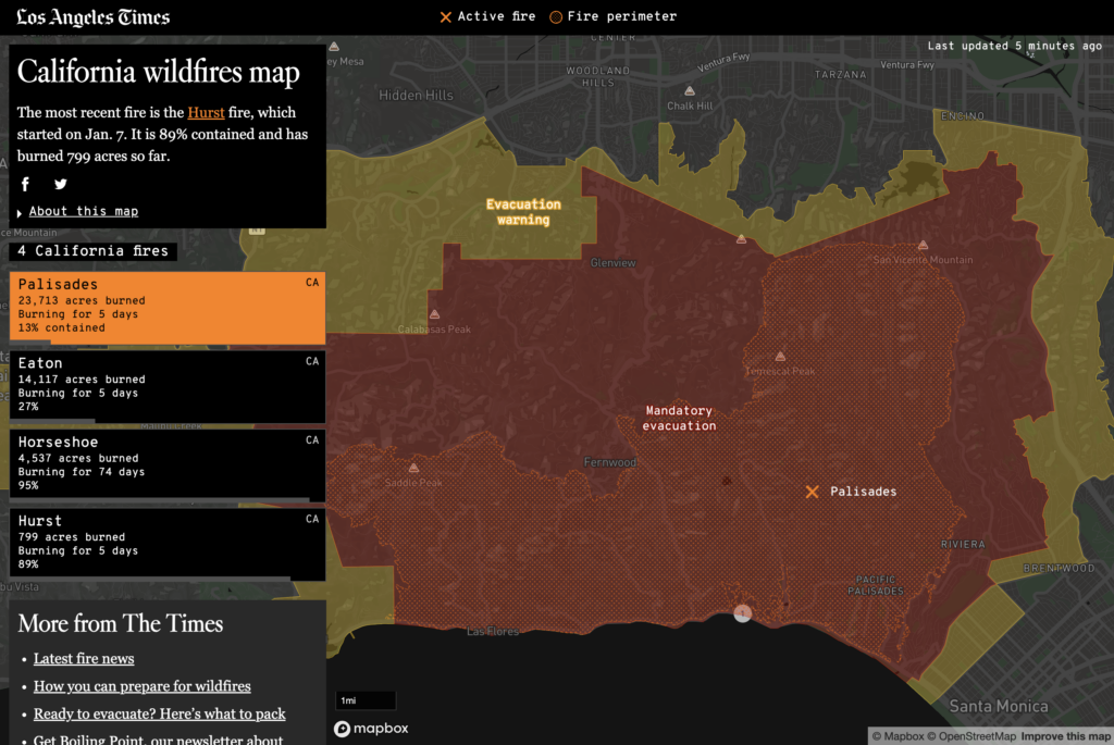
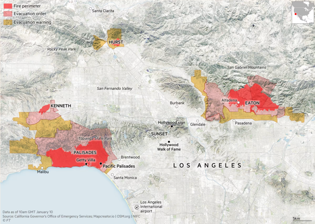
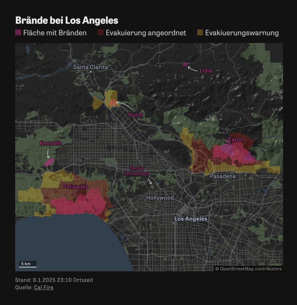
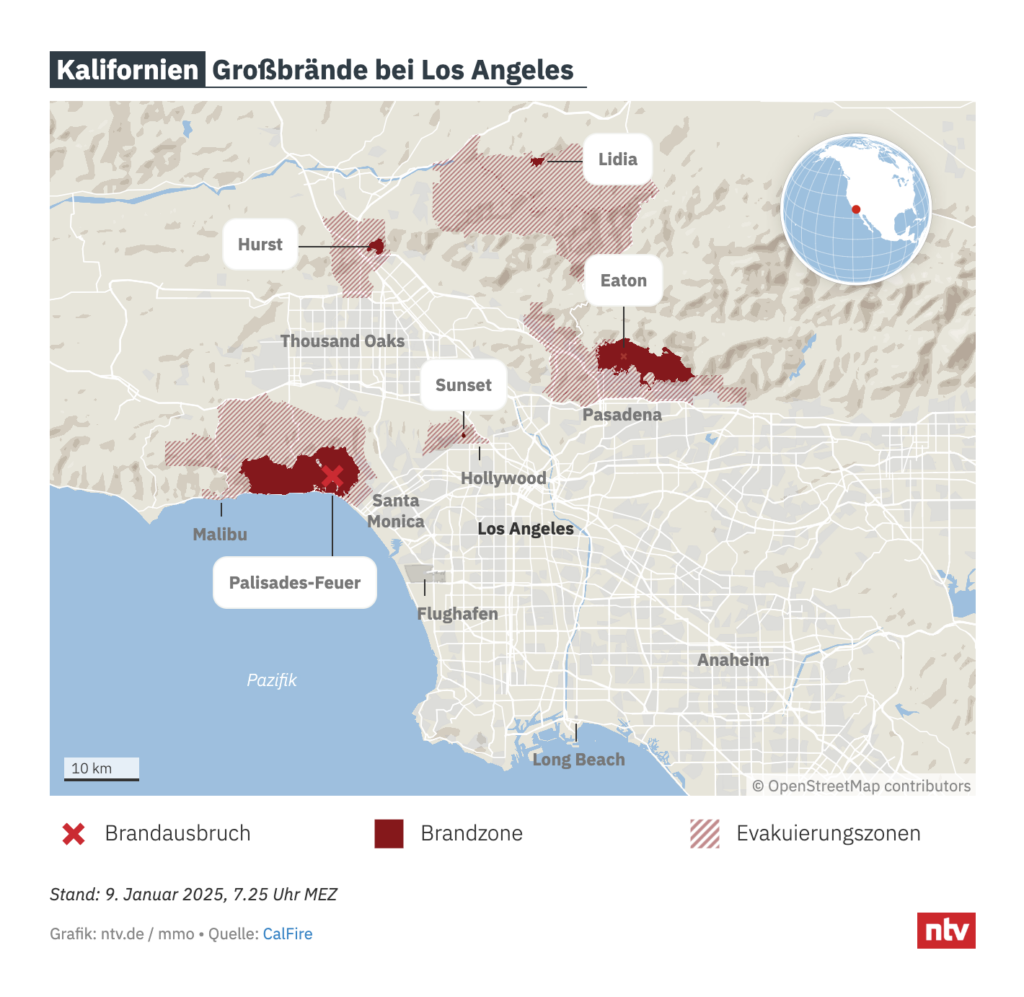
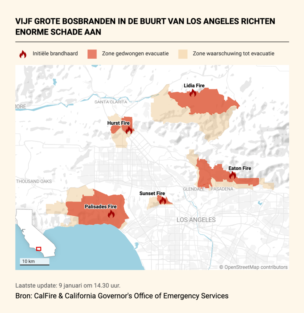
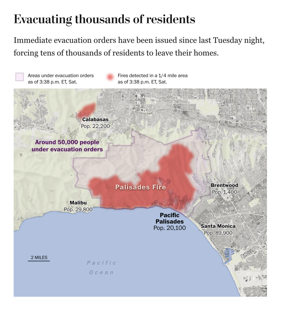
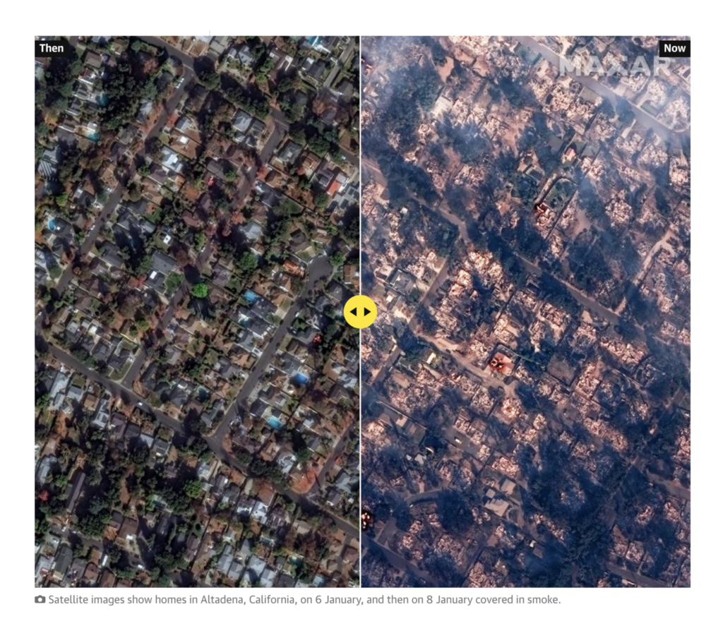
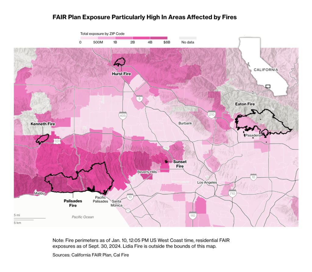
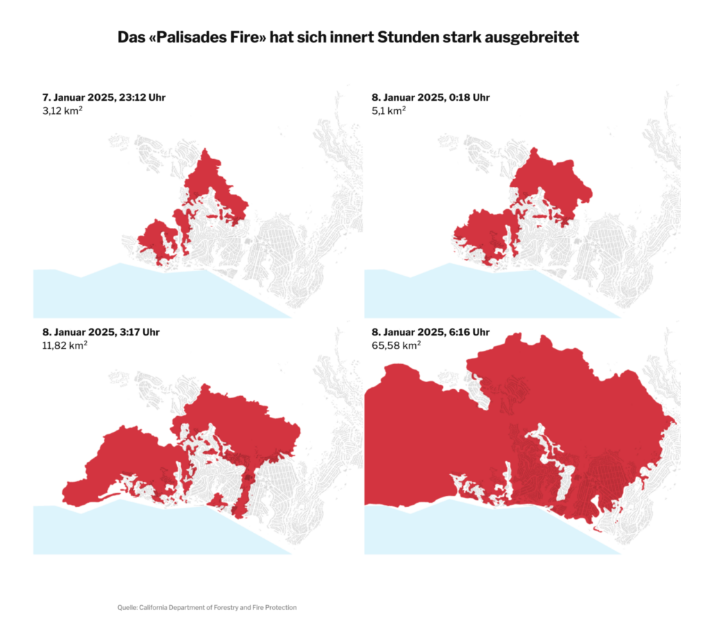
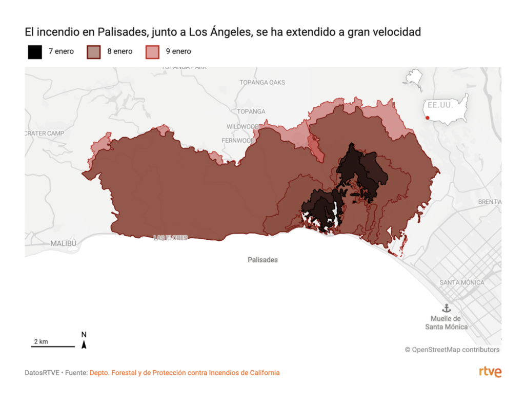
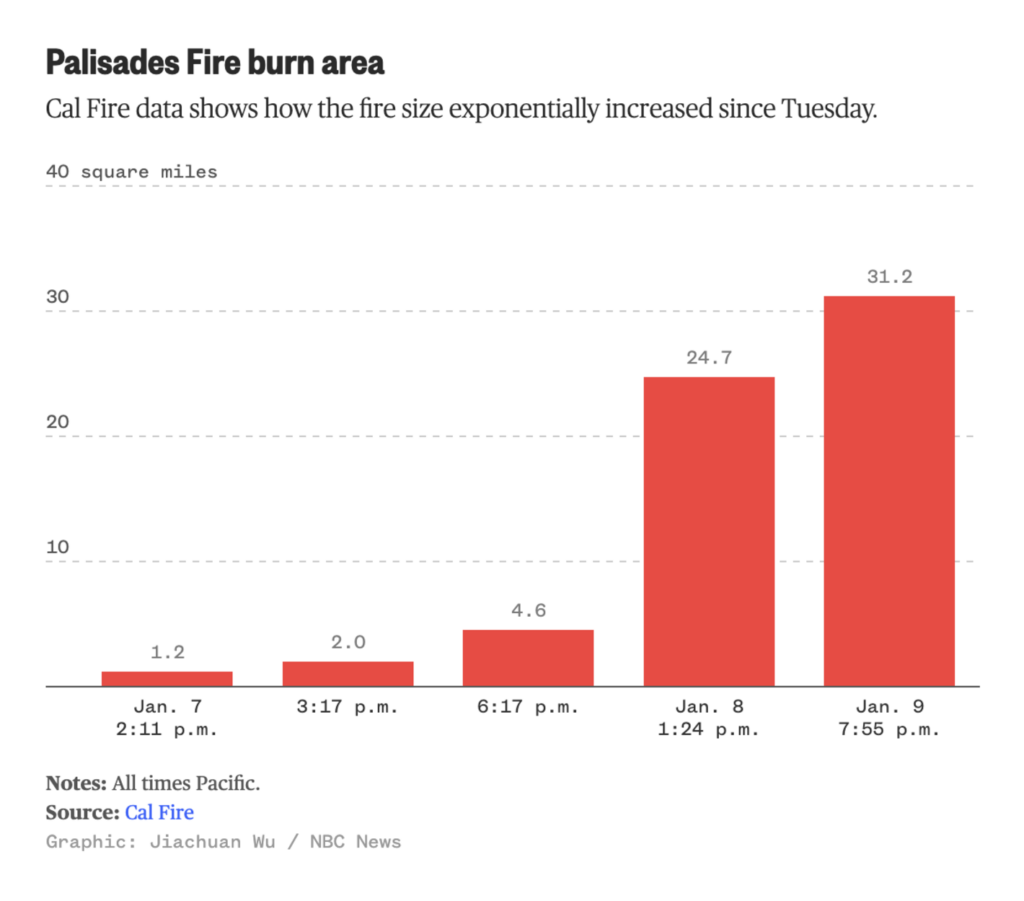
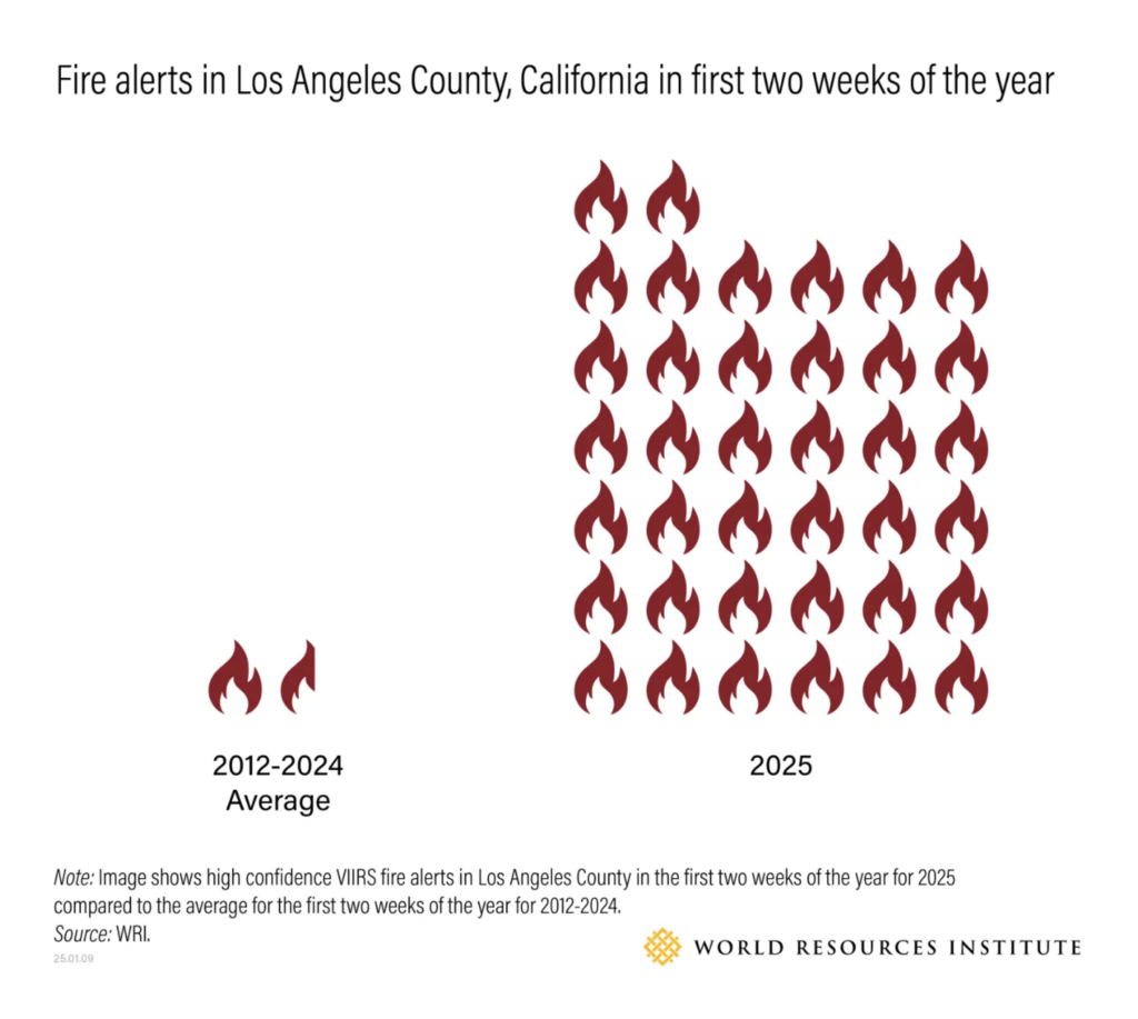
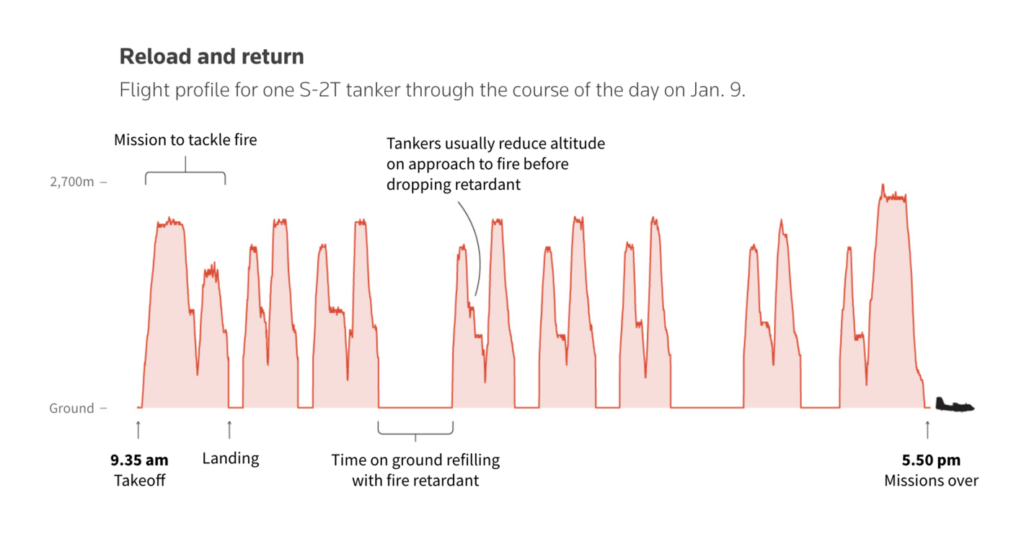
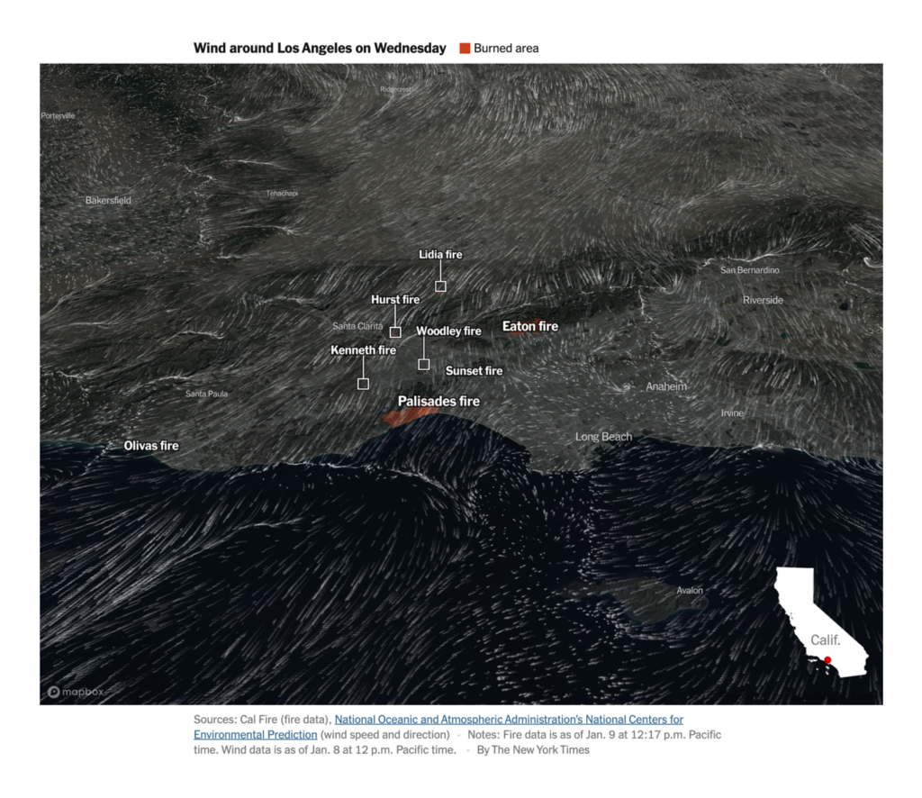
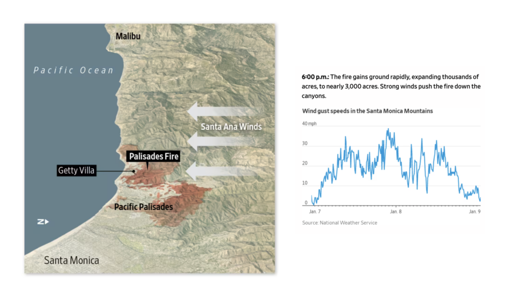
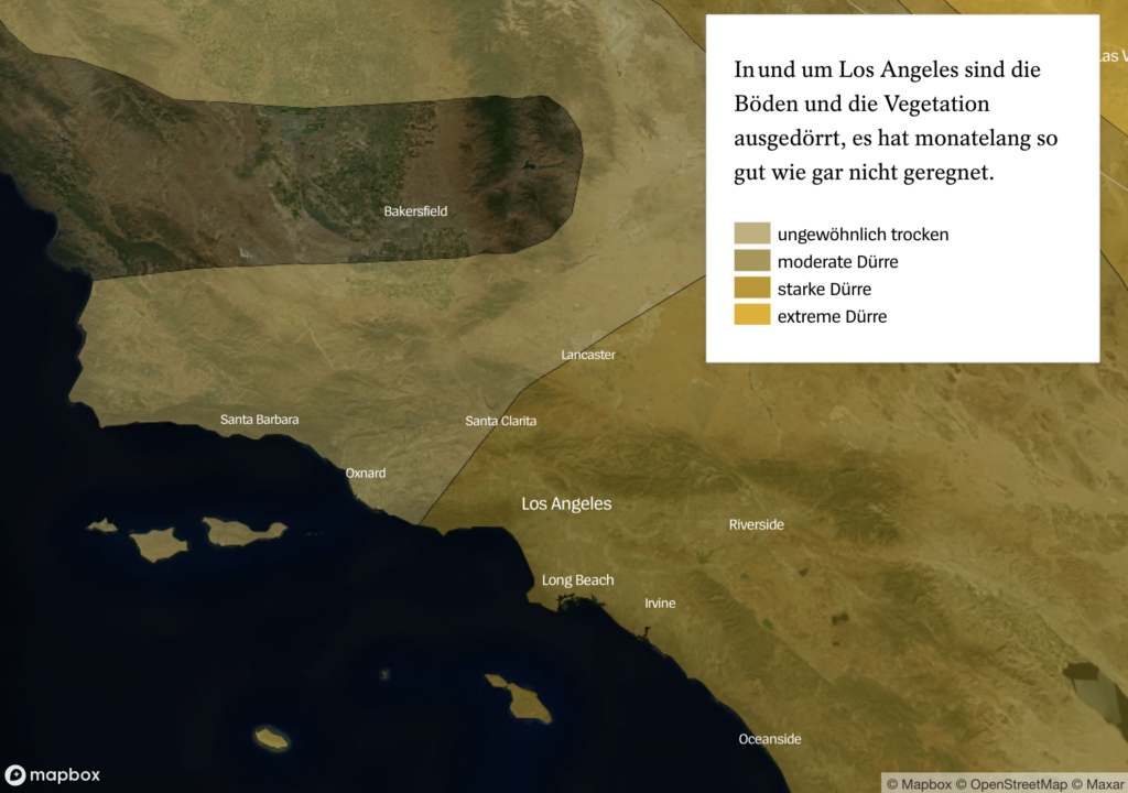
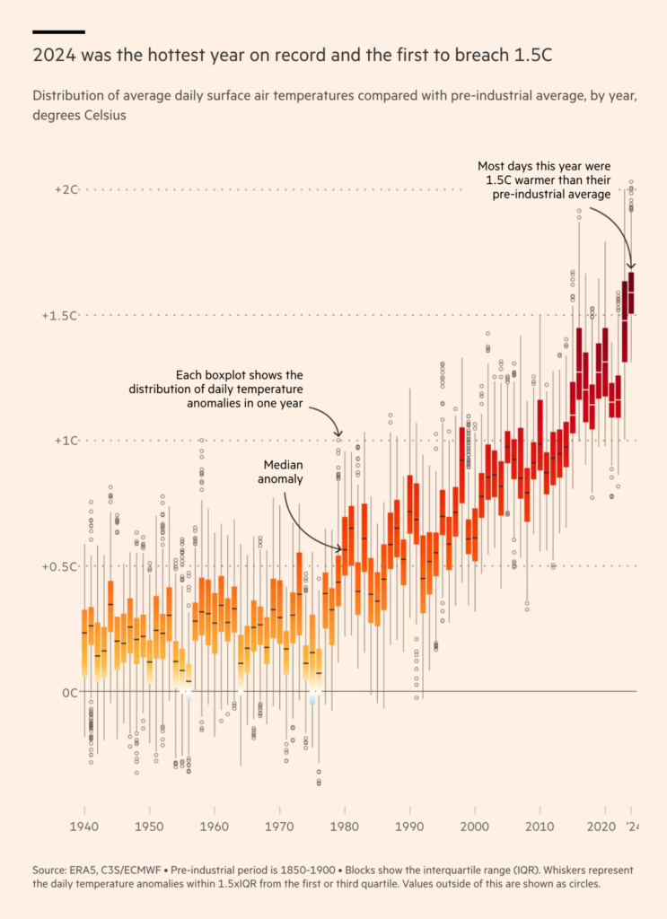
The hottest topic this week, was literally (and sadly) really hot. Multiple major fires burning in and around Los Angeles led the data vis community to produce tons of maps. Here are 3D maps of the burning areas:
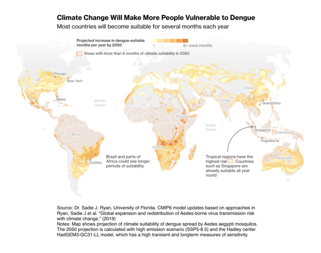
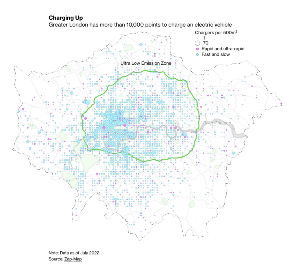
Aside from fires, other consequences of climate change include the faster spread of dengue fever (but don’t worry, we’re weaponizing mosquitoes) and London’s temperature actually getting colder:
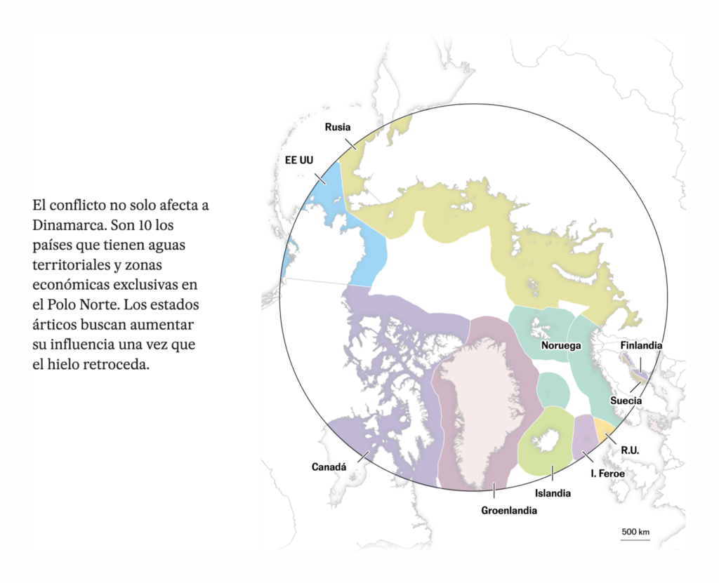
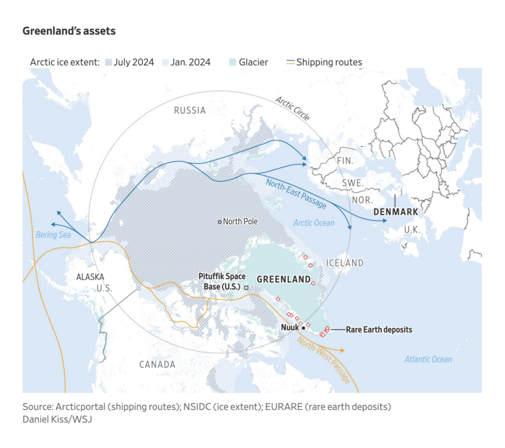
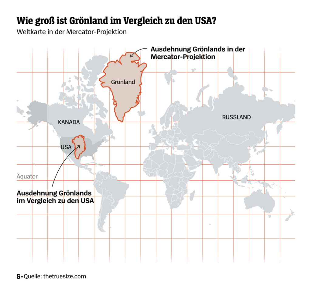
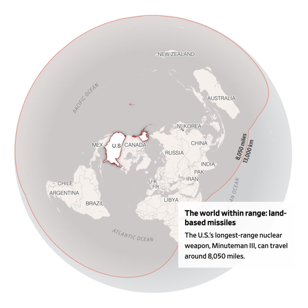
Another topic put on maps this week after Donald Trump declared he wants it: Greenland — a not-as-large-as-many-think Arctic island, with huge resource potential and an intriguing geographic location:
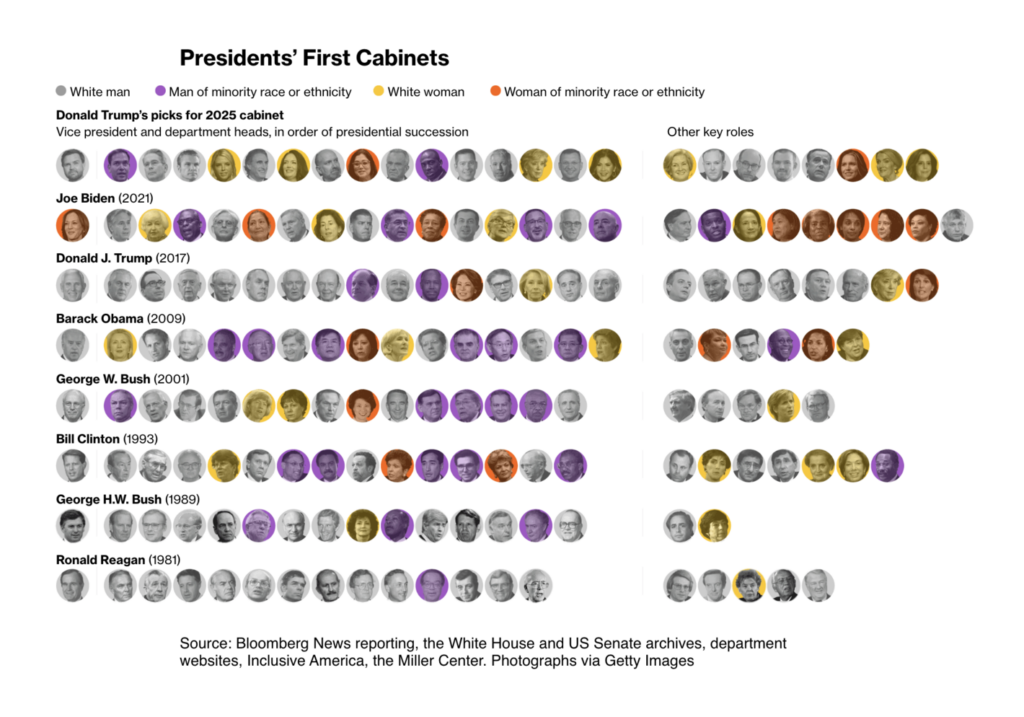
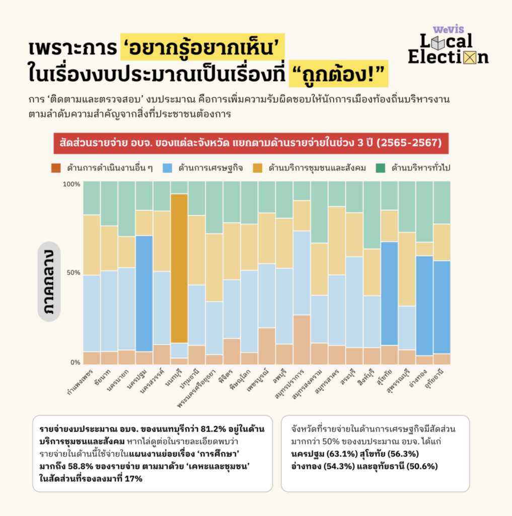
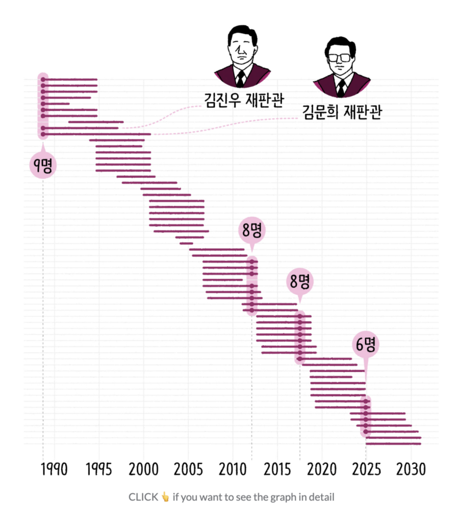
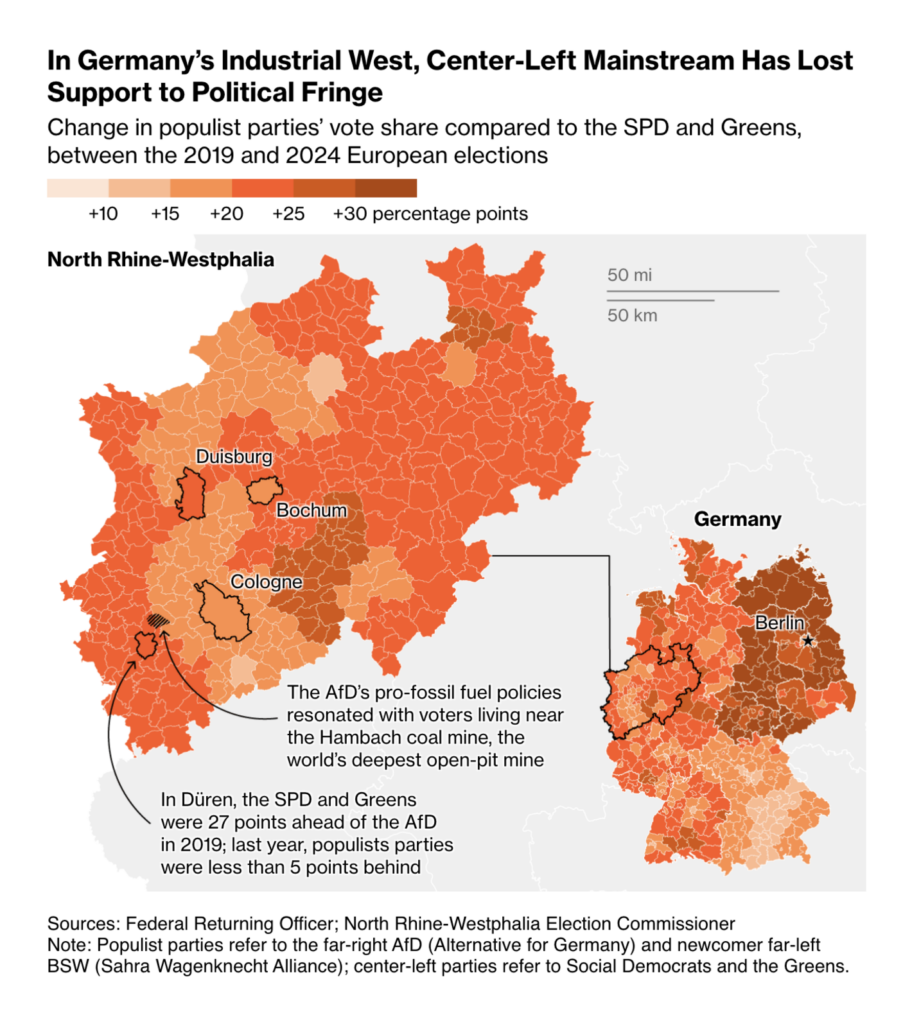
Speaking of Trump, let’s take a look at his more diverse cabinet. Other political visualizations include Thailand’s provincial budget distribution and South Korea’s constitutional court members:
Bloomberg: Trump’s Second-Term Cabinet Is More Diverse Than His First, January 10WeVis: แงะงบ อบจ. เมื่องบประมาณจังหวัดไม่ใช่เรื่องไกลตัว [Chart title: Provincial administrative organization expenditure share by expenditure category in each province over 3 years (2022-2024)], January 10SBS News: 무거워진 헌법재판소의 어깨, 올해가 피크일까? [Chart description: A graph of the terms of the 61 justices appointed to the Constitutional Court of Korea so far. Each line represents the term of office of one justice], January 9
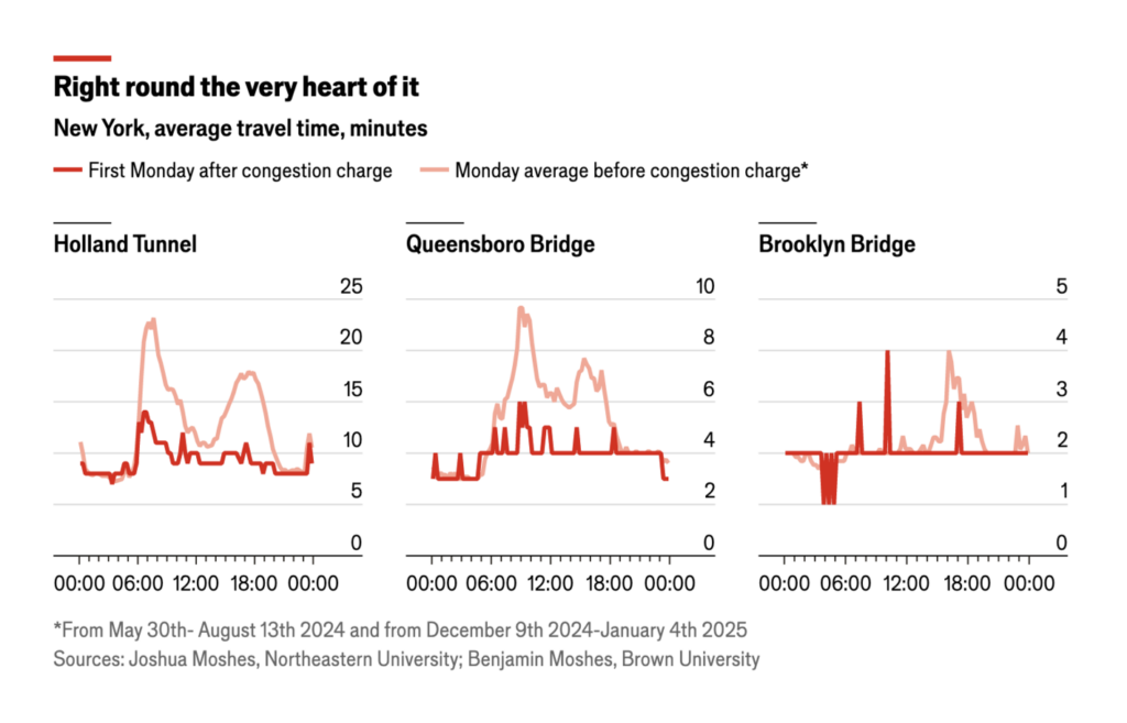
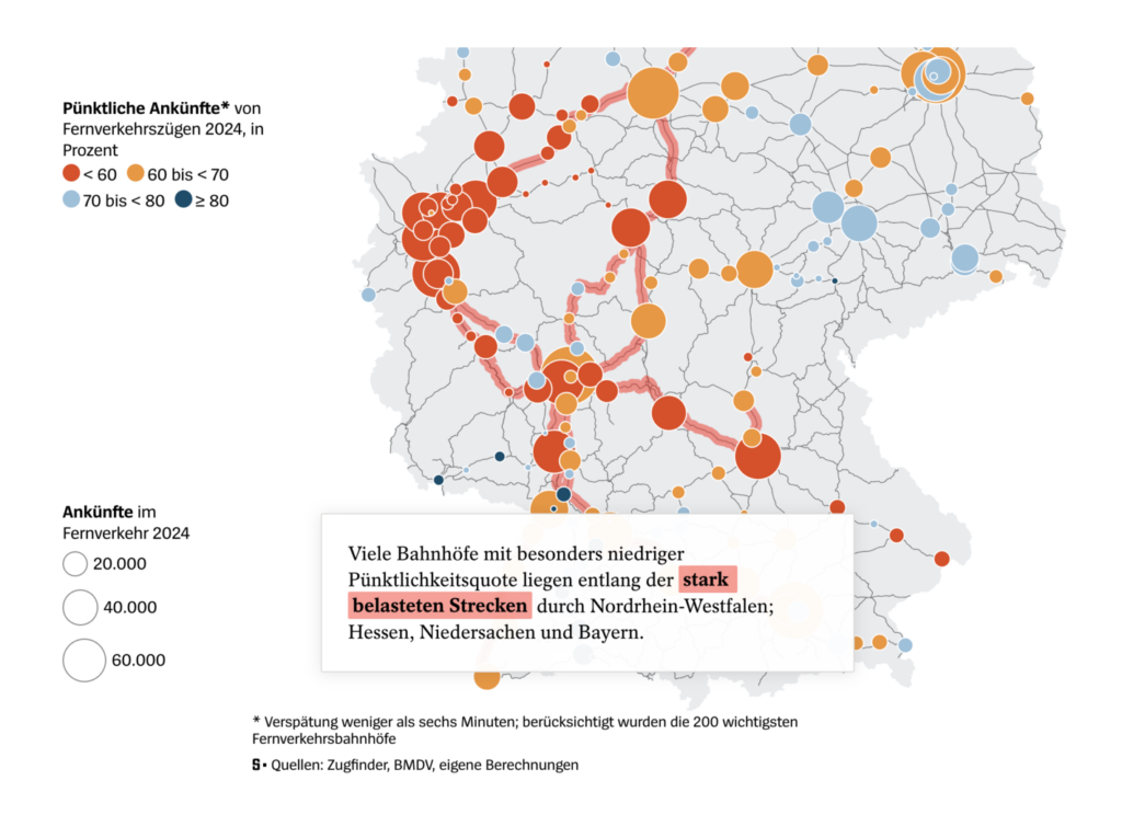
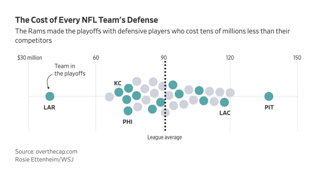
And another map topic: transportation. From congestion in New York (our colleague Rose actually wrote an interesting article about this) to rail networks in Germany:
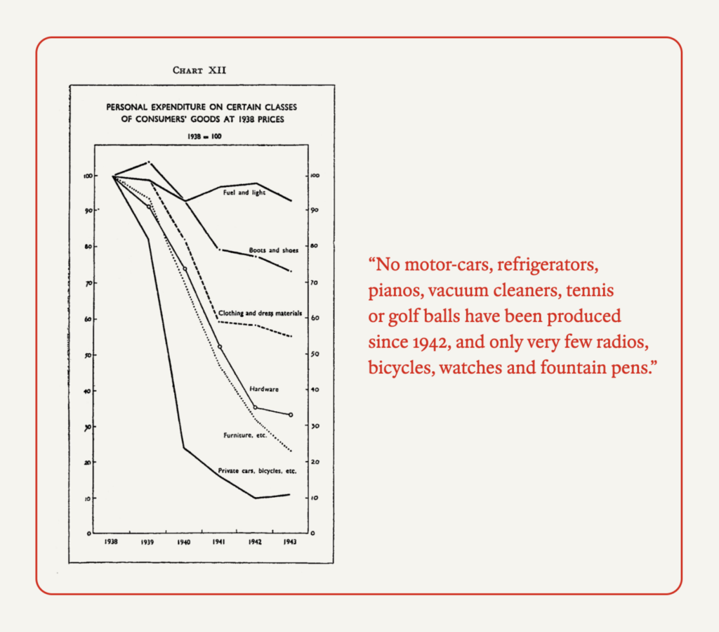
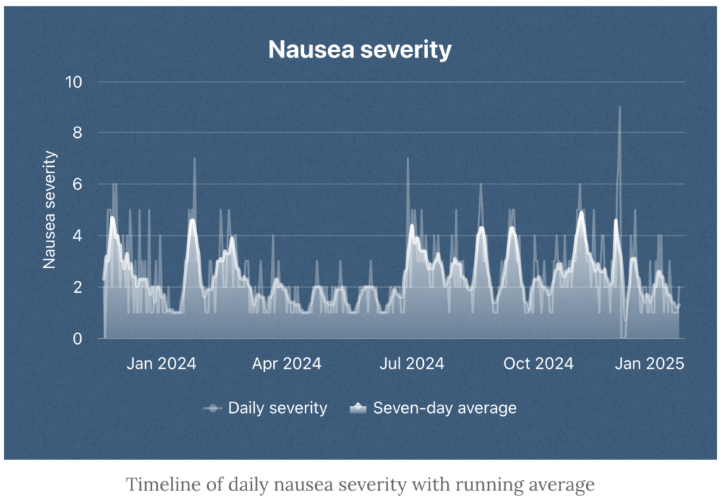
It’s still the beginning of 2025. Time to start new projects, as The Economist did with an archive of articles published in 1945, and time to look back to 2024, as Nicholas Rougeux did with a personal medical story:
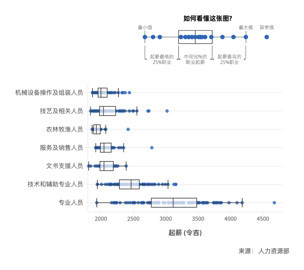
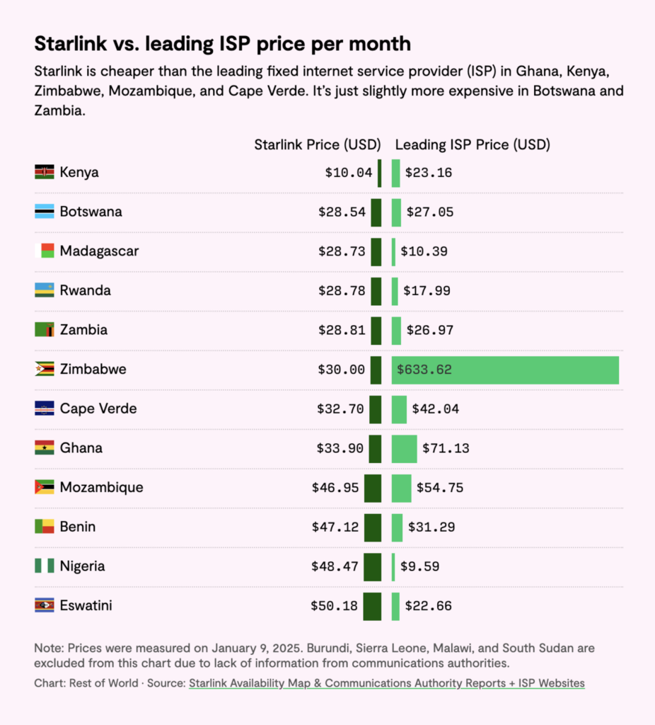
Last but not least, three remarkable visualizations about queueing during wartime, starting salaries in Malayisa, and Internet conditions in African countries:
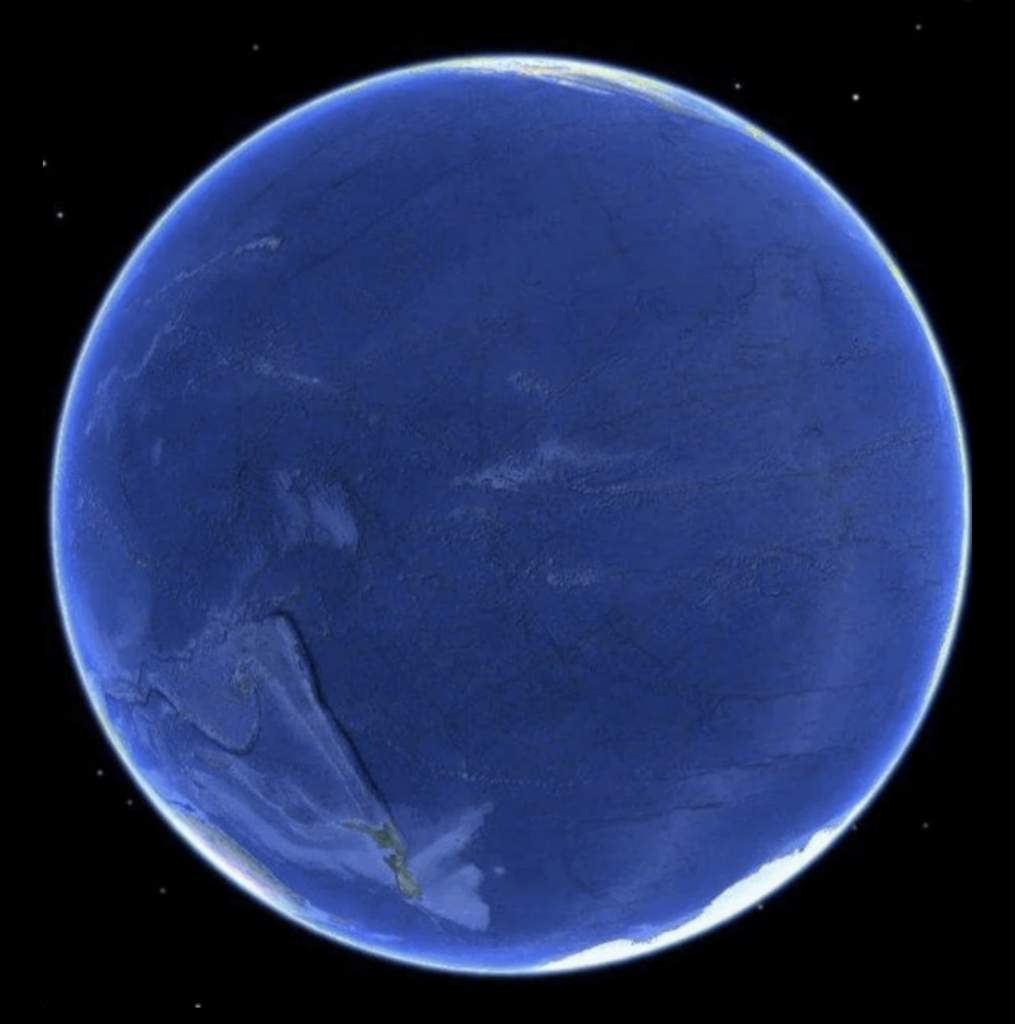
Axios: How a ransomware attack works, January 10Colossal: Mantra’s Murals Collect Enormous Butterflies in Building-Size Specimen Cases, January 10Information is Beautiful: “The side of the Earth we’re not used to seeing The Pacific Ocean covers 32.4% of the planet’s surface (more than all land & ice combined) The ocean’s widest point is 19,800km. The circumference of the Earth’s equator is 40,075km (via reddit https://bit.ly/EarthSide),” January 9 (Tweet)
Help us make this dispatch better! We’d love to hear which newsletters, blogs, or social media accounts we need to follow to learn about interesting projects, especially from less-covered parts of the world (Asia, South America, Africa). Write us at hello@datawrapper.de or leave a comment below.
(she/her) is a working student on Datawrapper’s Communications team. She creates the Data Vis Dispatch to keep data visualization enthusiasts up to date on exciting new projects. When she’s not working, she studies interface design, and when she’s not studying, she’s planning a festival stage or soldering light installations. Vivien lives in Potsdam.


Comments