This article is brought to you by Datawrapper, a data visualization tool for creating charts, maps, and tables. Learn more.
Data Vis Dispatch, January 16
The best of last week’s big and small data visualizations

Welcome back to the 125th edition of Data Vis Dispatch! Every week, we’ll be publishing a collection of the best small and large data visualizations we find, especially from news organizations — to celebrate data journalism, data visualization, simple charts, elaborate maps, and their creators.
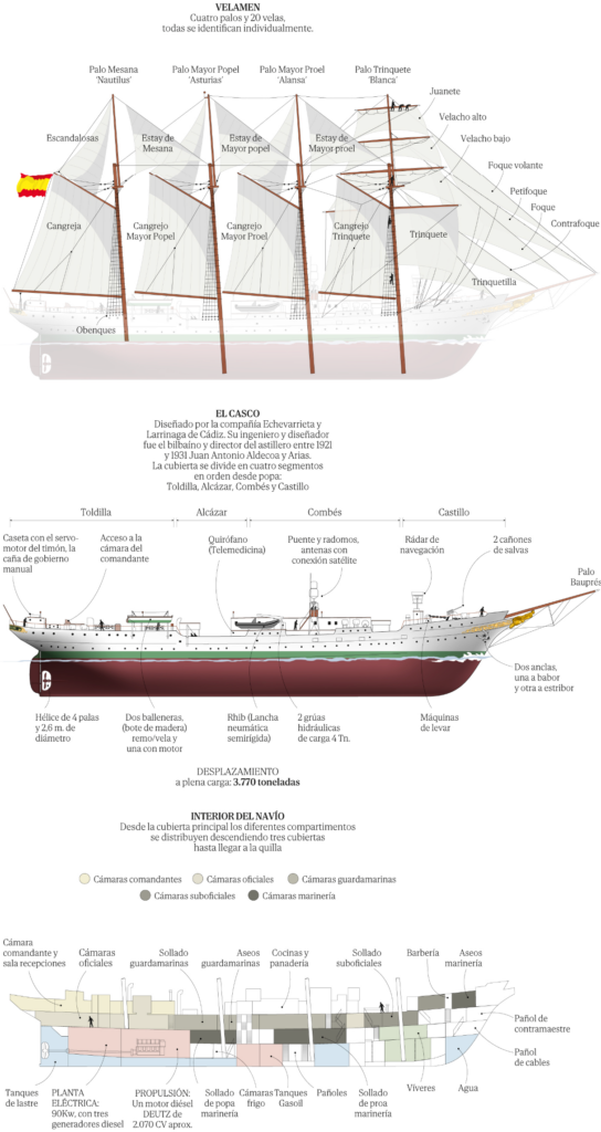
Recurring topics this week include the elections in Taiwan, record heat in 2023, and ships:
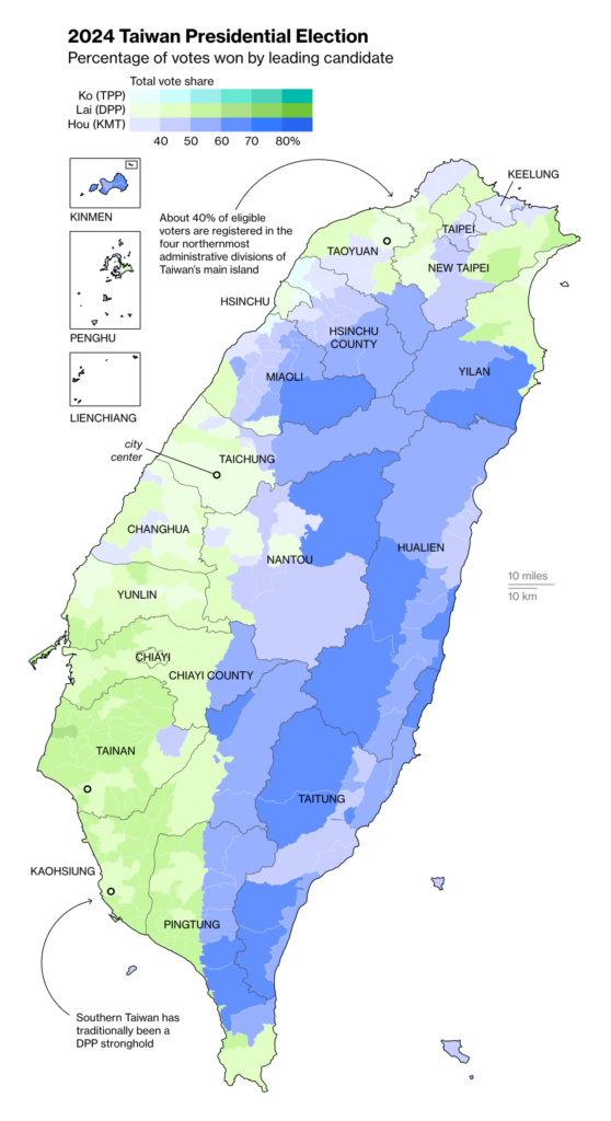
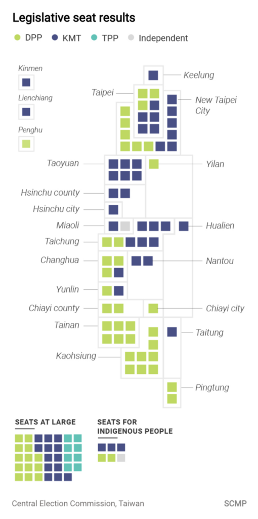
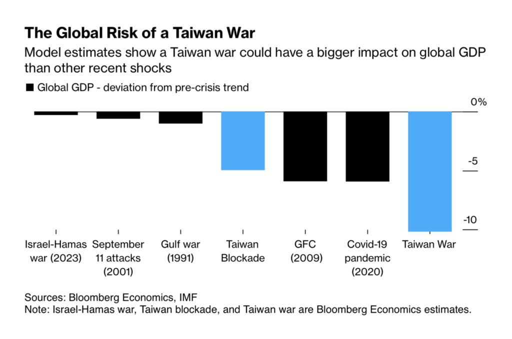
On January 13, the Taiwanese people elected their new president: previous Vice President Lai of the DPP party, associated with Taiwanese independence. We found visualizations that followed the election process and the risks of direct confrontation with China:
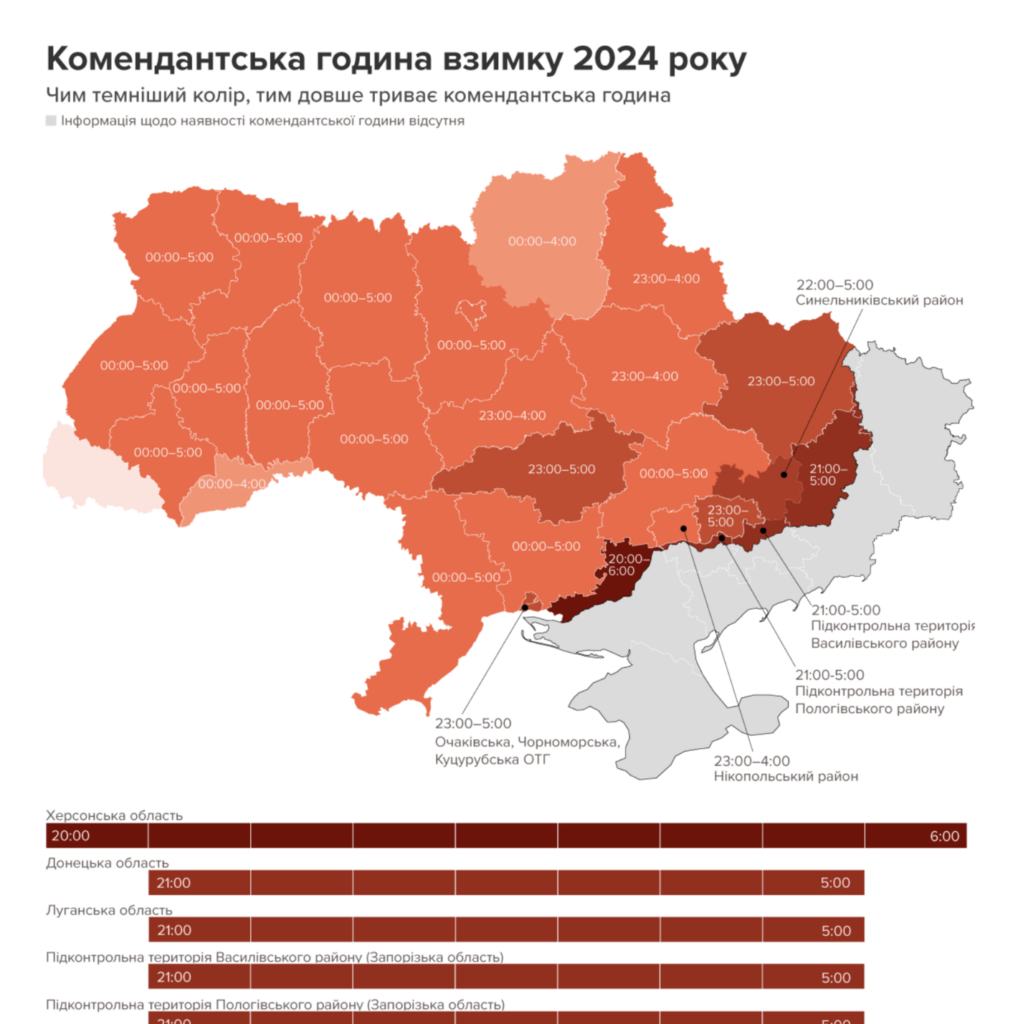
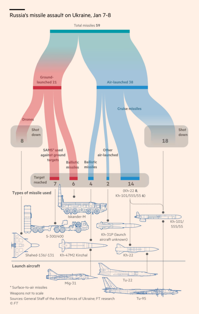
Two visualizations covered the current situation in Ukraine. Russia has intensified its missile attacks and strict curfews continue.
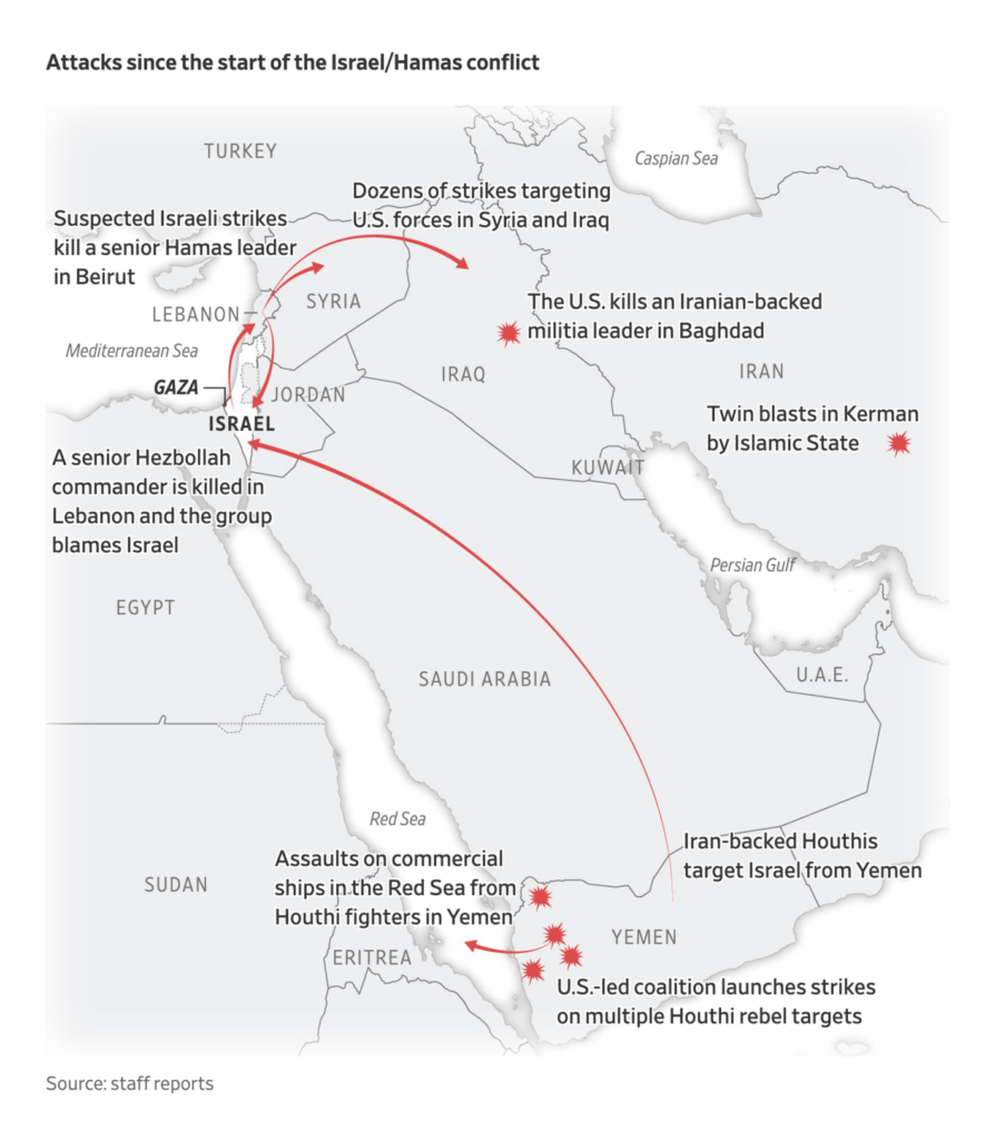
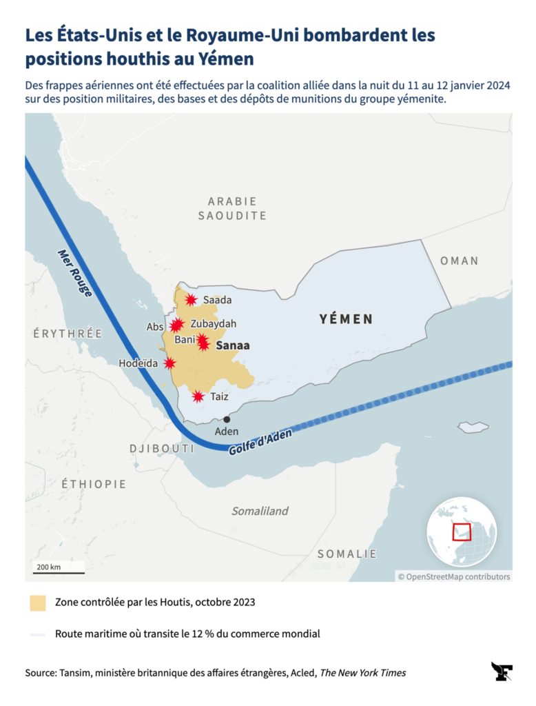
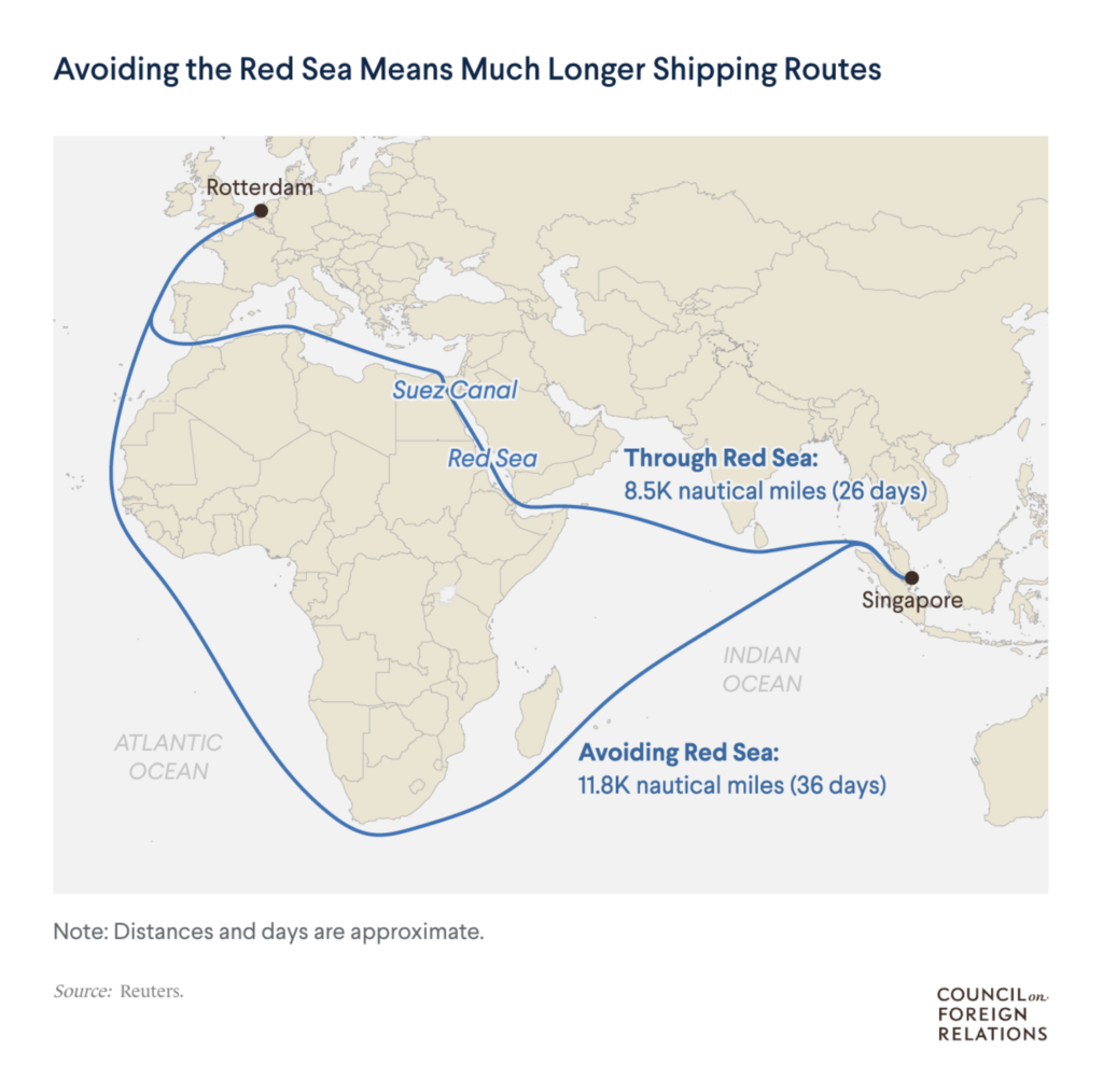
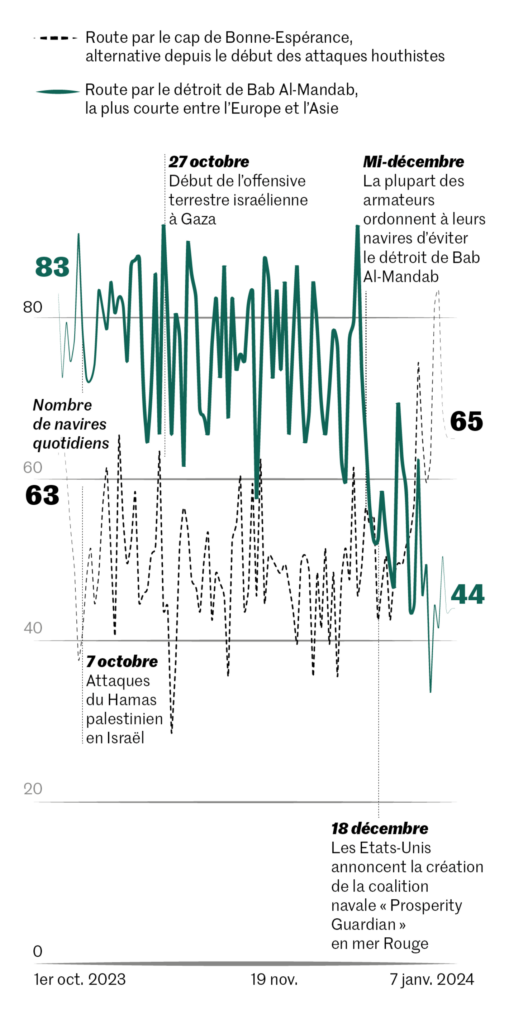
Now 100 days into the war between Israel and Hamas, the conflict has expanded to several other countries. On Friday and Saturday, the U.S. and U.K. carried out dozens of airstrikes against the Houthis in Yemen, who had attacked merchant ships in the Red Sea and Suez Canal:
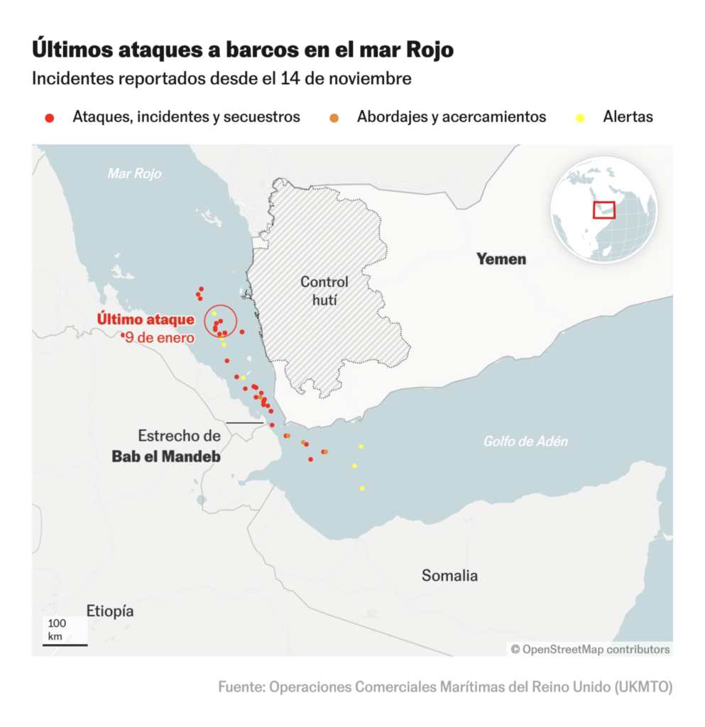
We also saw visualizations showing the impact of this important, now restricted, shipping route:
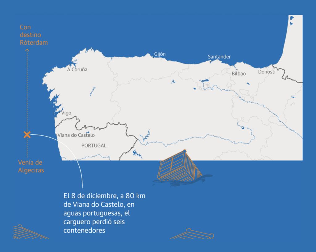
Shipping accounts for 80% of global world trade. But it’s not uncommon for a freight container to go missing:
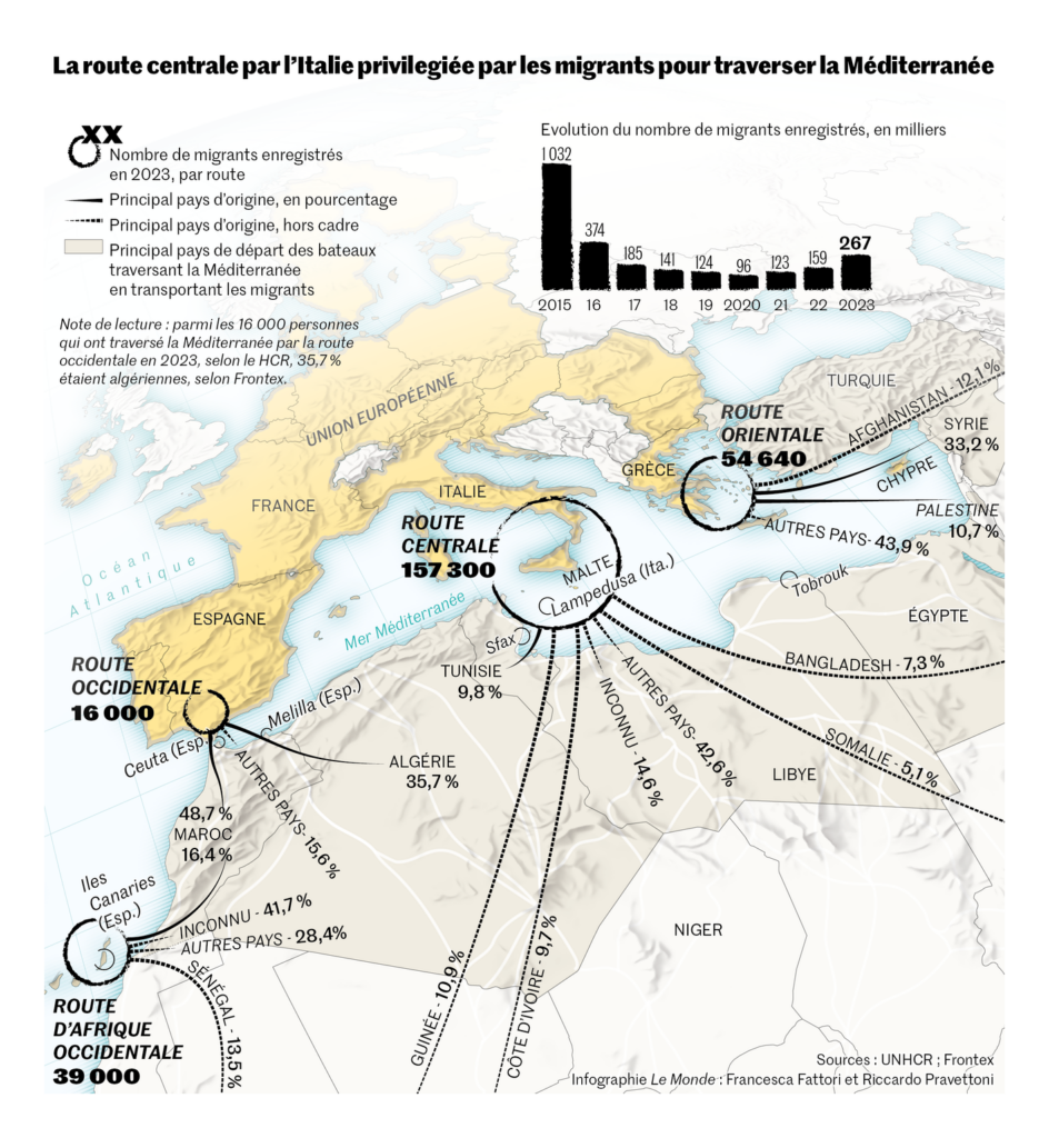
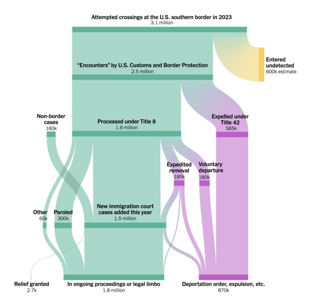
Immigration was a major topic this week:
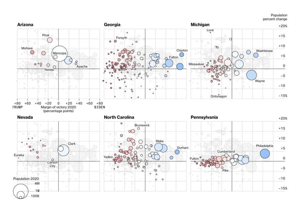
Internal migration even seems so important that it could influence this year’s presidential election in the U.S.:

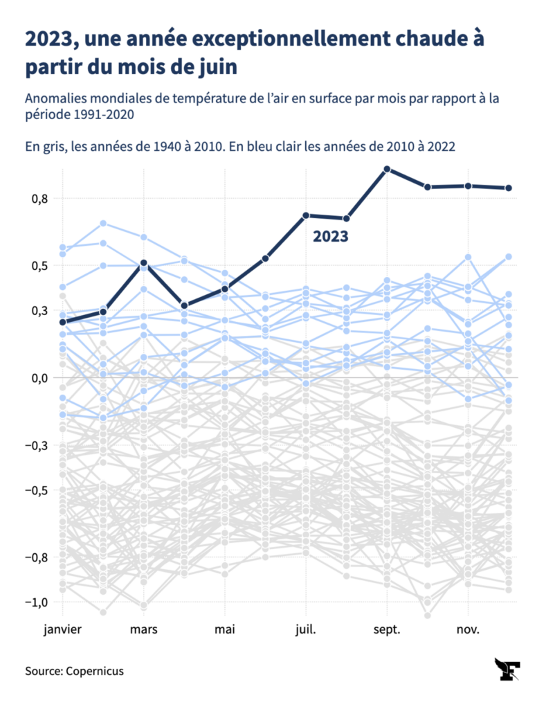
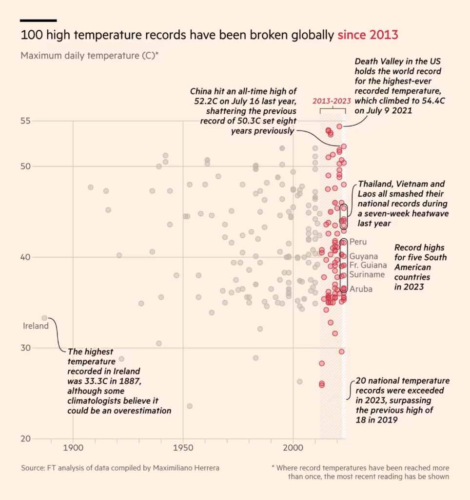
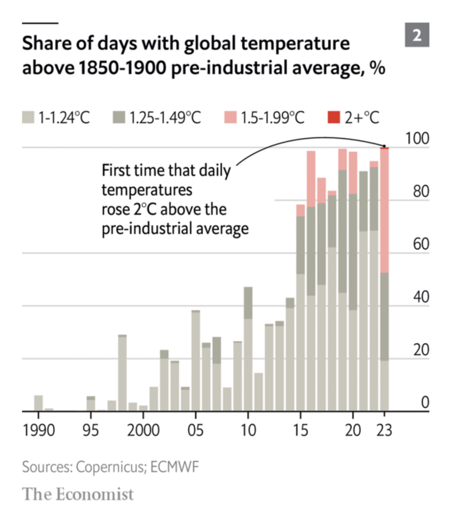
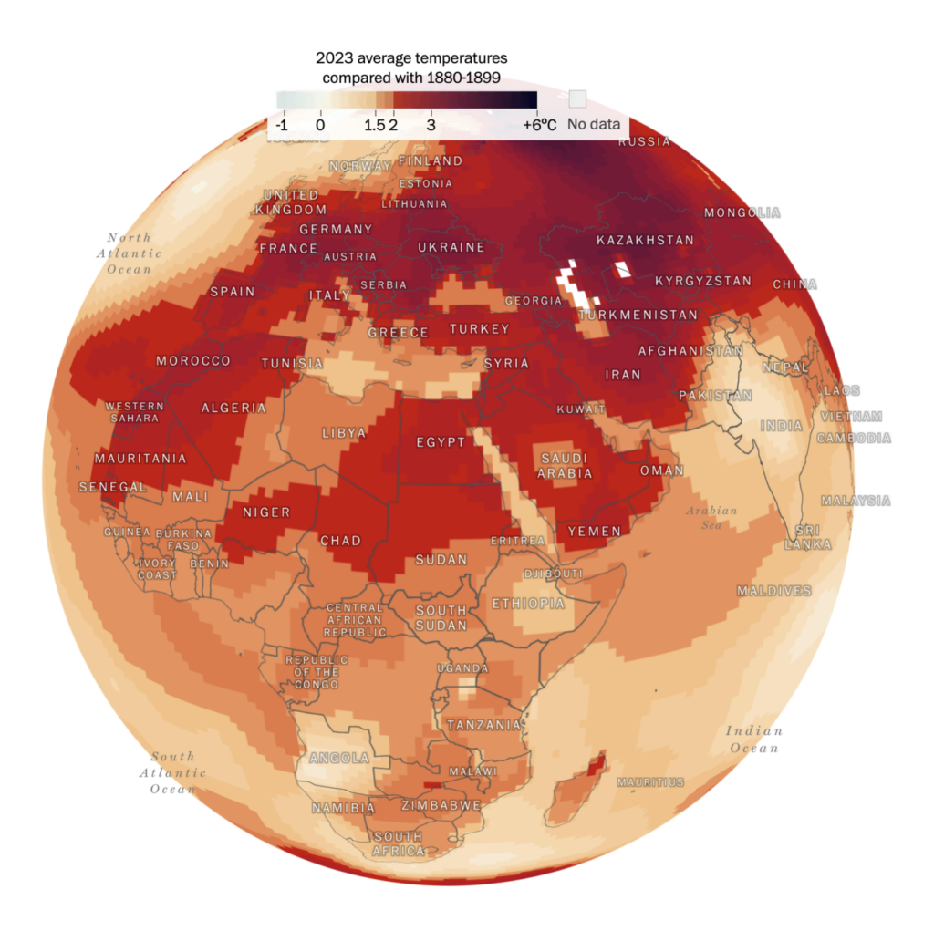
This week’s climate visualizations all revolve around one big, alarming, piece of news — 2023 was the hottest year on record, and not by a small margin:
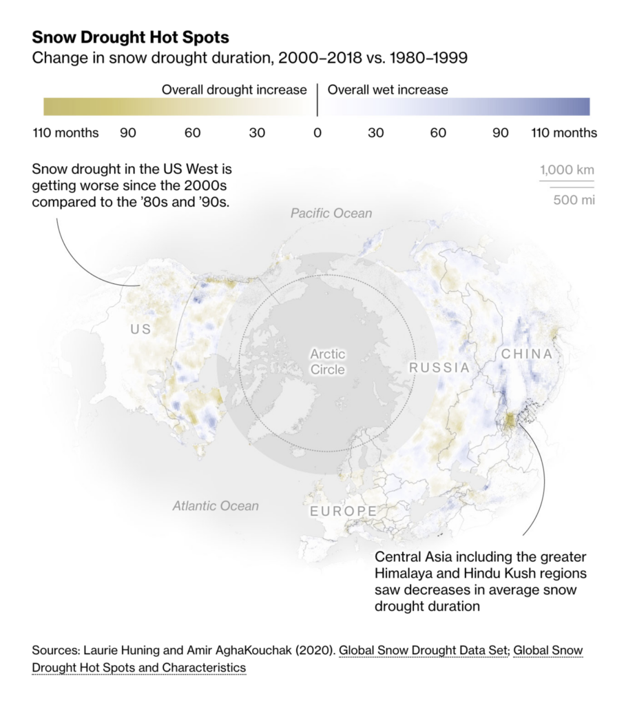
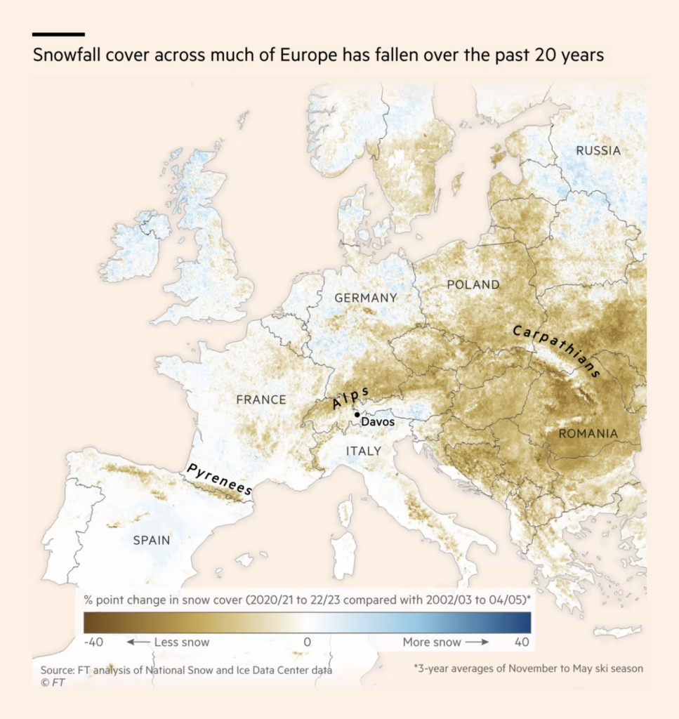
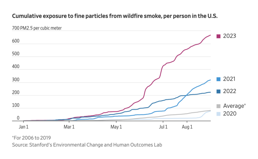
High temperatures change patterns in snowfall and wildfire:
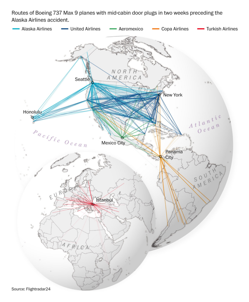
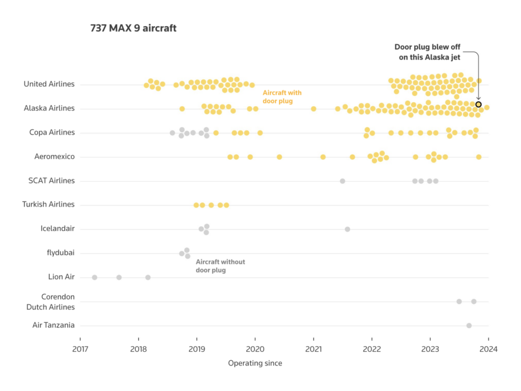
Last week’s airline disasters are still keeping newsrooms busy. We found further investigations into the specific aircraft whose door plug failed:
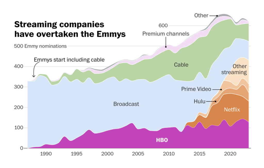
With the Golden Globe Awards and the postponed Emmy Awards taking place, it’s no wonder that these visualizations about movies were in the script this week:
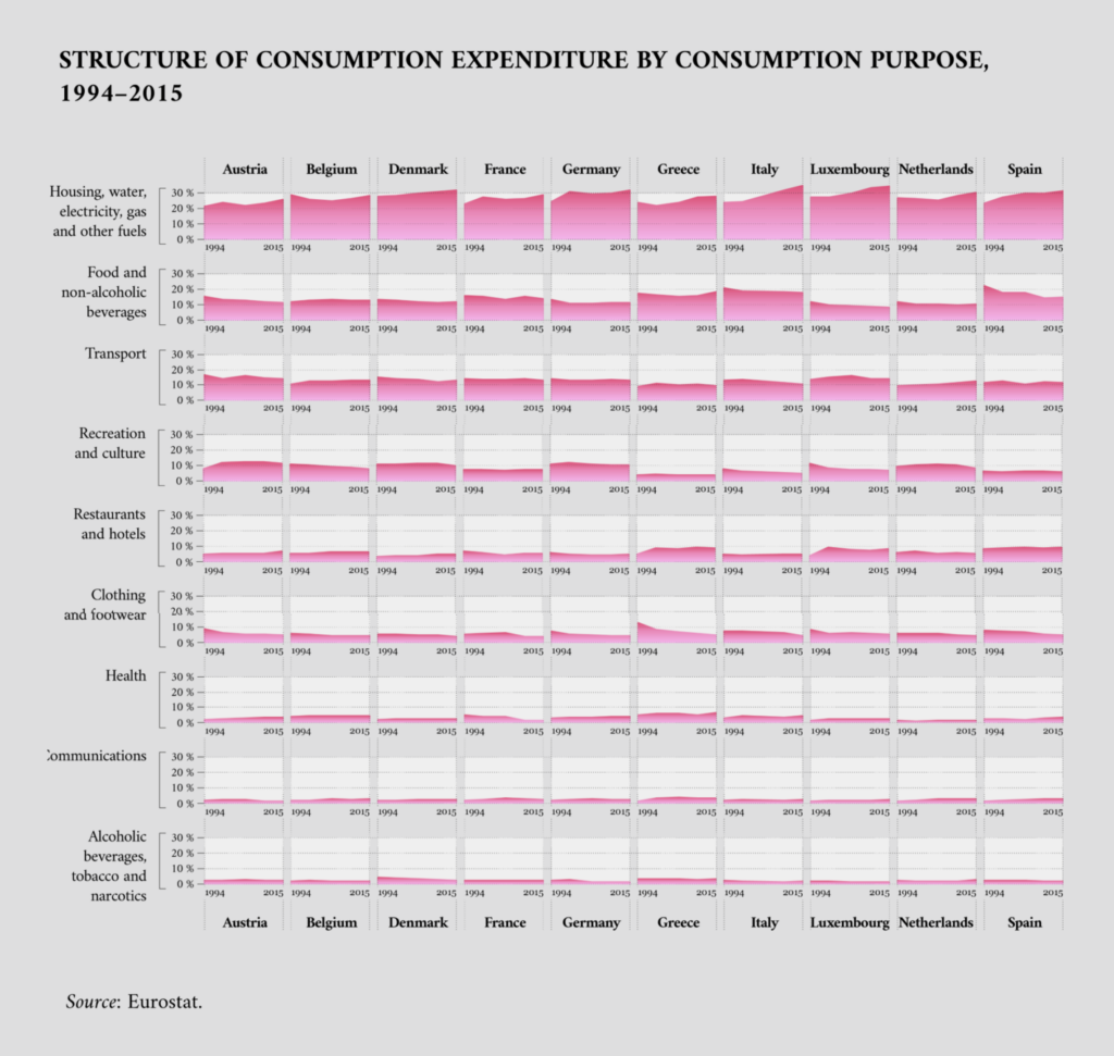
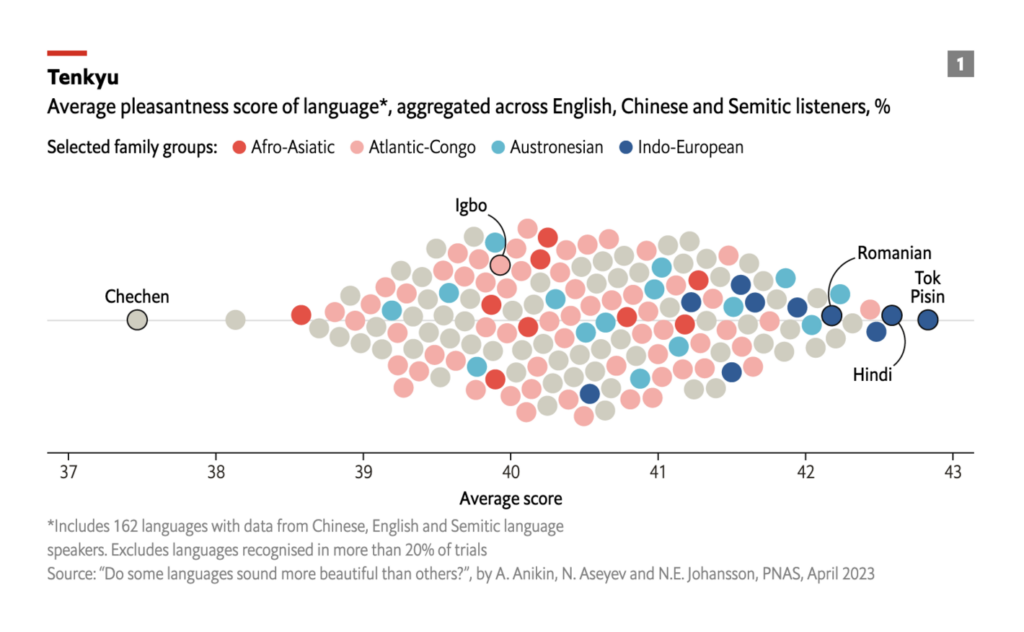
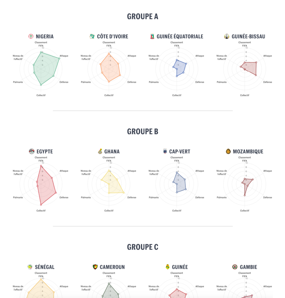
We close this week with a colorful set of visualizations showing consumption spending, the world’s lovliest languages, and African Cup of Nations teams.
What else we found interesting
Applications are open for…
- A data journalist in London and a data reporter in New York at Bloomberg
- A editorial and marketing intern at Kontinentalist
Help us make this dispatch better! We’d love to hear which newsletters, blogs, or social media accounts we need to follow to learn about interesting projects, especially from less-covered parts of the world (Asia, South America, Africa). Write us at hello@datawrapper.de or leave a comment below.
Want the Dispatch in your inbox every Tuesday? Sign up for our Blog Update newsletter!


Comments