This article is brought to you by Datawrapper, a data visualization tool for creating charts, maps, and tables. Learn more.
Data Vis Dispatch, January 17
The best of last week’s big and small data visualizations
Welcome back to the 77th edition of Data Vis Dispatch! Every week, we’ll be publishing a collection of the best small and large data visualizations we find, especially from news organizations — to celebrate data journalism, data visualization, simple charts, elaborate maps, and their creators.
Recurring topics this week include record-high temperatures and flight cancellations.
2022 was officially the fifth-hottest year on record, especially due to high temperatures in Europe and Asia.

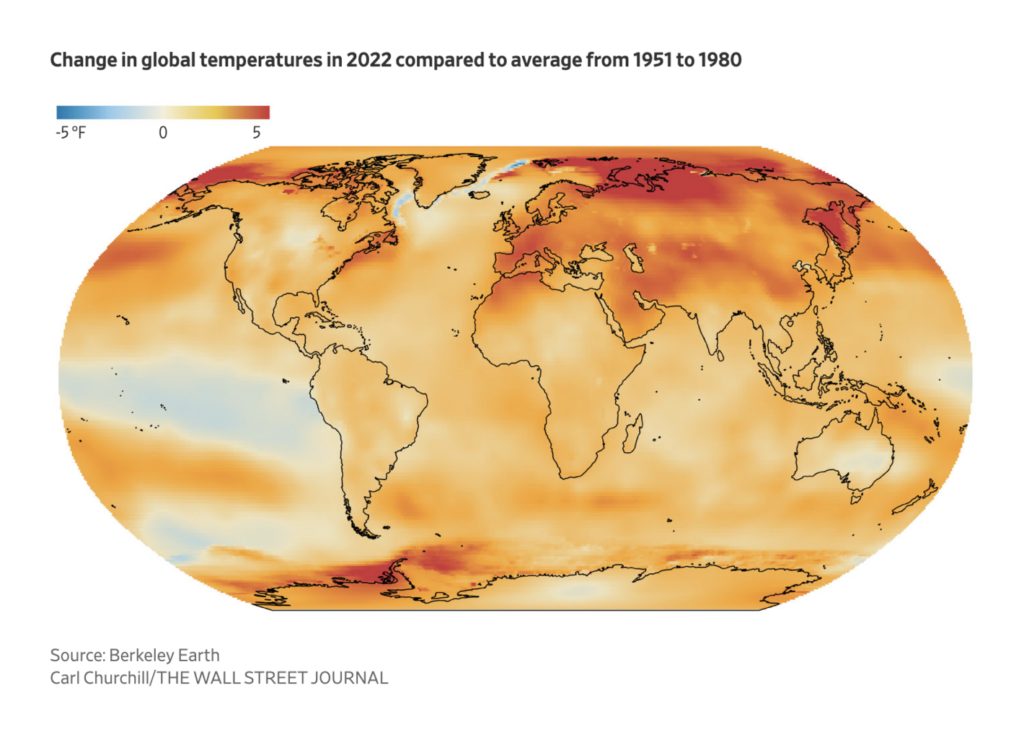
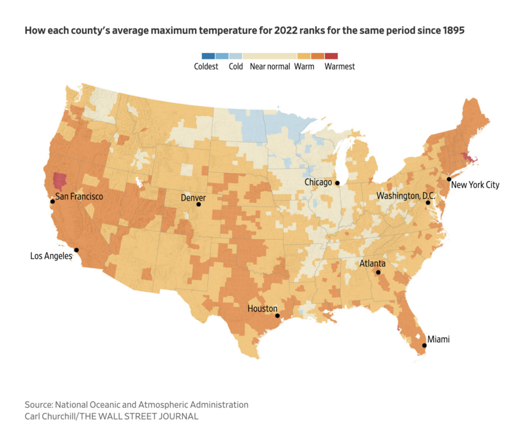
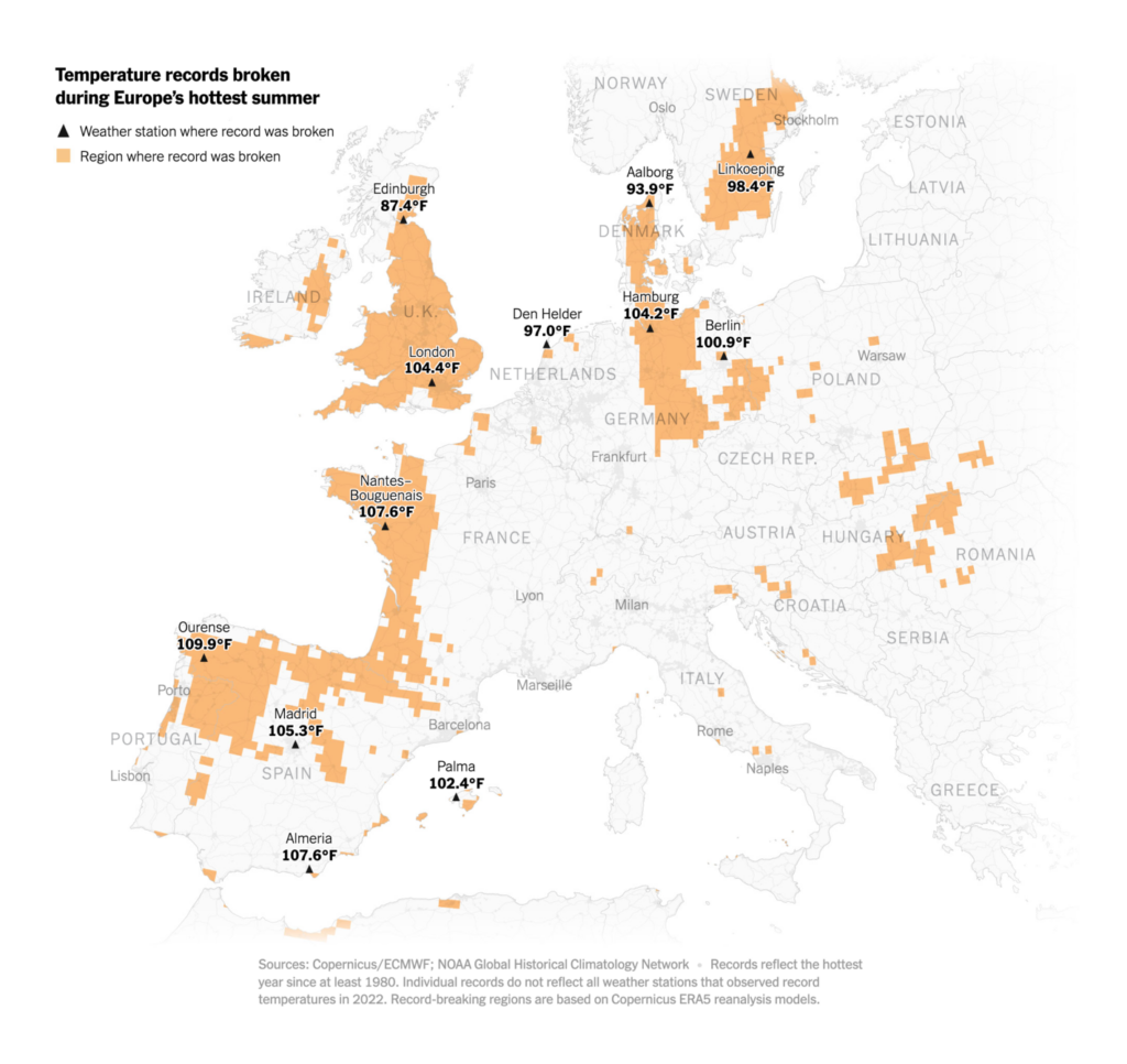

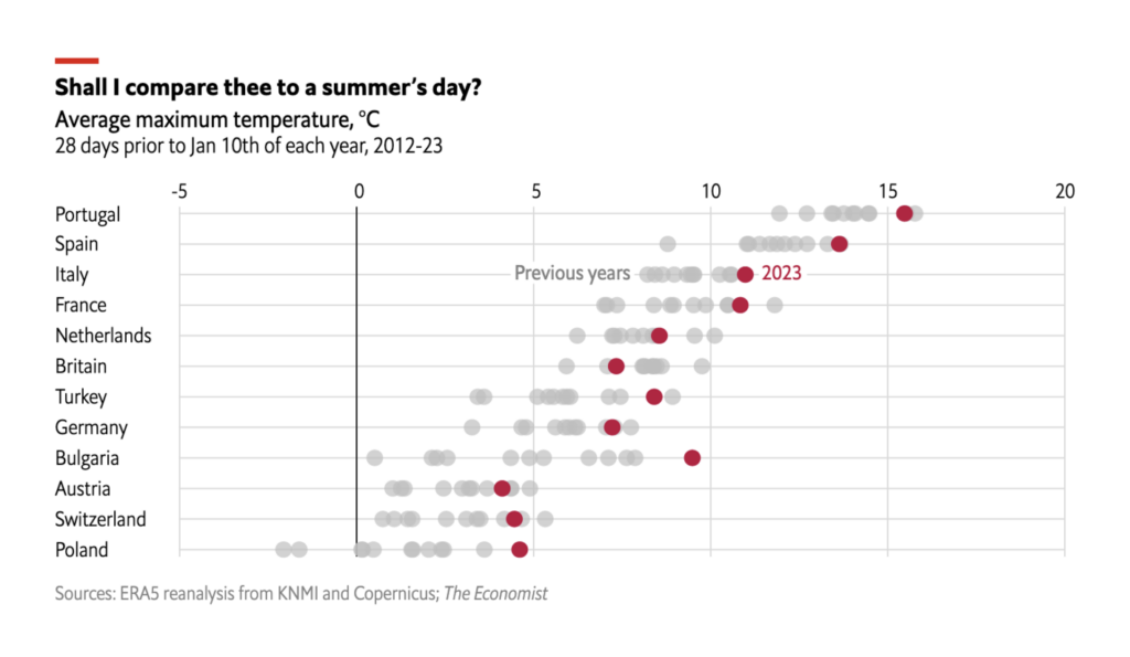
Unfortunately, the hot weather should come as no surprise. Researchers at the oil and gas giant ExxonMobil predicted global warming decades ago.

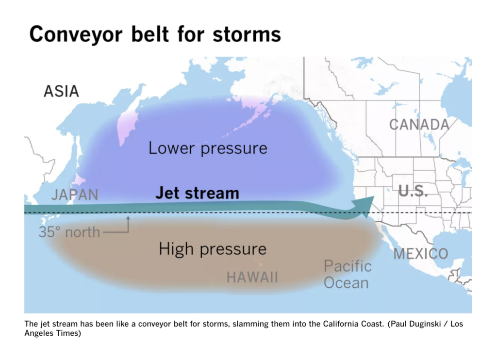
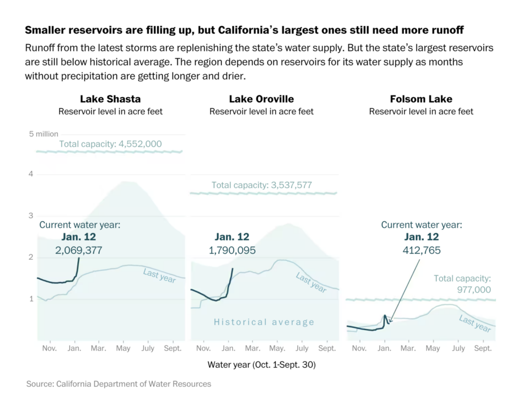
Meanwhile, California is hit by a series of harsh storms.
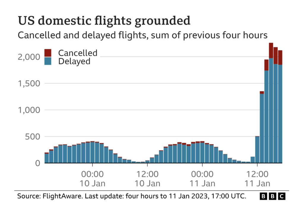
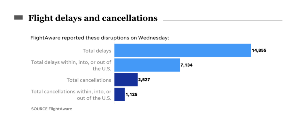
But it was a technical glitch, rather than extreme weather, that caused flight cancellations across the U.S. this week.

Charts from National Geographic and ZEIT Online looked at aging and migration in Japan and Germany.

Meanwhile, far-right political protests are a shared concern in the U.S. and Brazil.
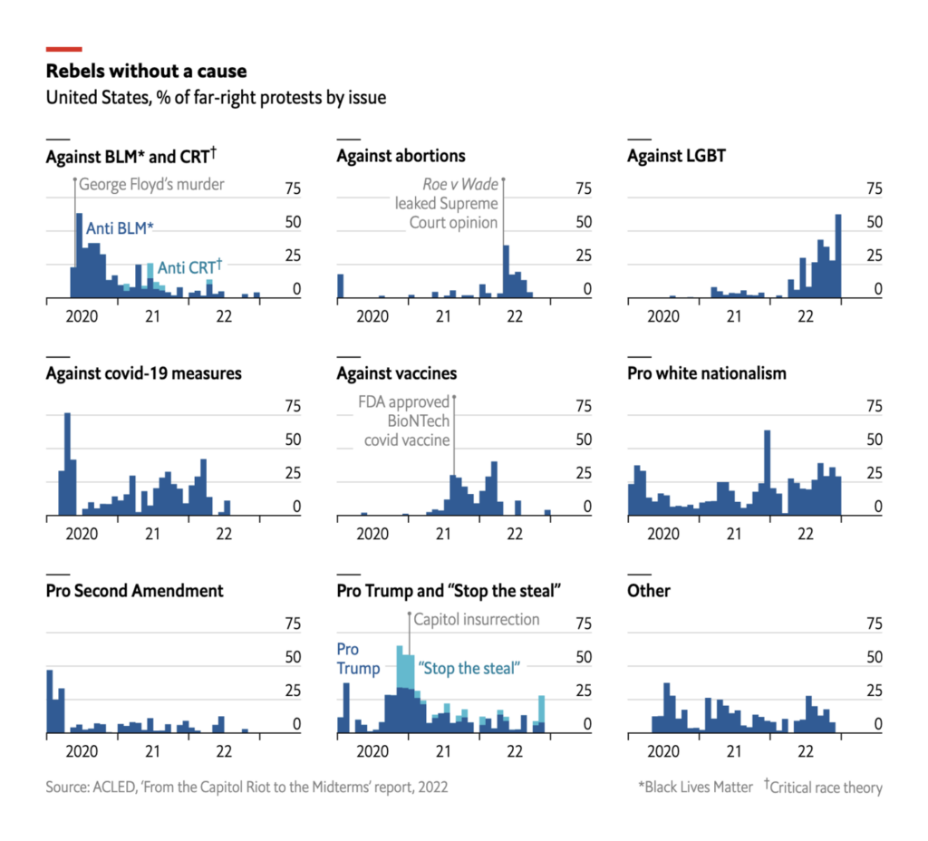

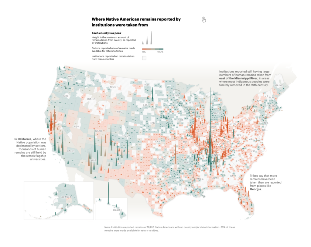
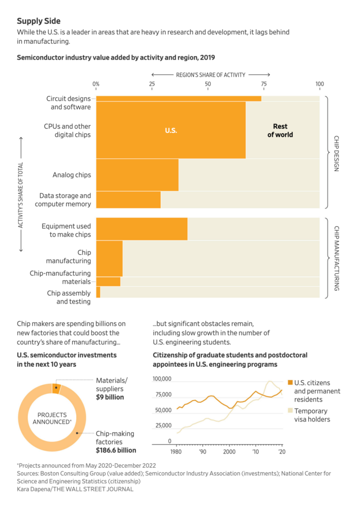
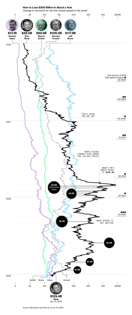
Other visualizations this week covered the return of Native American remains, the state of the semiconductor industry, and Elon Musk’s record-breaking losses in 2022.
What else we found interesting
Applications are open for…
- Frontend Developer at The Visual Agency (Milan)
- Data Scientist at Our World in Data (remote)
Help us make this dispatch better! We’d love to hear which newsletters, blogs, or social media accounts we need to follow to learn about interesting projects, especially from less-covered parts of the world (Asia, South America, Africa). Write us at hello@datawrapper.de or leave a comment below.
Want the Dispatch in your inbox every Tuesday? Sign up for our Blog Update newsletter!


Comments