We want to enable everyone to create beautiful charts, maps, and tables. New to data visualization? Or do you have specific questions about us? You'll find all the answers here.
The best of last week’s big and small data visualizations
Rose Mintzer-Sweeney
Welcome back to the 29th edition of Data Vis Dispatch! Every week, we’ll be publishing a collection of the best small and large data visualizations we find, especially from news organizations — to celebrate data journalism, data visualization, simple charts, elaborate maps, and their creators.
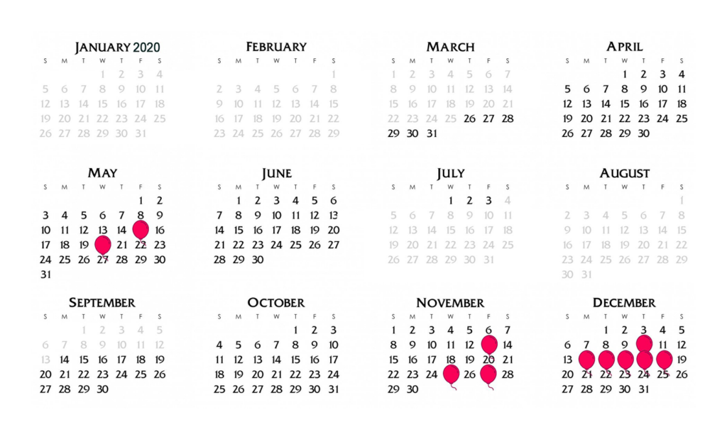
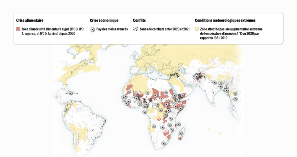
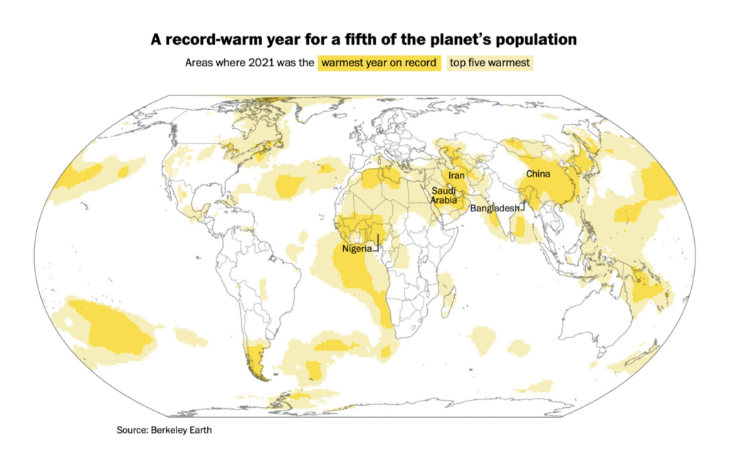
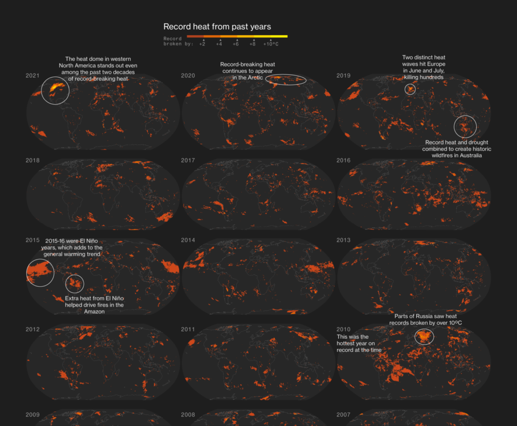
Recurring topics this week include volcanoes, famine, and poorly-timed parties.
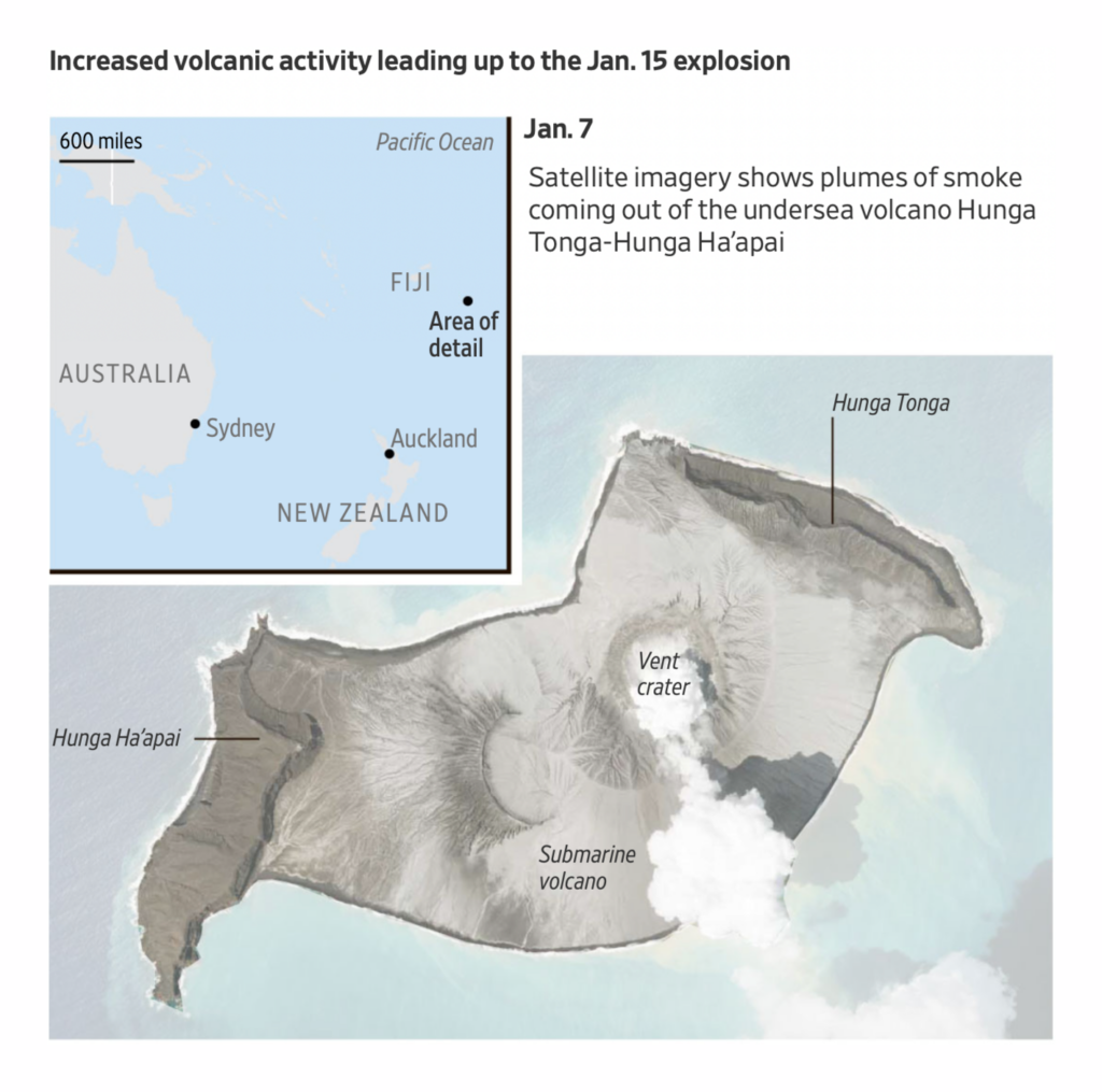
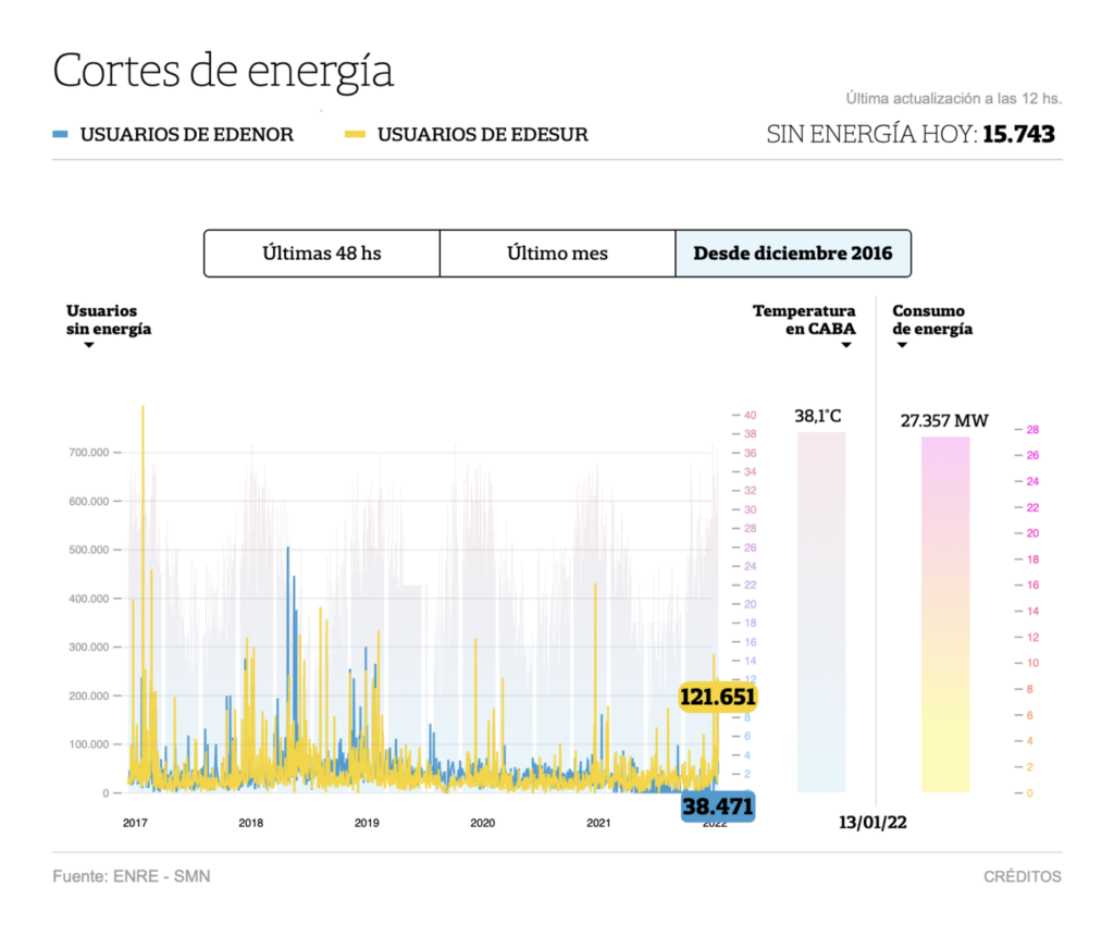
Starting with a bang — Tonga is in a state of disaster after a volcanic explosion powerful enough to send shock waves around the world:
The Wall Street Journal: Tonga Volcanic Eruption, Tsunami Cause Significant Damage, January 16TransTerraScape: “1月15日の16時10分~20時50分までのひまわり8号のバンド8(6.2μm)上層水蒸気の画像から前後フレームの差分(10分間)を取ってみると、日本時間20時40分頃のトンガ諸島の火山噴火によるソニックブーム(?)の到着が可視化できました。 興味深いのは同心円の模様が何重にも確認できることです,” January 16 (Tweet)
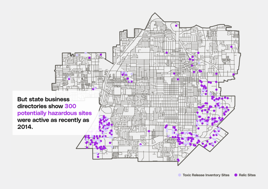
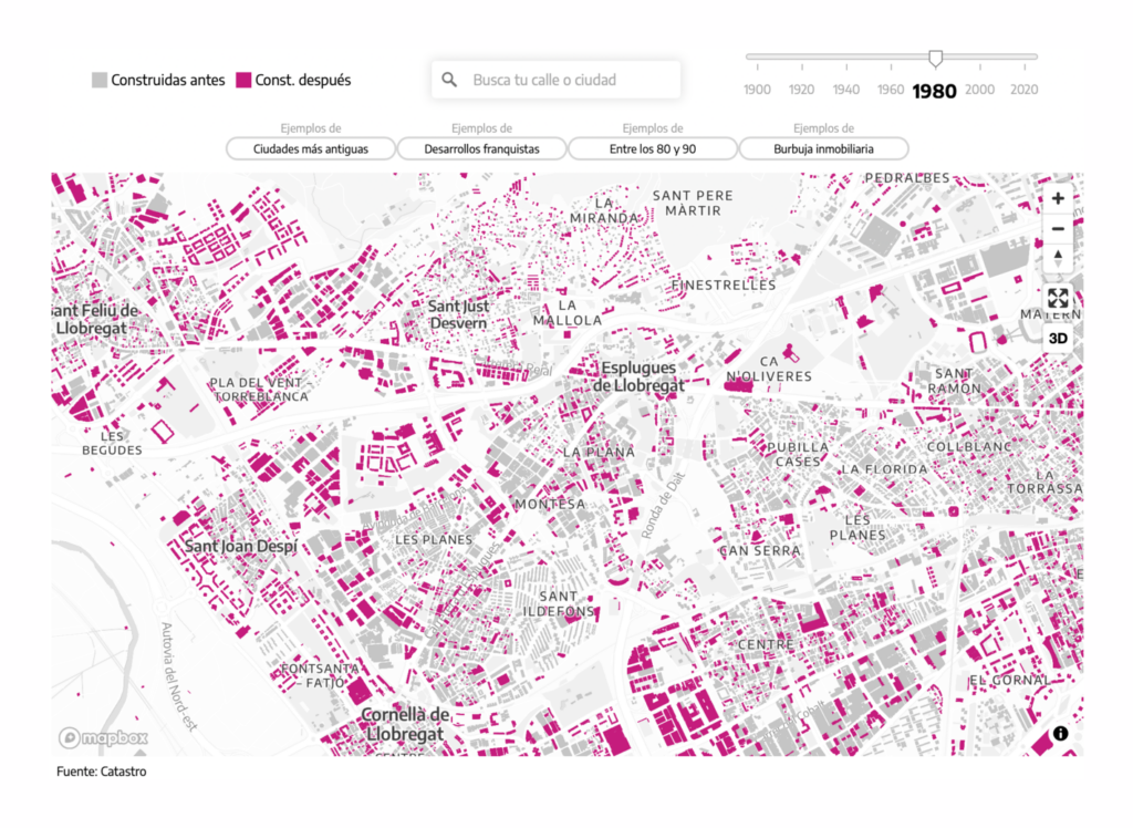
Several other maps also focused on the environments around us, both natural and built:
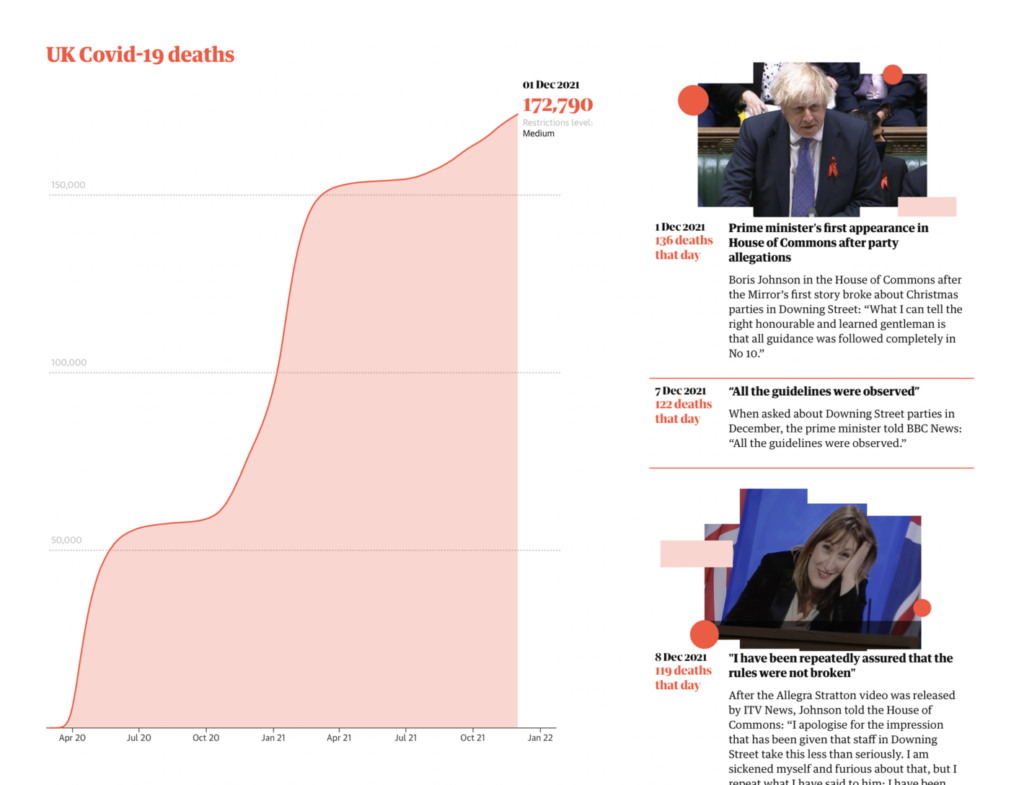
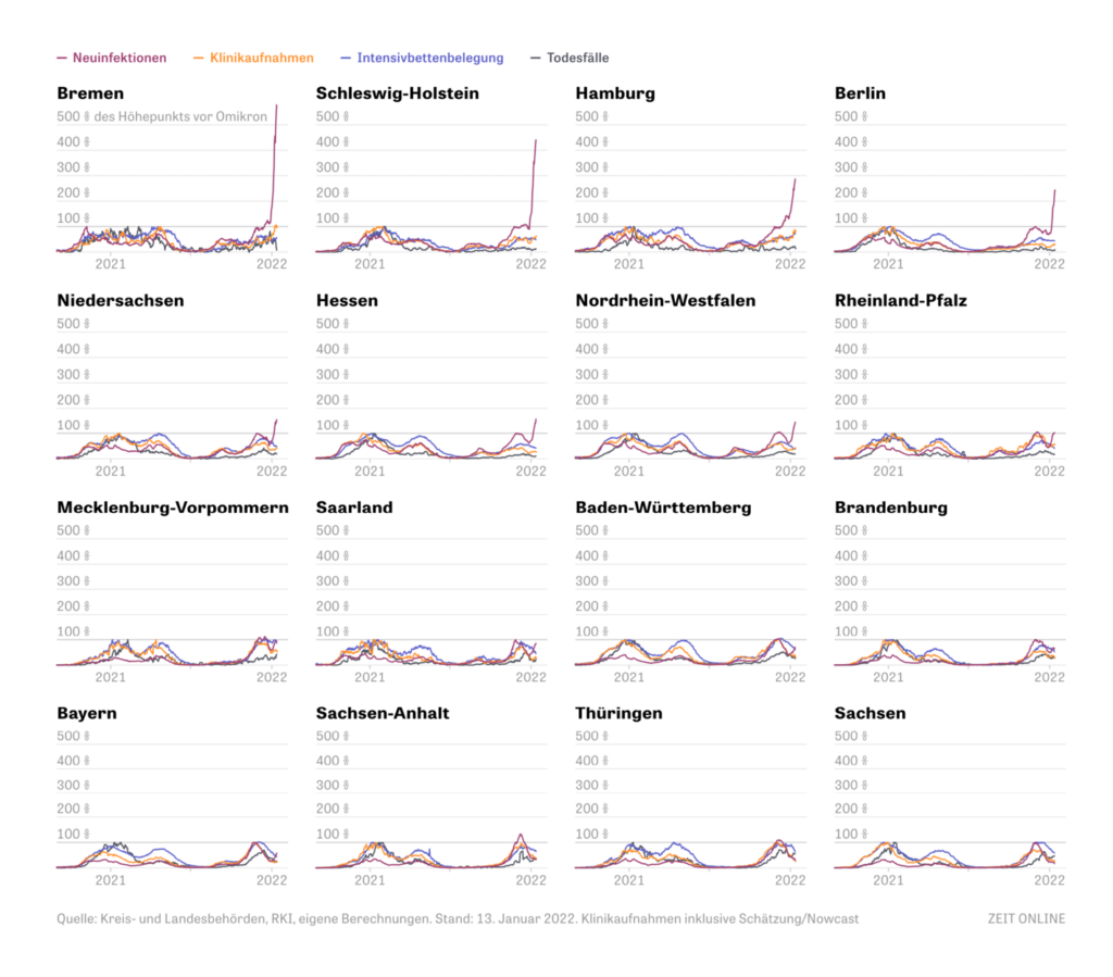
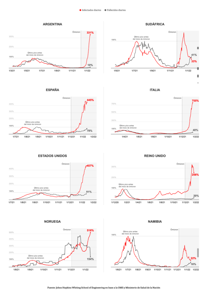
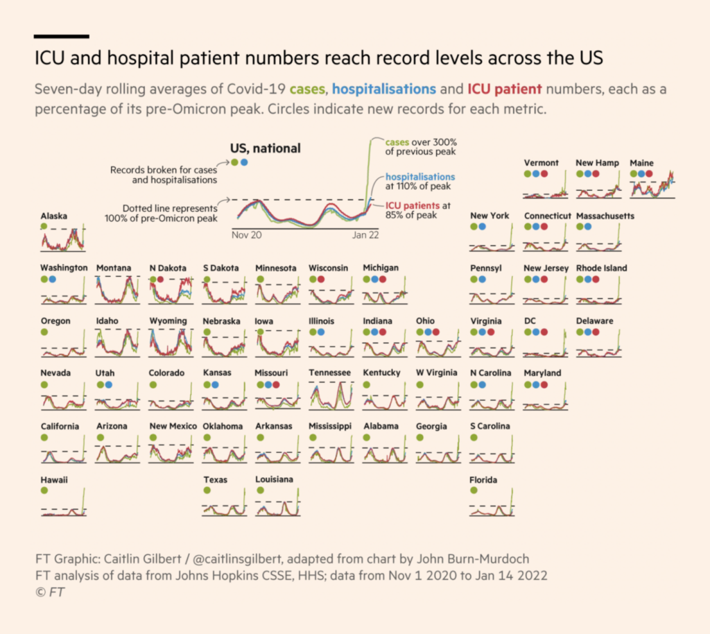
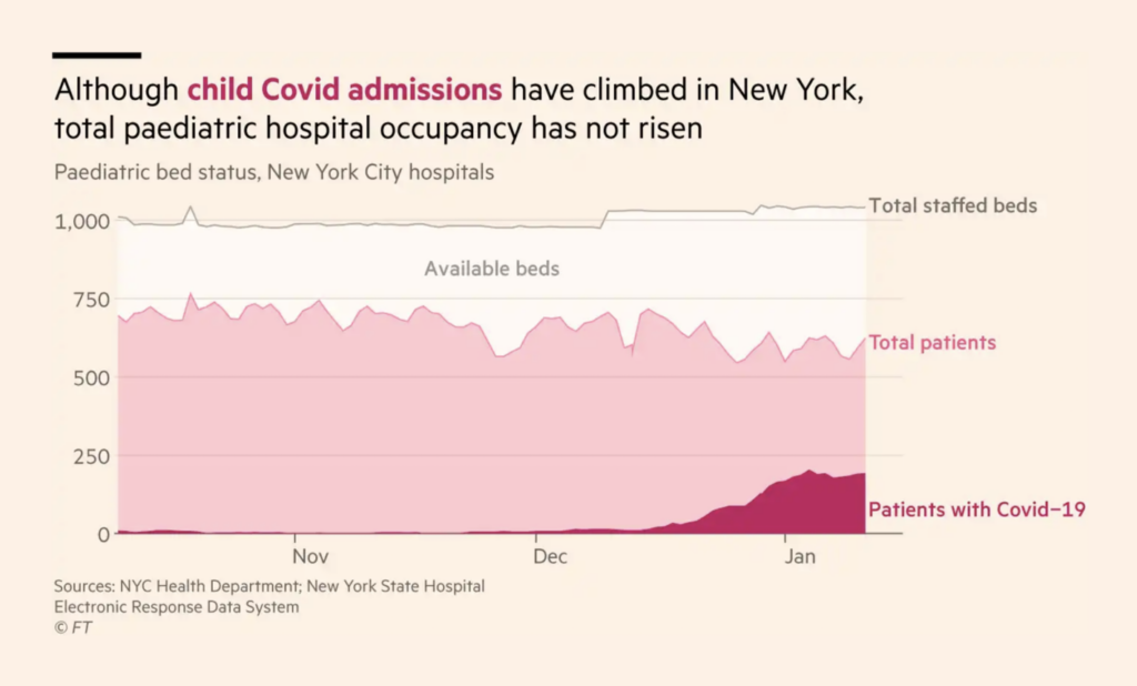
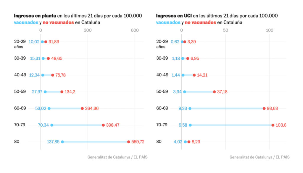
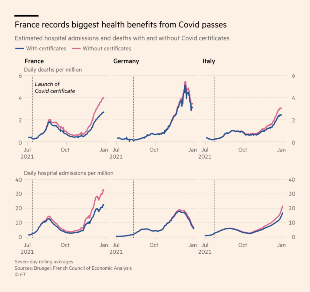
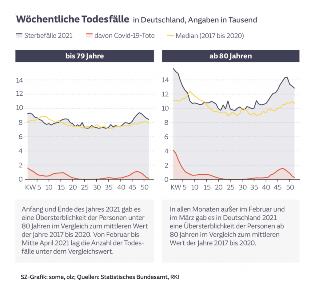
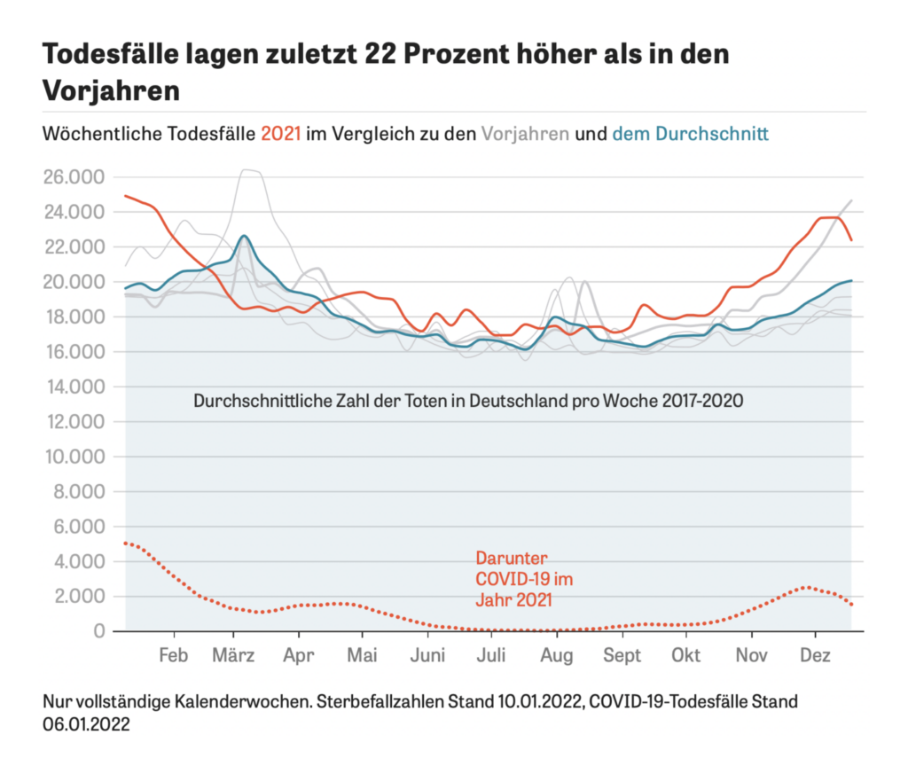
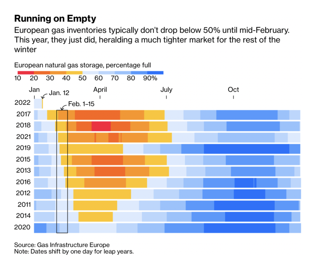
In COVID news proper, Omicron is breaking case records around the world — but hospitalizations and deaths don’t always follow. Relative measures make it easier to compare this wave to previous ones:
The Pudding Cup is a prize for non-commercial, visual and data-driven stories — 2021 submissions will close on January 28.
Help us make this dispatch better! We’d love to hear which newsletters, blogs, or social media accounts we need to follow to learn about interesting projects, especially from less-covered parts of the world (Asia, South America, Africa). Write us at hello@datawrapper.de or leave a comment below.
Rose Mintzer-Sweeney
(she/her, @rosemintzers) is a data vis writer on Datawrapper's communications team. She likes words, numbers, pictures, and all possible combinations of the same. Rose lives in Berlin.


Comments