This article is brought to you by Datawrapper, a data visualization tool for creating charts, maps, and tables. Learn more.
Data Vis Dispatch,
January 18
The best of last week’s big and small data visualizations

Welcome back to the 29th edition of Data Vis Dispatch! Every week, we’ll be publishing a collection of the best small and large data visualizations we find, especially from news organizations — to celebrate data journalism, data visualization, simple charts, elaborate maps, and their creators.
Recurring topics this week include volcanoes, famine, and poorly-timed parties.
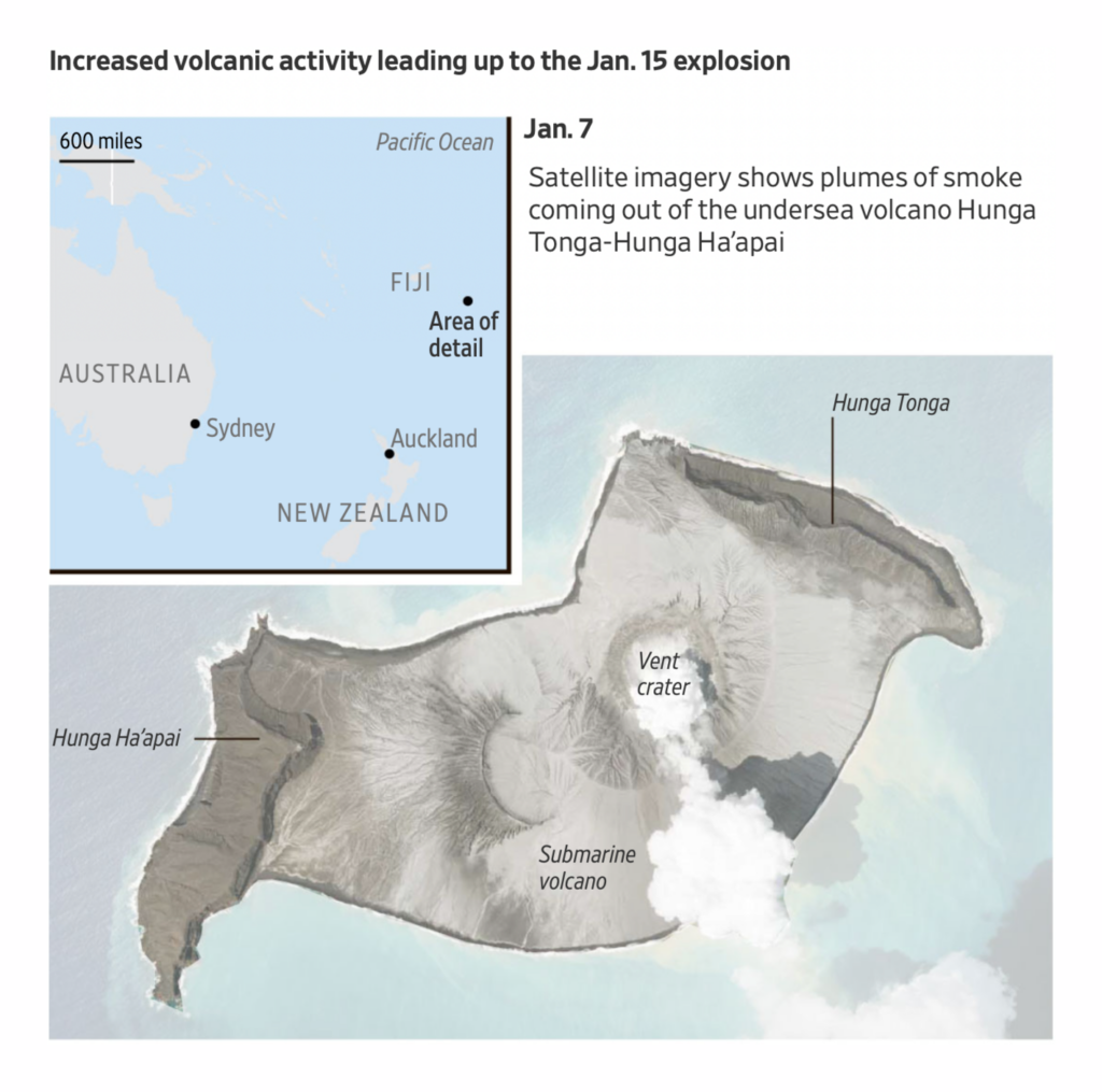
Starting with a bang — Tonga is in a state of disaster after a volcanic explosion powerful enough to send shock waves around the world:
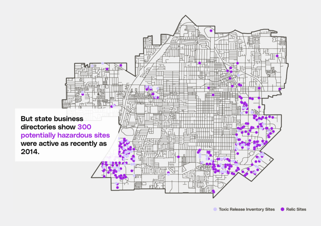
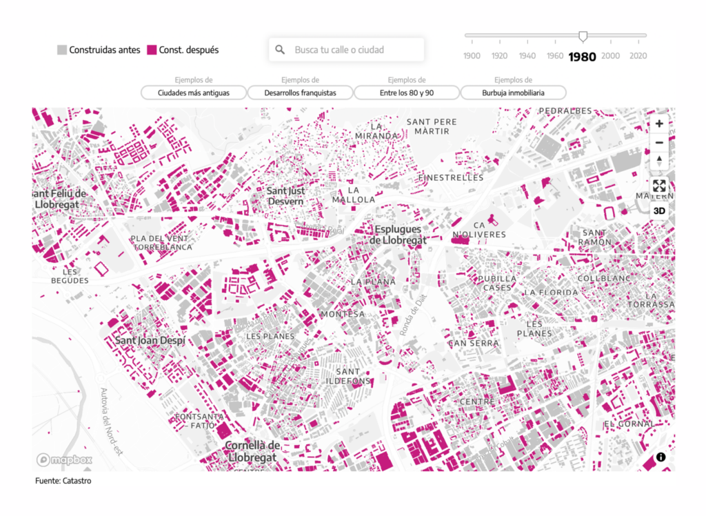
Several other maps also focused on the environments around us, both natural and built:


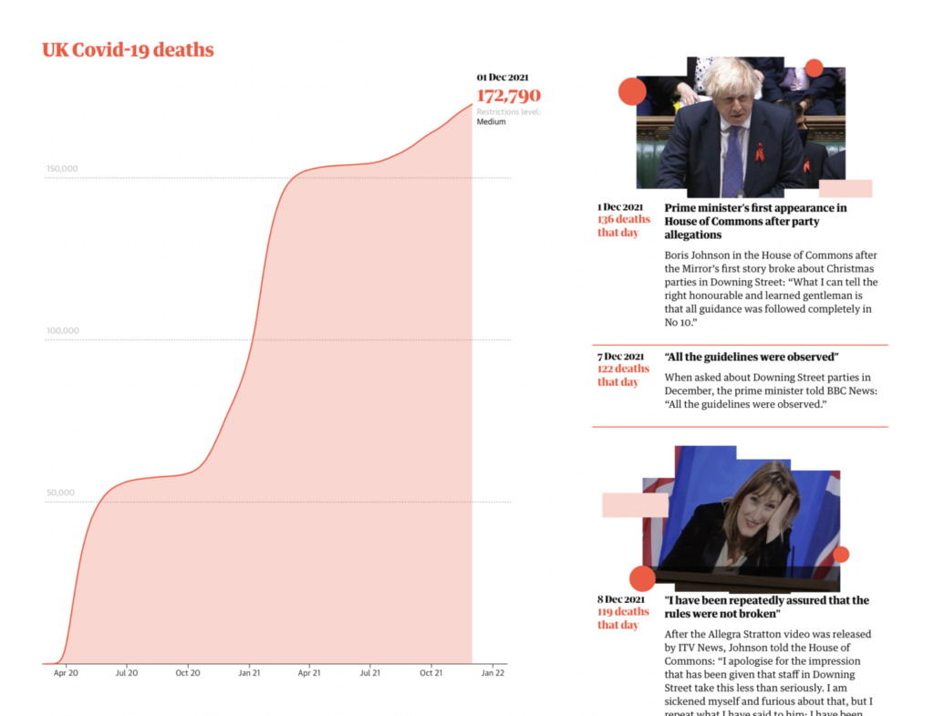
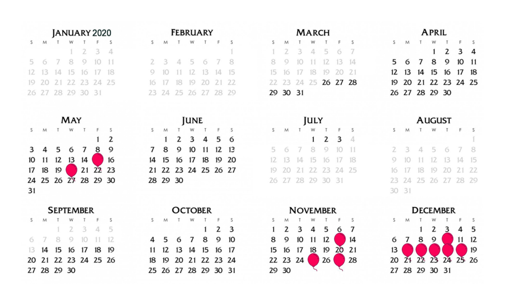
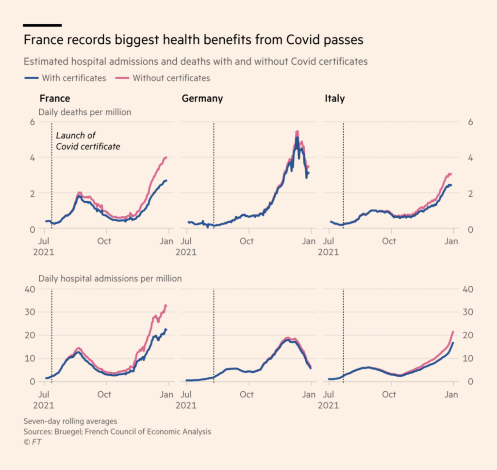
COVID has overrun our political section in the past — but this time, it’s less policy, more parties:
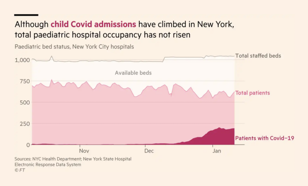
In COVID news proper, Omicron is breaking case records around the world — but hospitalizations and deaths don’t always follow. Relative measures make it easier to compare this wave to previous ones:
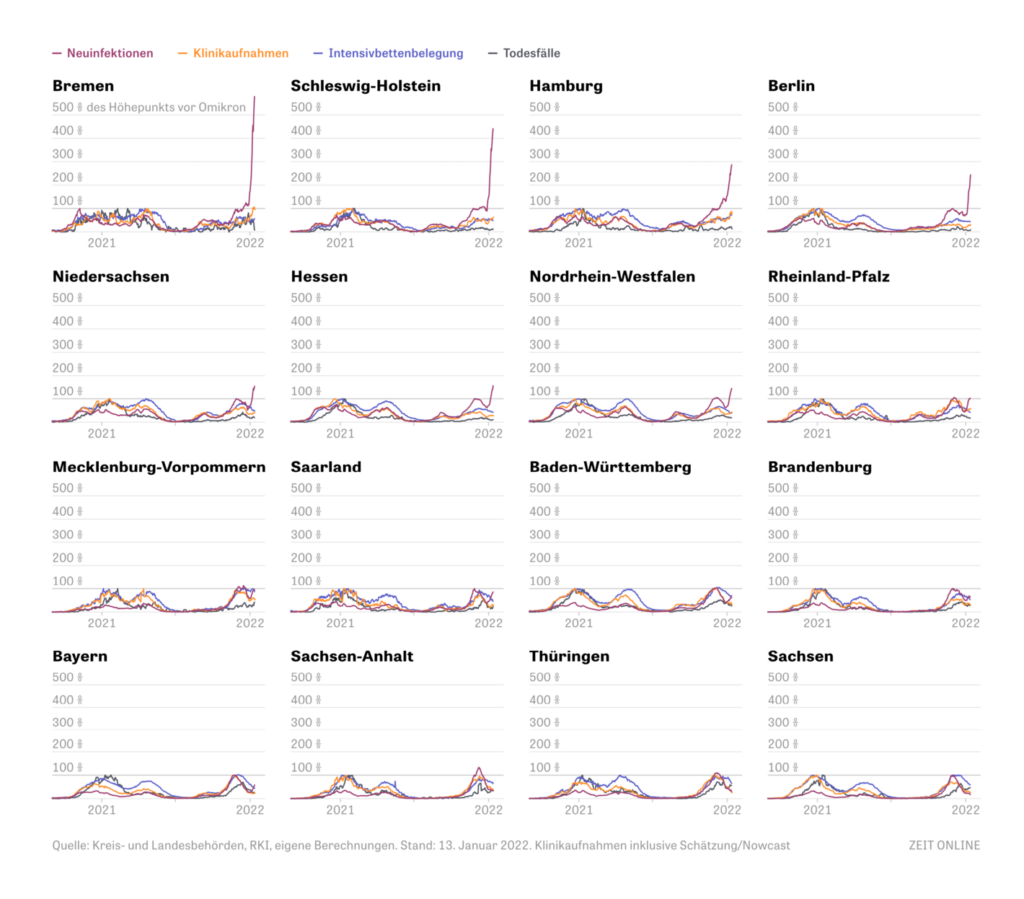
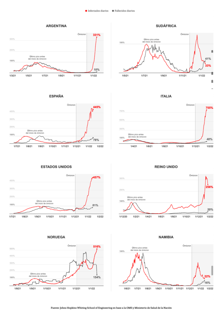
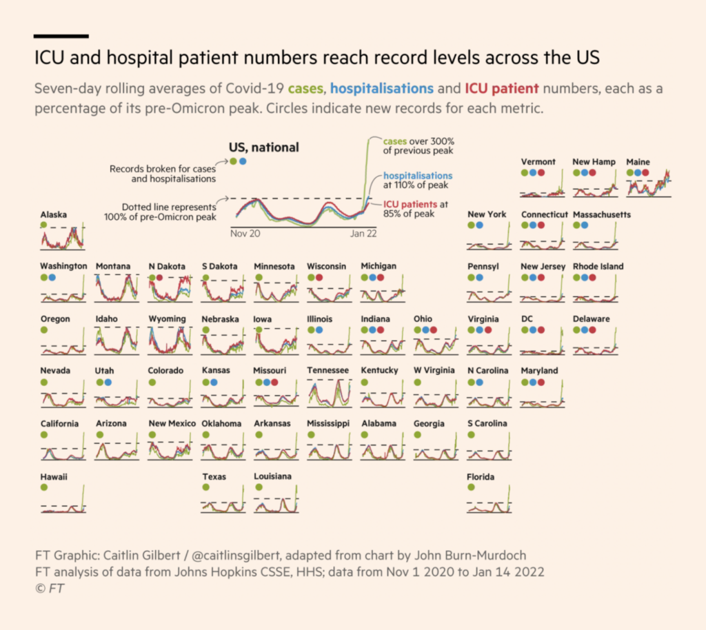
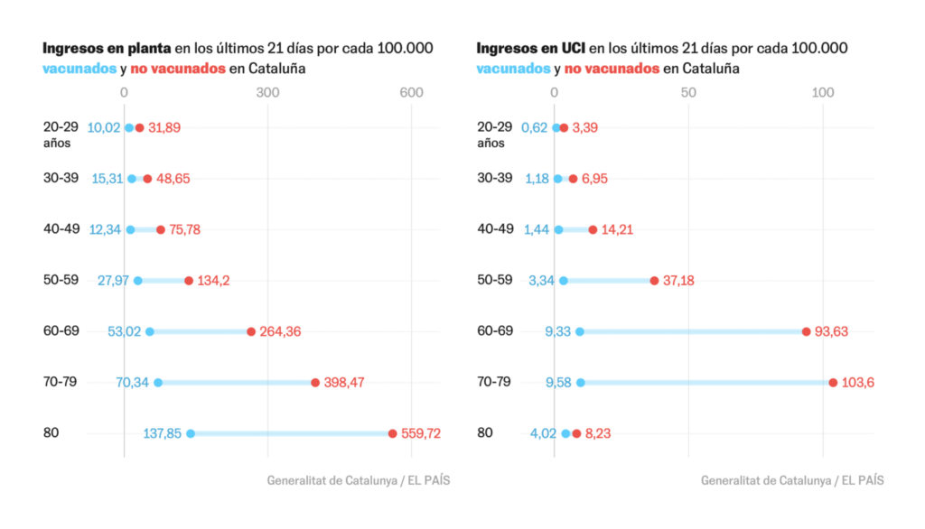
Of course, the basic incidence rates are still of interest too:
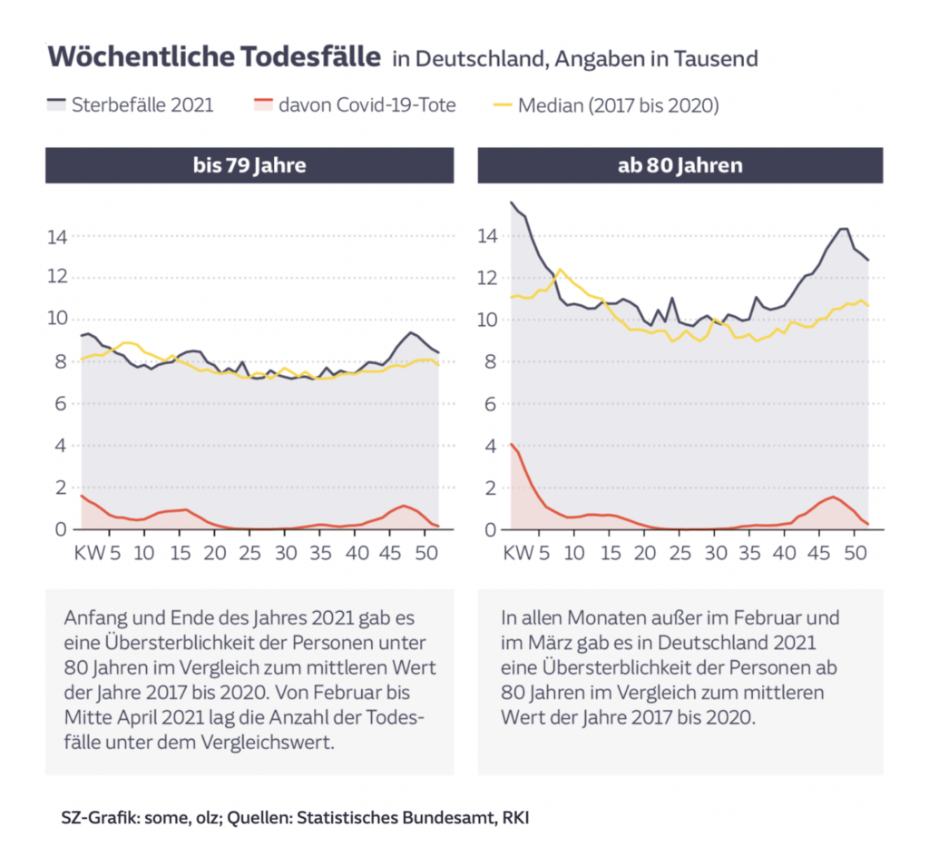
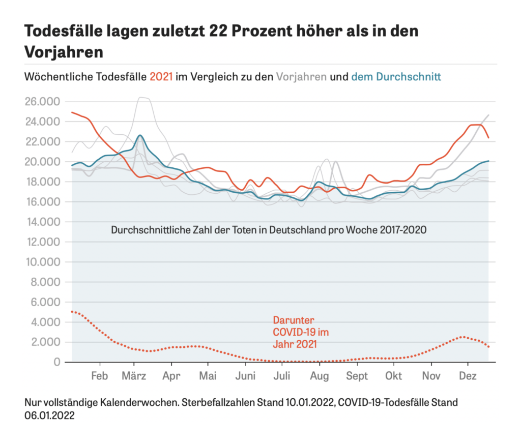
Vaccines have saved lives this year, but excess deaths were high despite them:
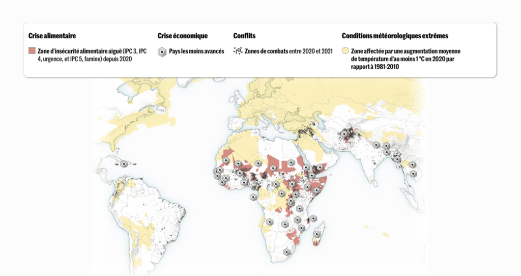
Two maps this week put a spotlight on food and famine:

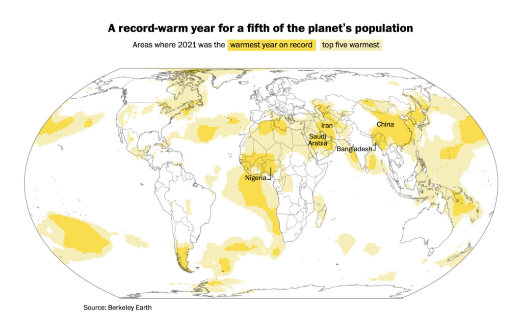
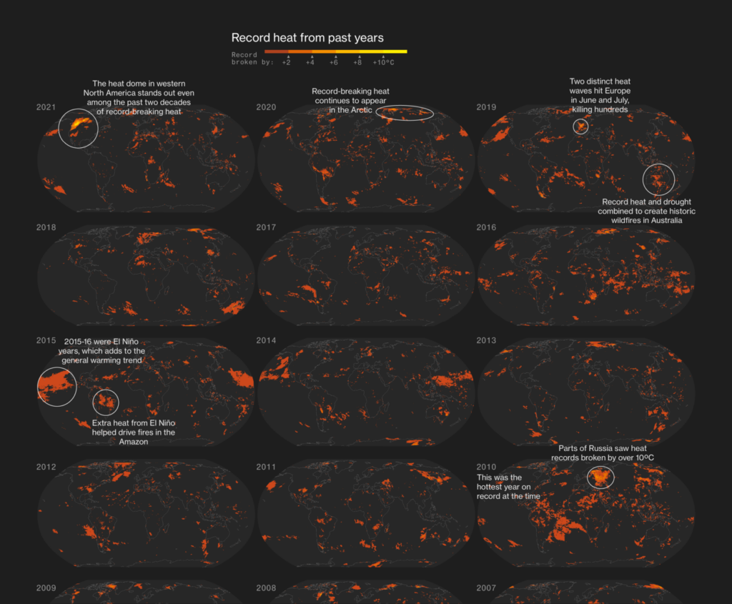
Meanwhile, another year of record-setting heat pushed climate failure to the top of economists’ risk list:

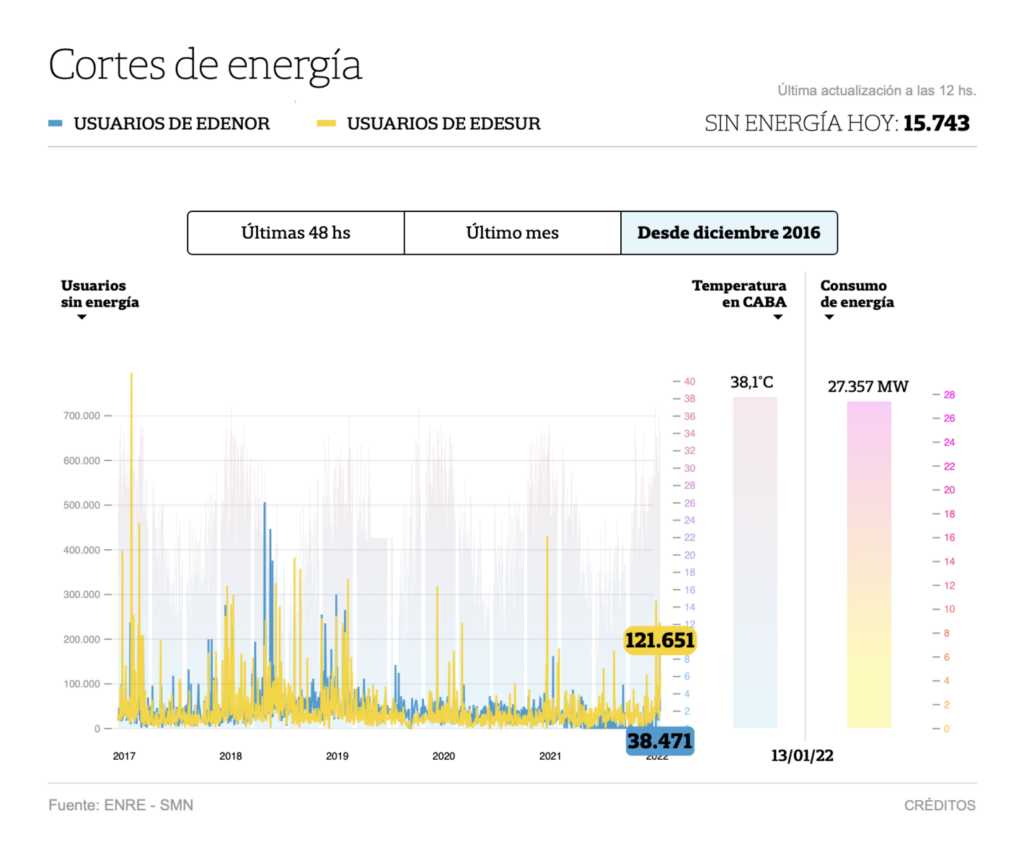
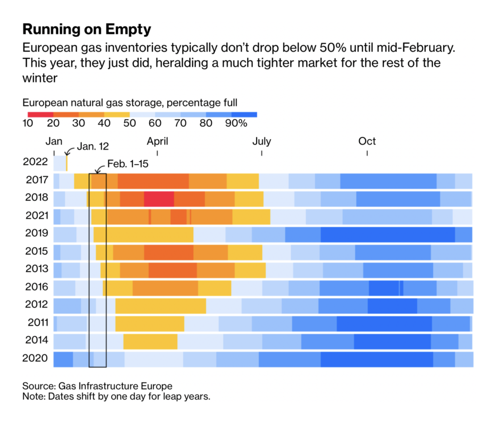
A historic heat wave caused power failures in Argentina, while Europeans are navigating a politically delicate energy crunch:

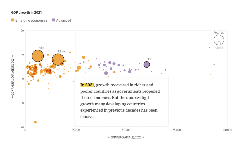
Finally, other economics charts took a geographic angle:

What else we found interesting


- Hiring: Several graphics reporters at the Wall Street Journal, a data journalist at SWR, a data editor at BuzzFeed, a multimedia editor and a developer at SRF News, an infographics editor at the Süddeutsche Zeitung
- The Pudding Cup is a prize for non-commercial, visual and data-driven stories — 2021 submissions will close on January 28.
Help us make this dispatch better! We’d love to hear which newsletters, blogs, or social media accounts we need to follow to learn about interesting projects, especially from less-covered parts of the world (Asia, South America, Africa). Write us at hello@datawrapper.de or leave a comment below.


Comments