Data Vis Dispatch, January 21: AI, inauguration, and ceasefire
The best of last week’s big and small data visualizations
Vivien Serve
Welcome back to the 177th edition of the Data Vis Dispatch! Every week, we publish a collection of the best small and large data visualizations we find, especially from news organizations — to celebrate data journalism, data visualization, simple charts, elaborate maps, and their creators.
Recurring topics this week include artificial intelligence, the presidential inauguration in the U.S., and the ceasefire in Gaza.
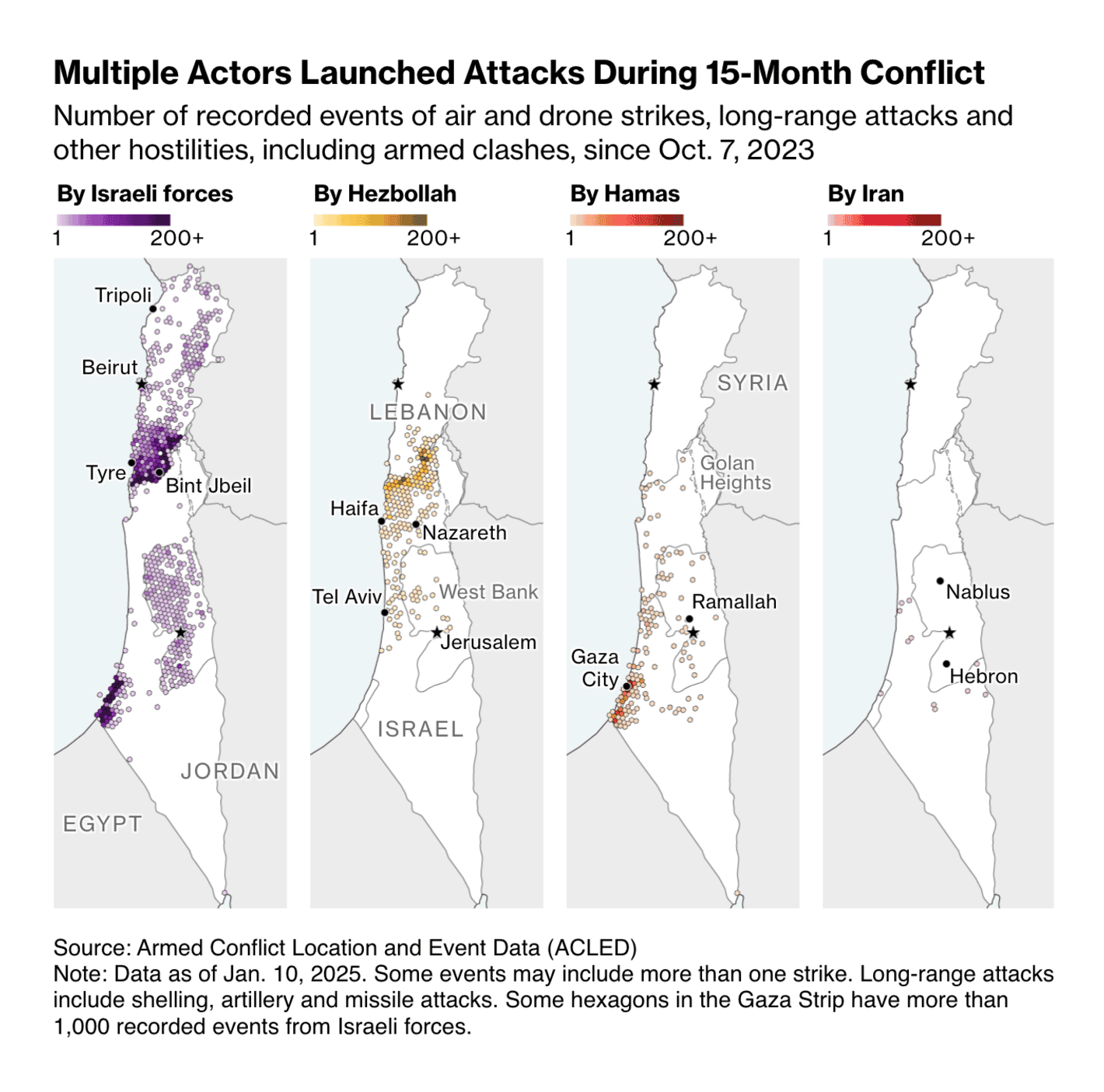
The Gaza ceasefire announced last week marks a temporary stop to a 15-month conflict that's left tens of thousands dead and destroyed vast stretches of land:
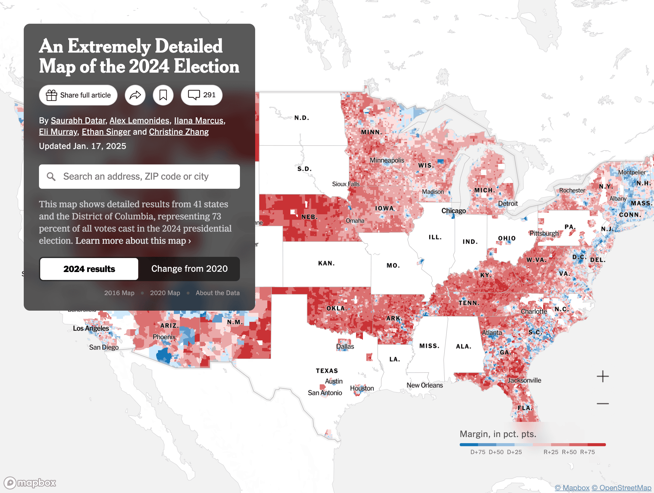
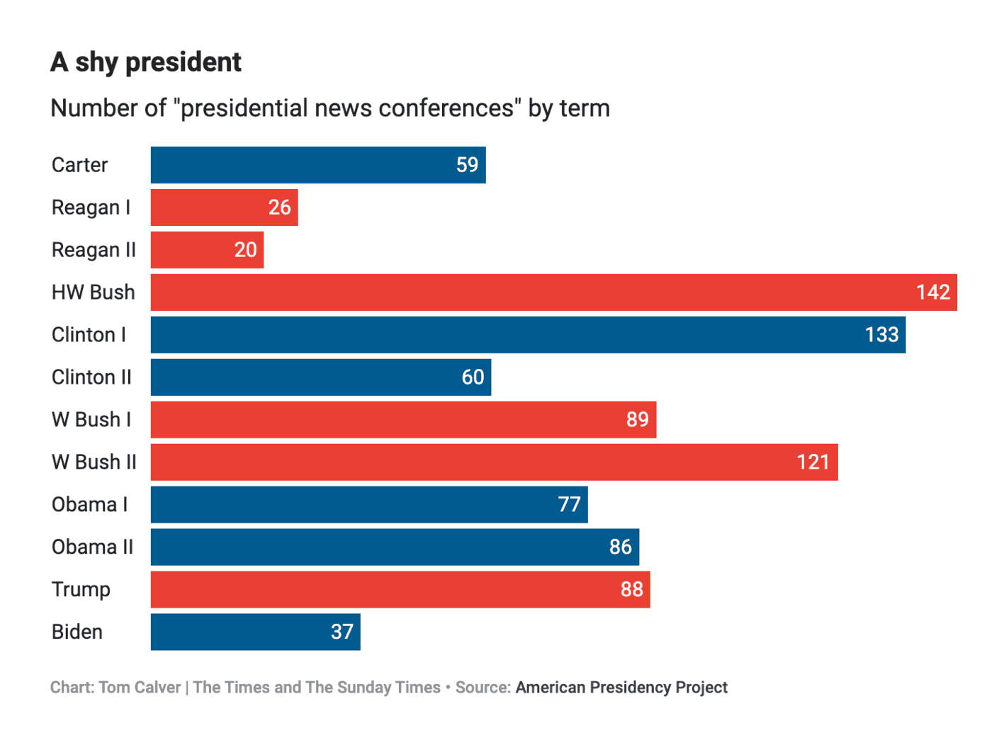
On Monday, January 20 Donald Trump was sworn in as U.S. president — again. These data visualizationslooked back at the election and documented the ceremony:
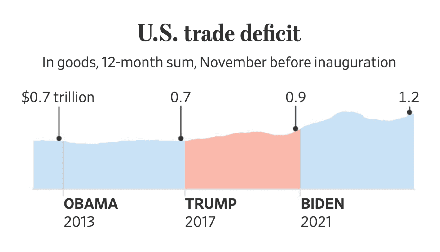
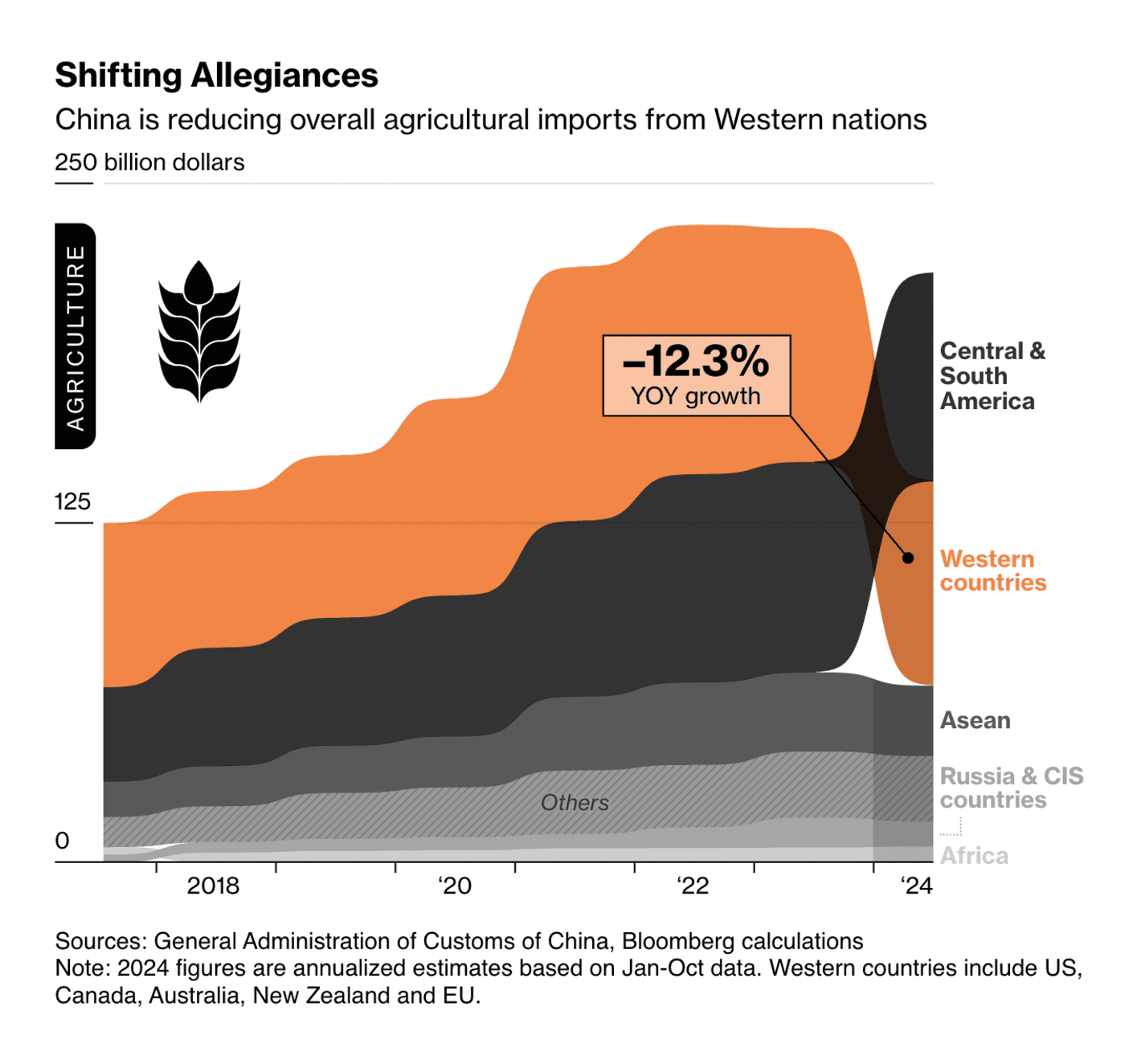
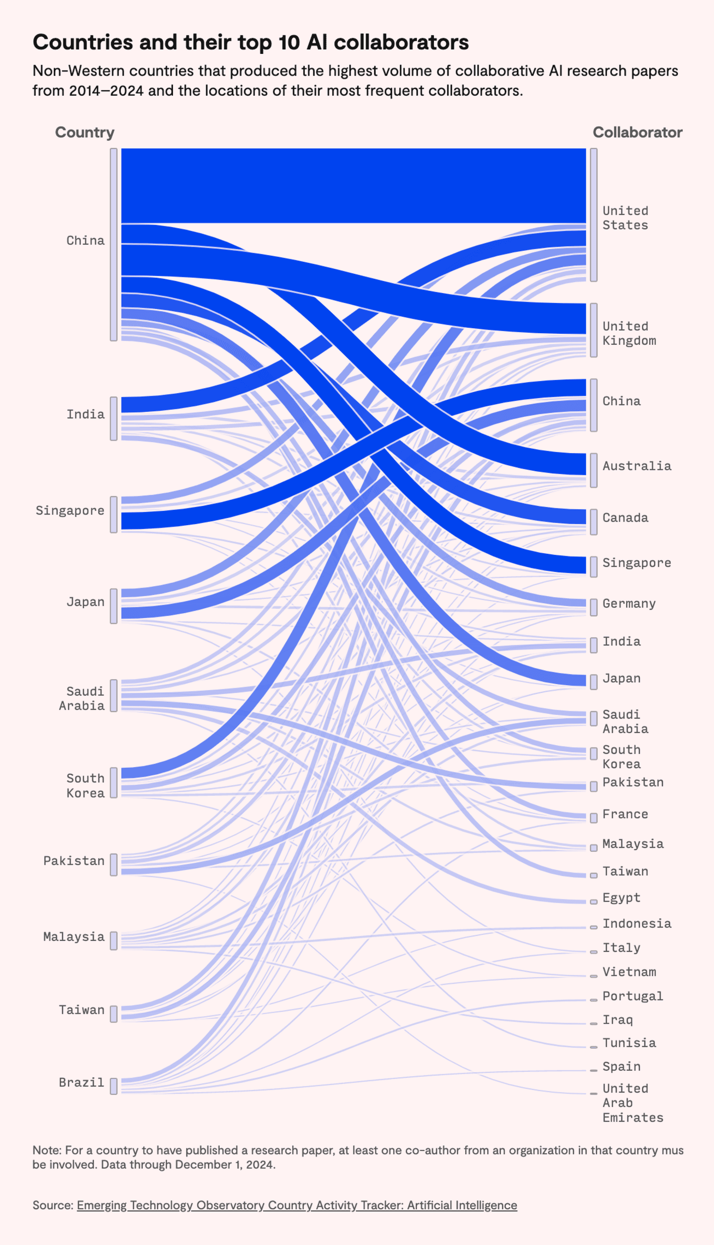
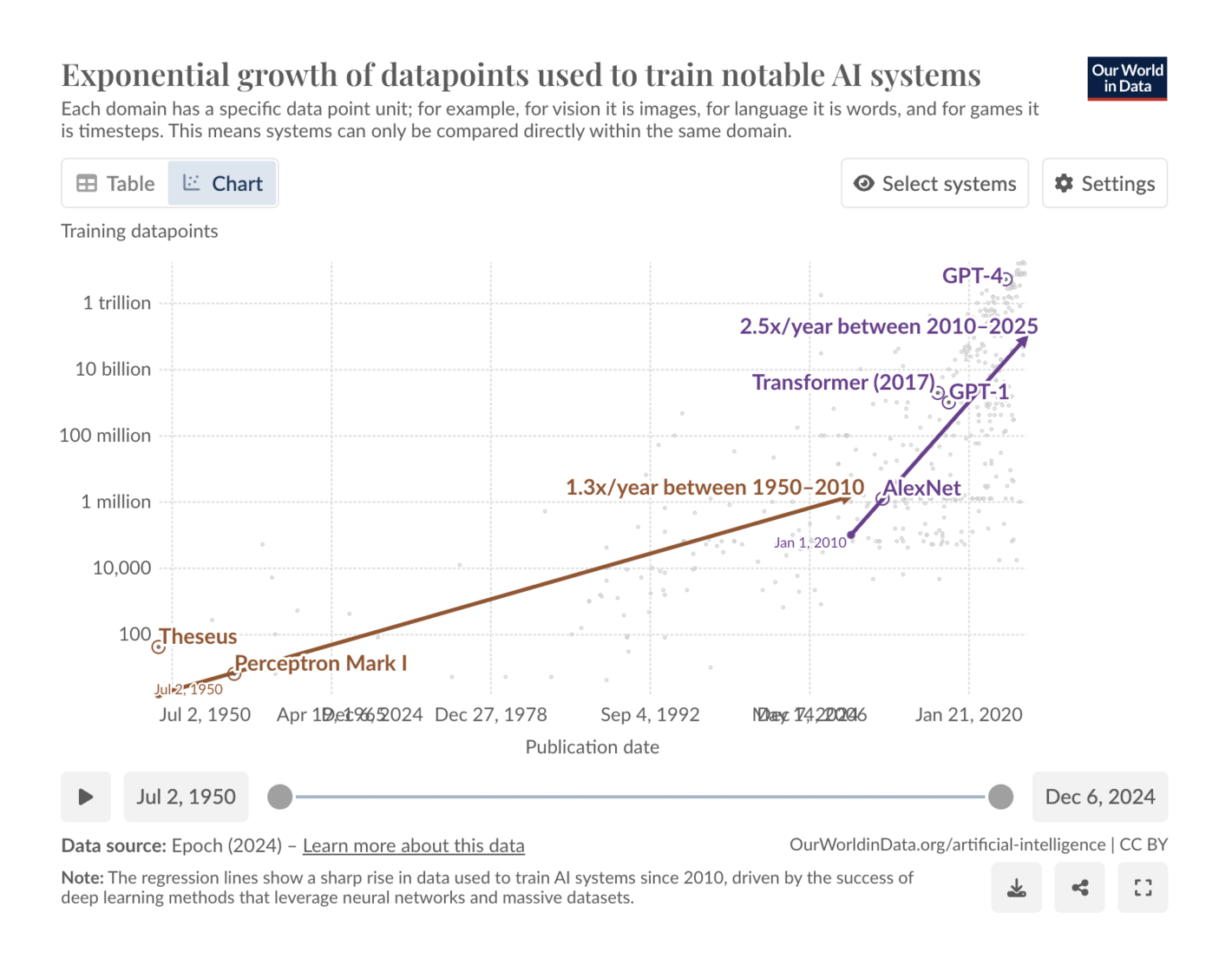
Trump has already signed his first executive orders, and repealed nearly 80 of his predecessor's. China is preparing for possible U.S. trade sanctions:
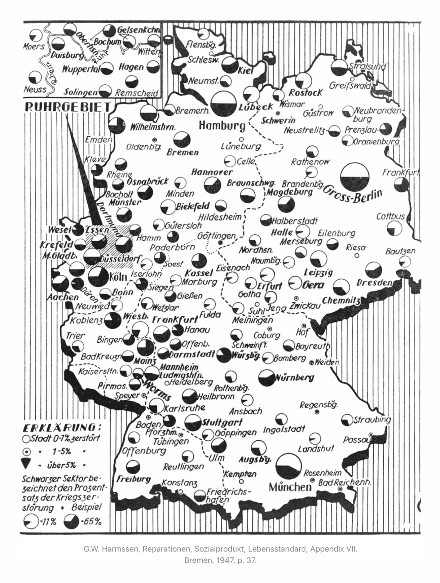
Trump's presidency prompts RJ Andrews to predict that more charts will pop up the next years, because charts thrive on times of crisis. Like here this map of damage after the Second World War in Germany:
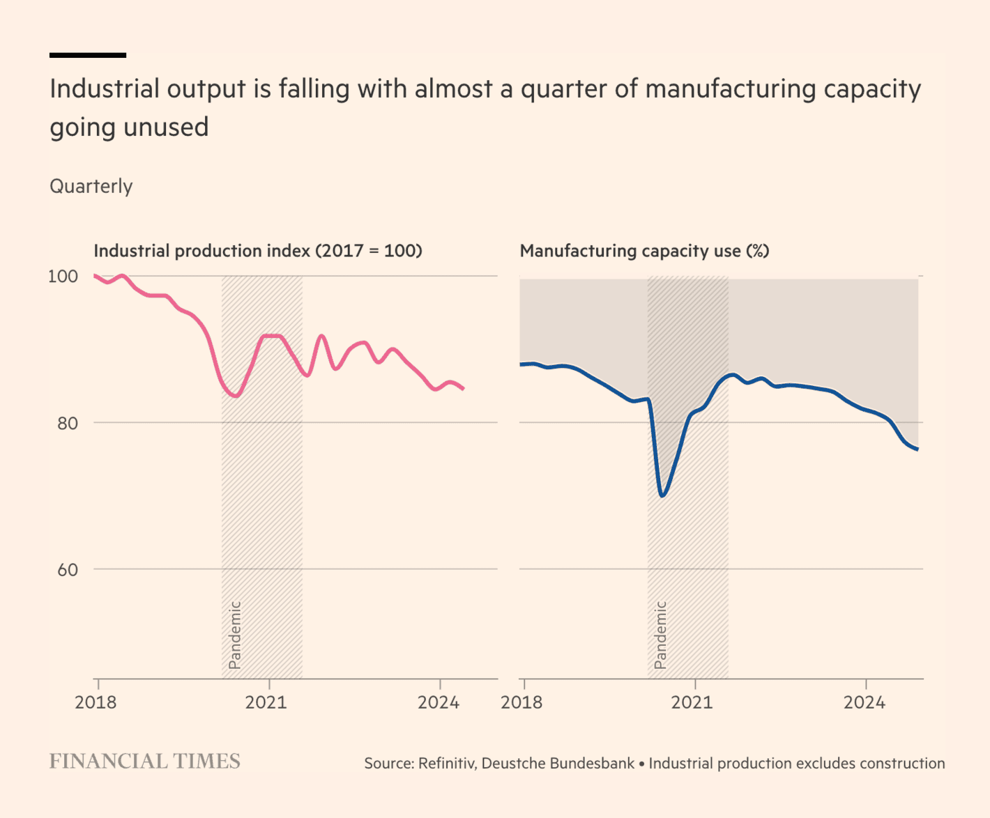
What are possible coalitions? Why did the previous government fail? Who gets how much funding? And what are the real consequences for the population of each party programme?
[Chart descriptions: How the selected proposals change disposable income for different annual gross incomes in percentages (left chart) and in euros (right chart) ]
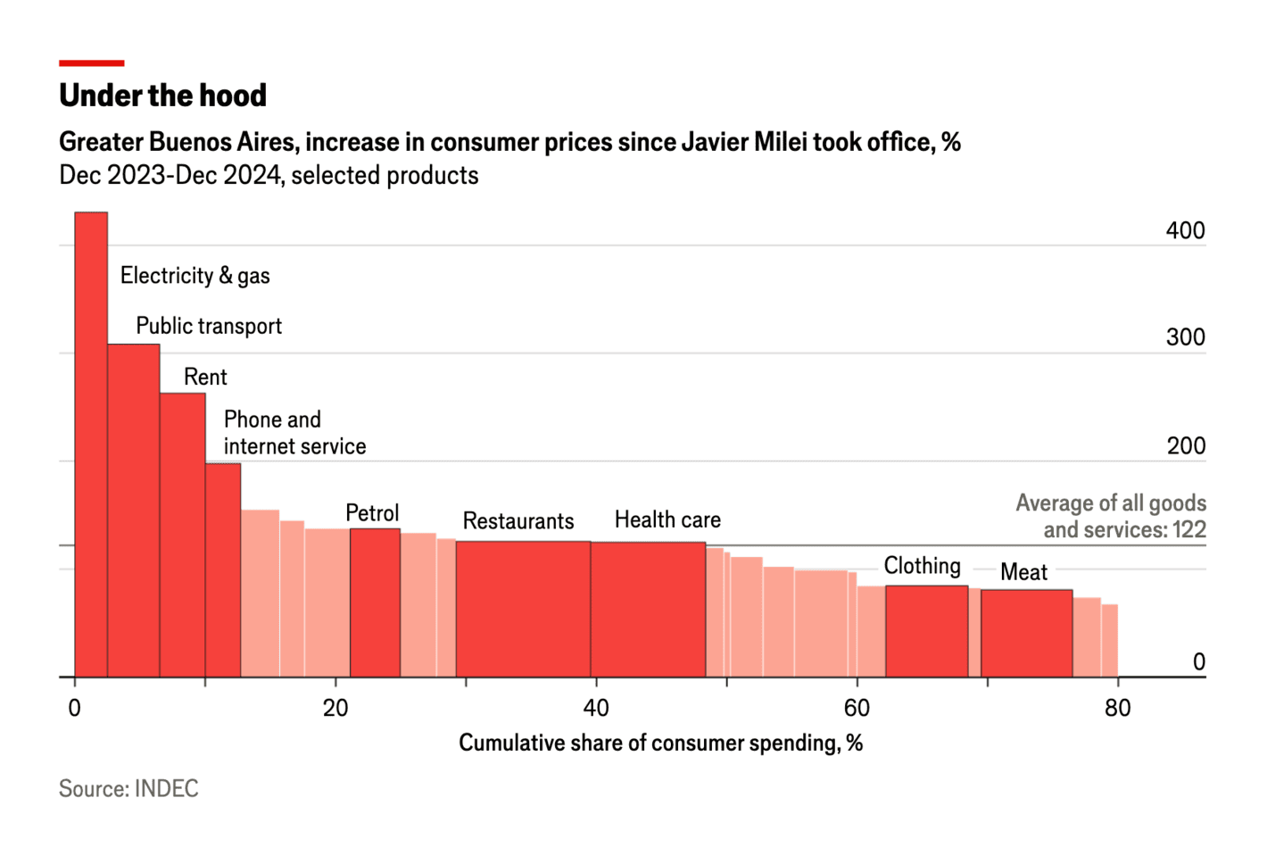
Checking in on Argentina's president, Javier Milei, and how his promise to fight inflation is working so far:
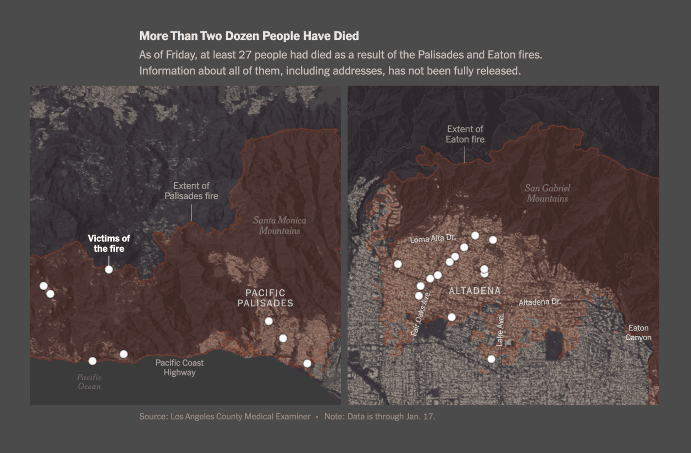
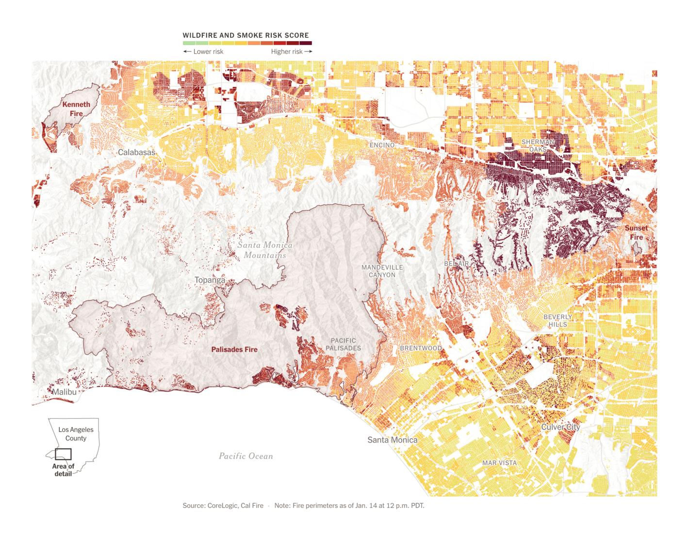
Last week's Dispatch was filled with visualizations of the Los Angeles wildfires. It's not over yet. This week we found maps about the terrible aftermath of these fires and the high risk that still remains:
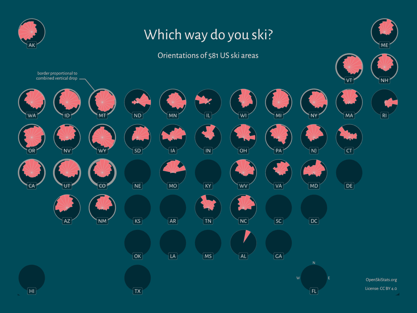
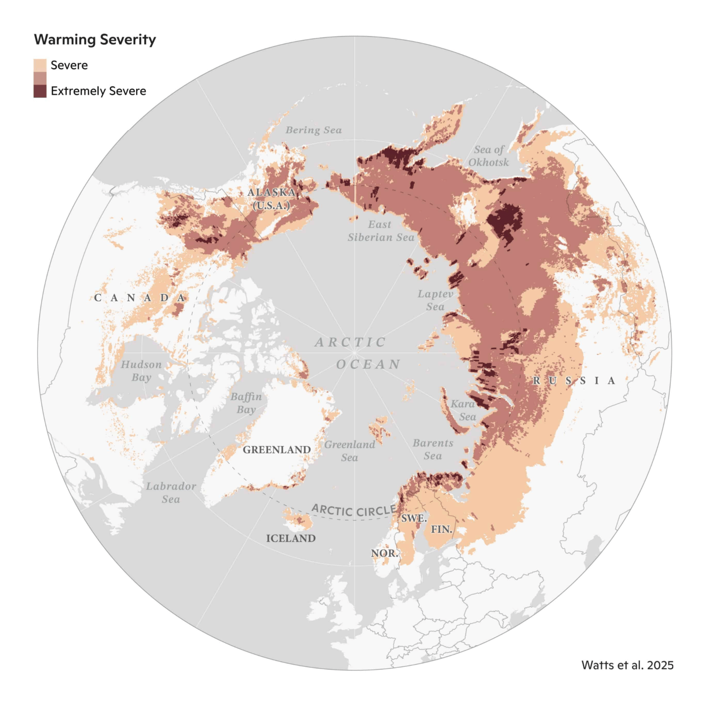
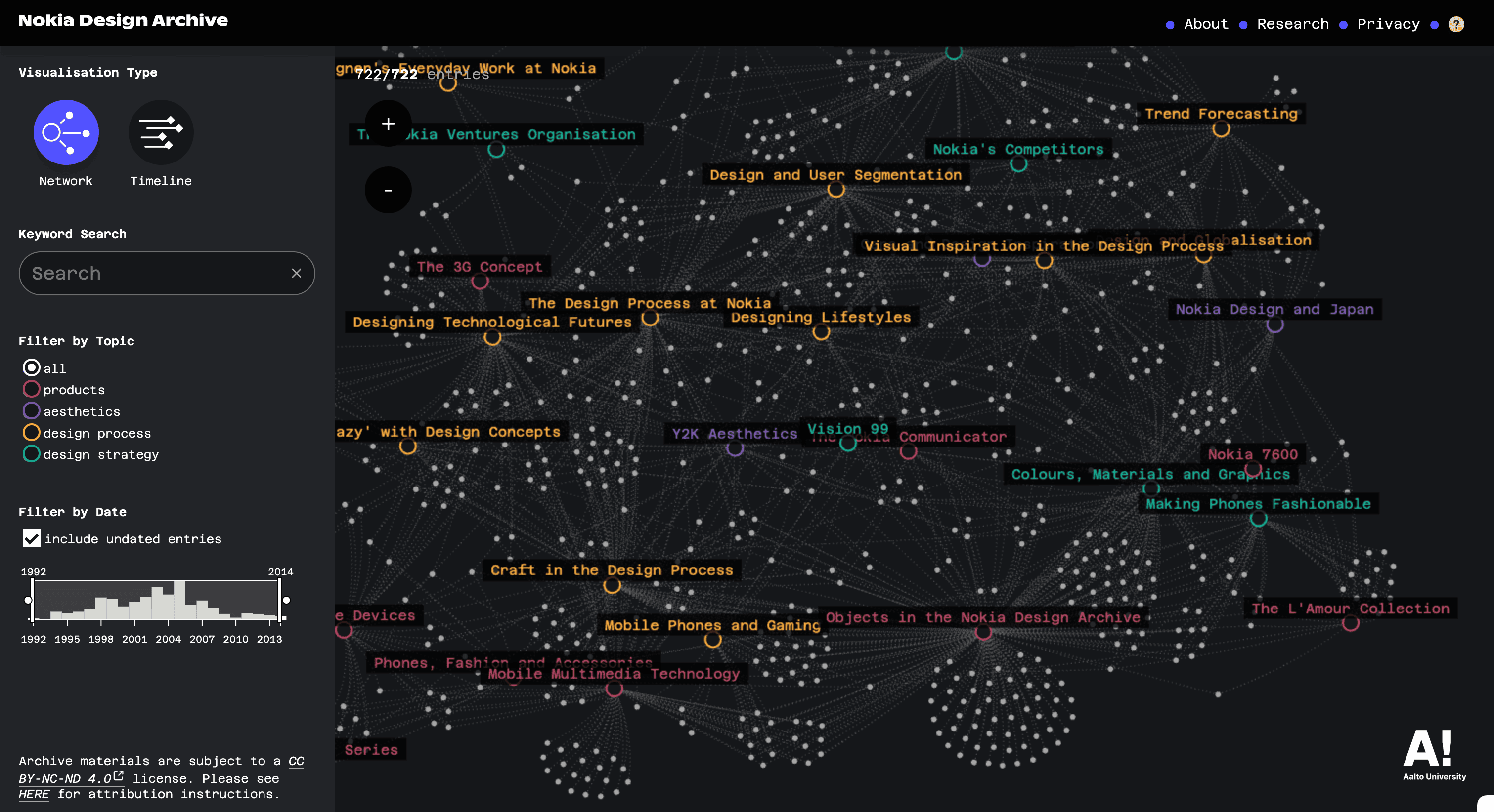
And finally, ski roses, a tool to illustrate the p-value issue, industrial chemicals in Spanish groundwater, climate stress in the Arctic Circle, and a huge interactive archive of Nokia design over the years:
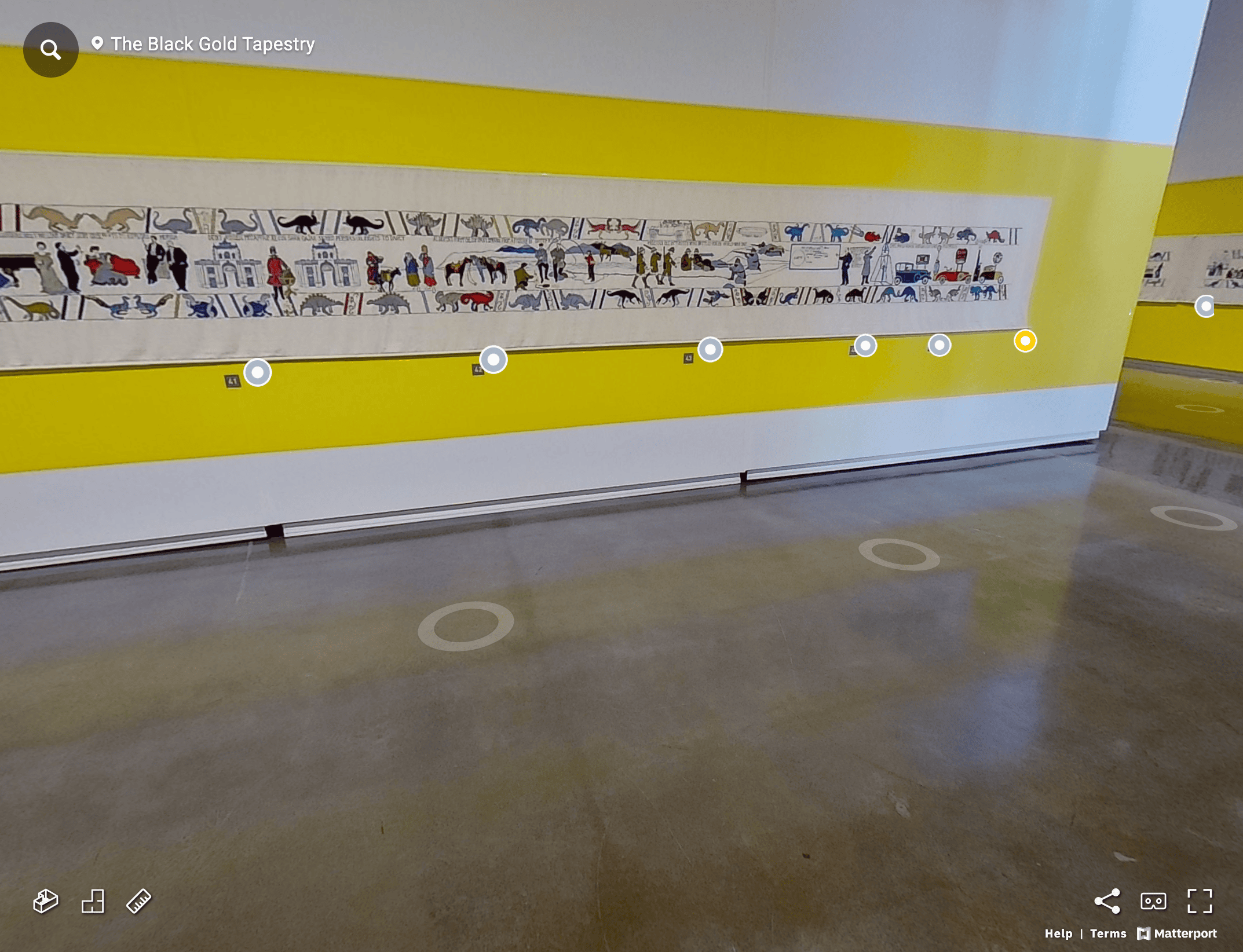
RJ Andrews: "Sandra Sawatzky's 220-foot tapestry charting the long history of oil, in 3-D," January 20 (Bluesky)Diario SUR: Un colegio ecológico, en la cumbre del arte moderno [An ecological school at the pinnacle of modern art], January 19CLEVER°FRANKE: "Our Dolby Atmos live visualization for LudoWic at ADE 2024 transformed spatial audio into dynamic visuals on 32 screens. Explore how technology and artistry created an immersive experience," January 16 (Bluesky)South China Morning Post: All you need to know about Year of the Snake, January 21
Applications are open for...
An academic employee in the “MyAppMyData” project at University of Applied Sciences Potsdam
Help us make this dispatch better! We'd love to hear which newsletters, blogs, or social media accounts we need to follow to learn about interesting projects, especially from less-covered parts of the world (Asia, South America, Africa). Write us at hello@datawrapper.de or leave a comment below.

![Corriere della Serra: <strong><a href="https://www.corriere.it/esteri/25_gennaio_15/cosa-succede-gaza-ostaggi-cessate-fuoco-5f492596-fe5d-4b03-b5a8-355b51471xlk.shtml">Cosa succede ora a Gaza: i dettagli del piano per il cessate il fuoco e il rilascio degli ostaggi</a></strong><br>[<em>What's Happening Now in Gaza: Details of the Ceasefire and Hostage Release Plan</em>], January 15](https://datawrapper.de/cdn-cgi/image/quality=85,width=1420,f=auto,fit=cover/https://kirby.datawrapper.de/media/pages/blog/data-vis-dispatch-january-21-2025/983d5652a6-1740123238/image1-1.png)
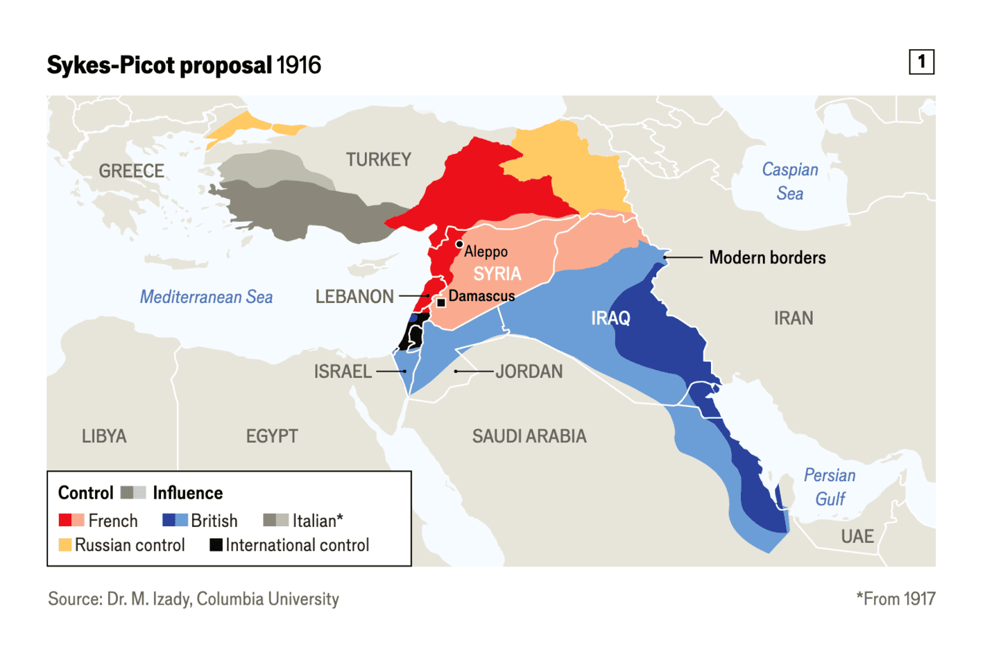
![El Orden Mundial: <strong><a href="https://elordenmundial.com/mapas-y-graficos/mapa-nueva-geopolitica-oriente-proximo/">El mapa de la nueva geopolítica de Oriente Próximo: las zonas de influencia de cada potencia</a></strong> [<em>The map of the new geopolitics of the Middle East: the zones of influence of each power</em>], January 14](https://datawrapper.de/cdn-cgi/image/quality=85,width=1300,f=auto,fit=cover/https://kirby.datawrapper.de/media/pages/blog/data-vis-dispatch-january-21-2025/212bdb4e6a-1740123238/mapa-nueva-geopolitica-oriente-proximo-limpio-def.png.webp)

![Le Monde: <strong><a href="https://www.lemonde.fr/les-decodeurs/article/2025/01/19/presidentielle-americaine-kamala-harris-aurait-pu-l-emporter-en-retournant-135-307-voix-dans-quatre-etats-cles-malgre-ses-2-3-millions-de-voix-de-retard_6505171_4355770.html">Kamala Harris aurait pu battre Donald Trump en « retournant » 135 307 voix dans quatre Etats-clés, malgré ses 2,3 millions de voix de retard</a></strong> [<em>Chart title: Winner's lead and votes needed to reverse the result</em>], January 19](https://datawrapper.de/cdn-cgi/image/quality=85,width=1420,f=auto,fit=cover/https://kirby.datawrapper.de/media/pages/blog/data-vis-dispatch-january-21-2025/63a88d828c-1740123238/image21-1.png)


![Le Temps: <strong><a href="https://www.letemps.ch/data/en-graphiques-les-sondages-et-la-course-a-la-chancellerie-allemande">En graphiques - Les sondages et Ela course à la chancellerie allemande</a></strong> [<em>In Charts - Polls and the Race for German Chancellor</em>], January 16](https://datawrapper.de/cdn-cgi/image/quality=85,width=1420,f=auto,fit=cover/https://kirby.datawrapper.de/media/pages/blog/data-vis-dispatch-january-21-2025/946641e0ab-1740123238/image28-1.png)
![Der Spiegel: <strong><a href="https://www.spiegel.de/politik/deutschland/sonntagsfrage-umfragen-zu-bundestagswahl-landtagswahl-europawahl-a-944816.html">So würde Deutschland heute wählen</a></strong> [<em>Chart description: Based on 1000 simulated election results, we calculated the number of seats for each coalition. Each result is shown as a square.</em>], January 20](https://datawrapper.de/cdn-cgi/image/quality=85,width=1420,f=auto,fit=cover/https://kirby.datawrapper.de/media/pages/blog/data-vis-dispatch-january-21-2025/7c59dd577c-1740123238/image17-2.png)
![Der Spiegel: <strong><a href="https://www.spiegel.de/politik/deutschland/parteispenden-tracker-das-nehmen-cdu-spd-und-co-im-wahlkampf-ein-a-b503718d-c483-4f98-867c-9f9aac012084">Das nehmen CDU, SPD und Co. im Wahlkampf ein</a></strong> [<em>Chart description: Large donations to political parties of over 35,000 euros</em>], January 20](https://datawrapper.de/cdn-cgi/image/quality=85,width=1420,f=auto,fit=cover/https://kirby.datawrapper.de/media/pages/blog/data-vis-dispatch-january-21-2025/6872c4db1e-1740123238/image16-2.png)
![Zeit Online: <strong><a href="https://www.zeit.de/politik/deutschland/2025-01/deutscher-bundestag-abgeordnete-historische-zusammensetzung-1949?utm_referrer=twitter&wt_zmc=sm.int.zonaudev.twitter.ref.zeitde.redpost.link.sf&utm_content=zeitde_redpost+_link_sf&utm_source=twitter_zonaudev_int&utm_campaign=ref&utm_medium=sm">Wie gut passt der Bundestag zum Volk?</a></strong> [<em>How well does the Bundestag match the people?</em>], January 20](https://datawrapper.de/cdn-cgi/image/quality=85,width=1420,f=auto,fit=cover/https://kirby.datawrapper.de/media/pages/blog/data-vis-dispatch-january-21-2025/641f37e162-1740123238/image39.png)
![Süddeutsche Zeitung: <strong><a href="https://www.sueddeutsche.de/projekte/artikel/wirtschaft/bundestagswahl-einkommen-buerger-steuer-versprechen-parteien-e995388/?reduced=true">Was die Wahlversprechen der Parteien jedem Bürger finanziell bringen</a></strong> [<em>What the parties' election promises mean financially for every citizen</em>], January 17](https://datawrapper.de/cdn-cgi/image/quality=85,width=1420,f=auto,fit=cover/https://kirby.datawrapper.de/media/pages/blog/data-vis-dispatch-january-21-2025/8fbb0e64ee-1740123238/image30-1.png)
![[<em>Chart descriptions: How the selected proposals change disposable income <em>for different annual gross incomes</em> in percentages (left chart) and in euros (right chart) </em>]](https://datawrapper.de/cdn-cgi/image/quality=85,width=1420,f=auto,fit=cover/https://kirby.datawrapper.de/media/pages/blog/data-vis-dispatch-january-21-2025/8bbf52d050-1740123238/image31-1.png)
![La Data Cuenta: <strong><a href="https://ladatacuenta.com/2025/01/18/incendios-en-los-angeles-y-si-hubieran-ocurrido-en-tu-ciudad/">Incendios en Los Ángeles: ¿Y si hubieran ocurrido en tu ciudad?</a></strong> [<em>Los Angeles Fires: What If They Happened in Your City?</em>], January 18](https://datawrapper.de/cdn-cgi/image/quality=85,width=1420,f=auto,fit=cover/https://kirby.datawrapper.de/media/pages/blog/data-vis-dispatch-january-21-2025/b256050be7-1740123238/image19-2.png)

![Yan Holtz: "Stop chasing the p-value! Increasing your sample size will always yield a significant result. Even for trivial differences [...]," January 16 (<strong><a href="https://bsky.app/profile/yan-holtz.bsky.social/post/3lfuiwtafb22m">Bluesky</a></strong>)](https://datawrapper.de/cdn-cgi/image/quality=85,width=1420,f=auto,fit=cover/https://kirby.datawrapper.de/media/pages/blog/data-vis-dispatch-january-21-2025/dbb2a1f2a7-1740123238/image32-1.png)
![DataDista: Alerta pfas: <strong><a href="https://especiales.datadista.com/medioambiente/alerta-pfas-papeles-secretos-contaminacion-quimica/">70 años de engaños de la industria química que ya han llegado al grifo y a 270° tu sangre</a></strong> [<em>Chart description: Map of municipalities with the presence of PFAS in tap water with values at or above the legal limit and (green) o measurements that are at 60% of their limit value (orange). At the moment, only 44% of municipalities have reported their PFAS analyses</em>], January 14](https://datawrapper.de/cdn-cgi/image/quality=85,width=1420,f=auto,fit=cover/https://kirby.datawrapper.de/media/pages/blog/data-vis-dispatch-january-21-2025/957de8a4fc-1740123238/image45.png)
![Diario SUR: <strong><a href="https://www.diariosur.es/culturas/arte/colegio-ecologico-cumbre-arte-moderno-20250119070011-ntrc.html">Un colegio ecológico, en la cumbre del arte moderno</a></strong> [<em>An ecological school at the pinnacle of modern art</em>], January 19](https://datawrapper.de/cdn-cgi/image/quality=85,width=1420,f=auto,fit=cover/https://kirby.datawrapper.de/media/pages/blog/data-vis-dispatch-january-21-2025/1d571a2646-1740123238/image18-2.png)