Data Vis Dispatch, February 18: German election polls, corruption, and tariffs
February 18th, 2025
9 min
Datawrapper lets you show your data as beautiful charts, maps or tables with a few clicks. Find out more about all the available visualization types.
Our mission is to help everyone communicate with data - from newsrooms to global enterprises, non-profits or public service.
We want to enable everyone to create beautiful charts, maps, and tables. New to data visualization? Or do you have specific questions about us? You'll find all the answers here.
Data vis best practices, news, and examples
250+ articles that explain how to use Datawrapper
Answers to common questions
An exchange place for Datawrapper visualizations
Attend and watch how to use Datawrapper best
Learn about available positions on our team
Our latest small and big improvements
Build your integration with Datawrapper's API
Get in touch with us – we're happy to help
This article is brought to you by Datawrapper, a data visualization tool for creating charts, maps, and tables. Learn more.
The best of last week’s big and small data visualizations
Welcome back to the 126th edition of Data Vis Dispatch! Every week, we’ll be publishing a collection of the best small and large data visualizations we find, especially from news organizations — to celebrate data journalism, data visualization, simple charts, elaborate maps, and their creators.
Recurring topics this week include animals, money, and conflicts around the world.
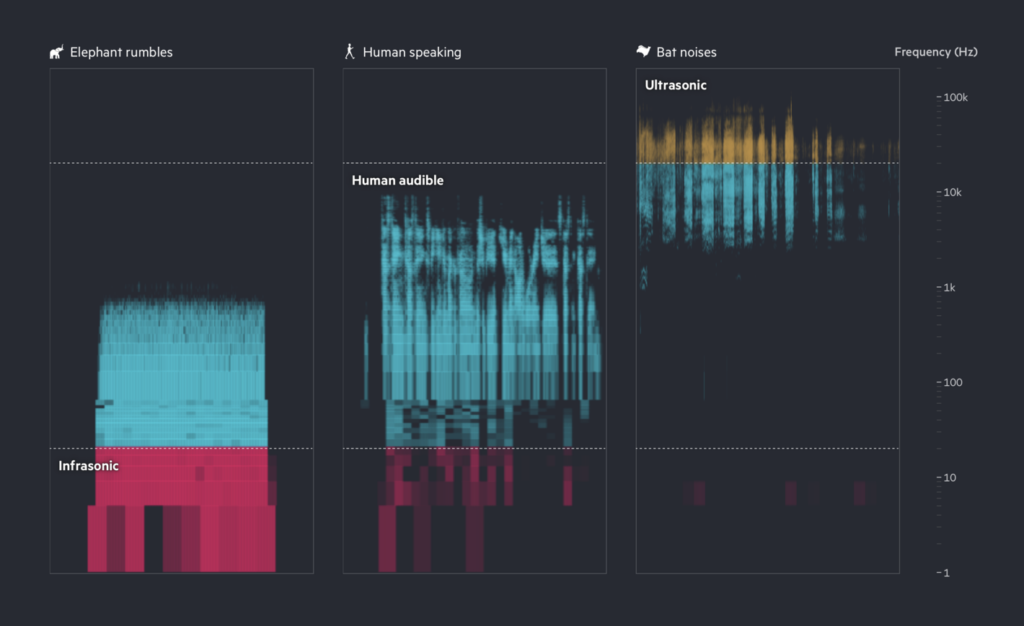
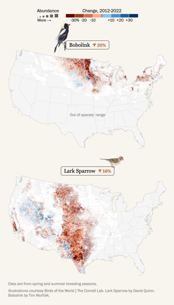
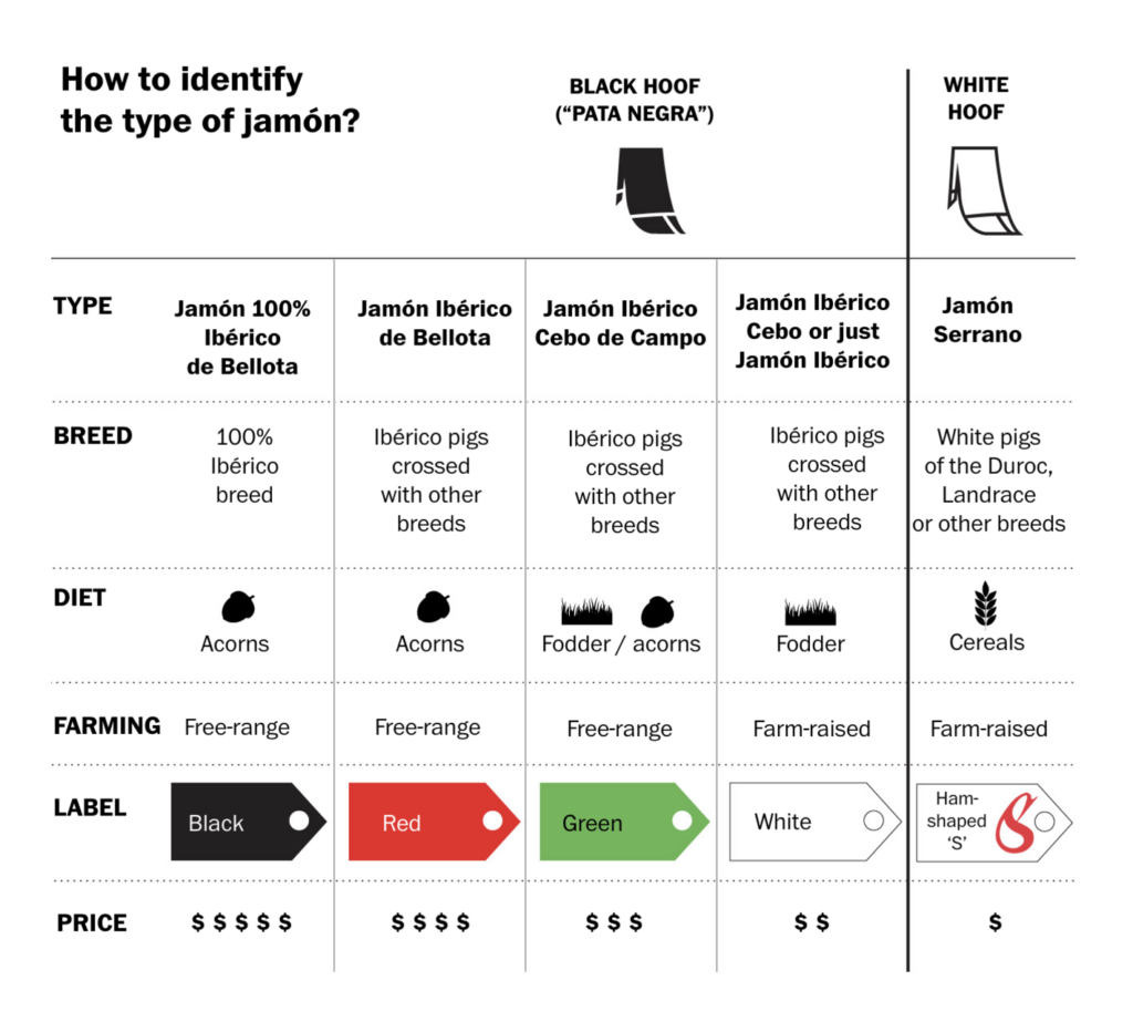
This week we saw all sorts of animal visualizations: AI decoding animal behavior, shrinking bird populations and — maybe a bit macabre — a special animal coming to our tables for big bucks:
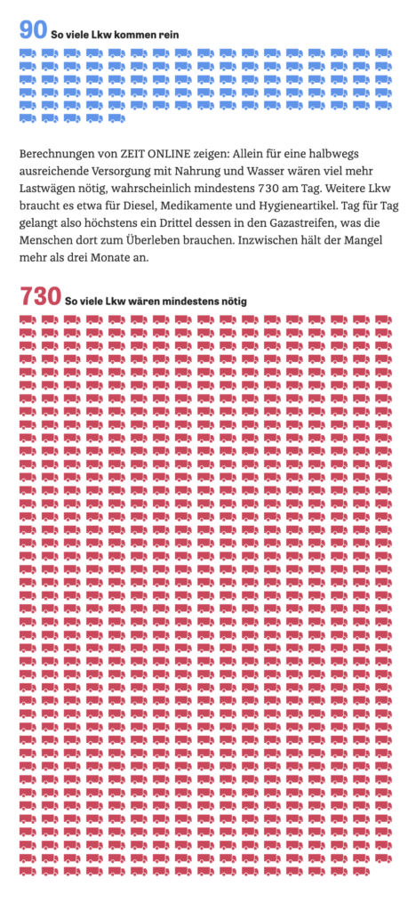
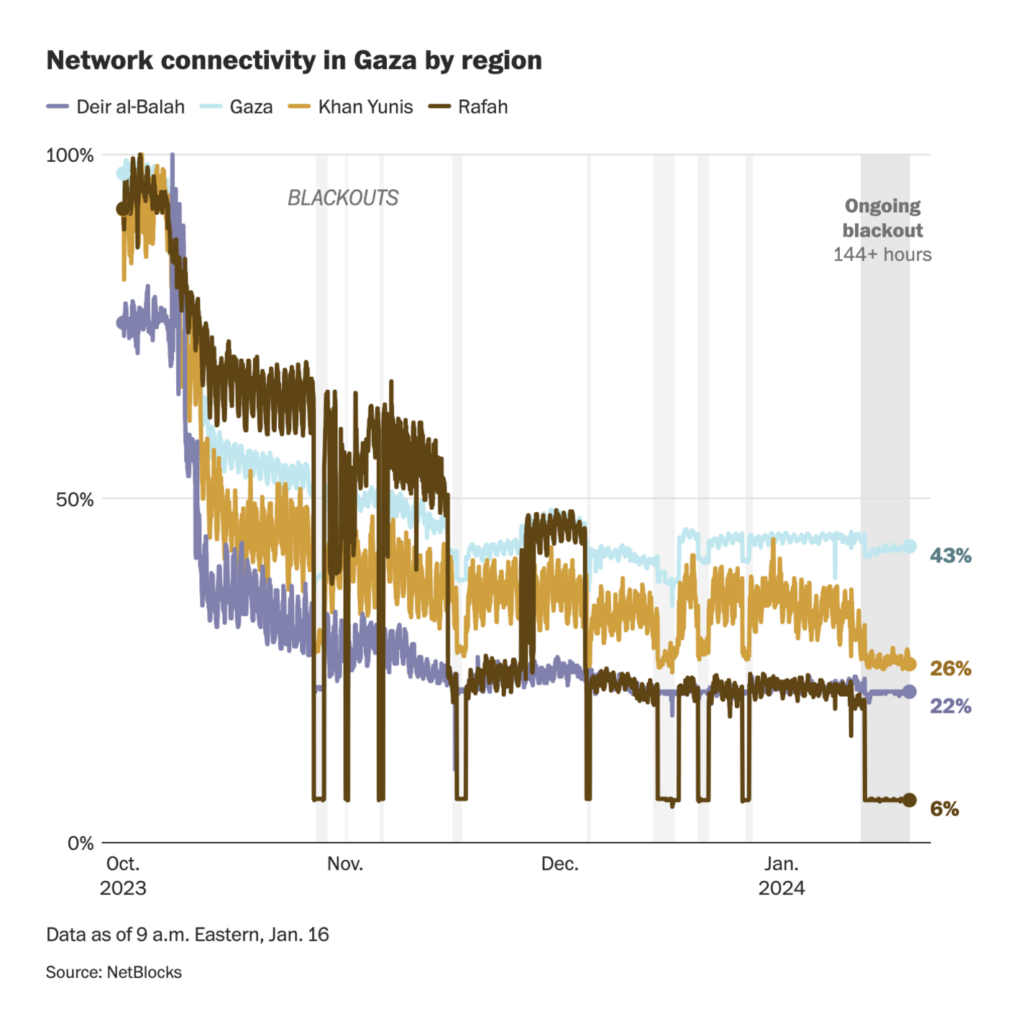
After over three months of war between Israel and Hamas, the United Nations has declared the Gaza Strip uninhabitable. We saw charts and maps on lack of aid deliveries, network failures, and Israeli ground operations in Gaza:

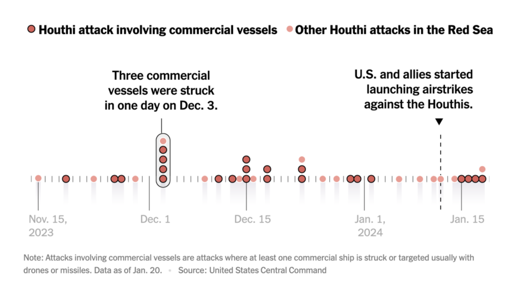
We also saw updates on Houthi attacks on ships in the Suez Canal and their consequences for international shipping:
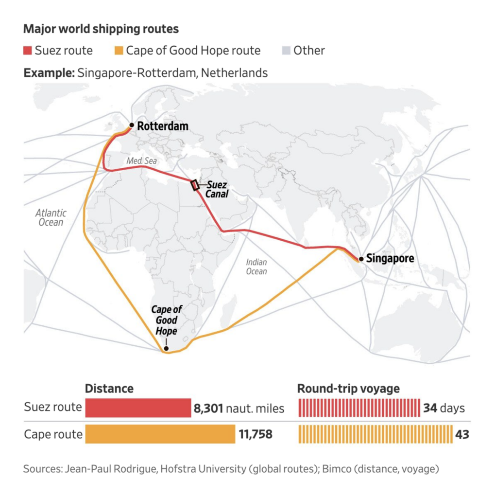
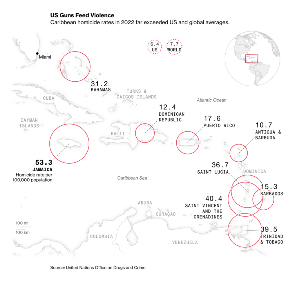
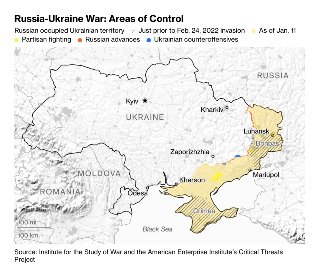
But let’s not forget other warfare and violence. Of the ten countries with the highest homicide rates in the world, five are in the Caribbean; West African coastal countries are concerned about the spread of Islamist insurgents in the Sahel. And while Ukraine has had some successes, economists and officials predict that money and time may be running out:
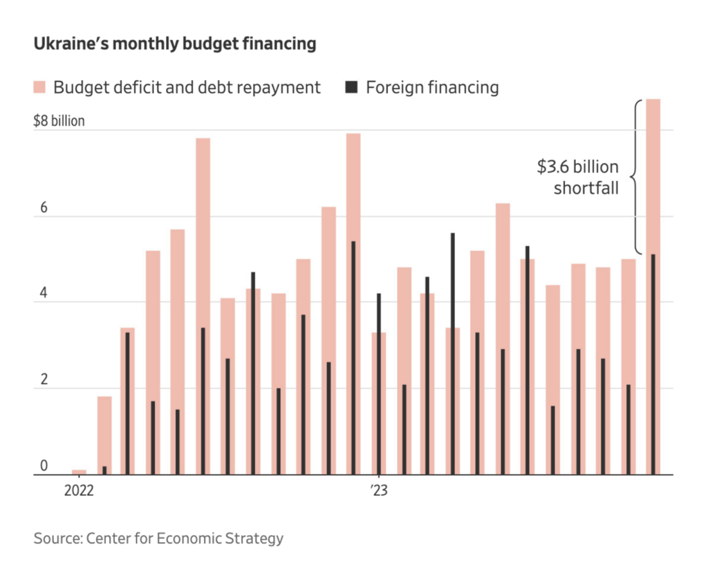
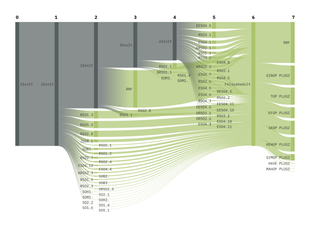
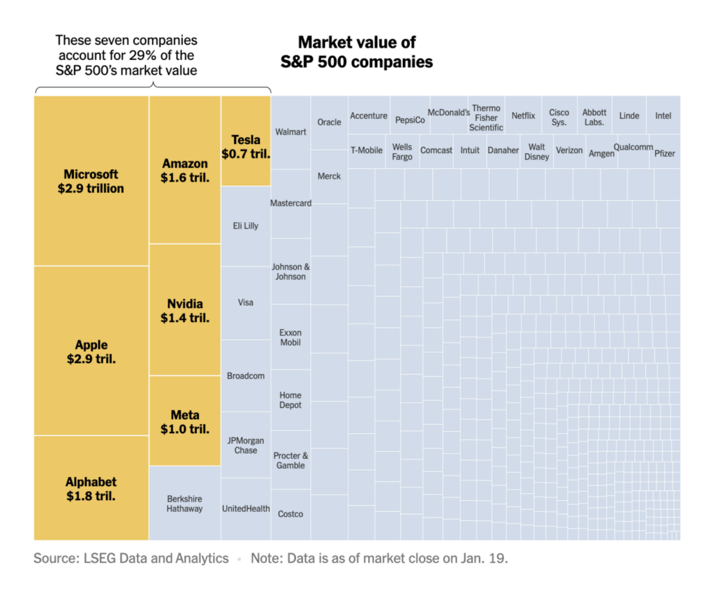
Money wasn’t only an important topic in this week’s Ukraine-Russia visualizations. We also saw charts on suspended EU payments to Hungary, seven tech companies with huge market values, and eight billionaires:

Good and bad news for the climate. The bad news first:
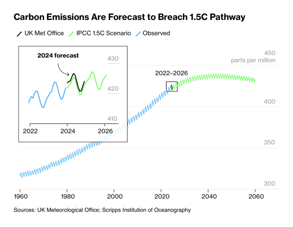
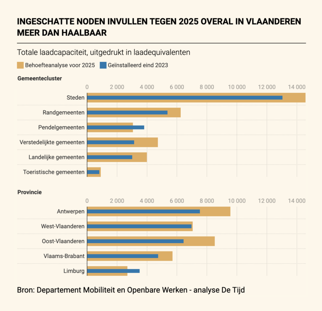
Next up, visualizations from space and air:
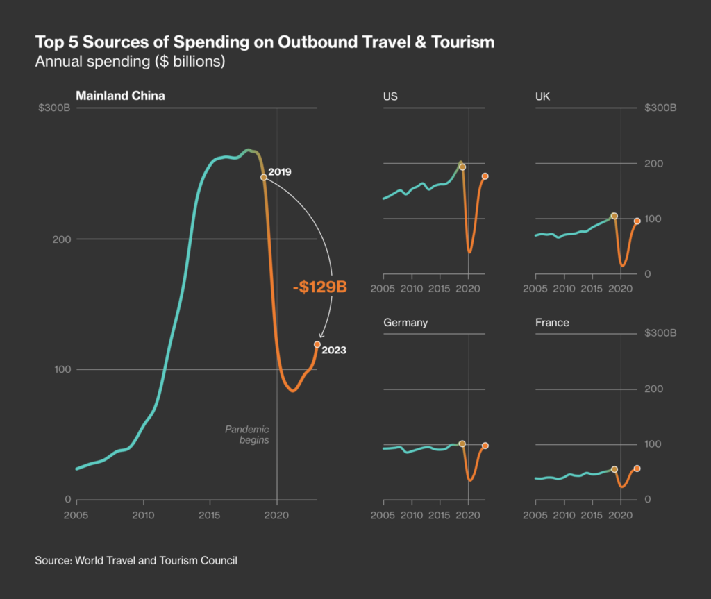
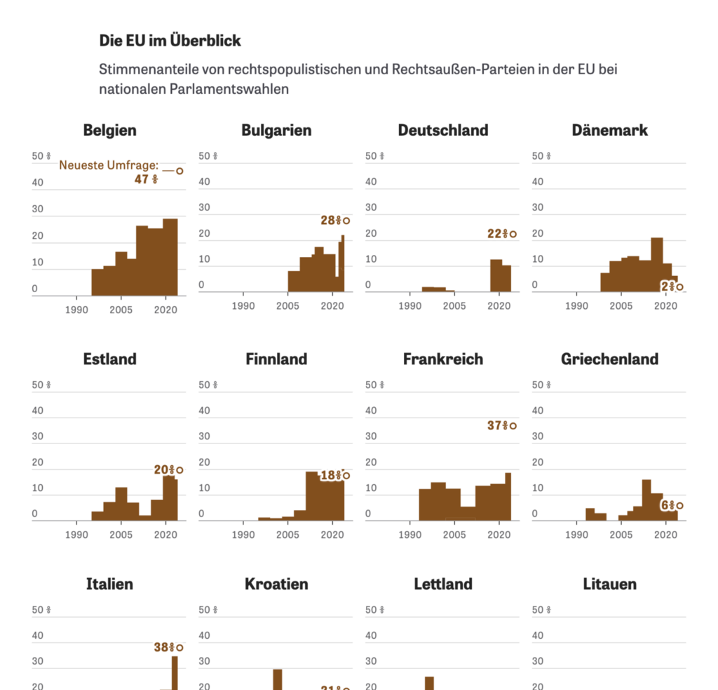
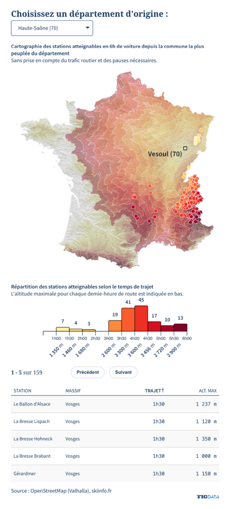
Finally, a detailed account of Europe’s political shift to the right, a murder case in Spain, and routes to ski resorts in France:


Applications are open for…
Help us make this dispatch better! We’d love to hear which newsletters, blogs, or social media accounts we need to follow to learn about interesting projects, especially from less-covered parts of the world (Asia, South America, Africa). Write us at hello@datawrapper.de or leave a comment below.
Want the Dispatch in your inbox every Tuesday? Sign up for our Blog Update newsletter!
Comments