This article is brought to you by Datawrapper, a data visualization tool for creating charts, maps, and tables. Learn more.
Data Vis Dispatch, January 24
The best of last week’s big and small data visualizations
Welcome back to the 78th edition of Data Vis Dispatch! Every week, we’ll be publishing a collection of the best small and large data visualizations we find, especially from news organizations — to celebrate data journalism, data visualization, simple charts, elaborate maps, and their creators.
Recurring topics this week include wages in Britain, floods in California, and blackouts in Ukraine and South Africa.
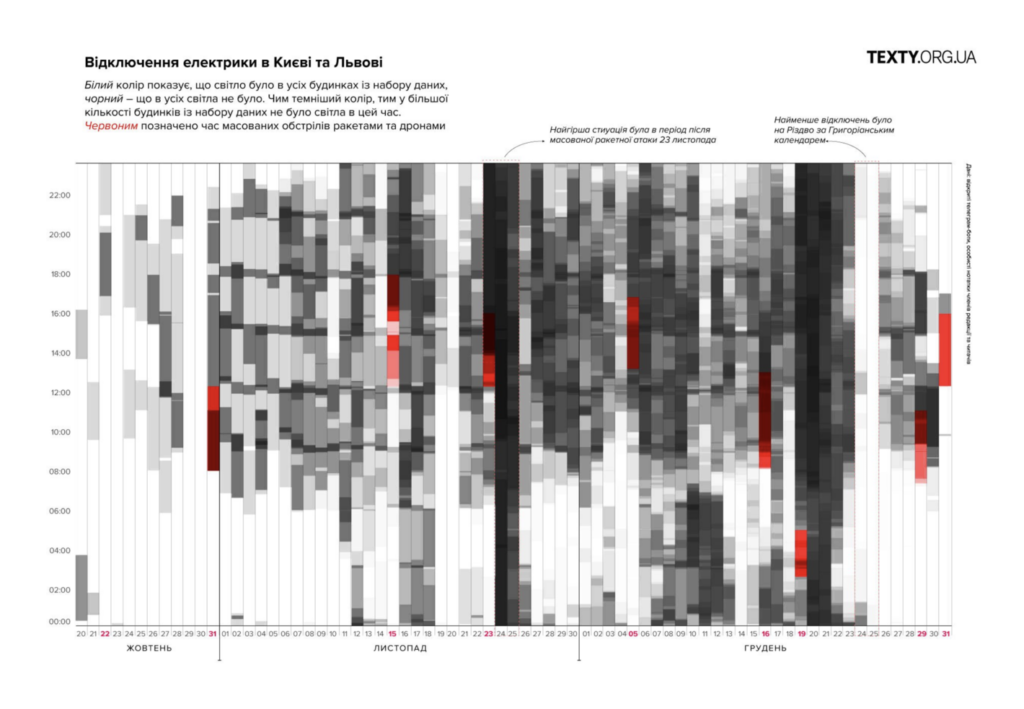
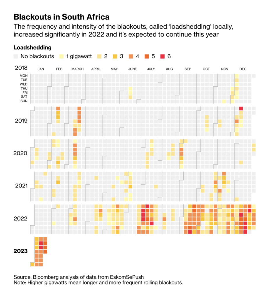
Two charts this week show countries struggling with frequent blackouts. In Ukraine, that’s due to Russian shelling; in South Africa, long-term corruption and political mismanagement.
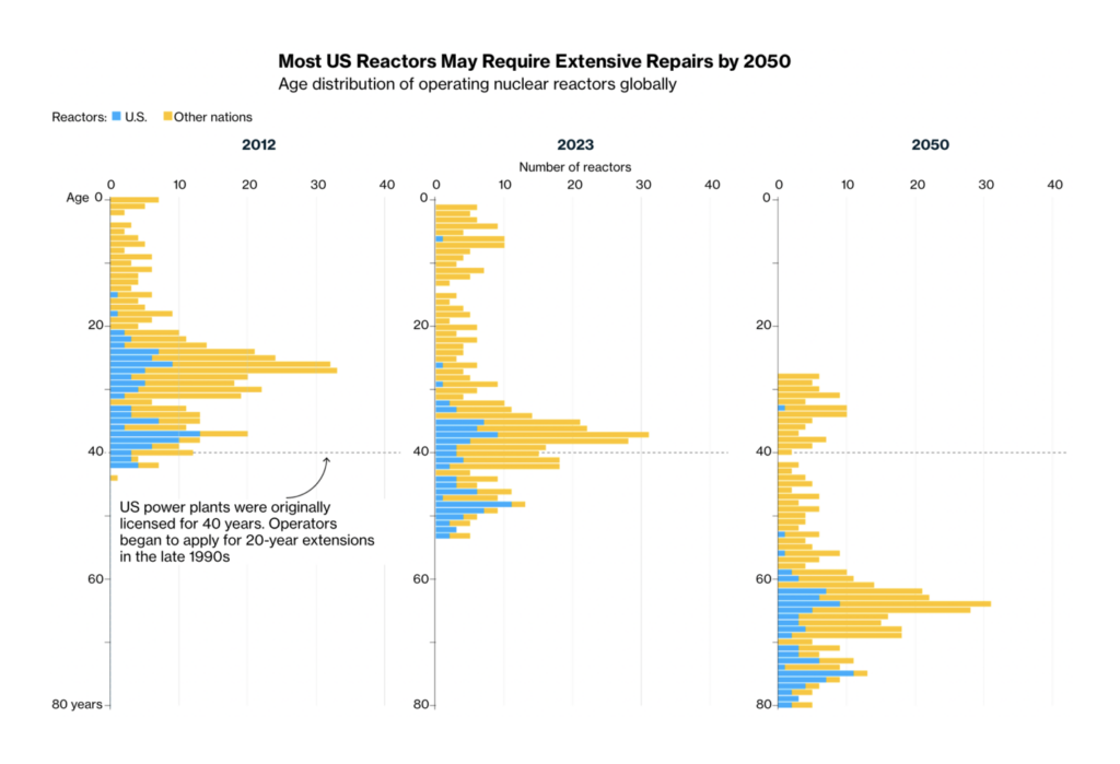
Nuclear power plants in the U.S. are becoming an elderly bunch:
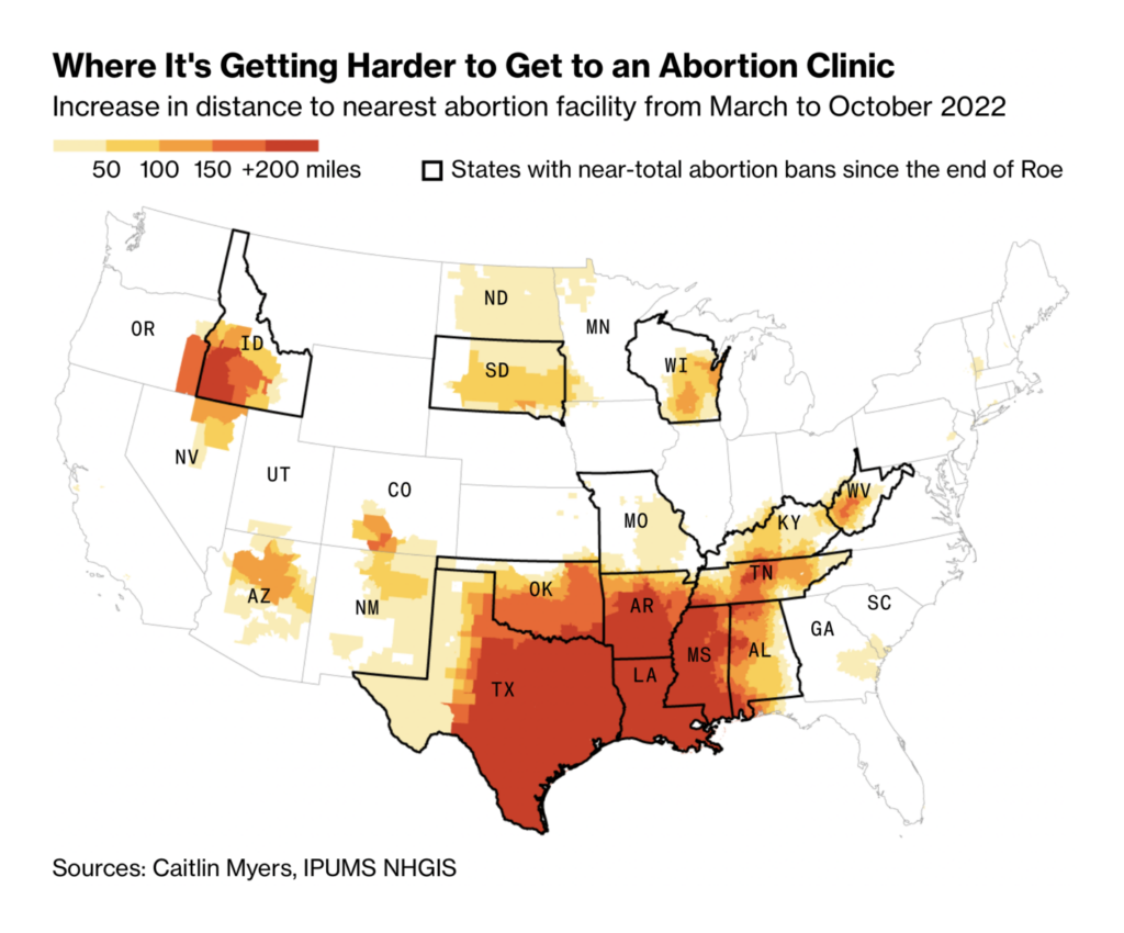
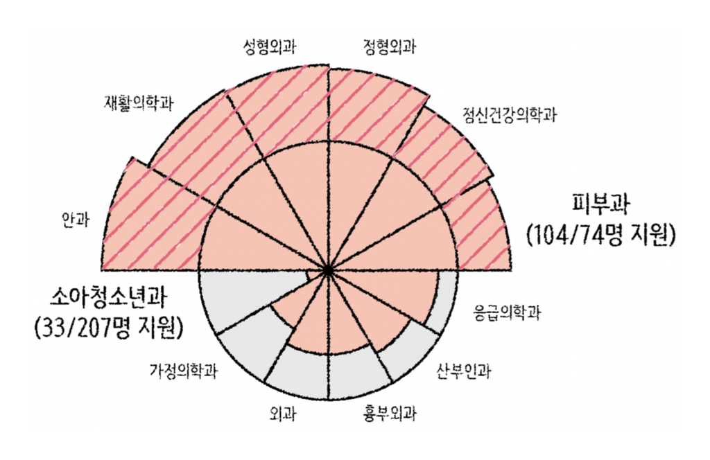
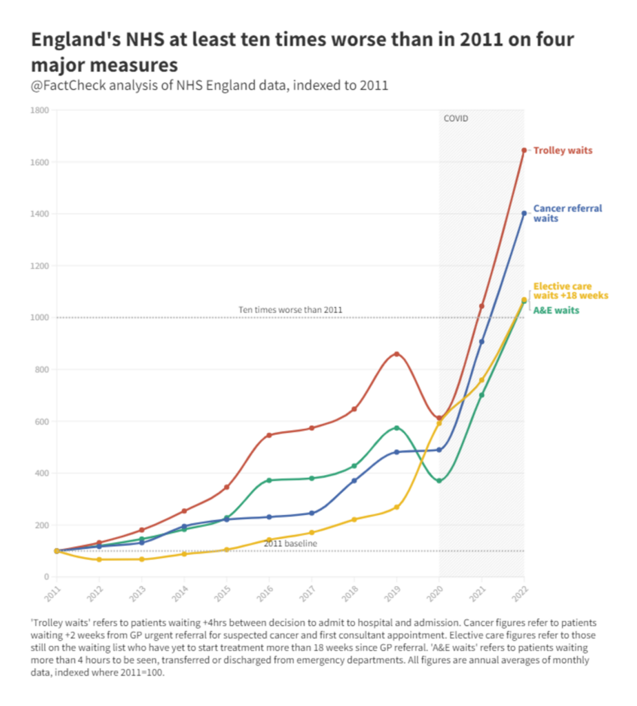
Health care systems are stressed around the world, with political interference in the U.S., a shortage of trainees in South Korea, and growing waitlists in England:
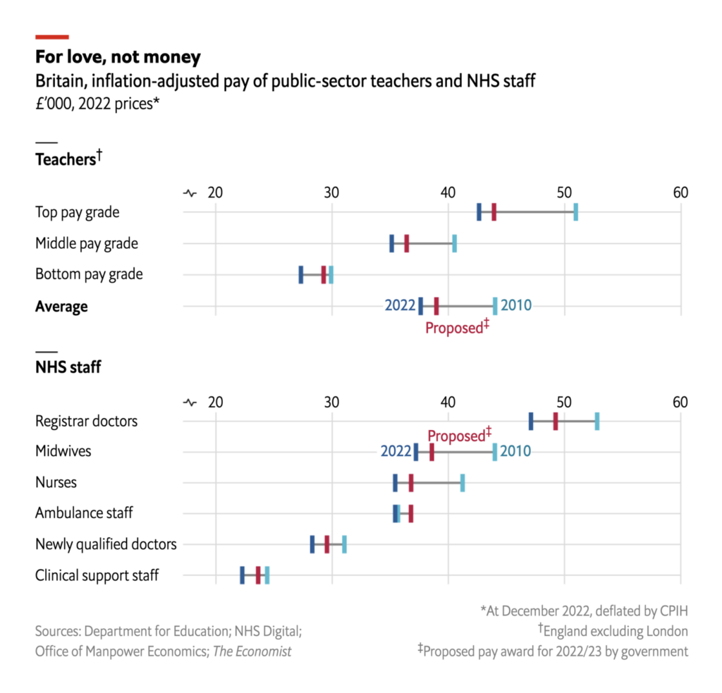
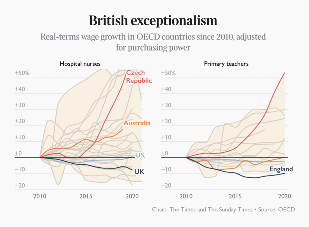
Meanwhile, low wages are fueling a winter of labor disputes across the U.K.:
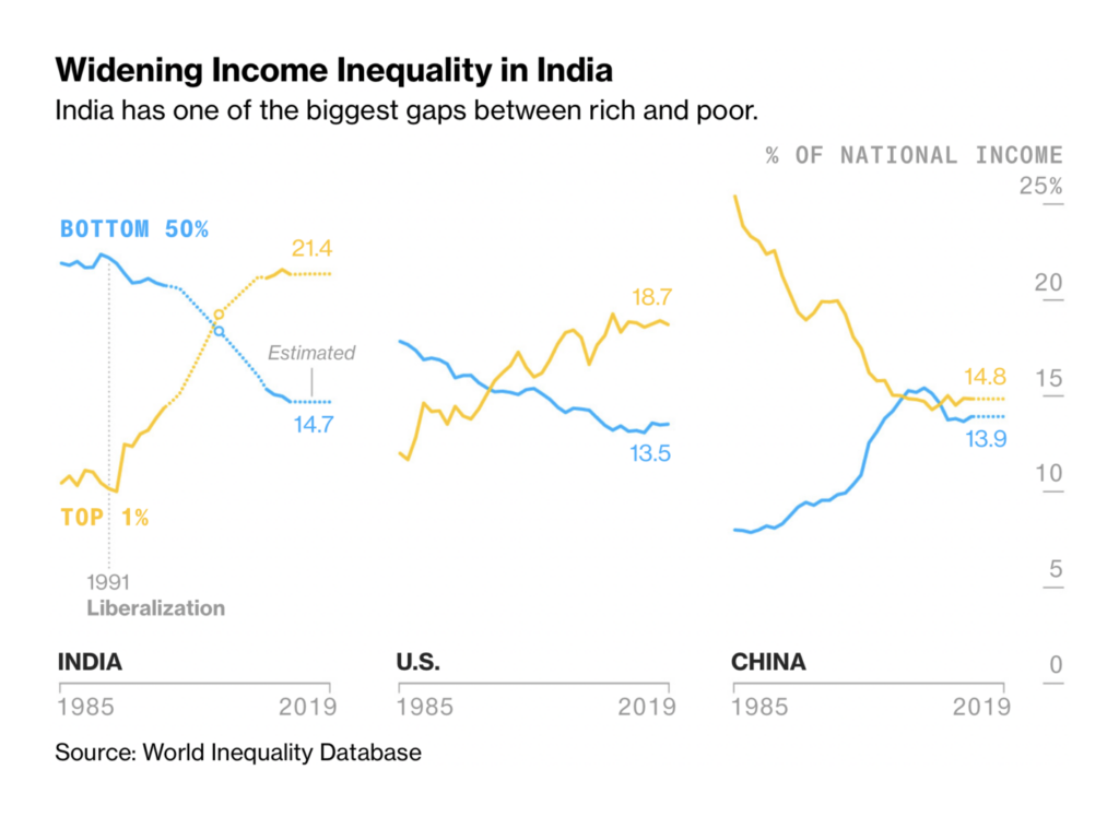
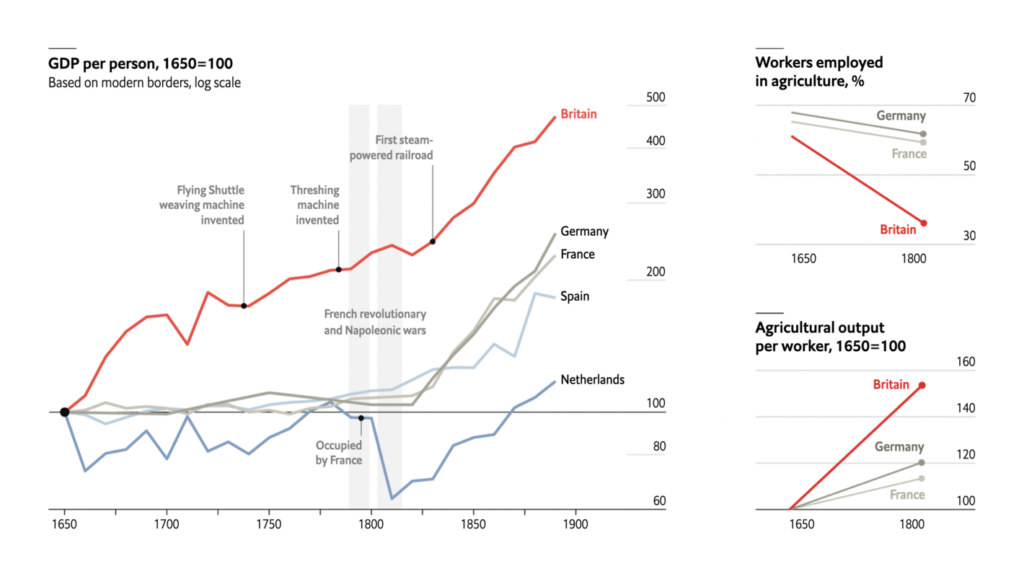
We saw historical perspectives on industrialization and transportation:
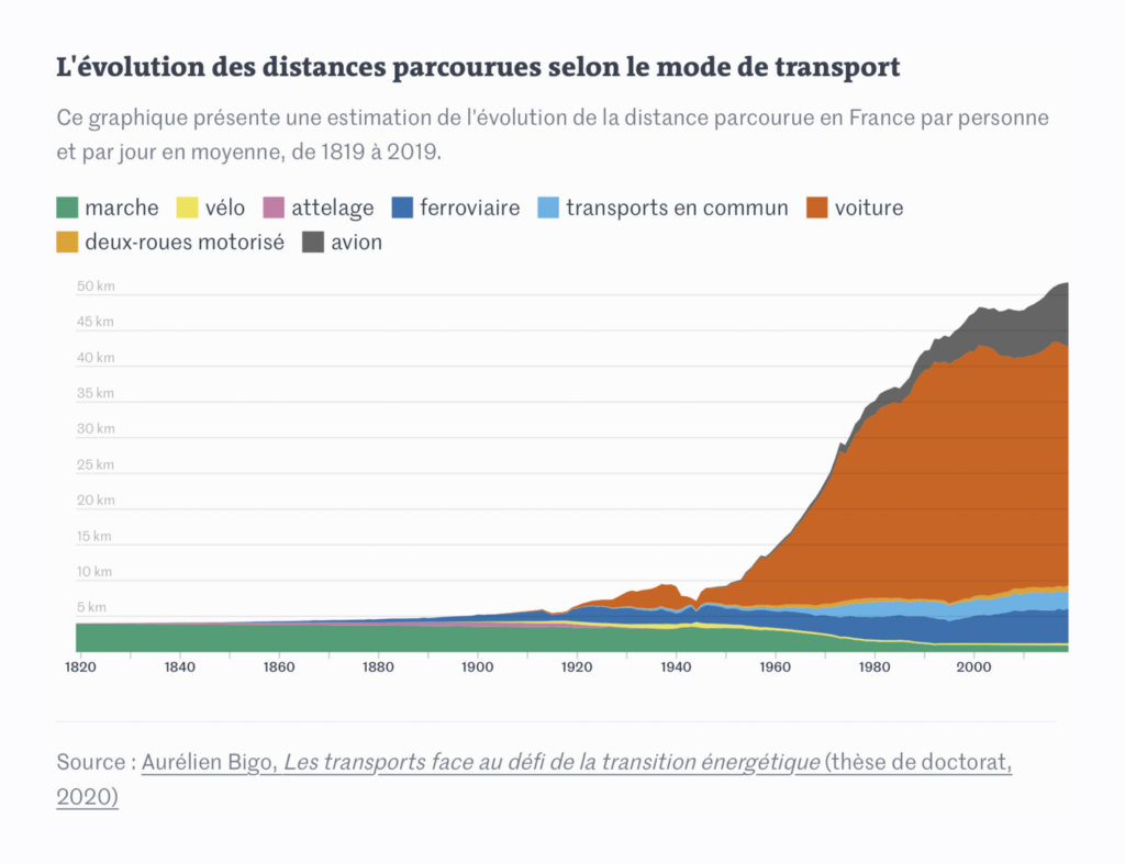
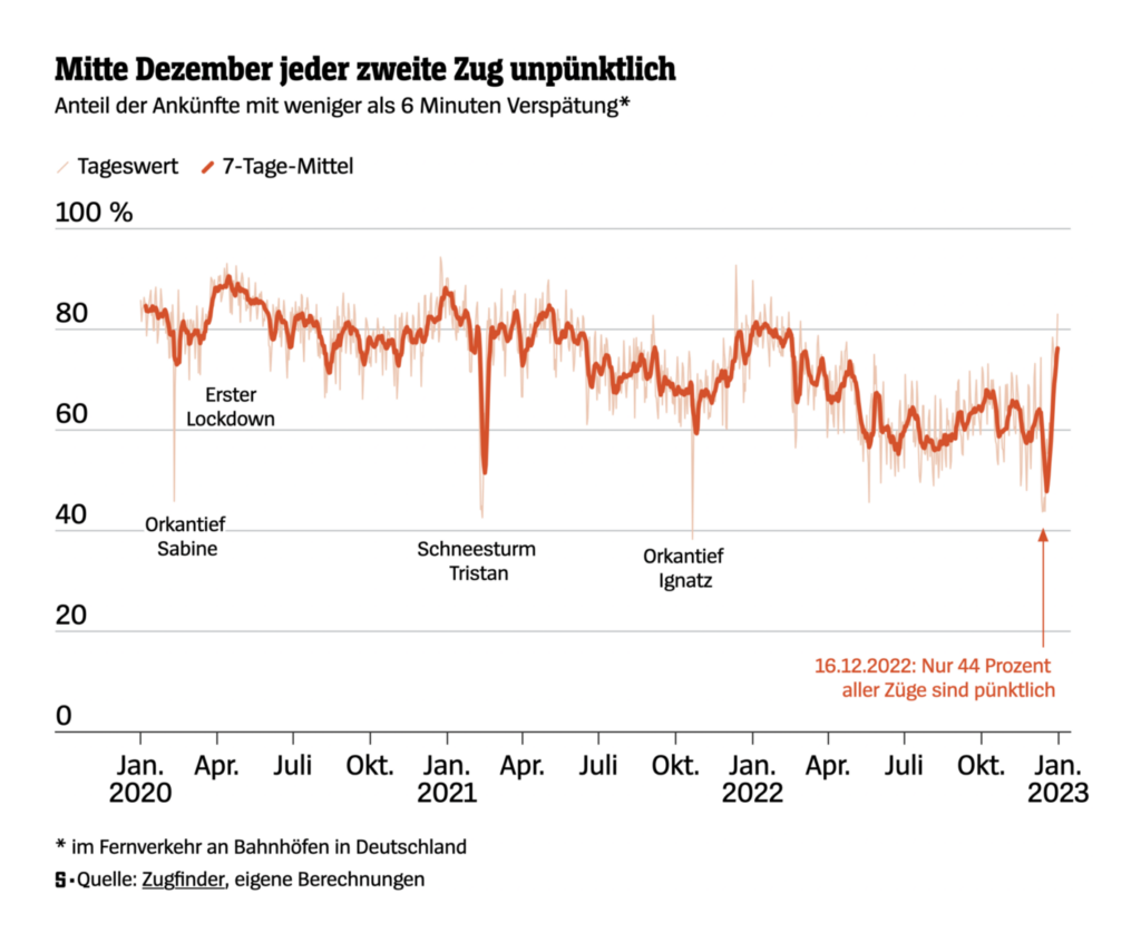
Along with more modern takes on late trains and big cars:

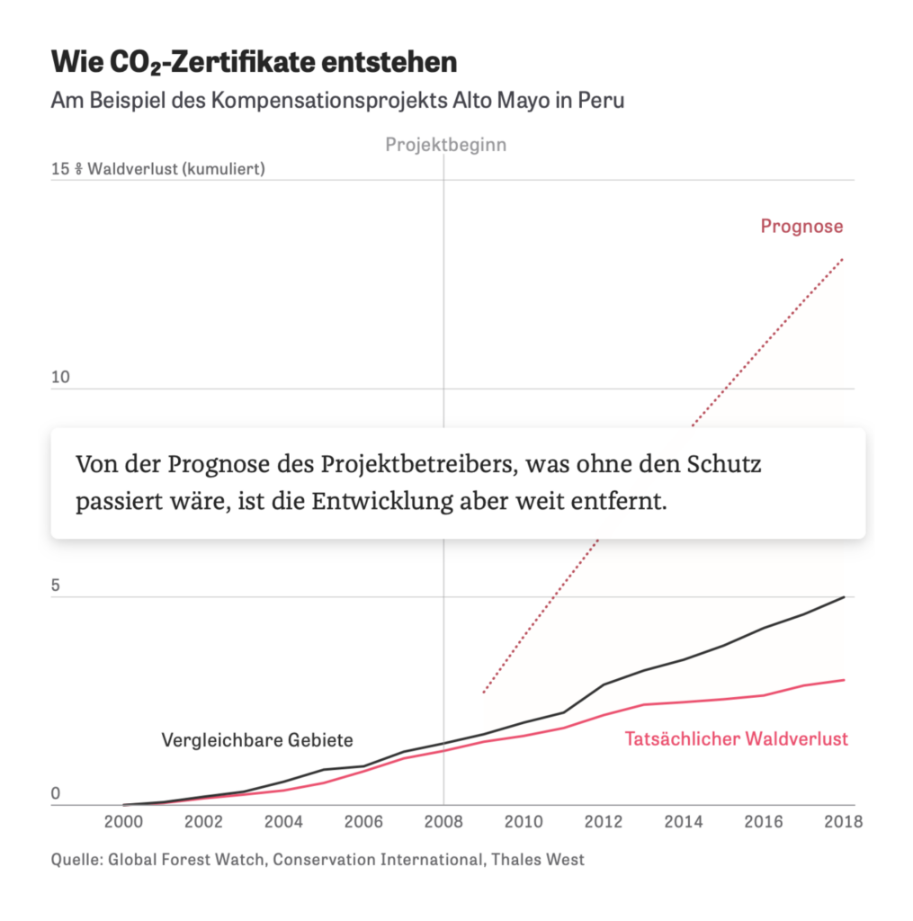
In climate and environment this week — why carbon offsets are worth less than advertised:
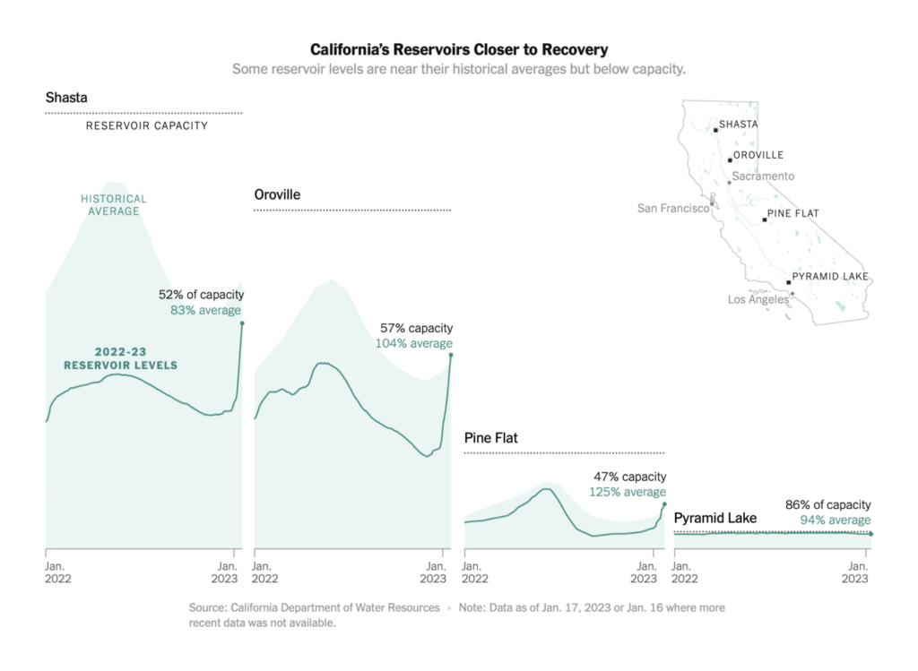
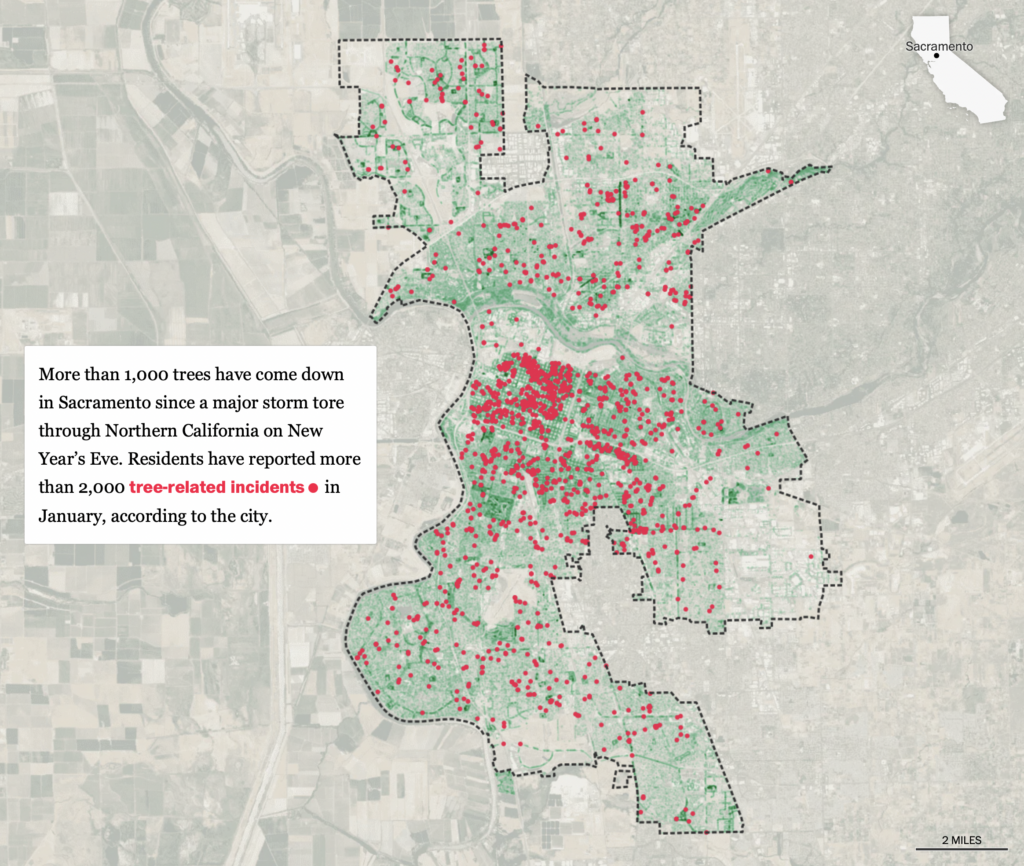
And how massive rainfall in California intersects with the region’s long-term state of drought:
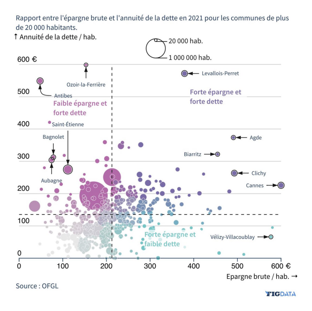
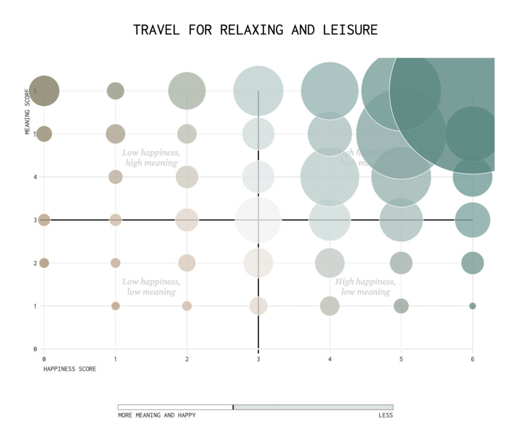
We saw Le Figaro and FlowingData experiment with bivariate colorings:
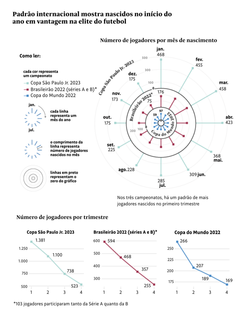
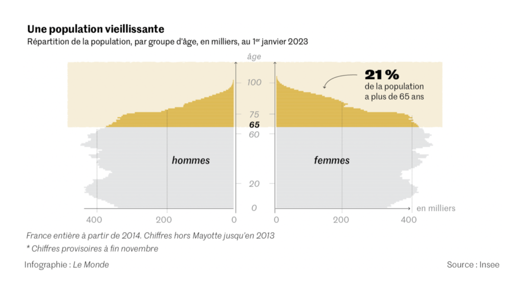
Other visualizations covered everything from the birthdays of elite athletes to the aging population of France:
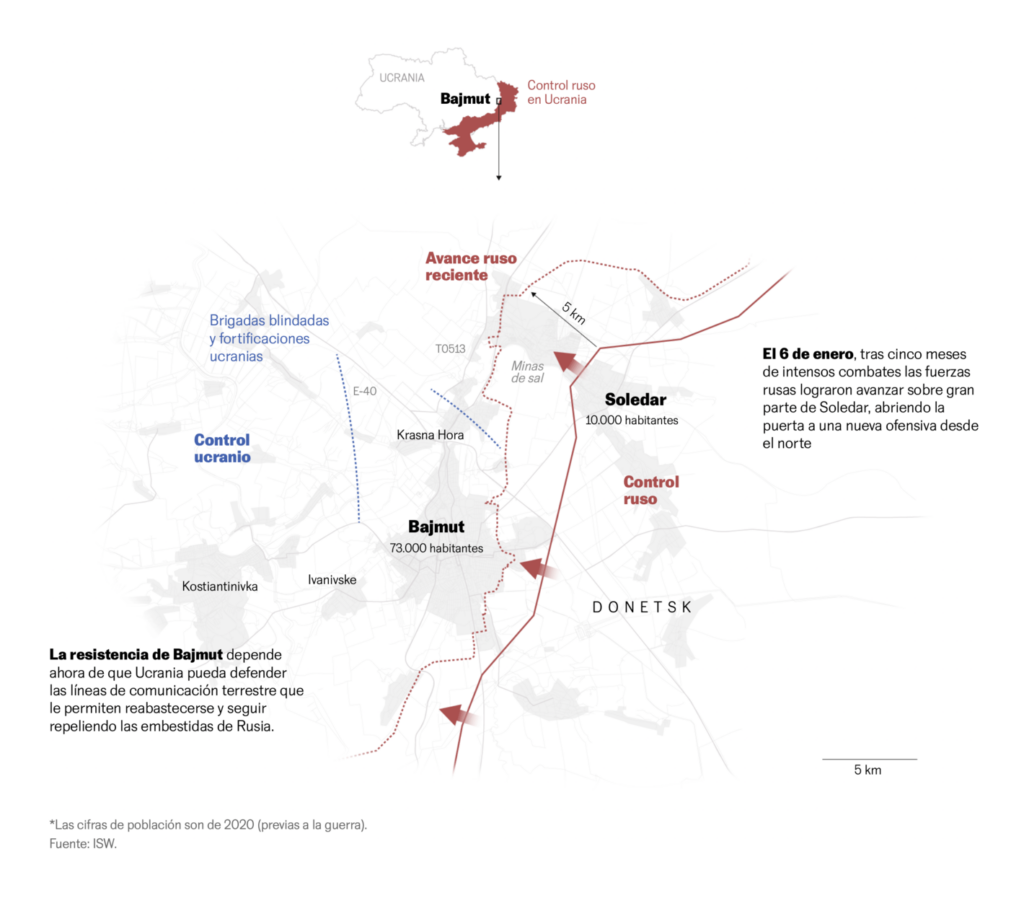
What else we found interesting



Applications are open for…
- An interactive story designer at ProPublica
- A senior data journalist at the BBC
- Submissions to the World Data Visualization Prize
- Lightning talks for NICAR 2023
- A visual journalist at the New York Times
Help us make this dispatch better! We’d love to hear which newsletters, blogs, or social media accounts we need to follow to learn about interesting projects, especially from less-covered parts of the world (Asia, South America, Africa). Write us at hello@datawrapper.de or leave a comment below.
Want the Dispatch in your inbox every Tuesday? Sign up for our Blog Update newsletter!


Comments