Data Vis Dispatch,
January 25

The best of last week’s big and small data visualizations

Welcome back to the 30th edition of Data Vis Dispatch! Every week, we’ll be publishing a collection of the best small and large data visualizations we find, especially from news organizations — to celebrate data journalism, data visualization, simple charts, elaborate maps, and their creators.

Recurring topics this week include the volcanic eruption near Tonga, an increasing rate of job resignations, and the threat of war in Ukraine.

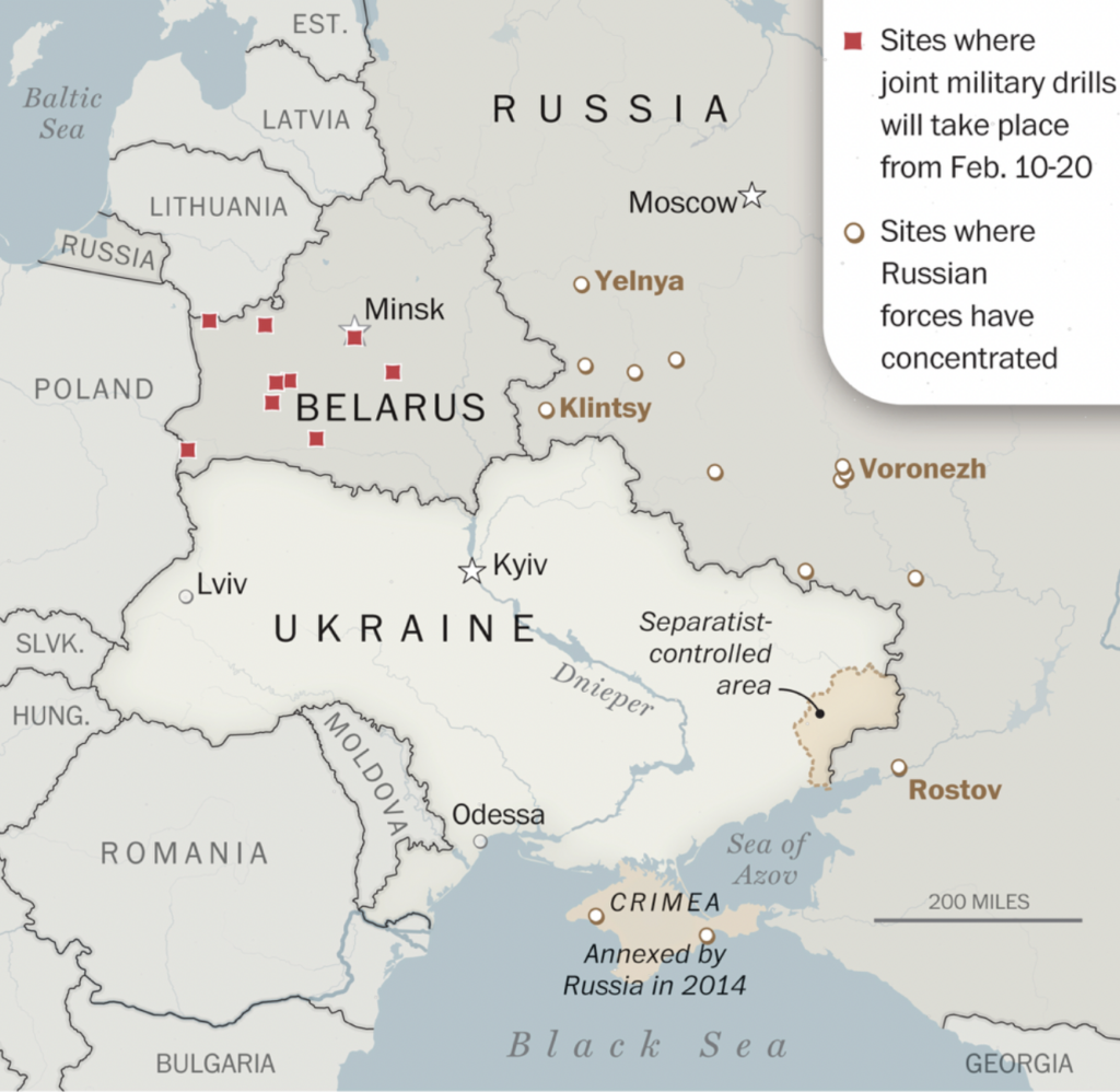
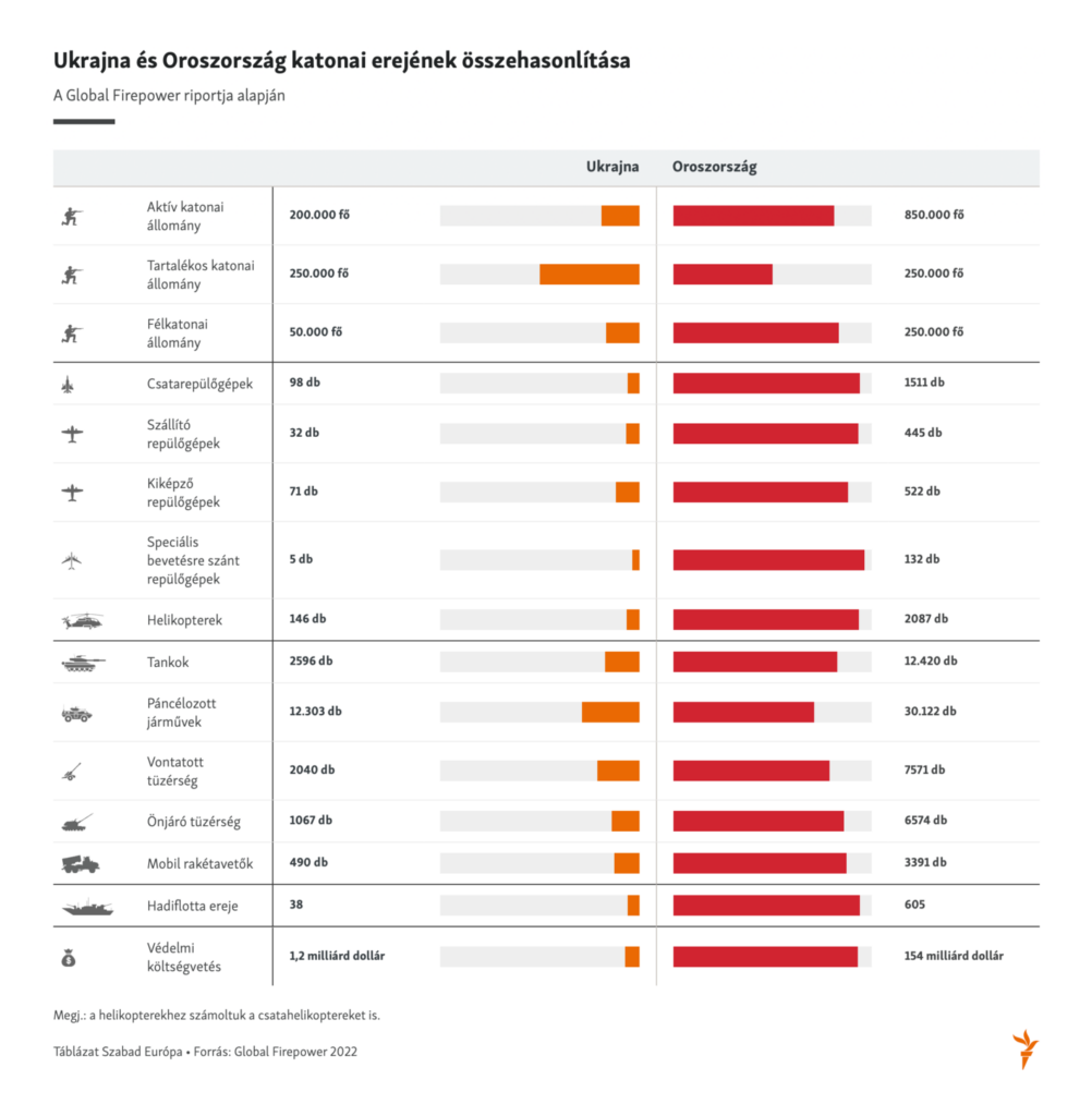
As tensions escalated this week, several maps and charts explored the threat of a Russian invasion of Ukraine:

El Mundo: Ucrania: el camino hacia la guerra, January 21
The Washington Post: Russia’s military is again on the move, adding pressure on Ukraine as invasion fears grow, January 20
Szabad Európa: Az orosz-ukrán erőviszonyok, January 24
The Washington Post: Four maps that explain the Russia-Ukraine conflict, January 21

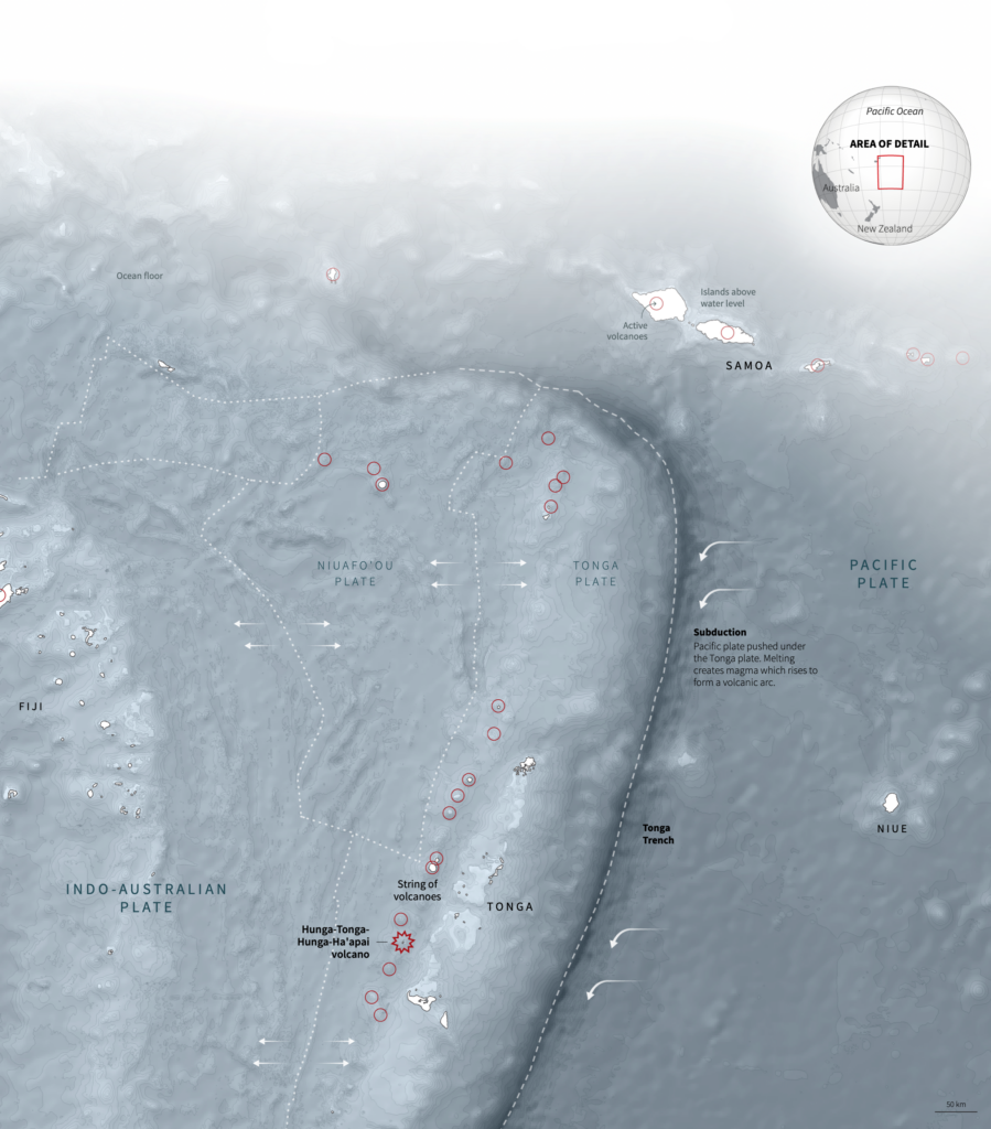
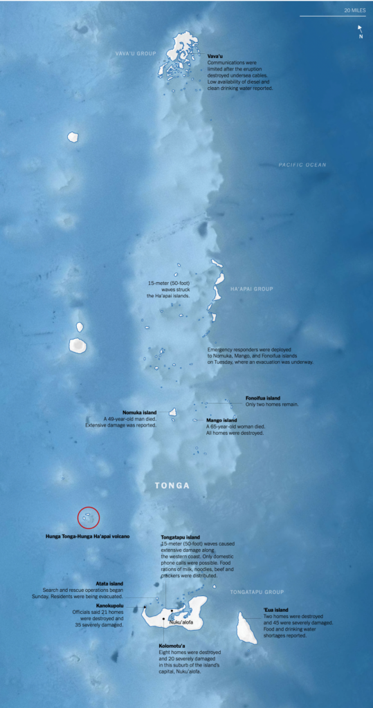
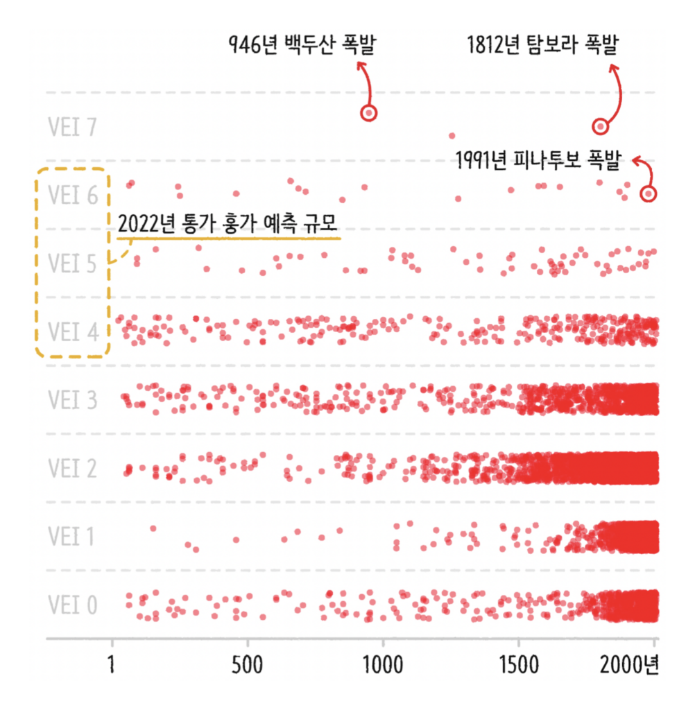
Meanwhile, we continue to learn more about the volcanic eruption near Tonga of January 14:

Reuters: A shockwave from the South Pacific, January 18
The New York Times: Mapping a First Look at Tonga’s Devastation After the Volcano Eruption, January 18
Reuters: How big was the Tonga eruption?, January 21
SBS News: 통가 화산 폭발이 지구에 미치는 영향은?, January 20

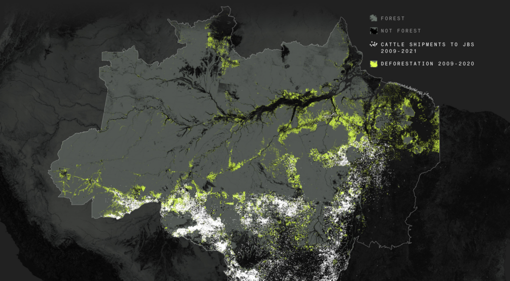
News on the climate and environment included this map from Bloomberg on the link between beef and deforestation in the Amazon:

Bloomberg: How Big Beef Is Fueling the Amazon’s Destruction, January 21
Tagesspiegel: Wer das Klima am meisten schädigt – und wer die Folgen trägt, January 20
Neue Zürcher Zeitung: Sauberer Importstrom ist ein Etikettenschwindel, January 24

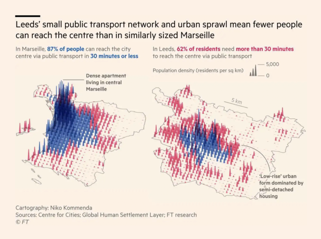
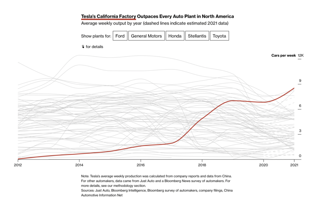
Urban transit was a breakout topic…:

Financial Times: How sprawling suburbs are stunting productivity in UK cities, jan 20
Bloomberg: U.S. Has a Blueprint to Electrify Its Country Roads, January 22

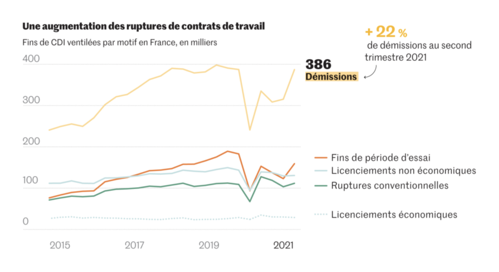
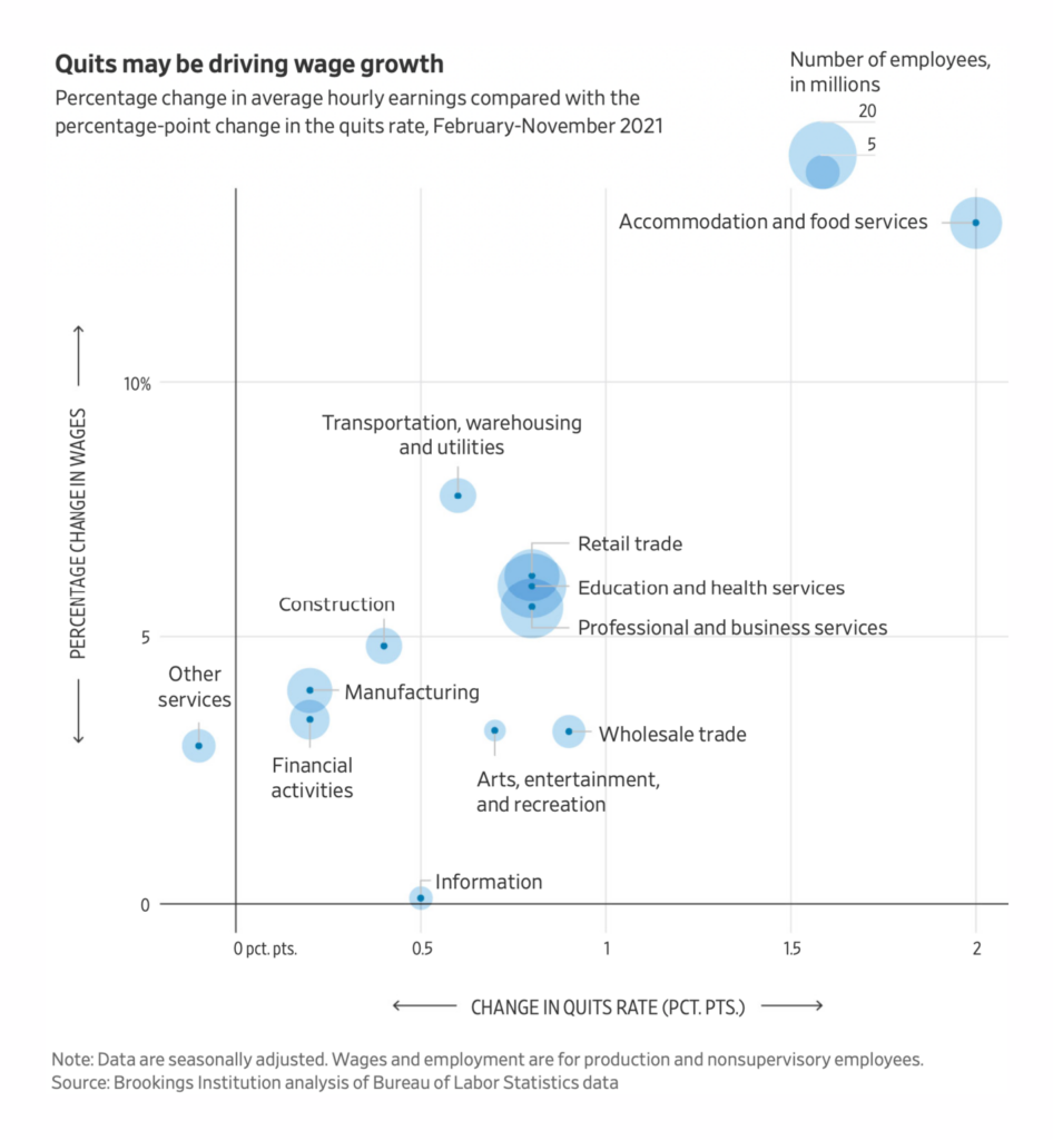
…and so was quitting your job:

Le Monde: Le rapport des jeunes au travail, une révolution silencieuse, January 23
The Wall Street Journal: Workers Are Having Their Moment. How Long Can It Last?, January 22

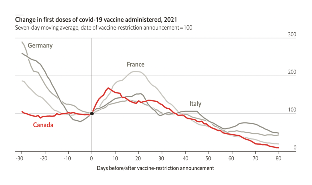
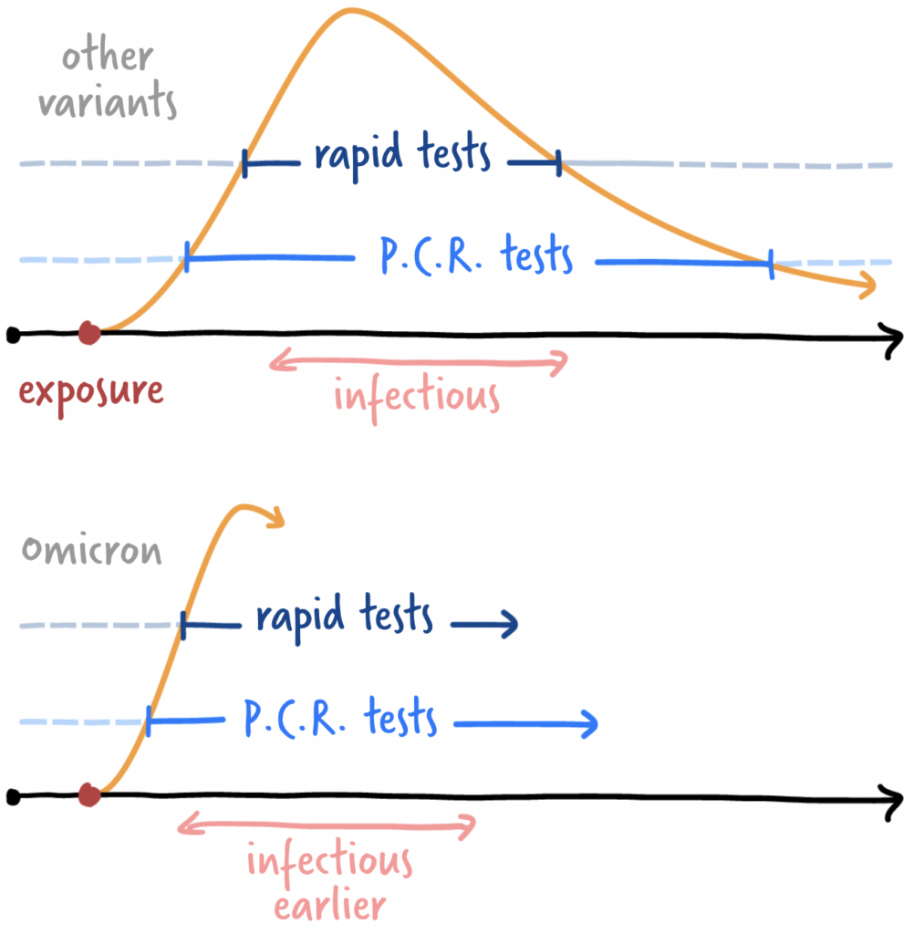
A calm week in COVID charts focused on the benefits of vaccination. It turns out they’re not just physical:

The Economist: Do vaccine mandates actually work?, January 22
The Economist: Covid-19 vaccines have made Americans less anxious and depressed, January 20

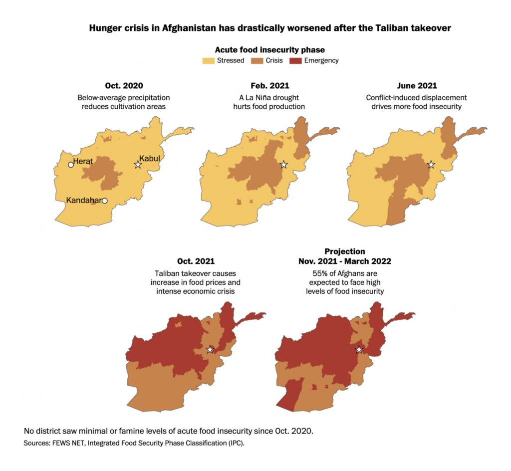
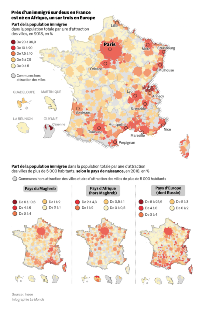
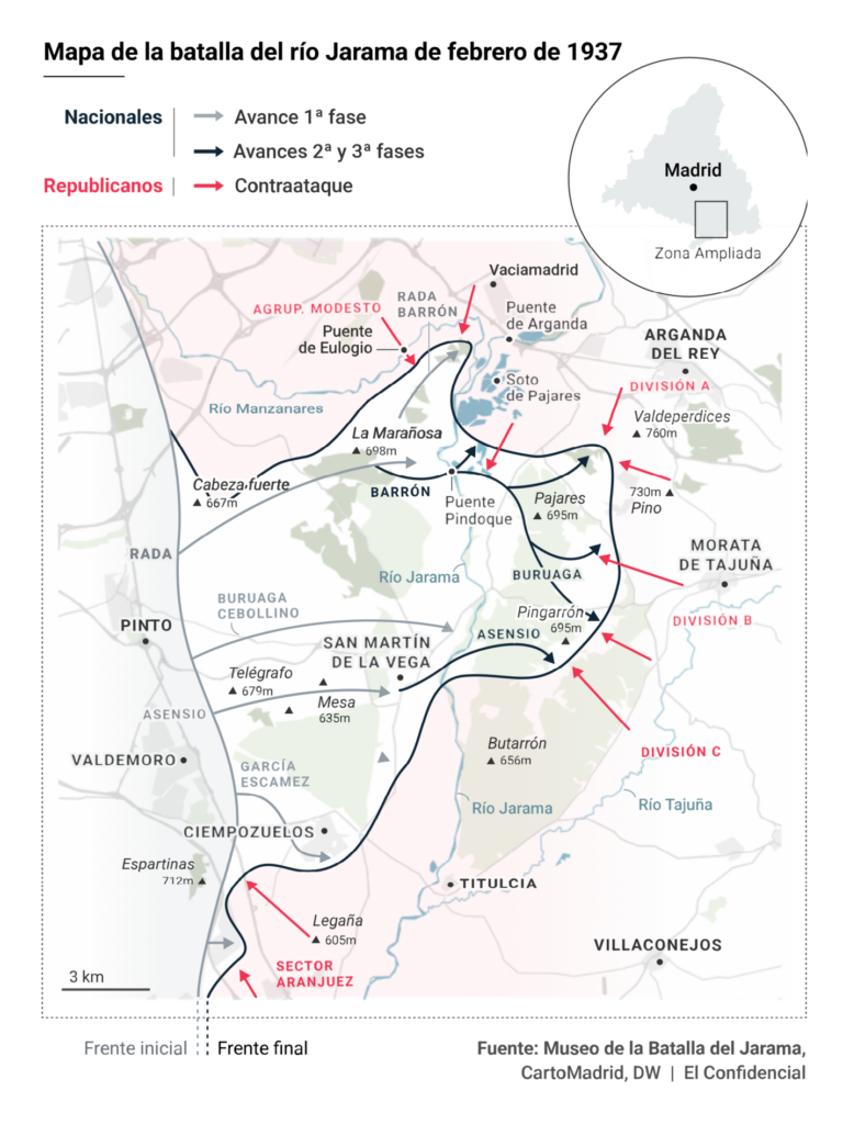
Finally, other maps and charts covered hunger in Afghanistan, history in Spain, and the presidential race in France:

The Washington Post: Afghanistan faces widespread hunger amid worsening humanitarian crisis, January 24
Le Monde: Entre « fermeté » et « humanité », la ligne de crête d’Emmanuel Macron sur l’immigration, January 20
El Confidencial: El guardián del Jarama: el jubilado que lleva desde los siete años recorriendo trincheras, January 22
Bloomberg: Tesla Now Runs the Most Productive Auto Factory in America, January 24
Le Monde: Présidentielle 2022 : entre Marine Le Pen et Valérie Pécresse, l’enjeu de la deuxième place, January 22

What else we found interesting

Attila Bátorfy: “The original “Ethnicities of Hungary” by Pál Balogh and Sándor Kocsárd, 1902 – first equal square tilegram?” January 24 (Tweet)
The New York Times: How Oath Keepers Are Accused of Plotting to Storm the Capitol, January 19
Danae Dholakia: “Fascinating Tsinghua University exhibition on Liang Sicheng (1901-72) sets out how he cracked the codes of ancient Chinese architecture – including the evolution of Buddhist pagodas,” January 23 (Tweet)
The New York Times: Charting an Omicron Infection, January 22
South China Morning Post: Year of the Tiger 2022: a visual guide, January 20

Help us make this dispatch better! We’d love to hear which newsletters, blogs, or social media accounts we need to follow to learn about interesting projects, especially from less-covered parts of the world (Asia, South America, Africa). Write us at hello@datawrapper.de or leave a comment below.

Comments