We want to enable everyone to create beautiful charts, maps, and tables. New to data visualization? Or do you have specific questions about us? You'll find all the answers here.
The best of last week’s big and small data visualizations
Vivien Serve
Welcome back to the 127th edition of Data Vis Dispatch! Every week, we’ll be publishing a collection of the best small and large data visualizations we find, especially from news organizations — to celebrate data journalism, data visualization, simple charts, elaborate maps, and their creators.
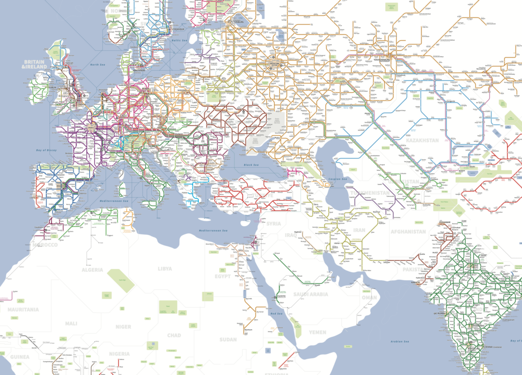
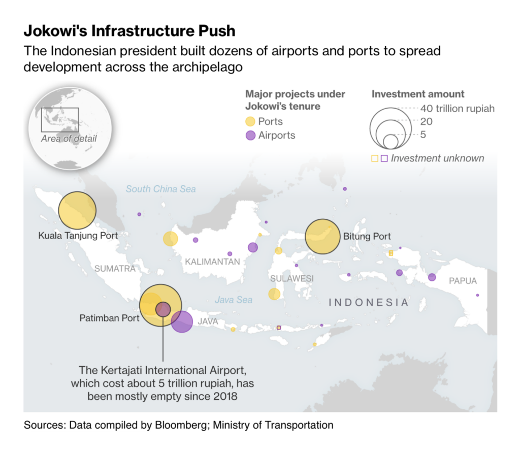
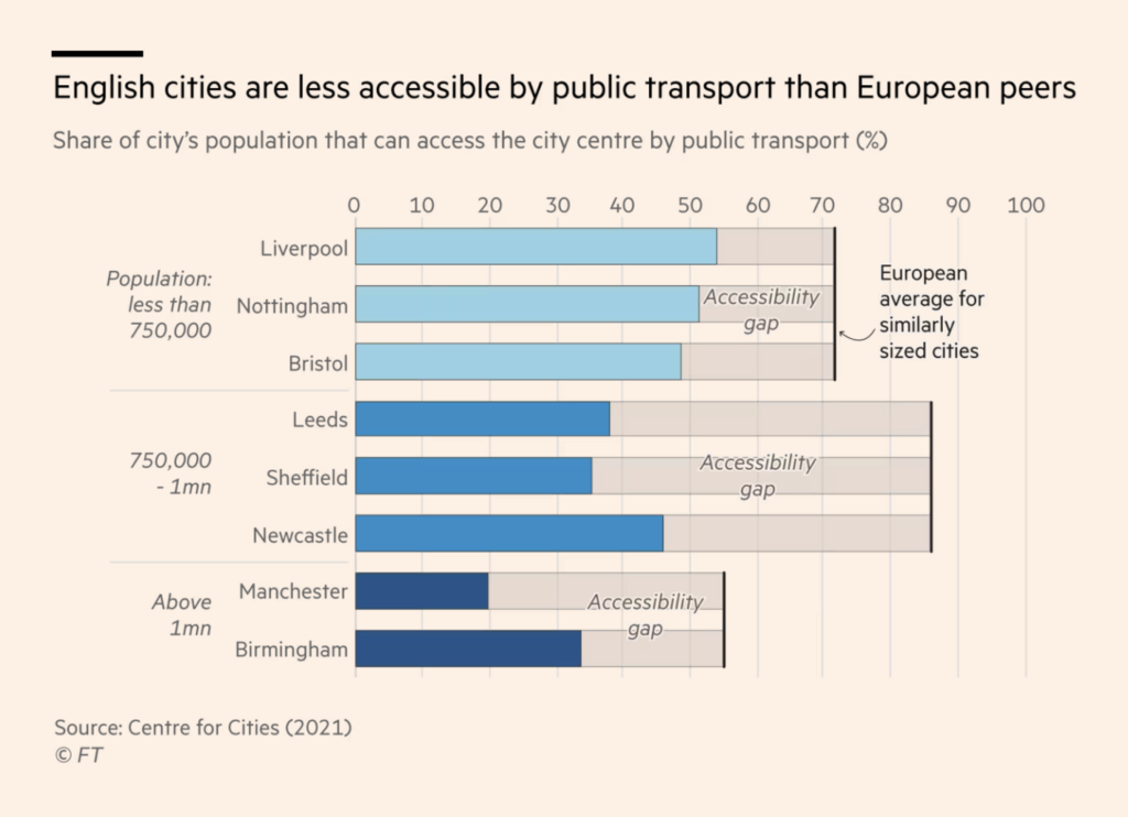
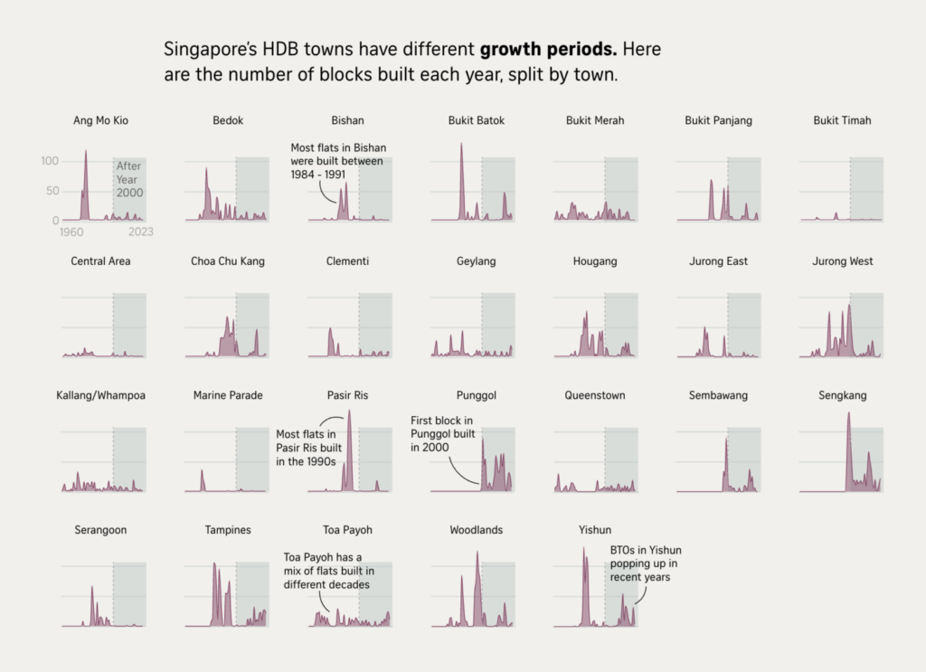
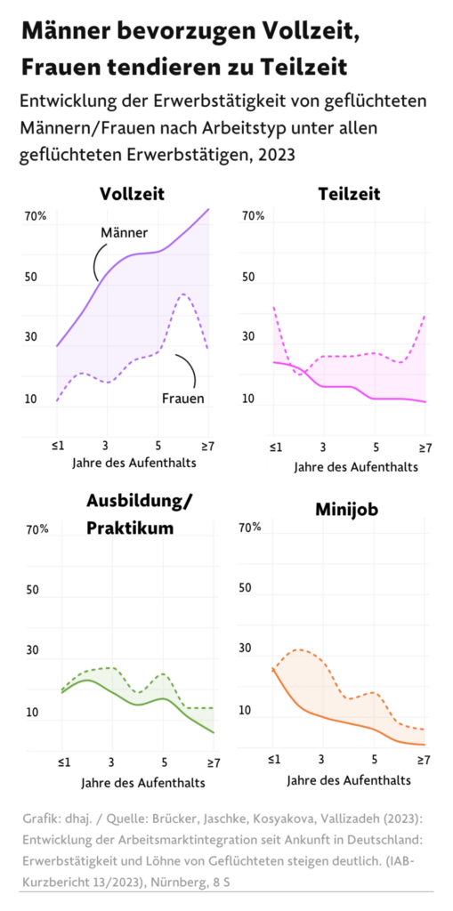
Recurring topics this week include the Republican primary in New Hampshire, gender political identity, and transportation.
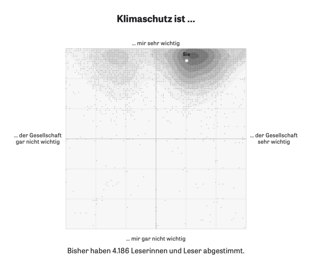
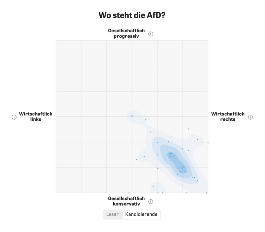
Zeit Online published several articles this week using an interactive matrix that allows readers to stake out a position and compare themselves to others:
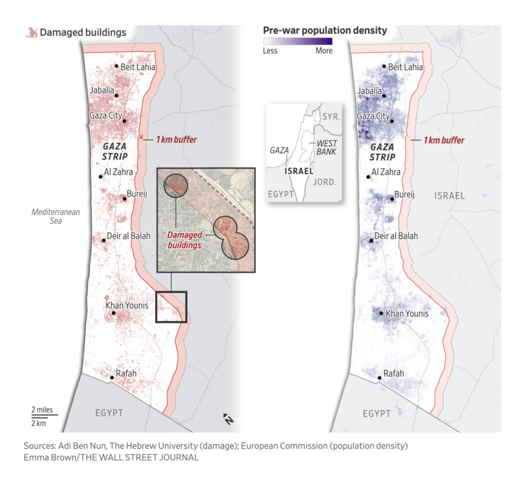
Maps about the Israel-Hamas war cover possible Israeli plans for Gaza, a visual investigation of the destruction in Gaza, and — as the unrest has spread — a scrollytelling look at Houthi attacks in the Red Sea:
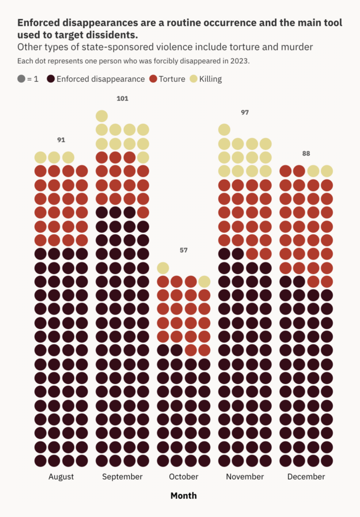
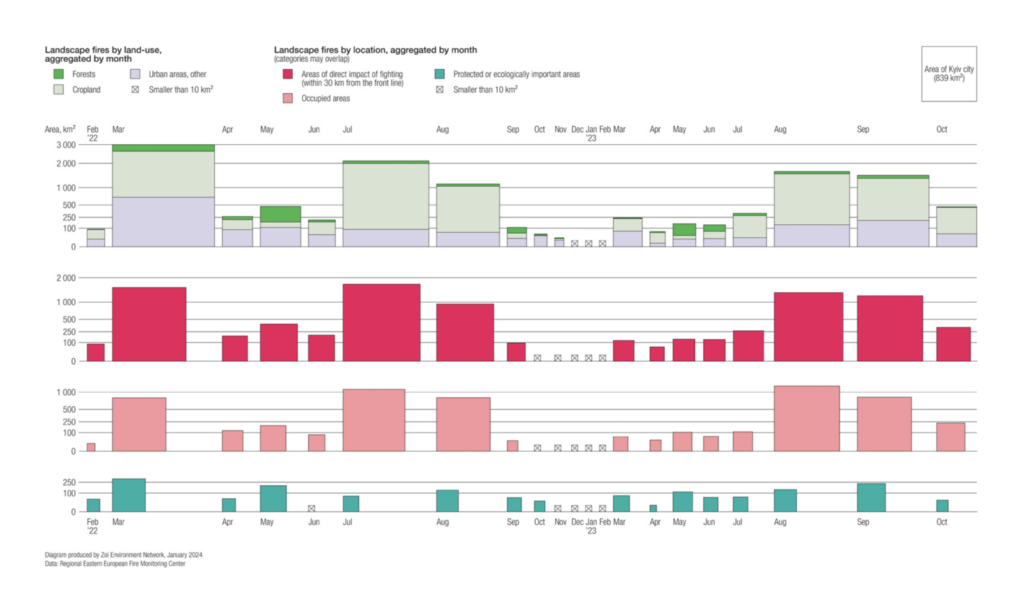
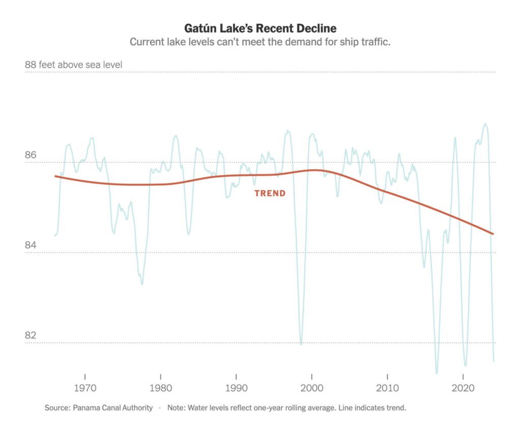
Other visualizations of war look at Pakistan, where thousands have been abducted and tortured in an ongoing conflict between separatists and the government, and the damage to the natural landscape in Ukraine:
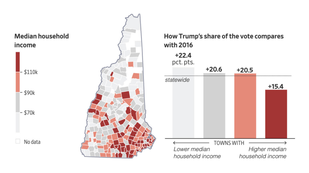
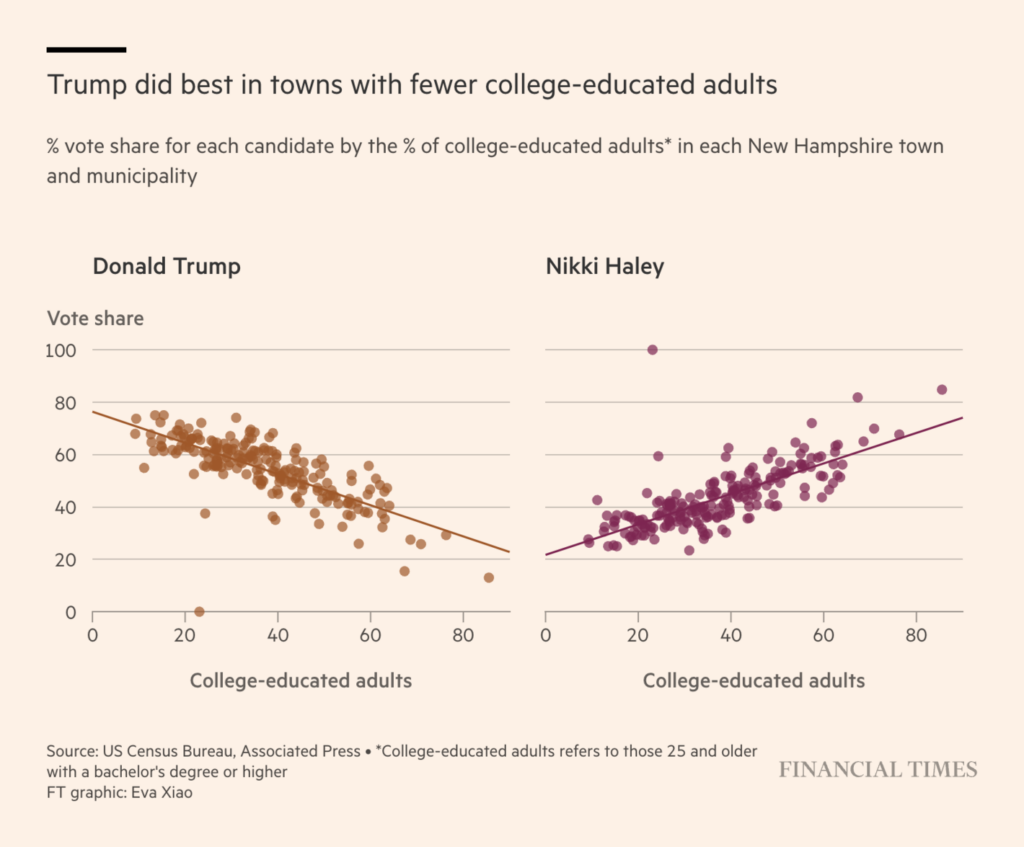
Papers were full of U.S. election news this week as Trump maintained his frontrunner status in the Republican primary in New Hampshire. We saw visualizations of voting behavior over the years and what voters’ circumstances can tell us about their choices:
But some are looking at Trump’s calendar, which is full of court appearances and negotiations over criminal convictions and civil liabilities, in addition to political appointments:
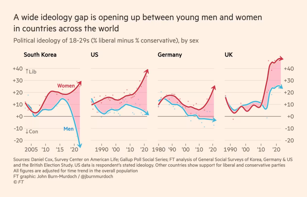
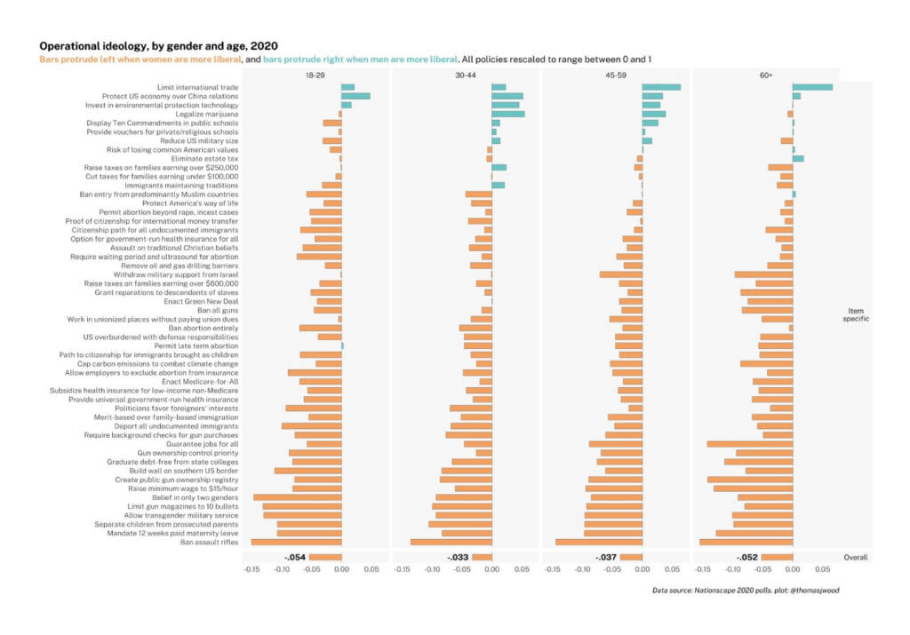
A Financial Times chart on the political divergence of young men and women went viral, leading to many more data visualizations on the topic:
Financial Times: A new global gender divide is emerging, January 26 Tom Wood: “Inspired by @janzilinsky-gender x age differences on 52 policy items in 2020 Nationscape poll. My changes: *Plotting gender differences rather than agreement *Numerical summaries Amount youth, gender *policy* differences appear smaller than differences in lib/con affiliation,” January 27 (Tweet)
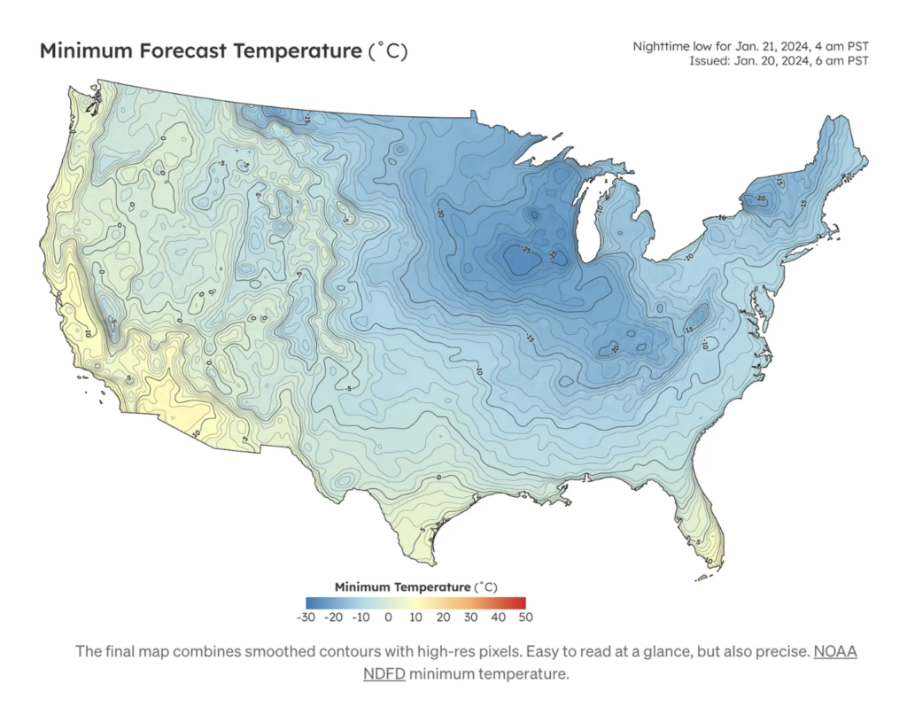
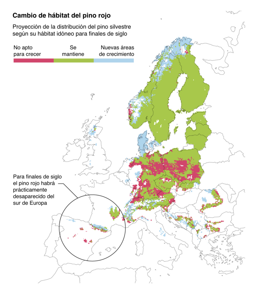
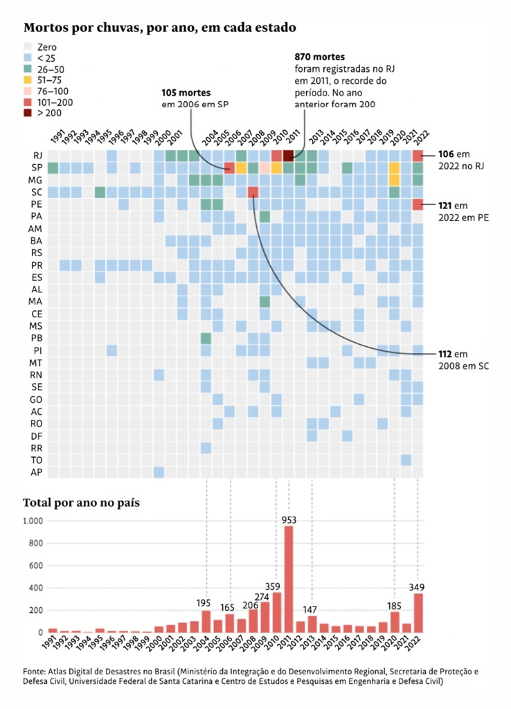
On the climate and environment: The cold is returning, forests are fleeing the heat, and people are dying from rain:
Attila Bátorfy: “Statistics using real photos of children, and statistics using multiplication of human figures. From Hungarian newspaper Új Idők, 1899!!!,” January 24 (Tweet)
Help us make this dispatch better! We’d love to hear which newsletters, blogs, or social media accounts we need to follow to learn about interesting projects, especially from less-covered parts of the world (Asia, South America, Africa). Write us at hello@datawrapper.de or leave a comment below.
(she/her) is a working student on Datawrapper’s Communications team. She creates the Data Vis Dispatch to keep data visualization enthusiasts up to date on exciting new projects. When she’s not working, she studies interface design, and when she’s not studying, she’s planning a festival stage or soldering light installations. Vivien lives in Potsdam.


Comments