This article is brought to you by Datawrapper, a data visualization tool for creating charts, maps, and tables. Learn more.
Data Vis Dispatch, January 30
The best of last week’s big and small data visualizations

Welcome back to the 127th edition of Data Vis Dispatch! Every week, we’ll be publishing a collection of the best small and large data visualizations we find, especially from news organizations — to celebrate data journalism, data visualization, simple charts, elaborate maps, and their creators.
Recurring topics this week include the Republican primary in New Hampshire, gender political identity, and transportation.
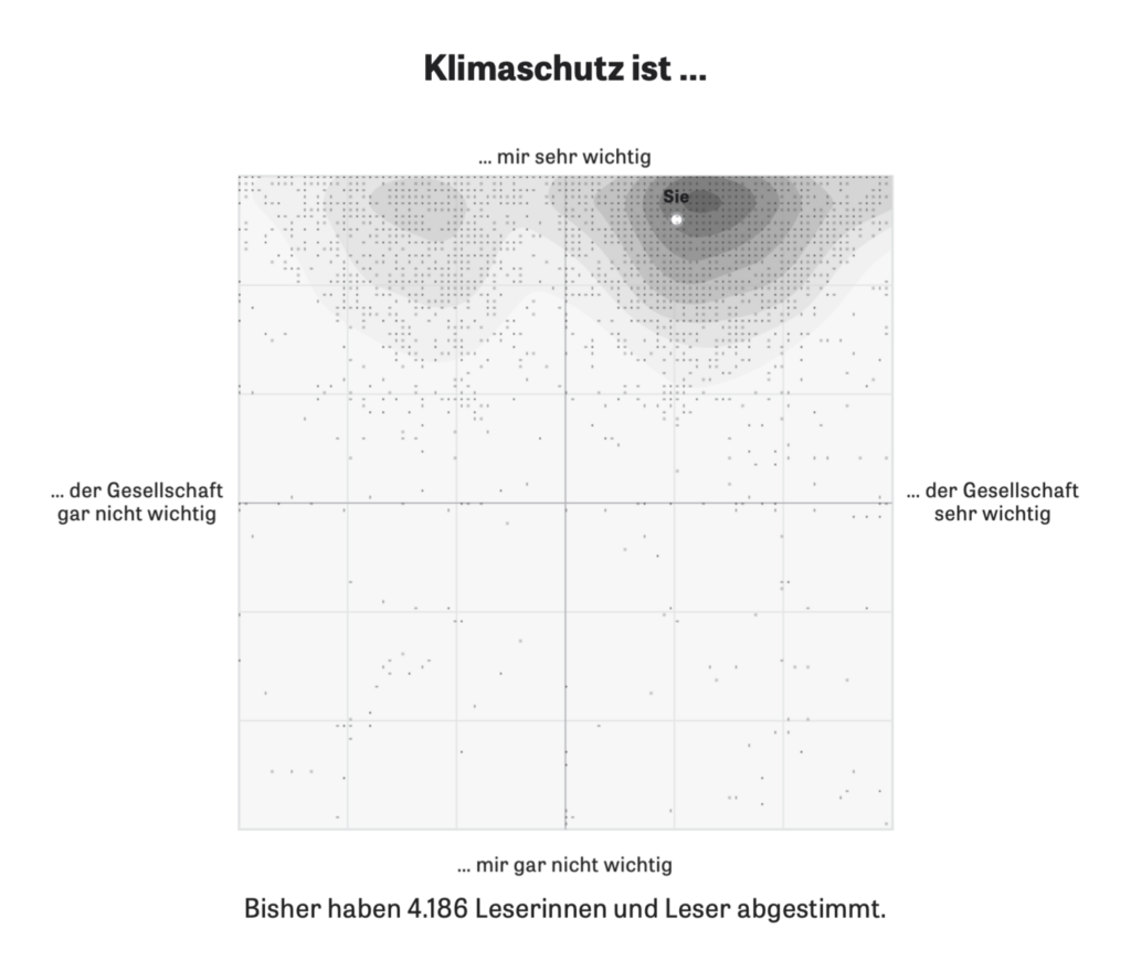
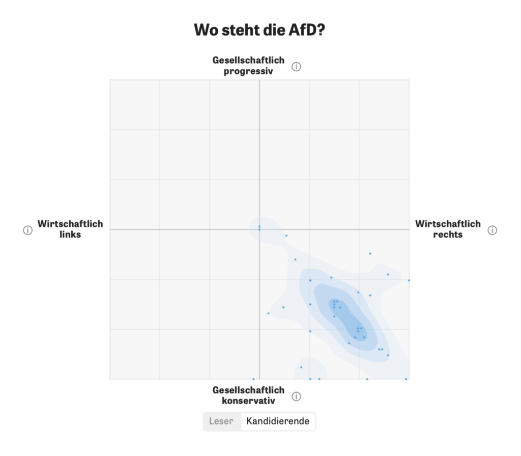
Zeit Online published several articles this week using an interactive matrix that allows readers to stake out a position and compare themselves to others:
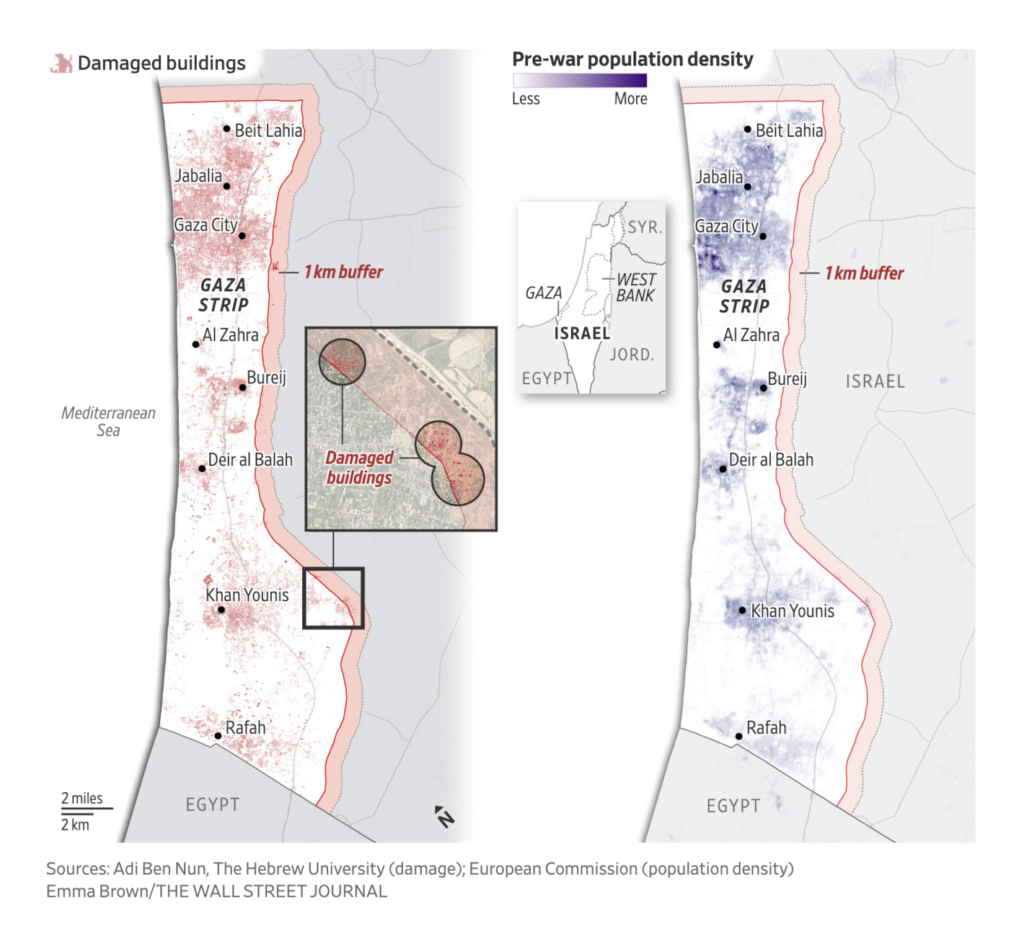
Maps about the Israel-Hamas war cover possible Israeli plans for Gaza, a visual investigation of the destruction in Gaza, and — as the unrest has spread — a scrollytelling look at Houthi attacks in the Red Sea:
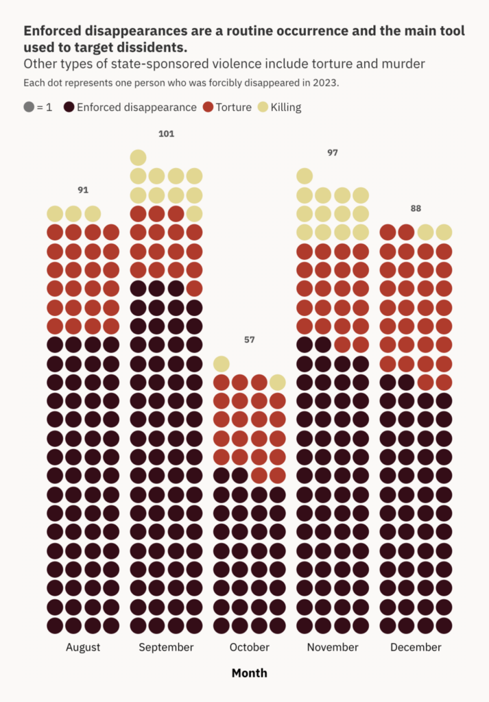
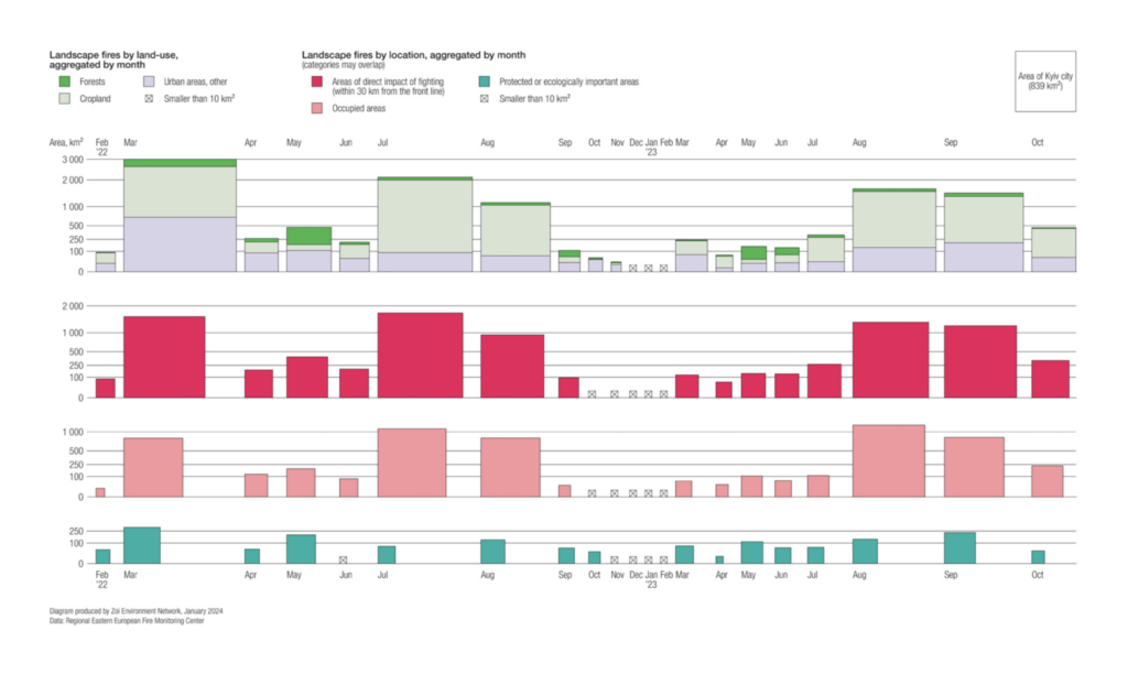
Other visualizations of war look at Pakistan, where thousands have been abducted and tortured in an ongoing conflict between separatists and the government, and the damage to the natural landscape in Ukraine:
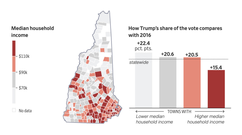
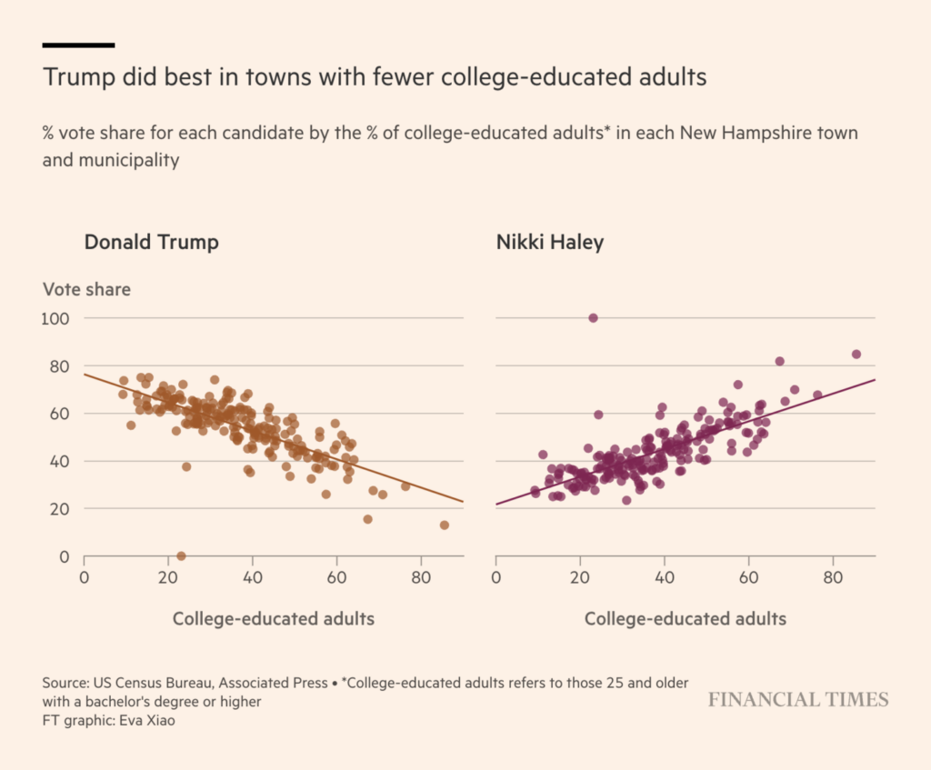
Papers were full of U.S. election news this week as Trump maintained his frontrunner status in the Republican primary in New Hampshire. We saw visualizations of voting behavior over the years and what voters’ circumstances can tell us about their choices:

But some are looking at Trump’s calendar, which is full of court appearances and negotiations over criminal convictions and civil liabilities, in addition to political appointments:
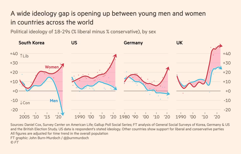
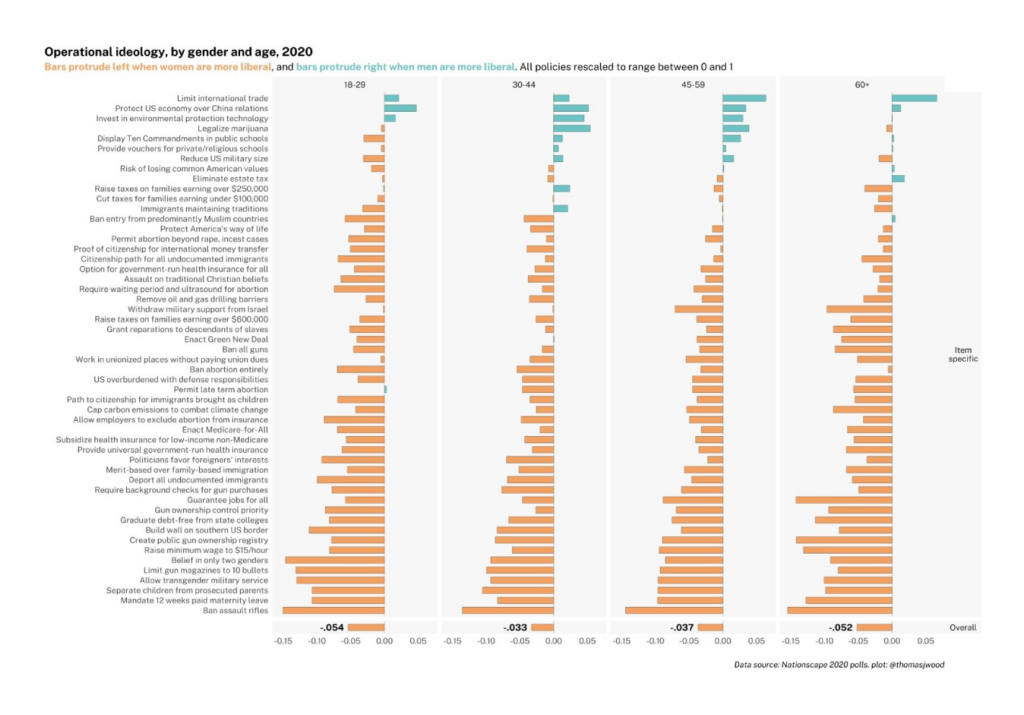
A Financial Times chart on the political divergence of young men and women went viral, leading to many more data visualizations on the topic:
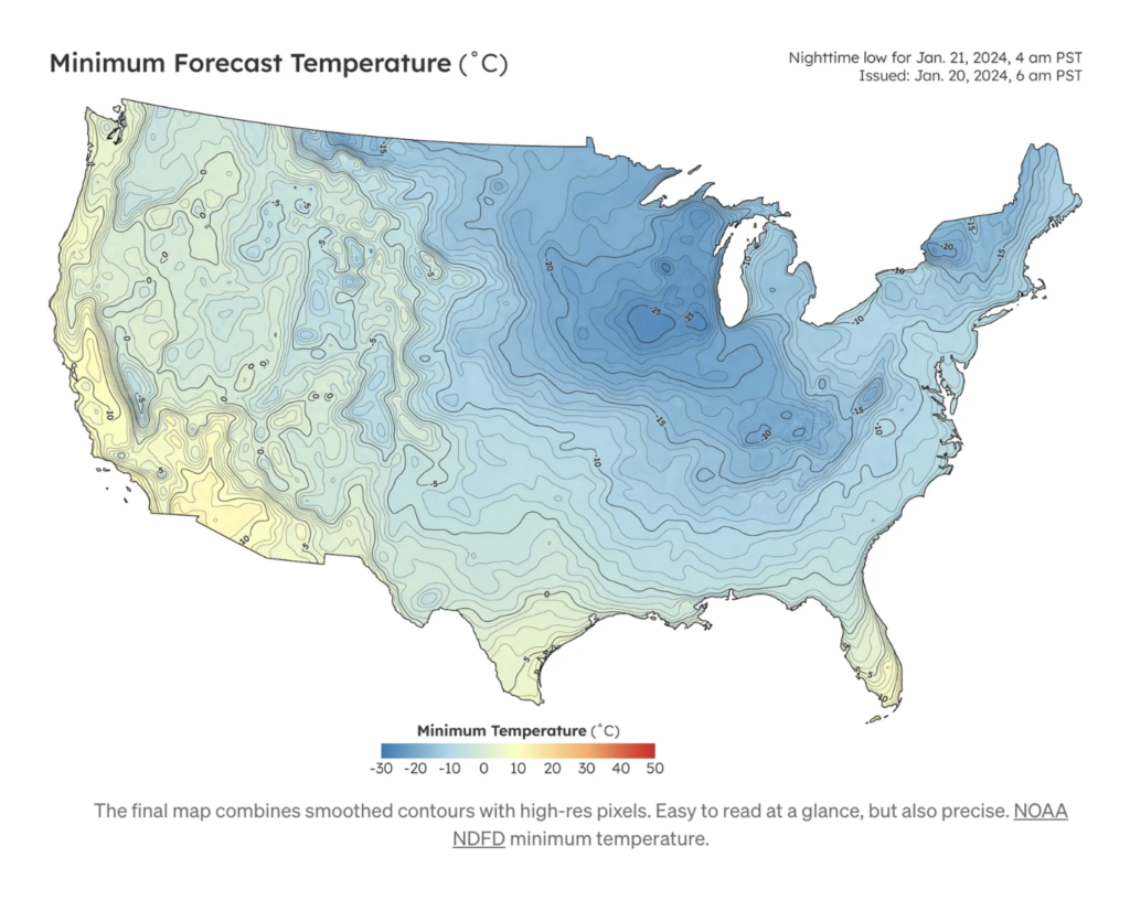
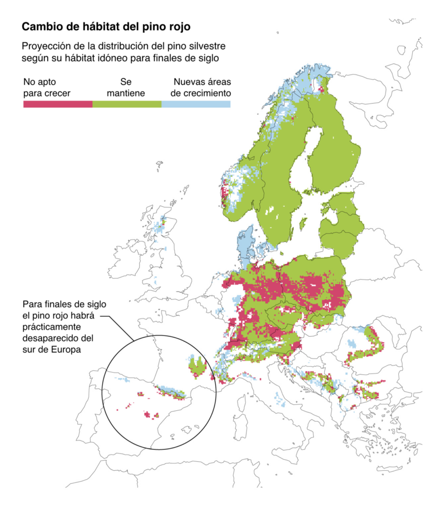
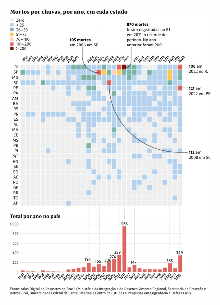
On the climate and environment: The cold is returning, forests are fleeing the heat, and people are dying from rain:
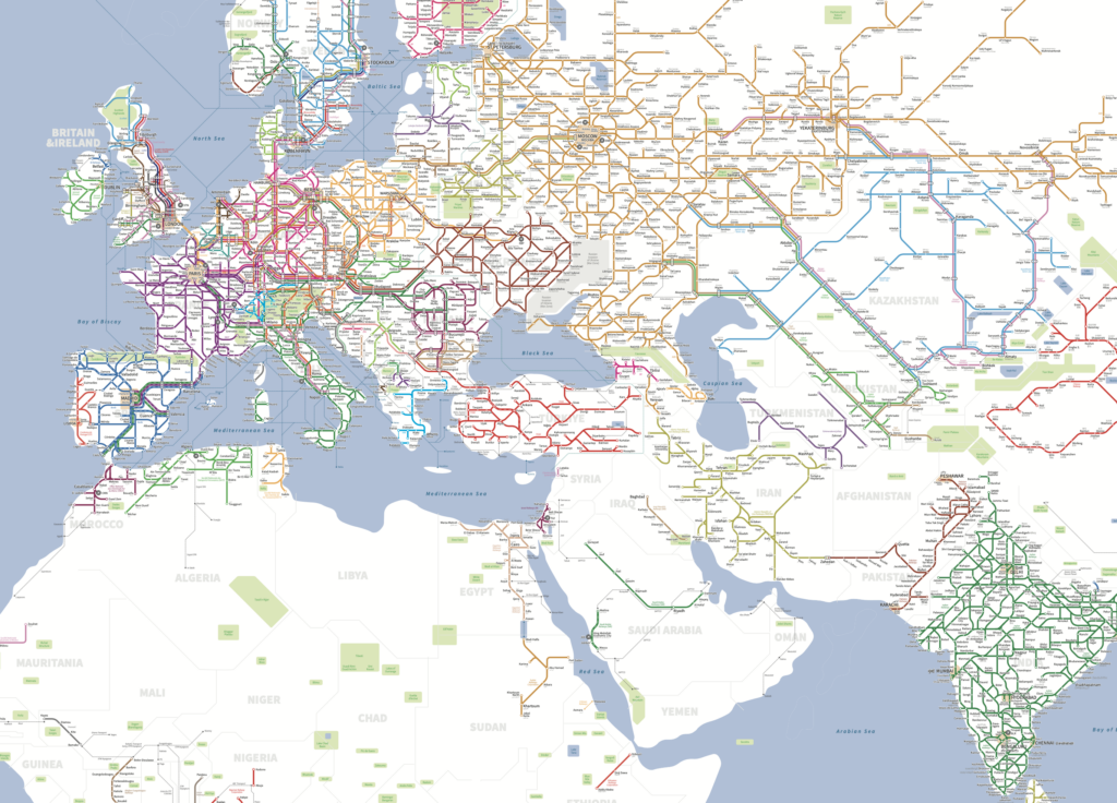
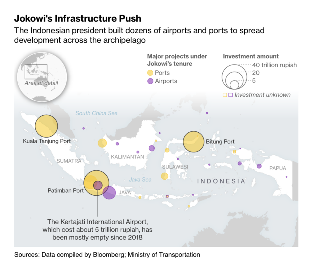
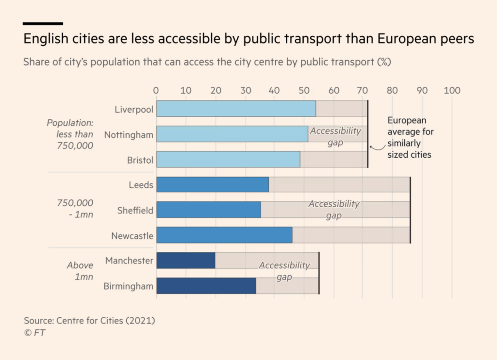
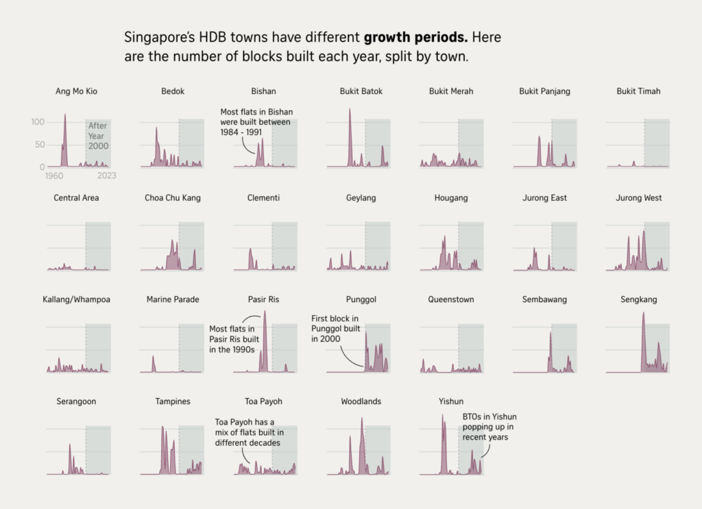
Transportation was huge this week, from motorcycle routes to train networks to infrastructure planning:
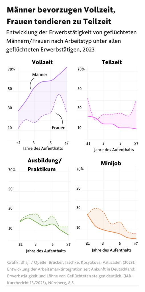
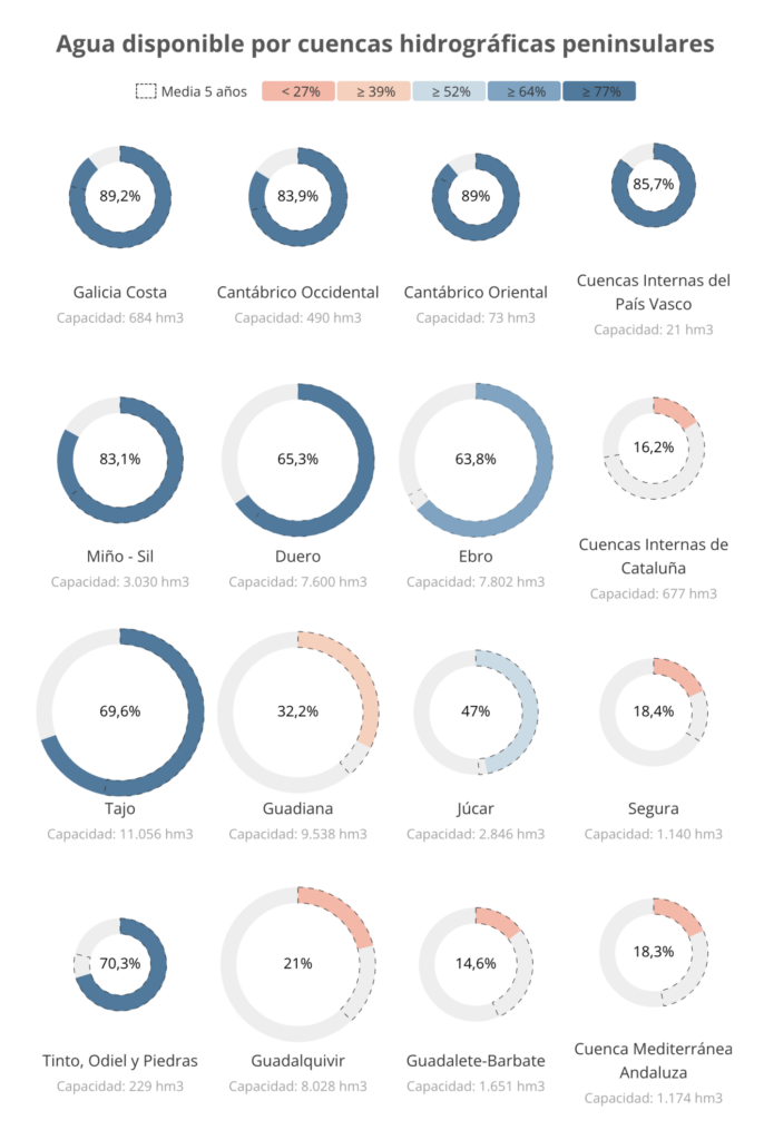
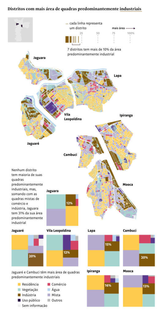
Our last cluster is for small multiples, whether of lines, donuts, or tree maps:
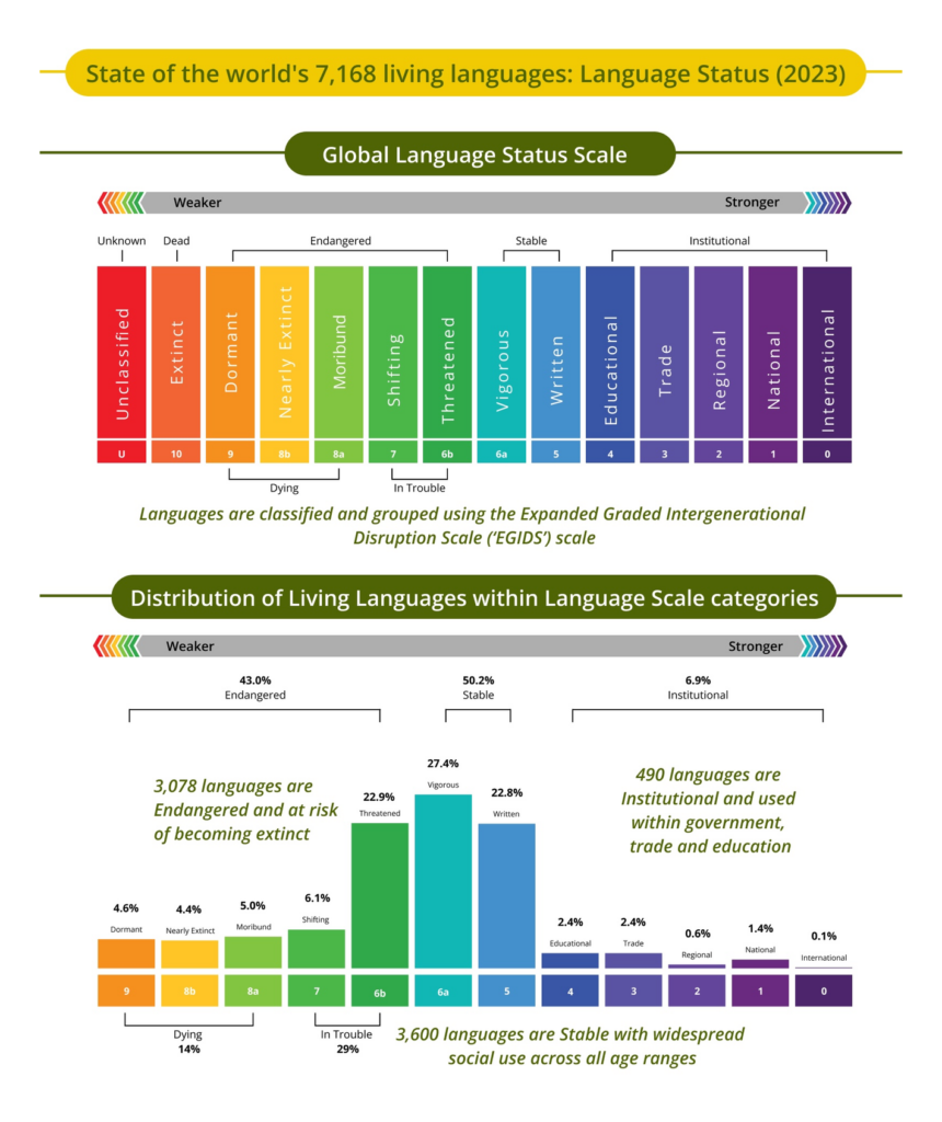
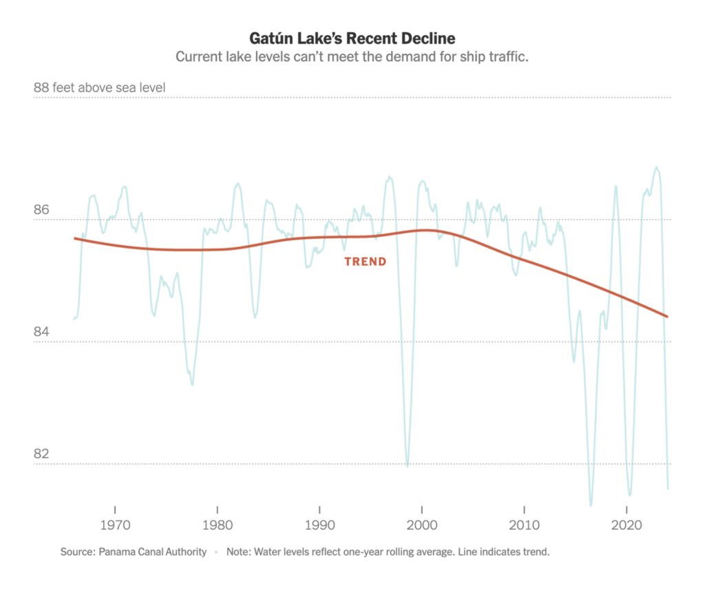
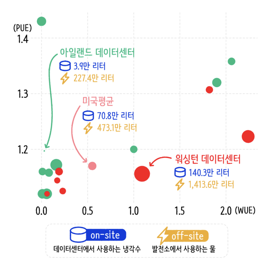
Finally — world languages, drought in Panama, and the climate costs of artificial intelligence:
What else we found interesting

Applications are open for…
- A graphics/multimedia editor at The New York Times
- A 10-week summer fellowship at The Pudding
Help us make this dispatch better! We’d love to hear which newsletters, blogs, or social media accounts we need to follow to learn about interesting projects, especially from less-covered parts of the world (Asia, South America, Africa). Write us at hello@datawrapper.de or leave a comment below.
Want the Dispatch in your inbox every Tuesday? Sign up for our Blog Update newsletter!


Comments