This article is brought to you by Datawrapper, a data visualization tool for creating charts, maps, and tables. Learn more.
Data Vis Dispatch, July 11
The best of last week’s big and small data visualizations

Welcome back to the 101st edition of Data Vis Dispatch! Every week, we’ll be publishing a collection of the best small and large data visualizations we find, especially from news organizations — to celebrate data journalism, data visualization, simple charts, elaborate maps, and their creators.
Recurring topics this week include pollution, transportation, and high temperatures. Plus: an opportunity to work on the Dispatch yourself as our Werkstudent*in.
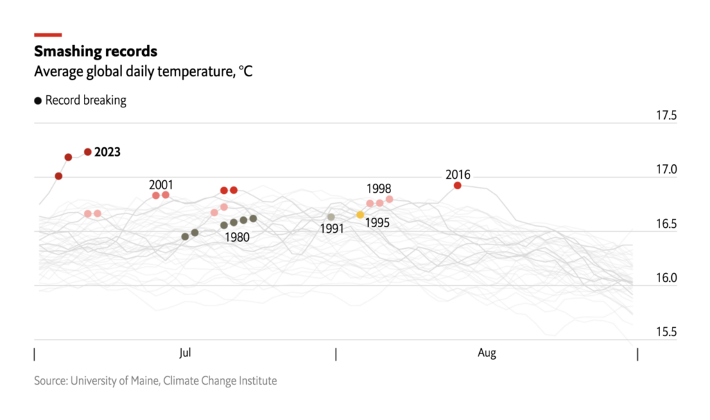
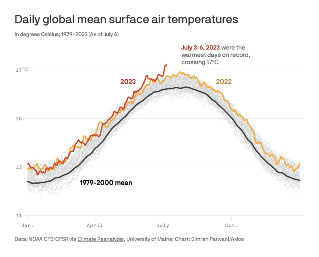
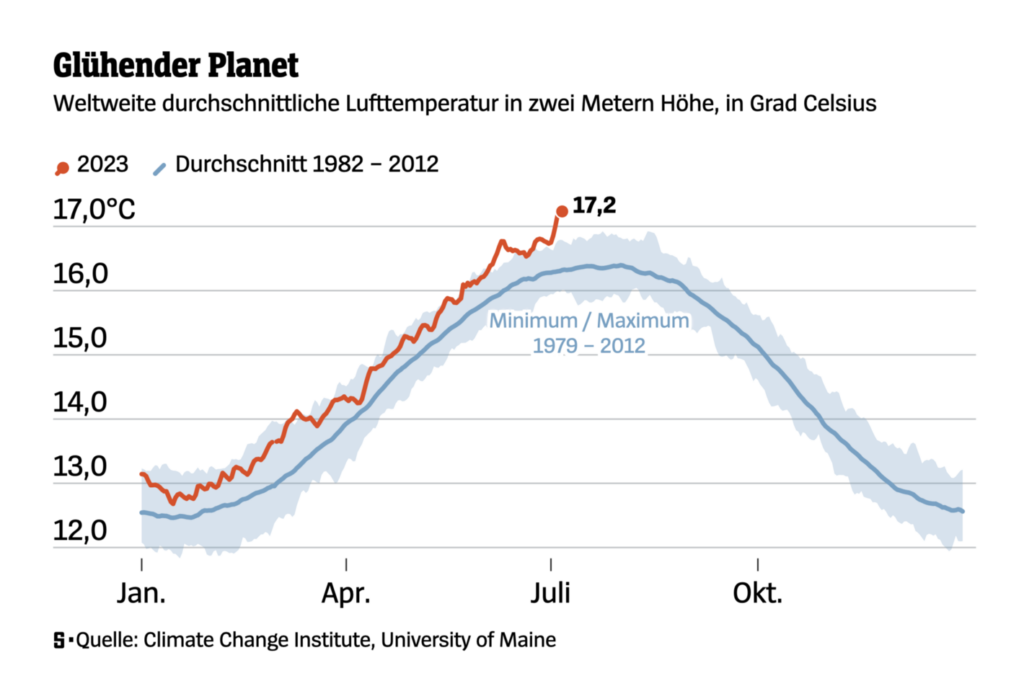
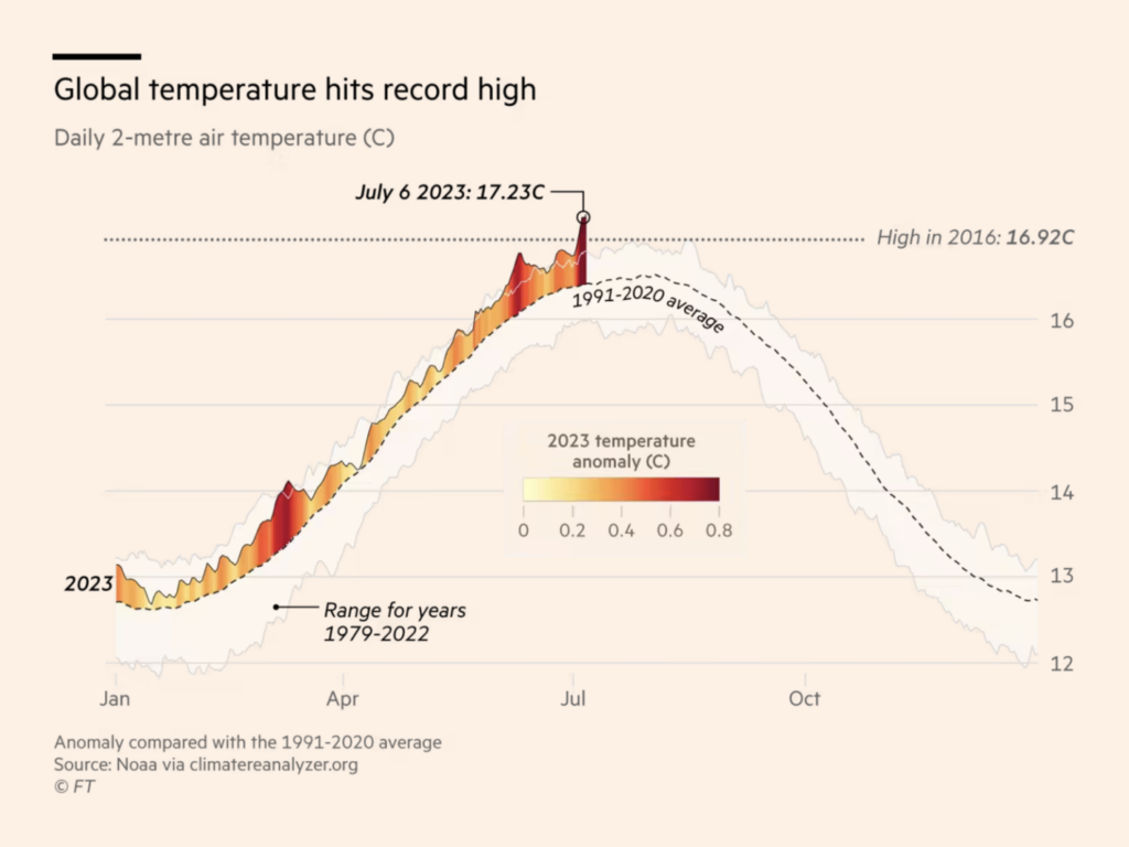
The four hottest days ever recorded were all last week:
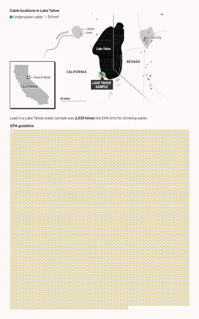
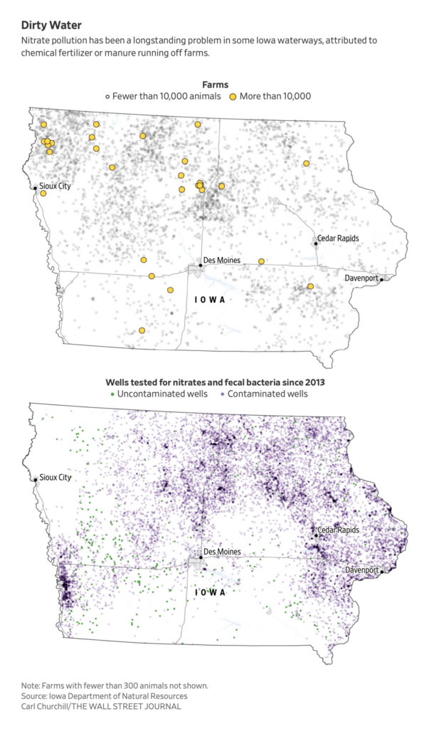
To relax, try thinking about ordinary environmental problems like pollution:
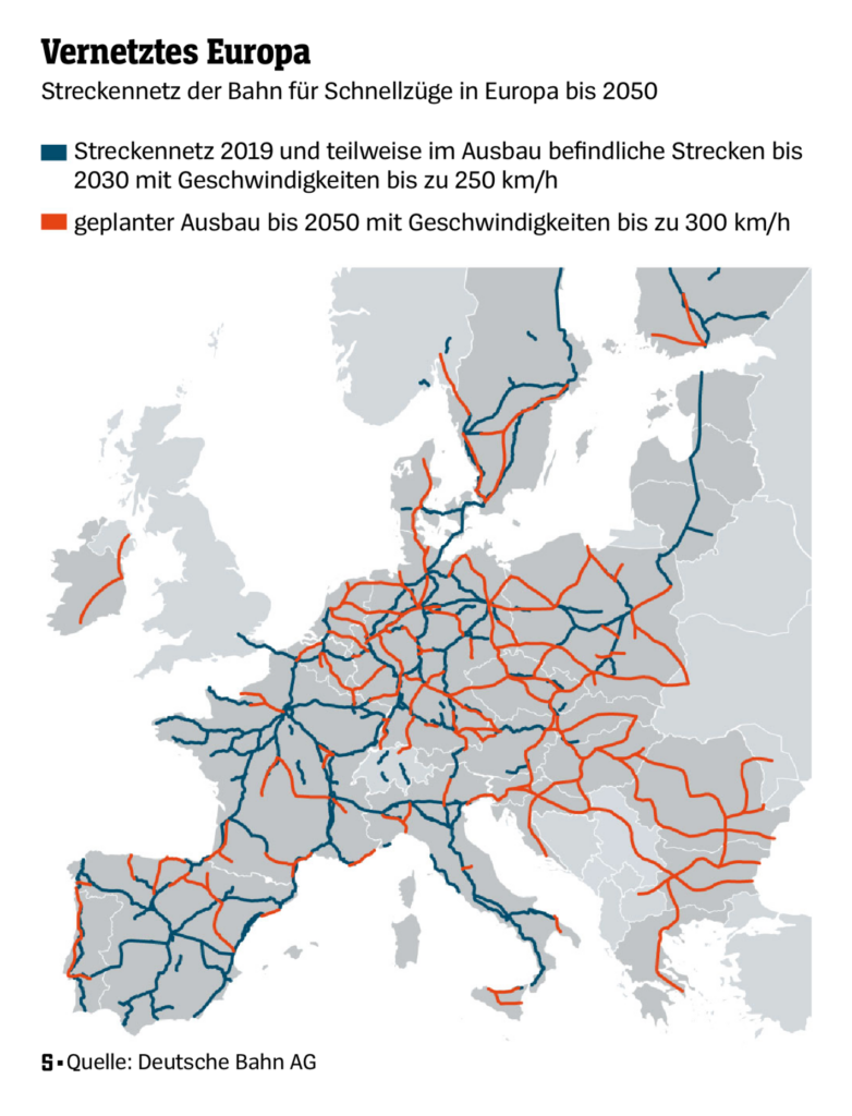
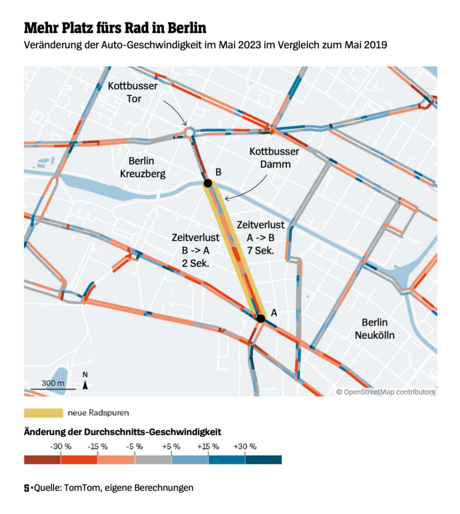
We saw maps of travel by plane, train, car, and bike:
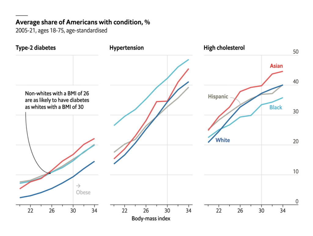
As well as line charts on public health issues:
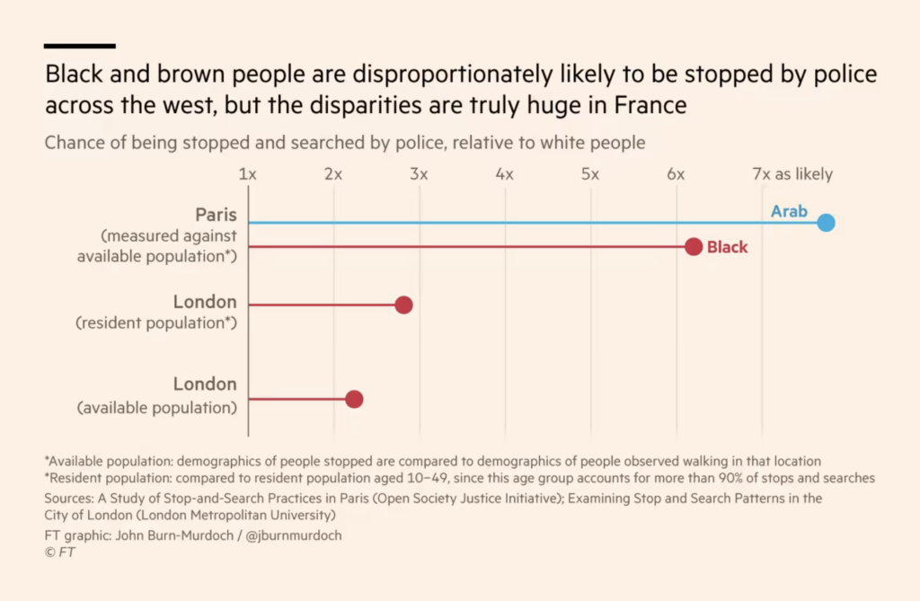
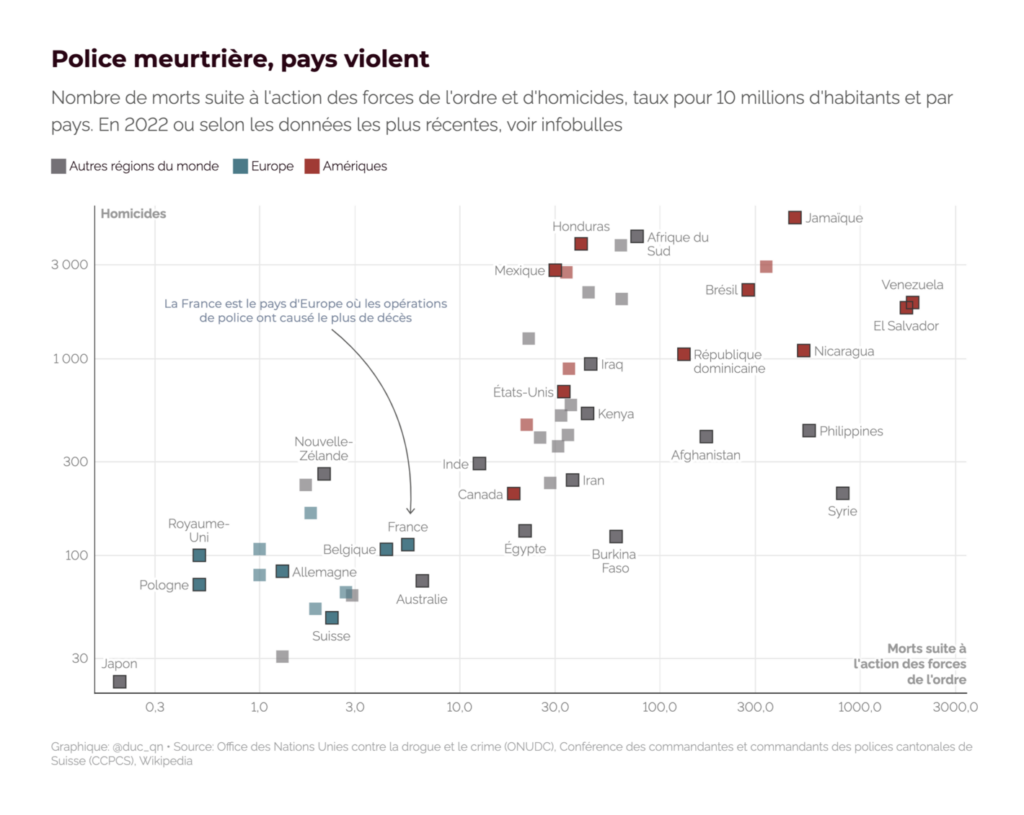
Two news topics got a focus this week. First, a police killing in France and the unrest that’s followed:
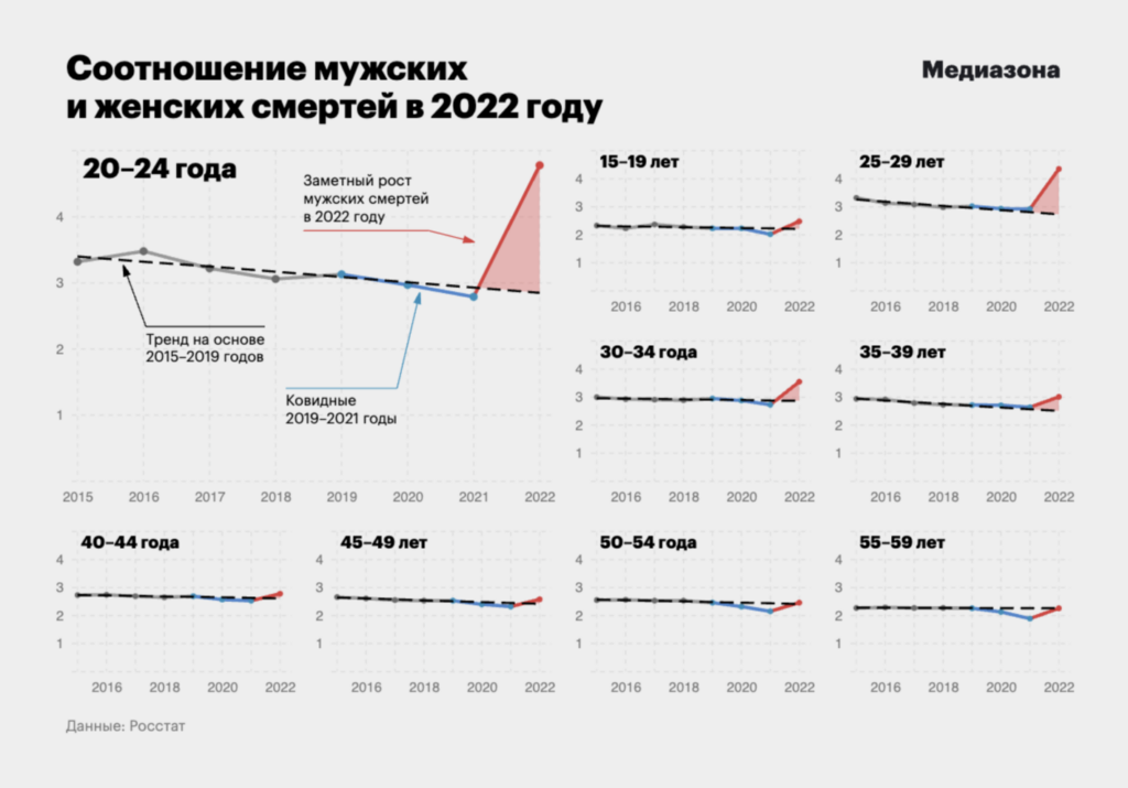
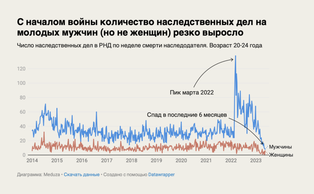
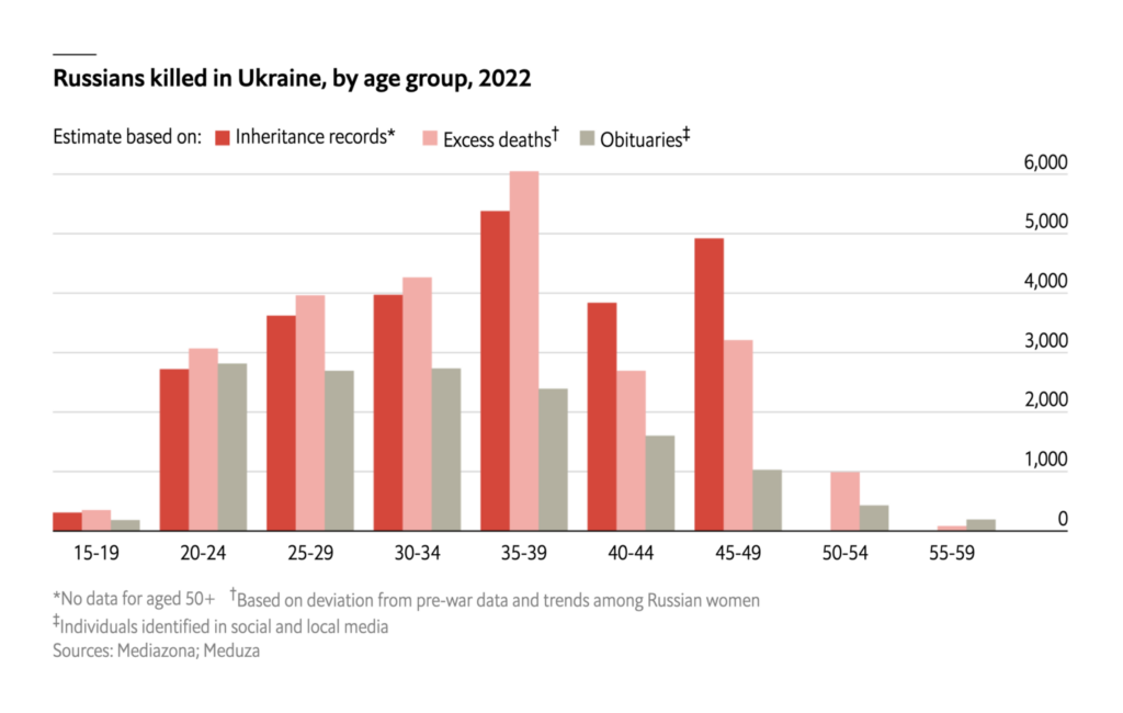
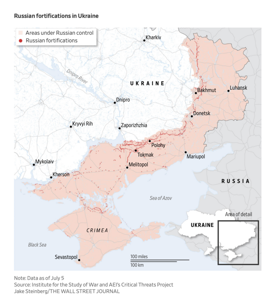
And second, a new investigation of the true number of Russian casualties in Ukraine:
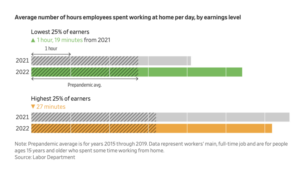
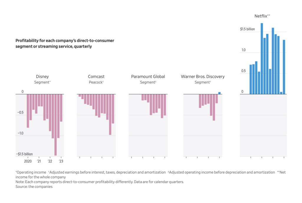
Other charts covered everything from the persistence of remote work to unprofitable TV streaming:
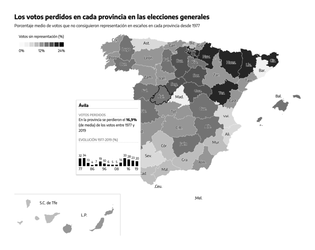
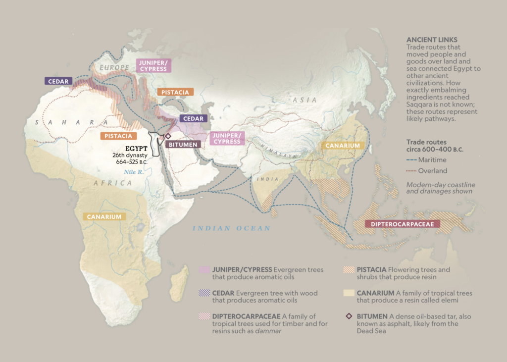
And maps dealt with fair representation in Spain and the history of mummification:
What else we found interesting
Applications are open for…
- A student worker on Datawrapper’s communication team! If you’re a fan of this Dispatch and want to try writing one yourself (and you’re currently a student in Germany), send me an email at rose@datawrapper.de. I’m excited to hear from you.
- A UI/UX designer at Datawrapper
- A temporary graphics editor at ProPublica
Help us make this dispatch better! We’d love to hear which newsletters, blogs, or social media accounts we need to follow to learn about interesting projects, especially from less-covered parts of the world (Asia, South America, Africa). Write us at hello@datawrapper.de or leave a comment below.
Want the Dispatch in your inbox every Tuesday? Sign up for our Blog Update newsletter!


Comments