This article is brought to you by Datawrapper, a data visualization tool for creating charts, maps, and tables. Learn more.
Data Vis Dispatch, July 13
The best of last week’s big and small data visualizations

Welcome back to the fourth edition of Data Vis Dispatch! Every week, we’ll be publishing a collection of the best small and large data visualizations we find, especially from news organizations — to celebrate data journalism, data visualization, simple charts, elaborate maps, and their creators.
Recurring topics for this week include city buildings, hot weather, and, yes, the pandemic.
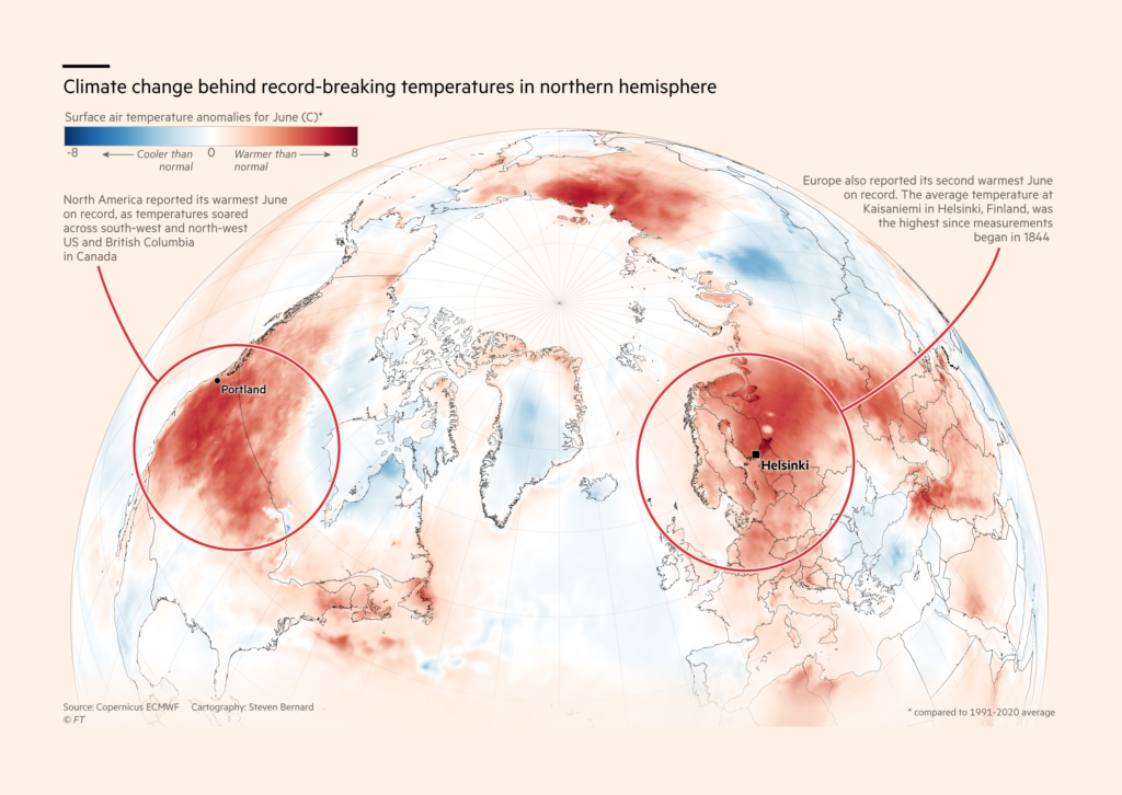
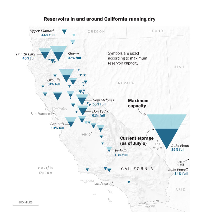
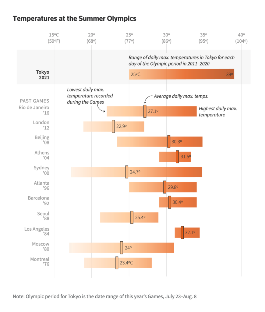
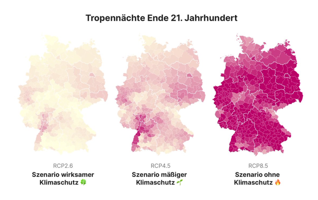
Heat has been almost as reliable a topic as the pandemic, and this week was no exception. These charts took a look back at June’s record temperatures and the resulting drought — and a look forward to the Olympics and our long-term climate future:
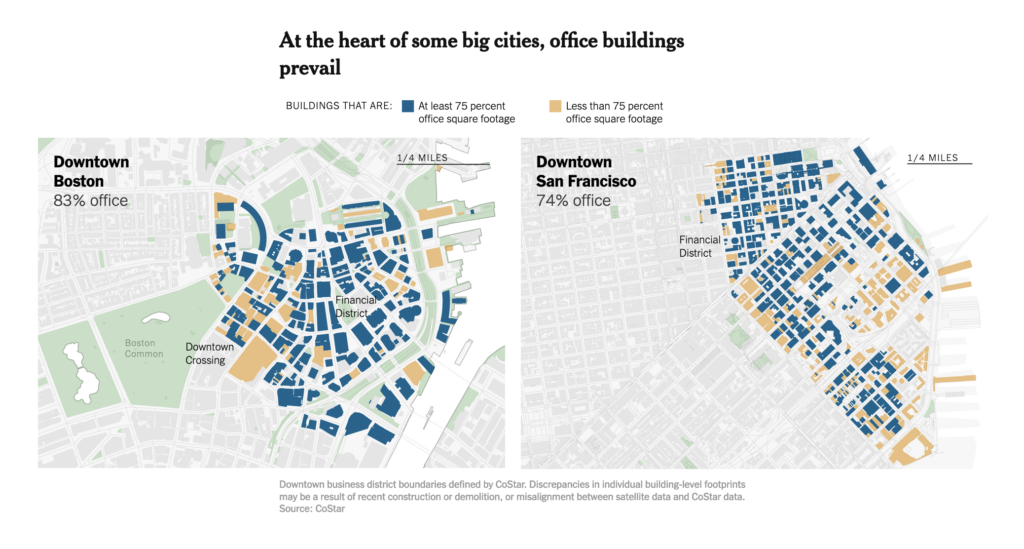
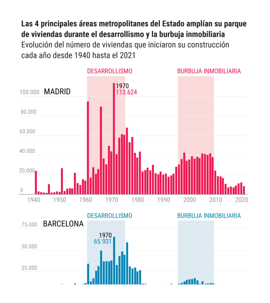
The built environment had its moment too, with these breakdowns of building stock in US and Spanish cities:
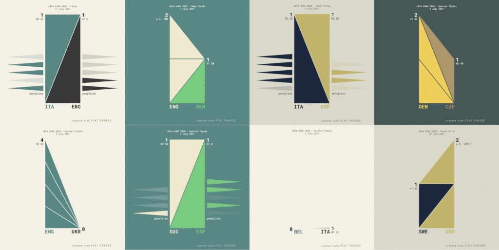
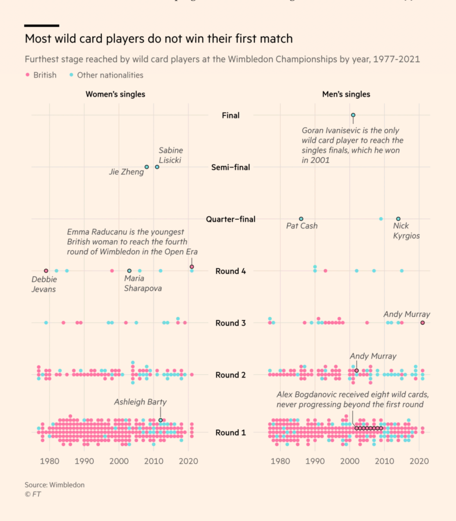
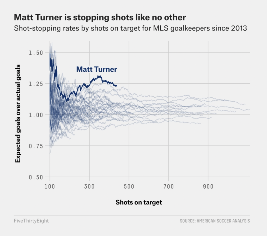
In sports this week, we saw the Euro Cup summed up in triangles, the history of Wimbledon wild cards, and a most valuable player where you might not expect one:
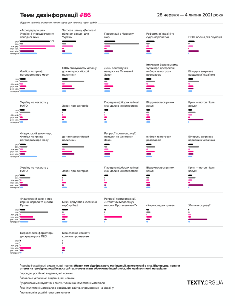
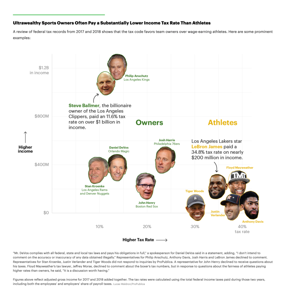
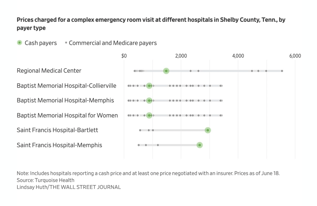
Some general topics — from disinformation to central banks’ spending to healthcare costs — showed up as simple charts:
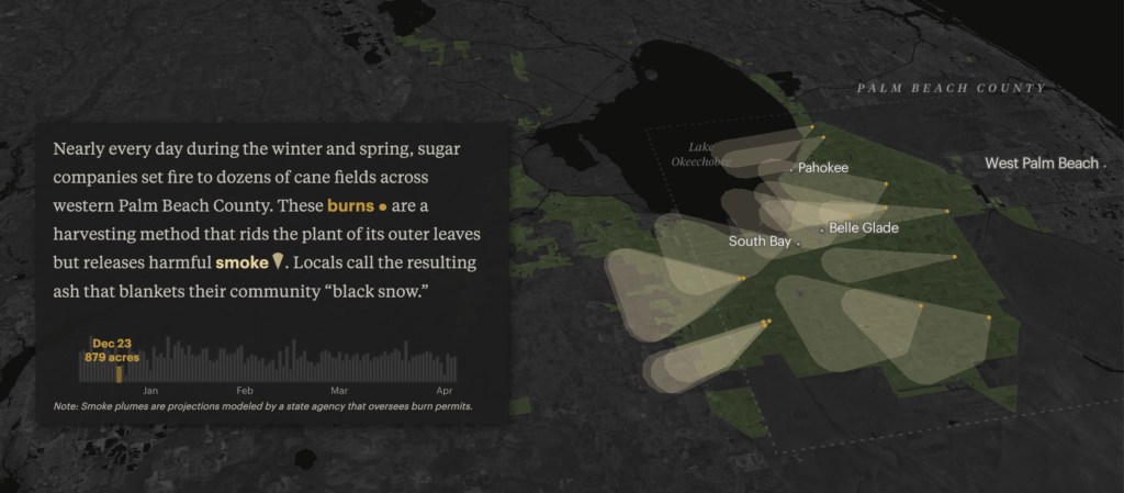
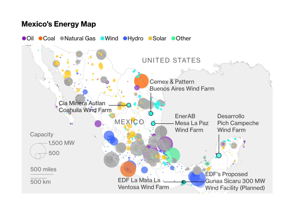
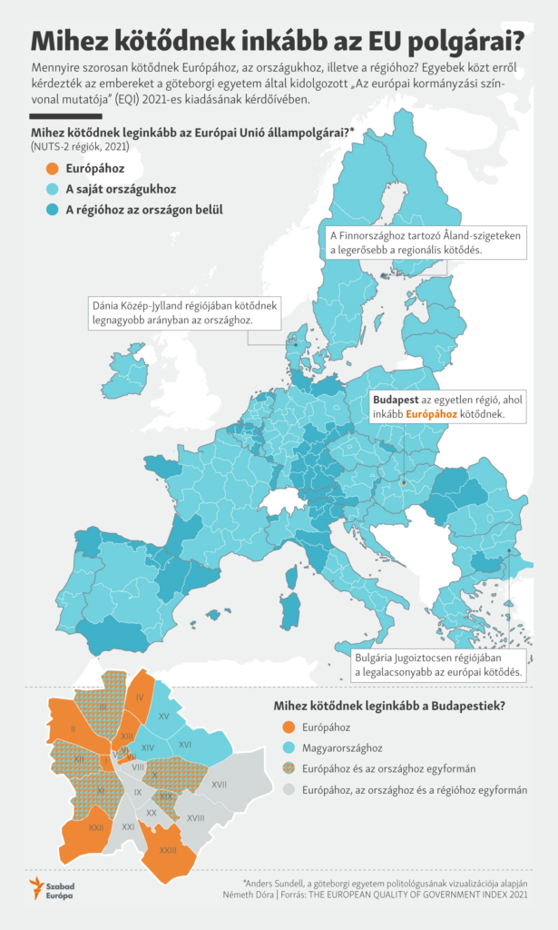
While others — from industrial pollution to energy sources to regional identity — showed up as maps (and who’s to say you can’t use both?):
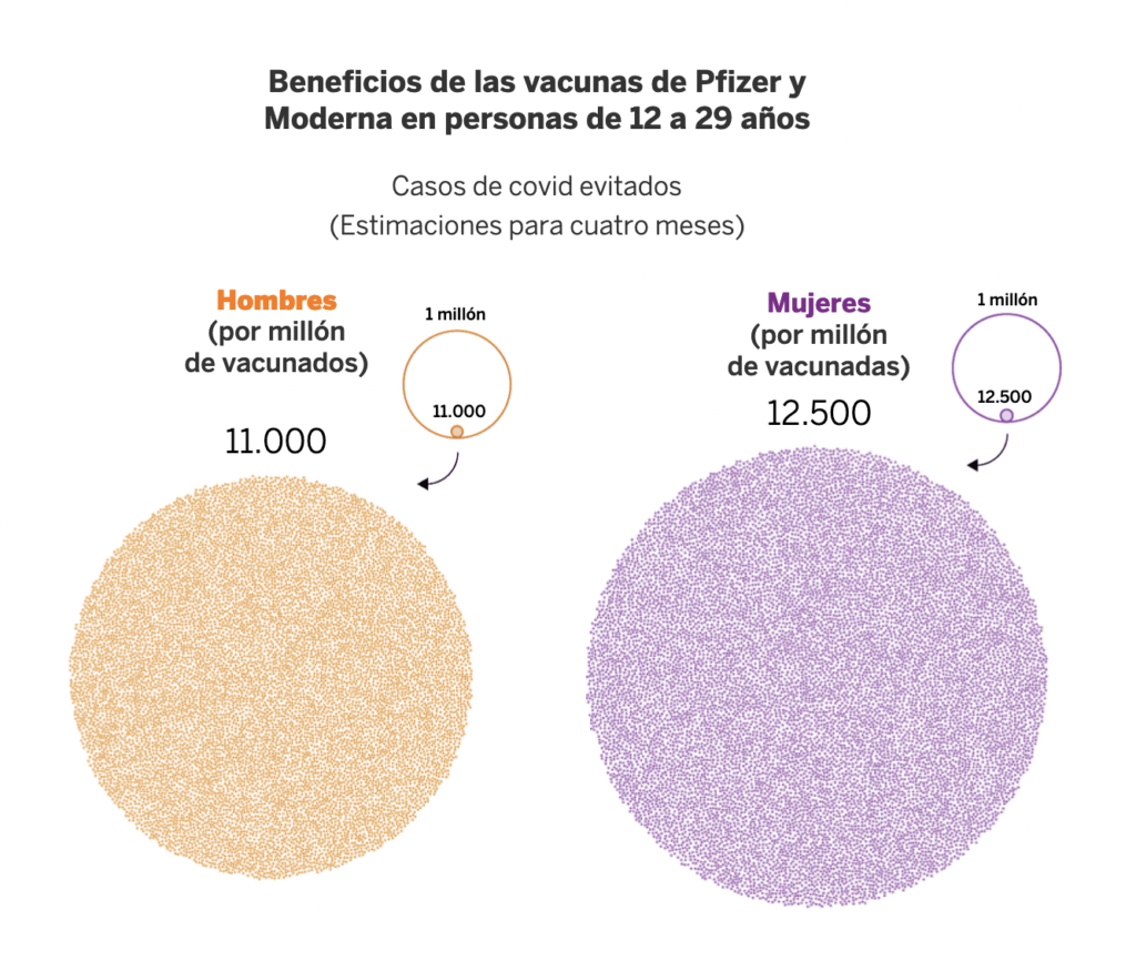
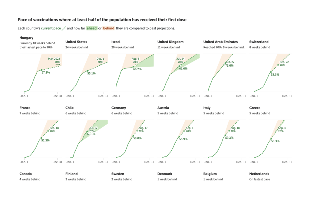
Vaccination was the breakout theme of this week’s COVID charts:
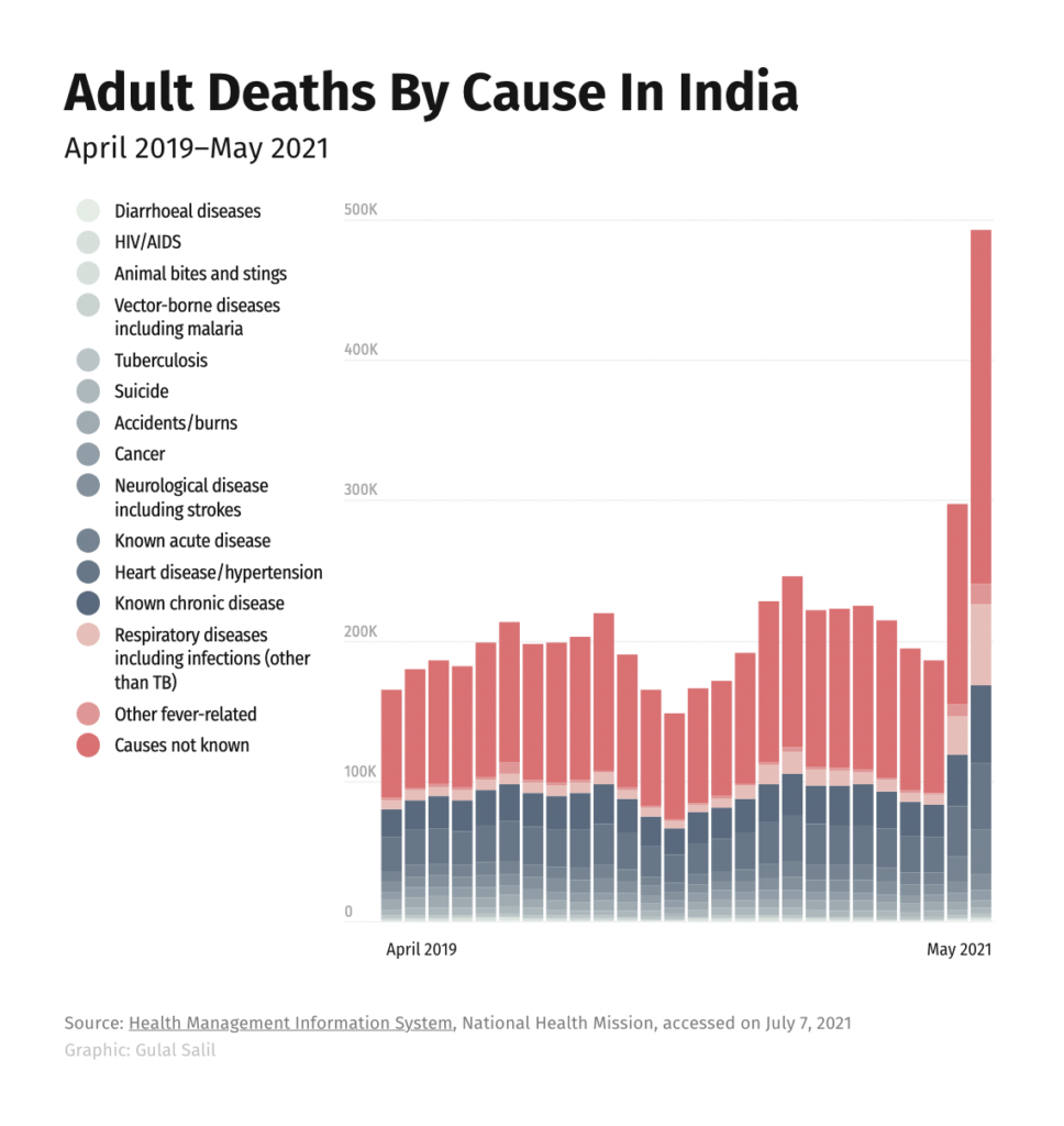
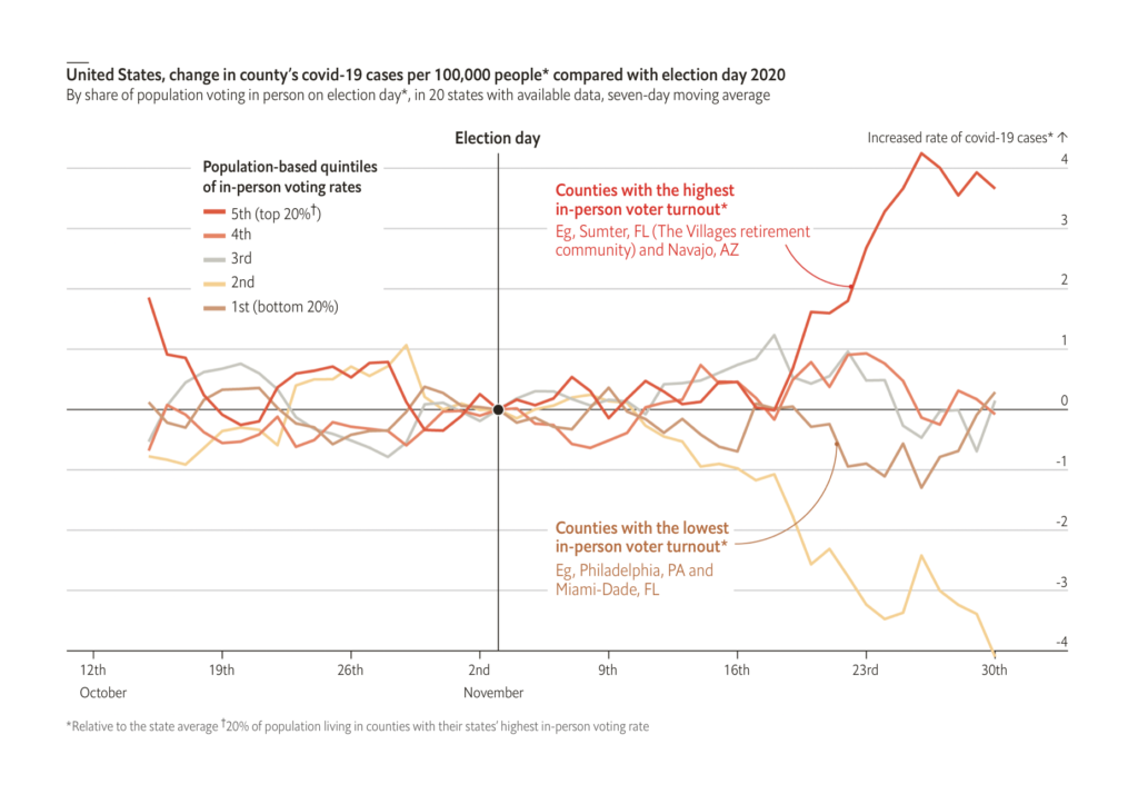
While other COVID topics covered undercounted victims, spreading events, and the coming return to office work:
What else we found interesting

And if that’s enough data visualization for one week, why not take a break with some data sonification over at Loud Numbers podcast? Three episodes are already out with a fourth on its way!
Help us make this dispatch better! We’d love to hear which newsletters, blogs, or social media accounts we need to follow to learn about interesting projects, especially from less-covered parts of the world (Asia, South America, Africa). Write us at hello@datawrapper.de or leave a comment below.


Comments