

Data Vis Dispatch, February 18: German election polls, corruption, and tariffs
February 18th, 2025
9 min
This article is brought to you by Datawrapper, a data visualization tool for creating charts, maps, and tables. Learn more.
The best of last week’s big and small data visualizations
Welcome back to the 151st edition of the Data Vis Dispatch! Every week, we publish a collection of the best small and large data visualizations we find, especially from news organizations — to celebrate data journalism, data visualization, simple charts, elaborate maps, and their creators.
You might notice something new this week: we’ve added a machine translation for every headline that isn’t already in English. It’s only fair to take machine translations with a grain of salt — neither we nor the original publisher can take responsibility for their accuracy. Still, we hope more accessible headlines will help you get the most out of all the perspectives in the Dispatch!
Recurring topics include the attempted assassination of Donald Trump, technology and culture, and the future of world population.
On July 13, an assassination attempt injured Donald Trump and killed a bystander at a rally in Pennsylvania:


The assassination attempt sparked a crisis in the Secret Service and led to stronger security measures at this week’s Republican National Convention, which is expected to draw 50,000 attendees:

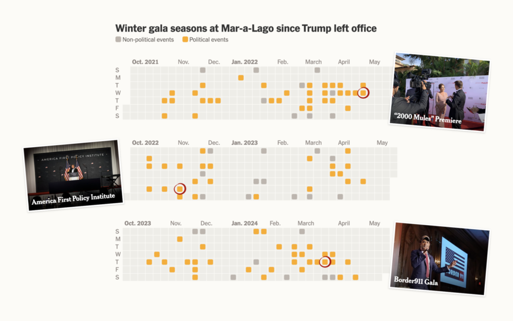
Trump’s own estate in Florida, Mar-a-Lago, has become a key spot for Republican politics since he left office:
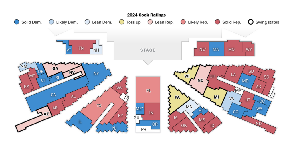
Over in Europe, let’s take a quick look at post-election charts. The newly elected European Parliament will move to Brussels on July 16th, after gains for conservative and far-right parties. An analysis by the Financial Times showed that the most successful right-wing parties were those with a more left-leaning economic agenda:

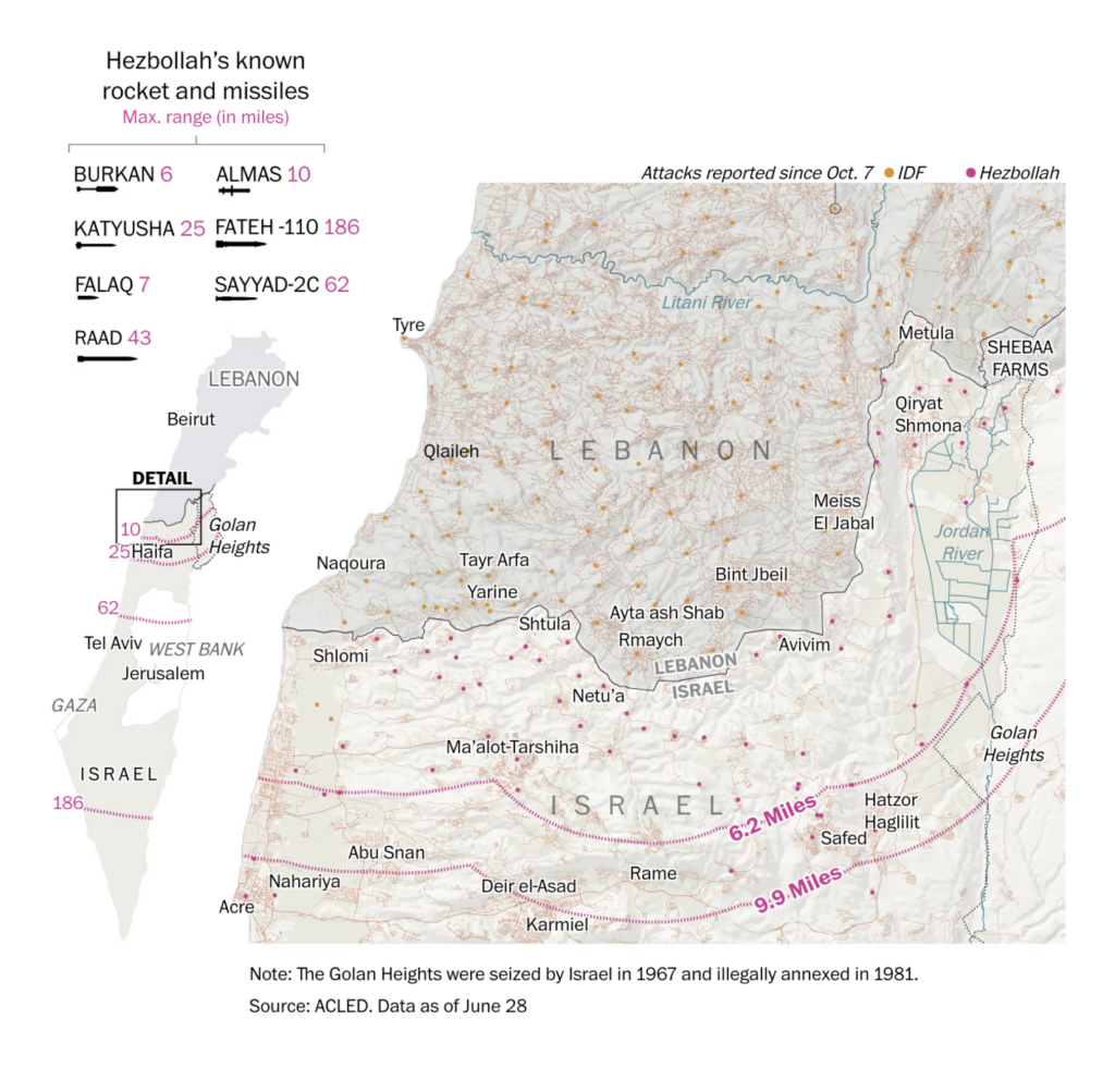
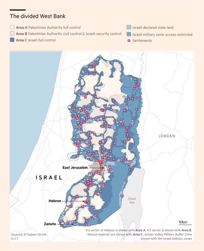
A map of Hezbollah’s rocket arsenal and ongoing Israeli land seizures and violence in the West Bank show a crisis that goes far beyond Gaza and could still get even worse:
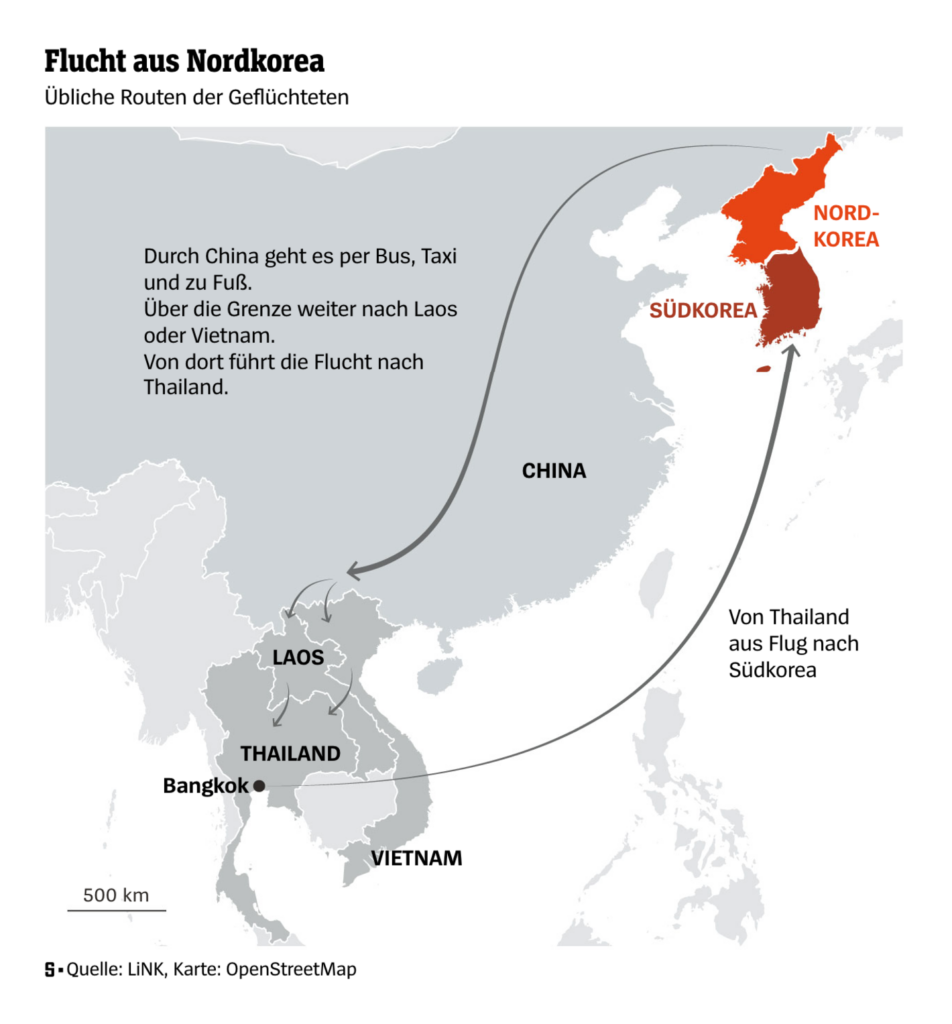
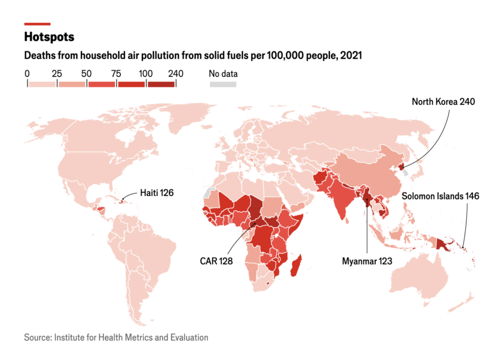
We continue with red maps and sad stories of a long escape from North Korea and four million premature deaths from indoor smoke each year:
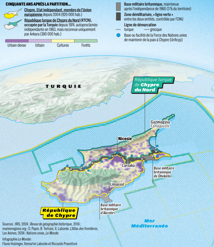
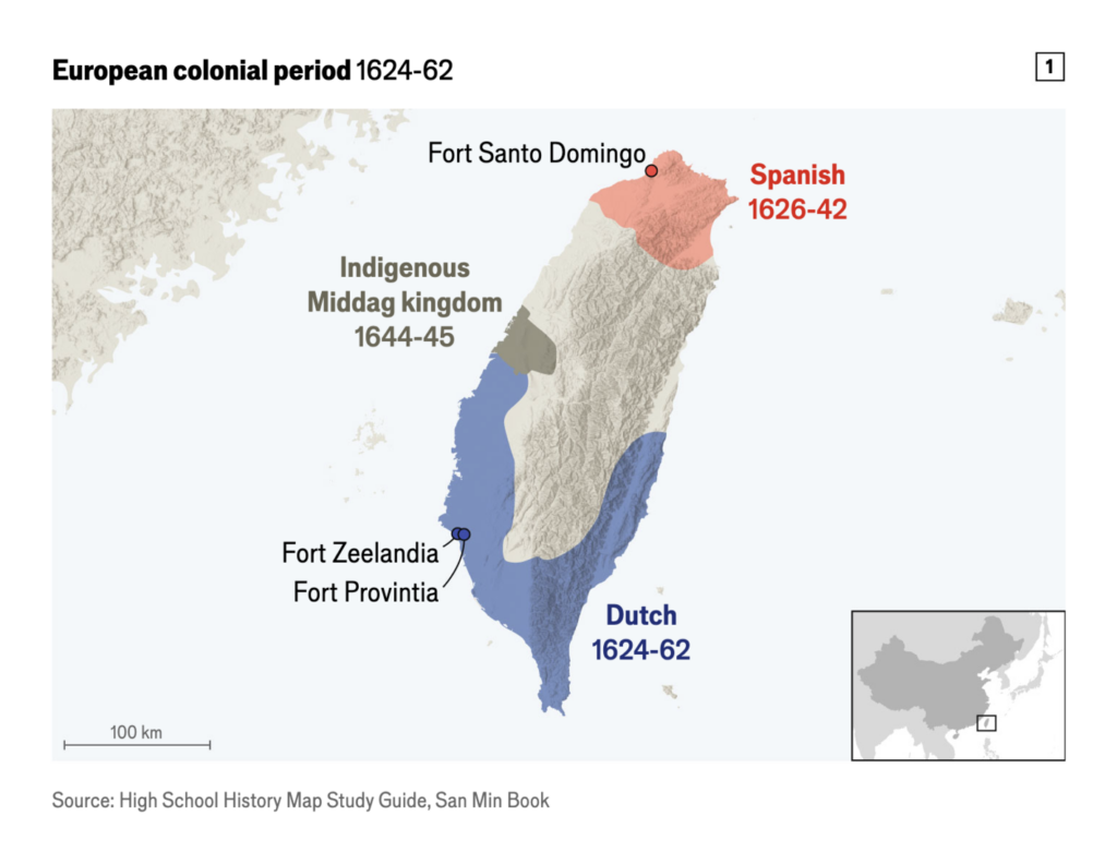
Two in-depth map stories this week look at more than 50 years of division in Cyprus and the long colonial history of Taiwan:
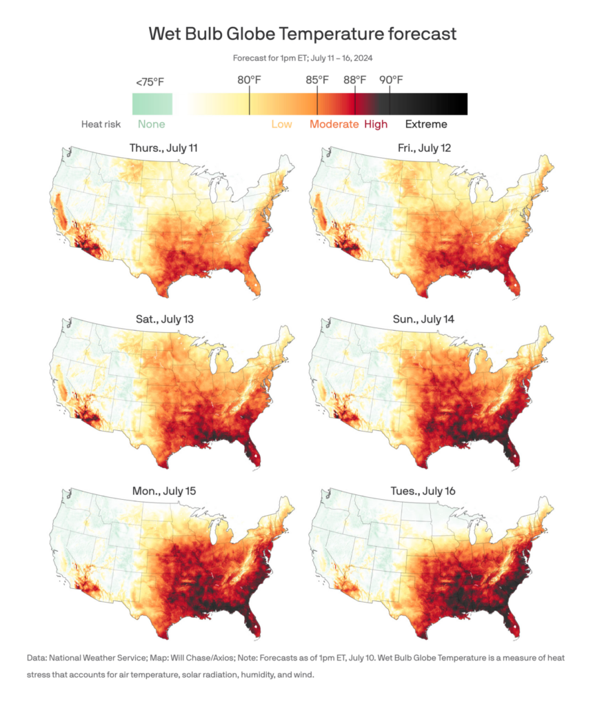
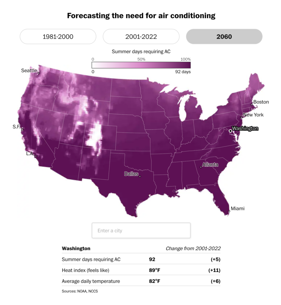
Heat leads to serious health risks in the U.S. and endangers the tea crop in Taiwan:
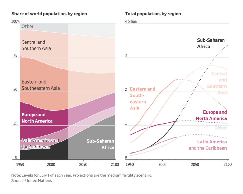
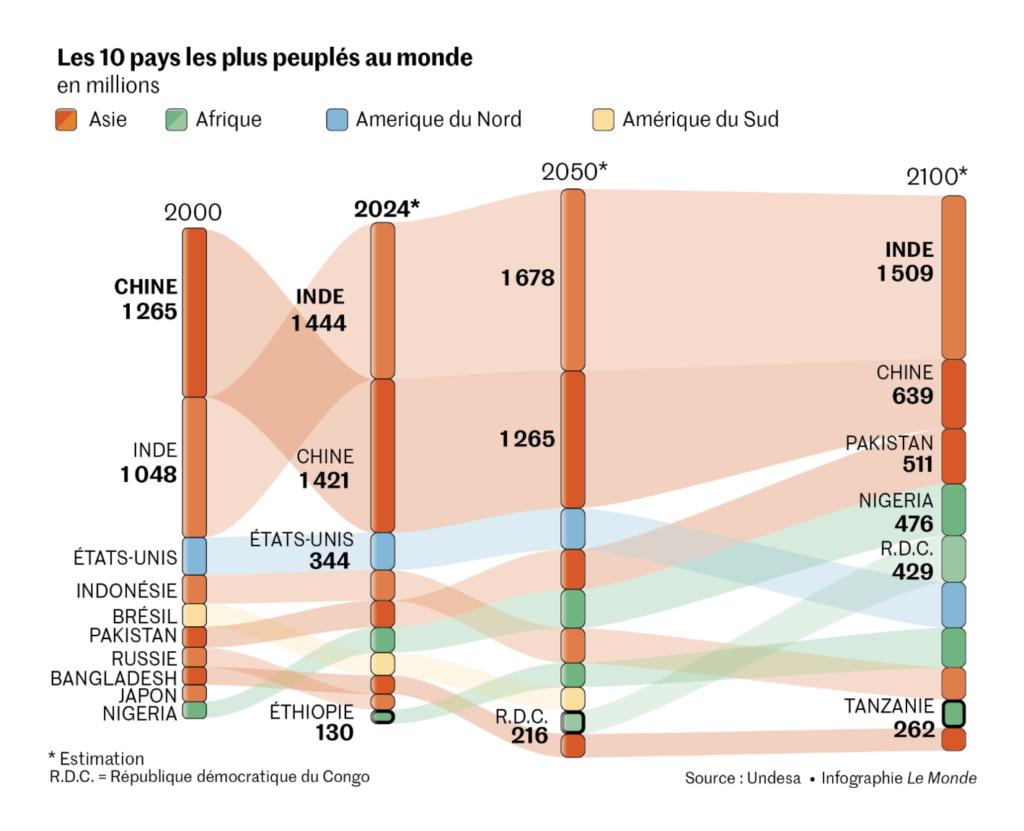
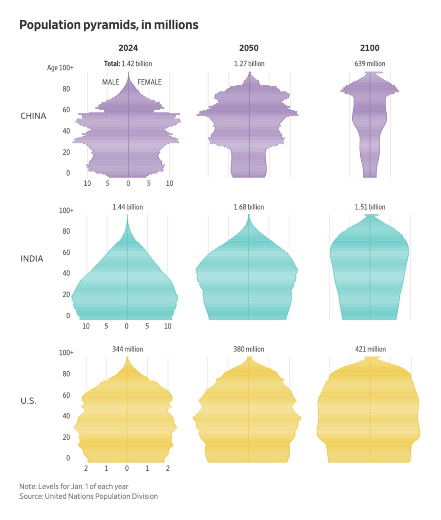
According to new projections from the United Nations, the world population will peak at 10.29 billion in 2084. Some places, like China and Europe, have already peaked — and in fact India recently surpassed China as the most populous country in the world:
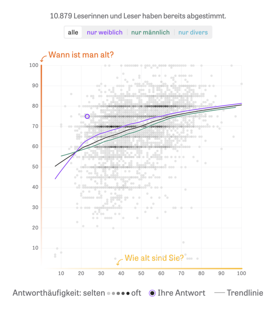
How old is actually old? Unsurprisingly, your perspective may change over time:
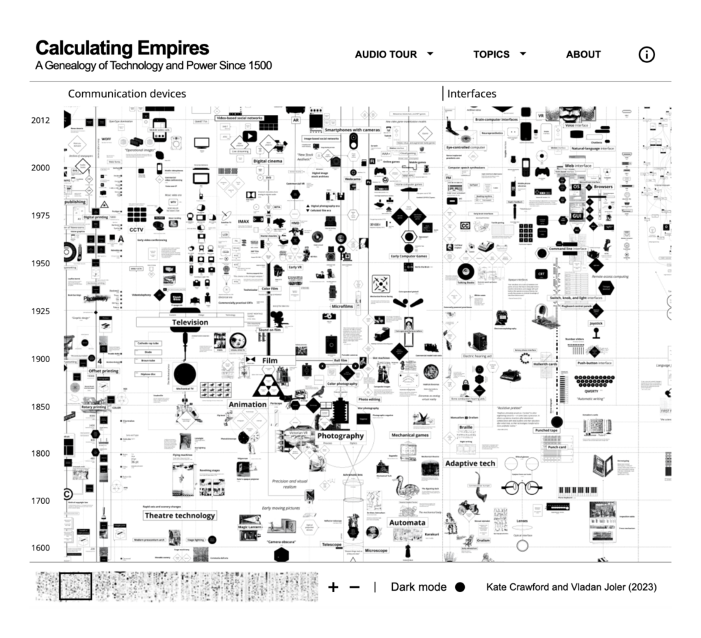
Last but definitely not least are two visualizations on technology and society. One shows the growing pessimism of science fiction, while the other lets us explore the relationship of technology and power:


Applications are open for…
Help us make this dispatch better! We’d love to hear which newsletters, blogs, or social media accounts we need to follow to learn about interesting projects, especially from less-covered parts of the world (Asia, South America, Africa). Write us at hello@datawrapper.de or leave a comment below.
Want the Dispatch in your inbox every Tuesday? Sign up for our Blog Update newsletter!


Comments