This article is brought to you by Datawrapper, a data visualization tool for creating charts, maps, and tables. Learn more.
Data Vis Dispatch, July 18
The best of last week’s big and small data visualizations

Welcome back to the 102nd edition of Data Vis Dispatch! Every week, we’ll be publishing a collection of the best small and large data visualizations we find, especially from news organizations — to celebrate data journalism, data visualization, simple charts, elaborate maps, and their creators.
Recurring topics this week include toxic substances, xenophobia, and heat. Plus: an opportunity to work on the Dispatch yourself as our Werkstudent*in.
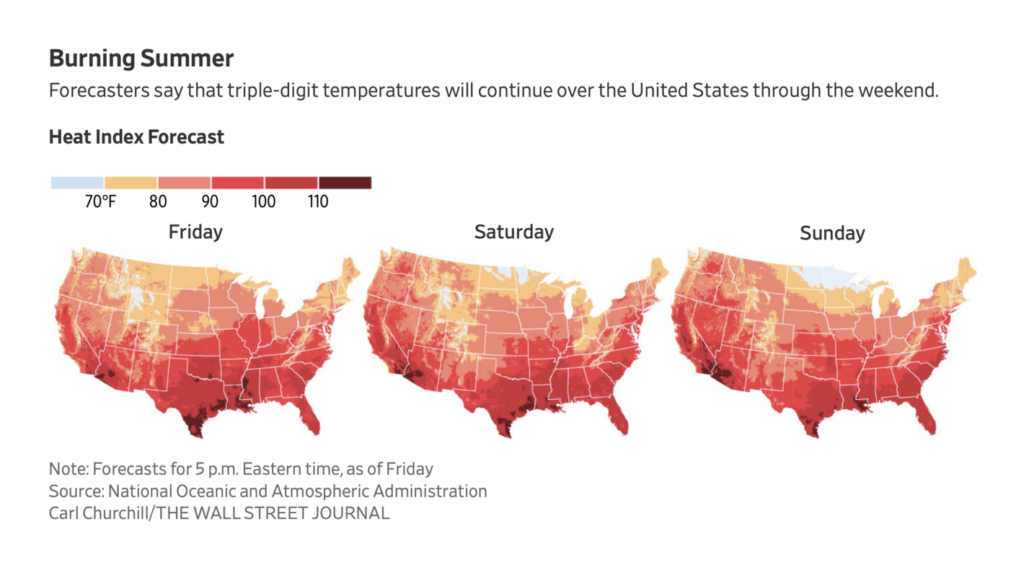
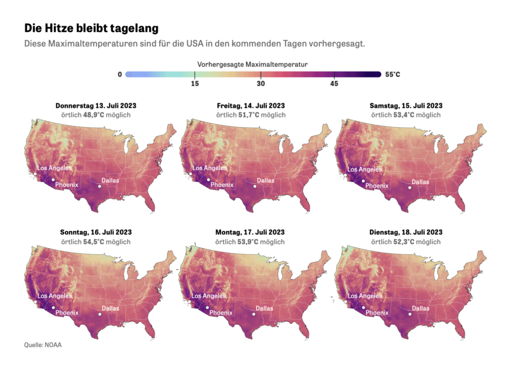
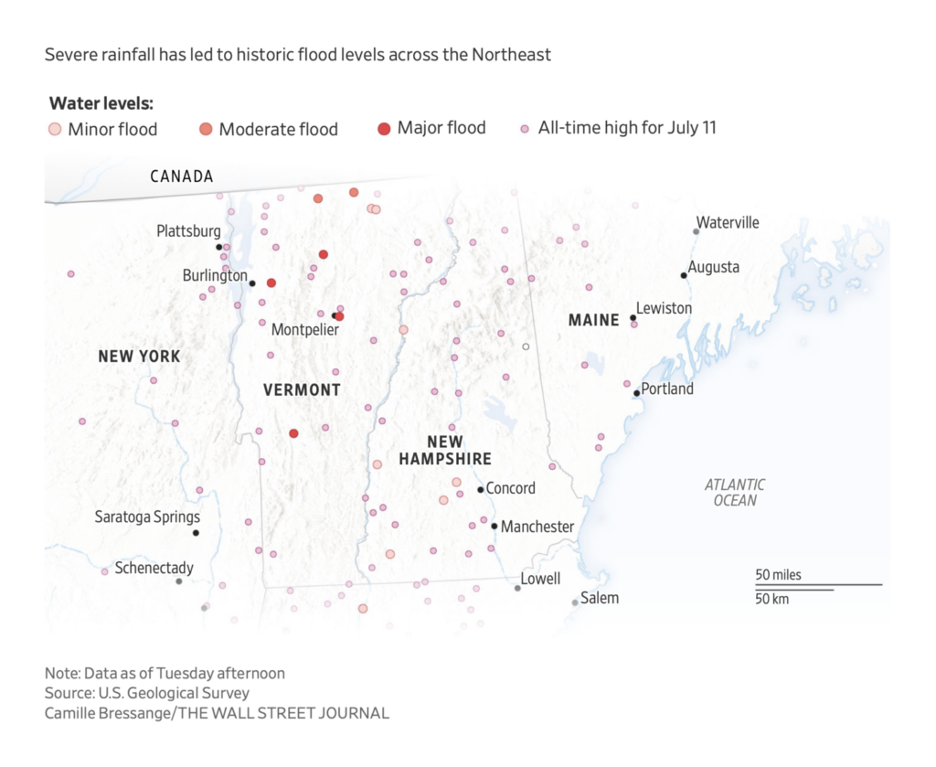
It was another normal week of life-threatening heat waves:
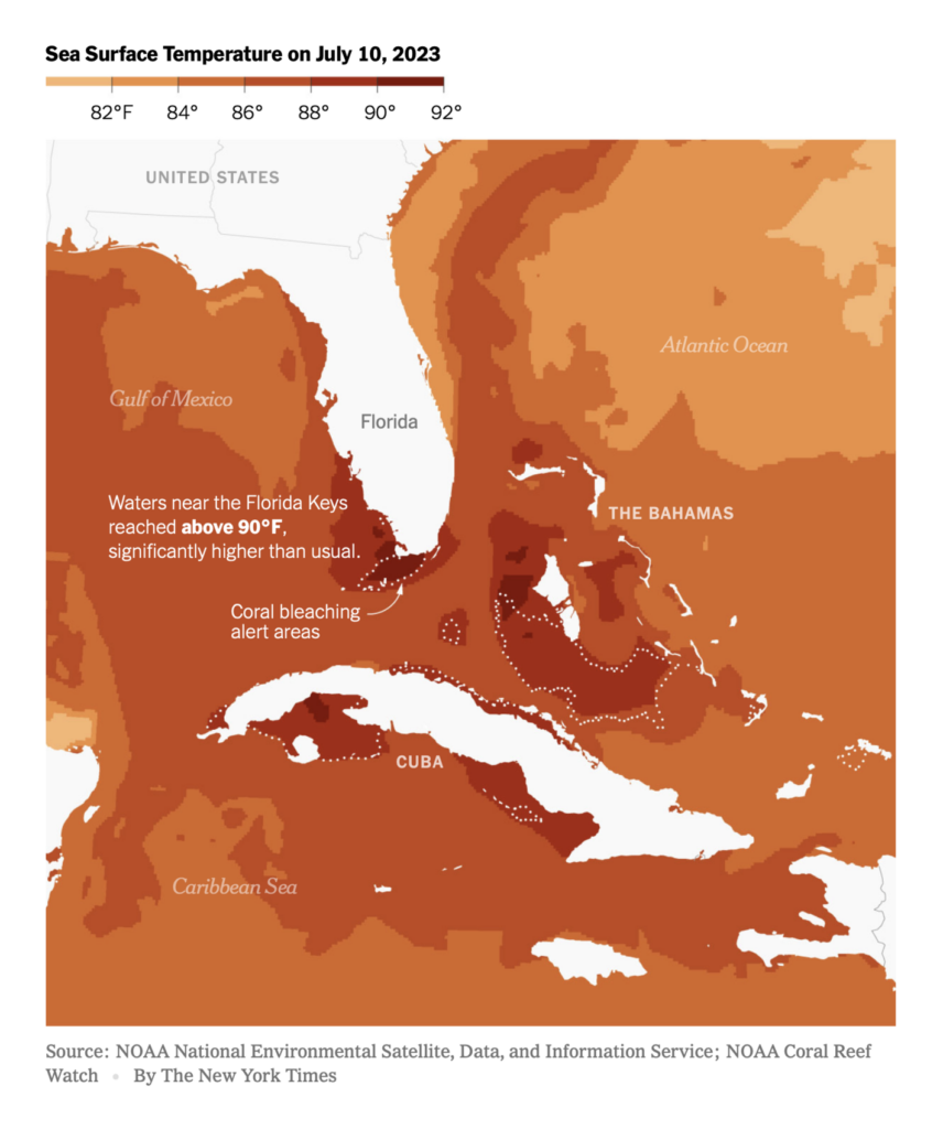
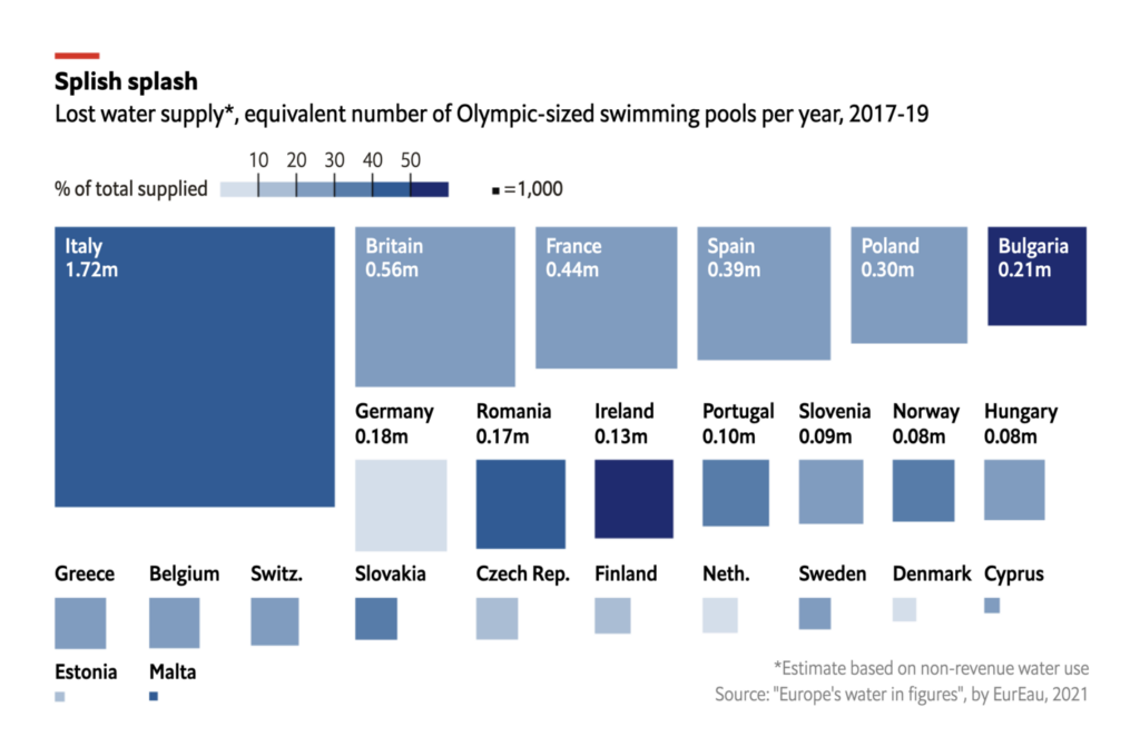
And don’t bother thinking about cooling off in the water:
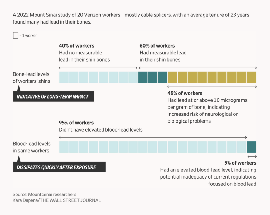
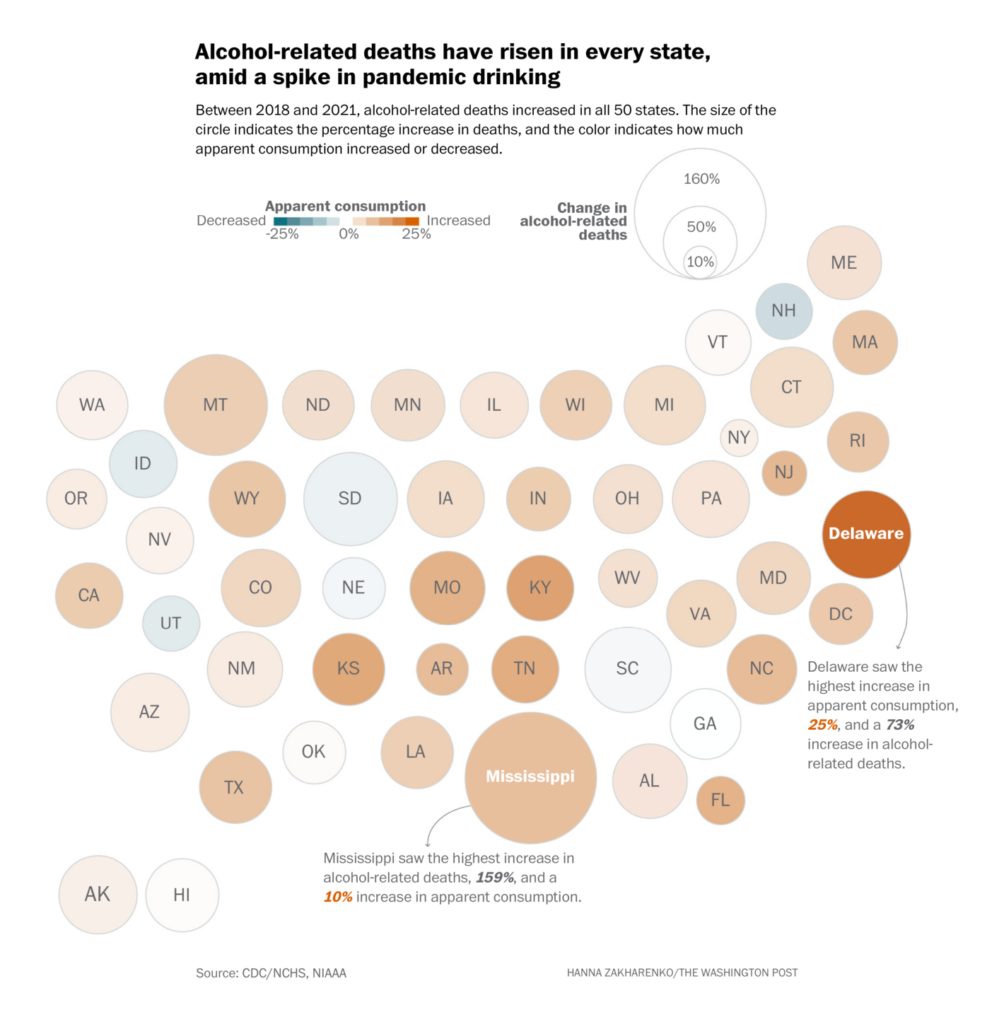
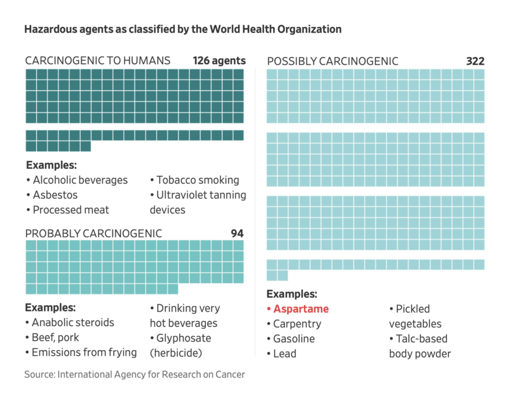
These charts covered the health risks of substances from lead to alcohol to artificial sweeteners:
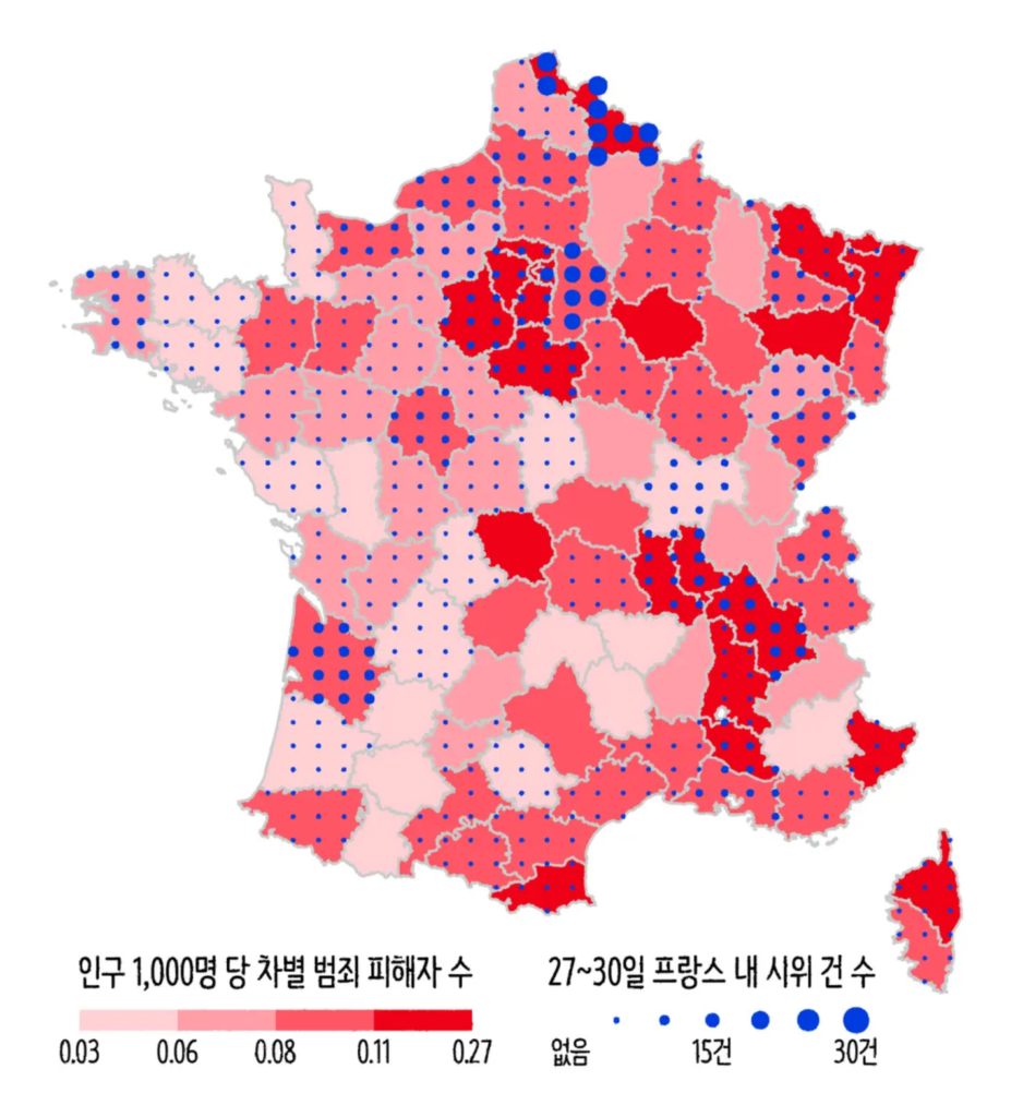
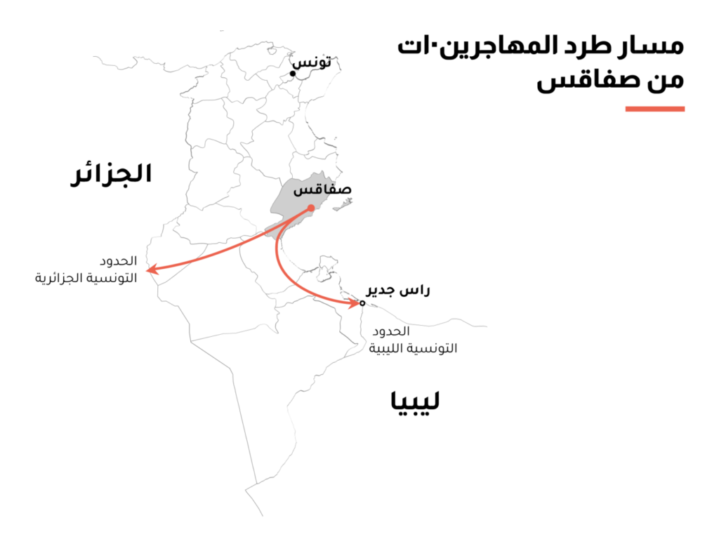
Two maps focused on immigration and xenophobia in France and Tunisia:
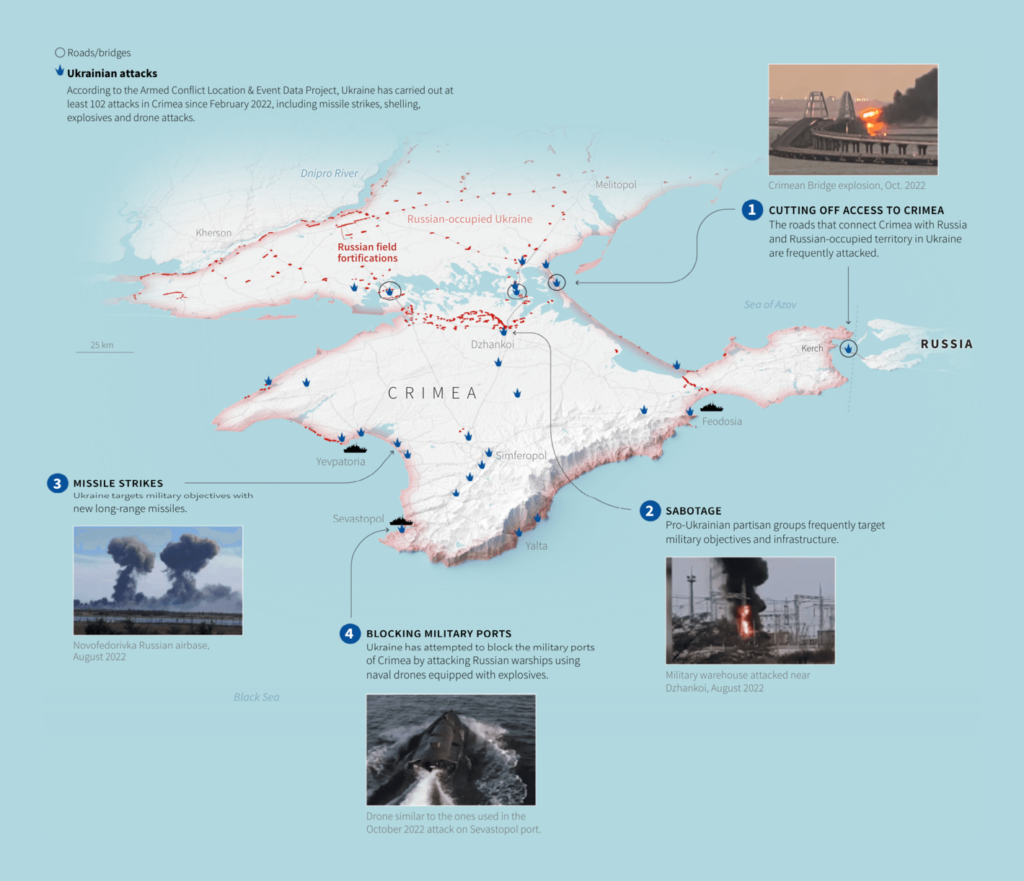
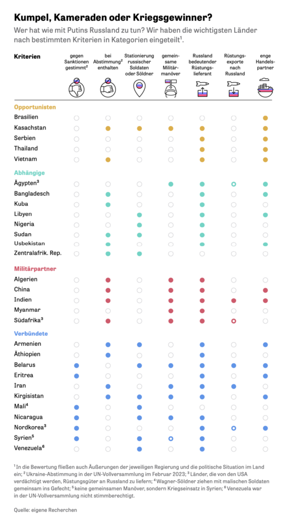
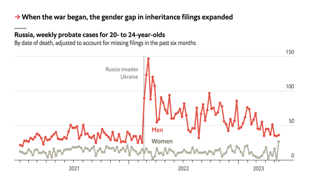
From the war in Ukraine this week — a map of strikes in Crimea, a table of Russia’s allies, and a chart on Russian casualties:
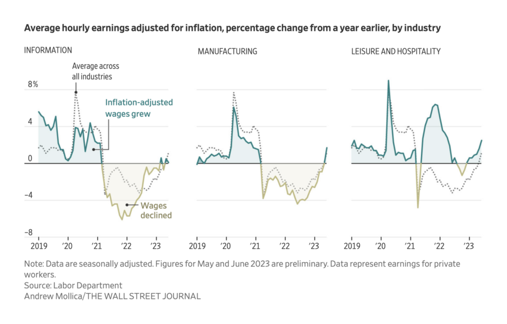
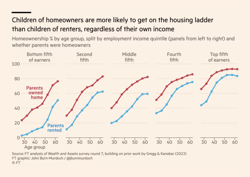
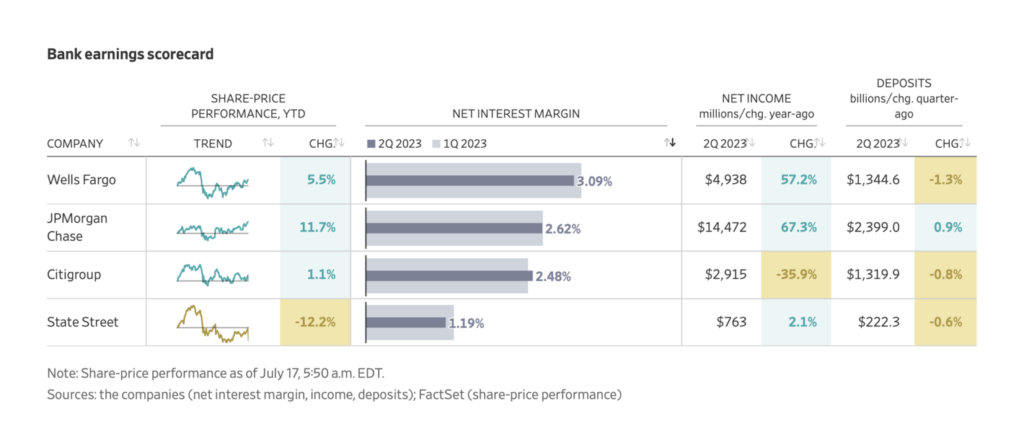
Finally, economic charts covered every scale from U.S. hospitality wages this month to world demographics over 60 years:
What else we found interesting
Applications are open for…
- A student worker on Datawrapper’s communication team! If you’re a fan of this Dispatch and want to try writing one yourself (and you’re currently a student in Germany), send me an email at rose@datawrapper.de. I’m excited to hear from you.
- A UI/UX designer at Datawrapper
- A senior news apps developer at NPR
- An interactive visual journalist at The Economist
Help us make this dispatch better! We’d love to hear which newsletters, blogs, or social media accounts we need to follow to learn about interesting projects, especially from less-covered parts of the world (Asia, South America, Africa). Write us at hello@datawrapper.de or leave a comment below.
Want the Dispatch in your inbox every Tuesday? Sign up for our Blog Update newsletter!


Comments