This article is brought to you by Datawrapper, a data visualization tool for creating charts, maps, and tables. Learn more.
Data Vis Dispatch, July 19
The best of last week’s big and small data visualizations
Welcome back to the 54th edition of Data Vis Dispatch! Every week, we’ll be publishing a collection of the best small and large data visualizations we find, especially from news organizations — to celebrate data journalism, data visualization, simple charts, elaborate maps, and their creators.
Recurring topics this week include heat, air travel, and the natural world.
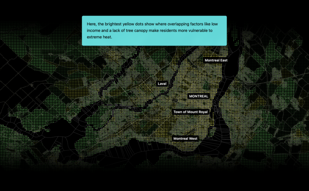
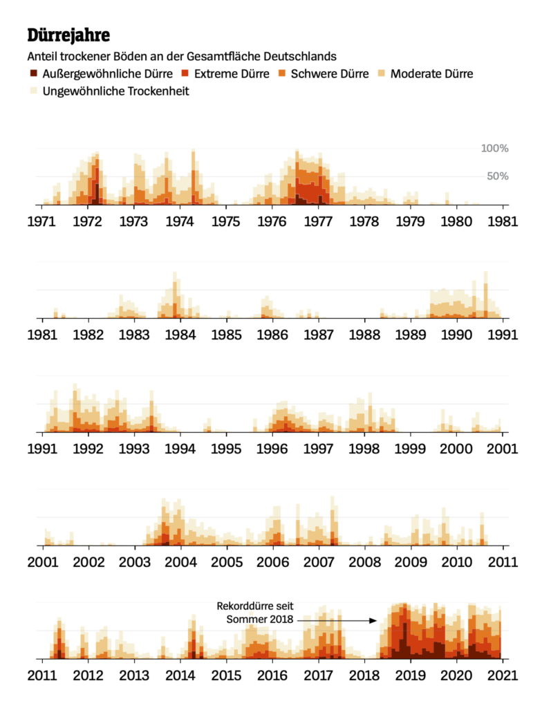
This week’s massive heat wave would have been one in a thousand just a few decades ago. But the future is likely to bring many more summers like it:
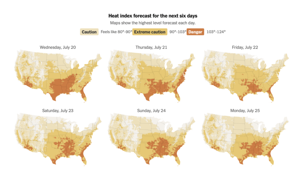
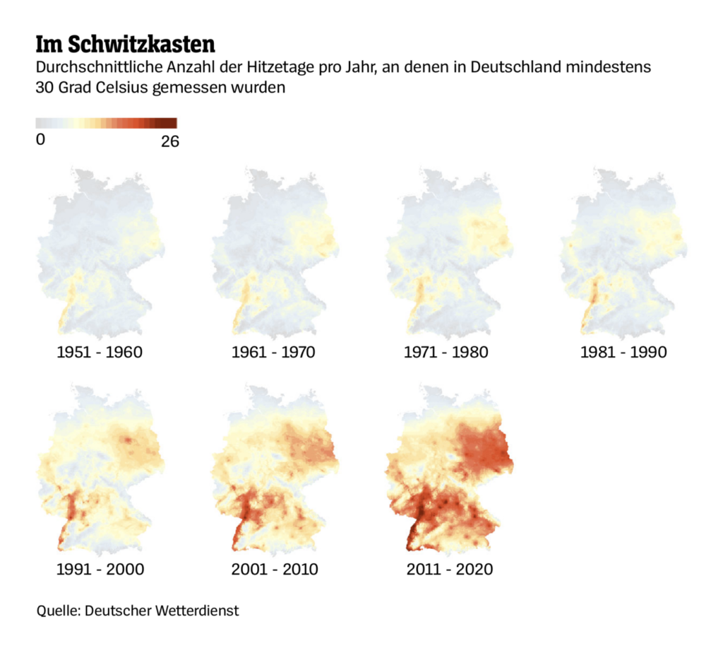
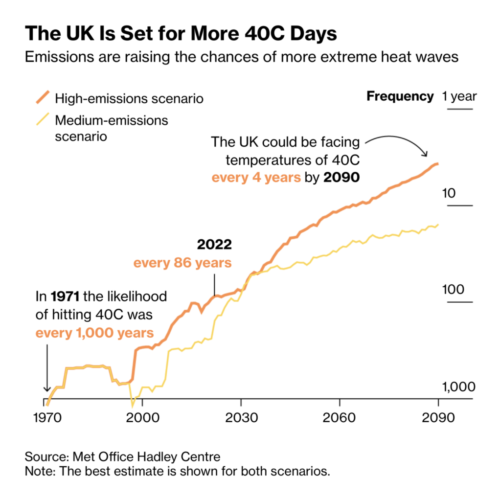
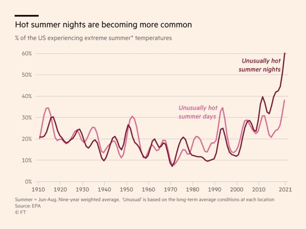
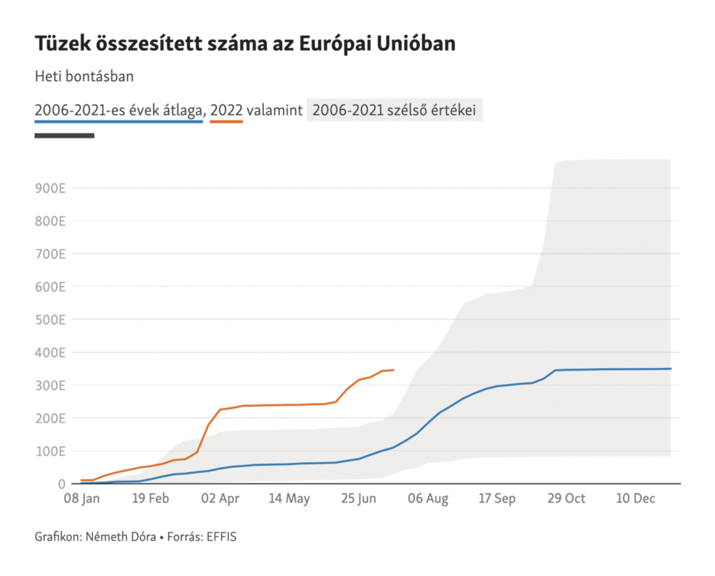
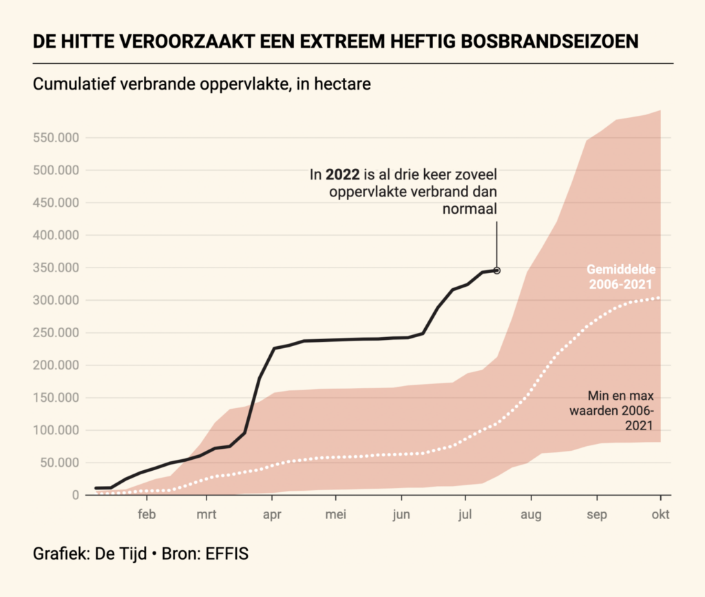
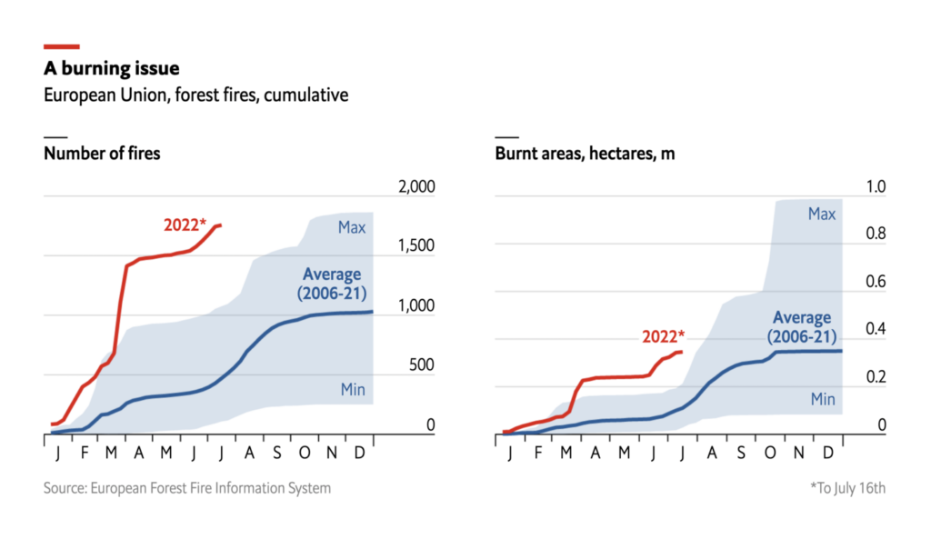
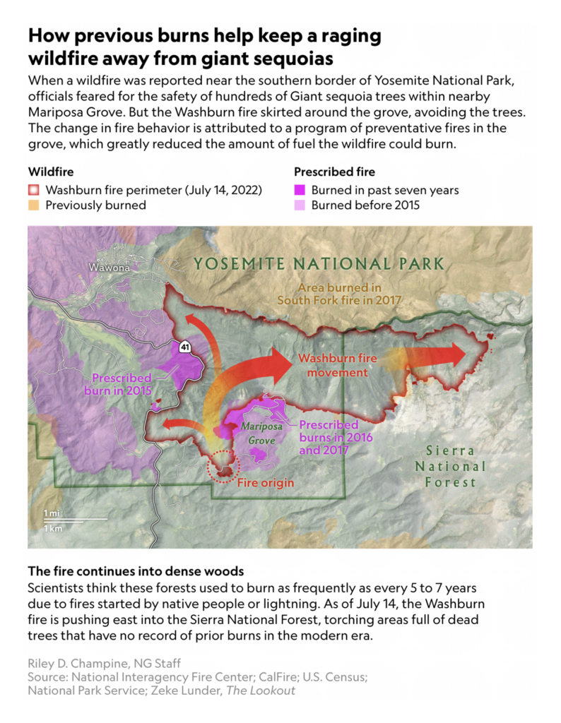
Hot, dry summers mean wildfires. We saw four different versions of this line chart (from The Financial Times, Szabad Európa, De Tijd, and The Economist) showing just how much worse than usual this fire season in Europe has been:
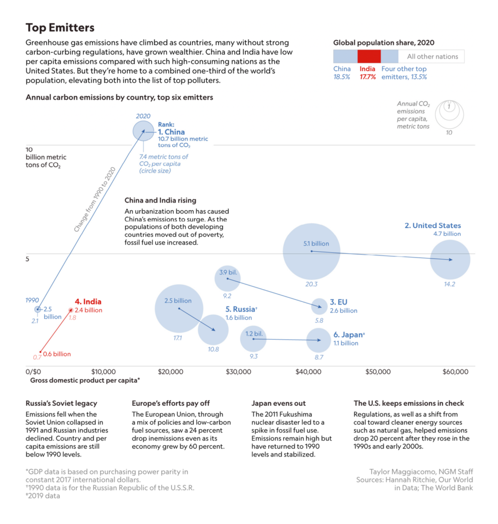
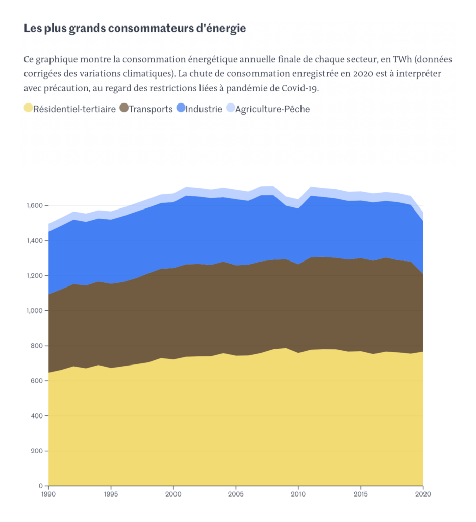
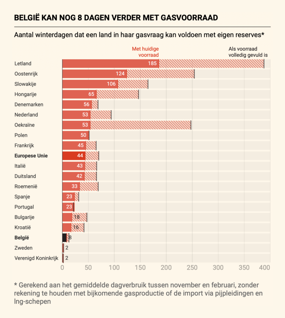
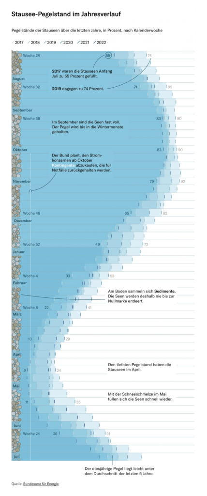
If the climate crisis weren’t a good enough reason for Europe to change its energy mix — there are also the risks of relying on imported gas:
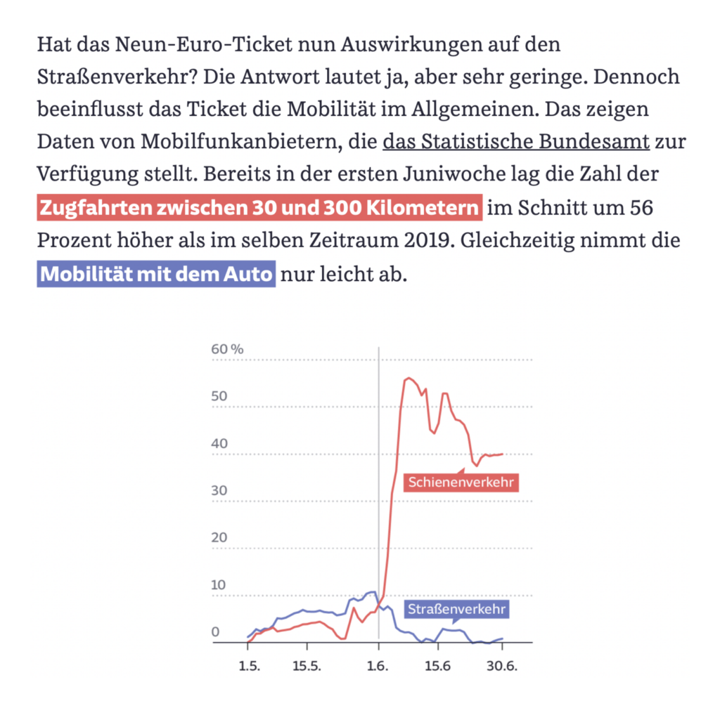
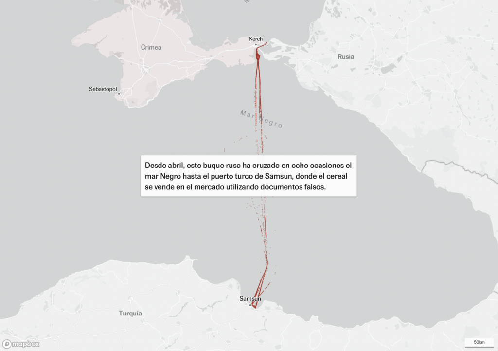
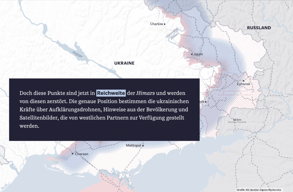
Even food exports are being used as a tool of war by Russia in its invasion of Ukraine:
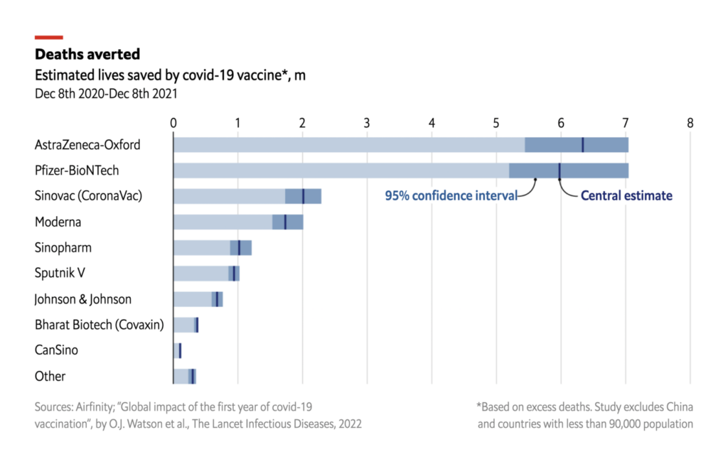
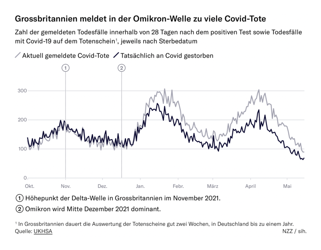
These charts looked back at lives saved and lost to COVID this year:
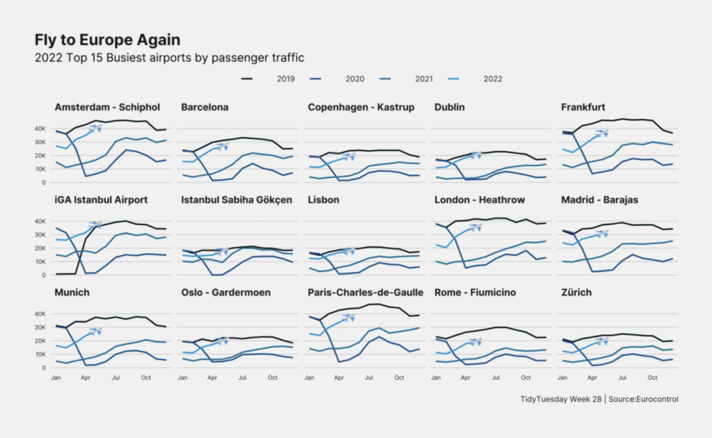
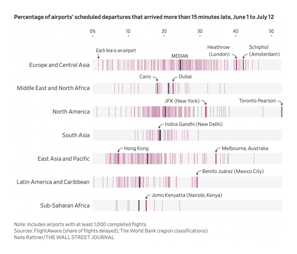
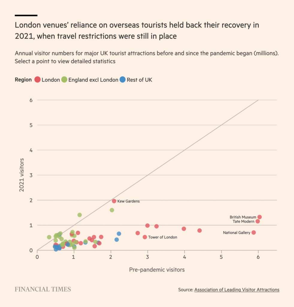
And air travel is still struggling to pull off its pandemic-era comeback:
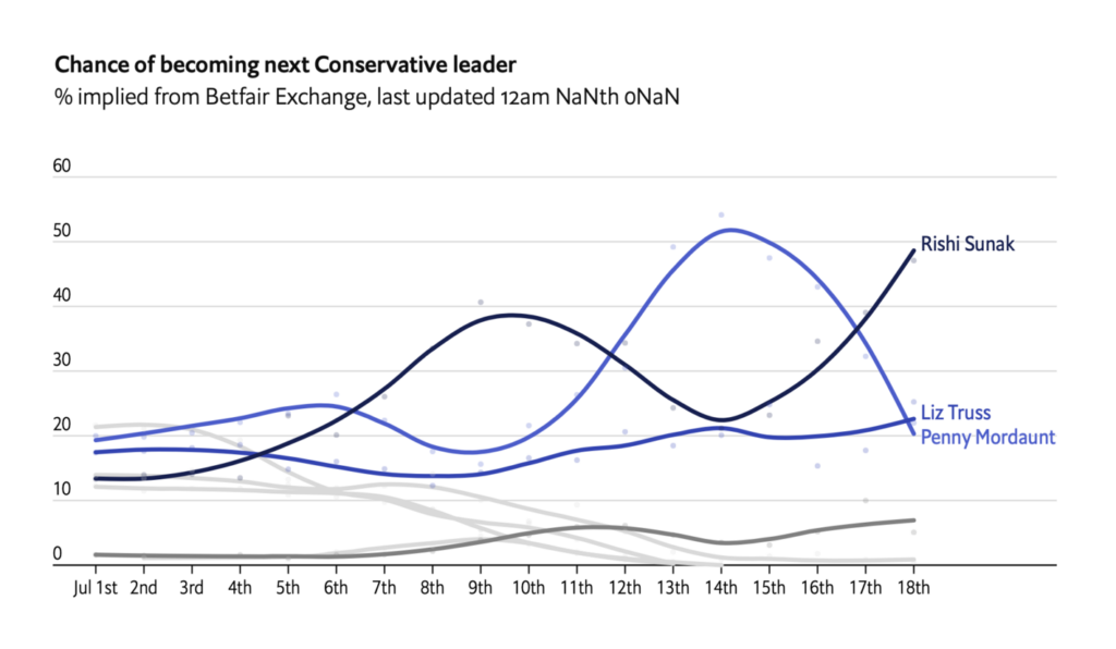
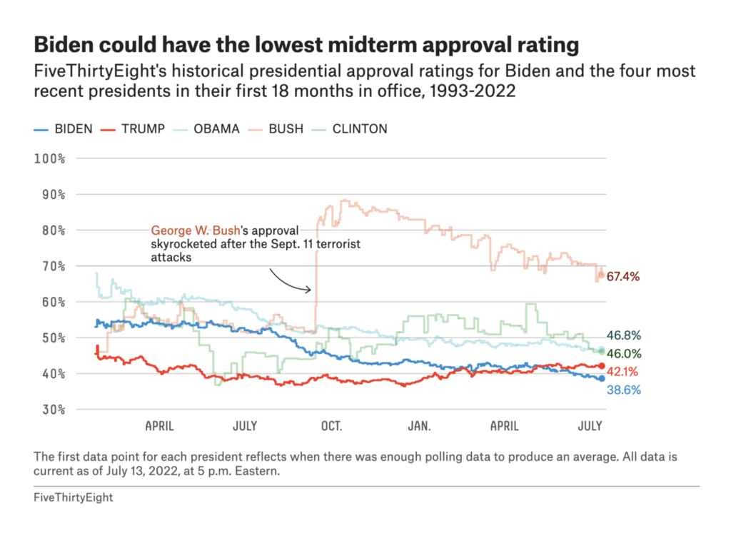
In elections, a leadership contest in Britain and an ominous midterm outlook in the U.S.:


This week brought several beautiful visualizations on science and nature:
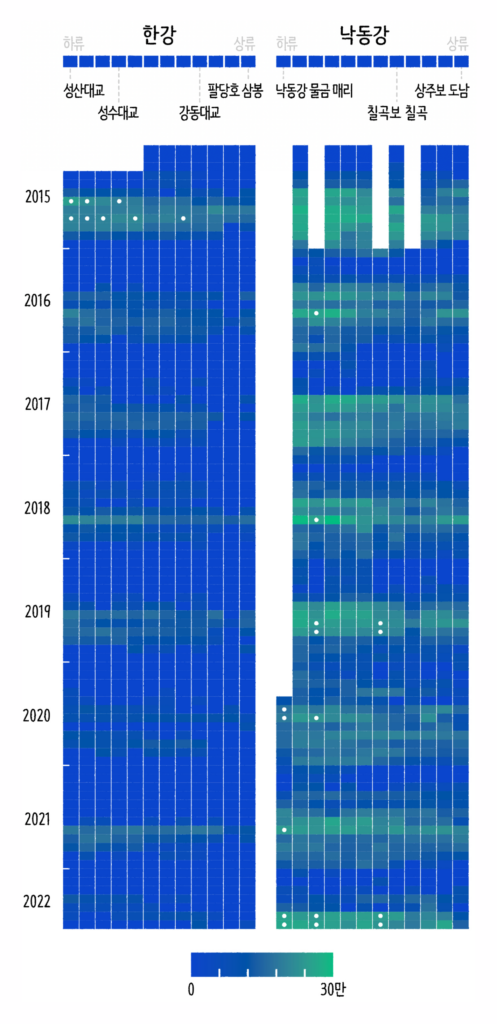
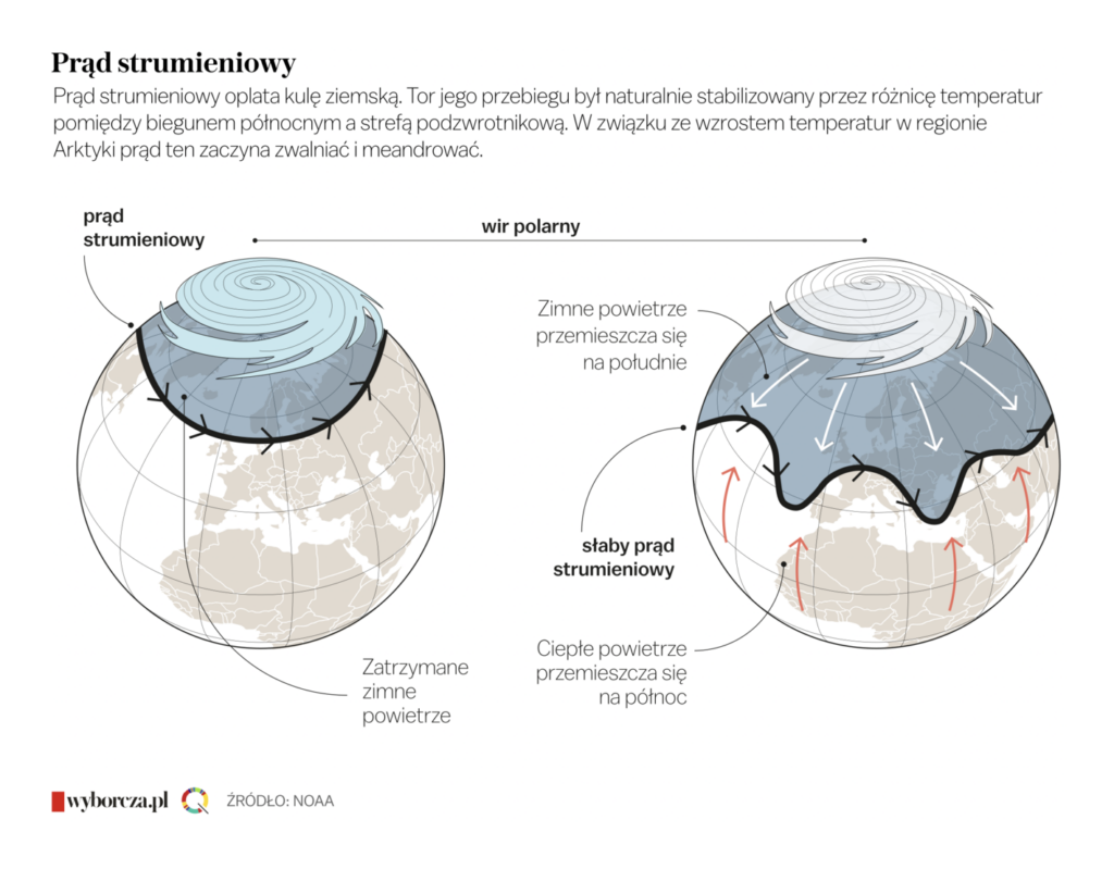
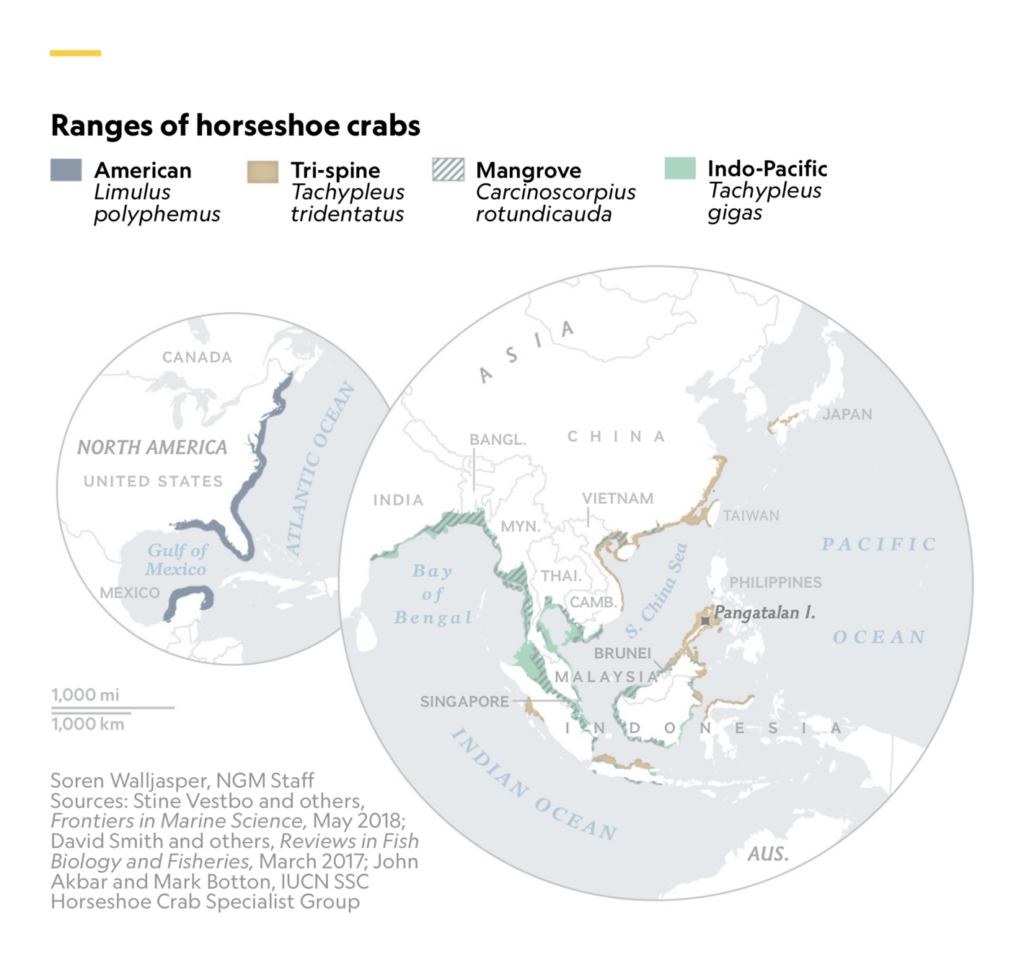
As well as these on race and racism in the United States:
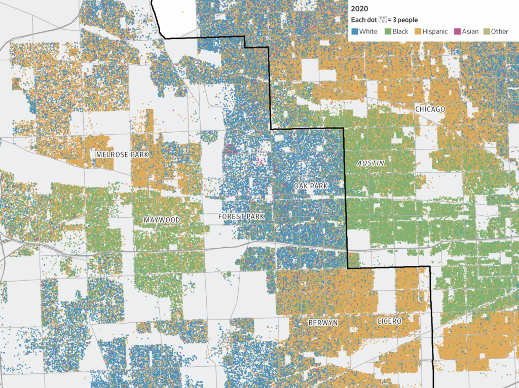
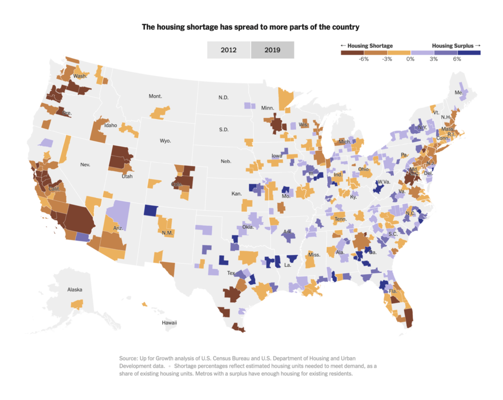
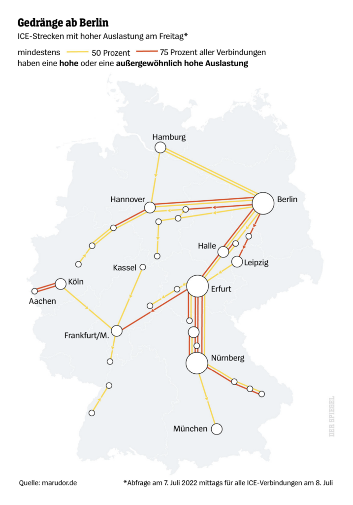
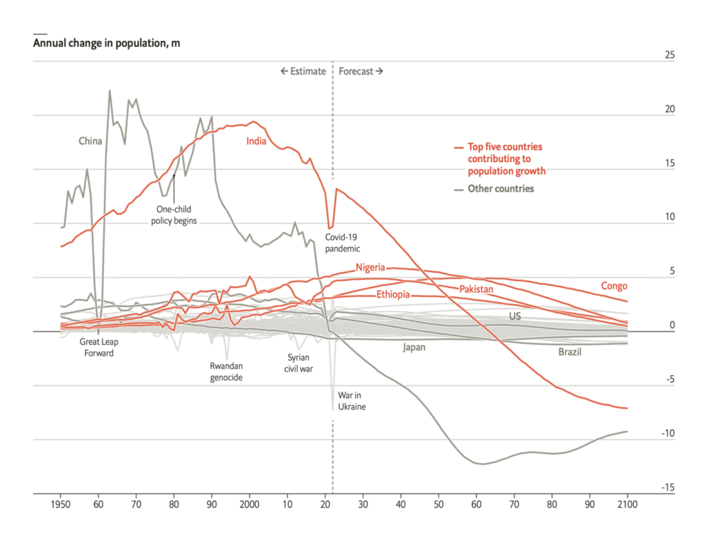
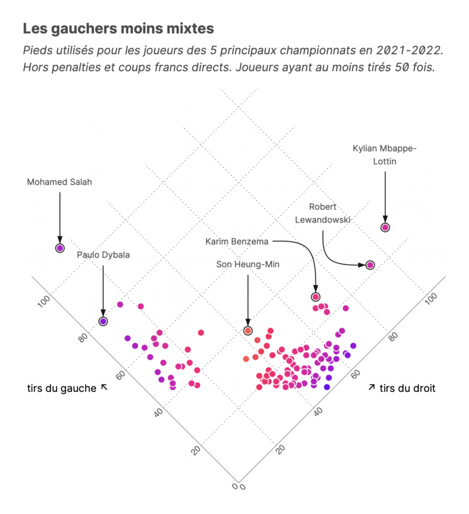
Finally, we saw other maps and charts of housing, trains, population, left-footedness, and detention without trial:
What else we found interesting

Applications are open for…
- ProPublica’s Emerging Reporters Program
- A deputy editor, graphics editor at the New York Times’ Upshot
- A full-stack developer and a senior backend developer at Datawrapper!
Help us make this dispatch better! We’d love to hear which newsletters, blogs, or social media accounts we need to follow to learn about interesting projects, especially from less-covered parts of the world (Asia, South America, Africa). Write us at hello@datawrapper.de or leave a comment below.
Want the Dispatch in your inbox every Tuesday? Sign up for our Blog Update newsletter!


Comments