Data Vis Dispatch, February 18: German election polls, corruption, and tariffs
February 18th, 2025
9 min
This article is brought to you by Datawrapper, a data visualization tool for creating charts, maps, and tables. Learn more.
The best of last week’s big and small data visualizations
Welcome back to the fifth edition of Data Vis Dispatch! Every week, we’ll be publishing a collection of the best small and large data visualizations we find, especially from news organizations — to celebrate data journalism, data visualization, simple charts, elaborate maps, and their creators.
Recurring topics for this week include flooding in western Europe, drug deaths in the US, and an unprecedented vaccination drive in France.
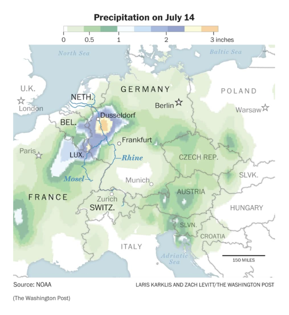
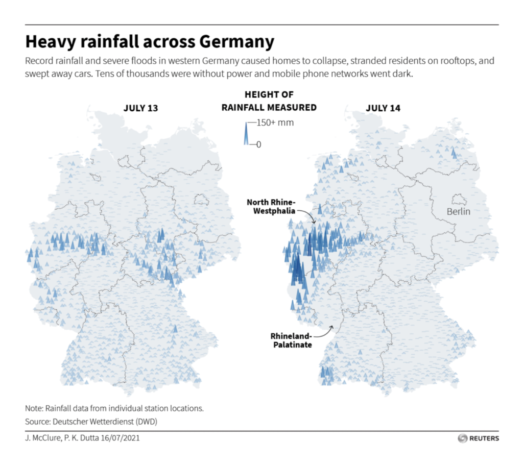
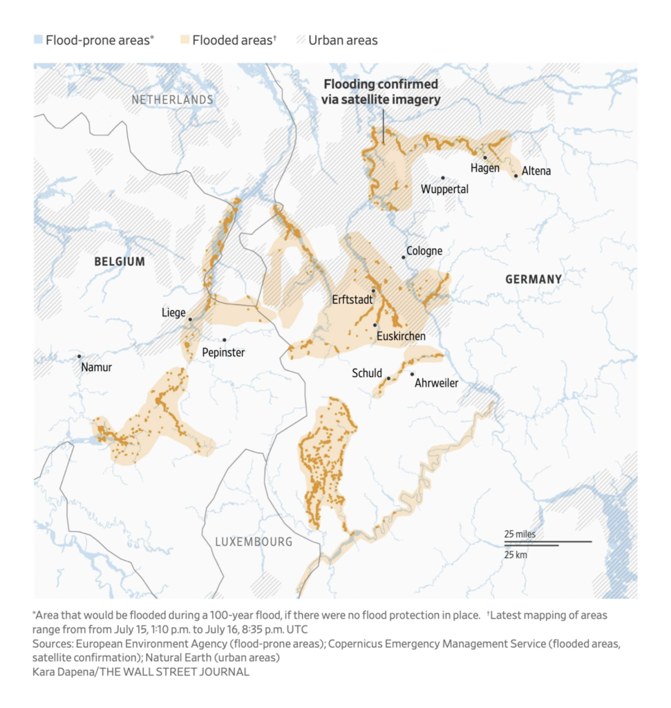
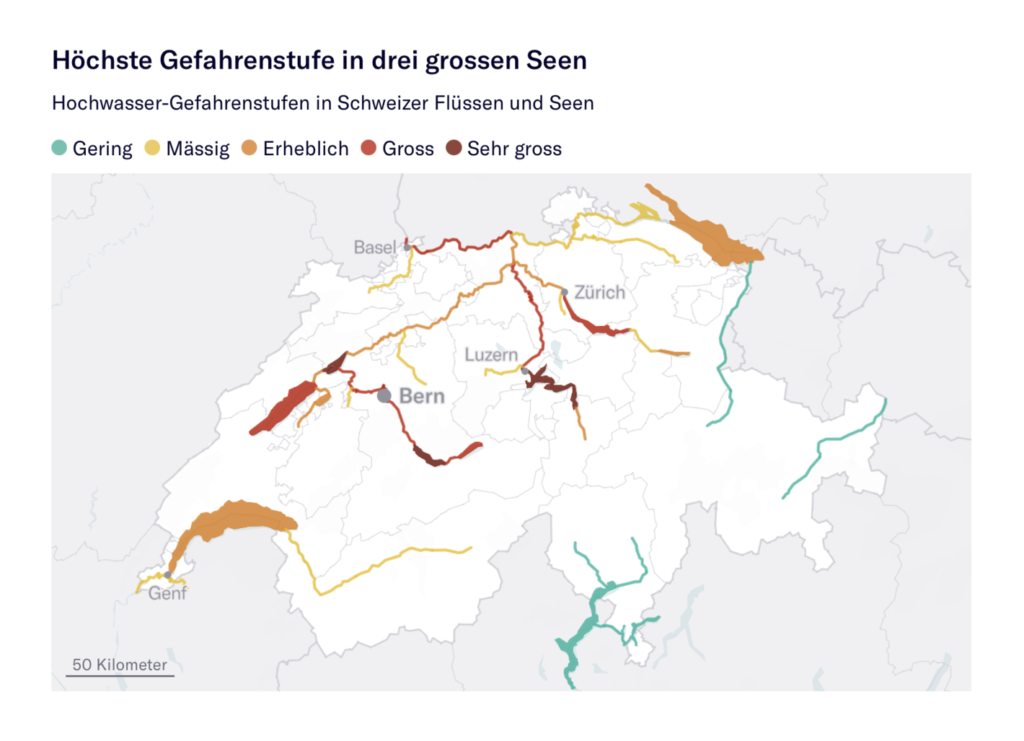
Maps this week were dominated by the catastrophic floods in western Europe — how much rain fell, which rivers overflowed, and where people were caught in their path:
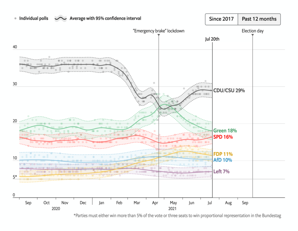
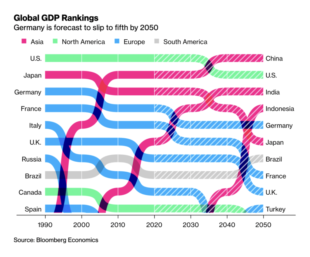
In the midst of it all, Germany’s electoral campaign season continued:
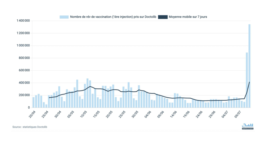
It’s not every week that a single data set is so striking, so newsworthy, that no fewer than four sources deliver basically the same chart. But when you see the numbers on new vaccination appointments in France, we think you’ll agree they deserve this special treatment:
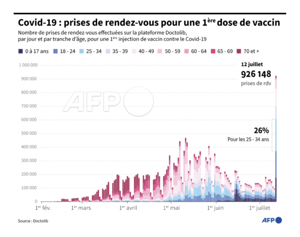
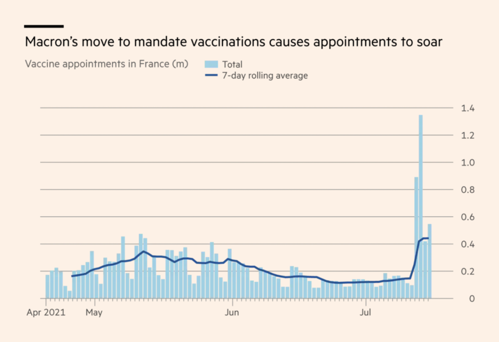
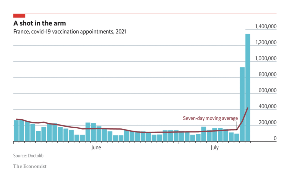
In the rest of the world, news on vaccination is mixed — an amazing success story for preventing deaths and hospitalizations, but a sobering outlook for global distribution and individual reluctance:
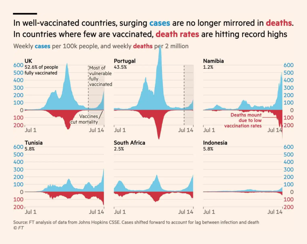
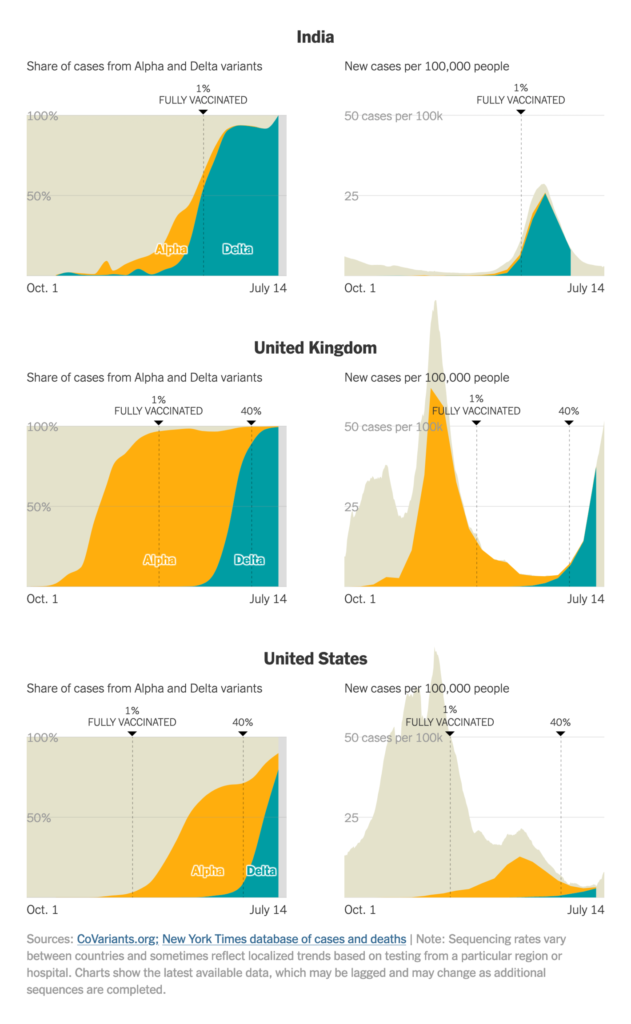
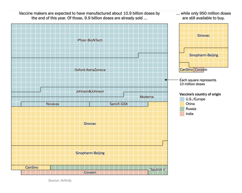
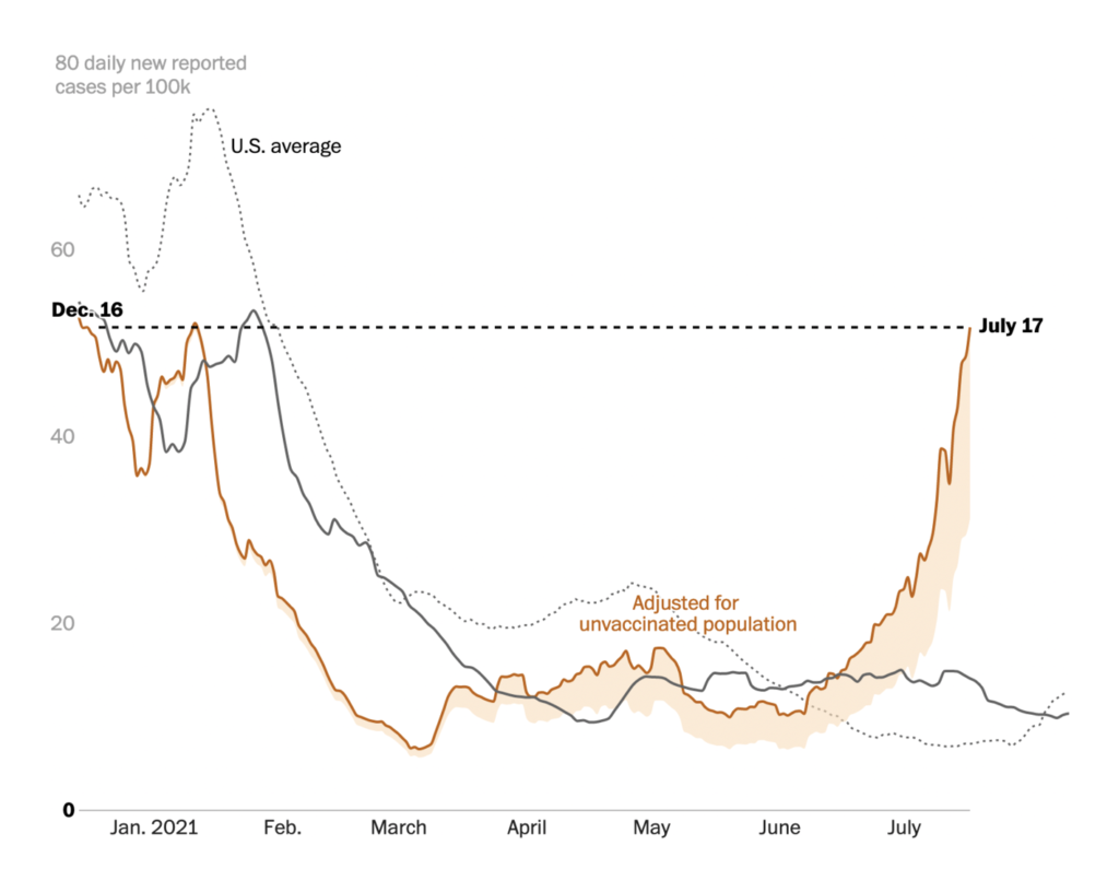
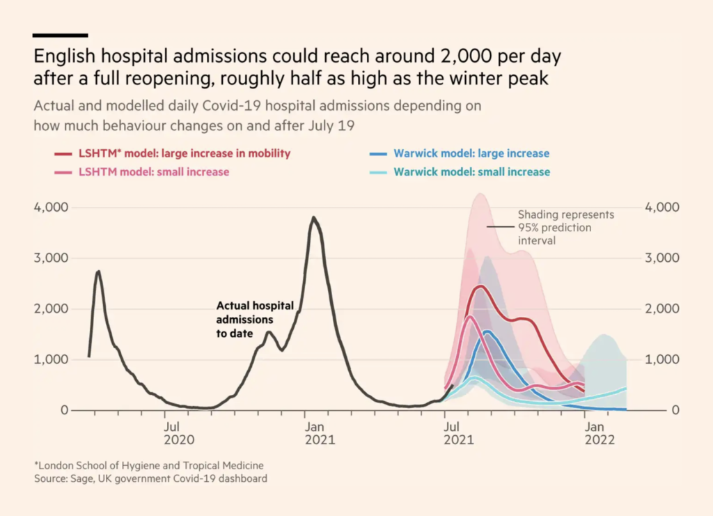
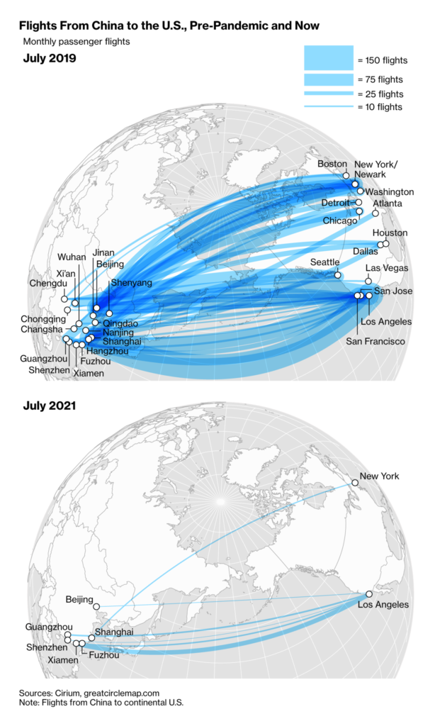
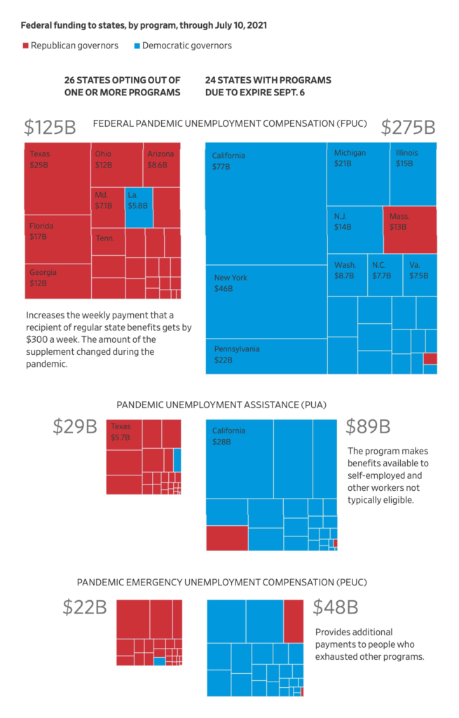
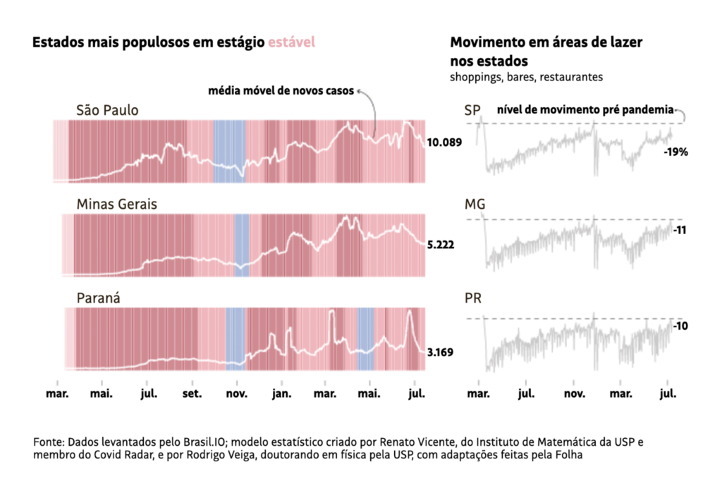
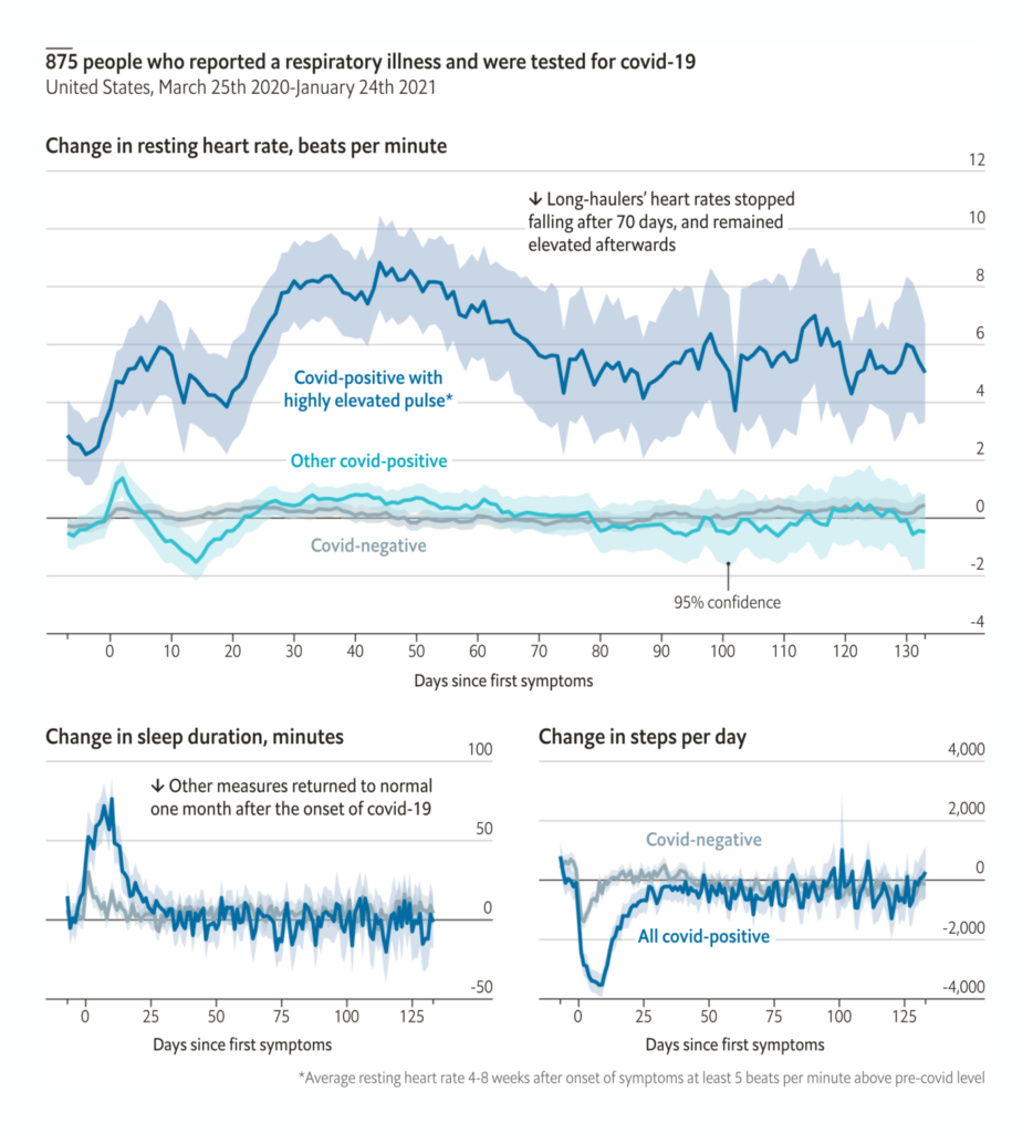
Finally, other COVID charts showed the economic effects of the pandemic and the long-term human consequences:
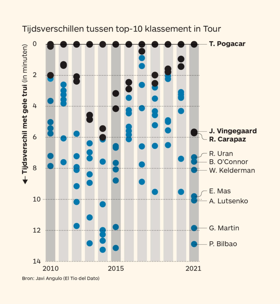
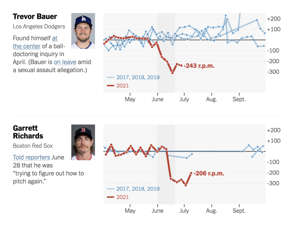
A break from the heavy topics for sports — an impressive lead in the Tour de France and the aftermath of a baseball crackdown:
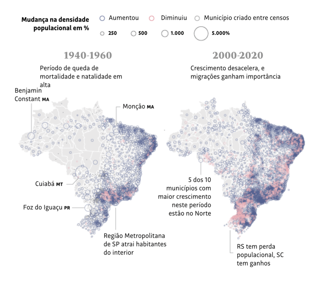
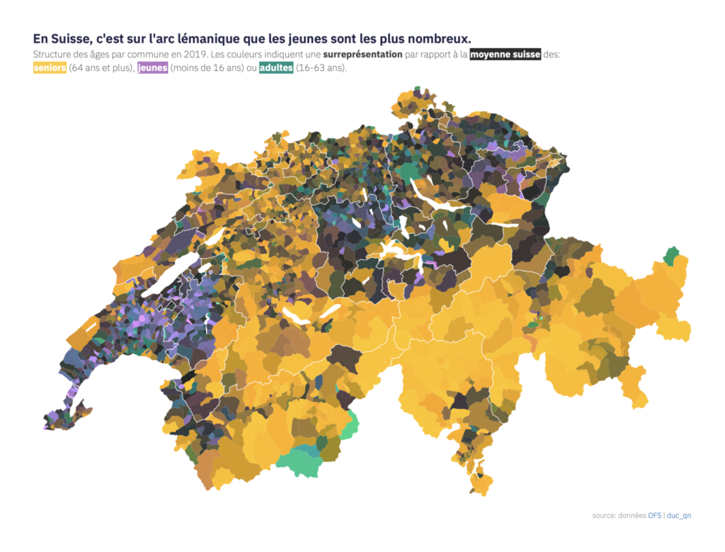
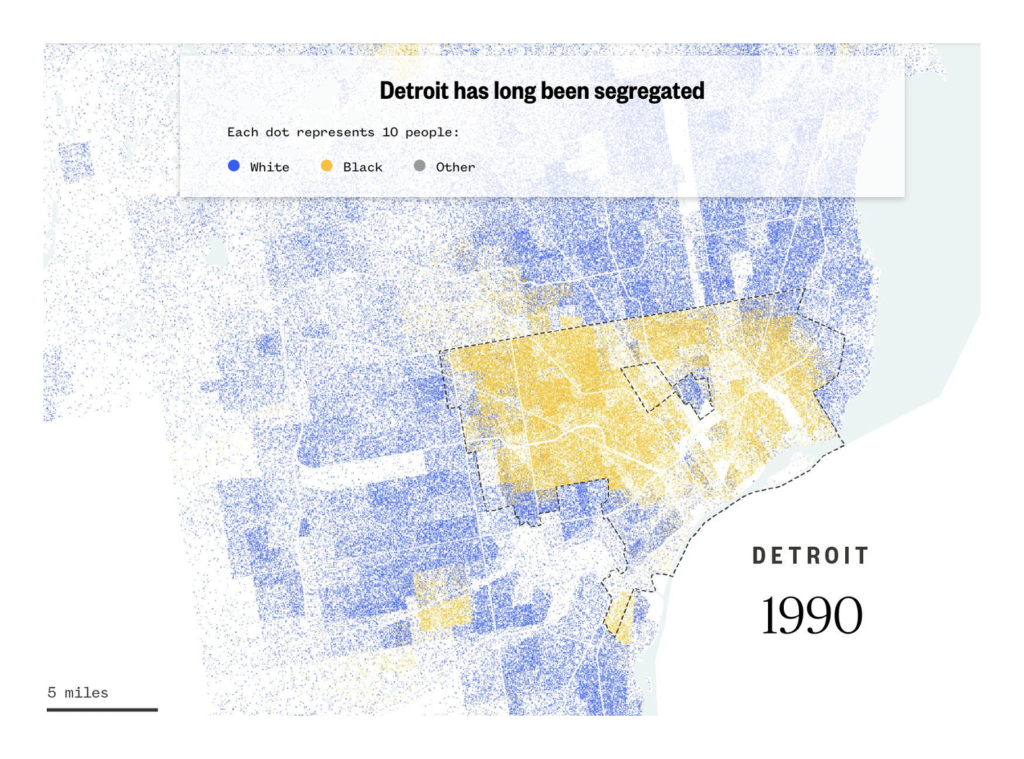
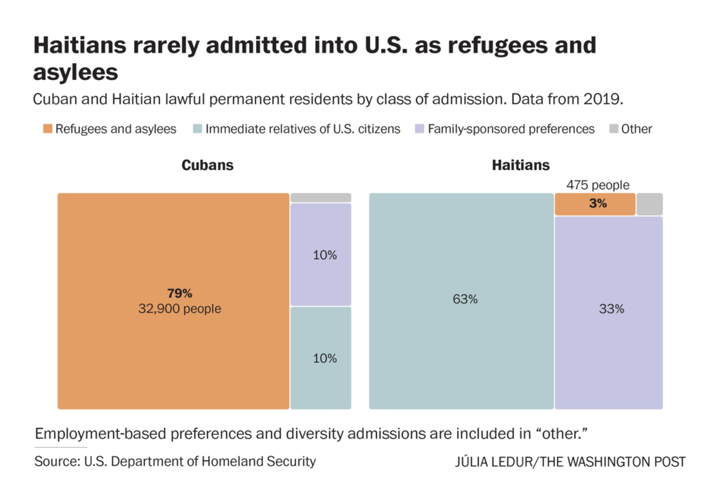
This week also provided a sampler of demographic data vis — urbanization in Brazil, age distribution in Switzerland, racial segregation in Detroit, and asylum admissions in the US:
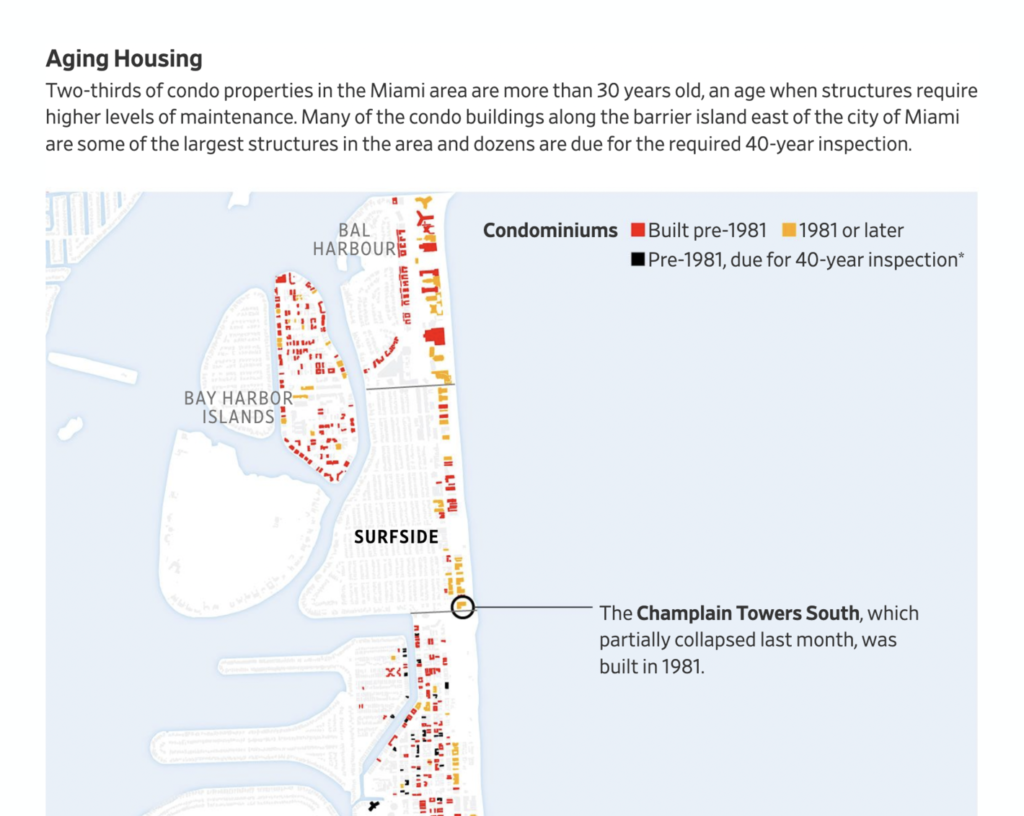
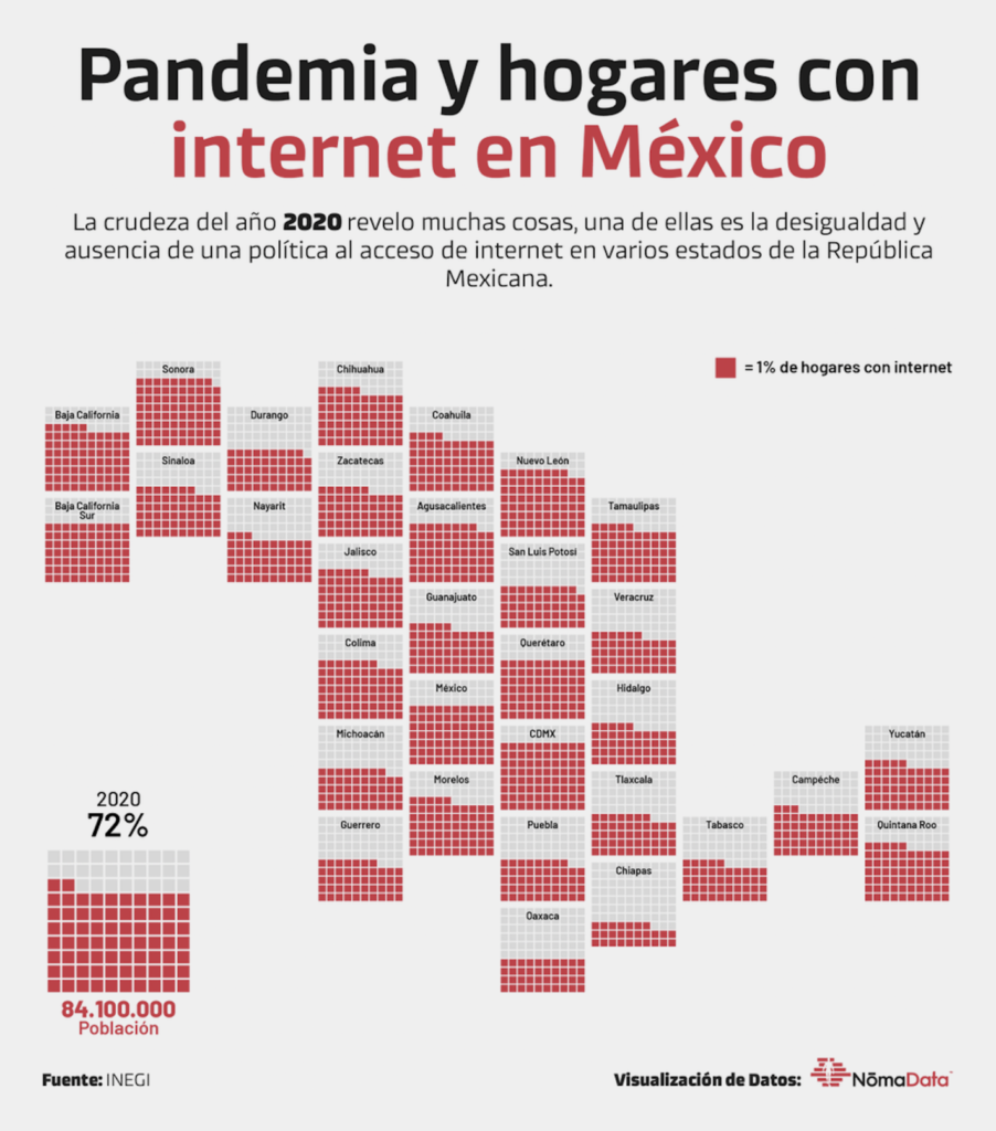
In infrastructure, we saw risky residential construction in Florida and unequal home internet access in Mexico:
Data on drug-overdose deaths can be sliced and diced a few ways — but the grim scale remains the same:
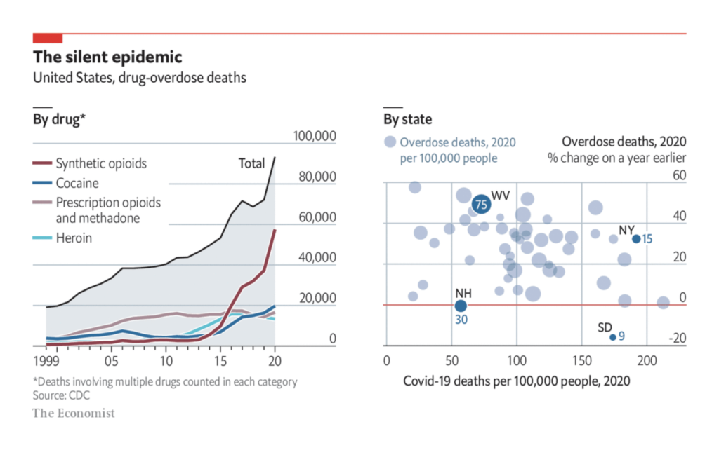
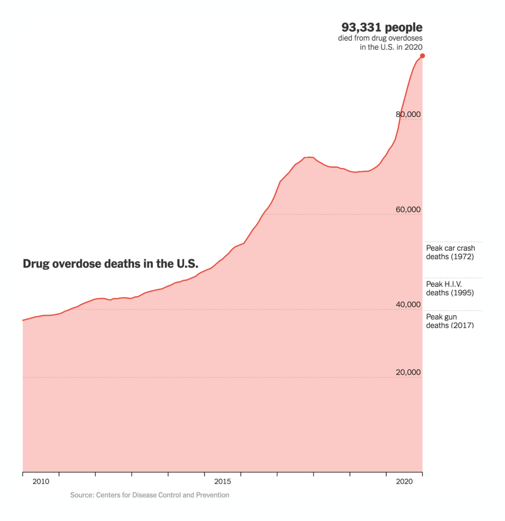
But we’ll end on two lighter notes — an eyebrow-raising poll on US support for regional secession, and a high bar to clear for second-time authors:
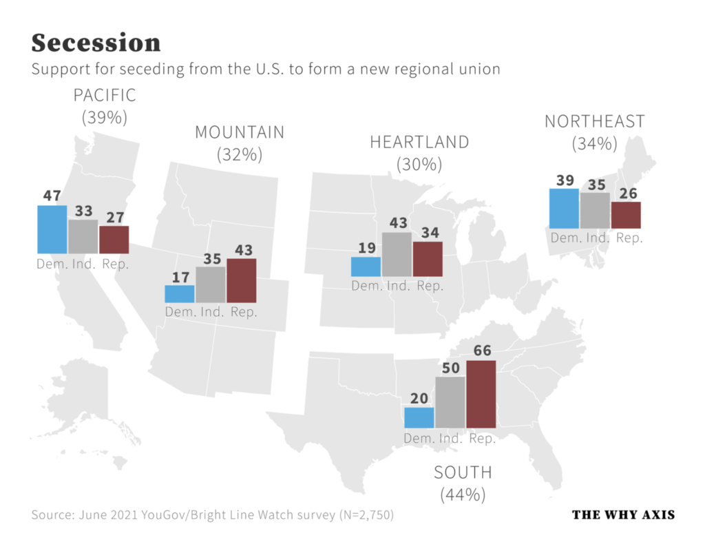
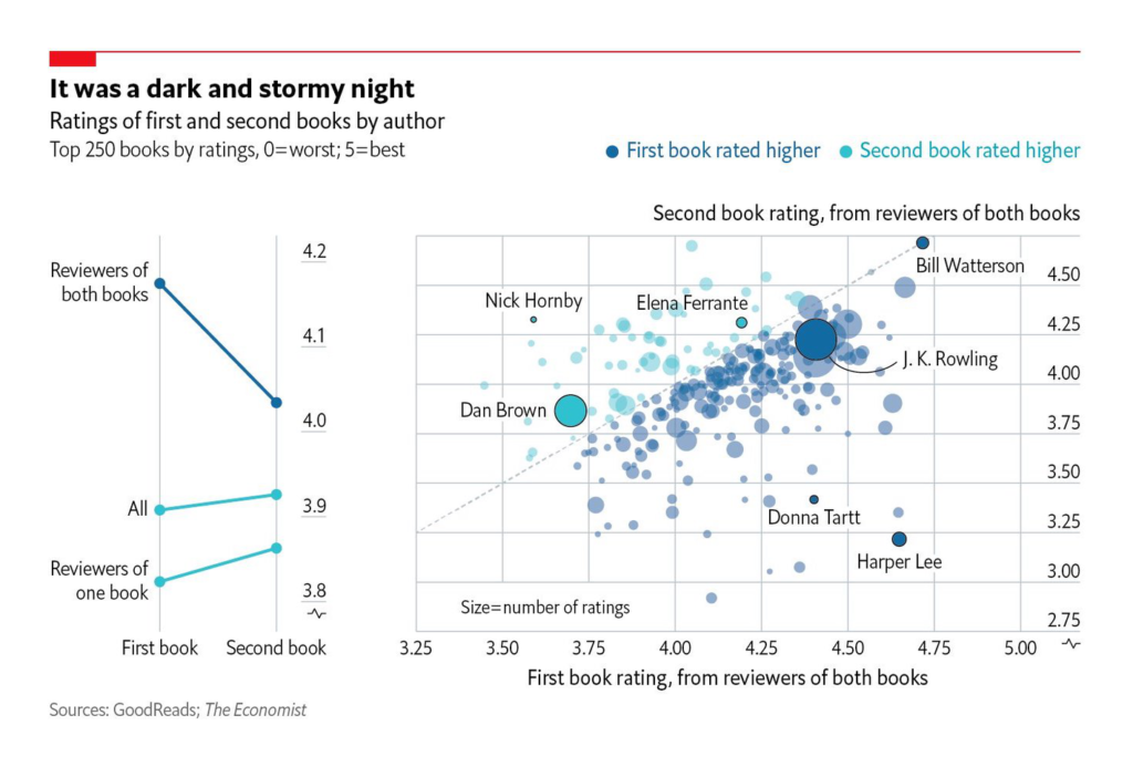


Help us make this dispatch better! We’d love to hear which newsletters, blogs, or social media accounts we need to follow to learn about interesting projects, especially from less-covered parts of the world (Asia, South America, Africa). Write us at hello@datawrapper.de or leave a comment below.
Comments