This article is brought to you by Datawrapper, a data visualization tool for creating charts, maps, and tables. Learn more.
Data Vis Dispatch, July 26
The best of last week’s big and small data visualizations

Welcome back to the 55th edition of Data Vis Dispatch! Every week, we’ll be publishing a collection of the best small and large data visualizations we find, especially from news organizations — to celebrate data journalism, data visualization, simple charts, elaborate maps, and their creators.
Recurring topics this week include heat, fire, and healthcare access.
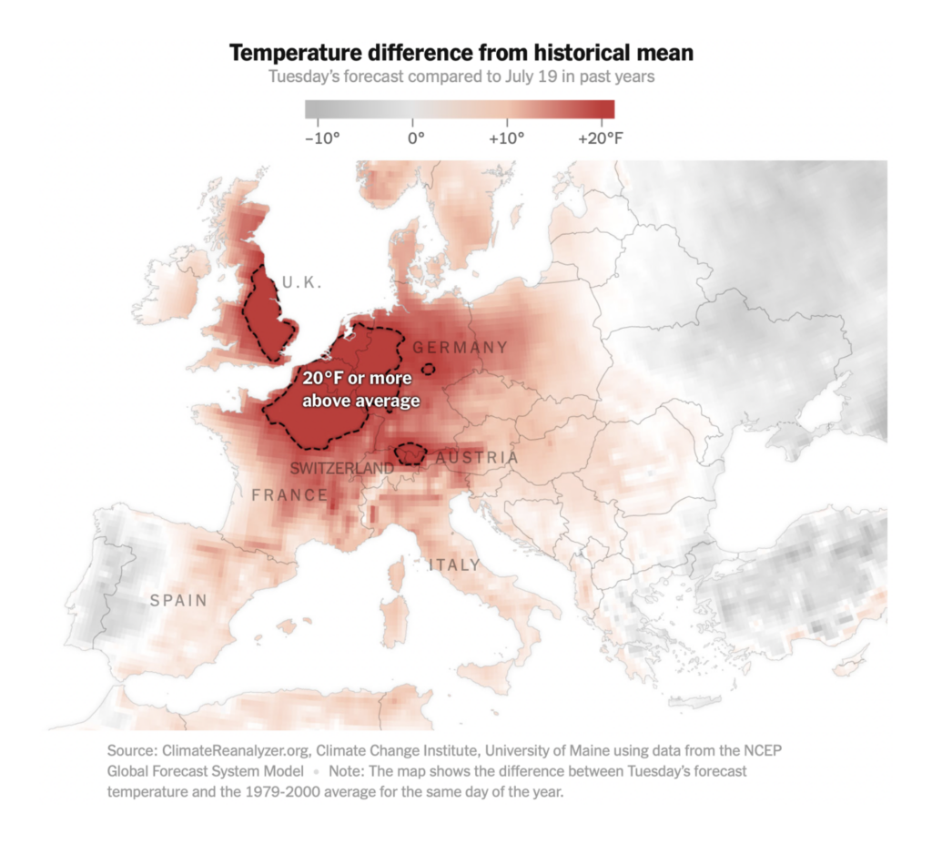
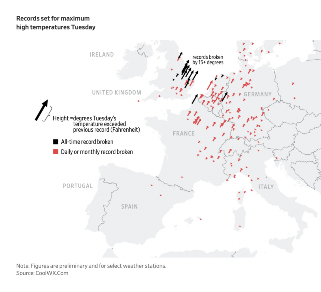
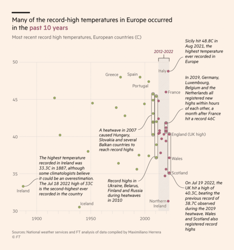
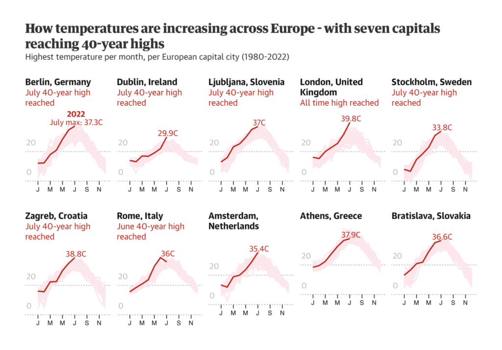
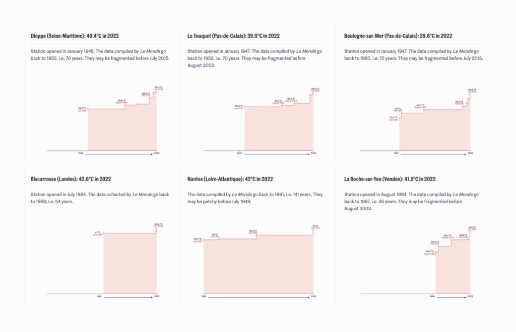
For the second week, charts and maps were dominated by a massive heat wave in Europe:
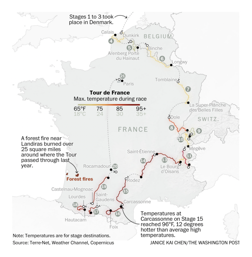
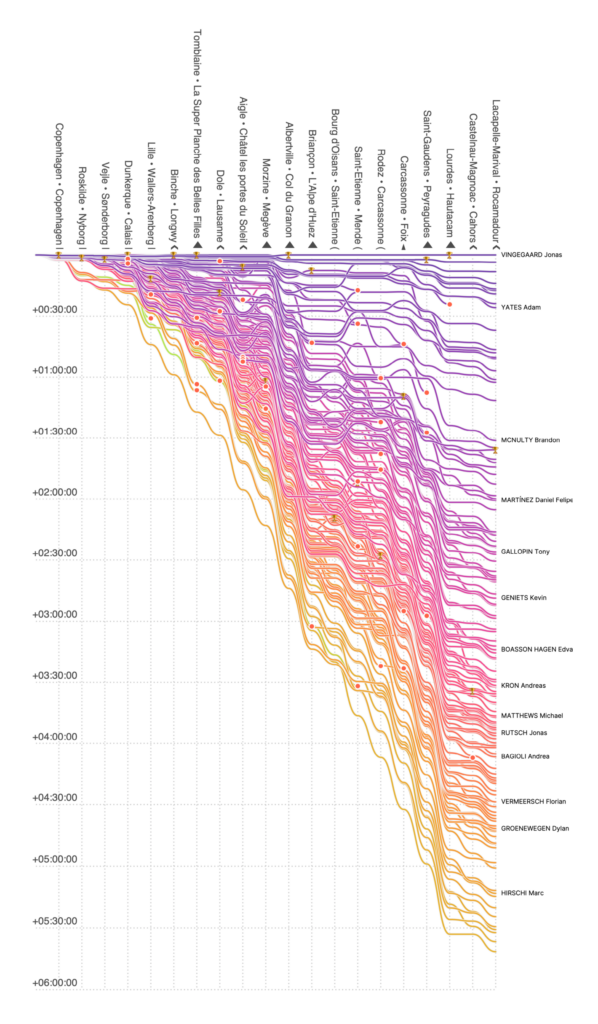
The Tour de France went forward despite staggering temperatures:
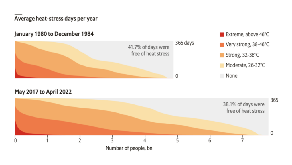
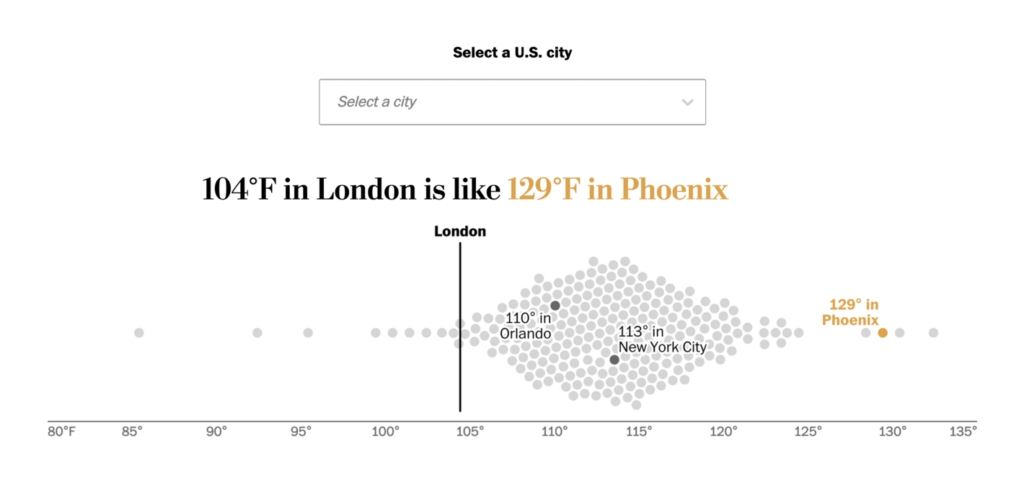
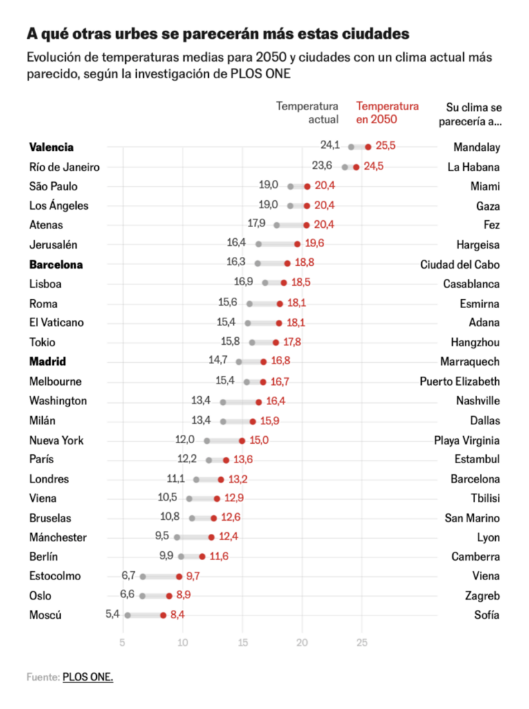
These charts compared cities around the world to illustrate the current heat wave and the climate future:
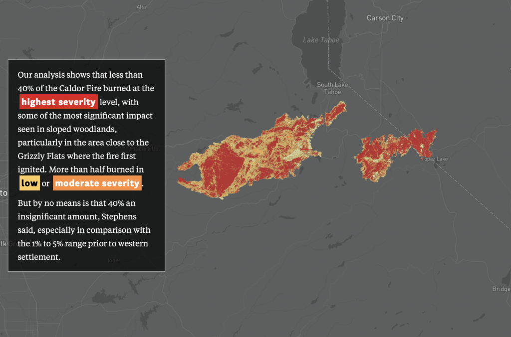
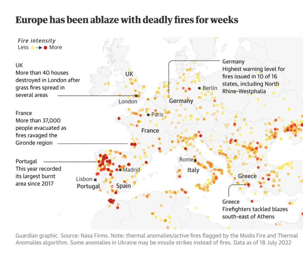
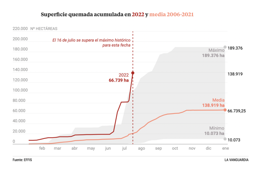
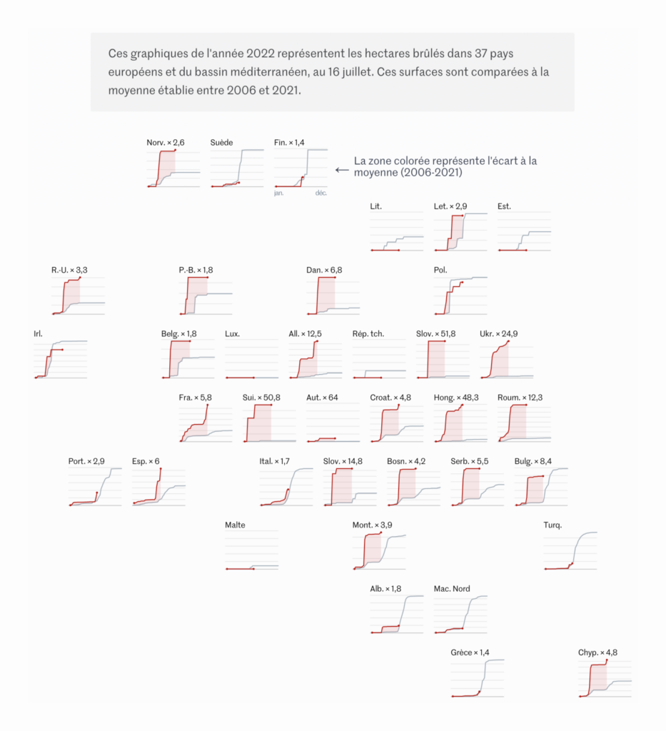
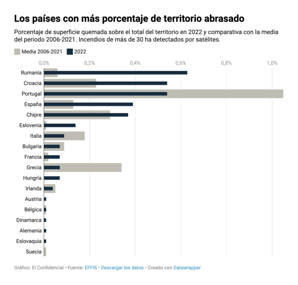
With heat comes fire:
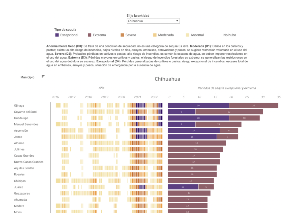
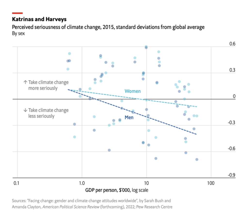
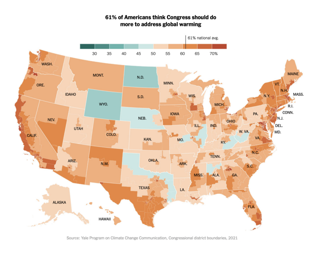
People in rich countries — especially men — are not as concerned about the climate as those in poorer ones. But they’re still more concerned than their own representatives:
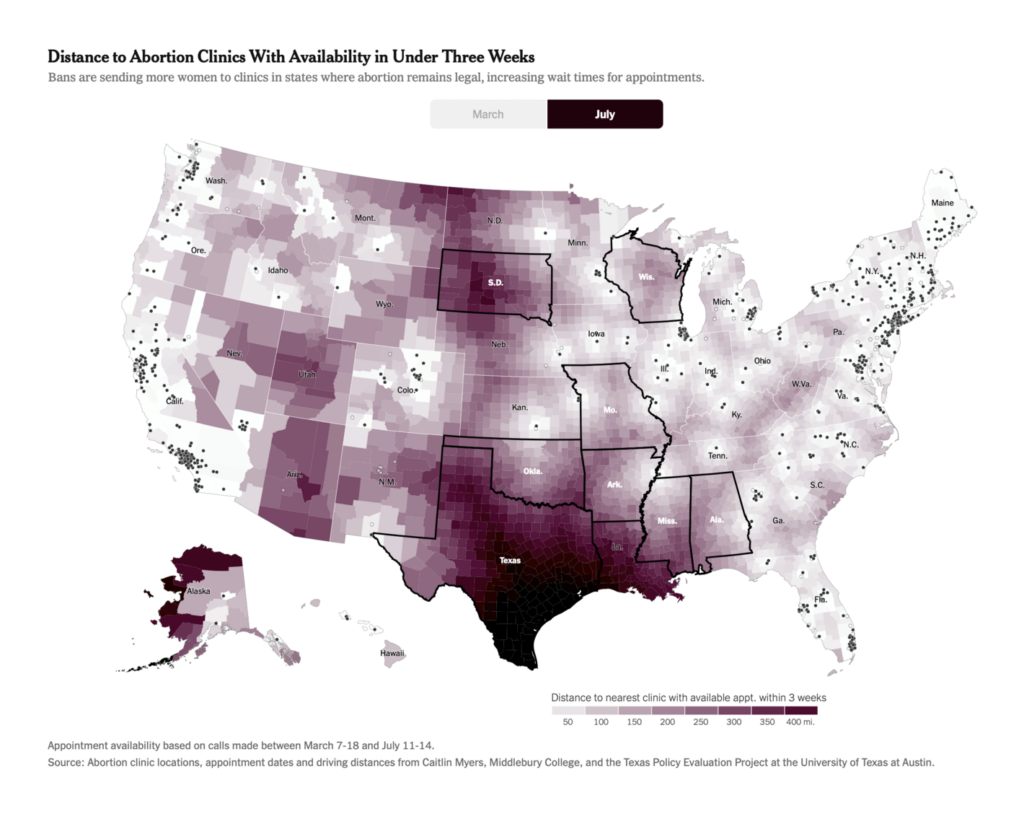
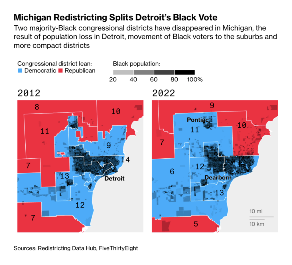
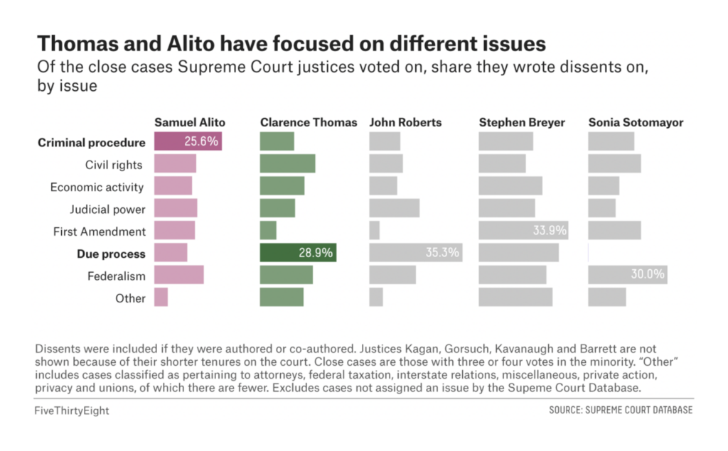
In U.S. politics this week — abortion, redistricting, and reading the tea leaves on the Supreme Court:
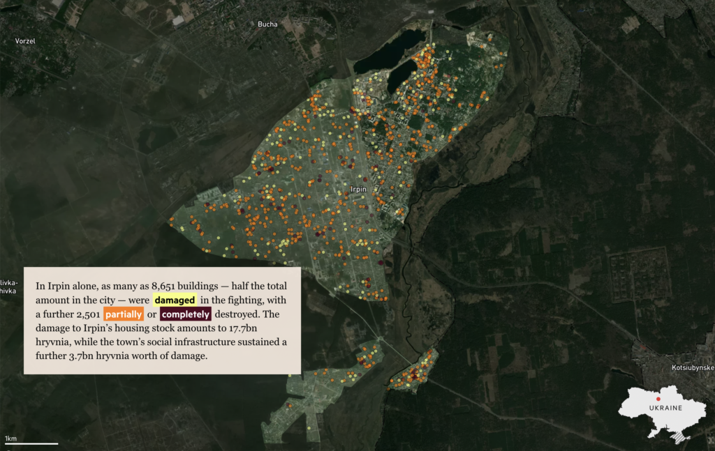
Two maps showed damage to Ukrainian cities at a street-by-street scale:
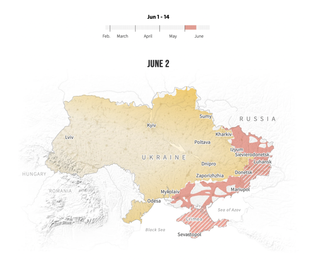
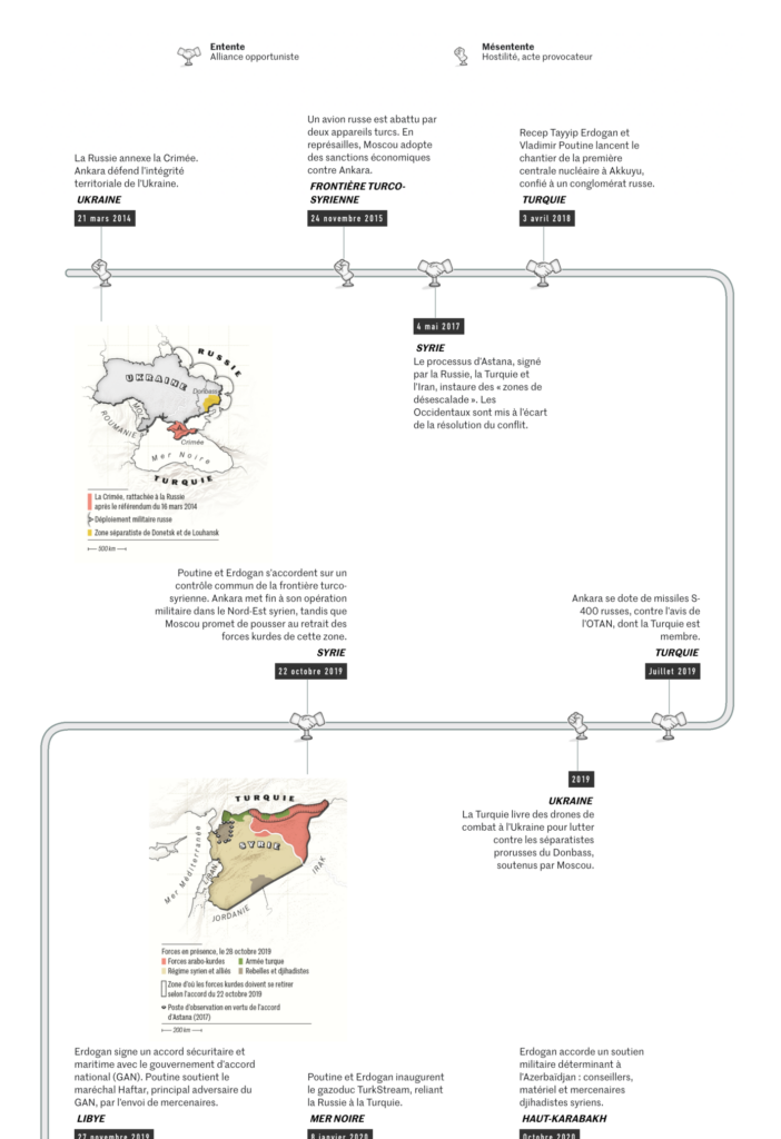
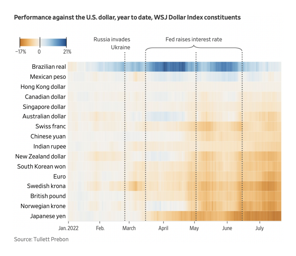
And the war in Ukraine is shaking up international relations on a larger scale as well:
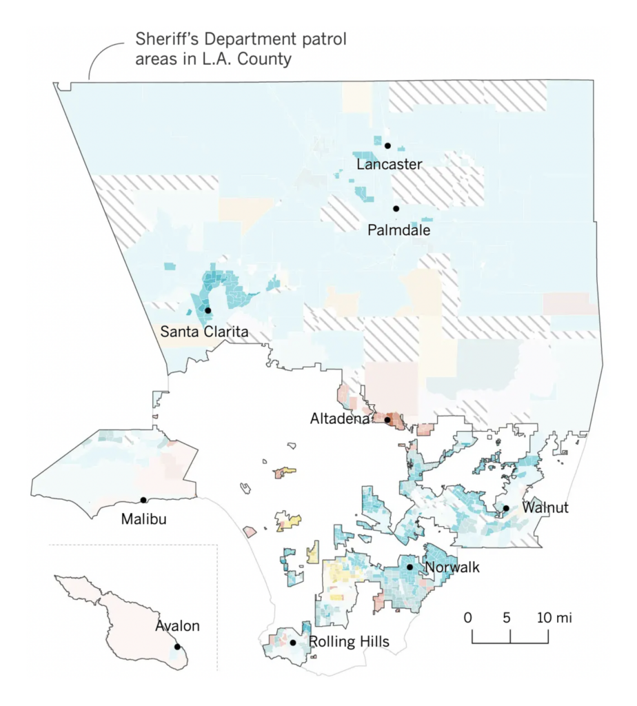
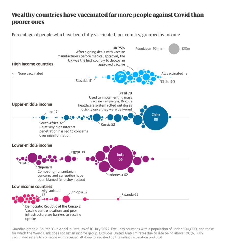
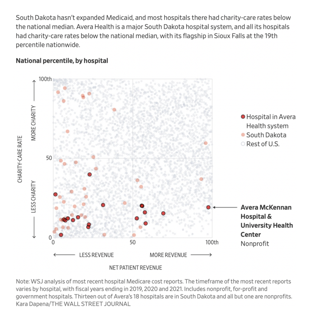
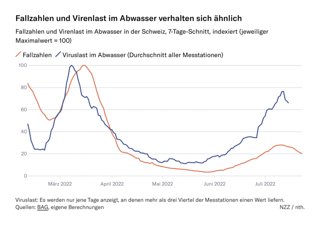
Public health topics included healthcare inequality, disability rates, and COVID surveillance:
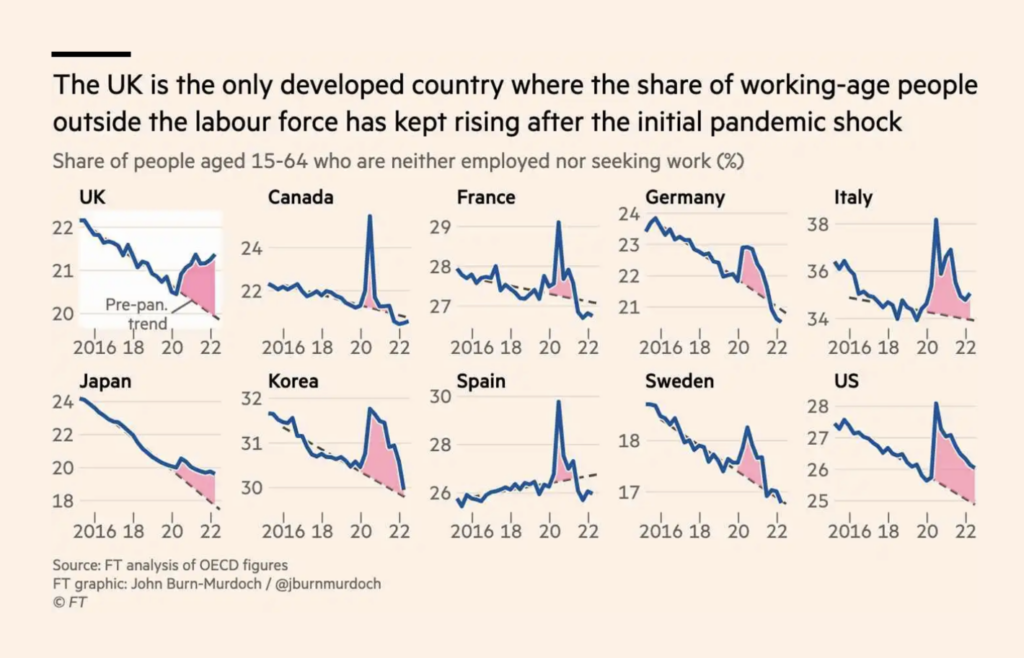
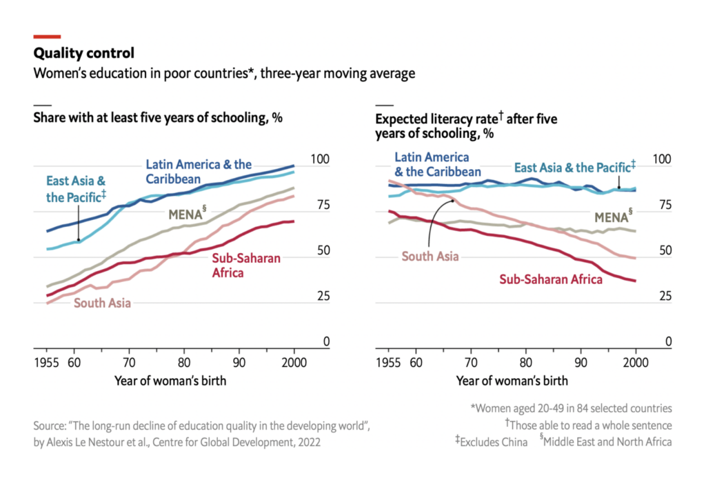
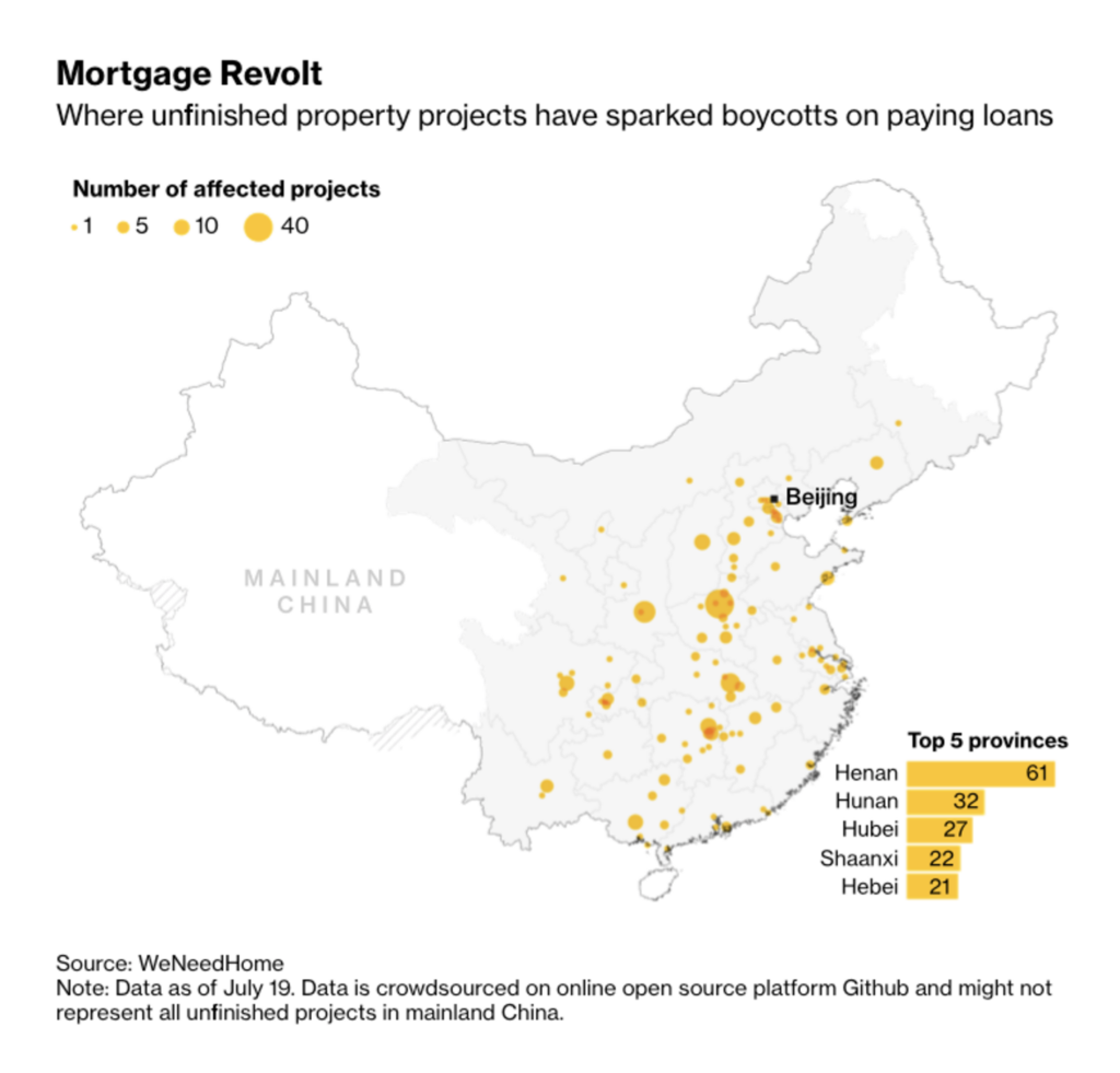
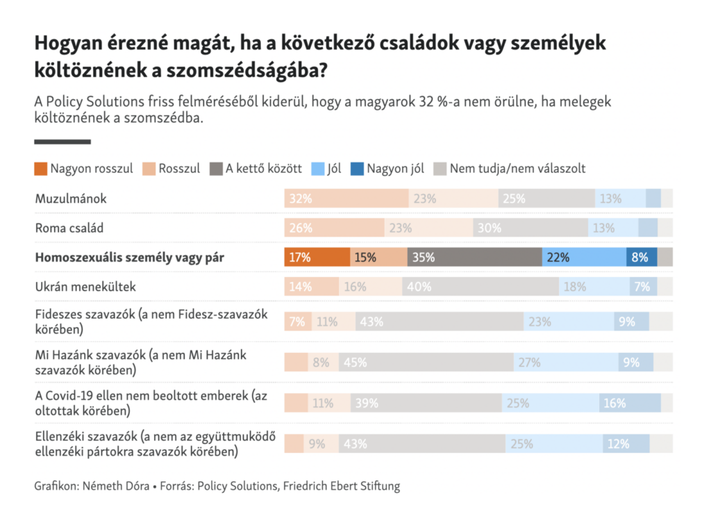
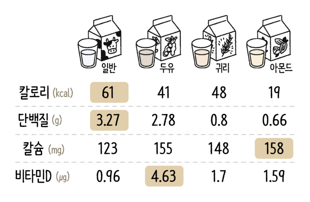
Other visualizations covered educational outcomes, economic trends, social tolerance, and milk alternatives:
What else we found interesting

Applications are open for…
- A visual journalist at Axios
- Two data reporters at the Tampa Bay Times
- An Upshot reporter at The New York Times
- A full-stack developer at The Visual Agency
- A visual editor at The Wall Street Journal
Help us make this dispatch better! We’d love to hear which newsletters, blogs, or social media accounts we need to follow to learn about interesting projects, especially from less-covered parts of the world (Asia, South America, Africa). Write us at hello@datawrapper.de or leave a comment below.
Want the Dispatch in your inbox every Tuesday? Sign up for our Blog Update newsletter!


Comments