Data Vis Dispatch, January 14: Fire, congestion, and Greenland
January 14th, 2025
11 min
This article is brought to you by Datawrapper, a data visualization tool for creating charts, maps, and tables. Learn more.
The best of last week’s big and small data visualizations
Welcome back to the sixth edition of Data Vis Dispatch! Every week, we’ll be publishing a collection of the best small and large data visualizations we find, especially from news organizations — to celebrate data journalism, data visualization, simple charts, elaborate maps, and their creators.
Recurring topics for this week include wildfire, floods, coronavirus, and… the Olympics!
Let’s start with the fun ones — the Olympics are here and the charts are flowing:
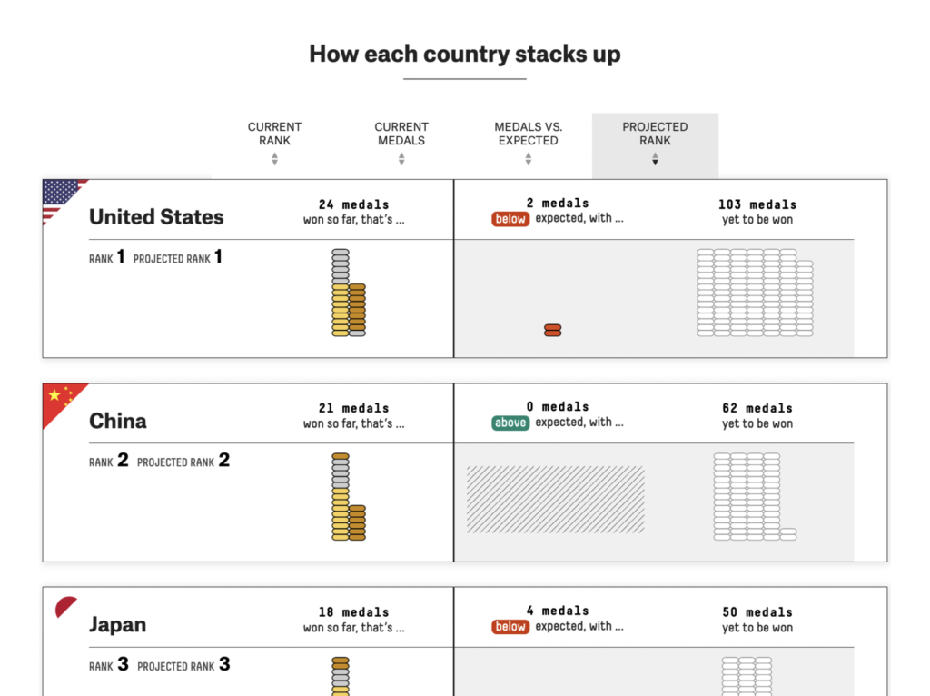
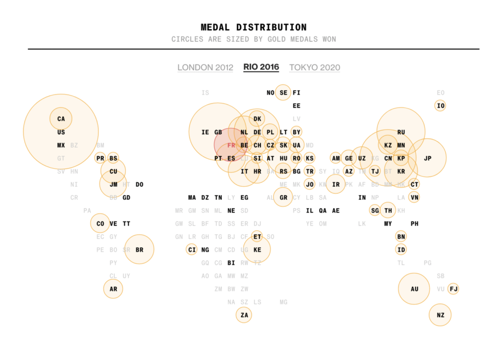
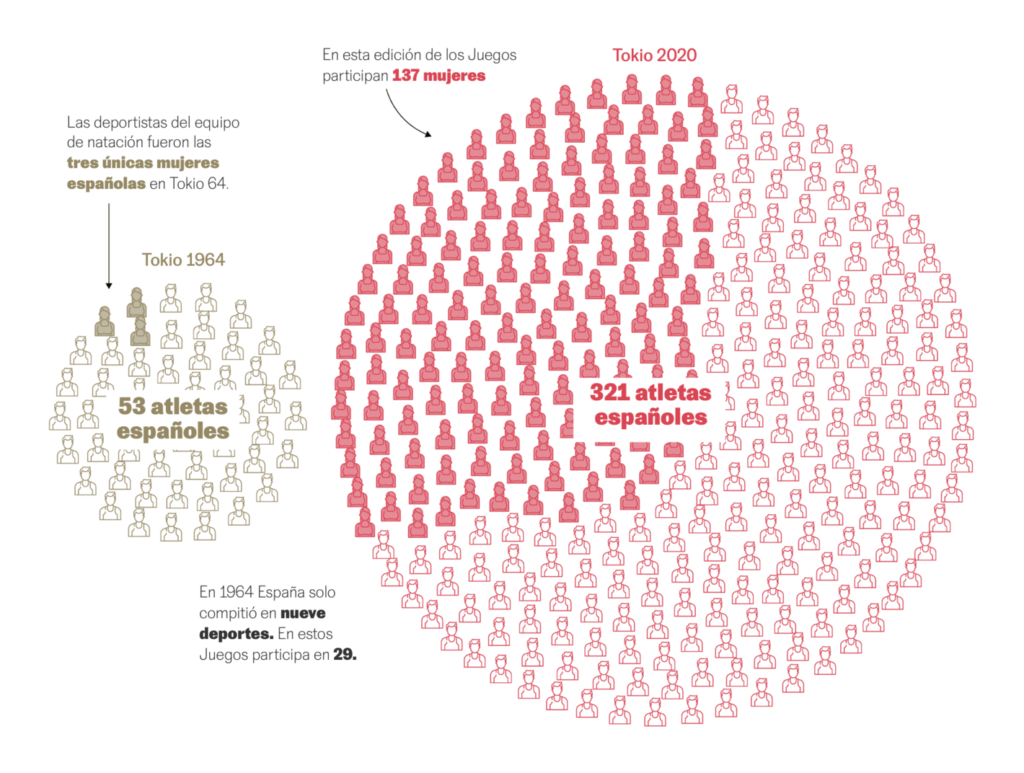
We got to look back at the history of the games:
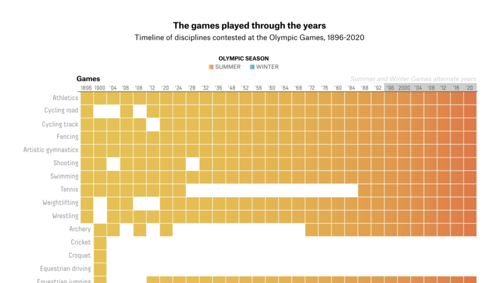
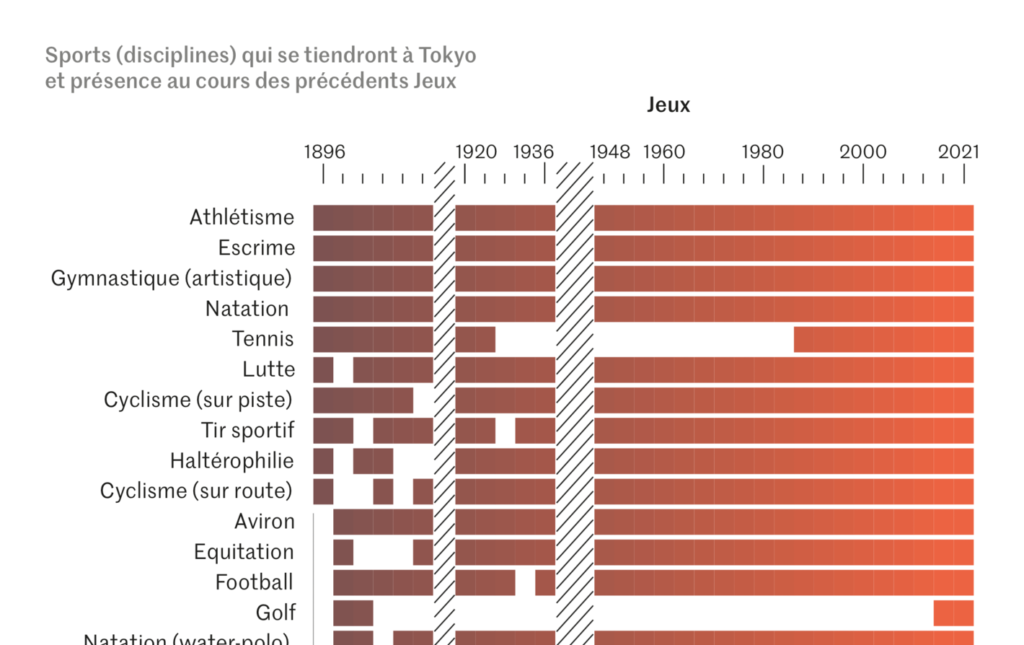
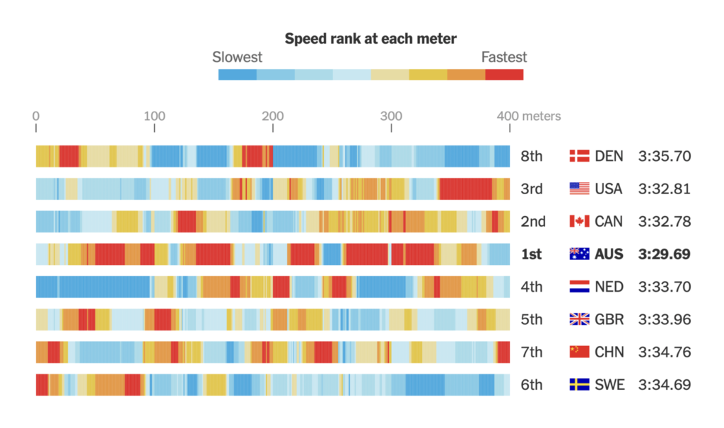
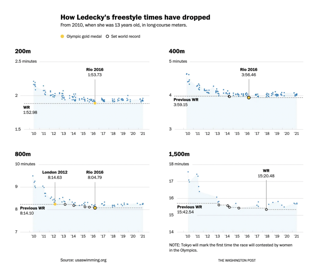
And take a deep dive (pun very much intended) into the world of swimming:
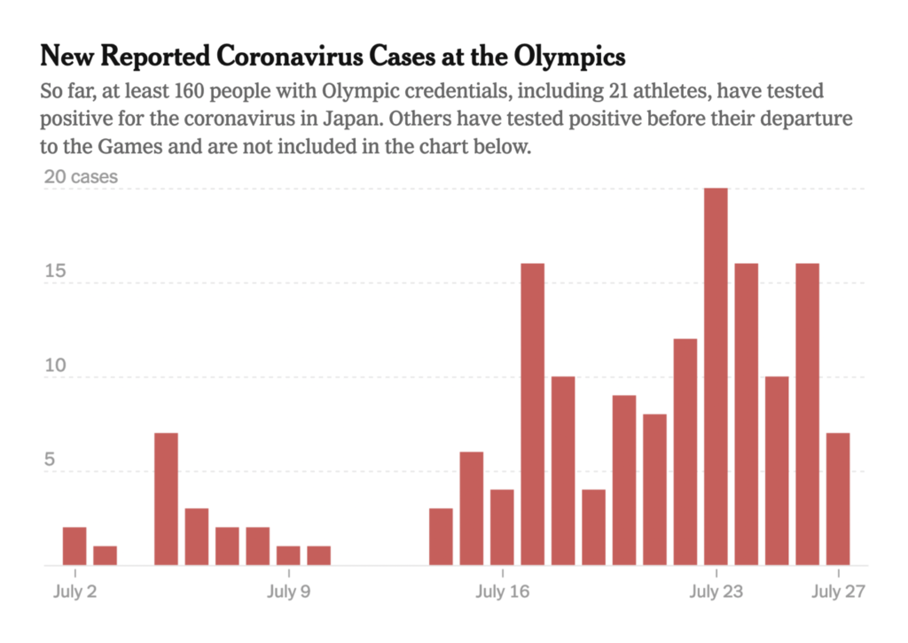
But the pandemic doesn’t stop for sports:
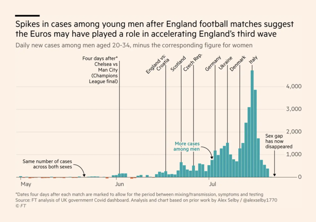
The virus is spreading, even as vaccination campaigns continue:
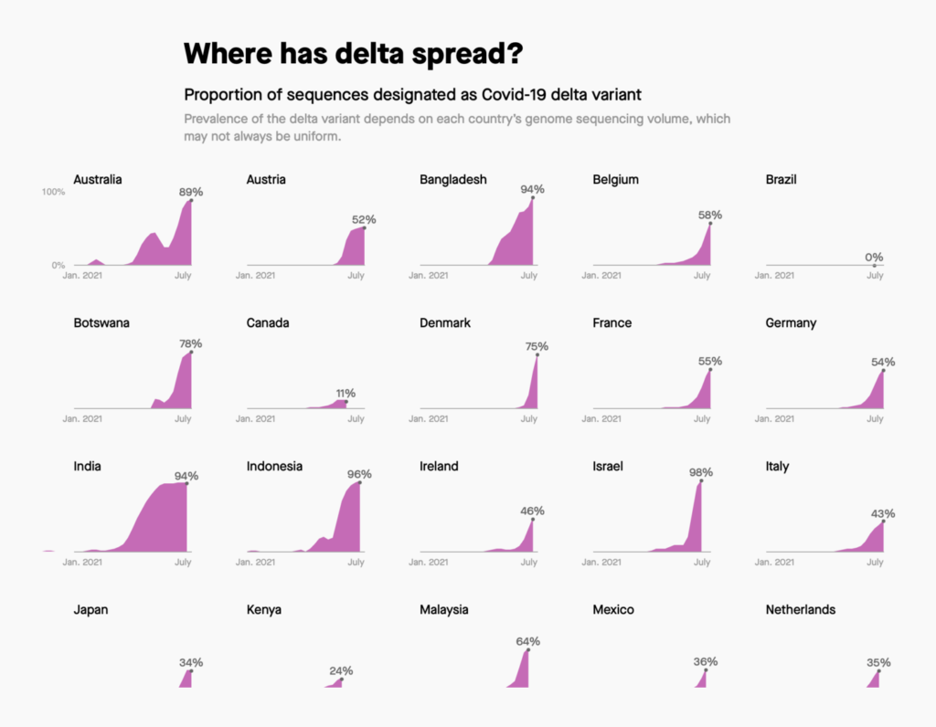
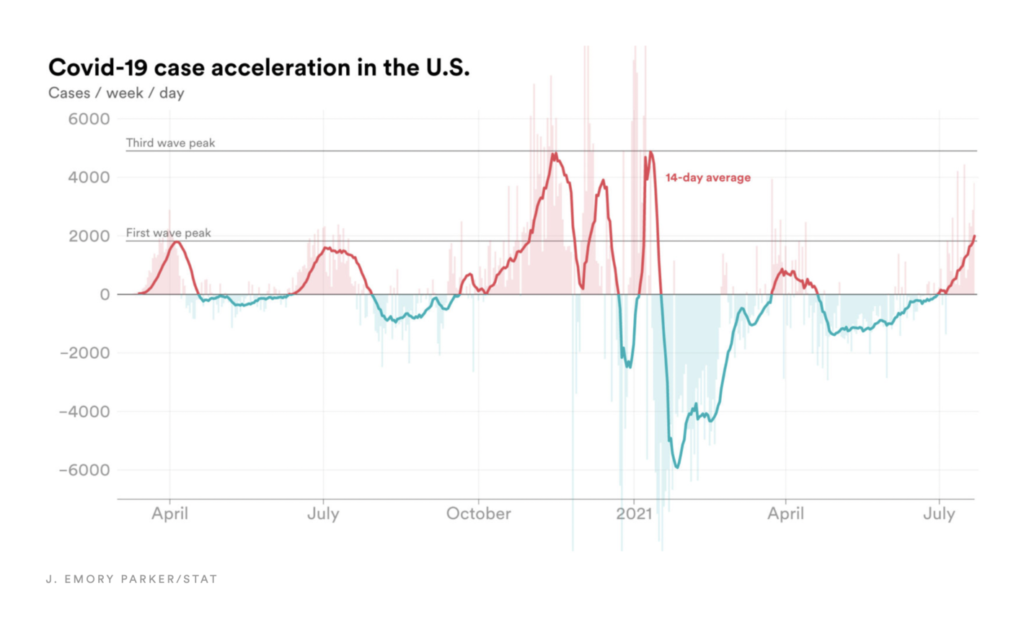

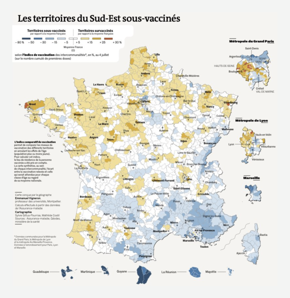
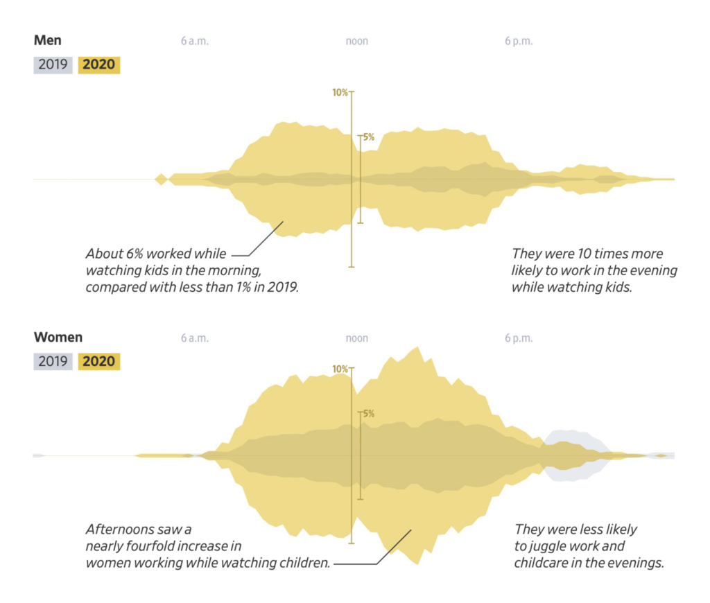
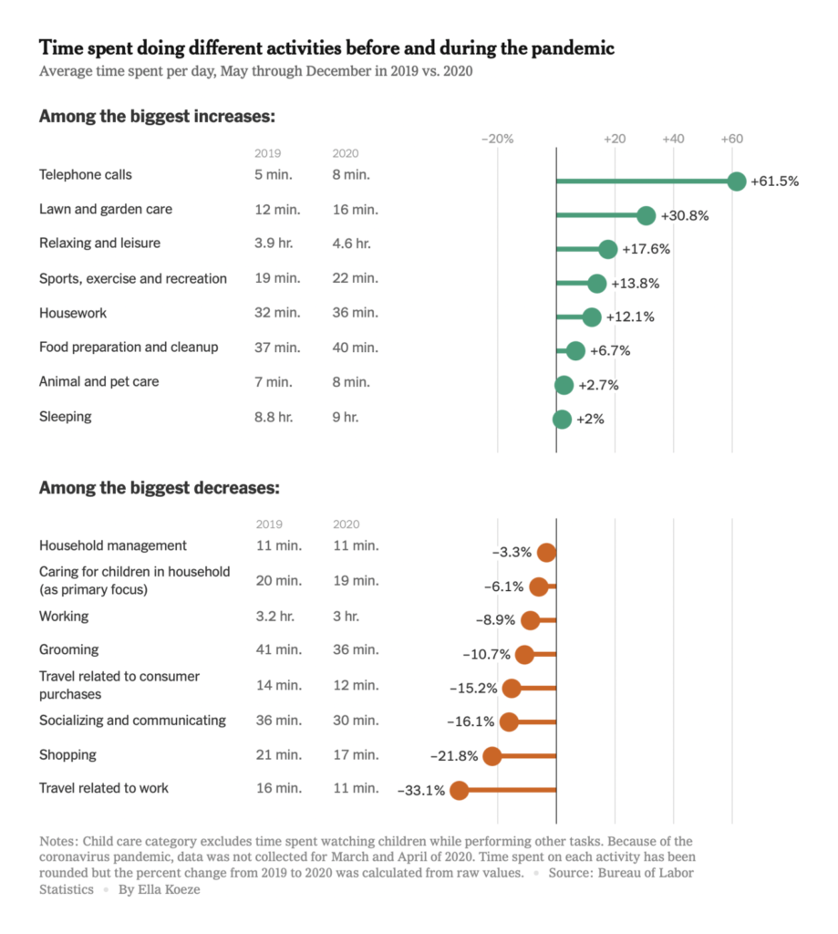
And we’re learning more about how COVID has changed our daily lives:
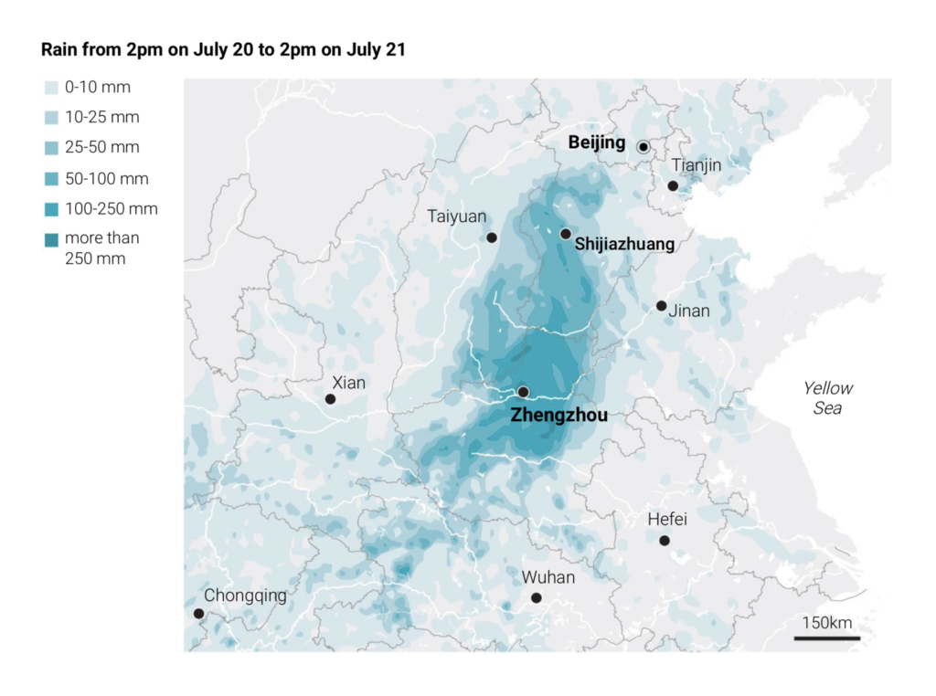
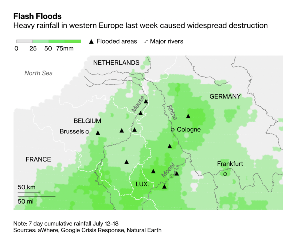
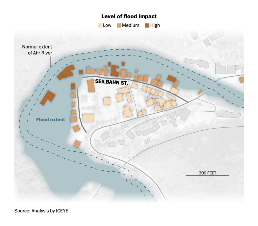
After last week’s deluge in Western Europe, this week saw more deadly flooding in Henan, China:
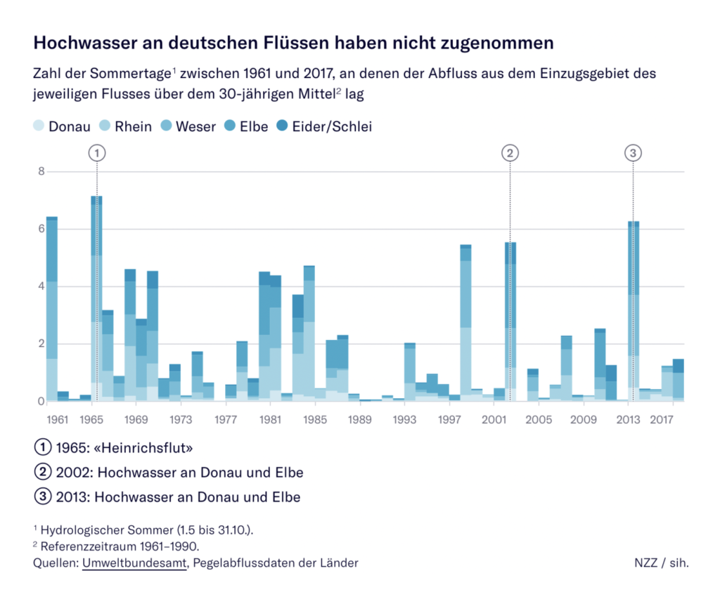
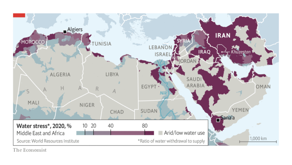
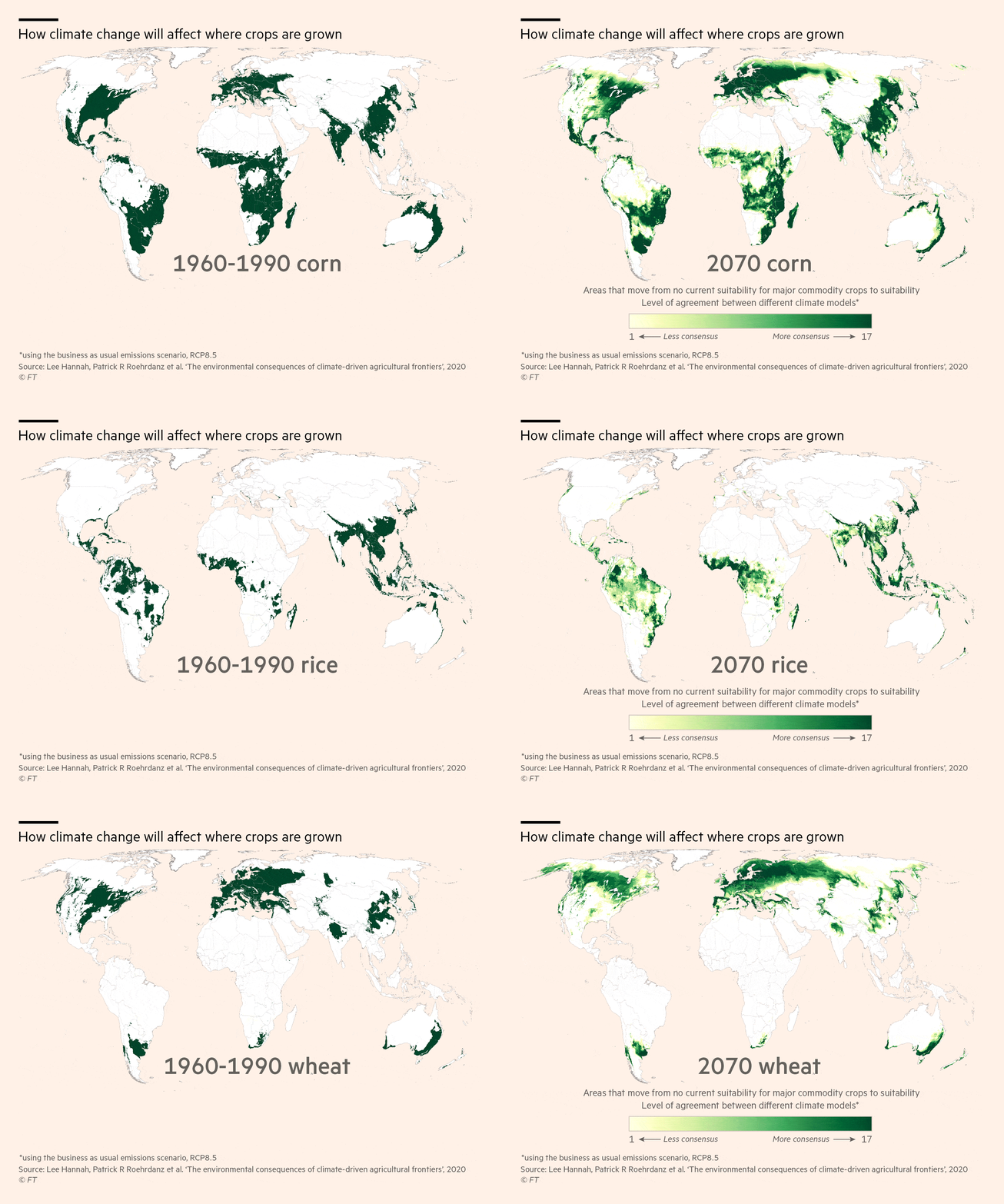
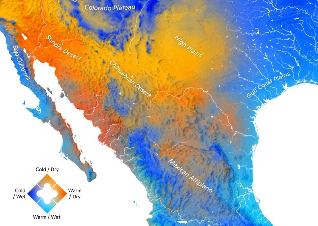
And the other side of the climate coin — extreme heat:
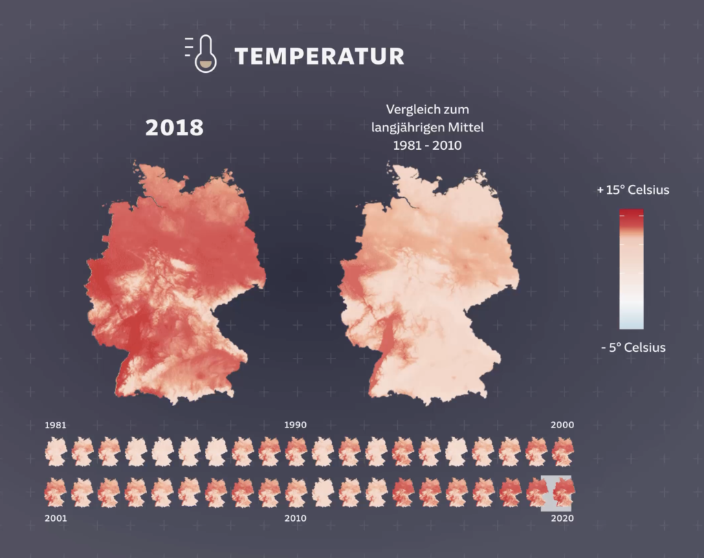
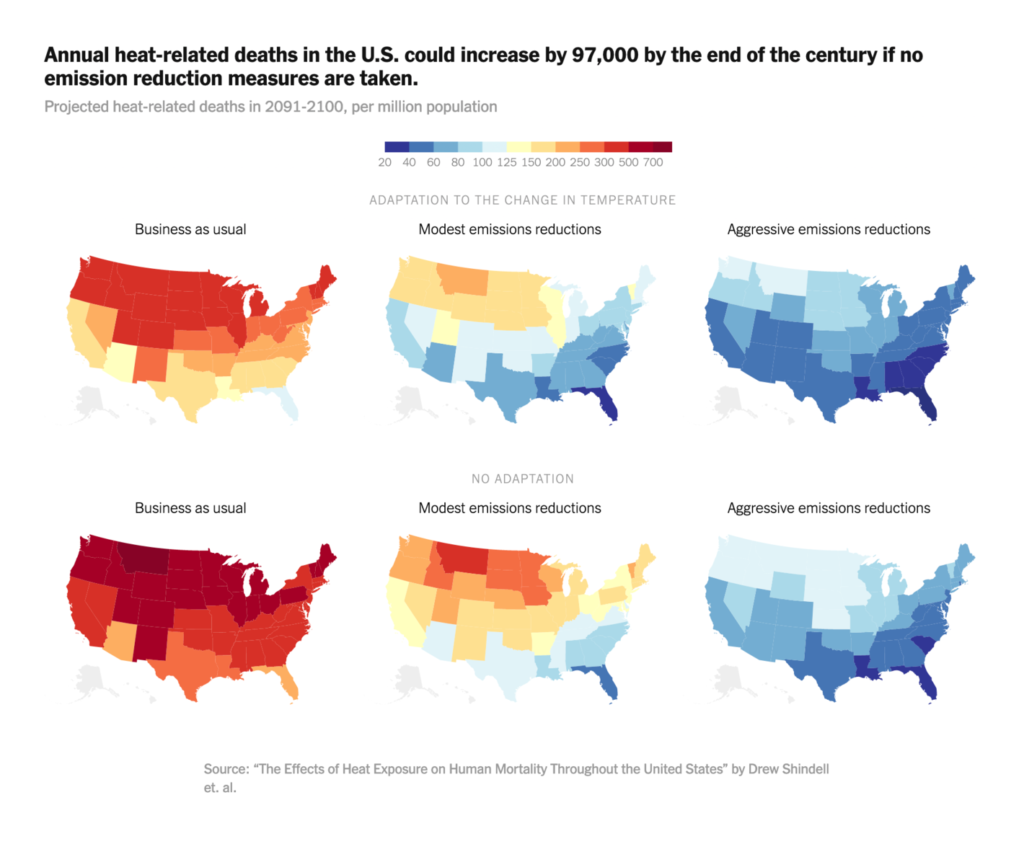
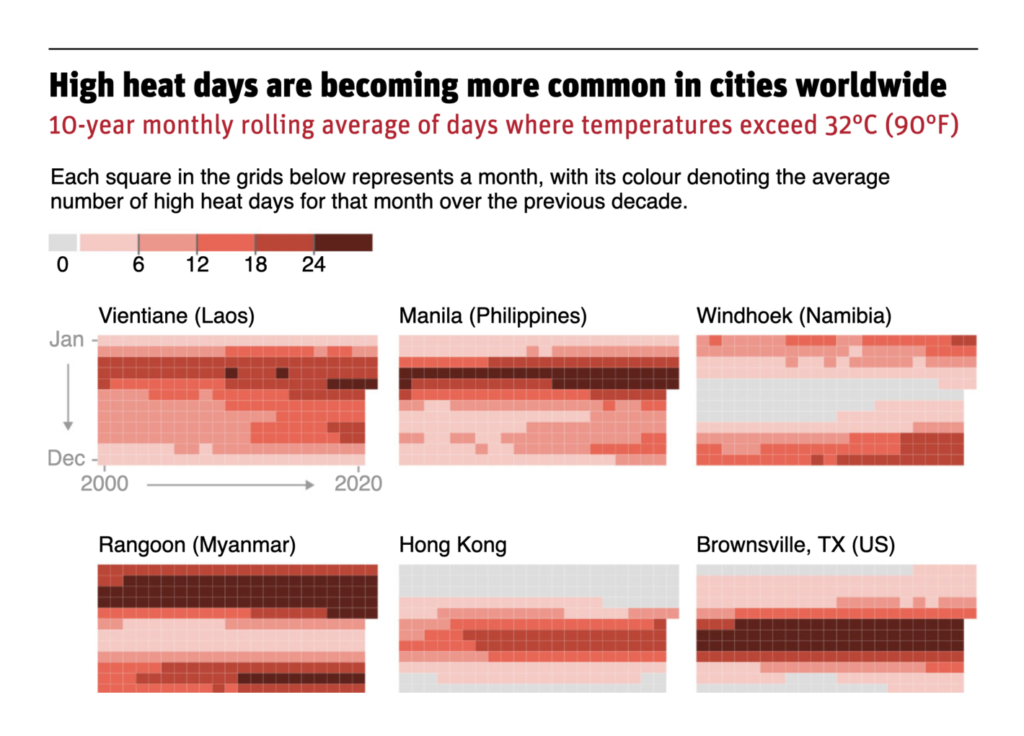
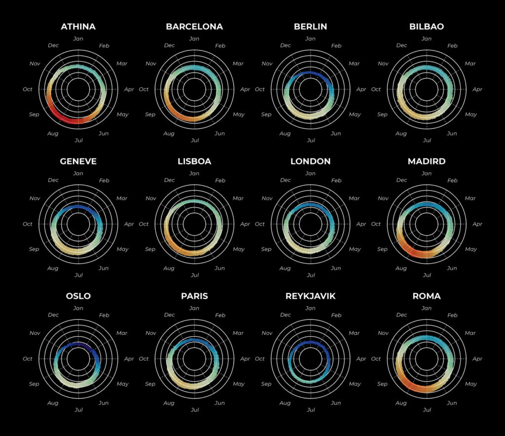
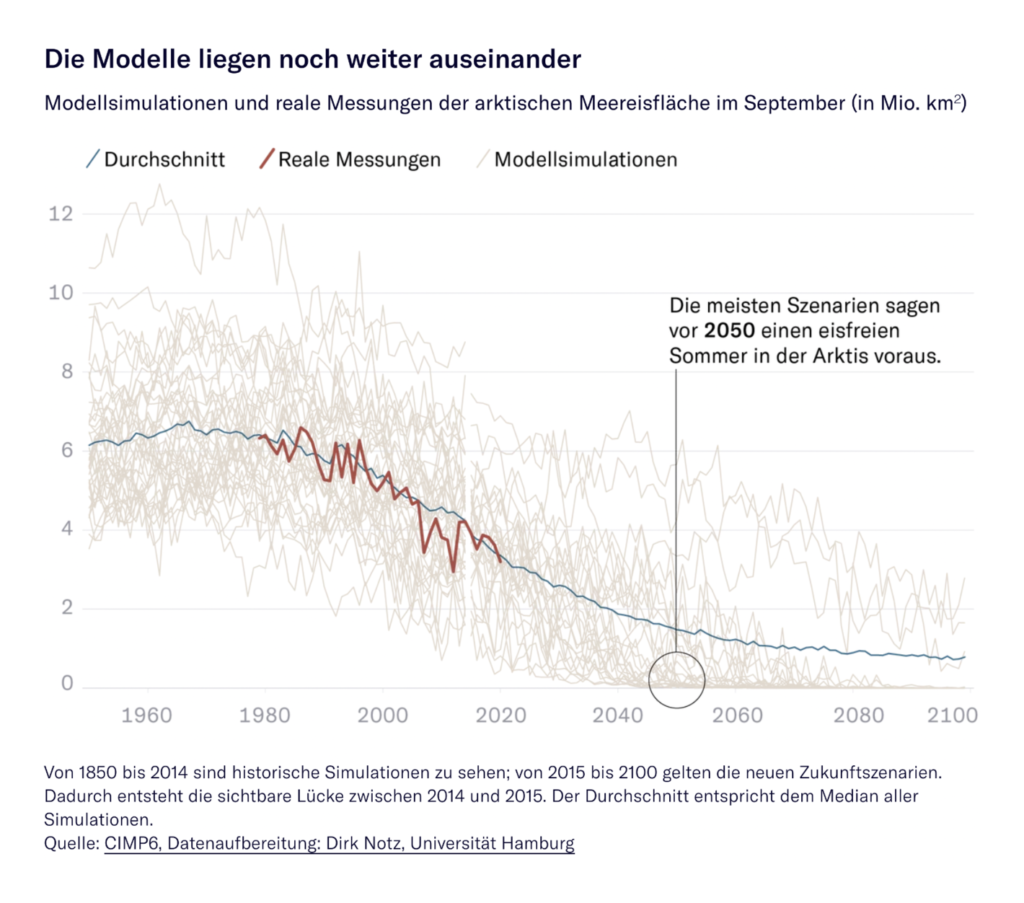
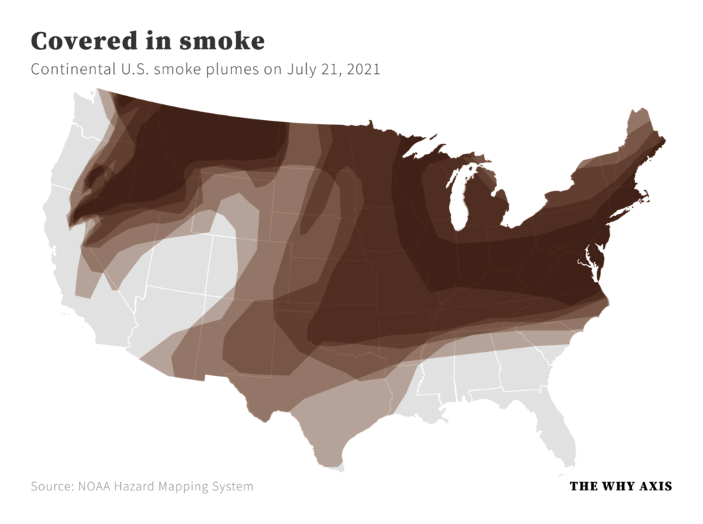
And the drought and wildfire that comes with it:
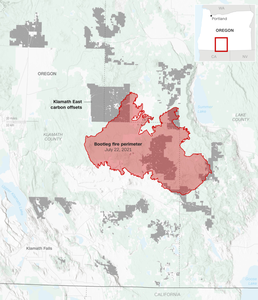

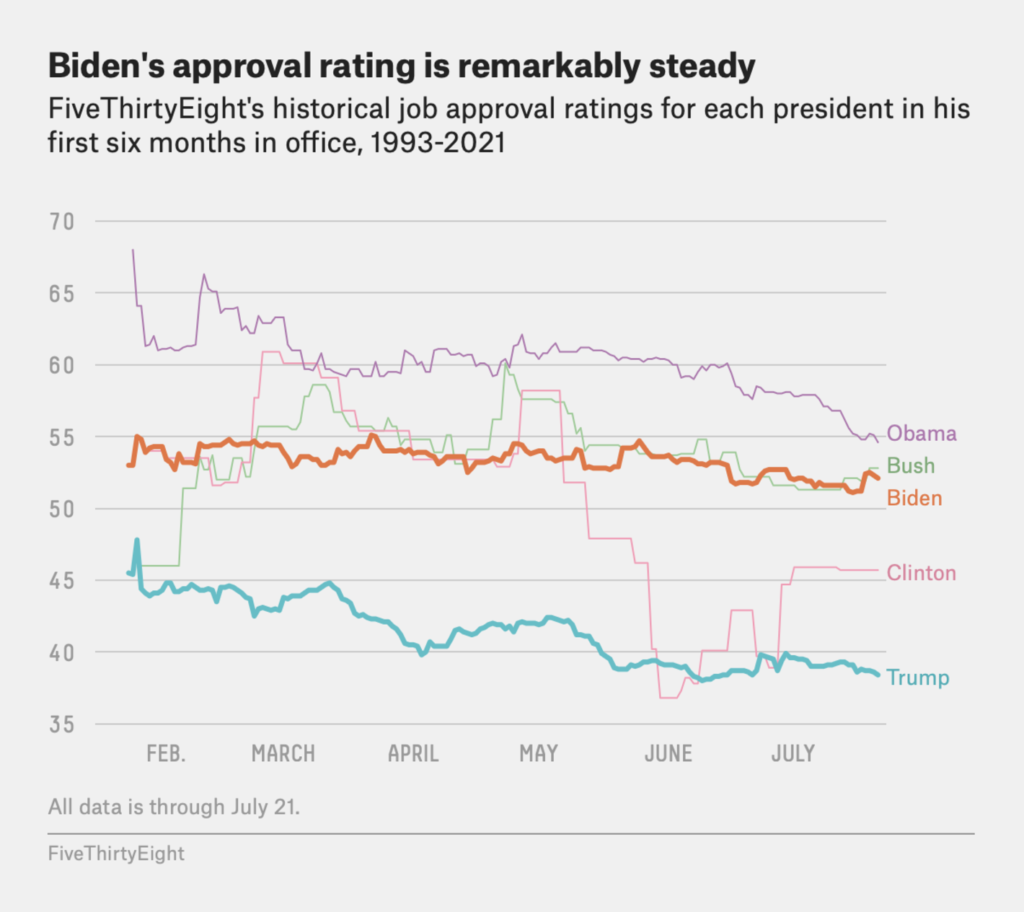
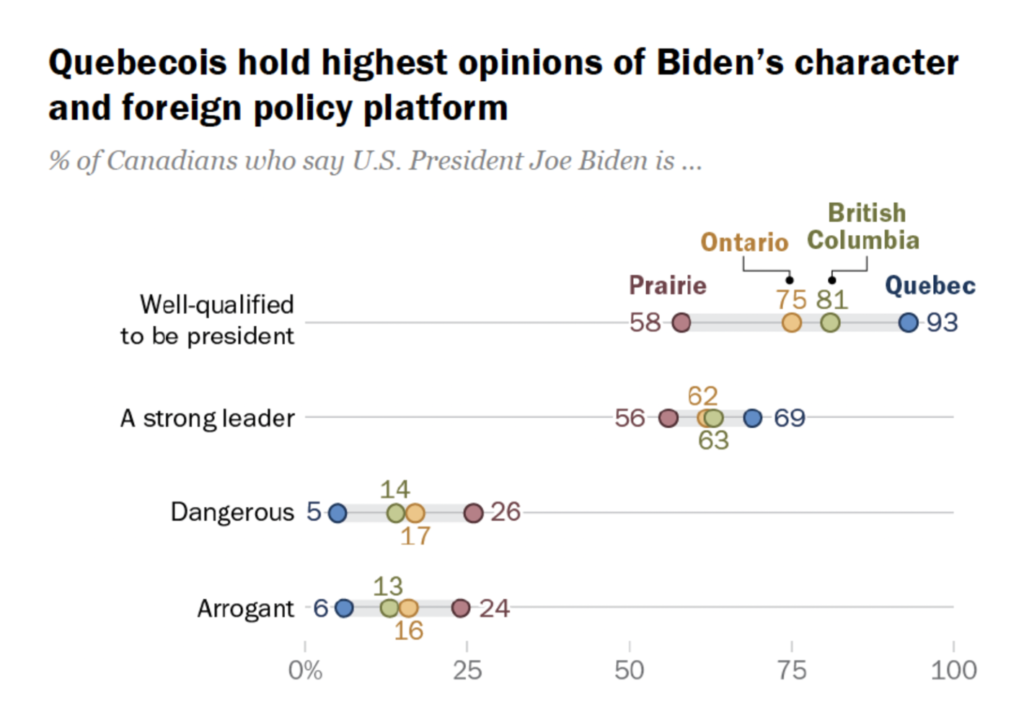
In the midst of it all, Joe Biden’s approval rating holds steady — and that’s not even counting his supporters in Quebec:
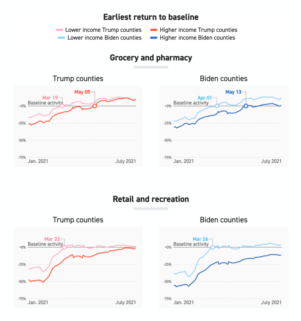
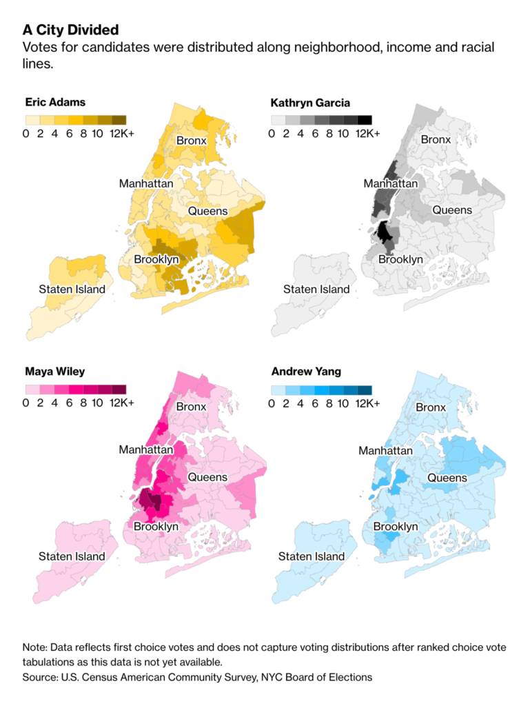
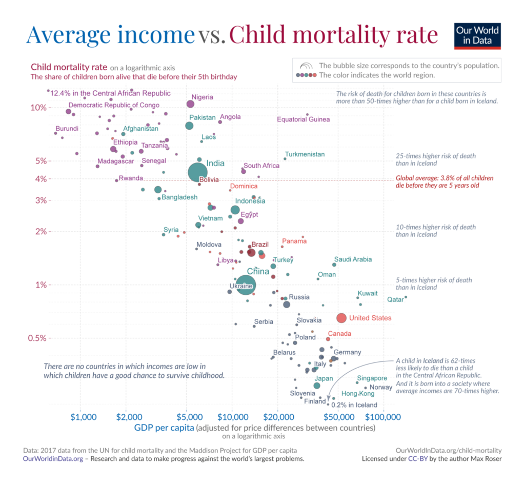
This week offered some interesting political correlations, mixing up income, lockdown timelines, vaccine hesitancy, votes, and neighborhood geography:

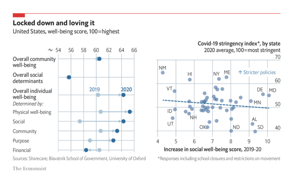
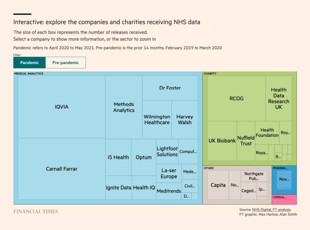
Finally, this week’s health and well-being charts can be split three ways. There’s good news, there’s bad news, and there’s… news:





Help us make this dispatch better! We’d love to hear which newsletters, blogs, or social media accounts we need to follow to learn about interesting projects, especially from less-covered parts of the world (Asia, South America, Africa). Write us at hello@datawrapper.de or leave a comment below.
Comments