Data Vis Dispatch, February 18: German election polls, corruption, and tariffs
February 18th, 2025
9 min
Datawrapper lets you show your data as beautiful charts, maps or tables with a few clicks. Find out more about all the available visualization types.
Our mission is to help everyone communicate with data - from newsrooms to global enterprises, non-profits or public service.
We want to enable everyone to create beautiful charts, maps, and tables. New to data visualization? Or do you have specific questions about us? You'll find all the answers here.
Data vis best practices, news, and examples
250+ articles that explain how to use Datawrapper
Answers to common questions
An exchange place for Datawrapper visualizations
Attend and watch how to use Datawrapper best
Learn about available positions on our team
Our latest small and big improvements
Build your integration with Datawrapper's API
Get in touch with us – we're happy to help
This article is brought to you by Datawrapper, a data visualization tool for creating charts, maps, and tables. Learn more.
The best of last week’s big and small data visualizations
Welcome back to the 100th edition of Data Vis Dispatch! Every week, we’ll be publishing a collection of the best small and large data visualizations we find, especially from news organizations — to celebrate data journalism, data visualization, simple charts, elaborate maps, and their creators.
Recurring topics this week include maps, sports, and the U.S. Supreme Court.
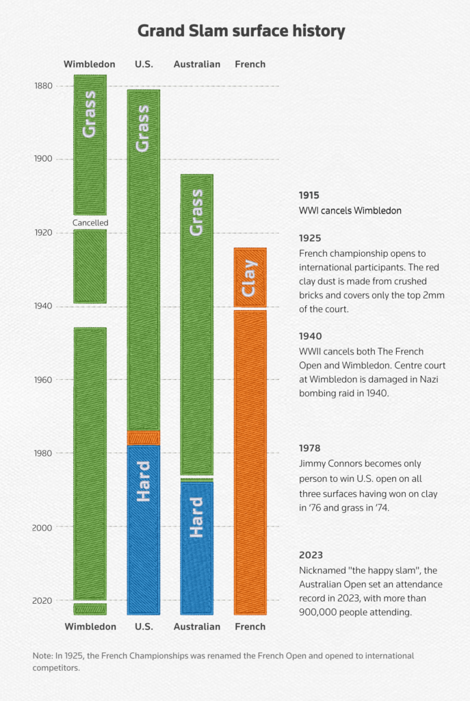
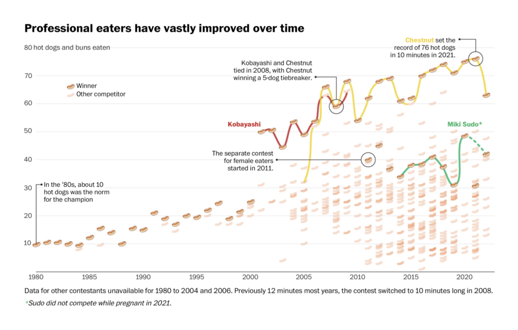
The beginning of July brings several seasonal topics to today’s Dispatch. There are the week’s main sporting events: the Tour de France, Wimbledon, and the Nathan’s Famous International Hot Dog Eating Contest:
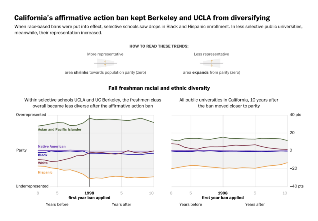
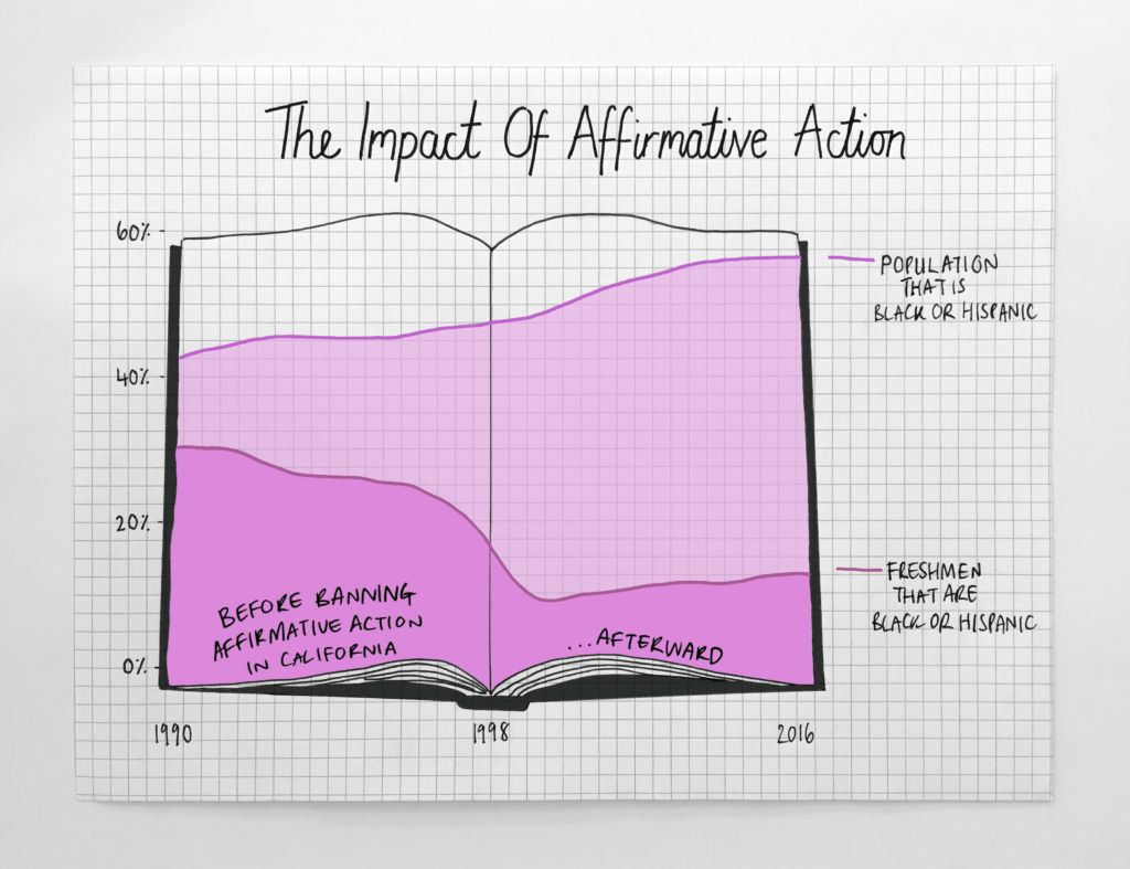
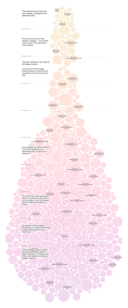
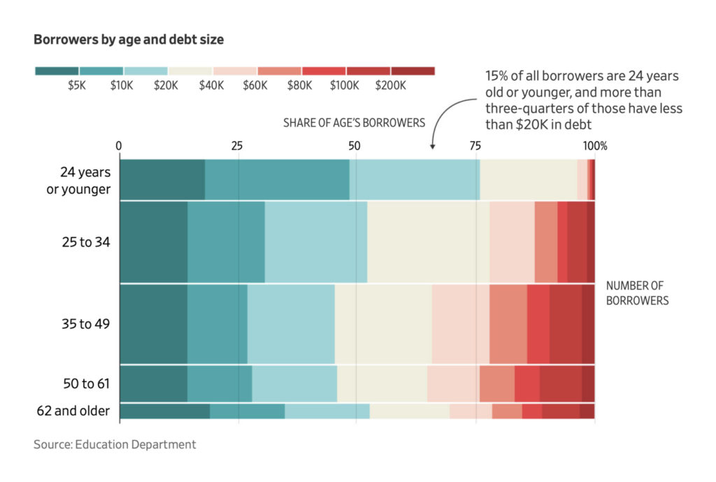
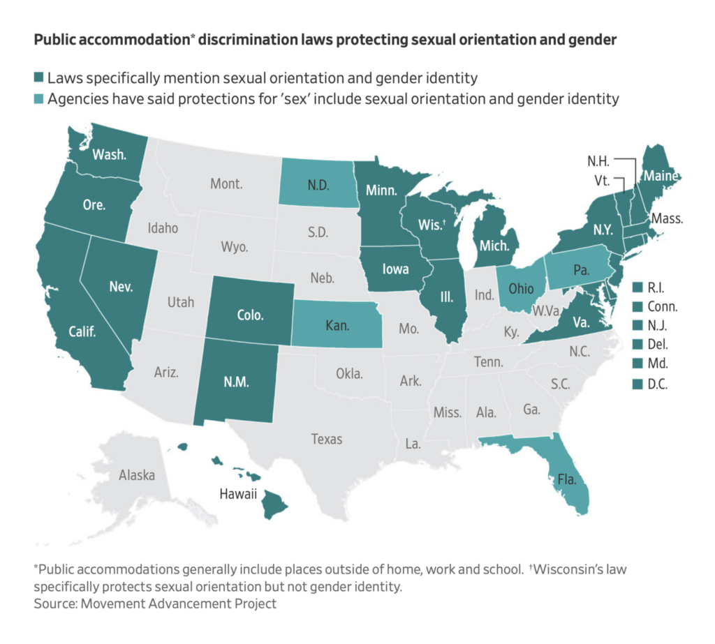
June closed out the 2022-23 term on the U.S. Supreme Court. Major decisions handed down in the final week dealt with affirmative action, student loan forgiveness, and antidiscrimination law:
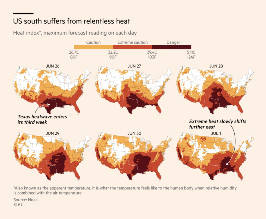
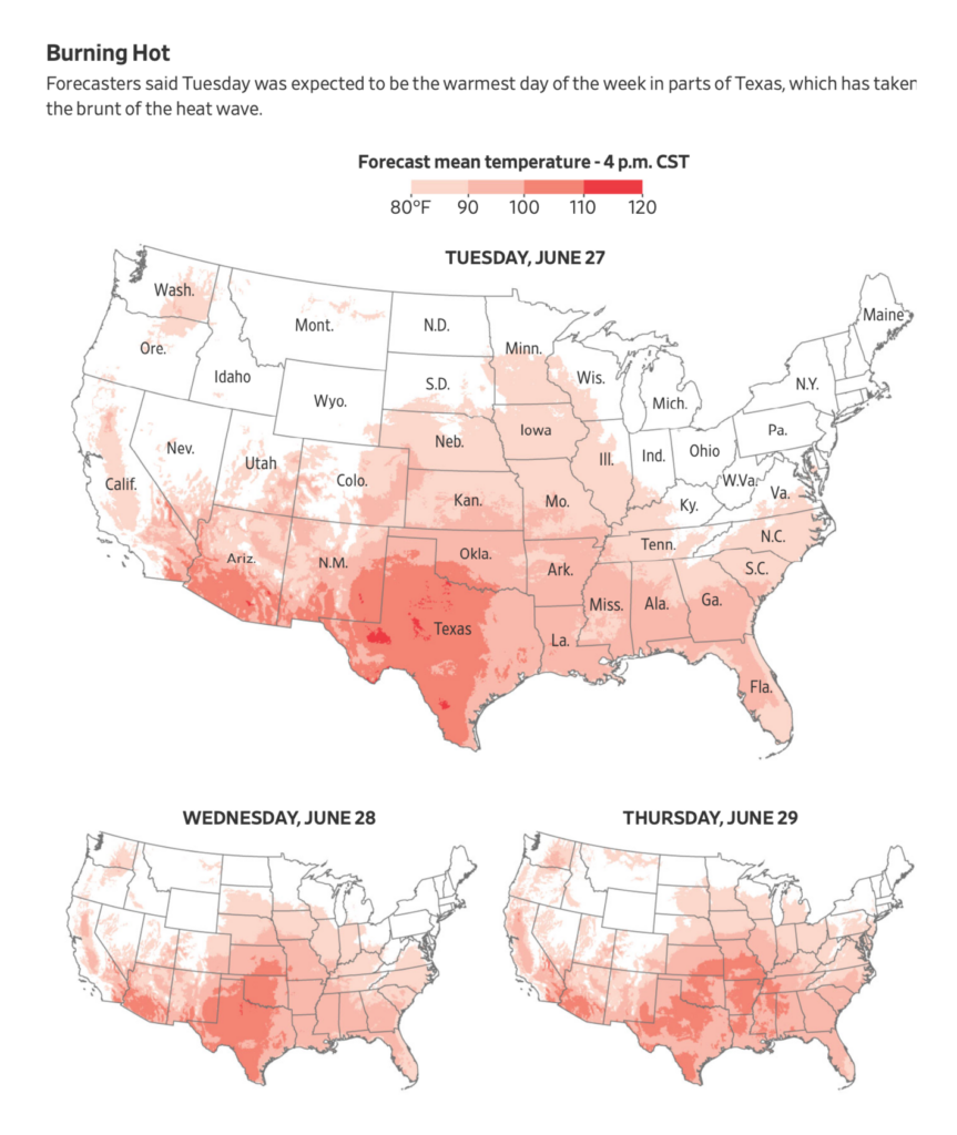
And summer also now means charts of life-threatening heat:
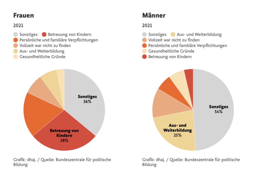
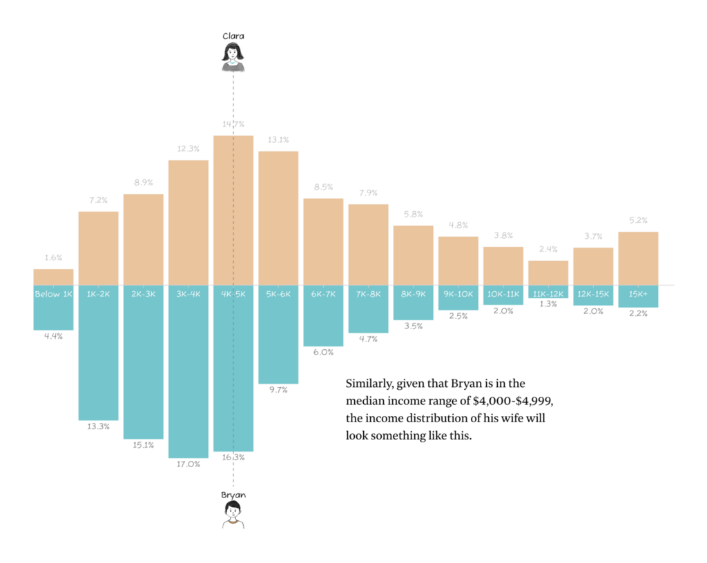
One breakout topic this week was gender inequalities at work:
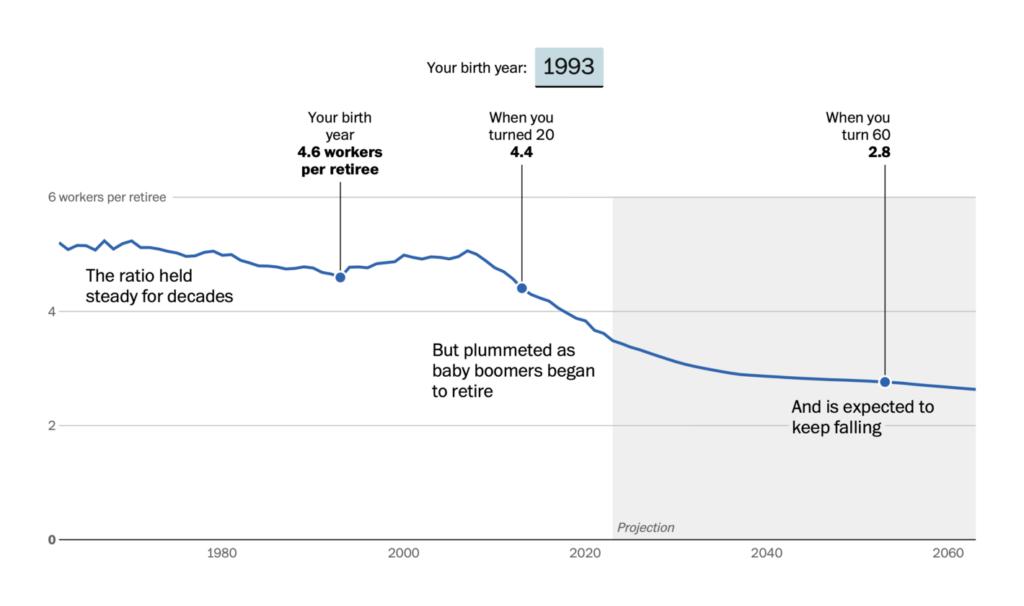
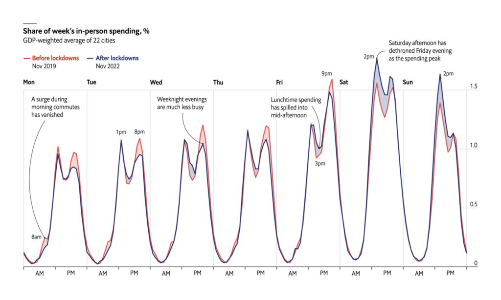
More on the changing nature of work — over the decades and over the hours:
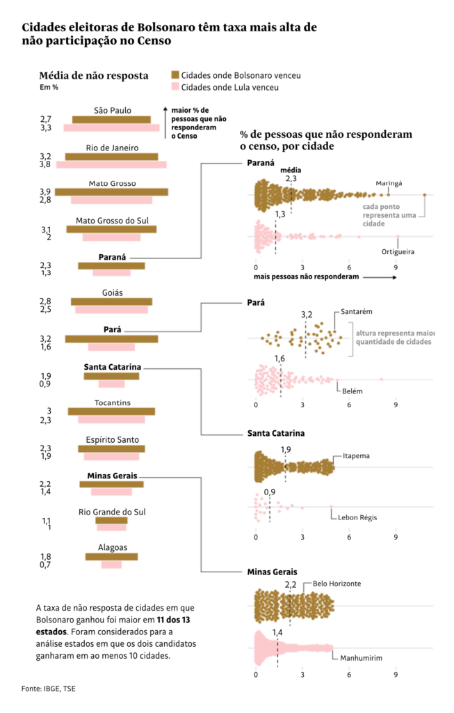
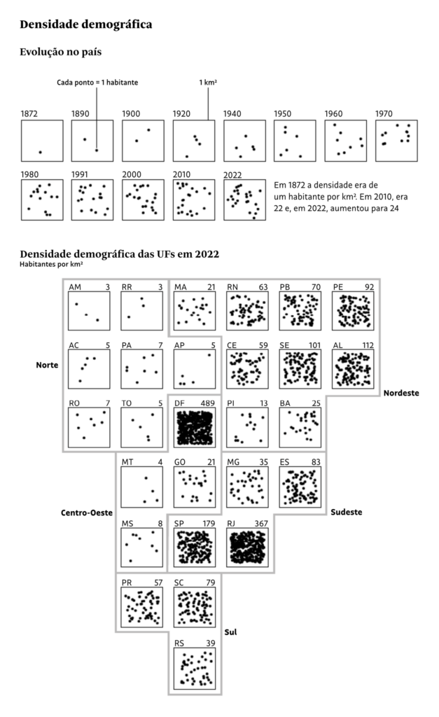
A census is always big news in data vis. This week, the numbers are in from Brazil:
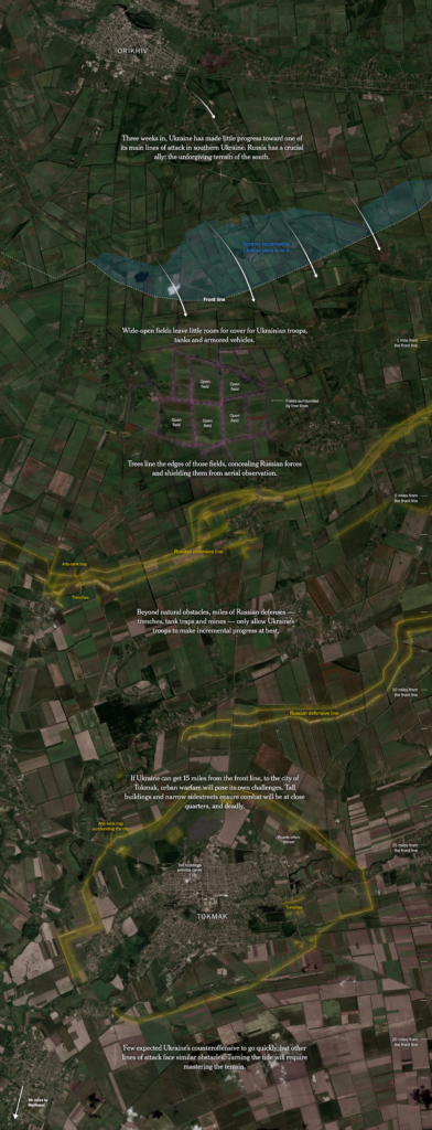
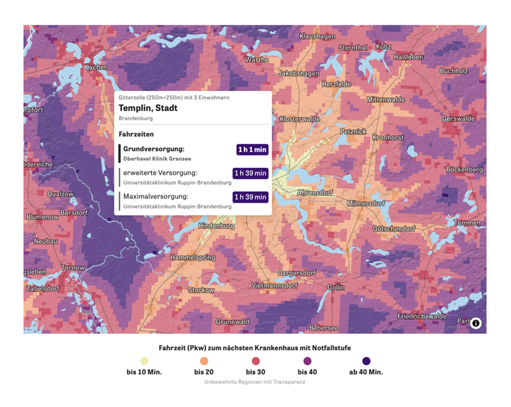
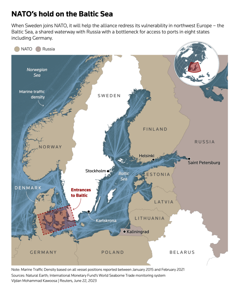
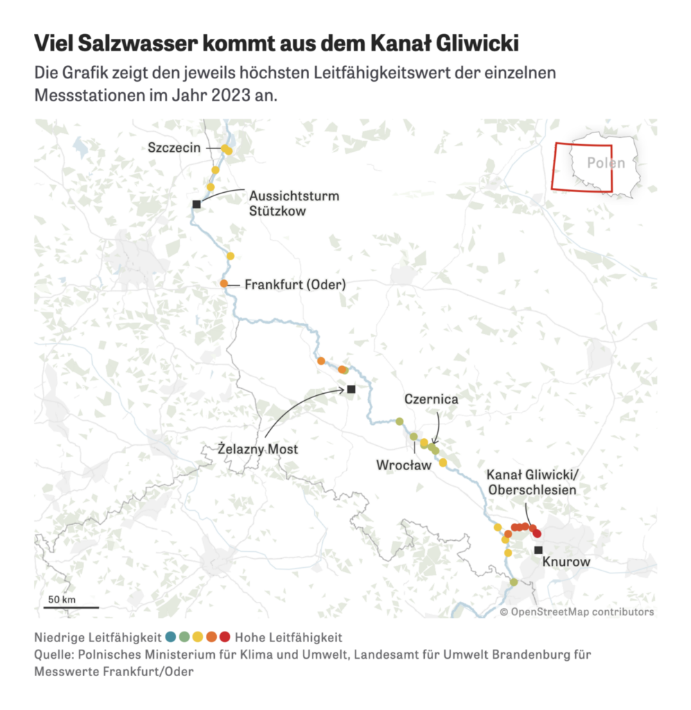
It was a great week for maps overall. We especially liked the New York Times’ annotation of satellite imagery from Ukraine and Zeit Online’s map of hospital access in Germany:

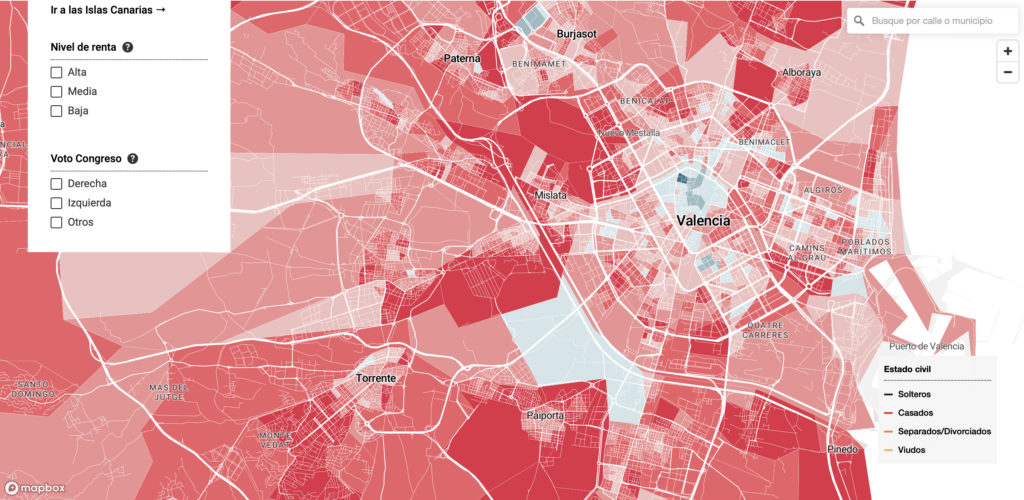
Finally, just for fun: where your neighbors are single in Spain, and the tracks of the Loch Ness Monster:
Help us make this dispatch better! We’d love to hear which newsletters, blogs, or social media accounts we need to follow to learn about interesting projects, especially from less-covered parts of the world (Asia, South America, Africa). Write us at hello@datawrapper.de or leave a comment below.
Want the Dispatch in your inbox every Tuesday? Sign up for our Blog Update newsletter!
Comments