This article is brought to you by Datawrapper, a data visualization tool for creating charts, maps, and tables. Learn more.
Data Vis Dispatch, July 6
The best of last week’s big and small data visualizations


Welcome back to the third edition of Data Vis Dispatch! Every week, we’ll be publishing a collection of the best small and large data visualizations we find, especially from news organizations — to celebrate data journalism, data visualization, simple charts, elaborate maps, and their creators.
Recurring topics for this week include trees in urban neighborhoods, wildfires in North America, and how our habits are or aren’t returning to normal during — you guessed it — the pandemic.
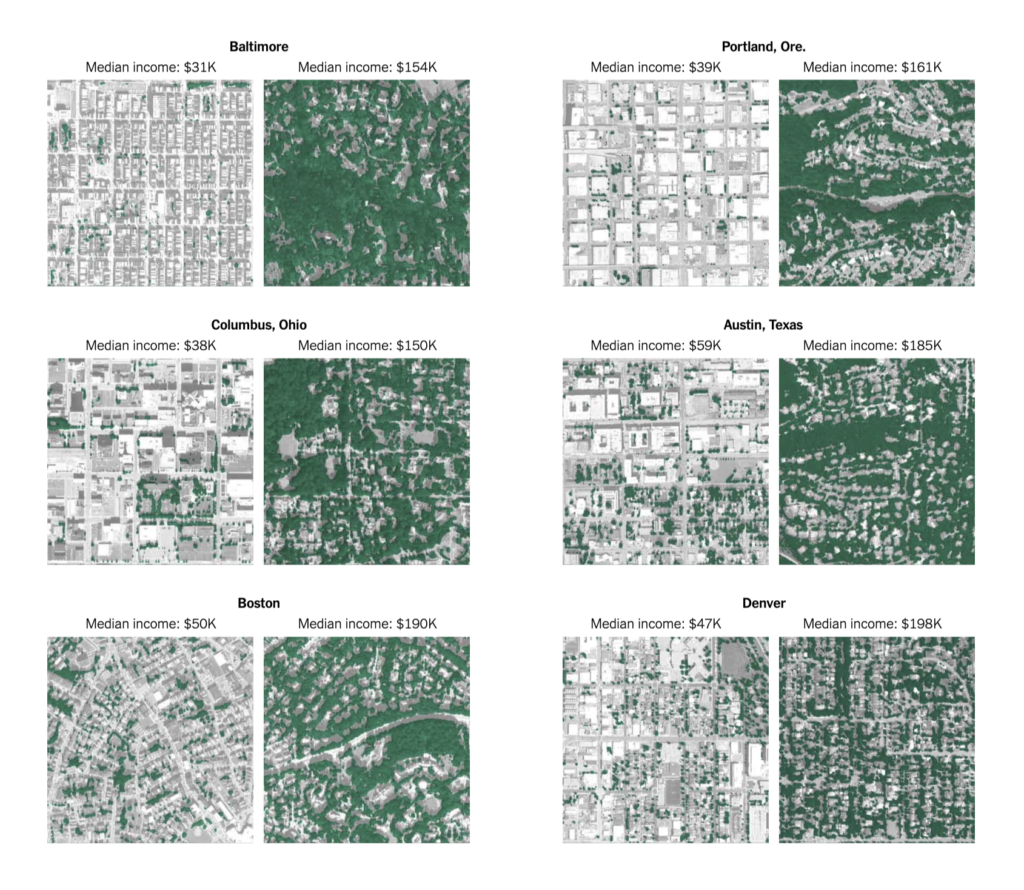
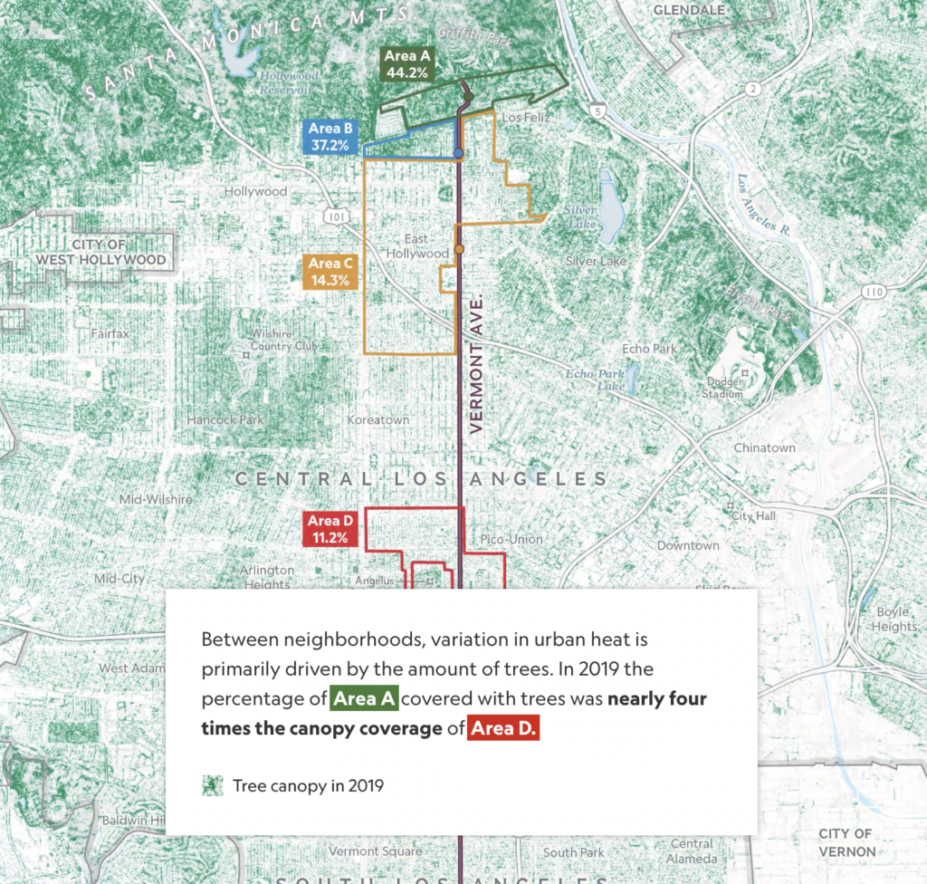
This was a big week for trees, both urban and rural. We saw several reports on how tree coverage in US cities reflects a history of segregation:
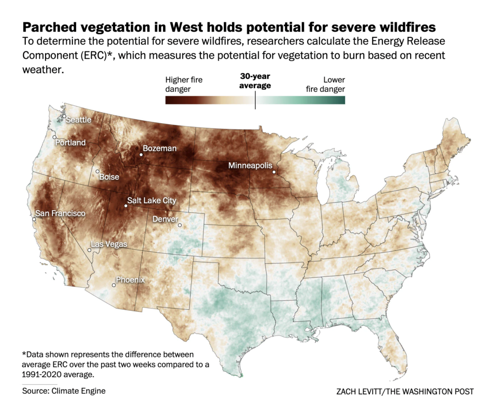
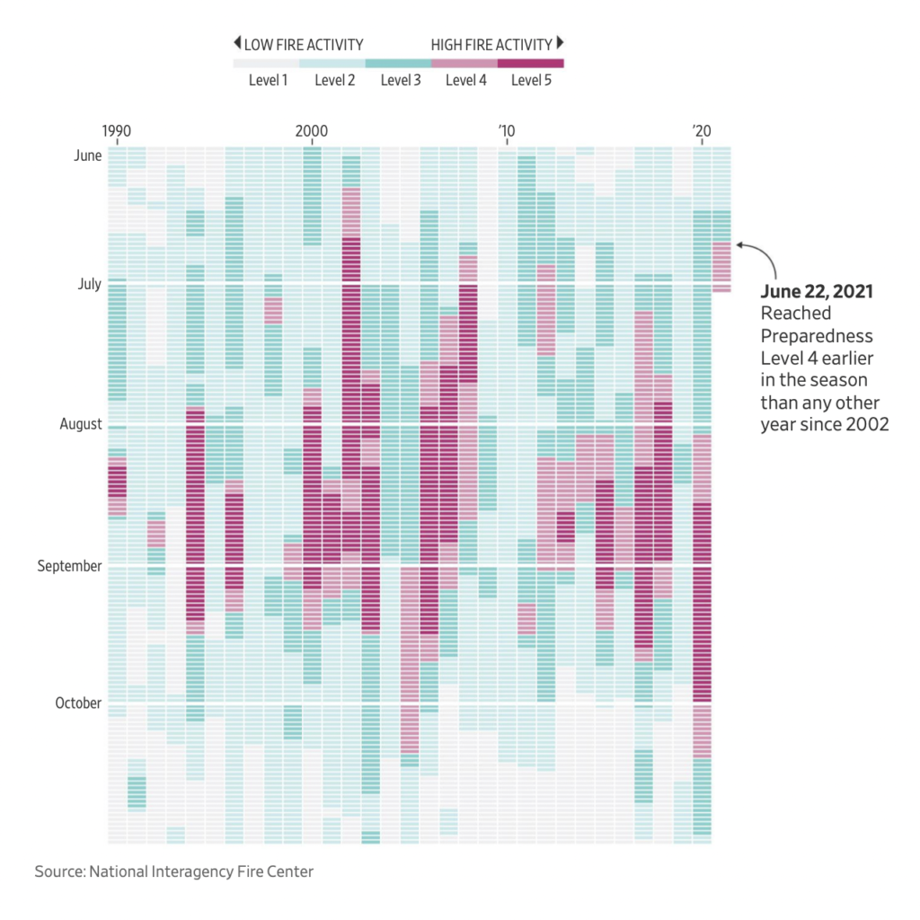
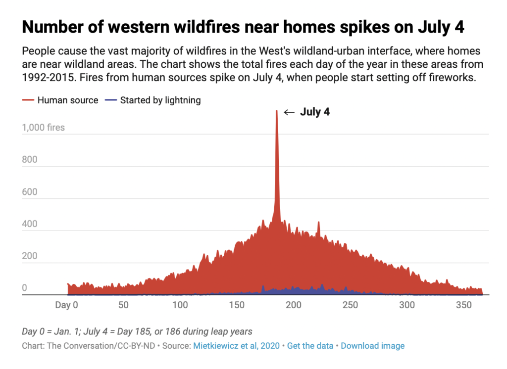
And also warnings of how dry plants indicate a dangerous fire season ahead. (Can you guess the date with more US wildfires than any other?)
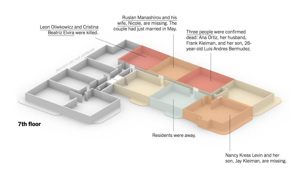
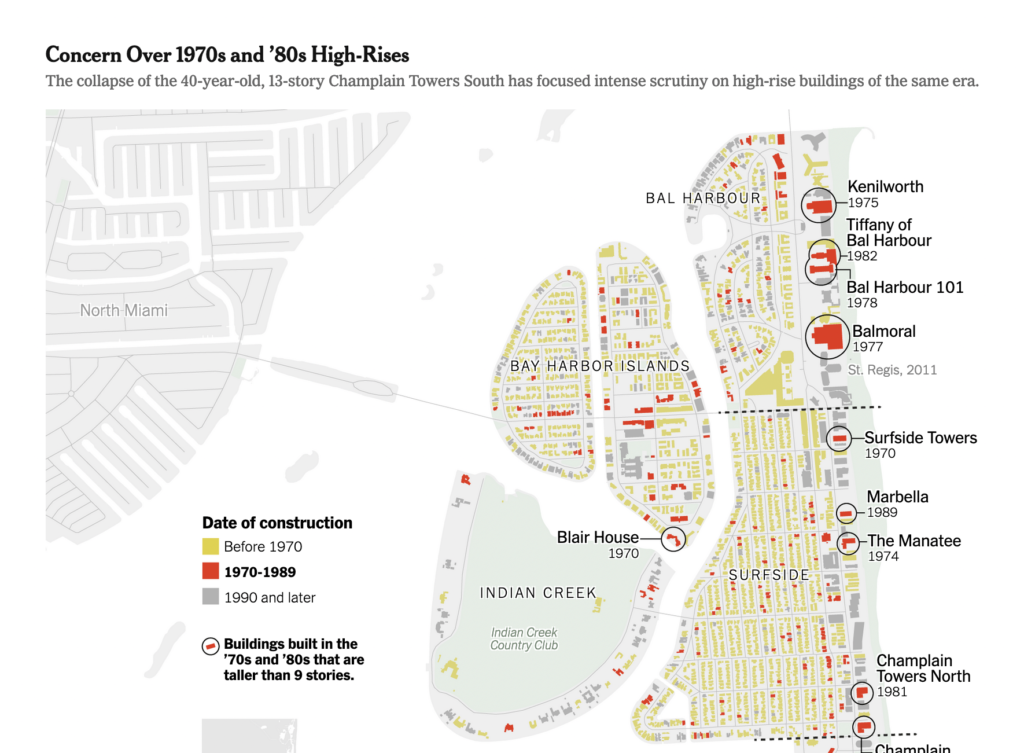
After the collapse of an apartment building near Miami, Florida, these maps helped us understand the tragedy and where it could happen again:
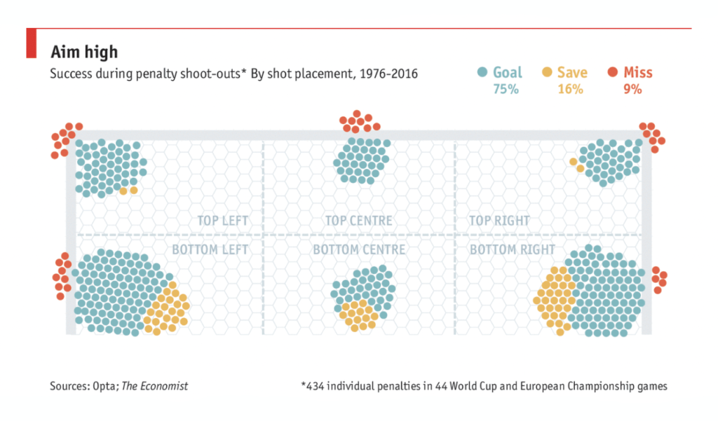
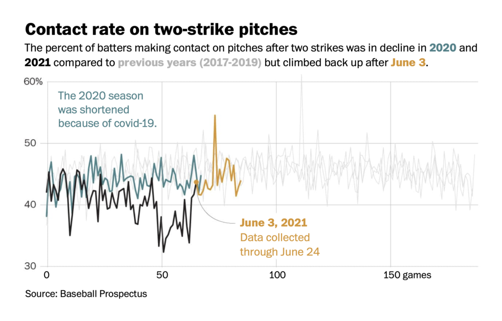
We found a lighter note in charts on the best place to aim during a penalty shootout and the effects of a recent crackdown on “sticky stuff” in baseball:
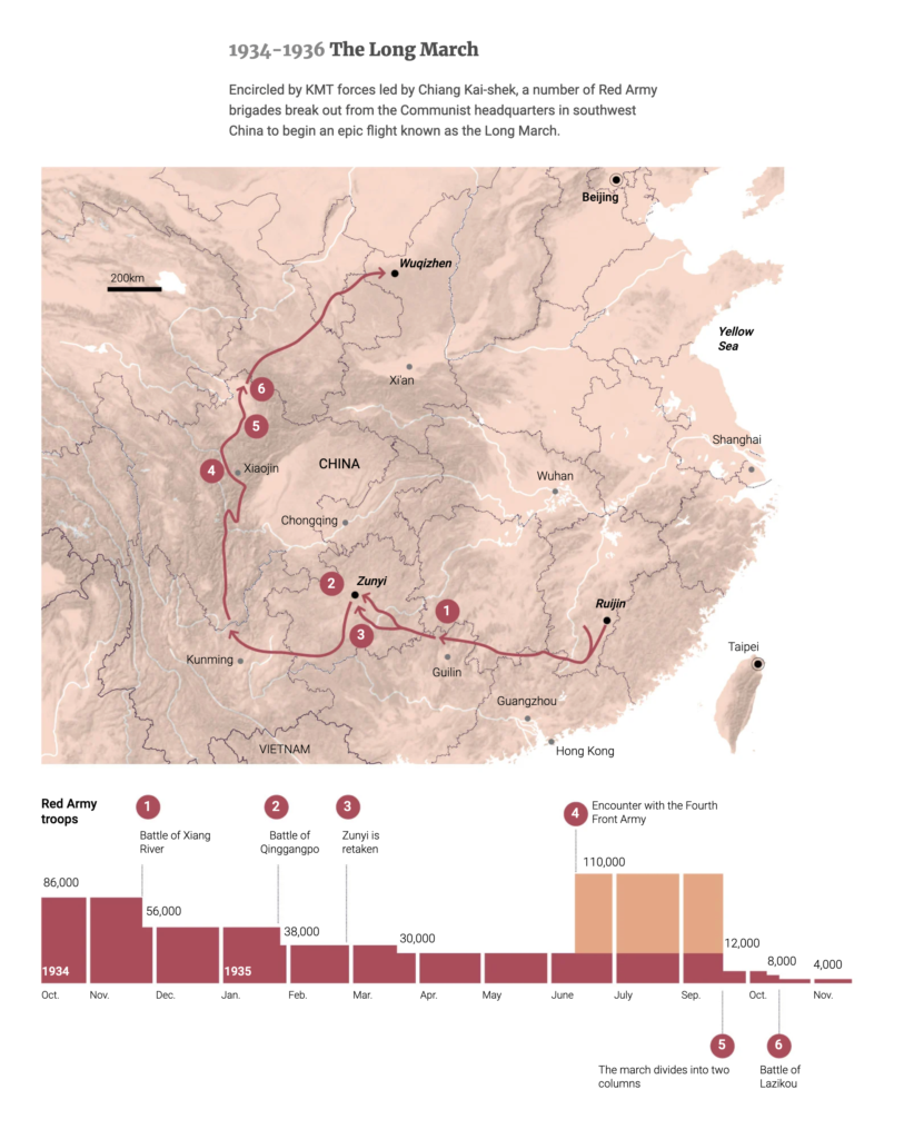
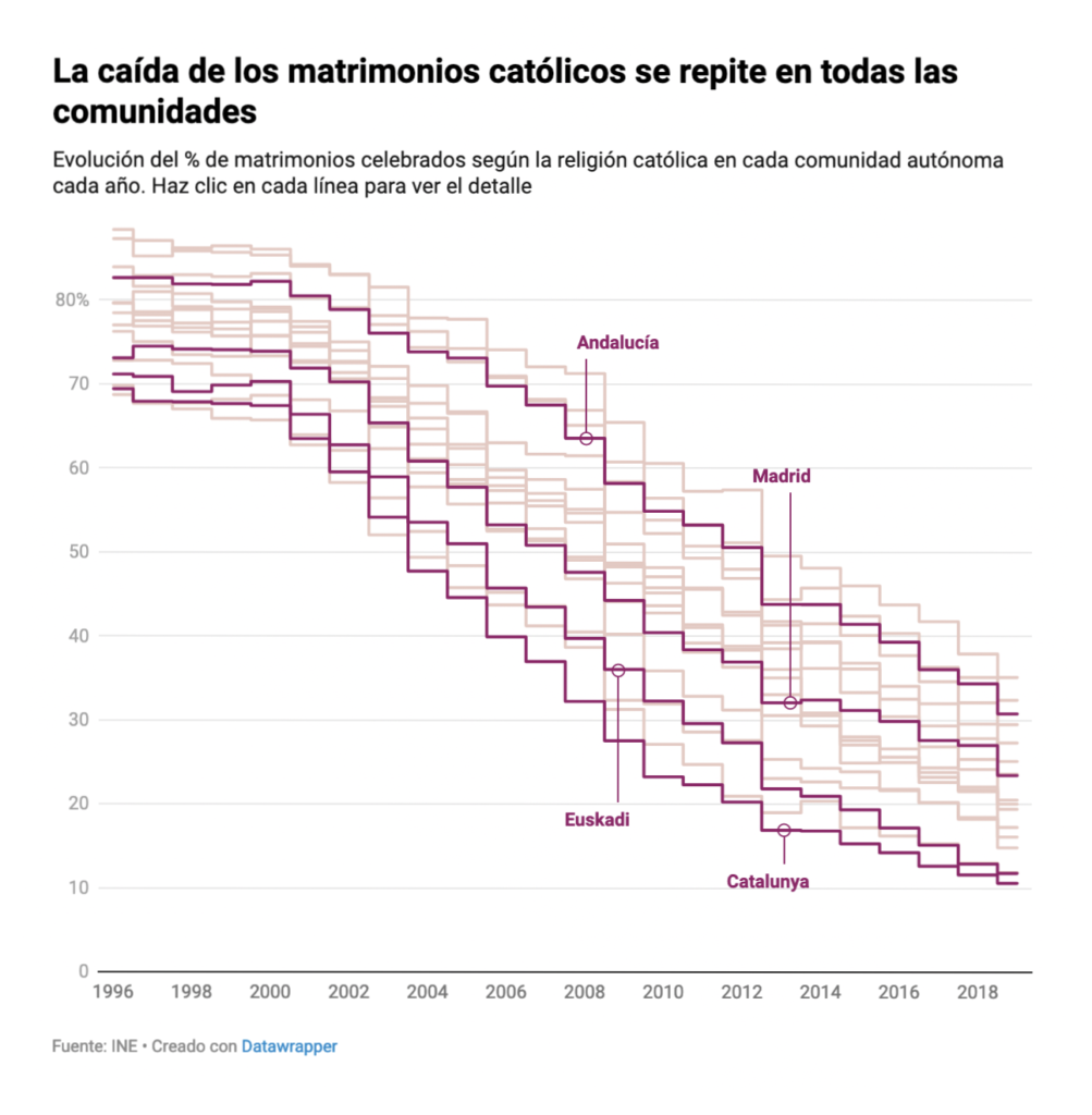
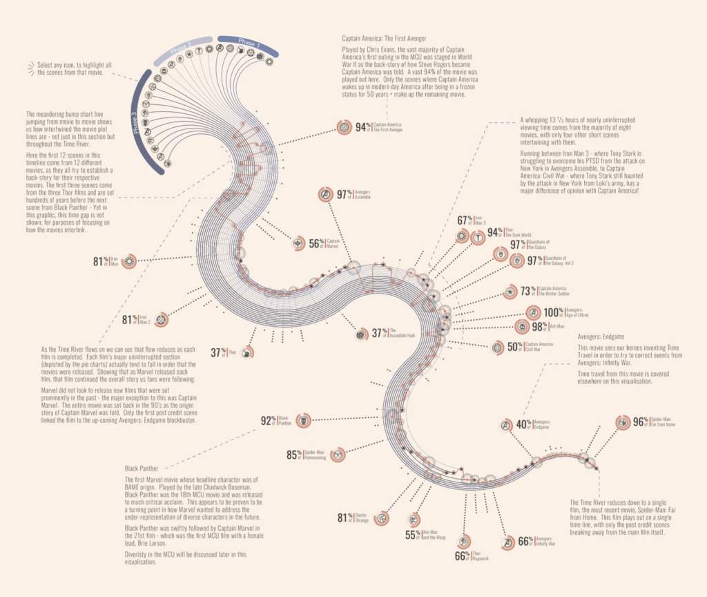
And this week’s general interest visualizations covered everything from a historical map of the Long March, to falling rates of Catholic weddings in Spain, to the intertwining timelines of Marvel movies:
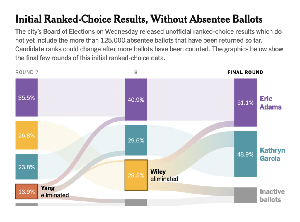
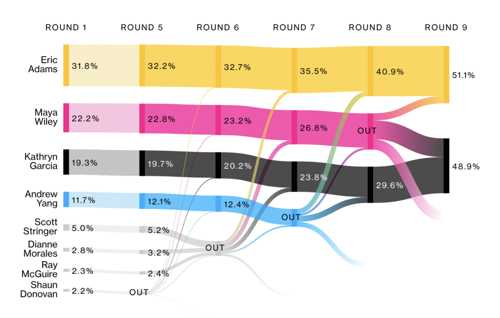
As votes were tallied in New York City’s mayoral primaries, we saw a fresh round of coverage for ranked-choice voting — this time with real numbers:
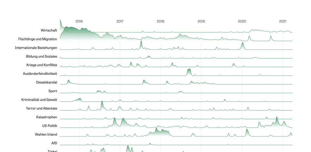
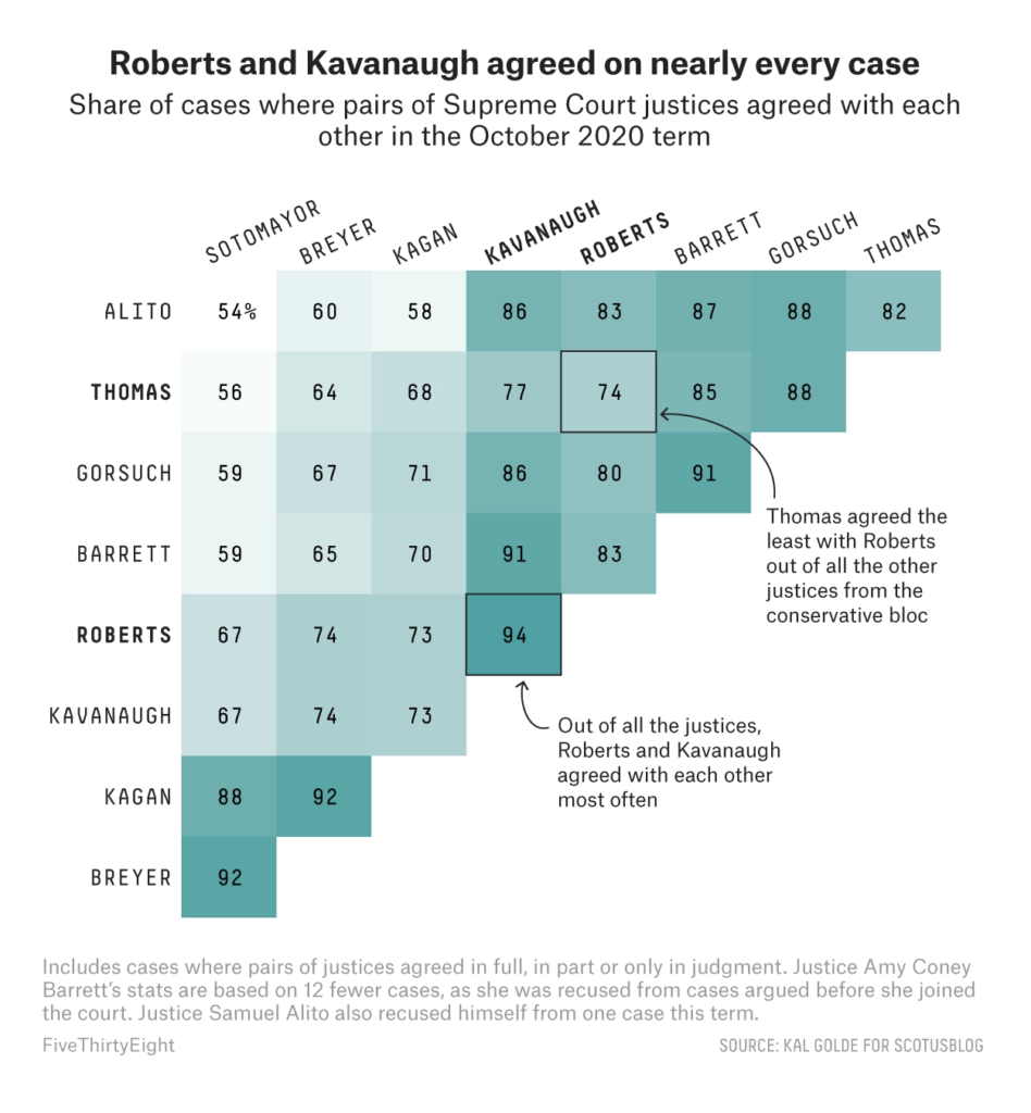
Other political charts were retrospective, showing us the issues of the day throughout the entire Merkel chancellorship and this term’s ideological blocs on the US Supreme Court:
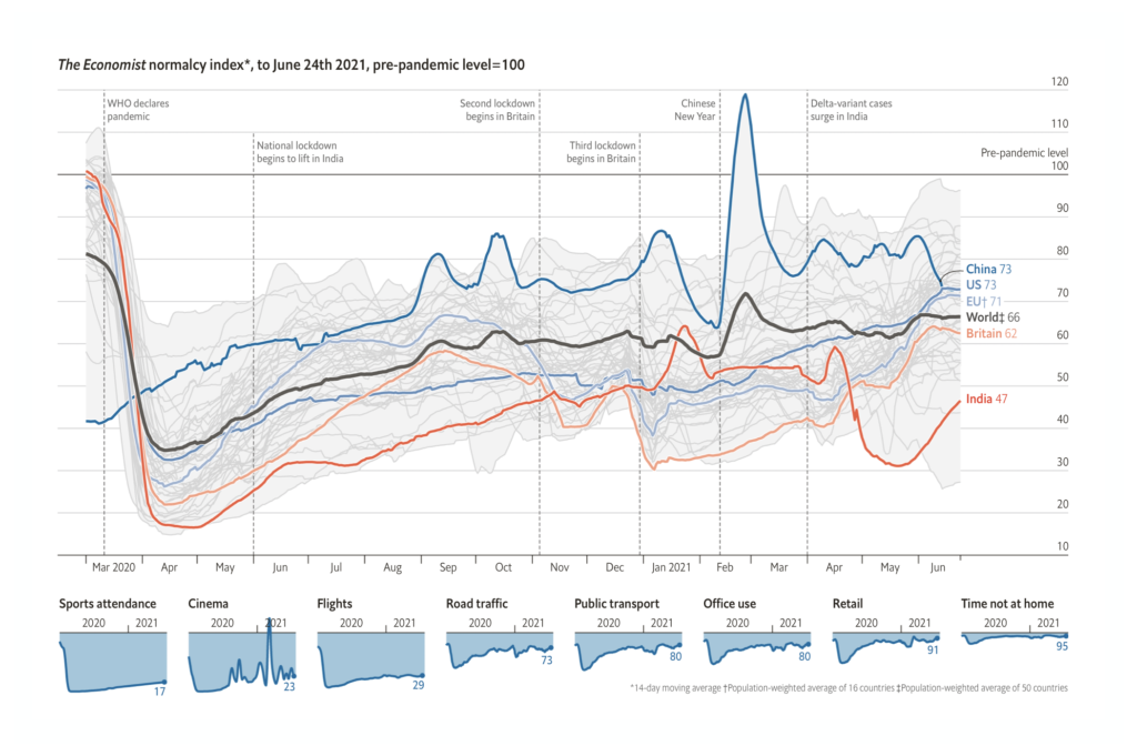
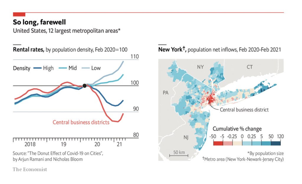
Finally, COVID charts this week tracked our lifestyle changes during the pandemic and how quickly “normal” is returning around the world:
What else we found interesting


Help us make this dispatch better! We’d love to hear which newsletters, blogs, or social media accounts we need to follow to learn about interesting projects, especially from less-covered parts of the world (Asia, South America, Africa). Write us at hello@datawrapper.de or leave a comment below.


Comments