We want to enable everyone to create beautiful charts, maps, and tables. New to data visualization? Or do you have specific questions about us? You'll find all the answers here.
The best of last week’s big and small data visualizations
Lisa Charlotte Muth
Welcome back to the 97th edition of Data Vis Dispatch! Every week, we’ll be publishing a collection of the best small and large data visualizations we find, especially from news organizations — to celebrate data journalism, data visualization, simple charts, elaborate maps, and their creators.
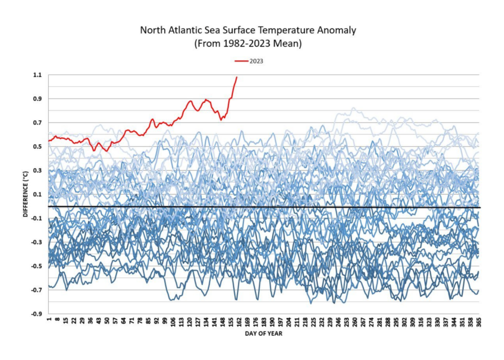
Recurring topics this week include the effect of wildfires in Canada on the U.S. East Coast, the dam breach in Ukraine, rising house prices, and the Champions League.
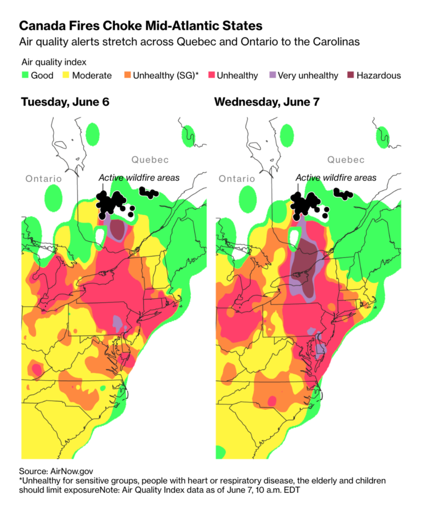
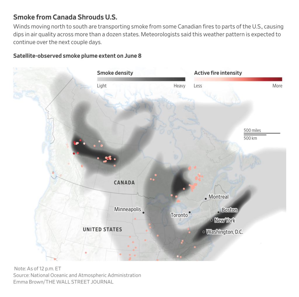
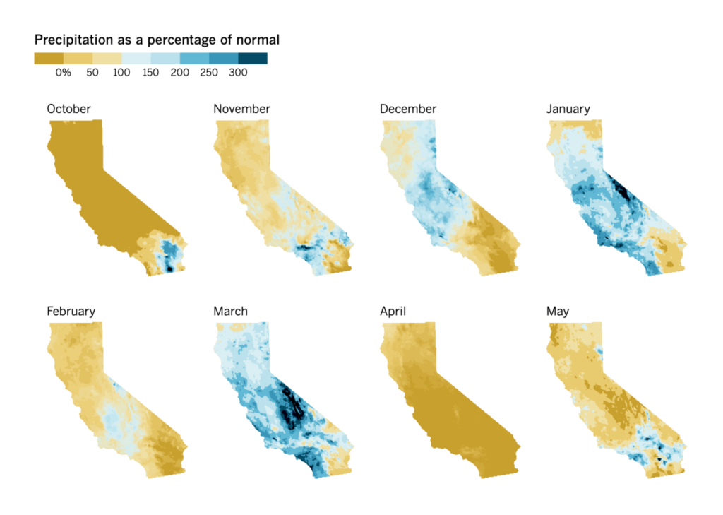
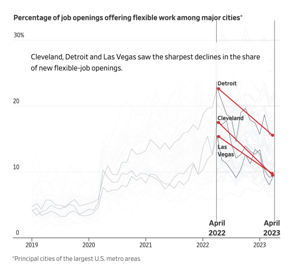
First, the wildfires in Canada. The resulting smoke made the air quality in New York City go down (and the number of photos of an orange sky in New York City on social media go up):
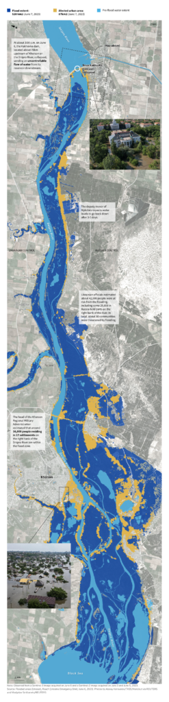
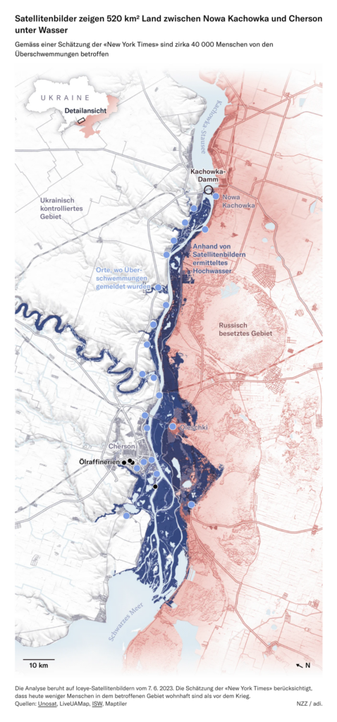
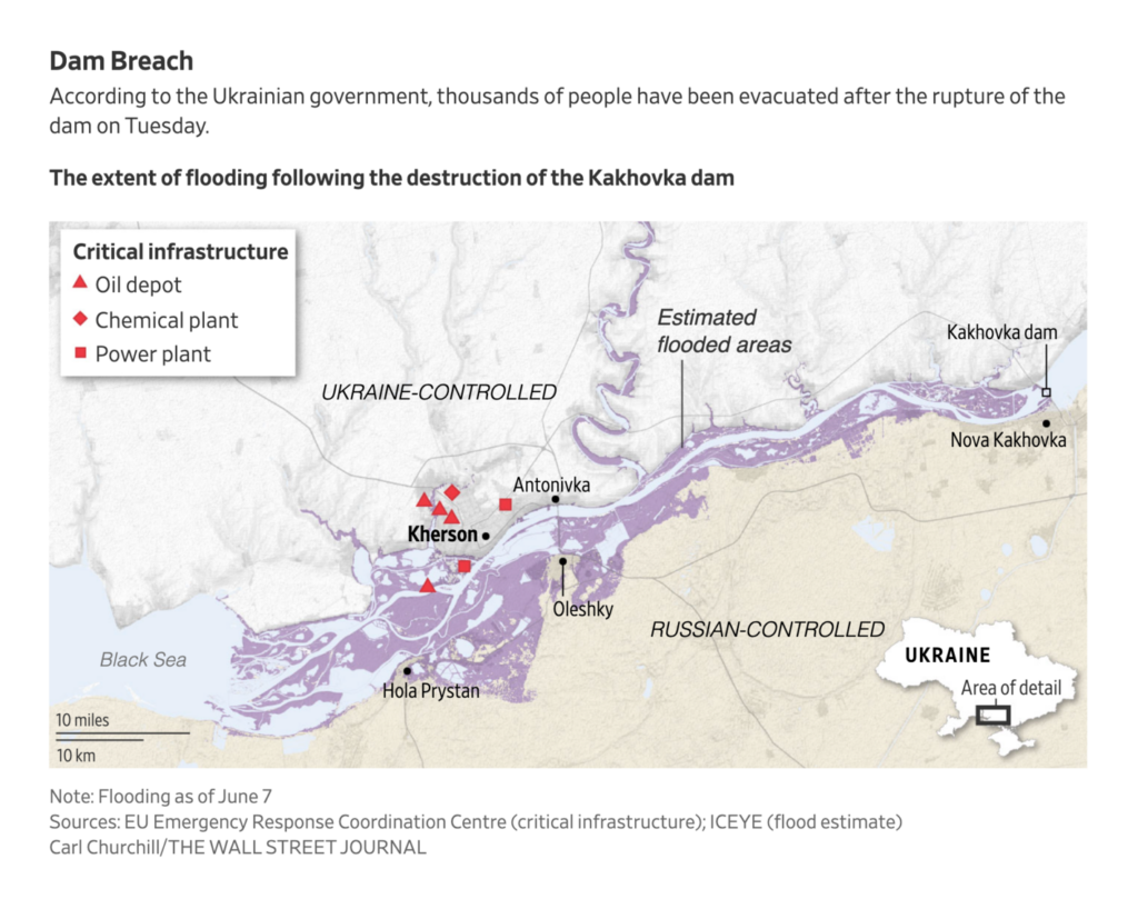
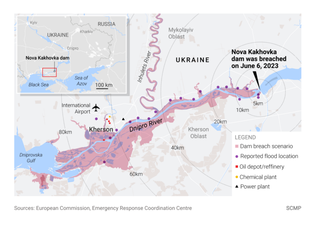
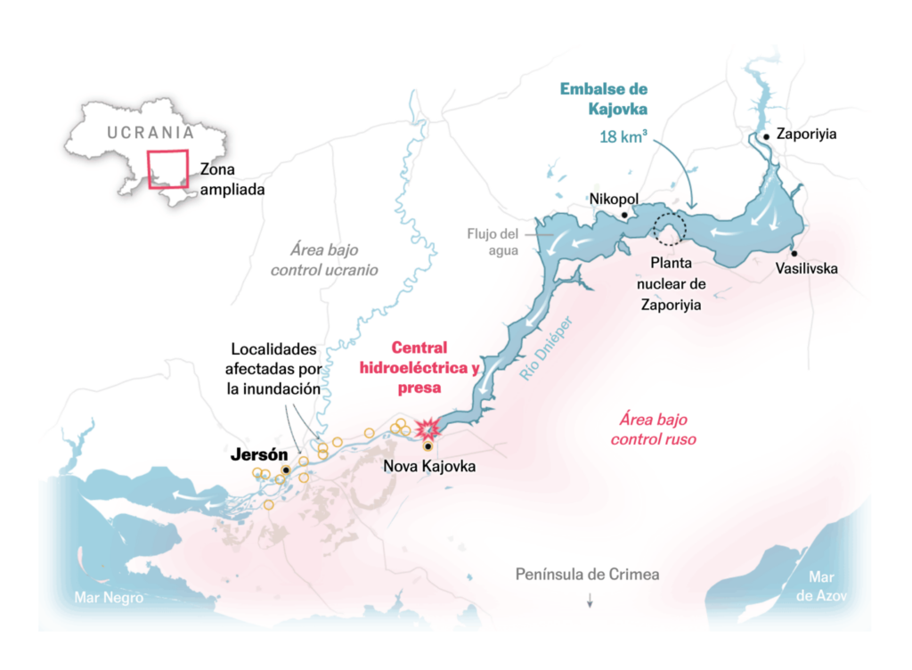
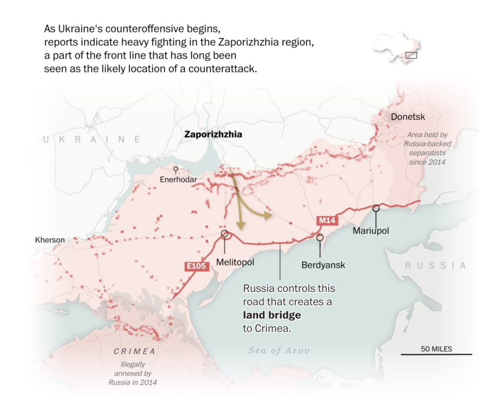
While fires have challenged North America, Ukraine battles huge amounts of water after the breach of the Kakhovka Dam last Tuesday. Many newsrooms mapped the massive flooding:
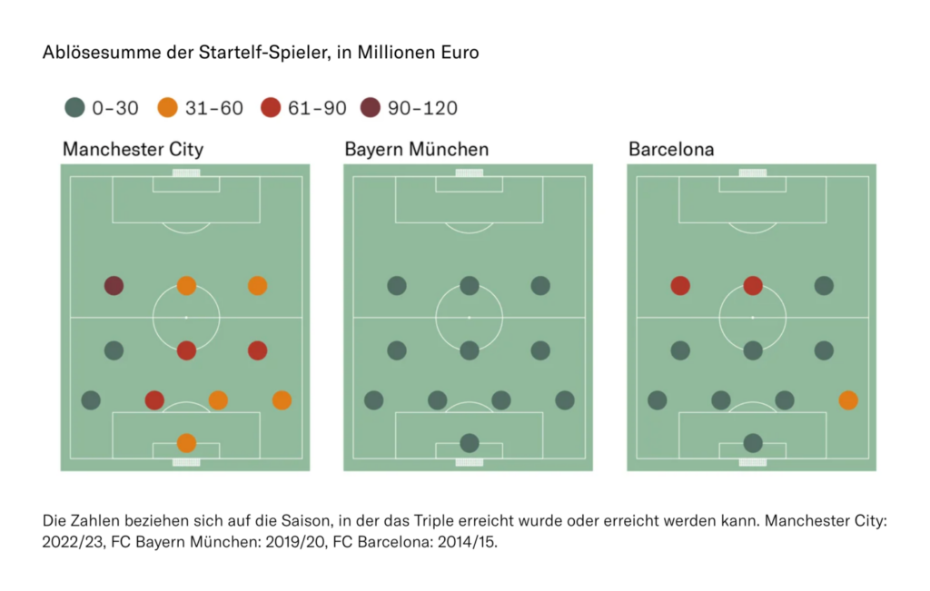
A more fun topic: Sports! The Champions League final was last weekend. Manchester City won, and newsrooms asked: How much money and transfers did they need to make that happen?
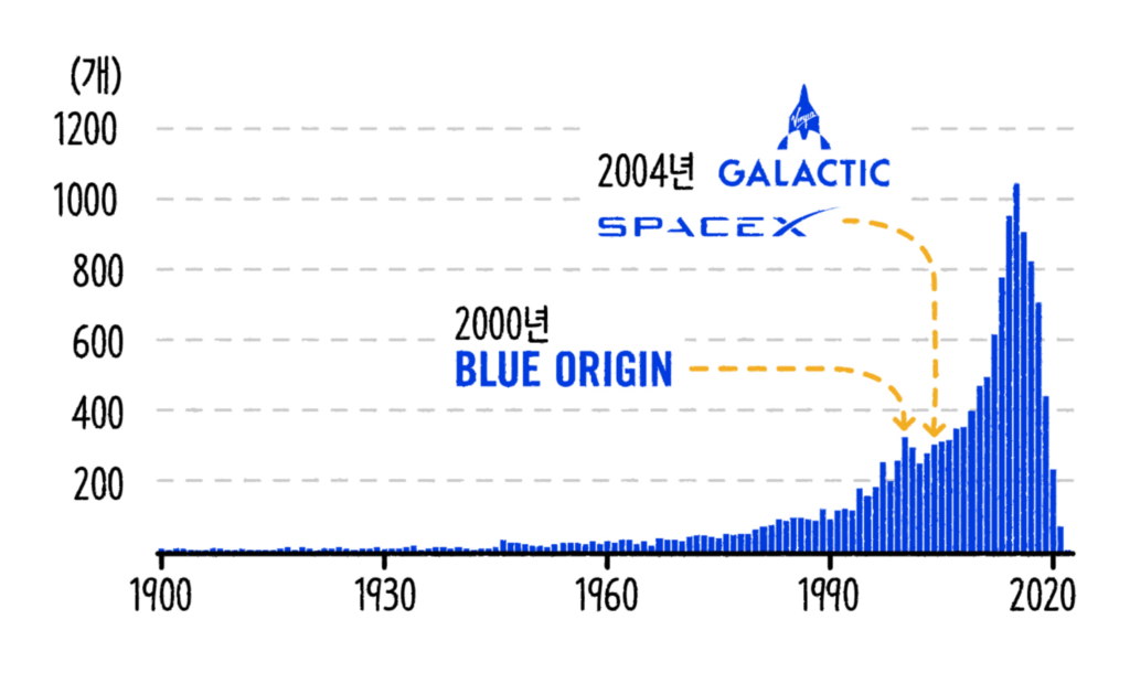
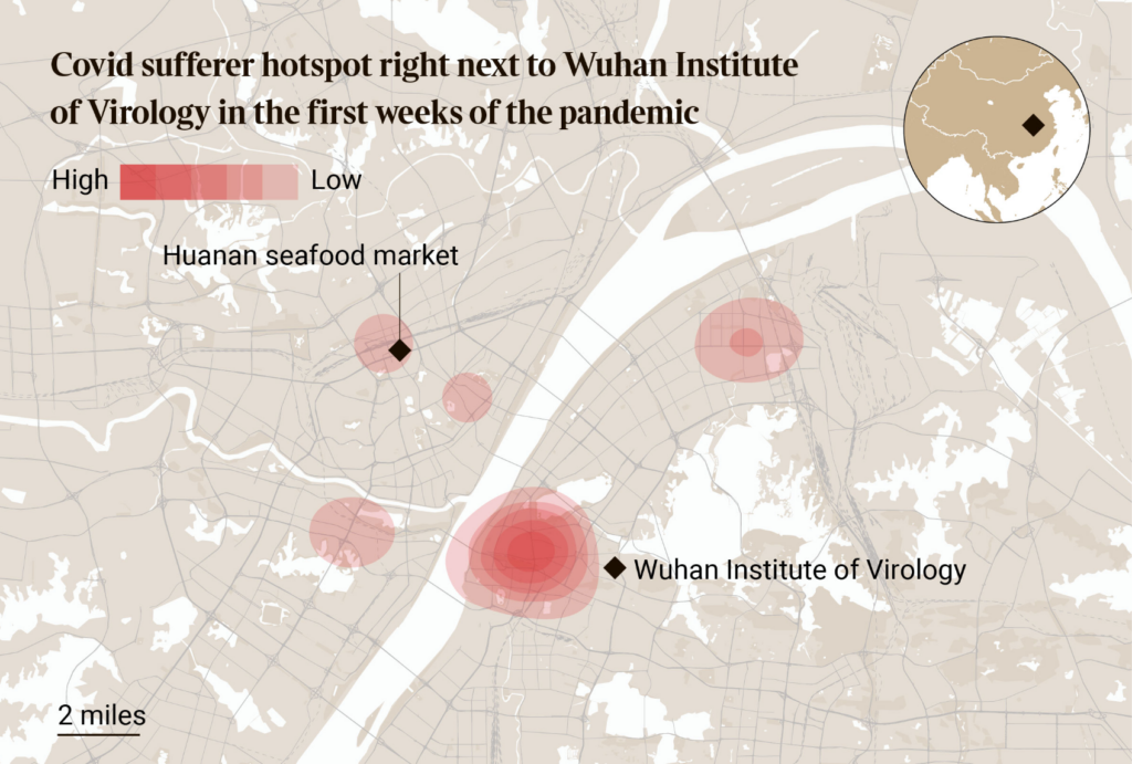
Last but not least, we find space endeavors, remote jobs, and a map of Wuhan in our miscellaneous section – and ZEIT Online tells us how much money we could have made by now with small savings (or still can in the future!):
Help us make this dispatch better! We’d love to hear which newsletters, blogs, or social media accounts we need to follow to learn about interesting projects, especially from less-covered parts of the world (Asia, South America, Africa). Write us at hello@datawrapper.de or leave a comment below.
(she/her, @lisacmuth, @lisacmuth@vis.social) is Datawrapper’s head of communications. She writes about best practices in data visualization and thinks of new ways to excite you about charts and maps. Lisa lives in Berlin.


Comments