We want to enable everyone to create beautiful charts, maps, and tables. New to data visualization? Or do you have specific questions about us? You'll find all the answers here.
The best of last week’s big and small data visualizations
Vivien Serve
Welcome back to the 147th edition of the Data Vis Dispatch! Every week, we publish a collection of the best small and large data visualizations we find, especially from news organizations — to celebrate data journalism, data visualization, simple charts, elaborate maps, and their creators.
Recurring topics this week are energy, electric vehicles, and the 2024 European Championships.
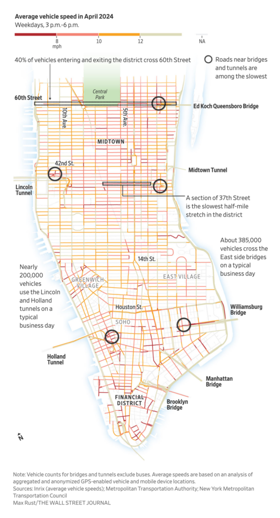
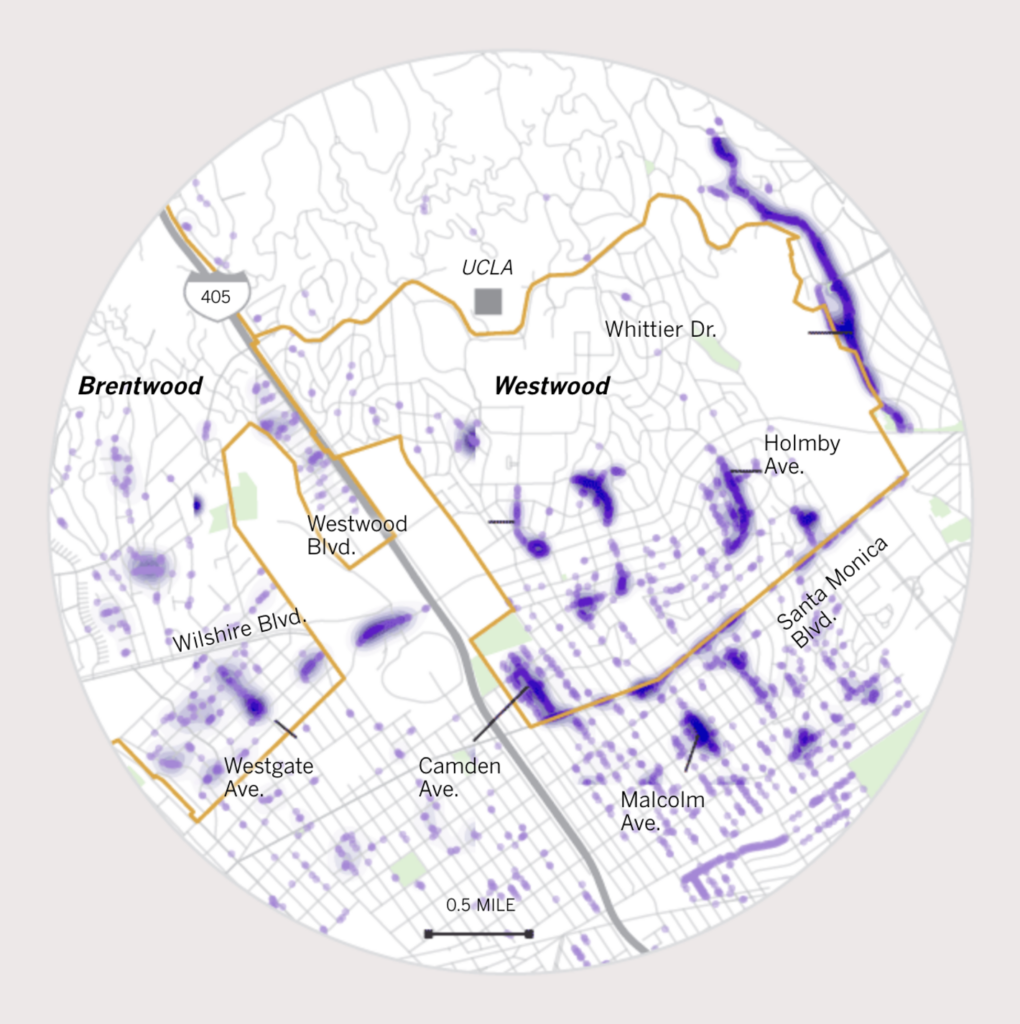
We begin this Dispatch with two detailed block-by-block street maps that almost remind us of Piet Mondrian:
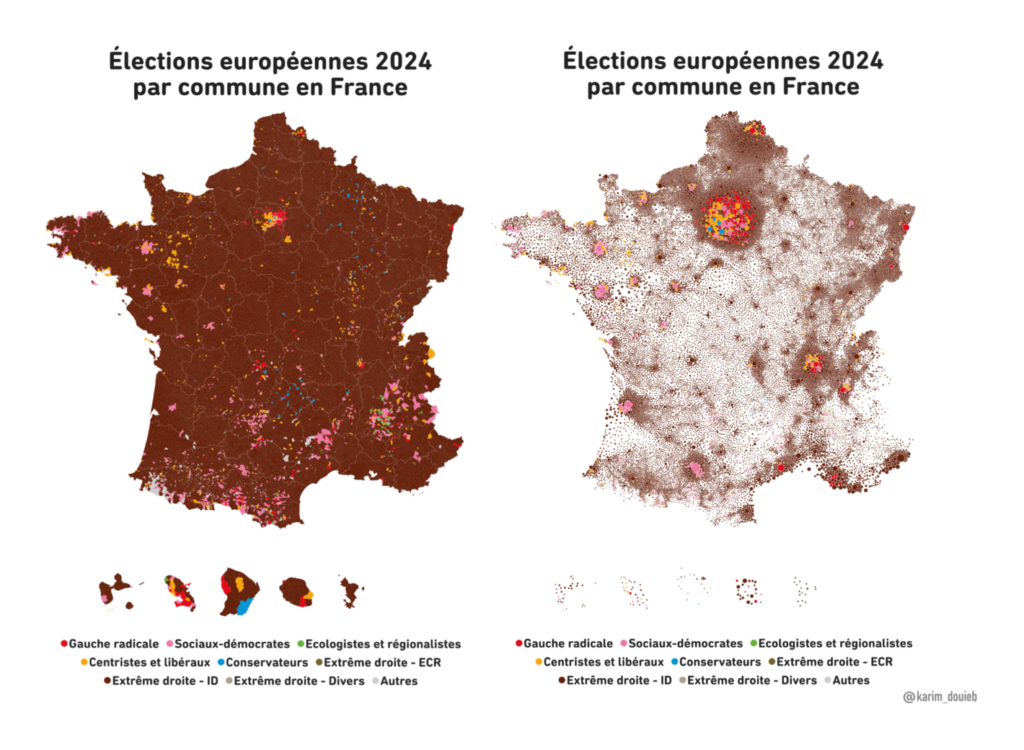
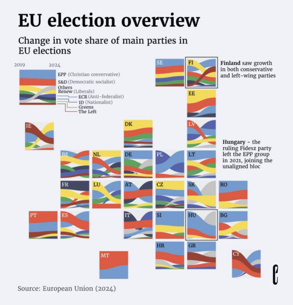
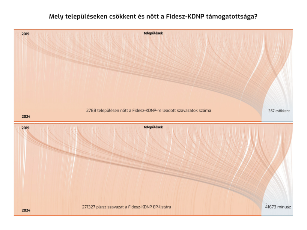
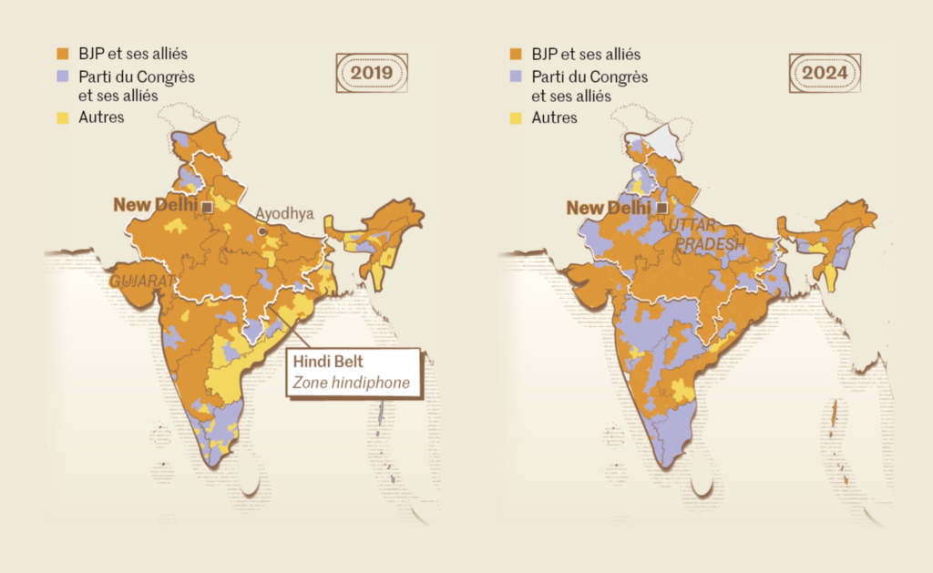
Visualizations about the European elections haven’t stopped. We found a critical analysis of the visualizations themselves, plus comparisons with the previous European elections of 2019:
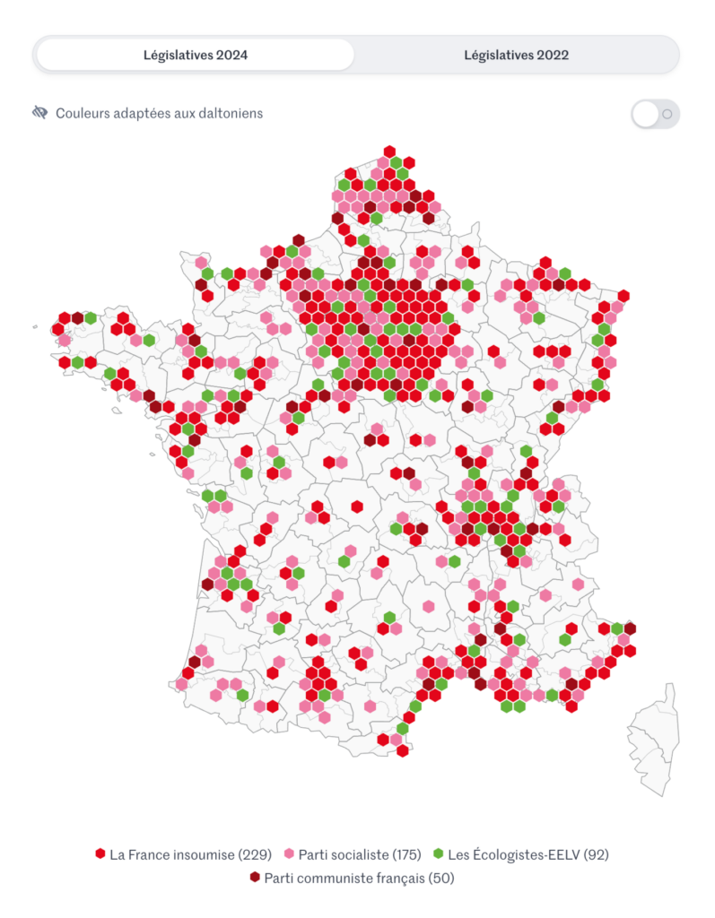
Karim Douïeb: “Land doesn’t vote, people do! French edition. Each municipality was transformed into a dot, with the area of the dot proportional to the number of voters, a more accurate representation of voting patterns. Nonetheless, right-wing support remains concerning,” June 12 (Tweet)Le Monde: European elections: the far right in force in the founding countries of the EU, June 13theeuropeancorrespondent: “What was the vote share like in your country? The 2024 EU elections are over. Although Europe broadly favored conservative to right-wing parties, there are national differences in the vote turnout. Some countries such as Finland or Lithuania have swung the opposite way, with increasing support for left-wing parties. Created by Sebastian Graeff,” June 17 (Instagram Post)Atlo: Orbán és Magyar alatt végleg összeomlott a baloldali-liberális ellenzék, June 12
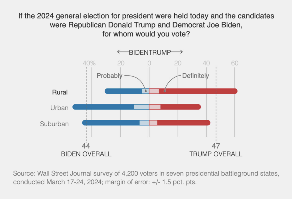
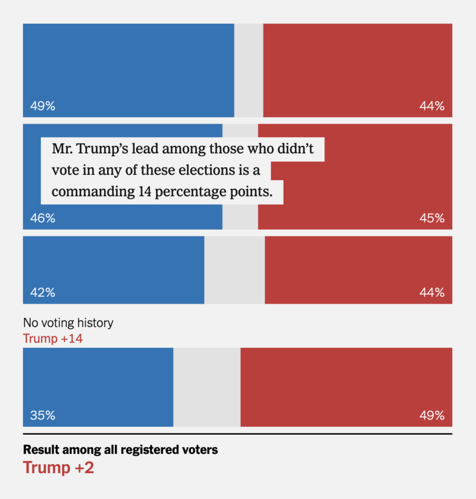
That’s not the end of elections this week — not nearly. Let’s continue with predictions about the upcoming U.S. elections:
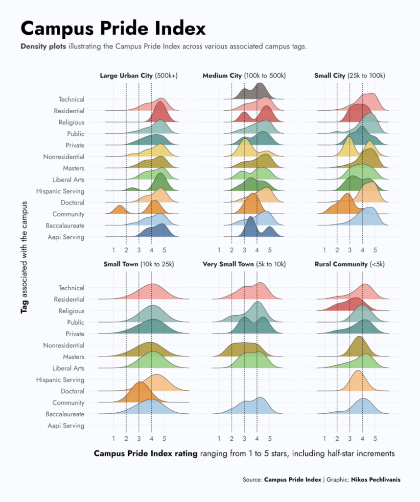
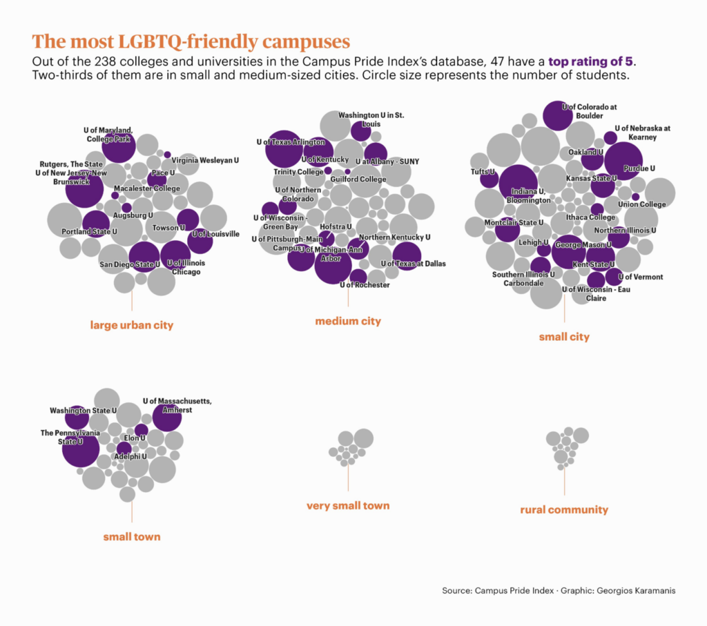
It’s still June, which means it’s Pride Month. This week’s #TidyTuesday provides data on campus pride:
Nikos Pechlivanis: “Campus Pride Index for this week’s #TidyTuesday challenge,” June 14 (Tweet)Georgios Karamanis: “Campus Pride Index for this week’s #TidyTuesday, testing out @EvaMaeRey’s very promising {ggcirclepack},” June 16 (Tweet)
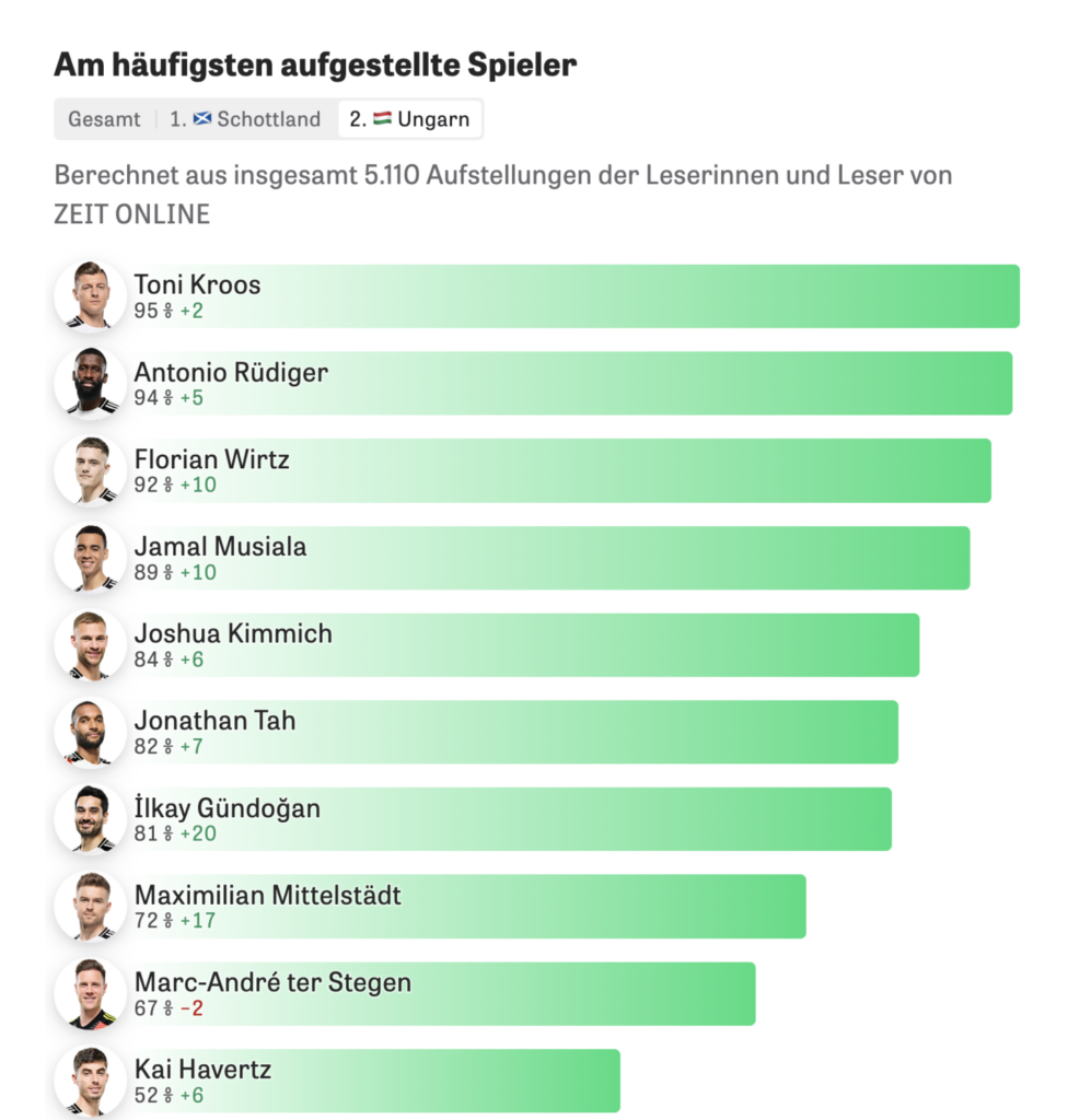
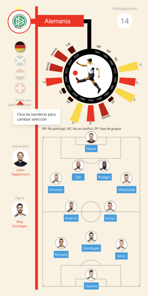
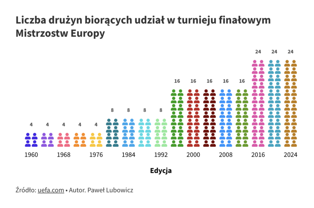
Whistles, rattles, and tubas are blowing, flags are waving: Euro 2024 has begun. The world of visualizations is full of fun, interactive charts that allow us to play coach for a moment:
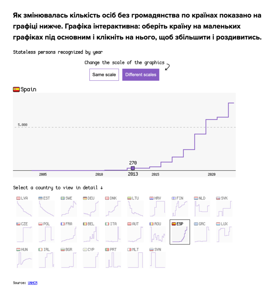
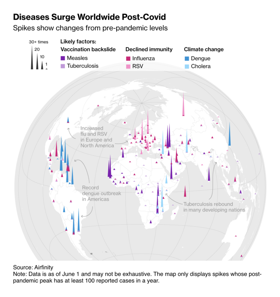
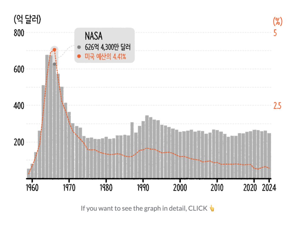
Drum roll for the miscellaneous section: Do you know what changes? Almost everything, including growing seasons, statelessness, diseases, and NASA’s budget:
Help us make this dispatch better! We’d love to hear which newsletters, blogs, or social media accounts we need to follow to learn about interesting projects, especially from less-covered parts of the world (Asia, South America, Africa). Write us at hello@datawrapper.de or leave a comment below.
(she/her) is a working student on Datawrapper’s Communications team. She creates the Data Vis Dispatch to keep data visualization enthusiasts up to date on exciting new projects. When she’s not working, she studies interface design, and when she’s not studying, she’s planning a festival stage or soldering light installations. Vivien lives in Potsdam.


Comments