We want to enable everyone to create beautiful charts, maps, and tables. New to data visualization? Or do you have specific questions about us? You'll find all the answers here.
The best of last week’s big and small data visualizations
Lisa Charlotte Muth
Welcome back to the 98th edition of Data Vis Dispatch! Every week, we’ll be publishing a collection of the best small and large data visualizations we find, especially from news organizations — to celebrate data journalism, data visualization, simple charts, elaborate maps, and their creators.
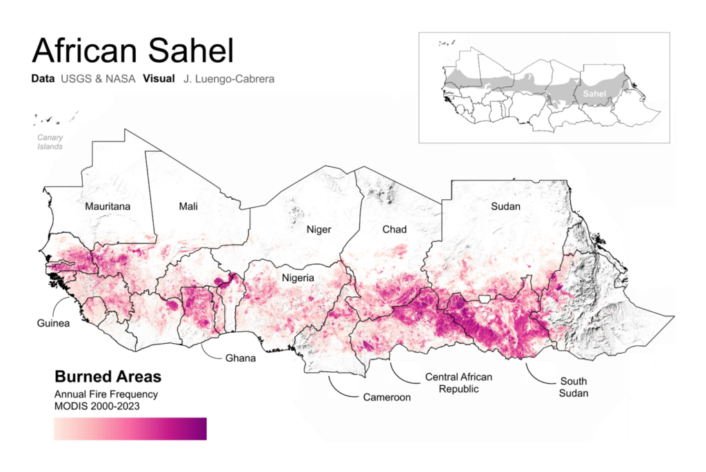
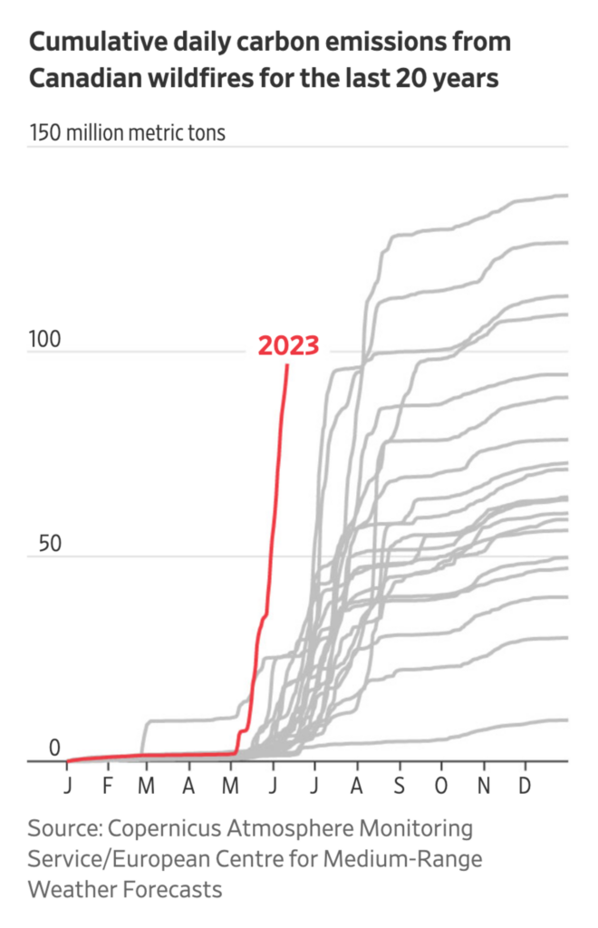
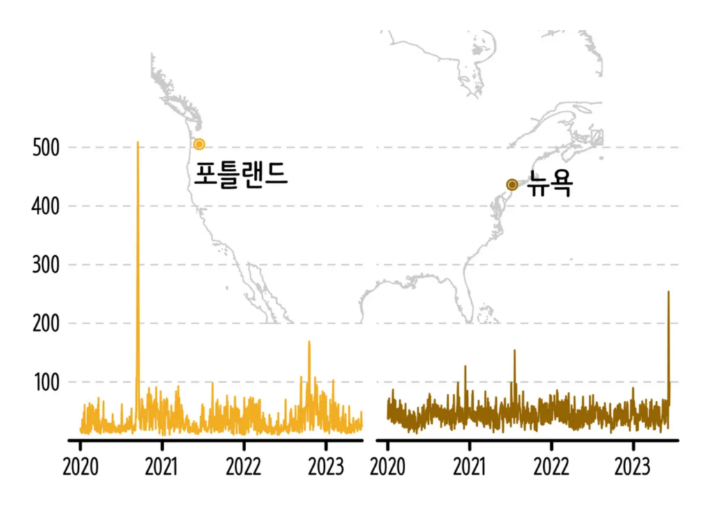
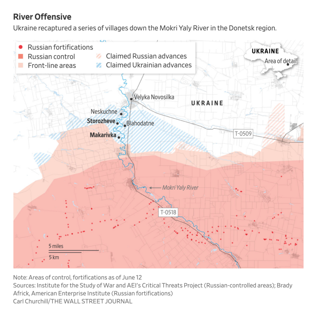
Recurring topics this week include heat records, wildfires, and the war in Ukraine:
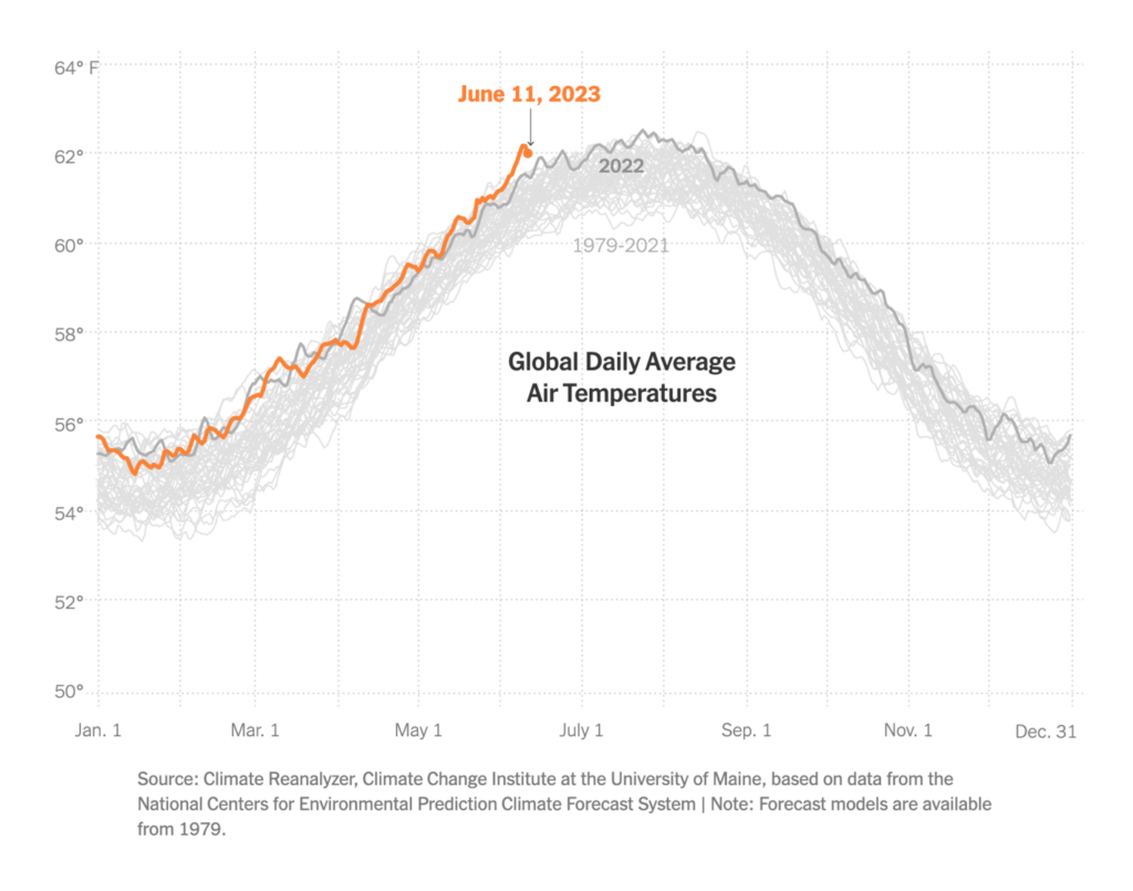
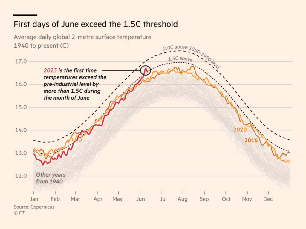
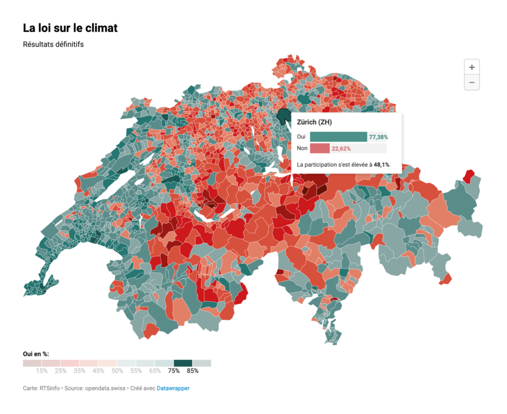
It’s summer in the northern hemisphere, and we all know what that means: We’ll see lots of beautiful charts of awful heat records in the next months. Our climate section starts with two:
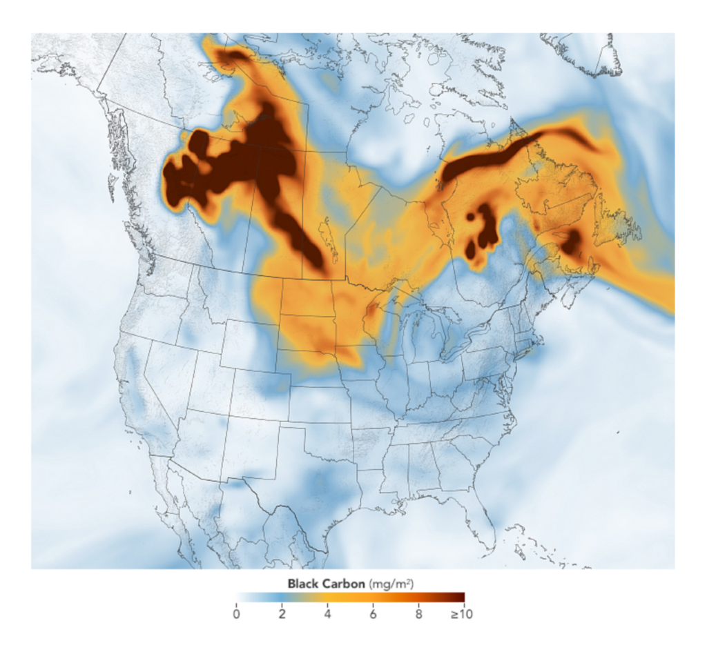
“There’s something in the air” – the following maps visualize carbon dioxide and nitrogen dioxide emissions. Make sure to check out the whole fascinating video on the NASA website:
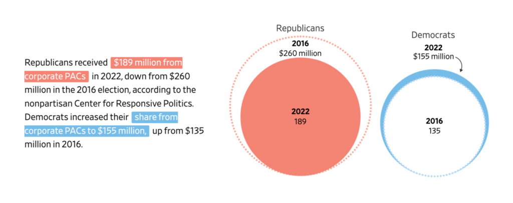
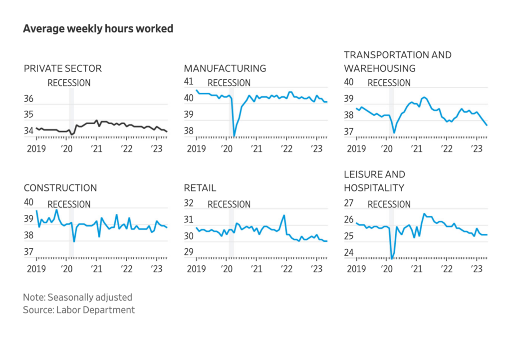
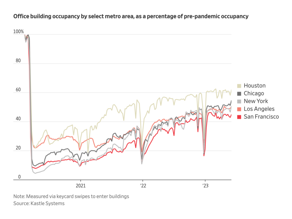
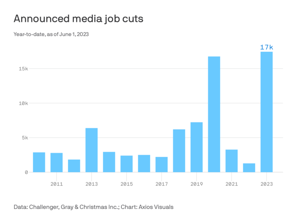
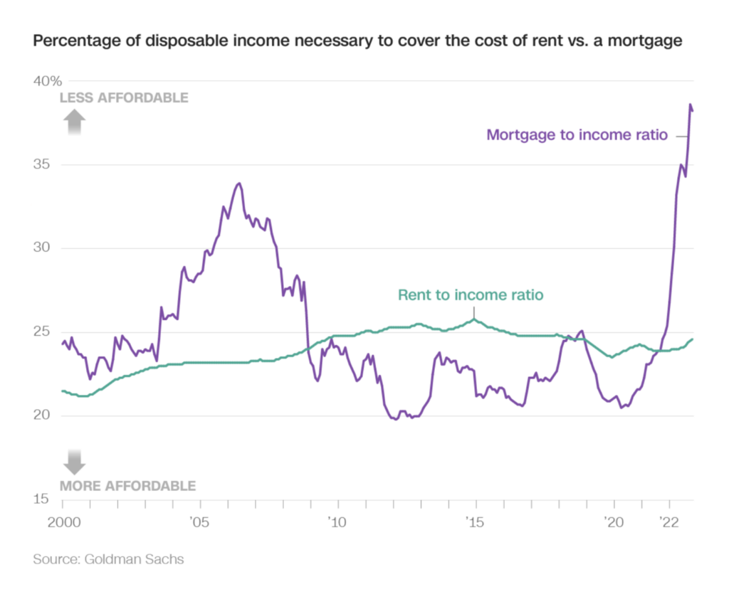
Our next section could be called “Very Simple Charts That Show How the Economy Is Doing”. They communicate empty downtowns, workers moving, jobs cut, and fewer bought houses. (For more visually exciting visualizations, simply skip this section.)
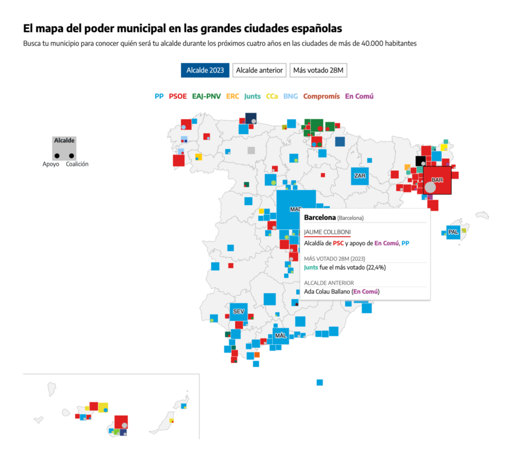
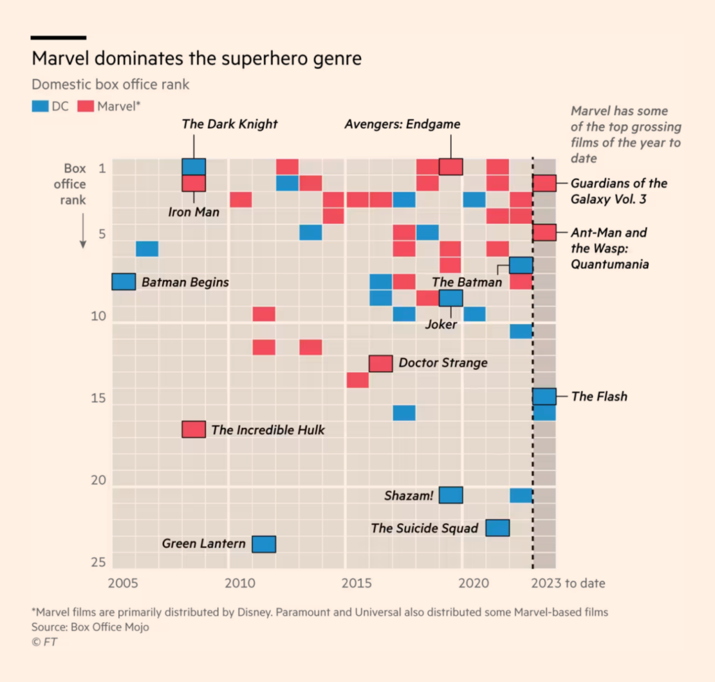
And last but not least: our miscellaneous section! This week, it’s dominated by charts about culture, be it Marvel movies or Rammstein lyrics. And Les Echos ask: Where is it faster to go from Paris by car – and where by train?
Help us make this dispatch better! We’d love to hear which newsletters, blogs, or social media accounts we need to follow to learn about interesting projects, especially from less-covered parts of the world (Asia, South America, Africa). Write us at hello@datawrapper.de or leave a comment below.
(she/her, @lisacmuth, @lisacmuth@vis.social) is Datawrapper’s head of communications. She writes about best practices in data visualization and thinks of new ways to excite you about charts and maps. Lisa lives in Berlin.


Comments