Data Vis Dispatch, June 20

The best of last week’s big and small data visualizations

Welcome back to the 98th edition of Data Vis Dispatch! Every week, we’ll be publishing a collection of the best small and large data visualizations we find, especially from news organizations — to celebrate data journalism, data visualization, simple charts, elaborate maps, and their creators.

Recurring topics this week include heat records, wildfires, and the war in Ukraine:

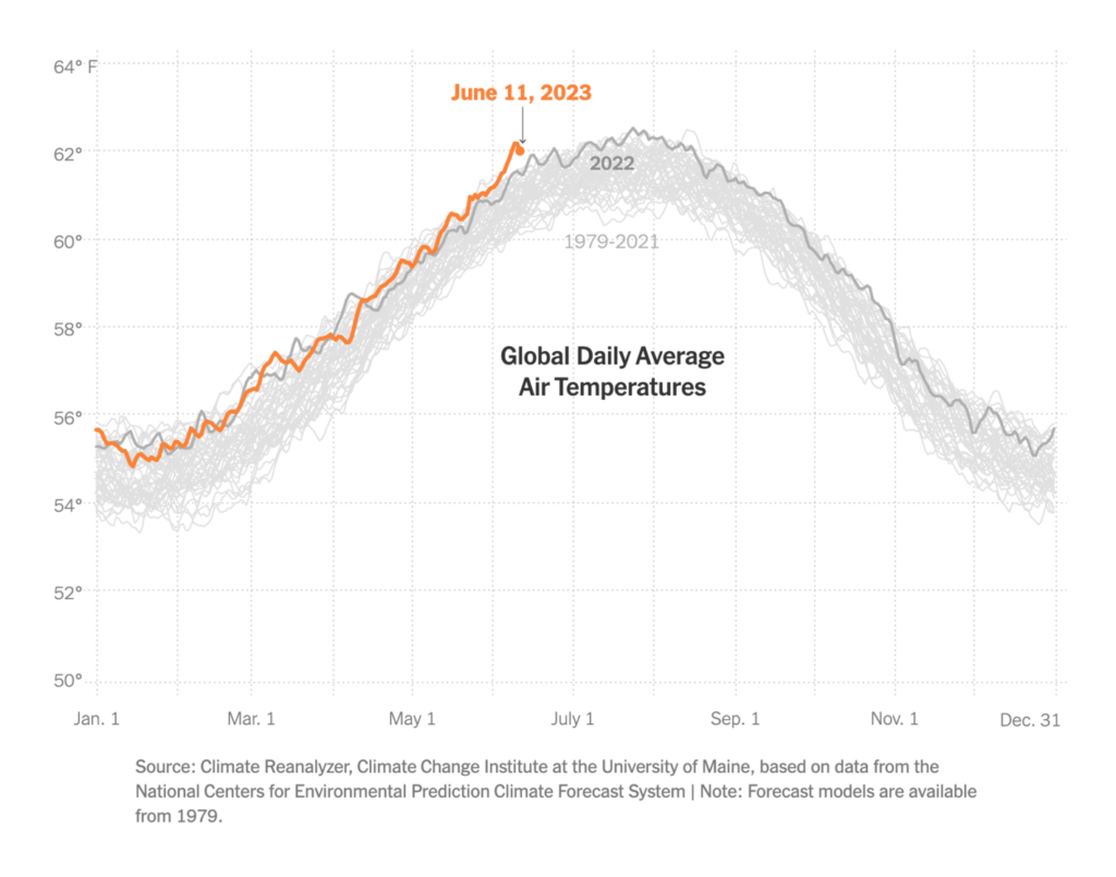
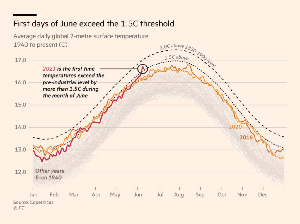
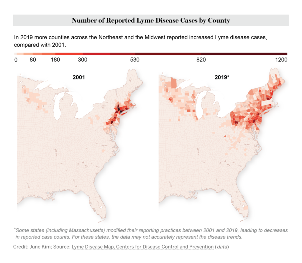
It’s summer in the northern hemisphere, and we all know what that means: We’ll see lots of beautiful charts of awful heat records in the next months. Our climate section starts with two:

The New York Times: Here’s How Much Hotter Than Normal This June Has Been, June 13
Financial Times: Climate graphic of the week: first days of June bring record heat, June 17
ZEIT Online: Wo die Erde so gut wie unbewohnbar wird, June 19
Le Monde: A Tignes, la fonte du glacier met le « ski business » en sursis, June 14
Berliner Morgenpost: Ist das Wetter noch normal?, June 13

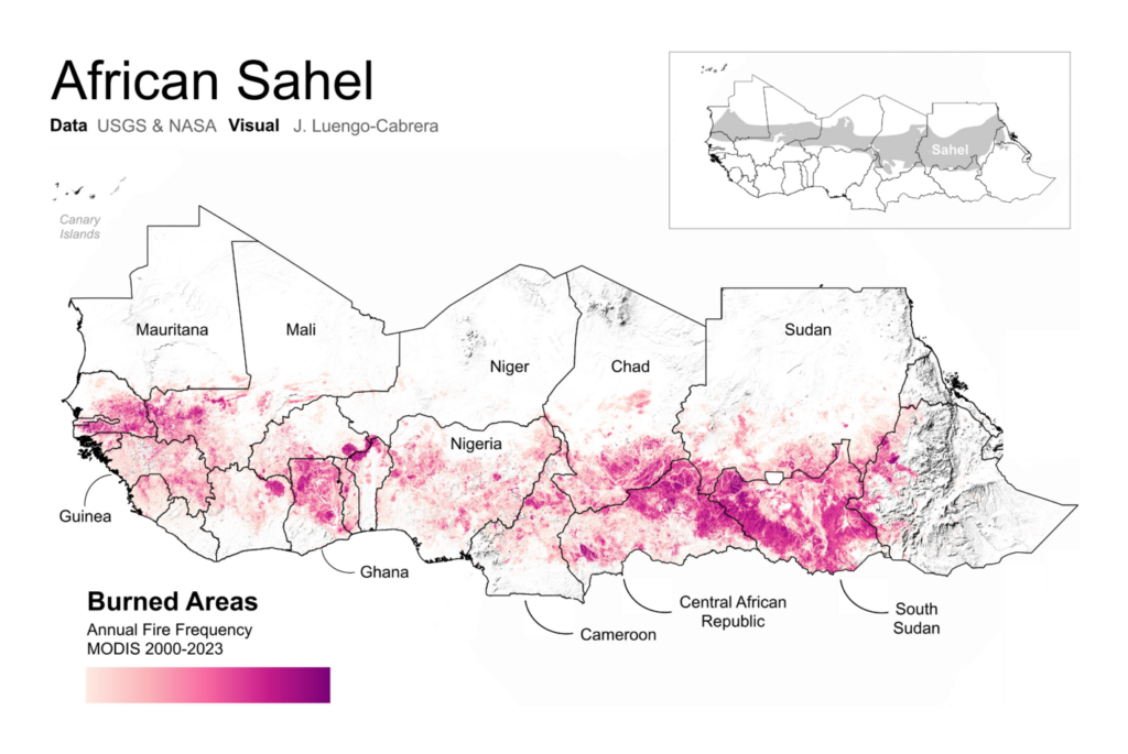
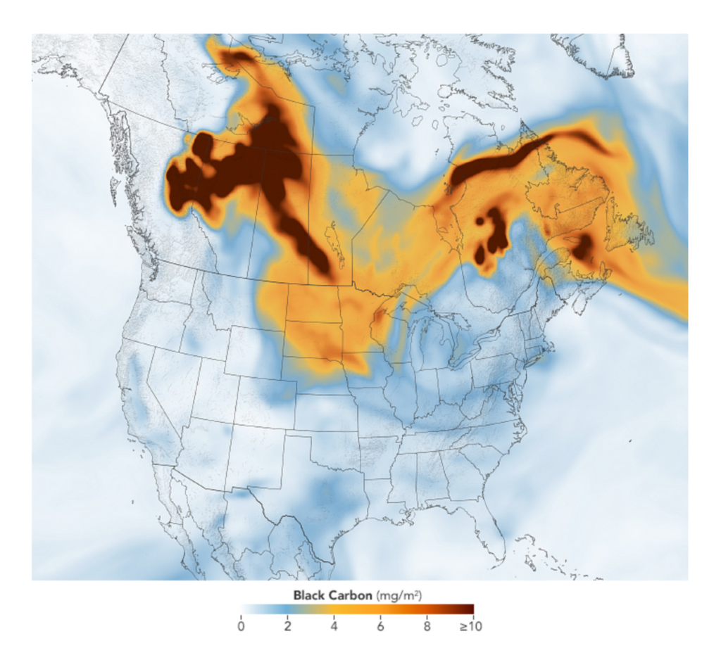
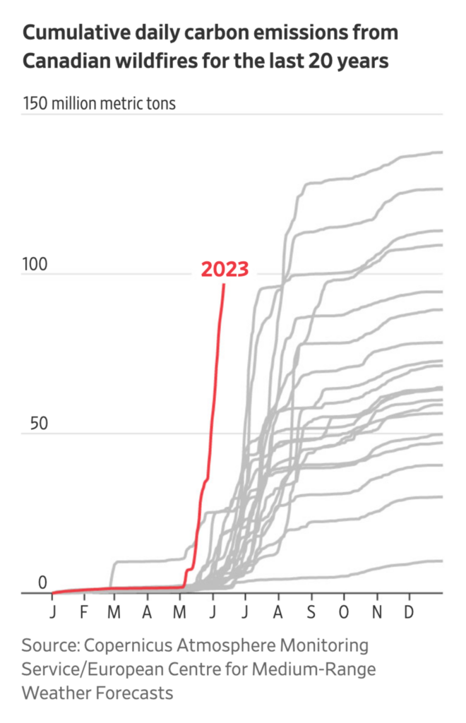
It’s always wildfire season somewhere, as NASA shows us. While Canadian fires breaks records, the season in Germany starts slow:

NASA Scientific Visualization Studio: Active Fires As Observed by VIIRS, 2022-Present, June 15
José Luengo-Cabrera: “African Sahel: burned areas. Data: @USGS & @NASA,” June 19 (Tweet)
SPIEGEL: Deutschland wird Waldbrandgebiet, June 20
NASA Earth: Smoke Blankets the Upper Midwest, June 16 (“This map shows the density of black carbon particles—or soot—in the smoke, which can be hazardous for human health.”, Tweet)
The Wall Street Journal: Canadian Fires Signal New Frontier in Climate Change, June 13
SBS: 캐나다 산불이 뉴욕 시민에게 미치는 영향은?, June 16

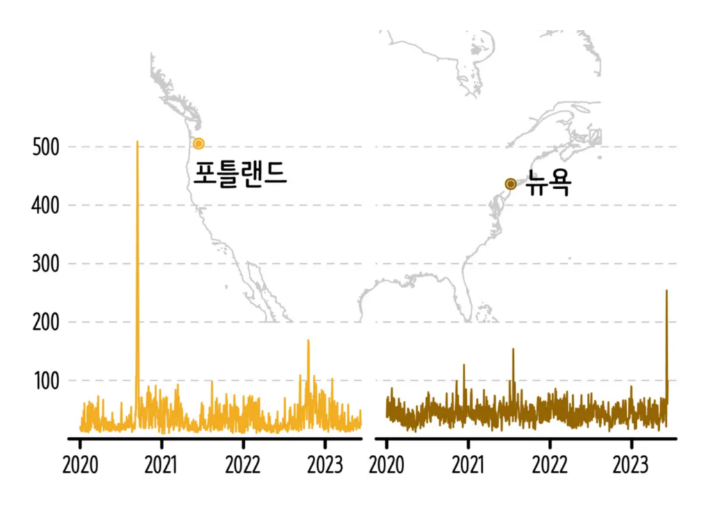
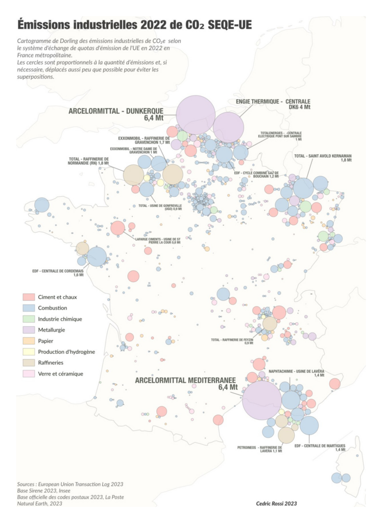
“There’s something in the air” – the following maps visualize carbon dioxide and nitrogen dioxide emissions. Make sure to check out the whole fascinating video on the NASA website:

NASA Scientific Visualization Studio: Atmospheric Carbon Dioxide Tagged by Source, June 16
Cedric Rossi: Émissions 2005-2022 de CO2 SEQE-UE en France métropolitaine, June 16 (Tweet)
Financial Times: Europe’s port cities ‘choking on toxic air’ from cruise ships, June 15

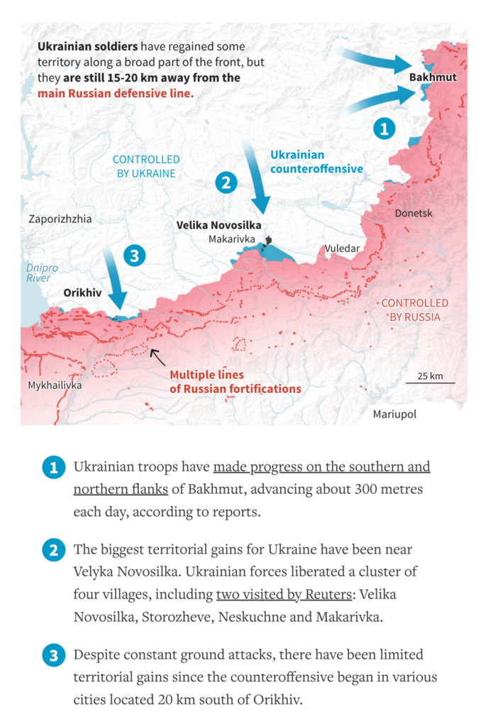
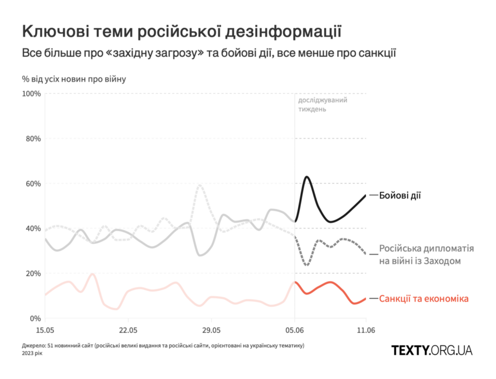
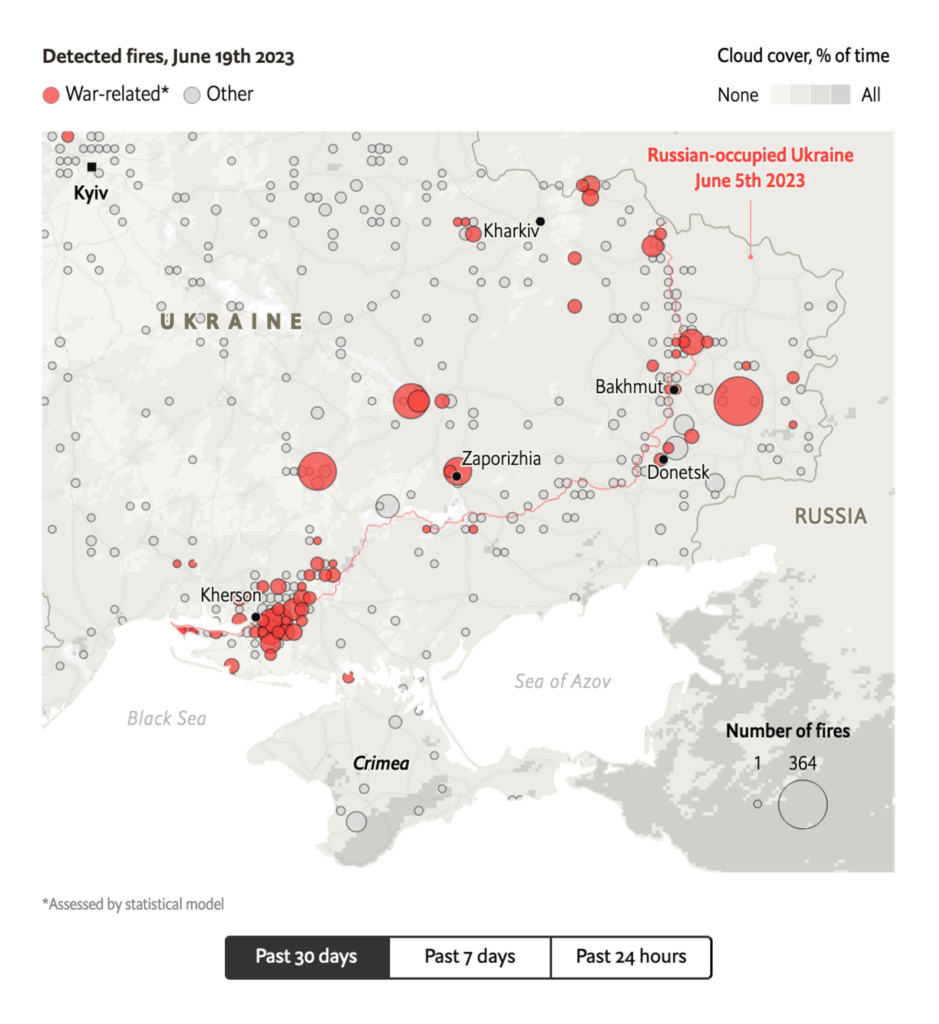
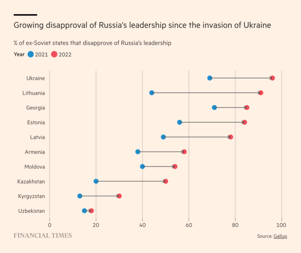
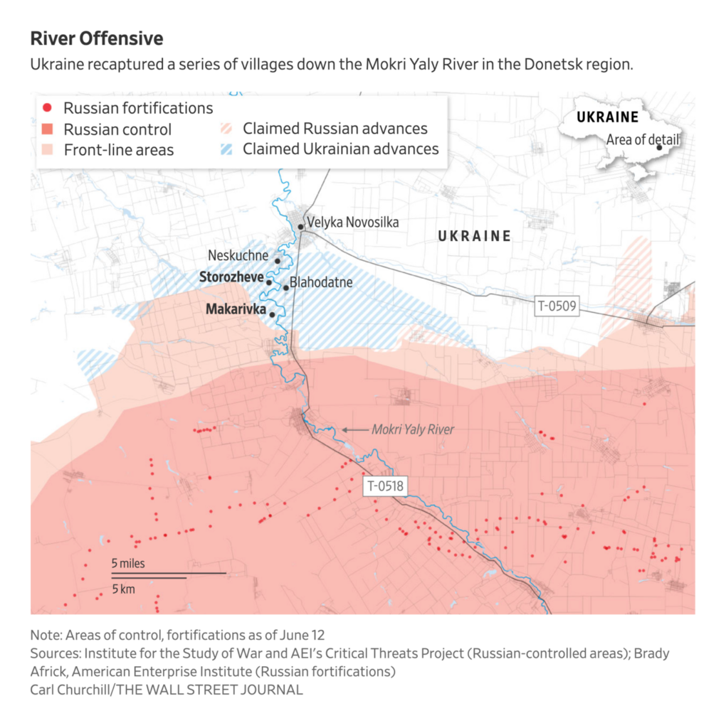
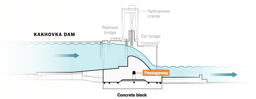
As Ukraine has begun its counterattacks, we’ve seen more charts and maps of the war in recent days and weeks:

Reuters: Mapping Ukraine’s counteroffensive, June 16
TEXTY.ORG.UA: Про Каховську ГЕС і контрнаступ. Моніторинг росЗМІ за 5–11 червня 2023 року, June 15
The Economist: Tracking the Ukraine war: where is the latest fighting?, June 16
Financial Times: Disapproval of Russia in former Soviet states is rising, June 16
The Wall Street Journal: ‘Just the Beginning’: Hardened Ukrainian Units Go on Attack in Country’s East, June 13

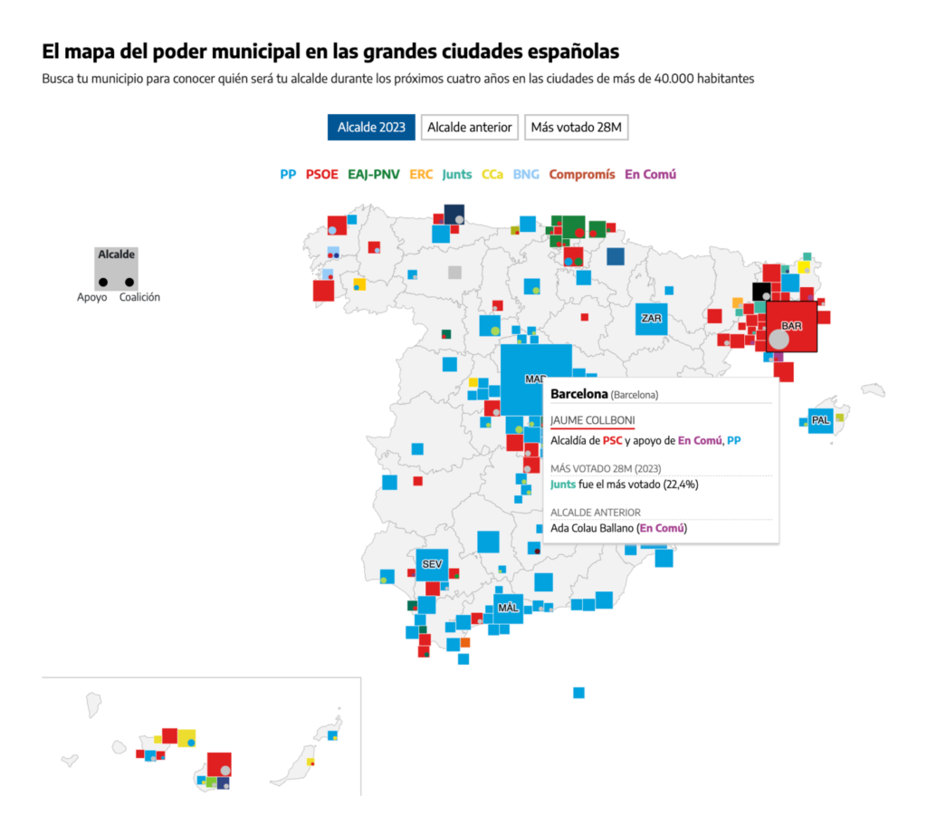
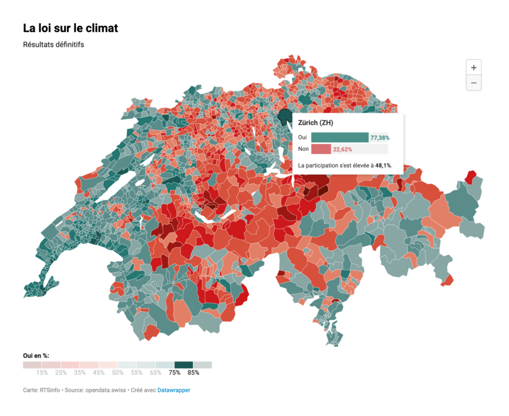
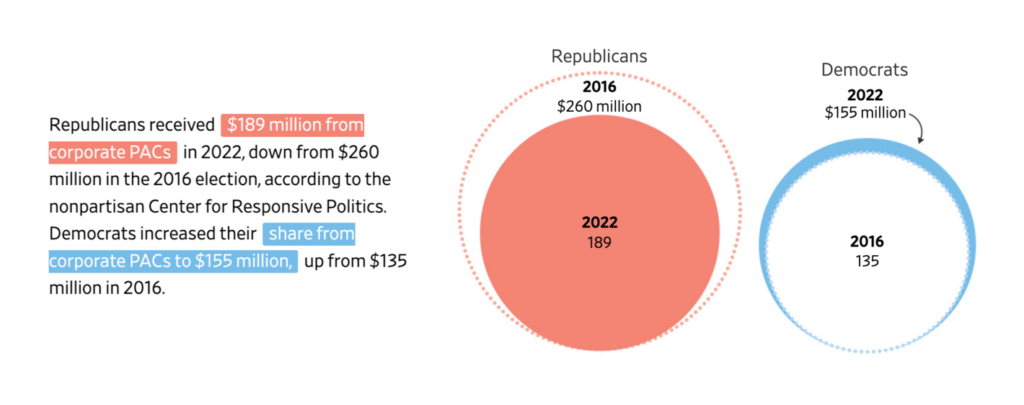
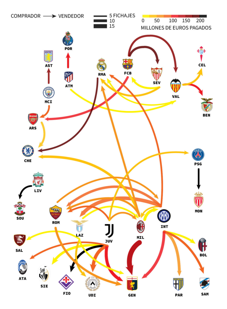
Investigations, party control, elections, referendums, donations – this week’s political visualizations have it all:

The New York Times: See How the G.O.P. Has Reacted to the Trump Indictment, June 16
The Wall Street Journal: A State-by-State Guide to Abortion Access in the U.S., June 17
elDiario.es: El nuevo mapa del poder municipal: consulta los nuevos alcaldes y los pactos en las grandes ciudades, June 16
RTS: Les cartes des résultats des votations fédérales, commune par commune, June 18
The Wall Street Journal: How Republicans and Big Business Broke Up, June 14

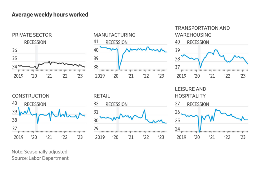
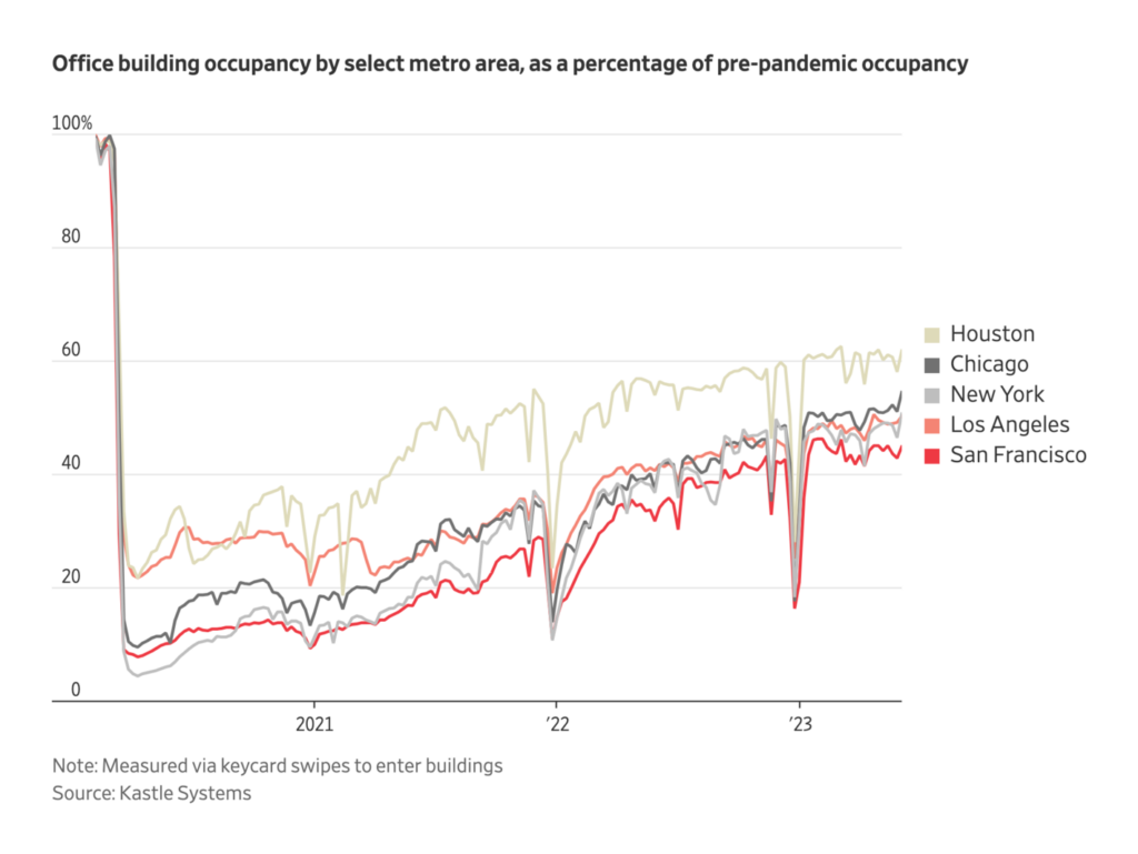
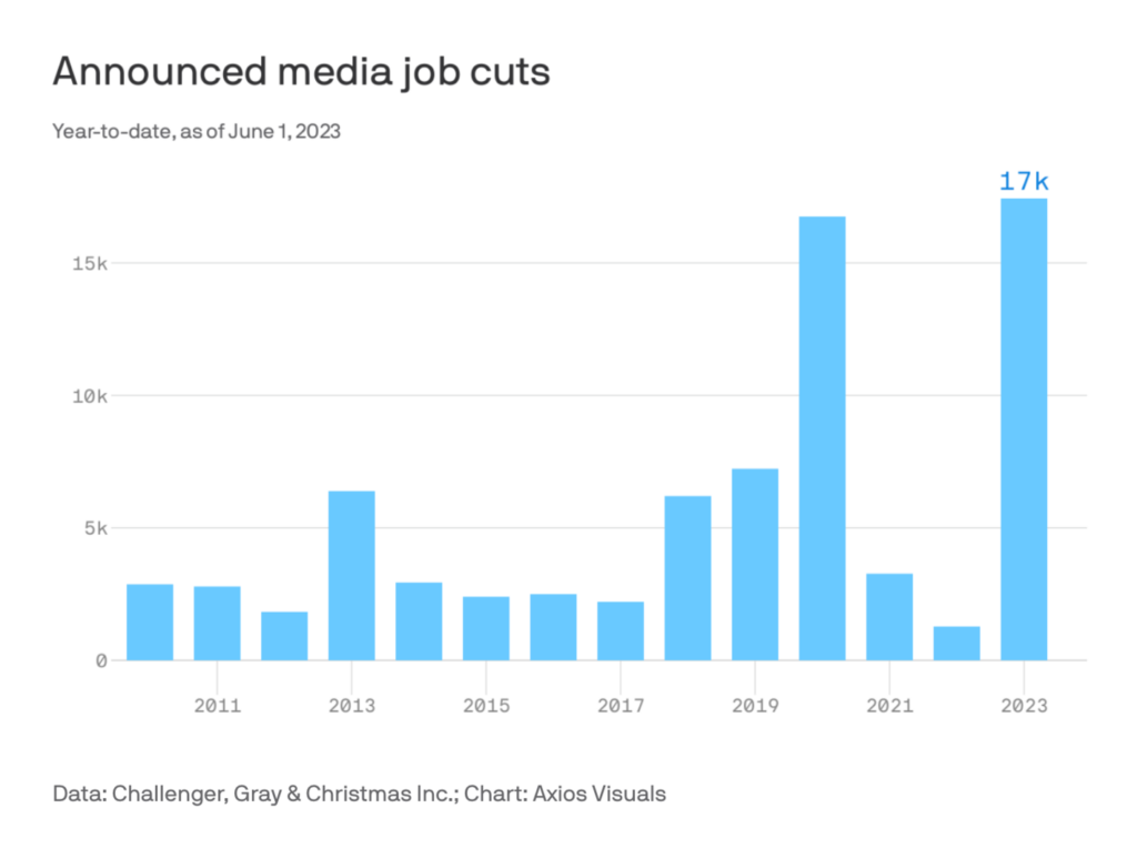
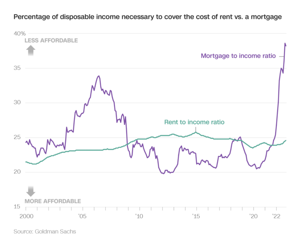
Our next section could be called “Very Simple Charts That Show How the Economy Is Doing”. They communicate empty downtowns, workers moving, jobs cut, and fewer bought houses. (For more visually exciting visualizations, simply skip this section.)

The New York Times: The Places Most Affected by Remote Workers’ Moves Around the Country, June 17
The Wall Street Journal: Lots of Hiring, but Not So Much Working, June 18
The Wall Street Journal: Wall Street Sours on America’s Downtowns, June 20
Axios: Axios Media Trends, June 13
The New York Times: May Inflation ReportInflation Continues to Cool, Offering Relief to Consumers, June 13
CNN: Buying a house is the hardest it’s been in nearly 30 years, June 17

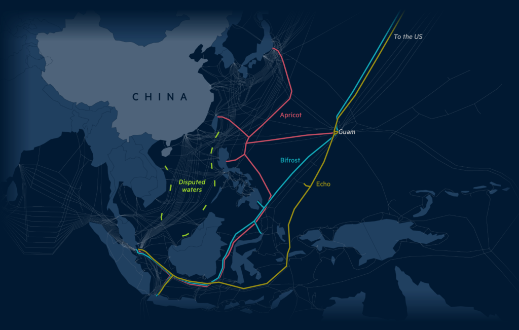
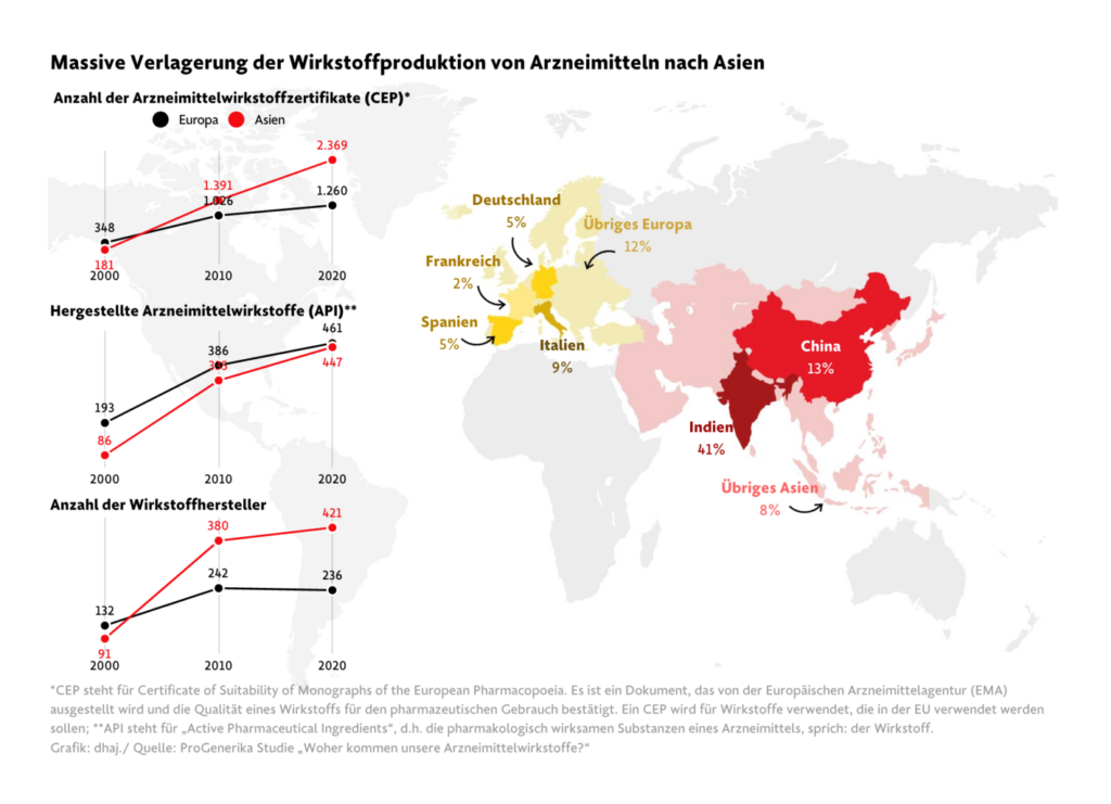
Let’s move on to maps about a globalized world:

Financial Times: How the US is pushing China out of the internet’s plumbing, June 13
Frankfurter Allgemeine Zeitung: Von protestierenden Apothekern und schwindenden Chancen , June 19
The Wall Street Journal: Migrants’ Perilous Route to Europe Is at Its Busiest—and Deadliest—in Years, June 15

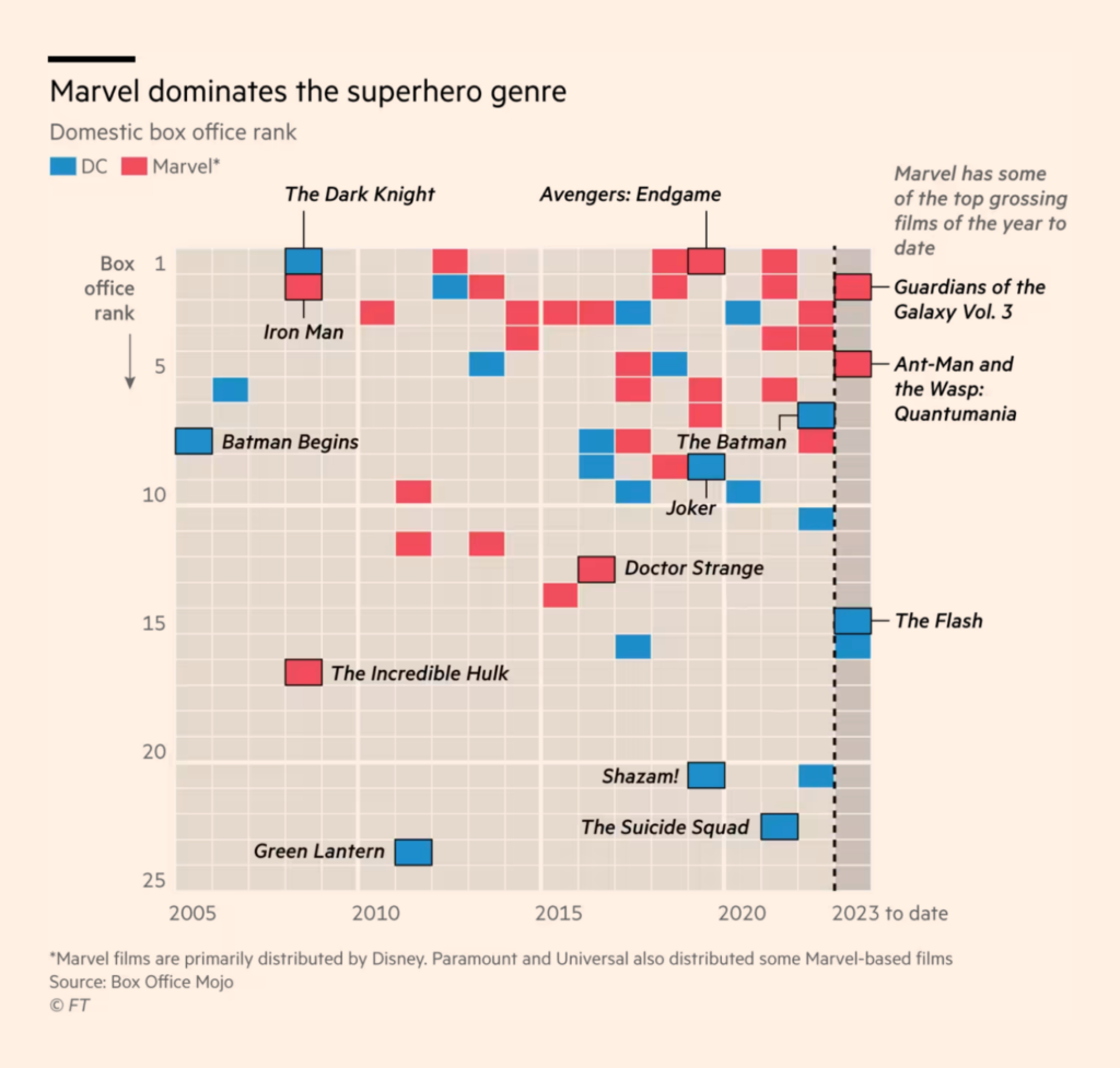
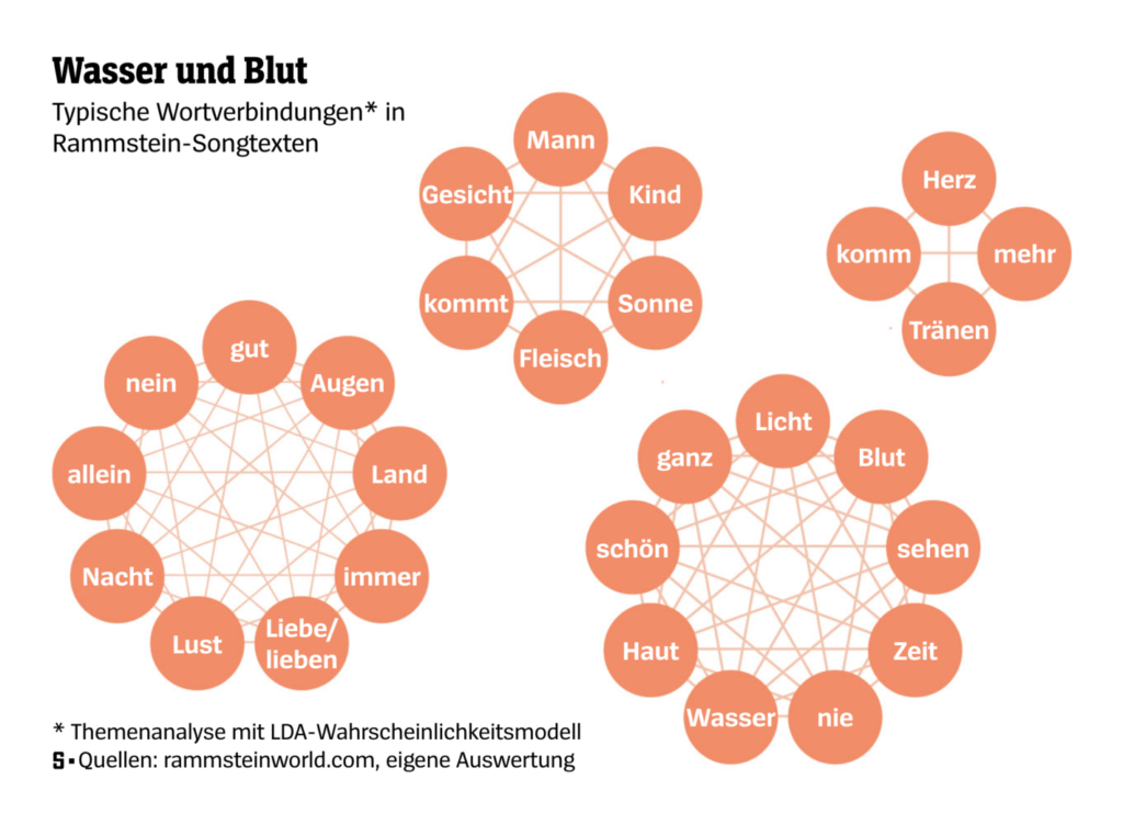
And last but not least: our miscellaneous section! This week, it’s dominated by charts about culture, be it Marvel movies or Rammstein lyrics. And Les Echos ask: Where is it faster to go from Paris by car – and where by train?

Financial Times: Elemental’s poor sales add to fears that Disney’s Pixar has lost its touch, June 18
SPIEGEL: Wie viel Gewalt steckt in Rammsteins Texten?, June 13
Les Echos: Train ou voiture ? Explorez l’option la plus rapide et la moins polluante pour partir en vacances, June 16
Scientific American: How to Protect Yourself from Ticks and the Dangerous Diseases They Spread, June 14
Fútbol Innecesario: El Rincón del Vago de los grandes de Europa, June 14

What else we found interesting

Reuters: How the train crash in eastern India unfolded, June 14
The New York Times: Decoding the Antiwar Messages of Miniature Protesters in Russia, June 16
Financial Times: Which flying taxi will take off first?, June 14
The New York Times: Why the Evidence Suggests Russia Blew Up the Kakhovka Dam, June 16

Help us make this dispatch better! We’d love to hear which newsletters, blogs, or social media accounts we need to follow to learn about interesting projects, especially from less-covered parts of the world (Asia, South America, Africa). Write us at hello@datawrapper.de or leave a comment below.

Want the Dispatch in your inbox every Tuesday? Sign up for our Blog Update newsletter!

Comments