Data Vis Dispatch, February 18: German election polls, corruption, and tariffs
February 18th, 2025
9 min
Datawrapper lets you show your data as beautiful charts, maps or tables with a few clicks. Find out more about all the available visualization types.
Our mission is to help everyone communicate with data - from newsrooms to global enterprises, non-profits or public service.
We want to enable everyone to create beautiful charts, maps, and tables. New to data visualization? Or do you have specific questions about us? You'll find all the answers here.
Data vis best practices, news, and examples
250+ articles that explain how to use Datawrapper
Answers to common questions
An exchange place for Datawrapper visualizations
Attend and watch how to use Datawrapper best
Learn about available positions on our team
Our latest small and big improvements
Build your integration with Datawrapper's API
Get in touch with us – we're happy to help
This article is brought to you by Datawrapper, a data visualization tool for creating charts, maps, and tables. Learn more.
The best of last week’s big and small data visualizations
Welcome back to the 99th edition of Data Vis Dispatch! Every week, we’ll be publishing a collection of the best small and large data visualizations we find, especially from news organizations — to celebrate data journalism, data visualization, simple charts, elaborate maps, and their creators.
Recurring topics this week include an attempted coup in Russia, one year without abortion rights in America, and boats lost at sea.
A lot has happened this week! We’ll take it one topic at a time. First up: the sinking of a submersible as it attempted to tour the wreck of the Titanic.
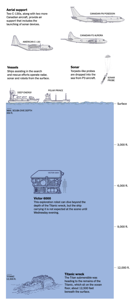


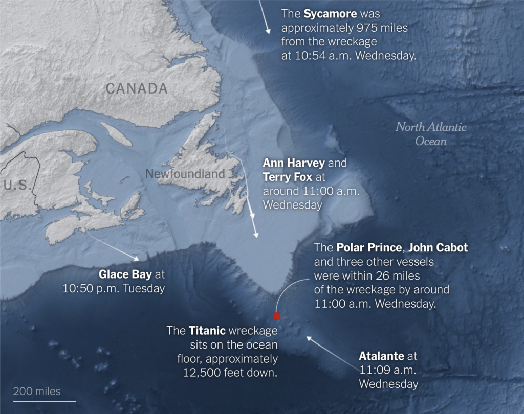
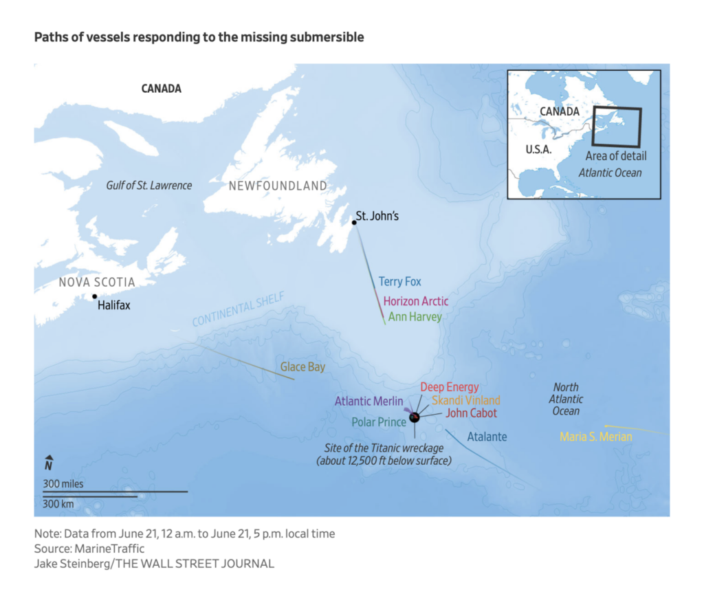
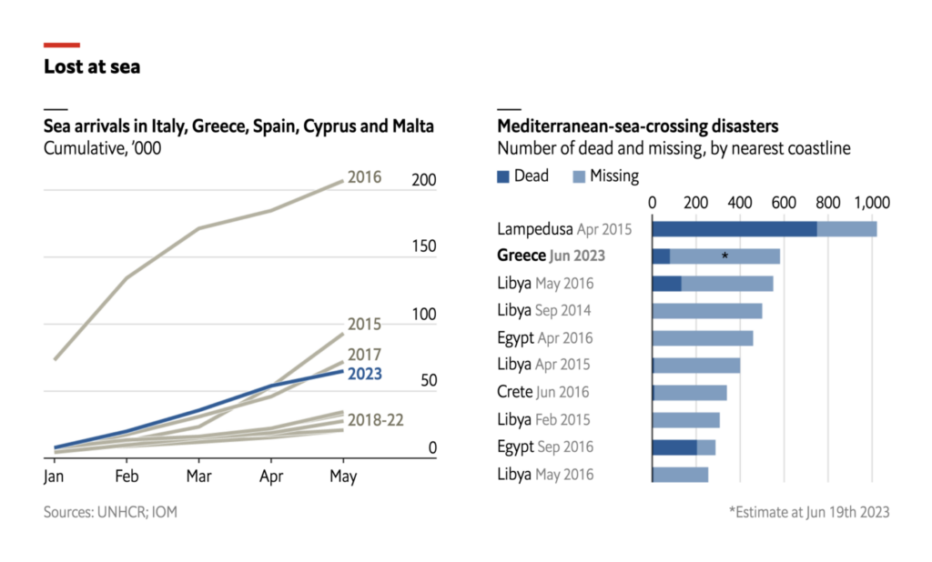
Another disaster at sea resulted in deaths of as many as 600 people bound for Italy from Libya:
Over the weekend, Wagner forces briefly took over the Russian city of Rostov-on-Don and came within 200 km of Moscow in an apparent attempted coup:
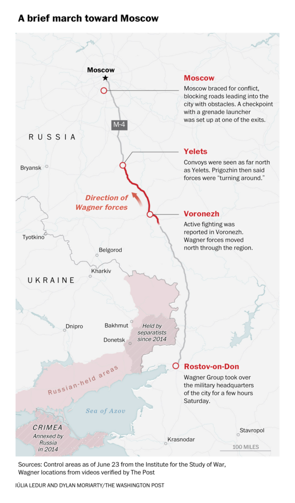

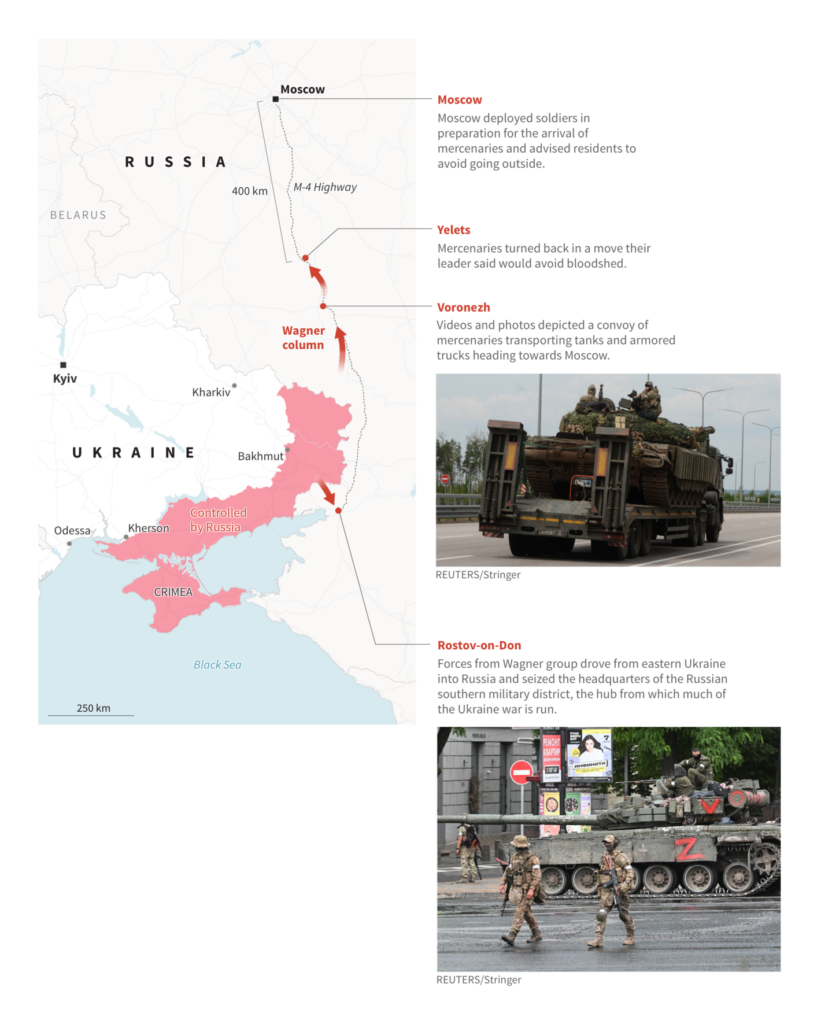
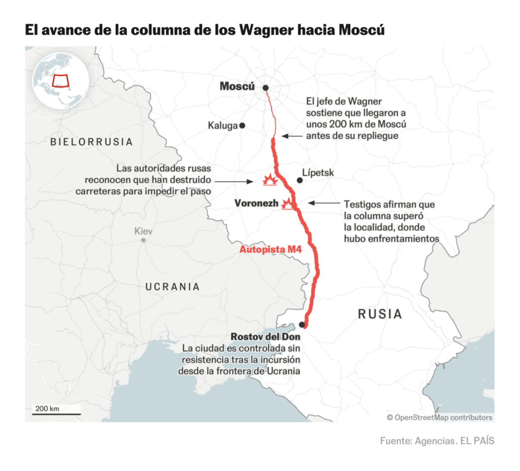
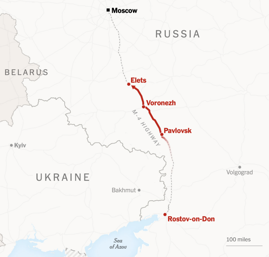
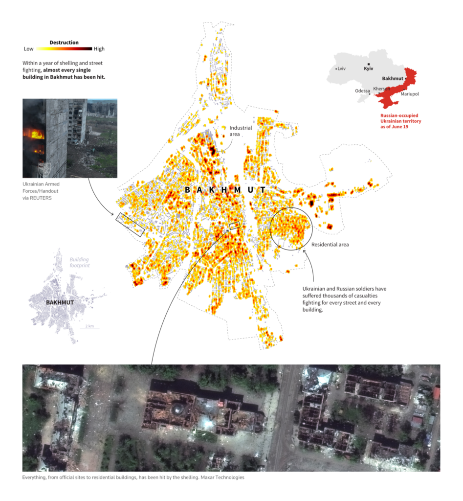
In other news of the war — Russian casualties, the destruction of Bakhmut, and India’s neutral position:
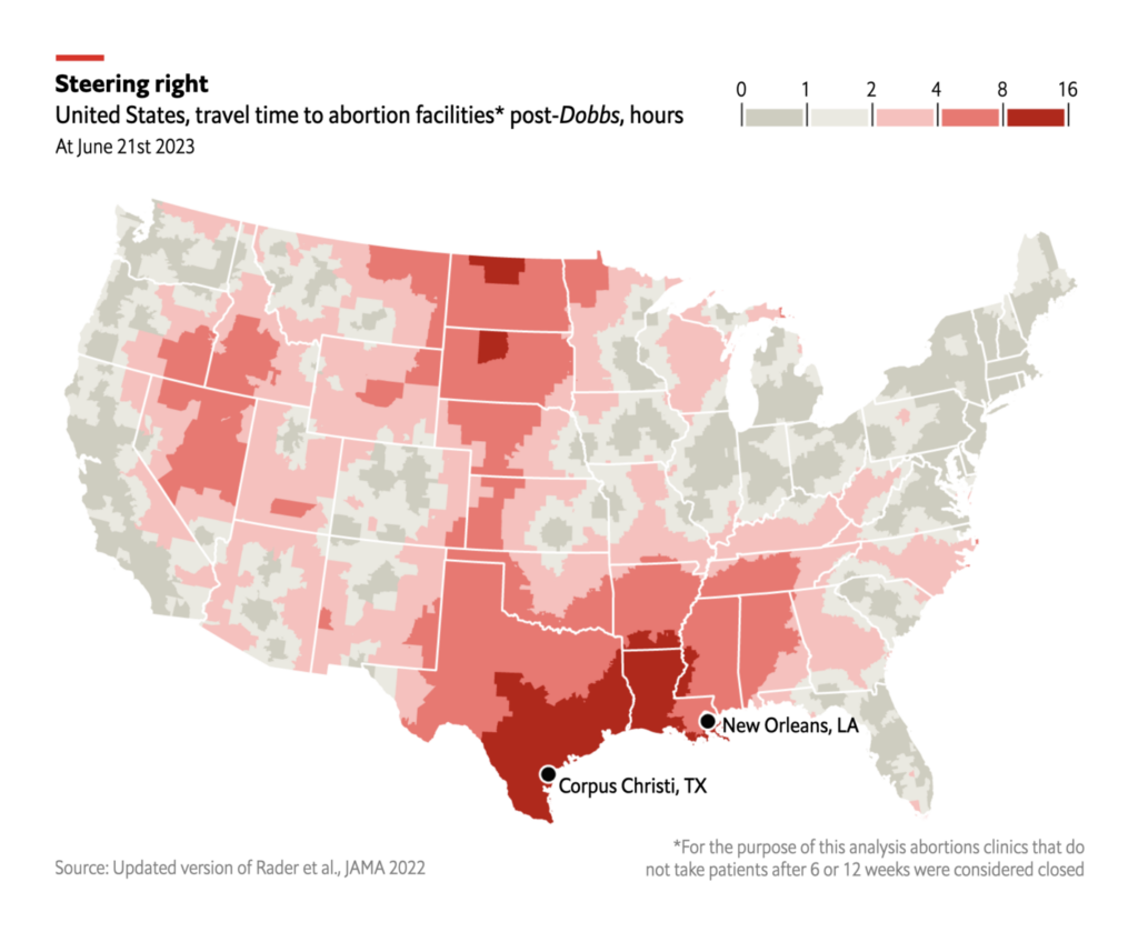
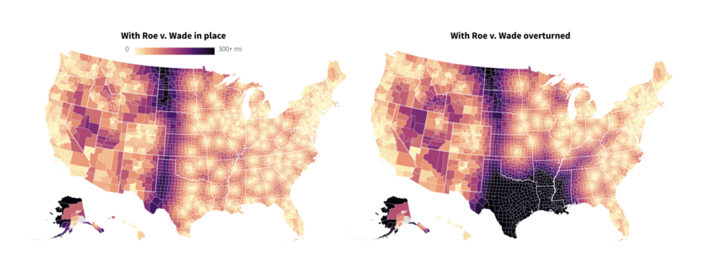
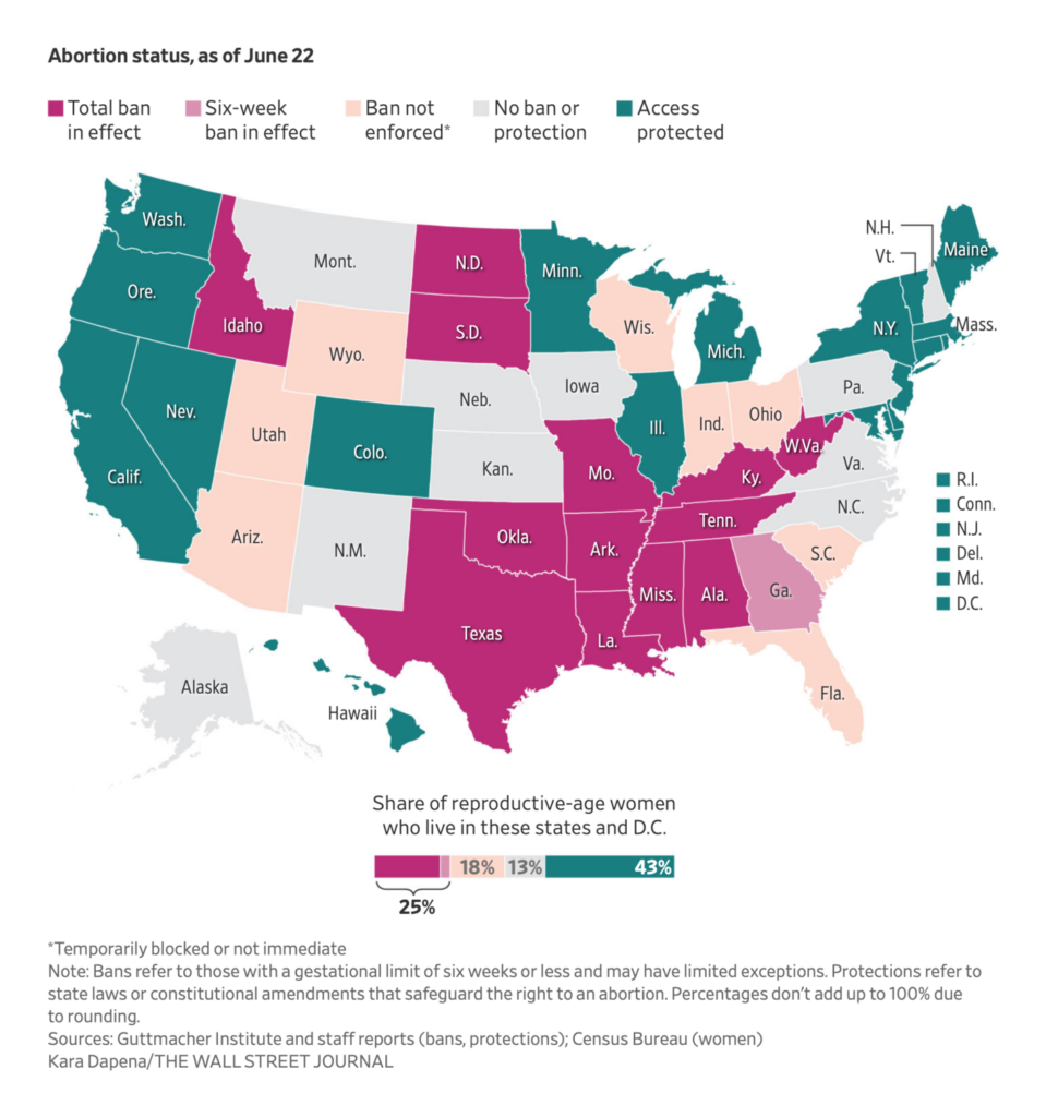
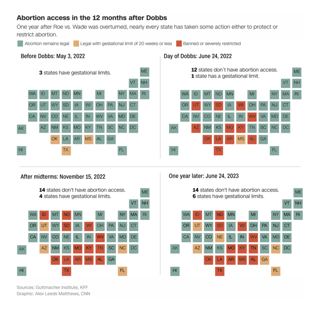
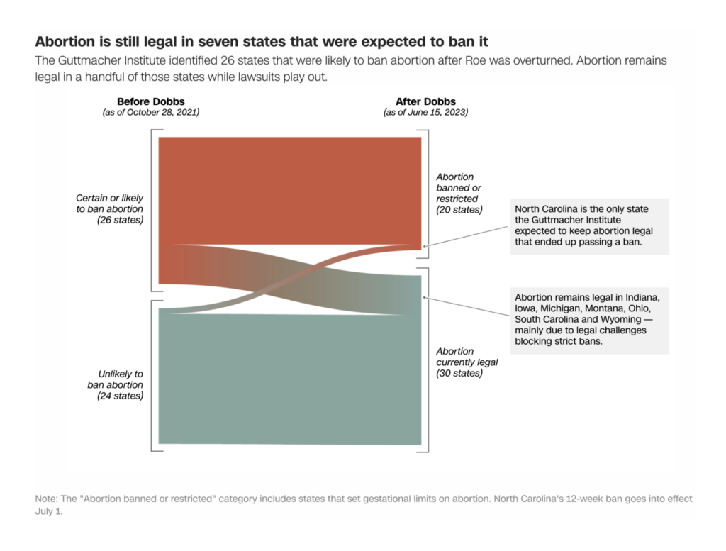
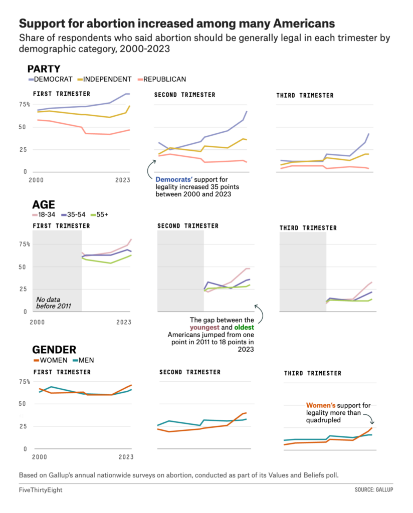
Saturday also marked one year without a constitutional right to abortion in the United States. Several maps visualized the state-level legal landscape:
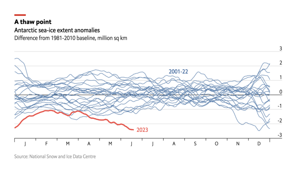
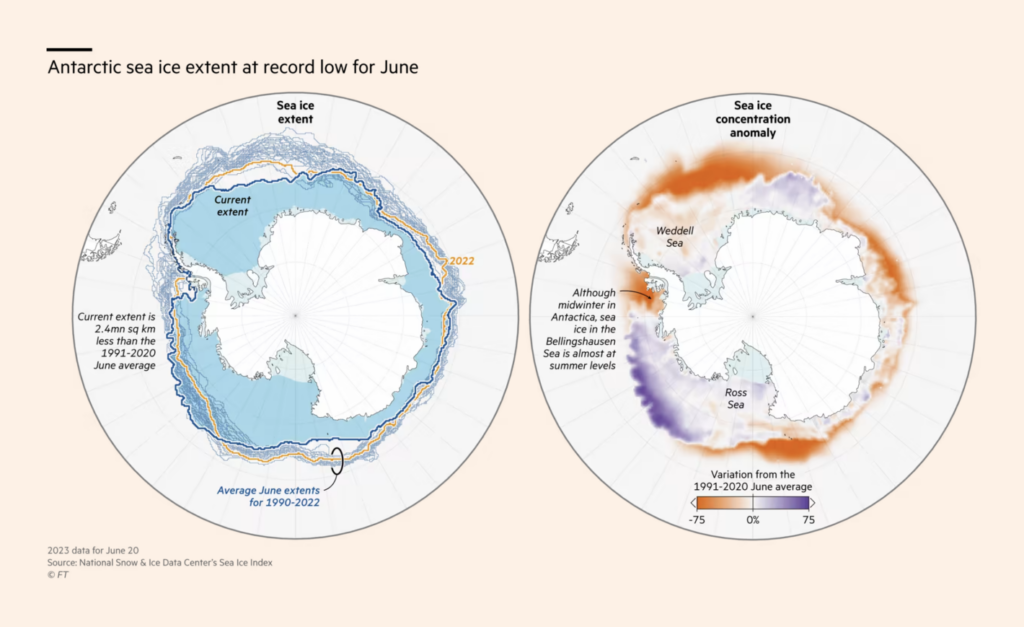
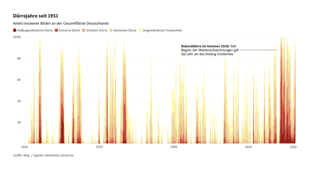
As summer begins, charts on broken climate records are returning as a weekly fixture:
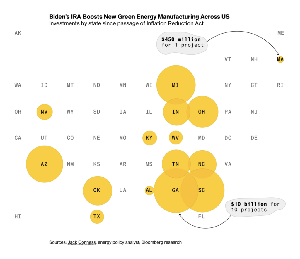
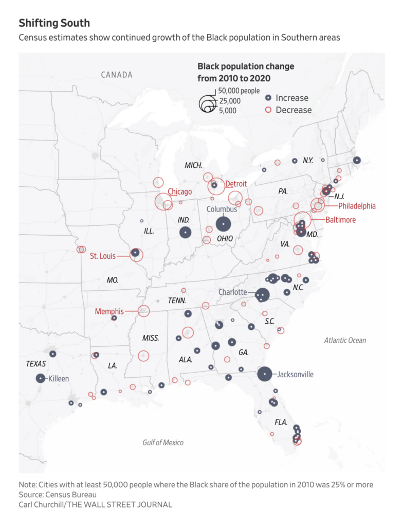
To round out this week: two visualizations of migration in the U.S. and U.K.

Help us make this dispatch better! We’d love to hear which newsletters, blogs, or social media accounts we need to follow to learn about interesting projects, especially from less-covered parts of the world (Asia, South America, Africa). Write us at hello@datawrapper.de or leave a comment below.
Want the Dispatch in your inbox every Tuesday? Sign up for our Blog Update newsletter!
Comments