

Data Vis Dispatch, February 18: German election polls, corruption, and tariffs
February 18th, 2025
9 min
This article is brought to you by Datawrapper, a data visualization tool for creating charts, maps, and tables. Learn more.
The best of last week’s big and small data visualizations
Welcome back to the 145th edition of Data Vis Dispatch! Every week, we publish a collection of the best small and large data visualizations we find, especially from news organizations — to celebrate data journalism, data visualization, simple charts, elaborate maps, and their creators.
Recurring topics this week include the power of nature, the month of Pride, and a whole lot of elections.
This week has really produced a ton of exciting and unique scroll-based visualizations about everything from Musk’s company orbit to noise levels in restaurants:

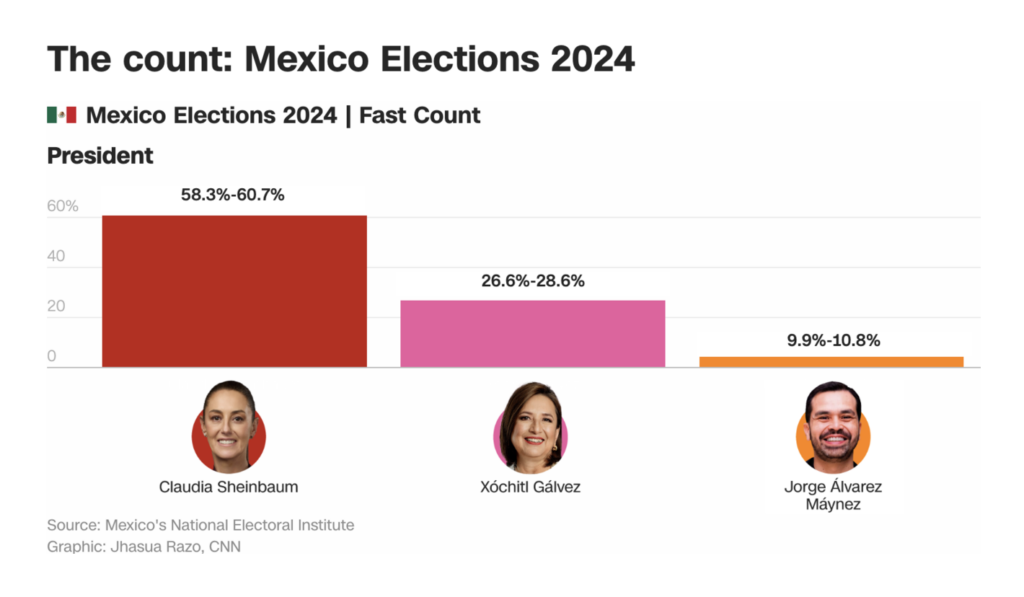
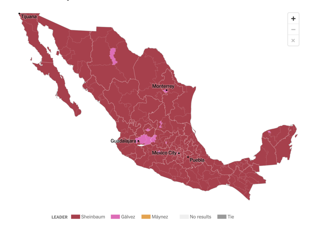
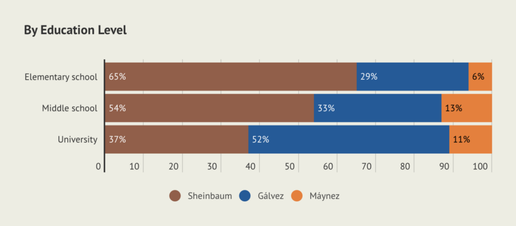
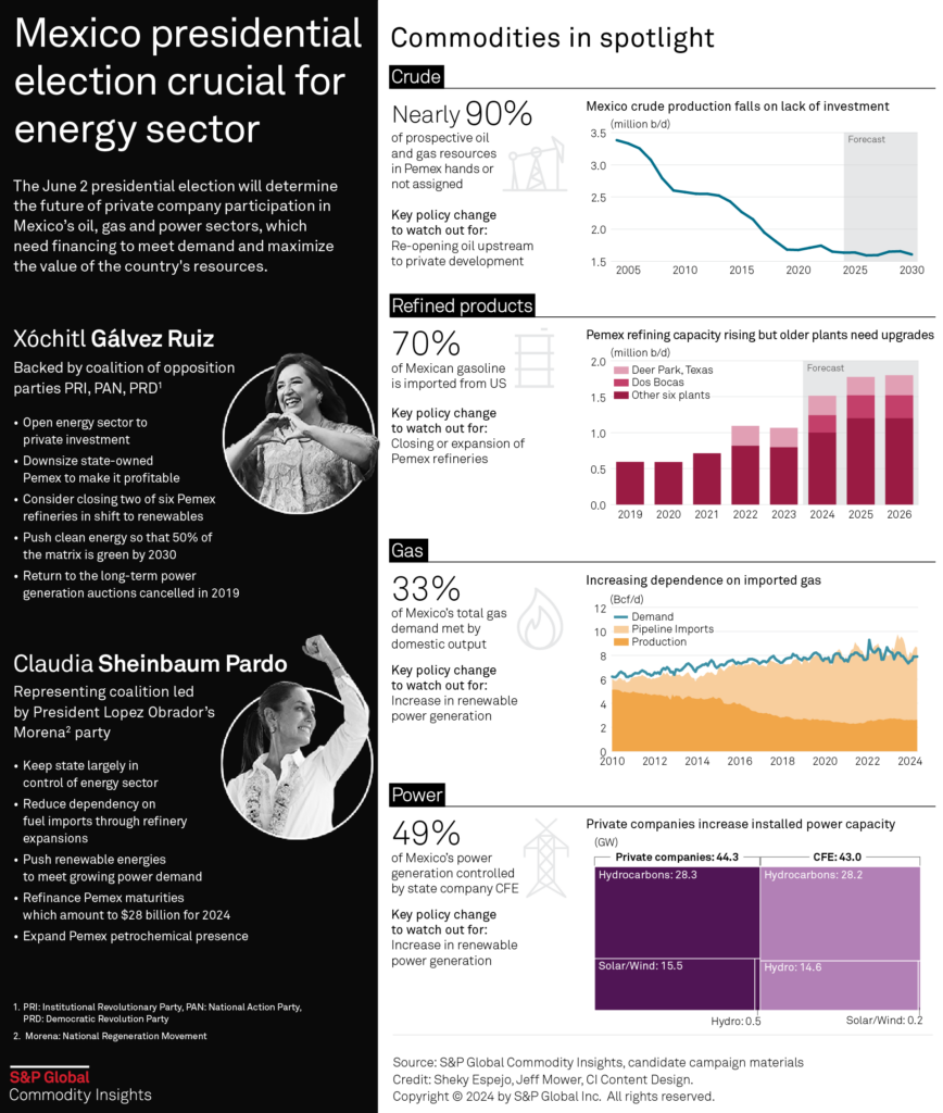
You know what else we found a ton of? Election visualizations! Sit back, because there are quite a few in this Dispatch. Mexico’s general elections were held on June 2, and Claudia Sheinbaum will become the first female president of Mexico. Visualizations explored the results, the voters, and the economic impact:
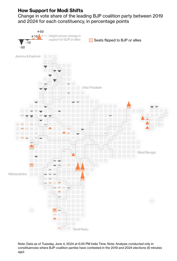
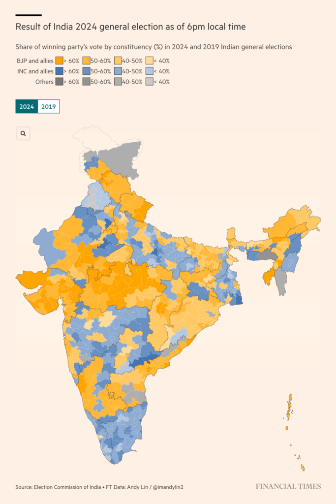
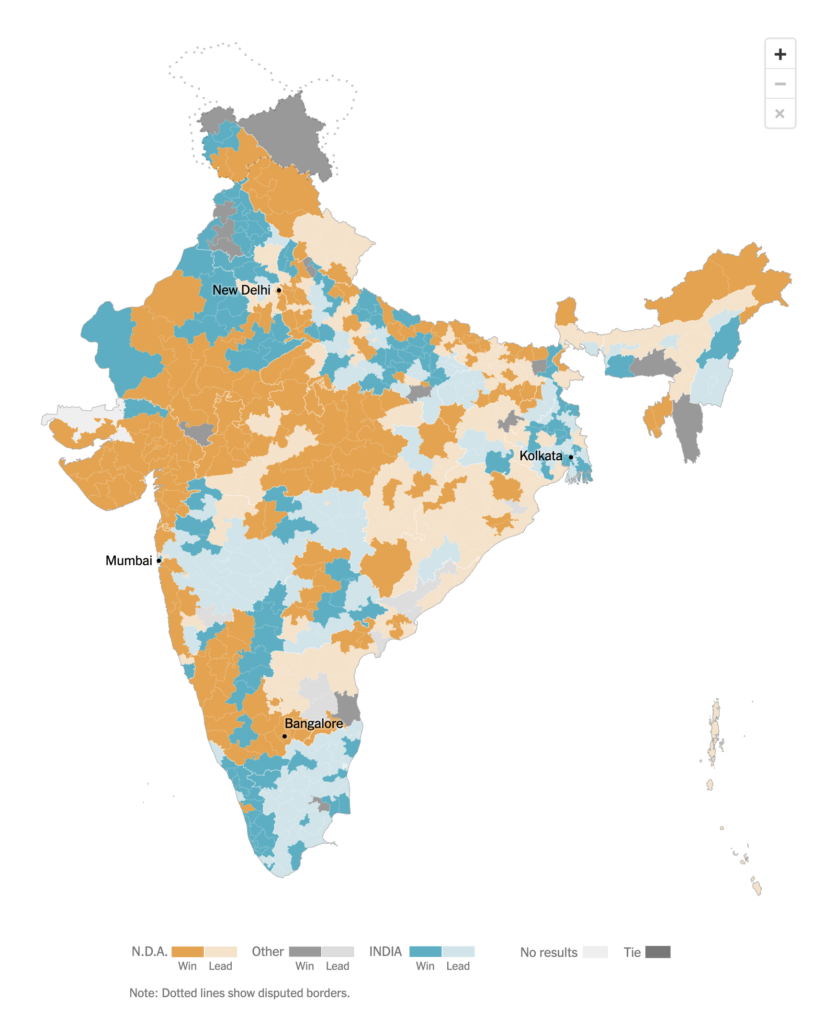
India is currently (at the time of writing this Dispatch) in the process of vote counting:
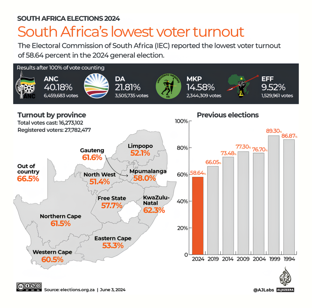
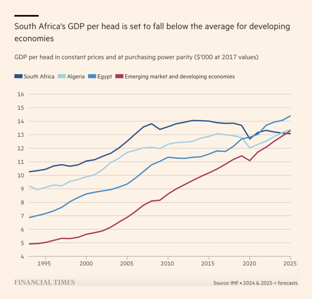
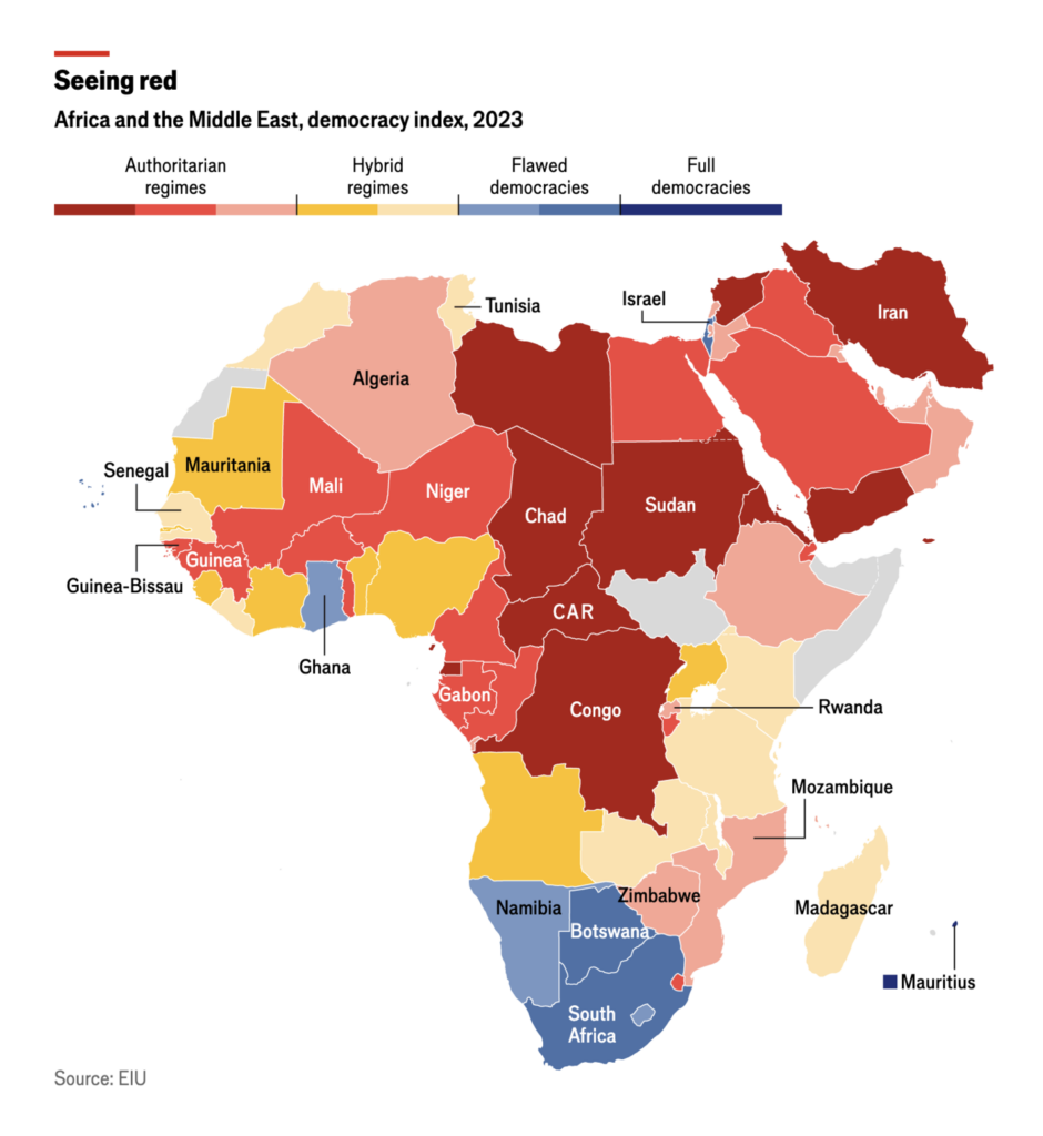
The ruling African National Congress lost its majority in South Africa’s elections on May 29th. In the wake of the election, we found investigations into the economic situation in South Africa and, a lot broader, democracy on the African continent:
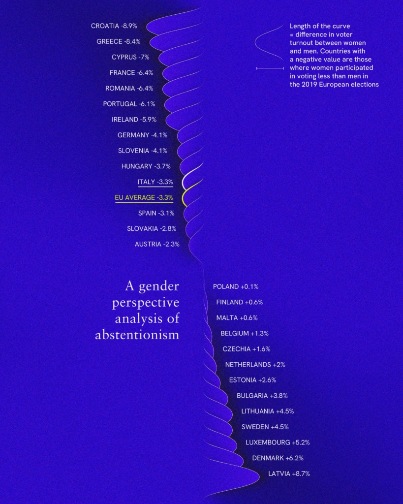
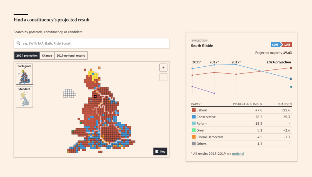
Almost done. Here are two more visualizations about future elections in the EU and UK:
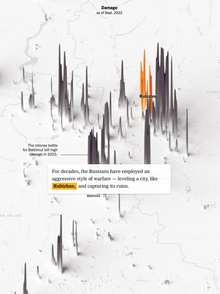
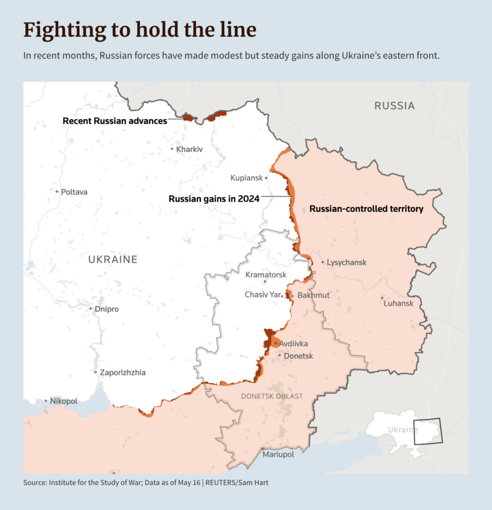
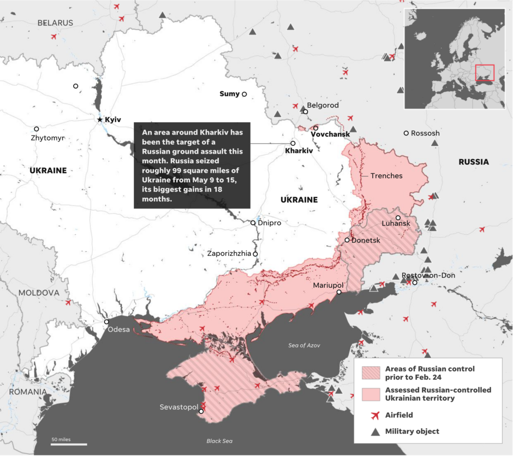
Staying with political visualizations, we look at the war between Russia and Ukraine. While visualizations are important, we would like to recall a quote from this Reuters article: “It’s not like it looks on a map with all these pretty lines and arrows … I see my friends, what’s happened to them, what we’re fighting. It’s hell, it’s worse than hell.” – Viktor, infantryman
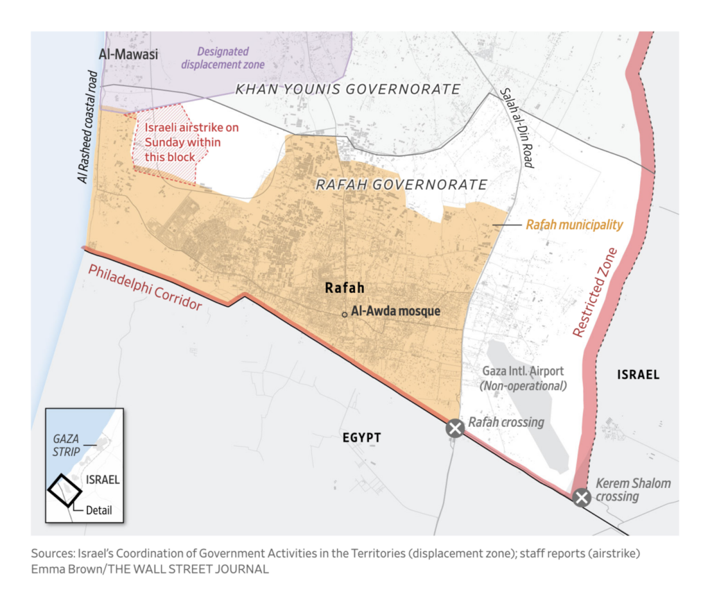
The visualizations on Israel and Gaza show the situation at the Egyptian border of the Gaza Strip and, related to this, an analysis of the blockade of the Suez Canal by the Houthis and the consequence of higher emissions:
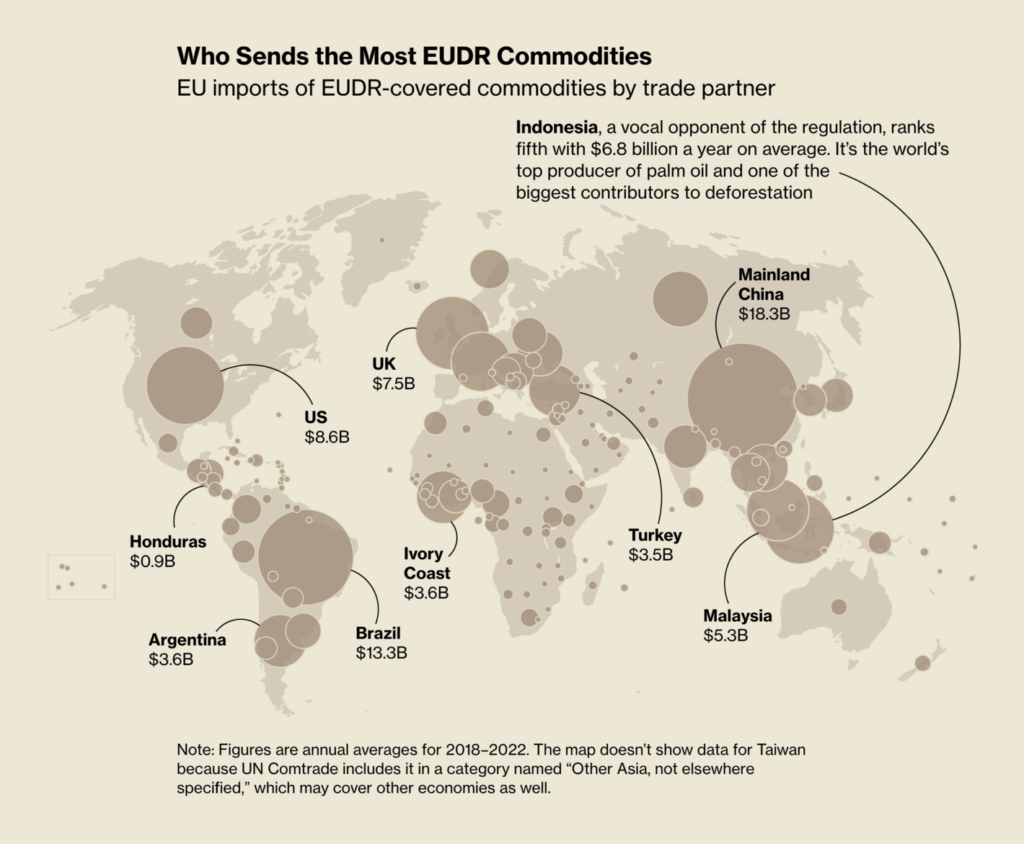
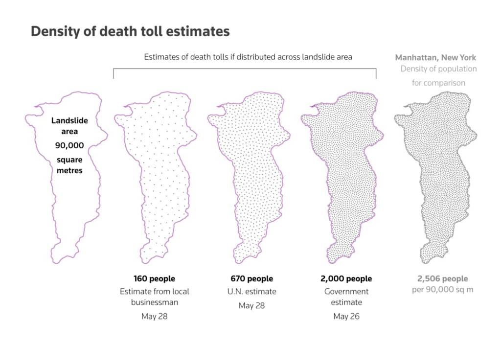
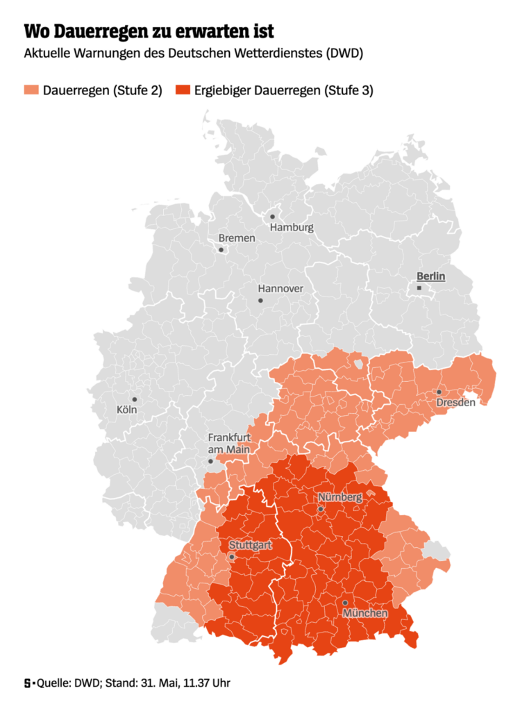
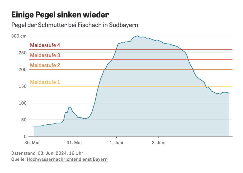
Environmental visualizations this week include a detailed look at the upcoming EU Deforestation Regulation (EUDR). Topics such as a massive landslide in northern Papua New Guinea and heavy rainfall in Germany show that nature is usually stronger than humankind:
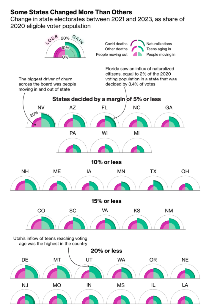
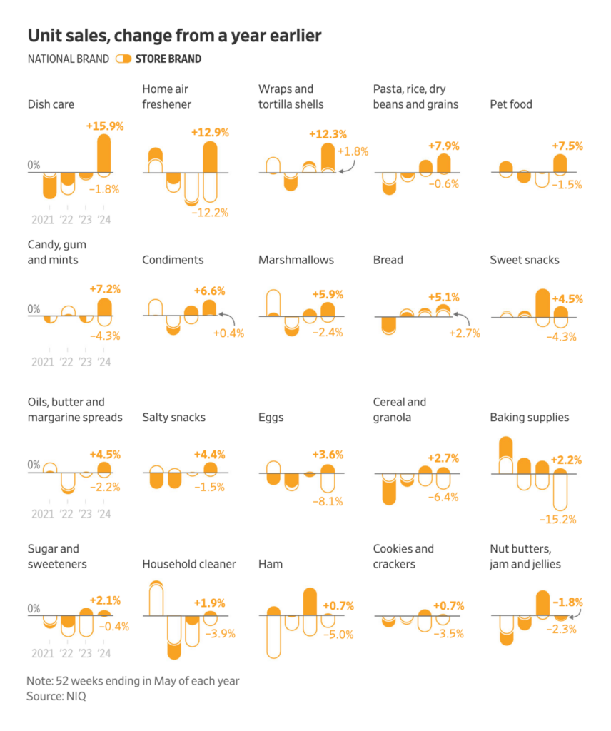
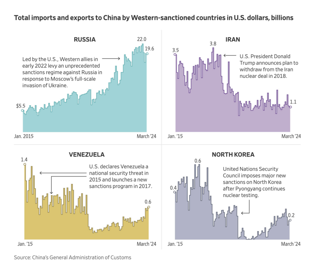
Here are three extraordinary small multiples: state electorates in the U.S., brand sales, and Chinese imports and exports with Western sanctioned countries:
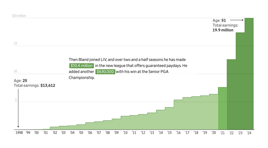
Is the best age for sports under 30 or at 51? It depends on the sport:
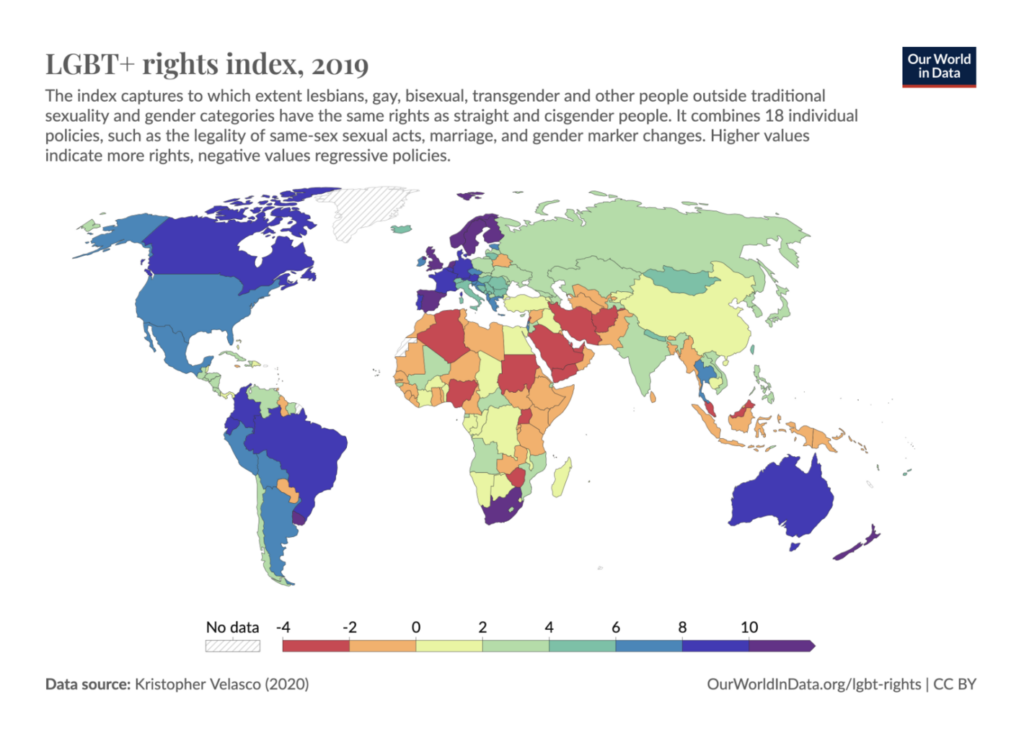
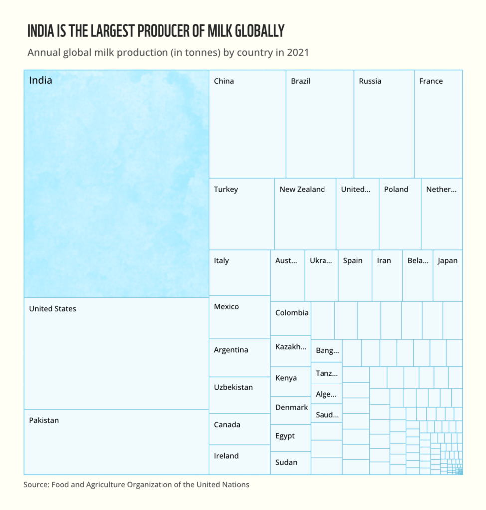
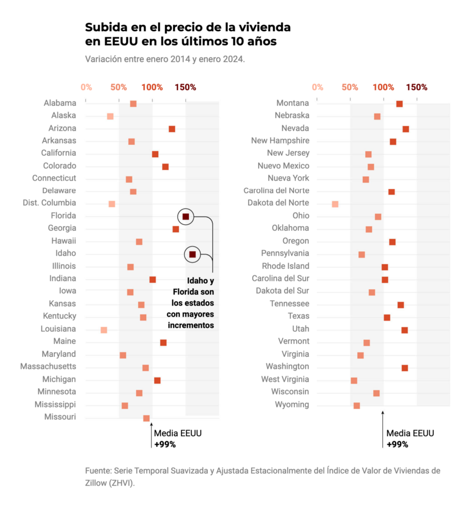
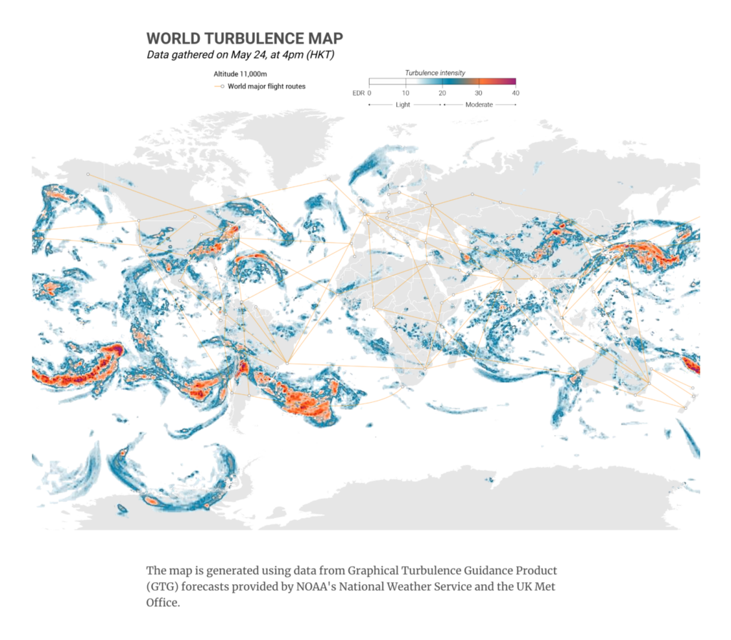
In the miscellaneous section, we have visualizations about Pride Month, milk, U.S. housing prices, and turbulence:
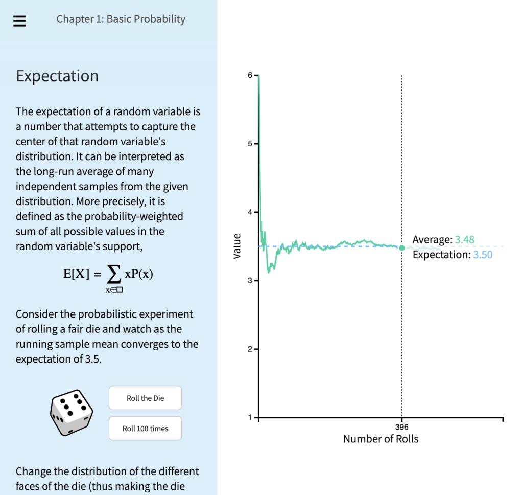
We end this Dispatch with a recommendation to read, try, and experiment. Here is a visual guide to learning the basics of probability from Brown University:
Applications are open for…
Help us make this dispatch better! We’d love to hear which newsletters, blogs, or social media accounts we need to follow to learn about interesting projects, especially from less-covered parts of the world (Asia, South America, Africa). Write us at hello@datawrapper.de or leave a comment below.
Want the Dispatch in your inbox every Tuesday? Sign up for our Blog Update newsletter!


Comments