Data Vis Dispatch, January 14: Fire, congestion, and Greenland
January 14th, 2025
11 min
Datawrapper lets you show your data as beautiful charts, maps or tables with a few clicks. Find out more about all the available visualization types.
Our mission is to help everyone communicate with data - from newsrooms to global enterprises, non-profits or public service.
We want to enable everyone to create beautiful charts, maps, and tables. New to data visualization? Or do you have specific questions about us? You'll find all the answers here.
Data vis best practices, news, and examples
250+ articles that explain how to use Datawrapper
Answers to common questions
An exchange place for Datawrapper visualizations
Attend and watch how to use Datawrapper best
Learn about available positions on our team
Our latest small and big improvements
Build your integration with Datawrapper's API
Get in touch with us – we're happy to help
This article is brought to you by Datawrapper, a data visualization tool for creating charts, maps, and tables. Learn more.
The best of last week’s big and small data visualizations
Welcome back to the 48th edition of Data Vis Dispatch! Every week, we’ll be publishing a collection of the best small and large data visualizations we find, especially from news organizations — to celebrate data journalism, data visualization, simple charts, elaborate maps, and their creators.
Recurring topics this week include trains, tennis, and reproductive rights.
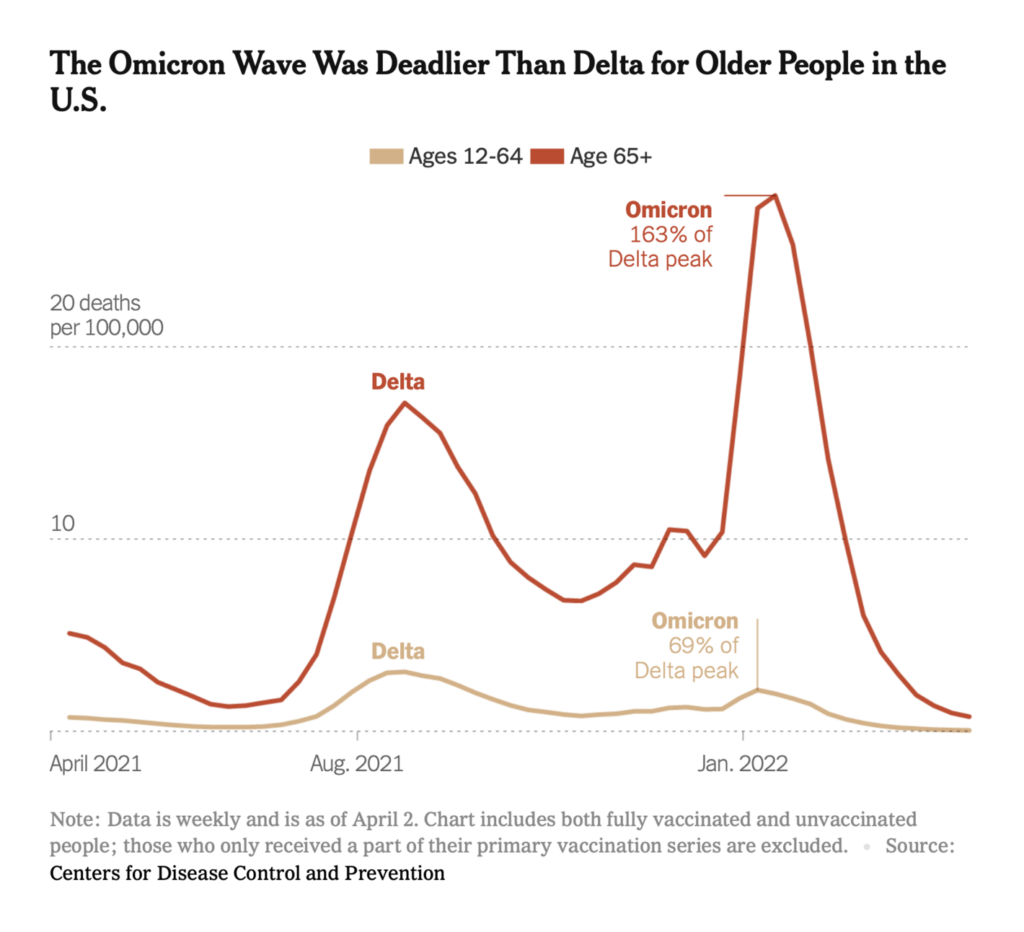
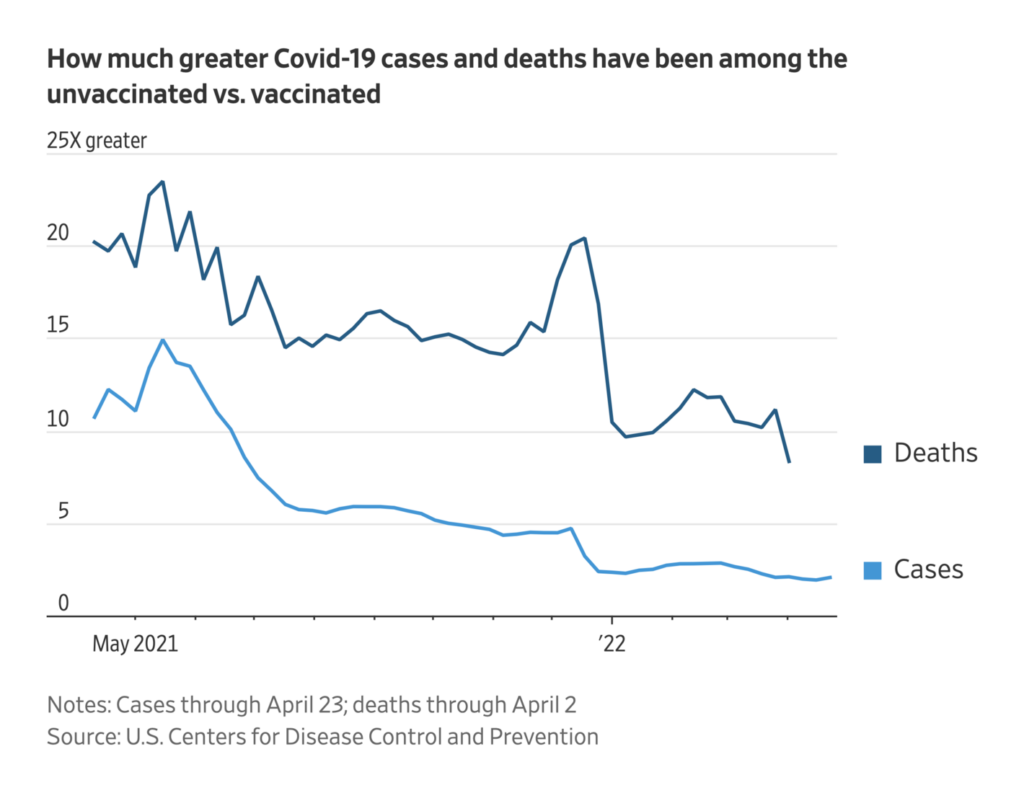
COVID death rates are lower now than at any time in the past two years. But high case numbers and falling vaccine efficacy mean the elderly are still especially vulnerable:
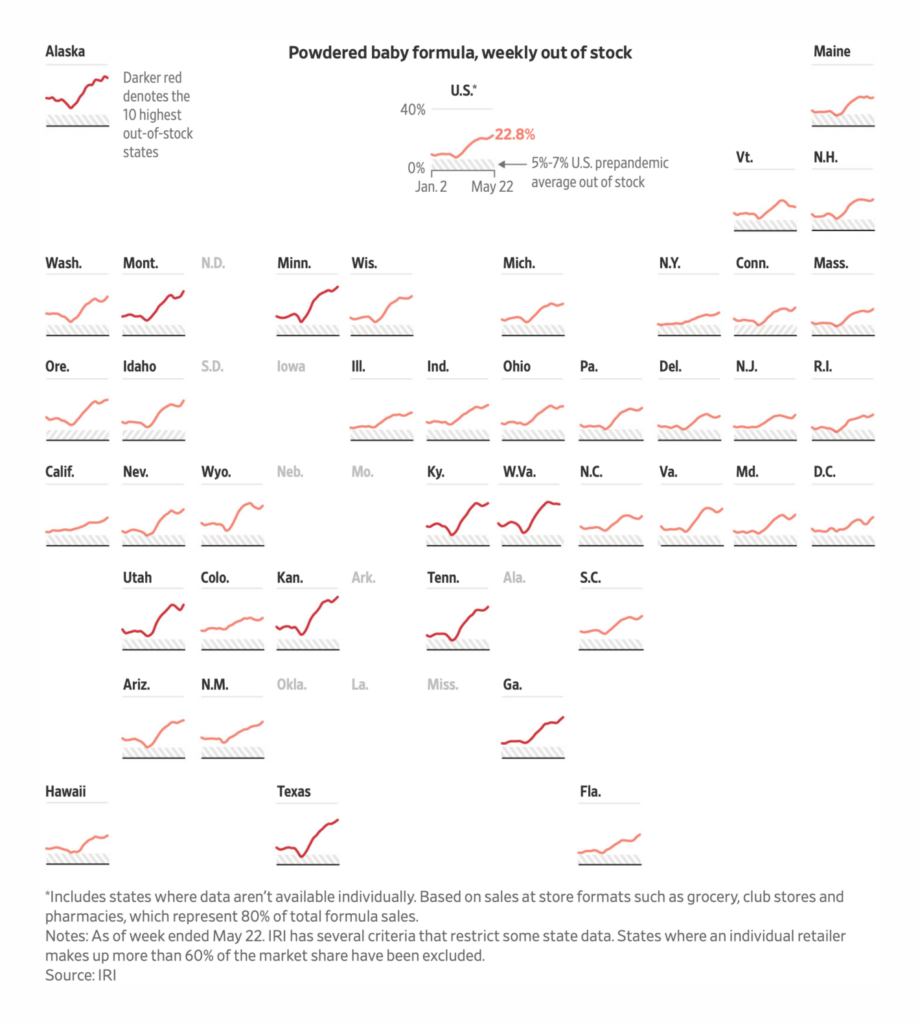
The pandemic is one of several causes behind an ongoing baby formula shortage in the U.S.:
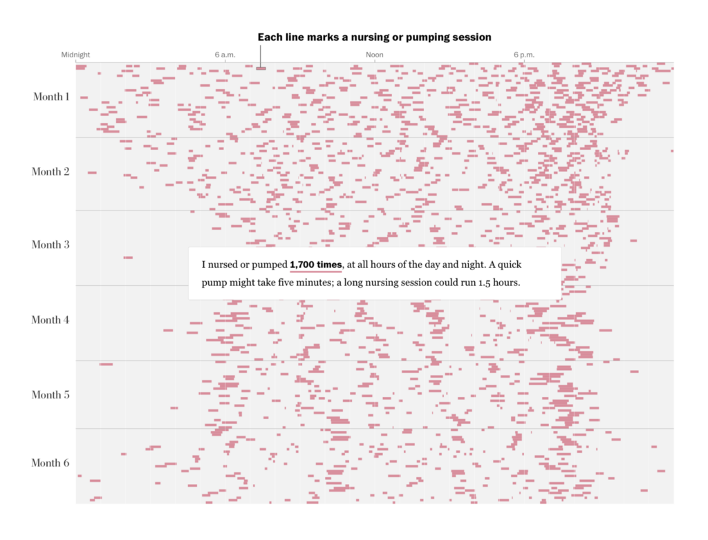
In fact, reproductive rights issues of all kinds were in the news this week:

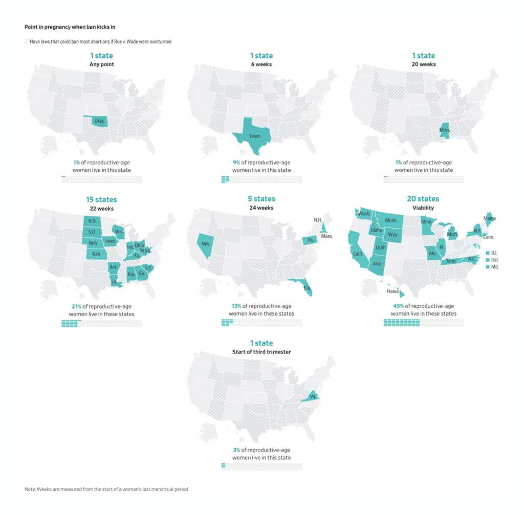
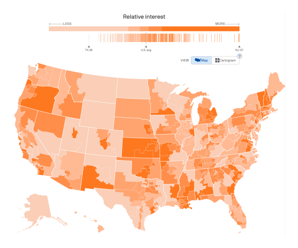
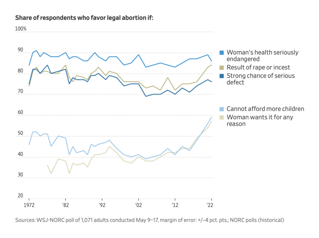
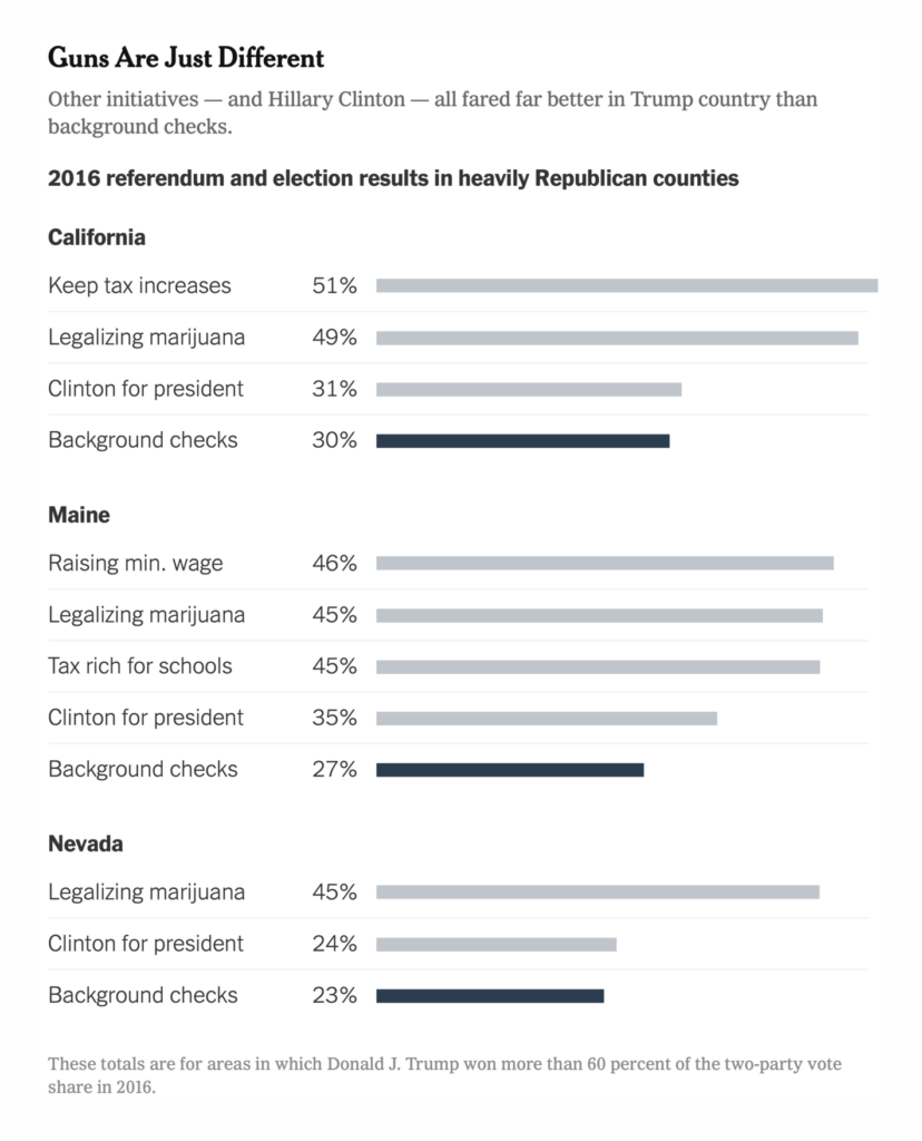
We saw more coverage of mass shootings in the U.S. — and why the crisis of gun violence is so politically stubborn:
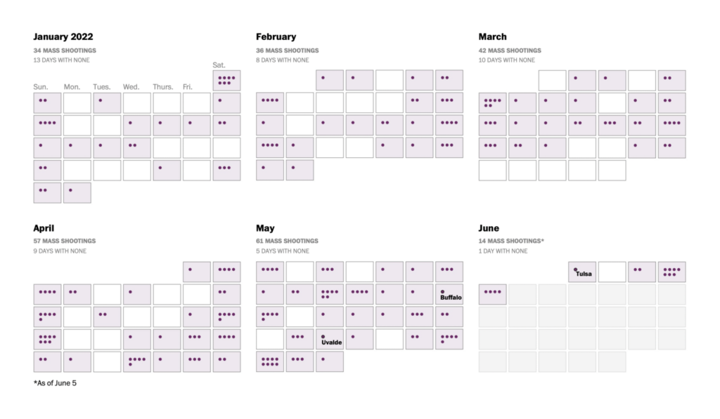
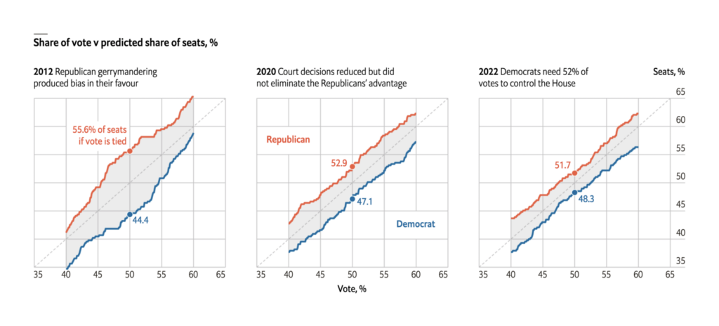
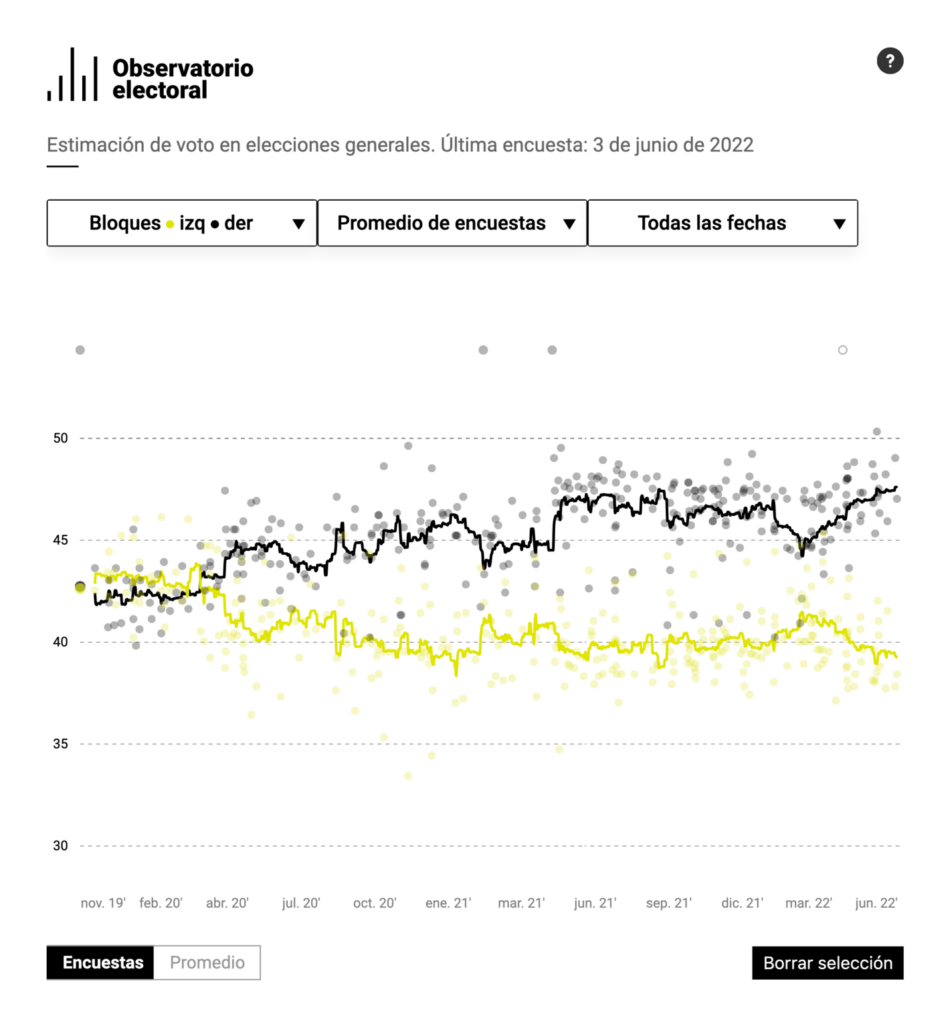
Other political charts dealt with gerrymandering in the U.S. and election polling in Spain:
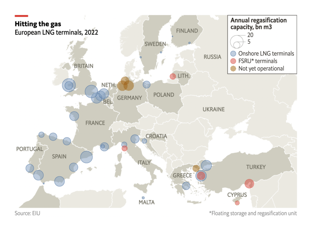
Russia’s invasion of Ukraine has now gone on for 100 days:
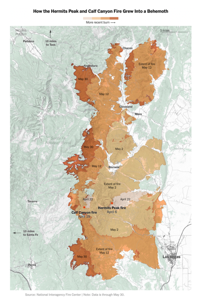
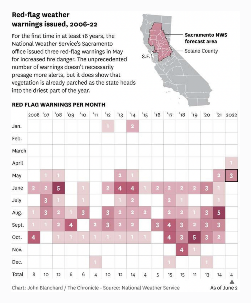
Fire season has begun in the western United States:
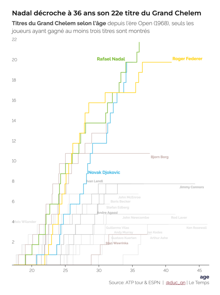
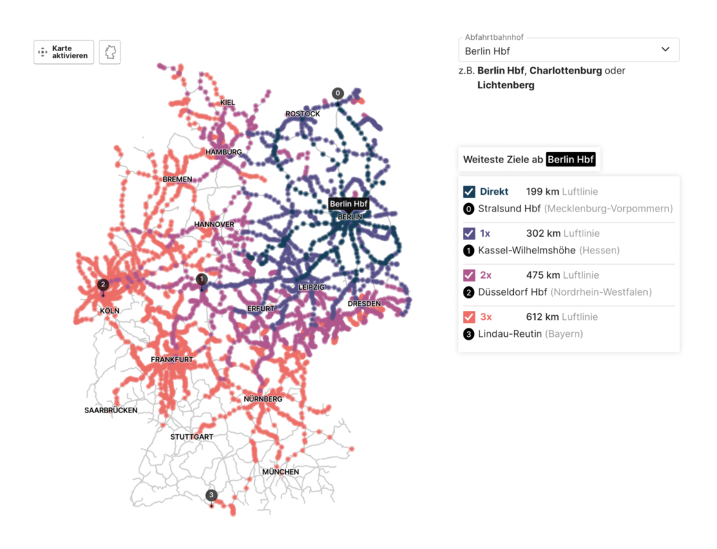
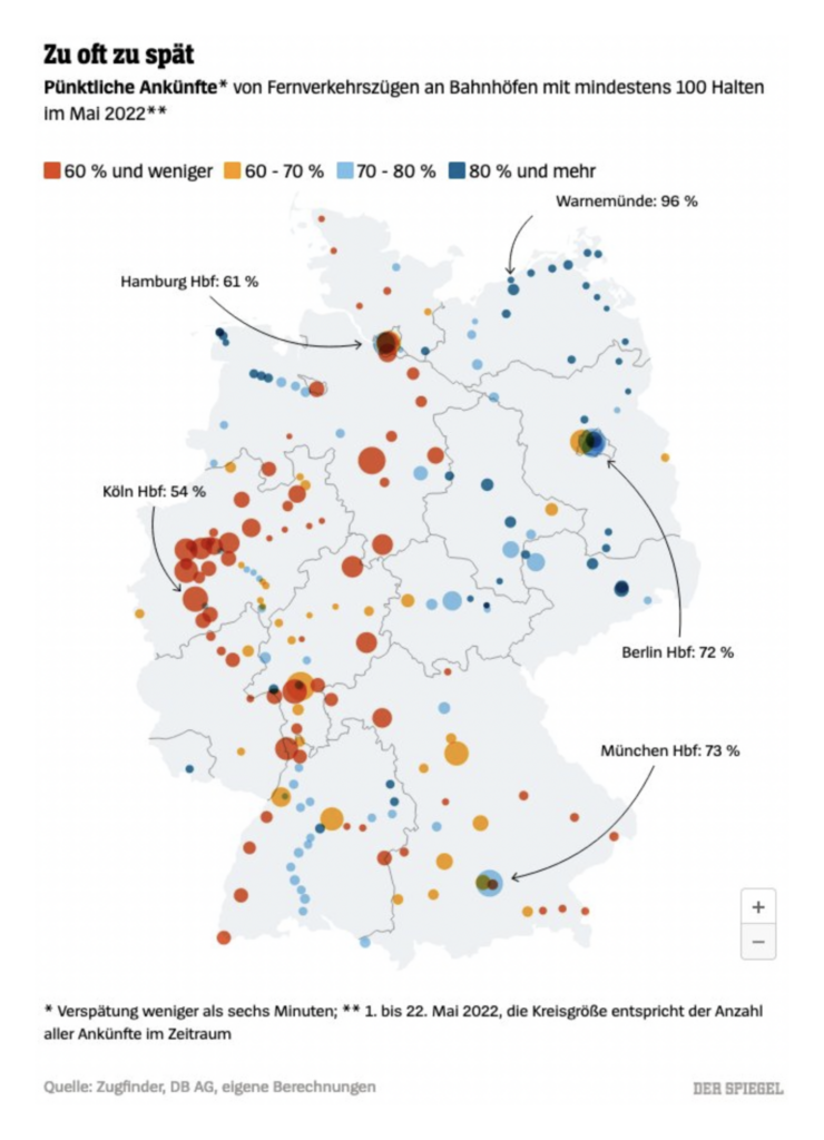
On a lighter note, we enjoyed these charts and maps on tennis and train travel in Germany:
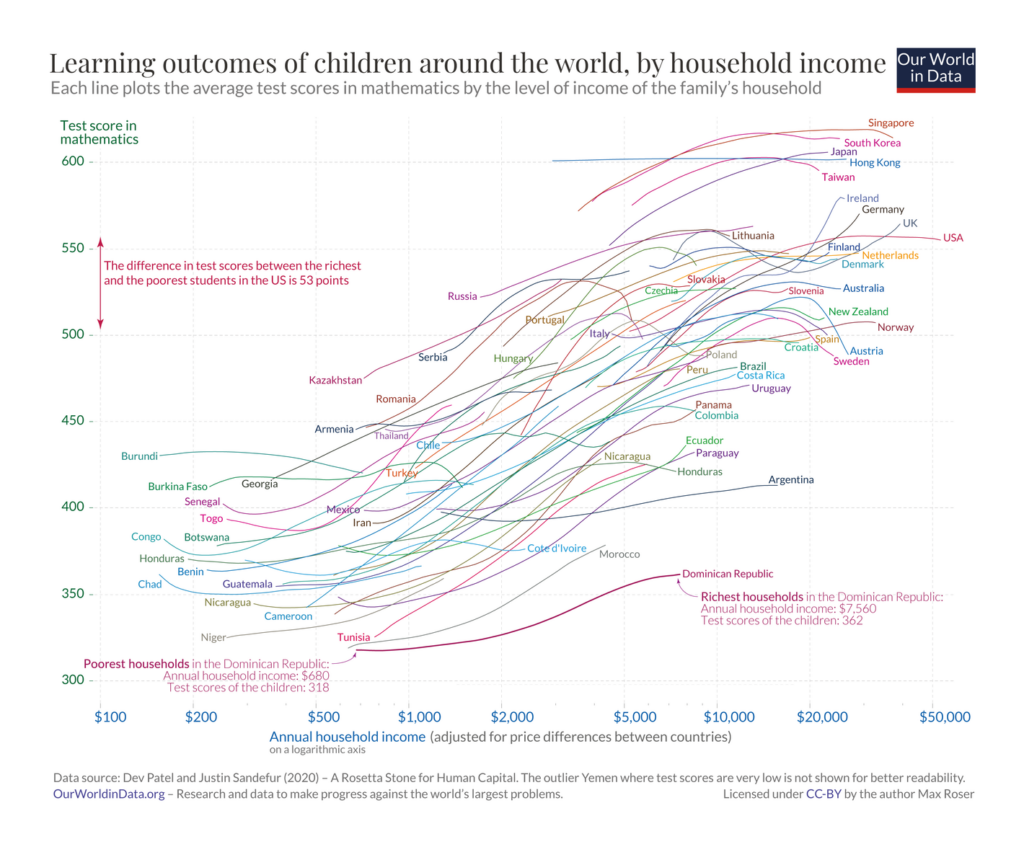
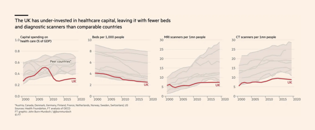
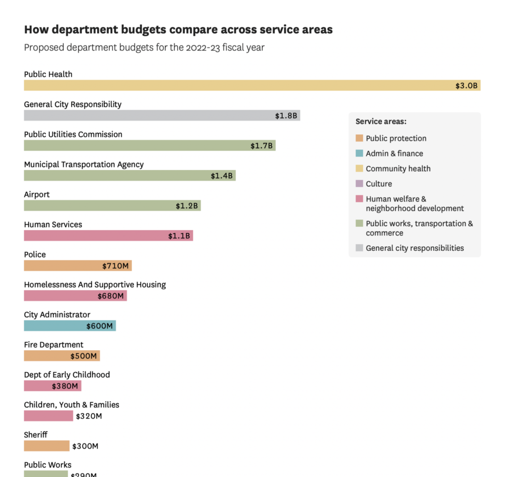
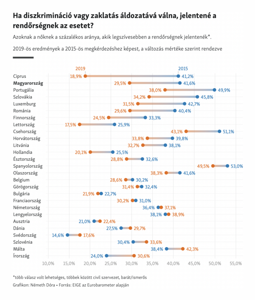
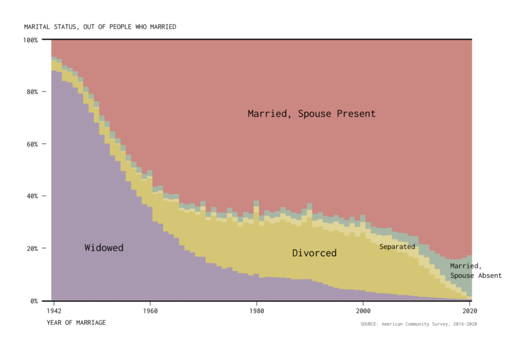
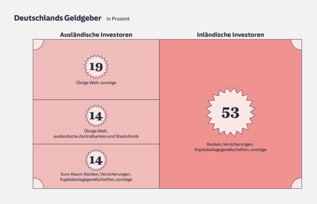
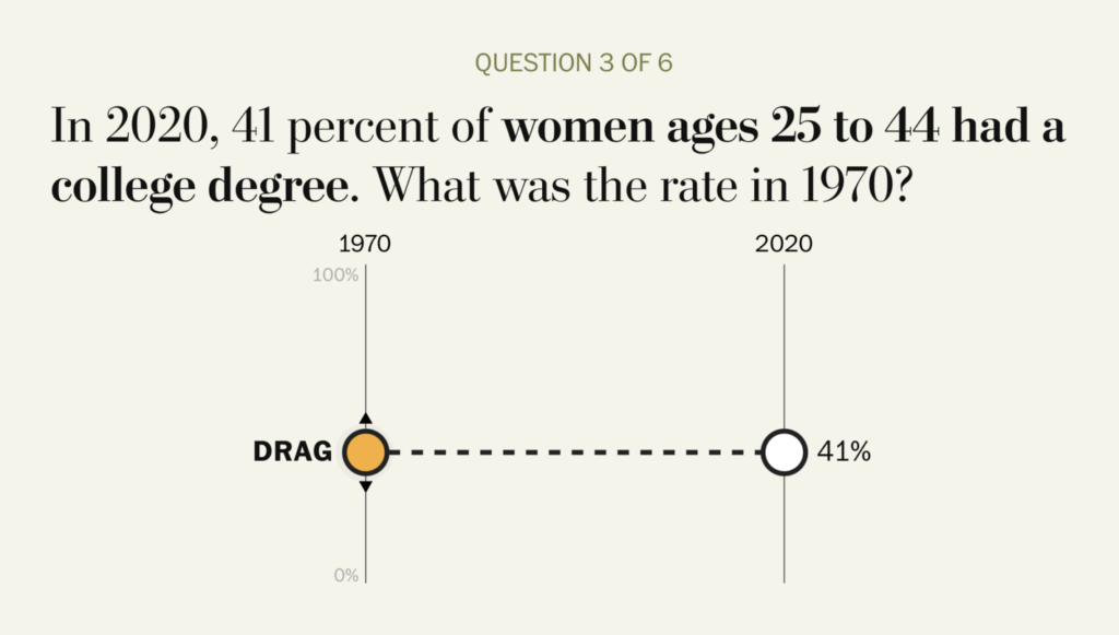
And other charts covered everything from educational outcomes around the world to marriage in America:
Applications are open for…
Help us make this dispatch better! We’d love to hear which newsletters, blogs, or social media accounts we need to follow to learn about interesting projects, especially from less-covered parts of the world (Asia, South America, Africa). Write us at hello@datawrapper.de or leave a comment below.
Want the Dispatch in your inbox every Tuesday? Sign up for our Blog Update newsletter!
Comments