Welcome back to the 35th edition of Data Vis Dispatch! Every week, we’ll be publishing a collection of the best small and large data visualizations we find , especially from news organizations — to celebrate data journalism, data visualization, simple charts, elaborate maps, and their creators.
Recurring topics this week include the Russia-Ukraine war and the latest IPCC report.
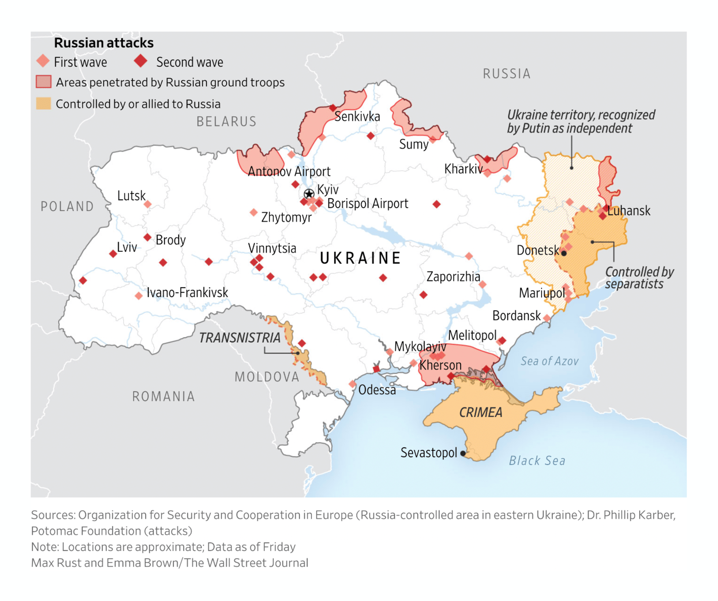
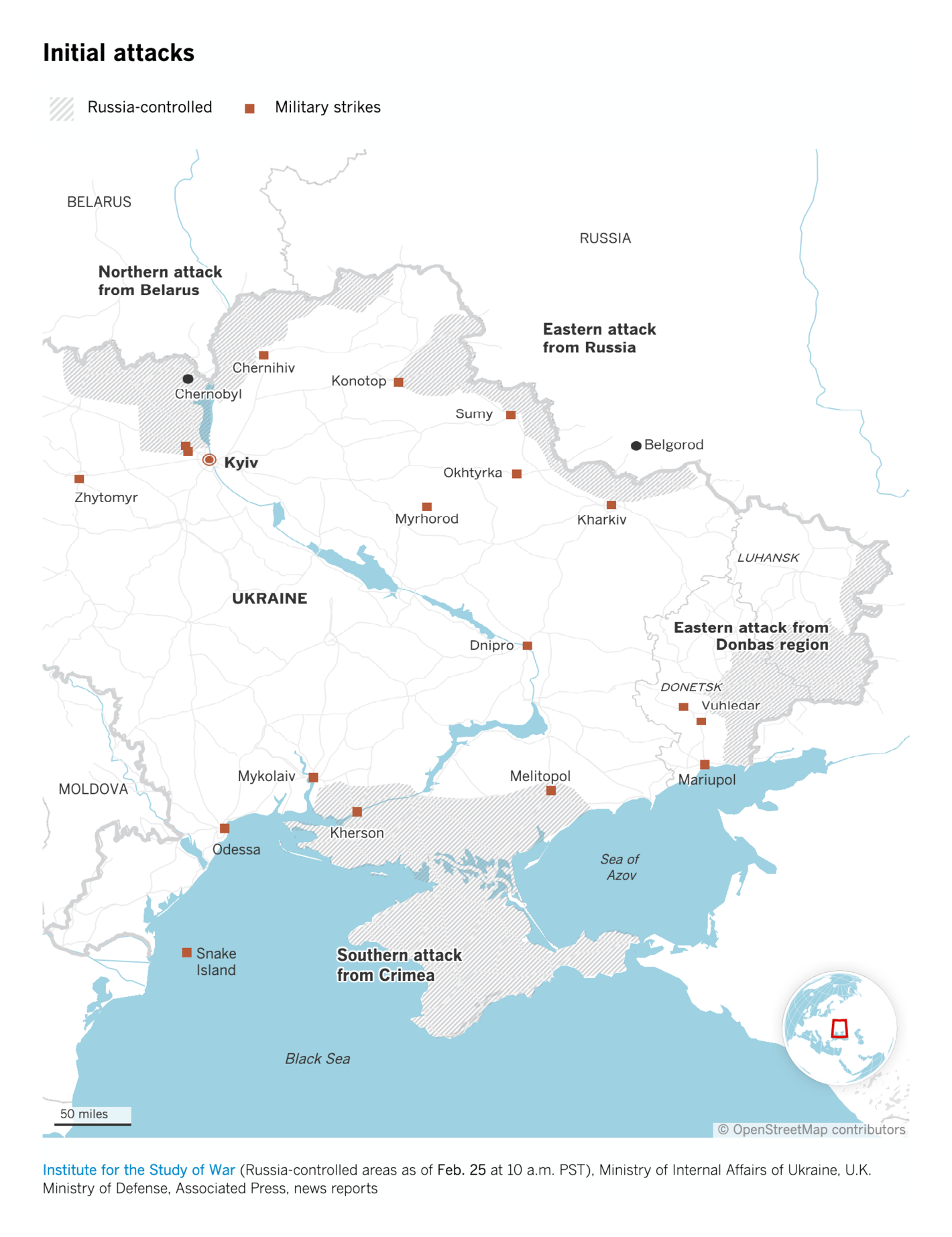
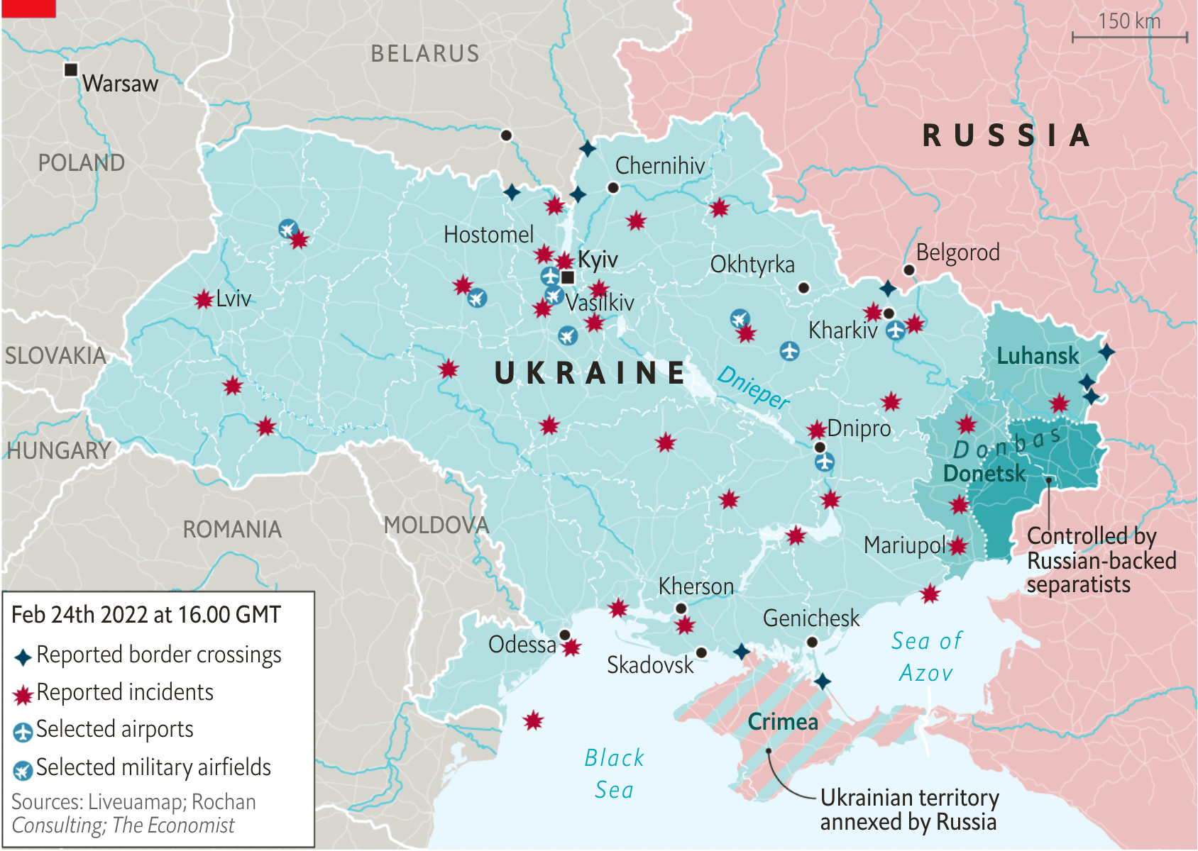
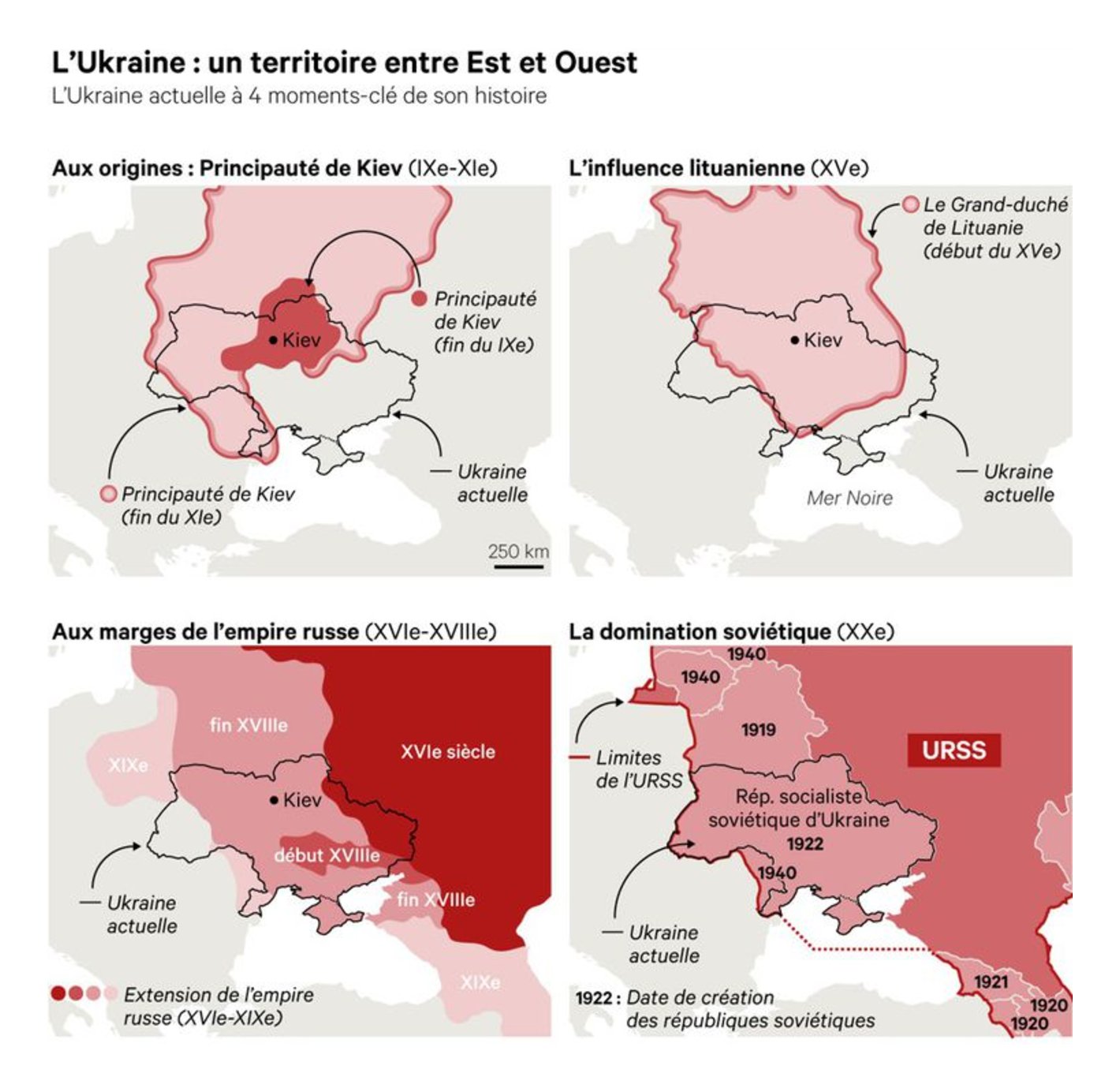
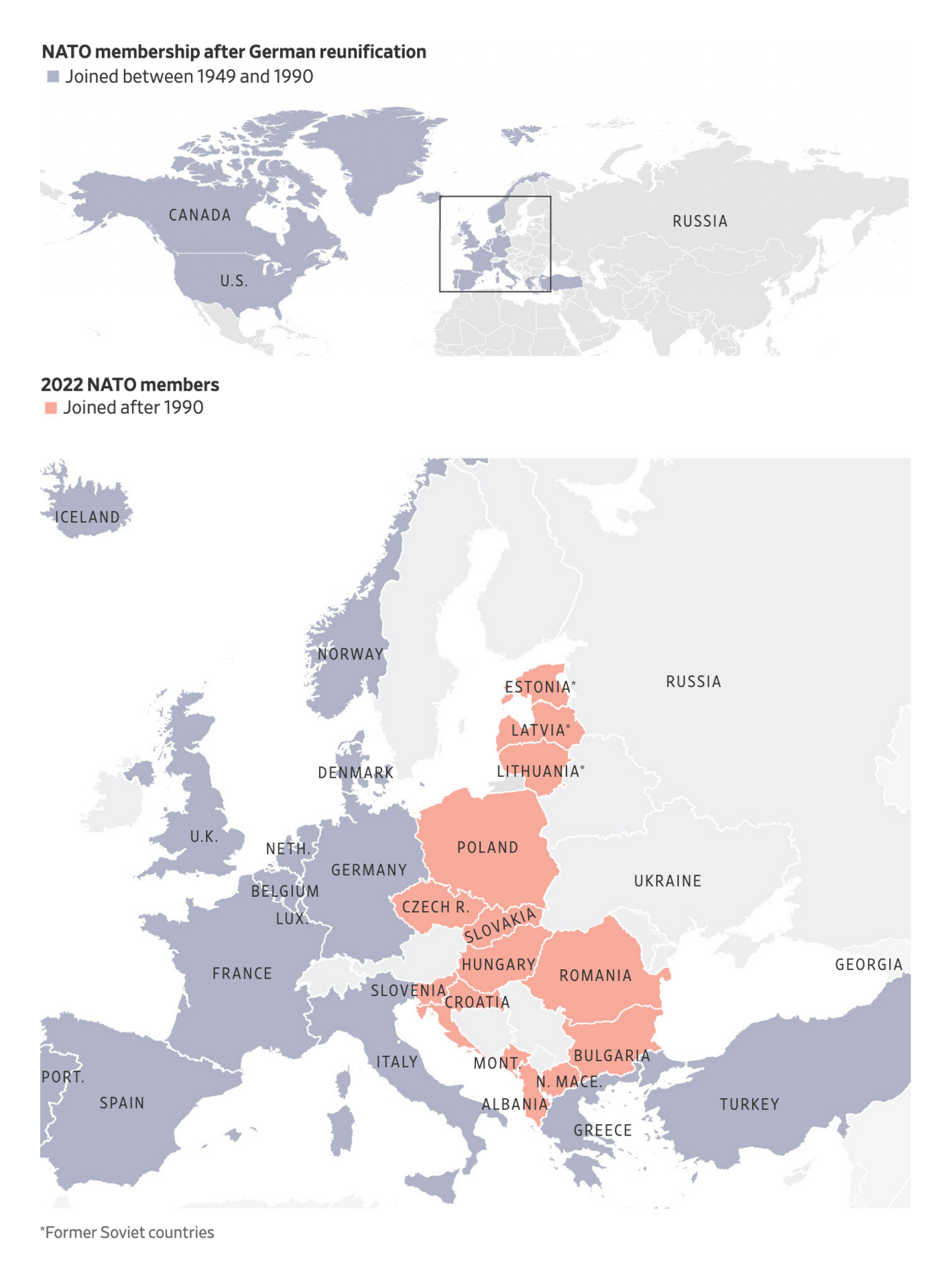
Last Thursday, Russia launched an invasion of Ukraine . Since then graphics reporters around the world have been busy explaining the situation with maps and charts — I collected maps from 47 different sources in this Twitter thread last week. News organizations like The New York Times , Neue Zürcher Zeitung , Financial Times , BBC , El País , The Times , Washington Post , Reuters , Bloomberg , The Guardian , Público , USA Today , and Al Jazeera have updated map collections on the conflict. Here are a few of the maps they and others created over the last few days:
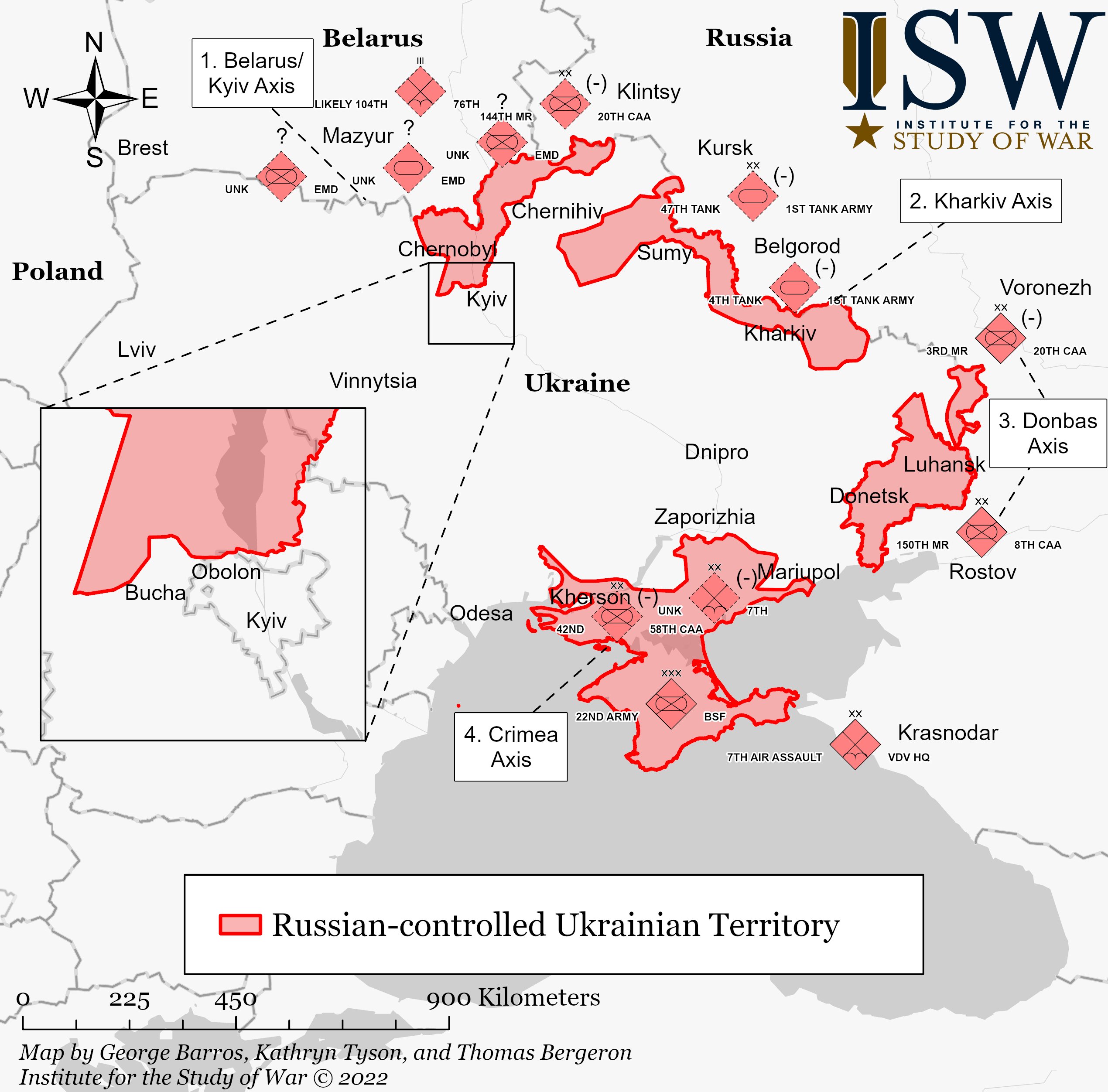
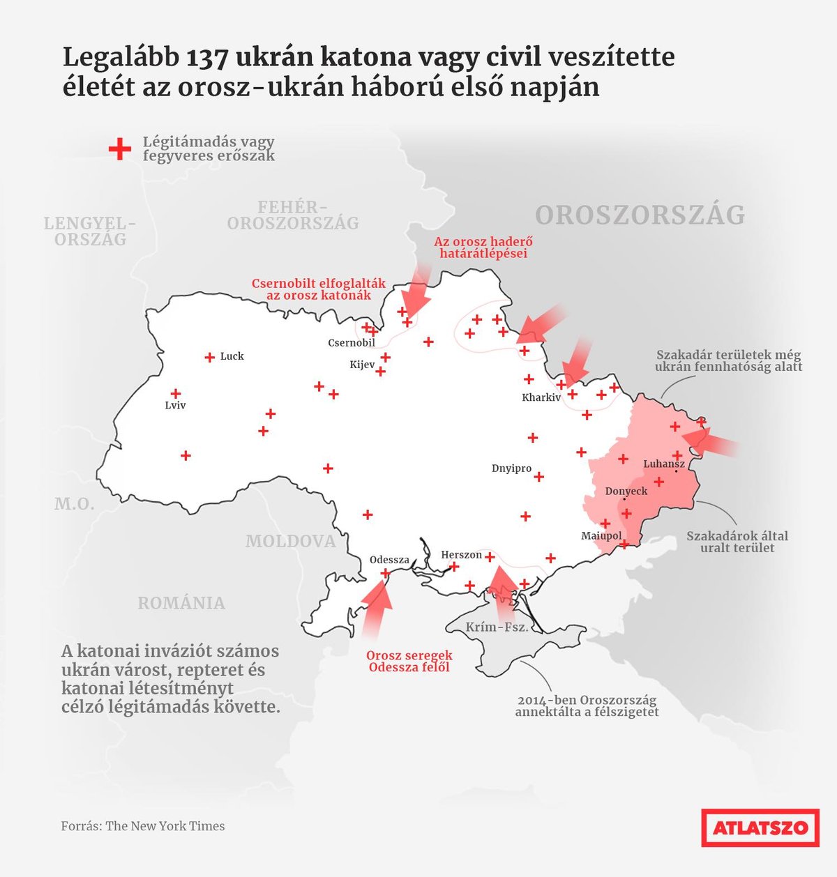
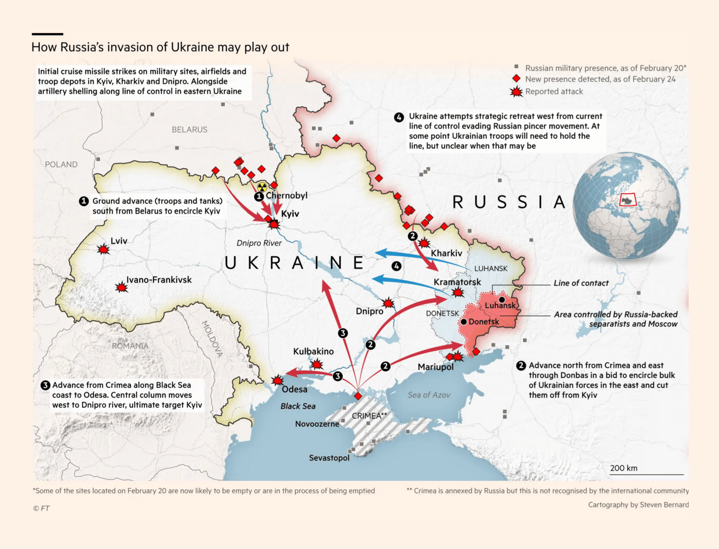
The Wall Street Journal: Ukrainian Capital Rocked by Explosions as Russia Intensifies Attack Neue Zürcher Zeitung: Putins Truppen rücken immer näher an Kiew heran – diese interaktive Karte zeigt den Stand des Krieges Los Angeles Times: Three maps explaining the Russia-Ukraine conflict Institute for the Study of War: Assessed Control of Terrain in Ukraine and Main Russian Maneuver Axes as of February 28, 2022, 3:00 PM EST The Economist: Where have Russian attacks taken place in Ukraine? Atlatszo: "Legalább 137 ukrán katona vagy civil vesztette életét az orosz-ukrán háború első napján. A katonai inváziót számos ukrán várost, repteret és katonai létesítményt célzó légitámadás követte. Az orosz katonák a csernobili atomerőművet is elfoglalták," February 25 (Tweet El Confidencial: La lucha llega a las calles de Kiev y Rusia asegura haber tomado Melitopol Sorry, your browser doesn't support embedded videos. La Vanguardia: Siete días para una guerra: así ha sido la escalada de tensión en el conflicto de Ucrania Financial Times: Russia mobilises for assault on Kyiv as its troops storm Ukraine Many newsrooms also tried to provide context on the war and on Ukraine . How did we get here? What was the situation before last Thursday? Why would Russia choose to invade? What does Ukraine have to work with?
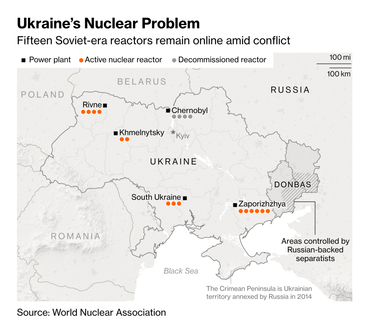
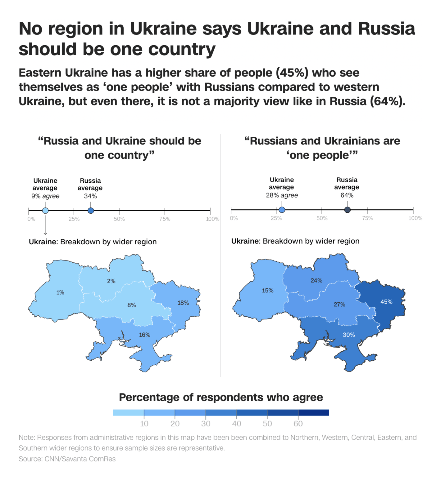
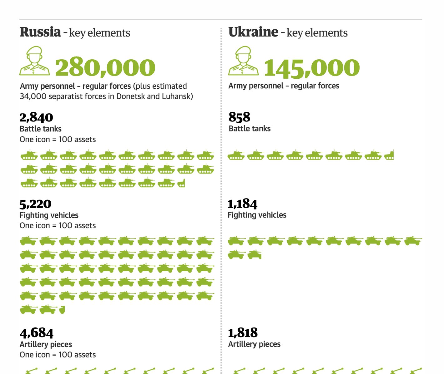
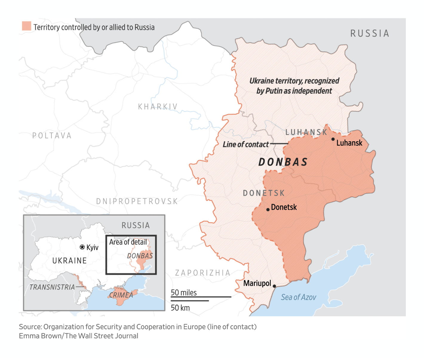
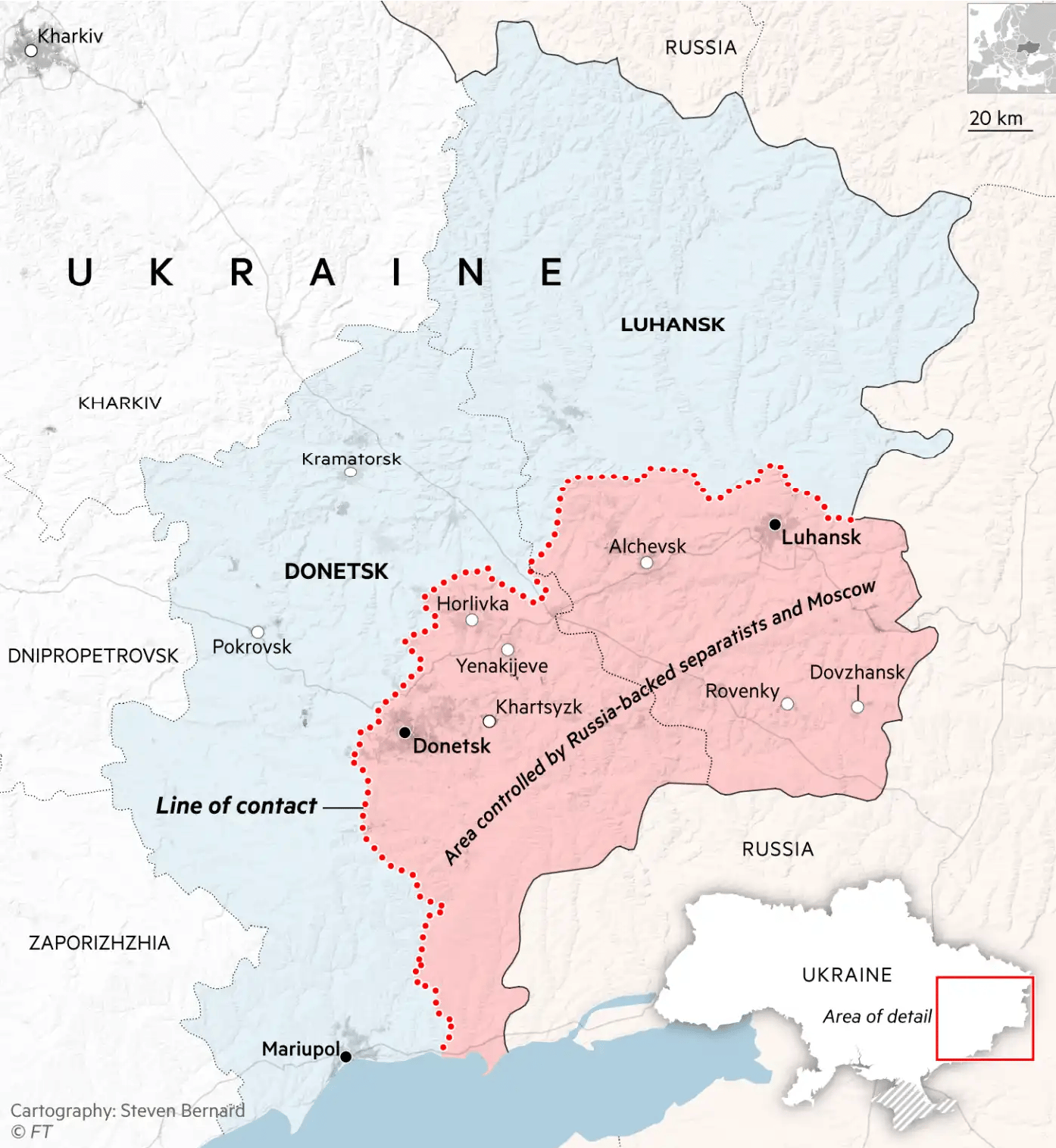
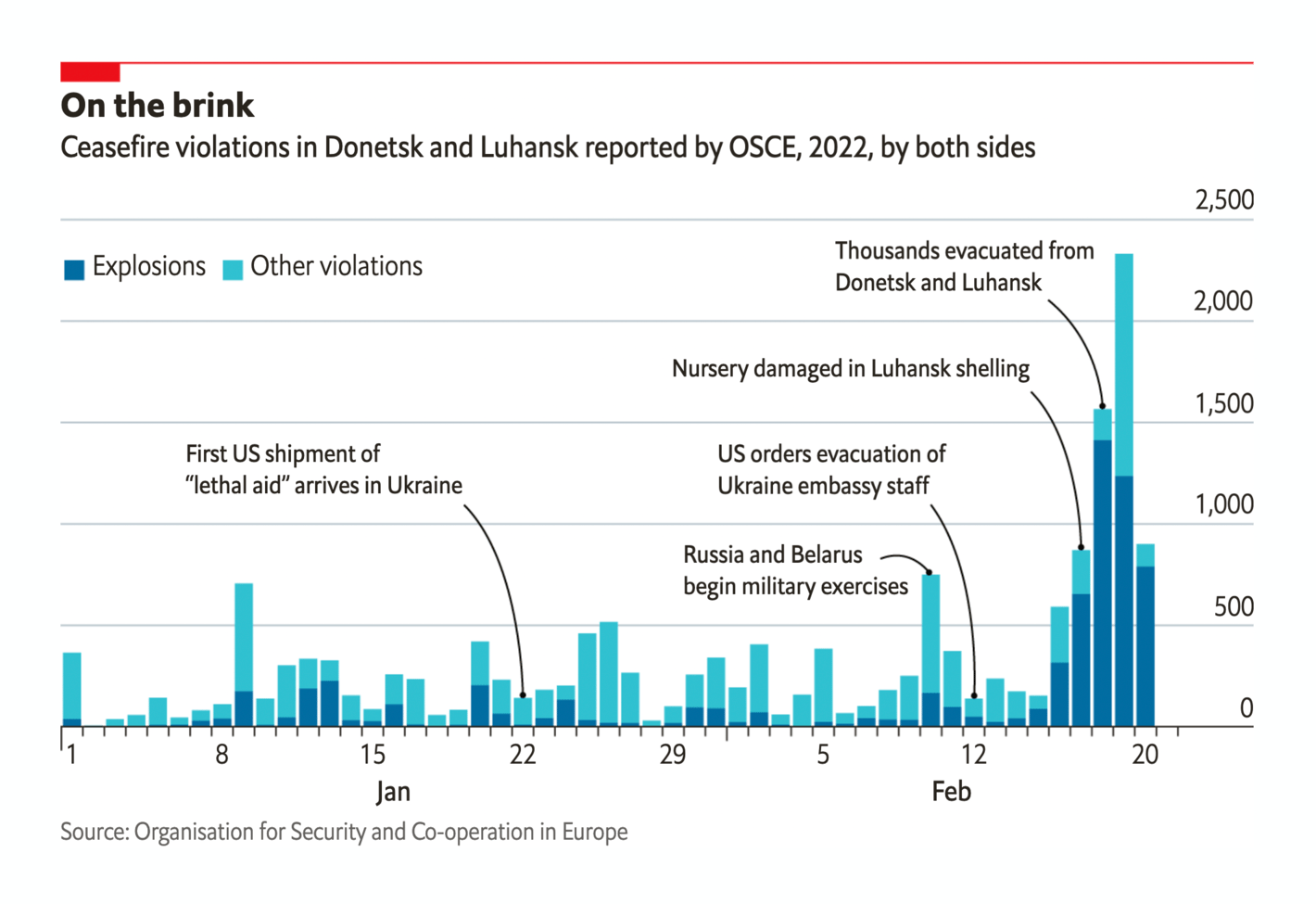
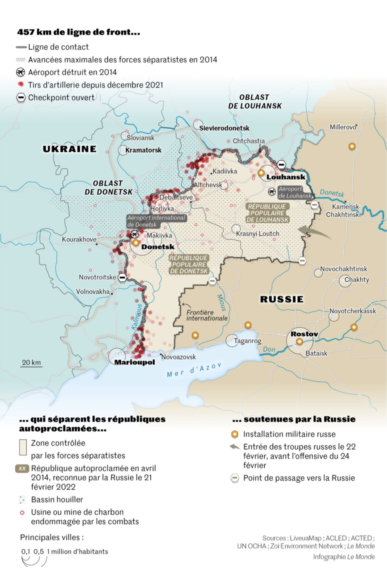
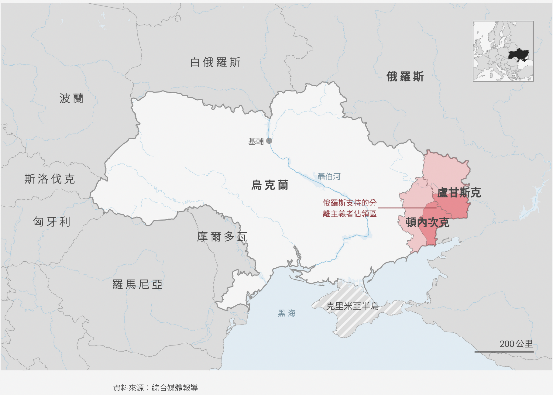
Reuters: Russia invades Ukraine Les Echos: Ukraine - Russie : comprendre la crise en 4 cartes The Wall Street Journal: Putin’s Endgame: Unravel the Post-Cold War Agreements That Humiliated Russia Bloomberg: There are Bigger Atomic Worries Than Chernobyl in Ukraine The New York Times: How to Think About Ukraine, in Maps and Charts CNN: Half of Russians say it would be right to use military force to keep Ukraine out of NATO The Guardian: Russia’s war in Ukraine: complete guide in maps, video and pictures The Economist: The military gap between Russia and Ukraine is vast Already in the days before the 24th of February, the Donbas region of Ukraine was in focus. It's been disputed by Russian-backed forces for years, and the ceasefire in place there was repeatedly broken in the last two weeks:
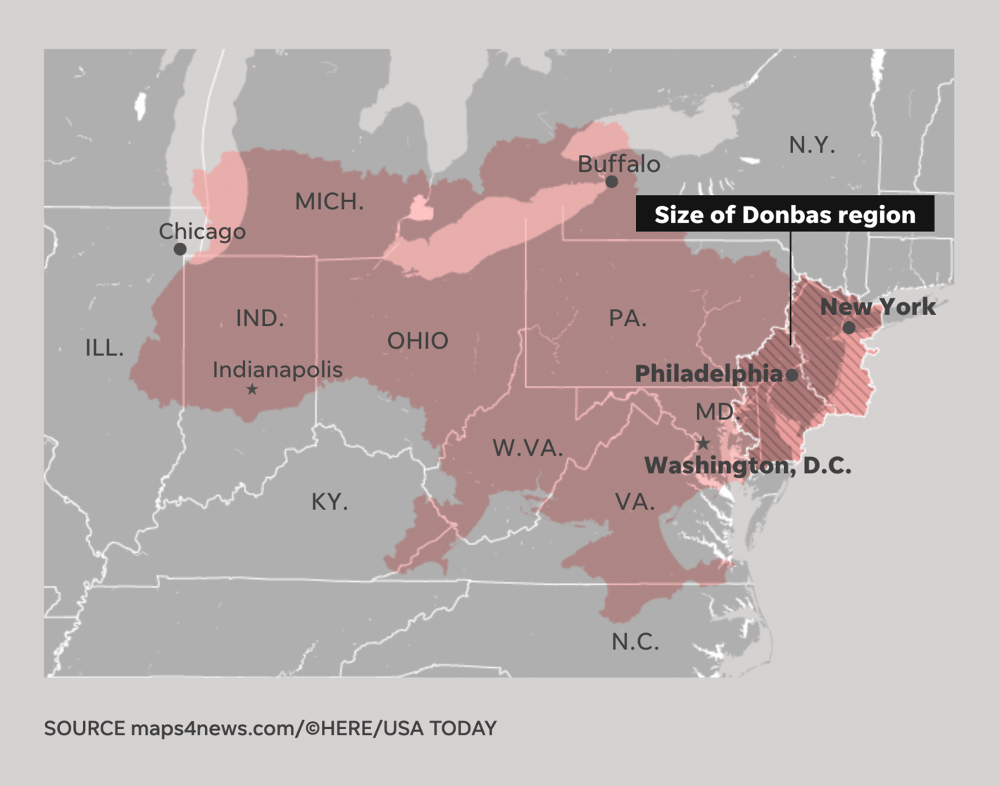
The Wall Street Journal: Ukraine Calls Up Reservists as Russian Troops Pour Into Breakaway Region; West Steps Up Sanctions Financial Times: What are Putin’s options after recognising breakaway regions in Ukraine? The Economist: The conflict in Ukraine’s Donbas region is escalating rapidly USA Today: What is Donbas and how does it fit into Russia’s invasion of Ukraine? Le Monde: Guerre en Ukraine : le Donbass, levier stratégique de Vladimir Poutine Tweet ) Many news organizations focused on Kyiv , Ukraine's capital, which Russian forces are trying to enter:
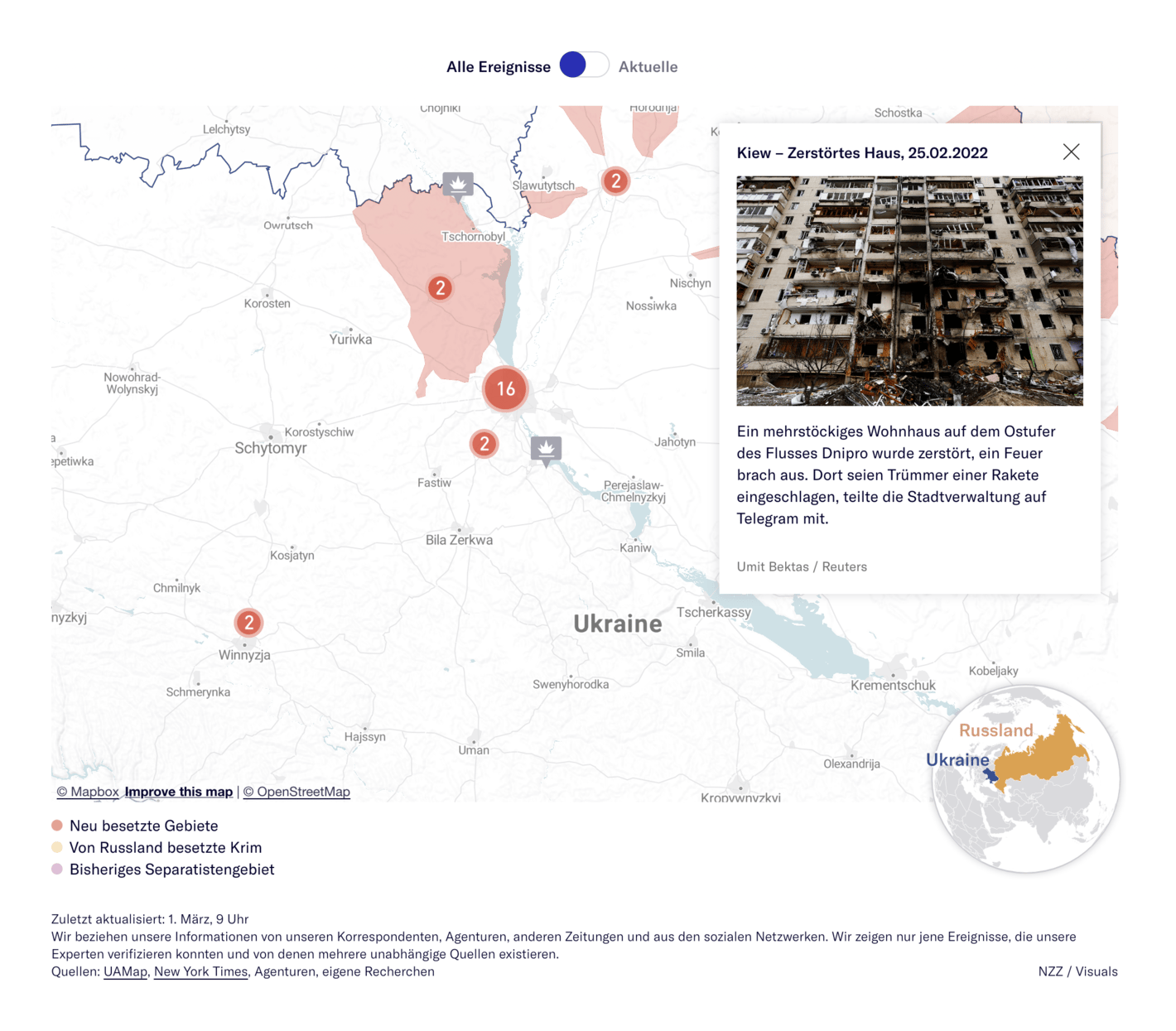
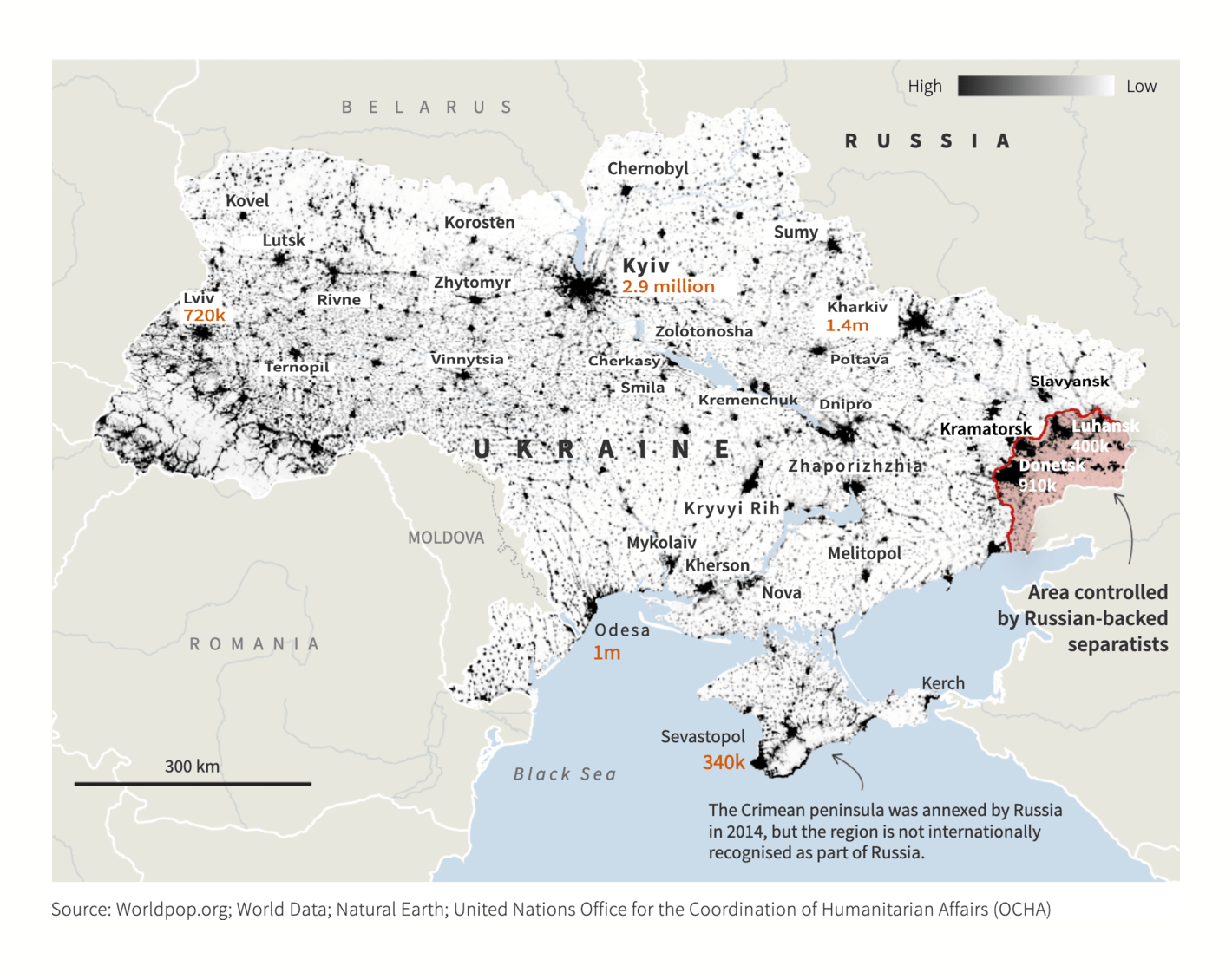
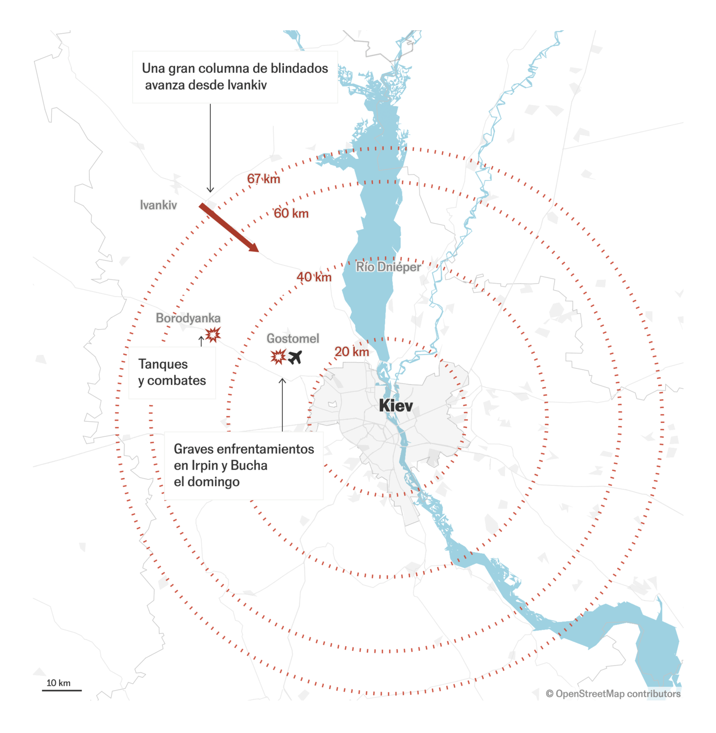
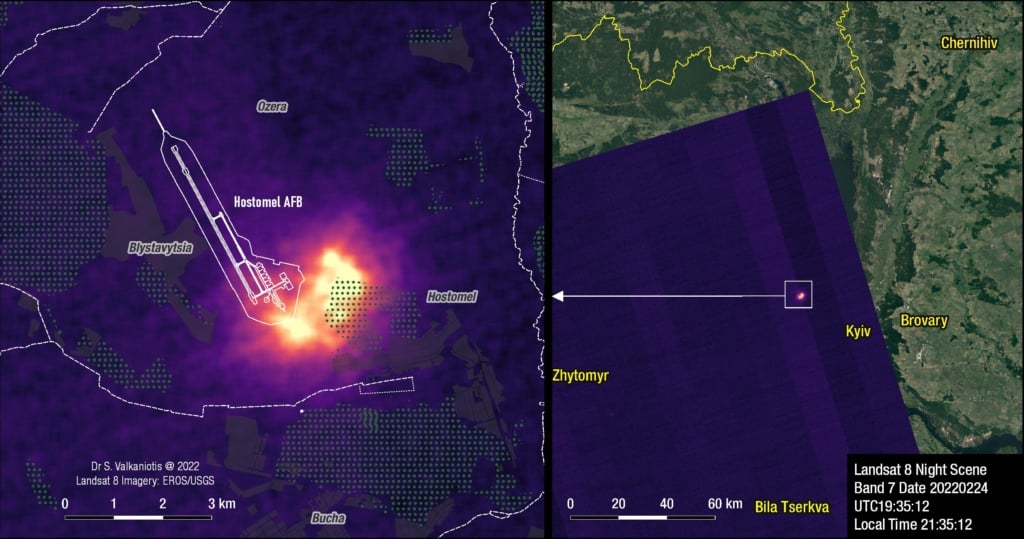
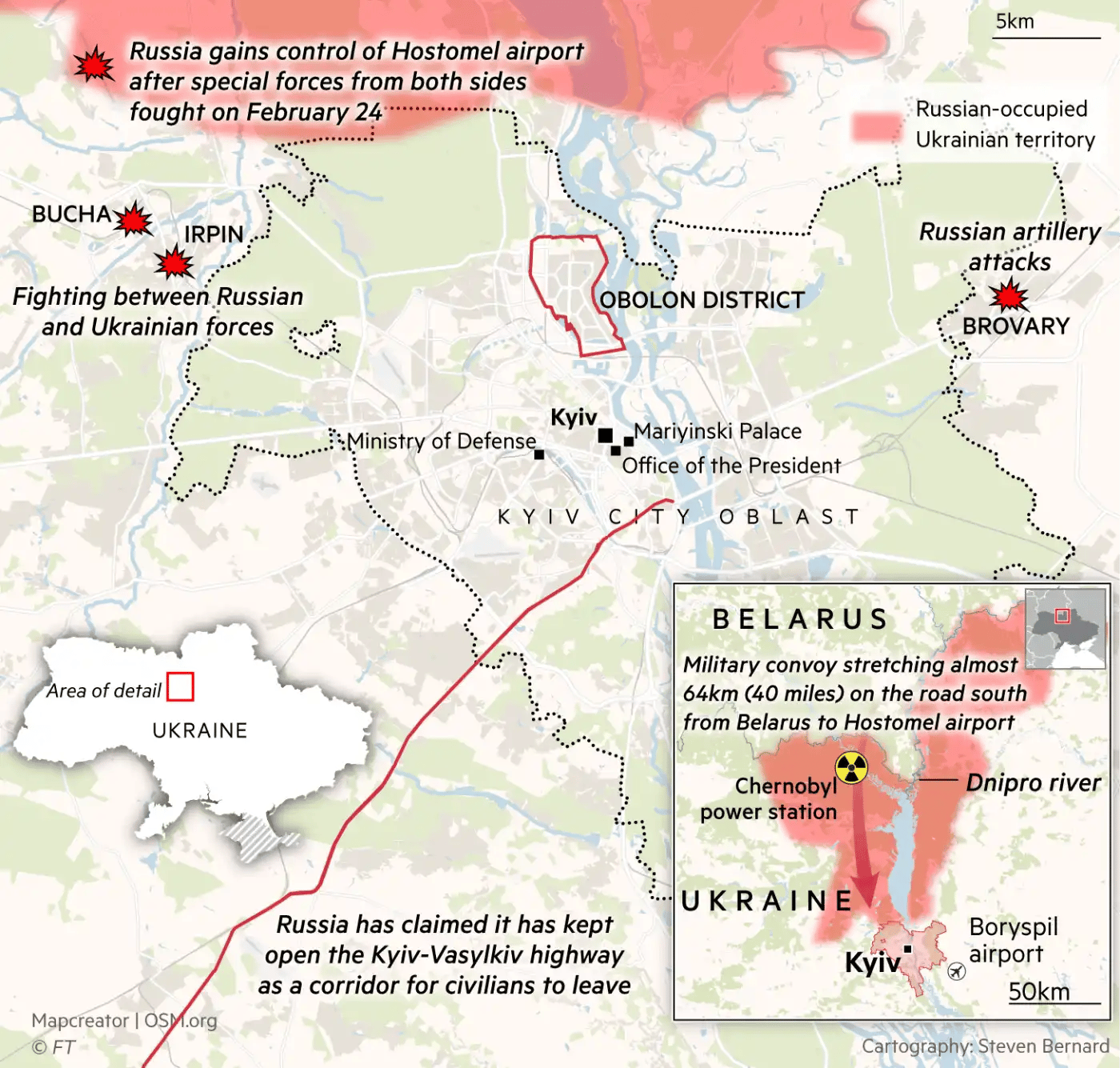
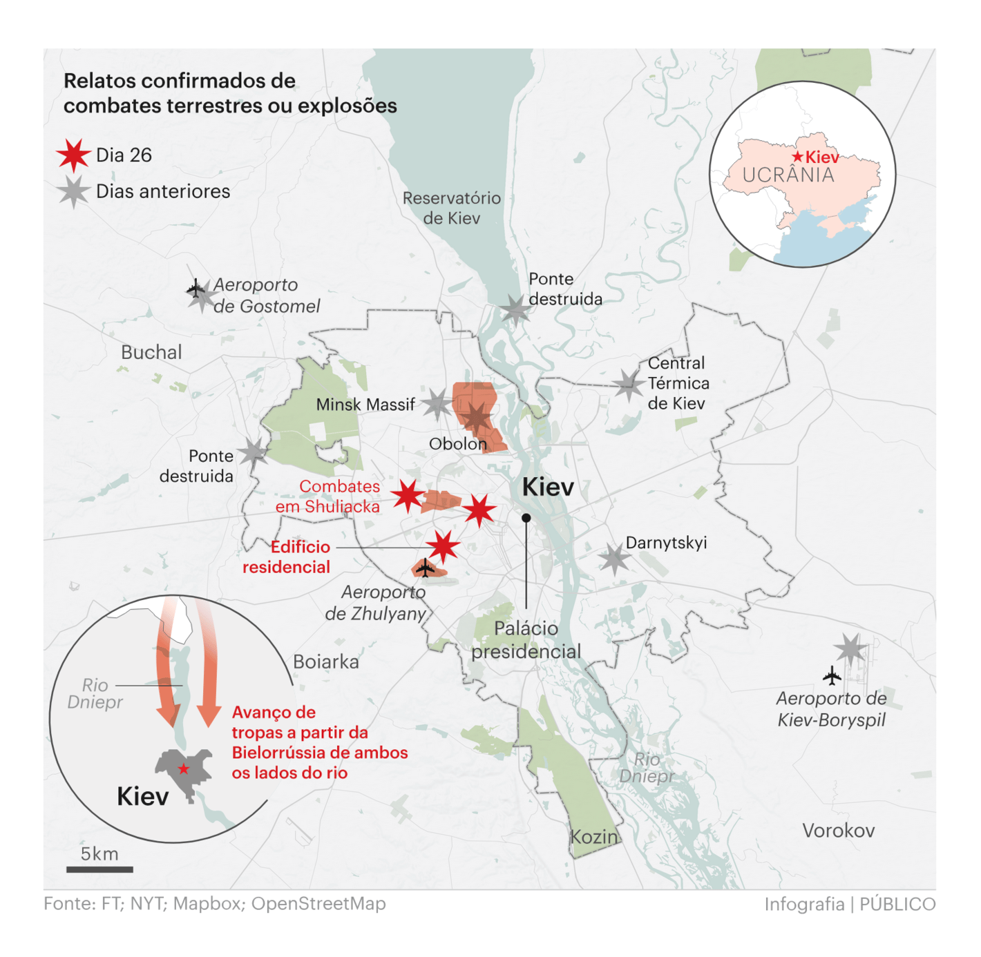
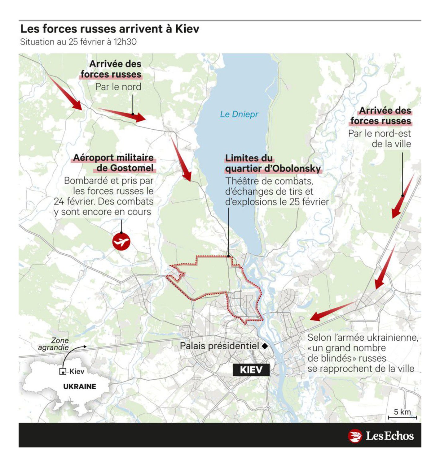
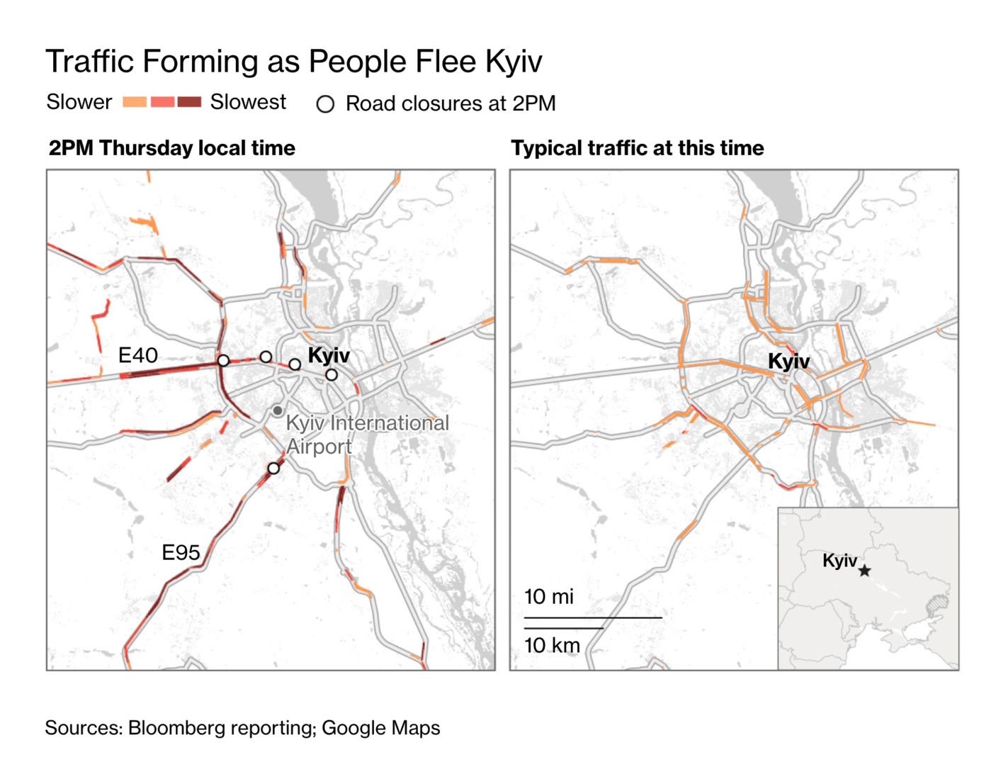
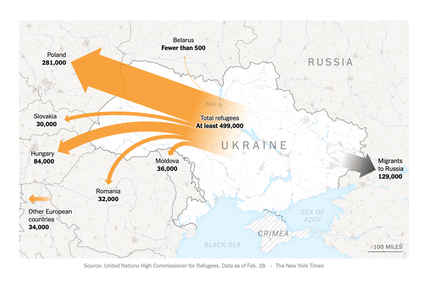
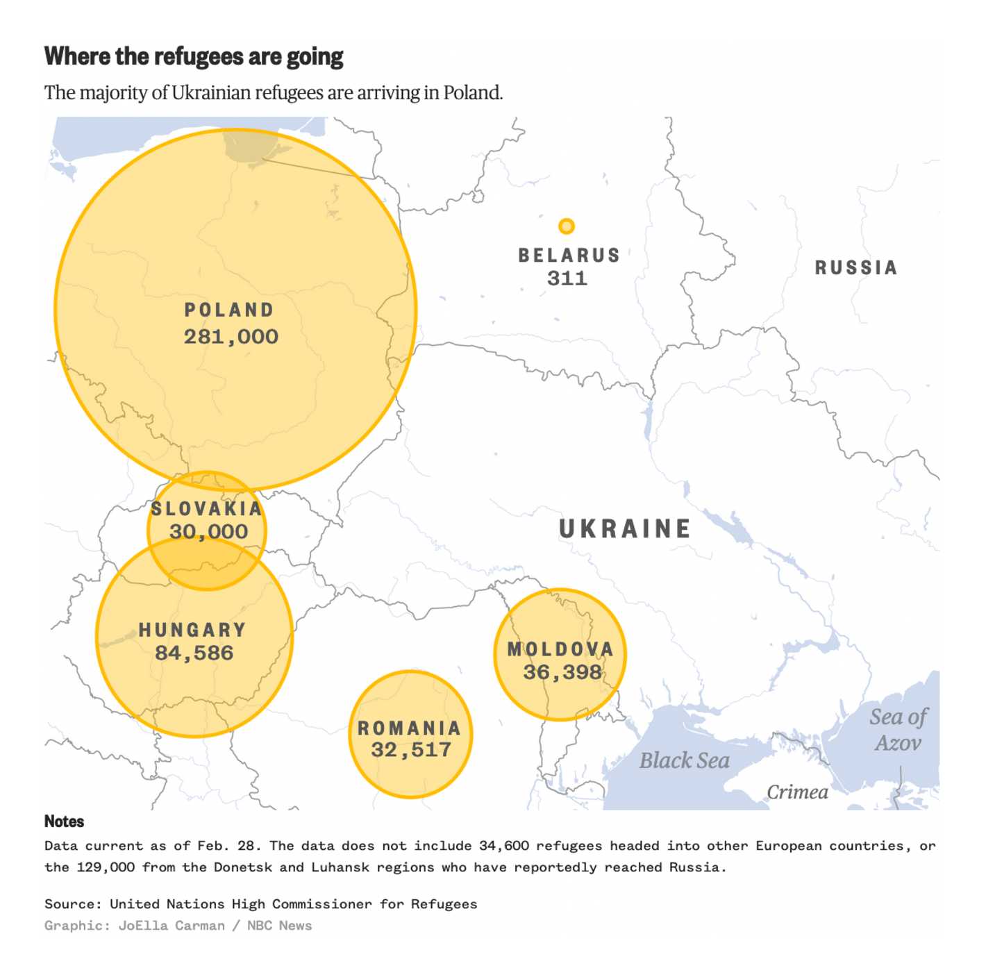
El País: Mapa del avance ruso hoy en Ucrania: las tropas se concentran cerca de Kiev Sotiris Valkaniotis: "Night #Landsat scene (Feb 24 21:35 local time) captures the battle for #Hostomel Air Base west of Kyiv #Ukraine. Despite darkness and cloud cover, SWIR band 7 marks a distinct hotspot around the SE part of the airport," February 25 (Tweet Financial Times: Russia’s invasion of Ukraine in maps — latest updates Público: Rússia invade a Ucrânia: um guia visual para entender a guerra Les Echos: Ukraine : ce qu'il faut retenir de la journée du vendredi 25 février Approximately 660,000 people have already fled Ukraine by train, bus, or car, and many more are still trying to escape:
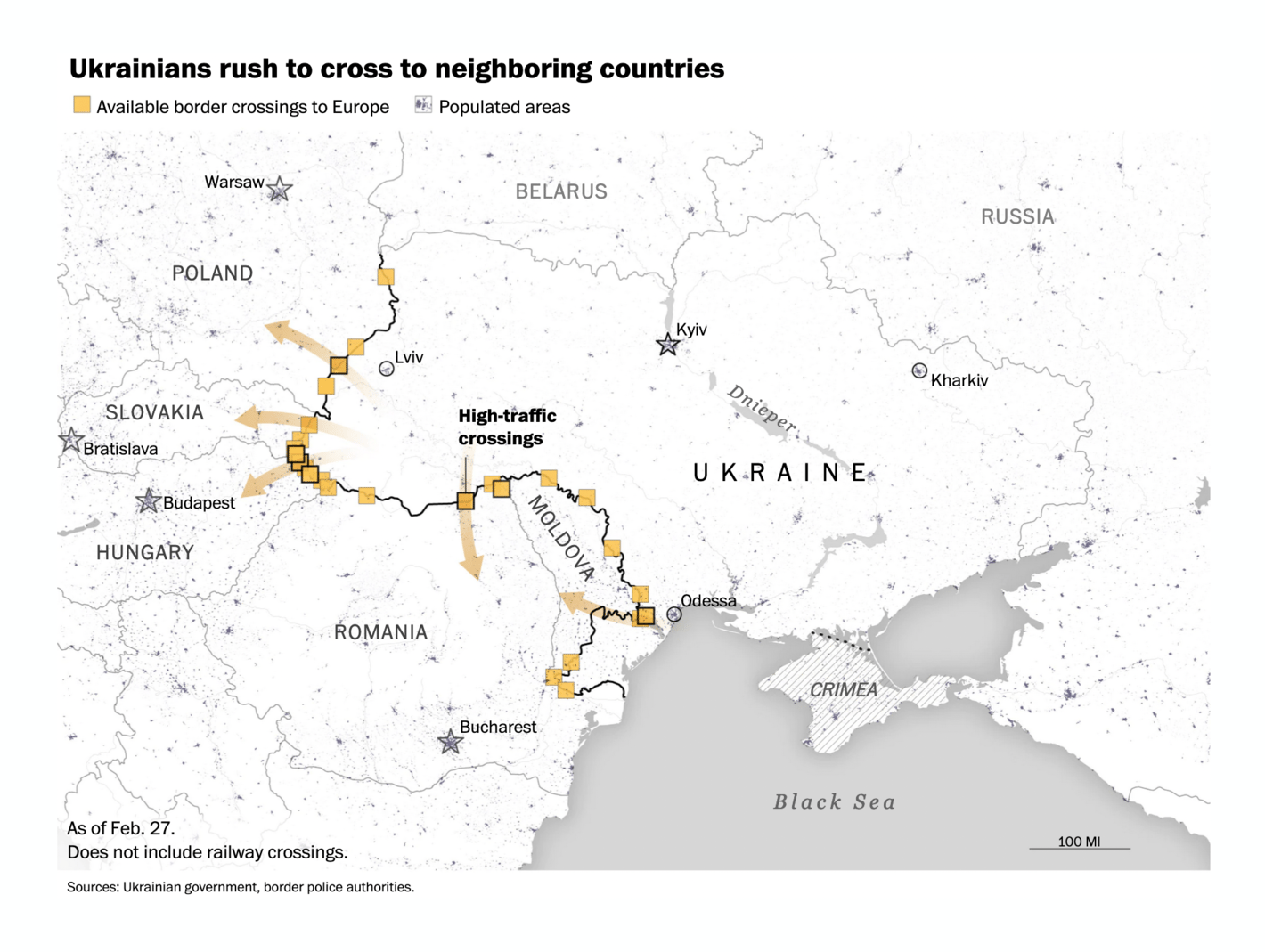
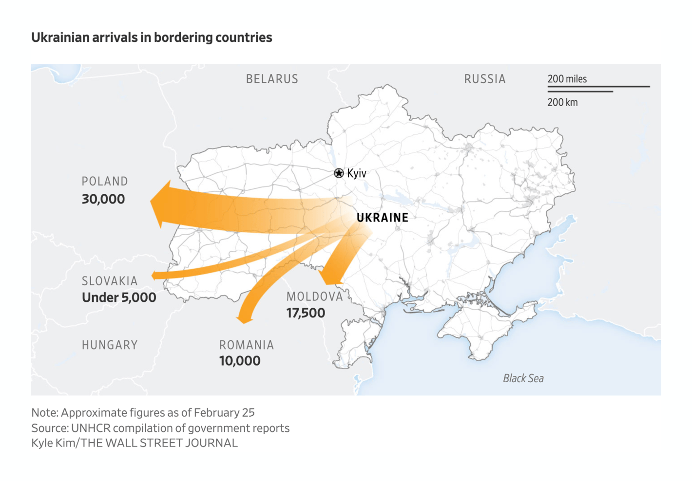
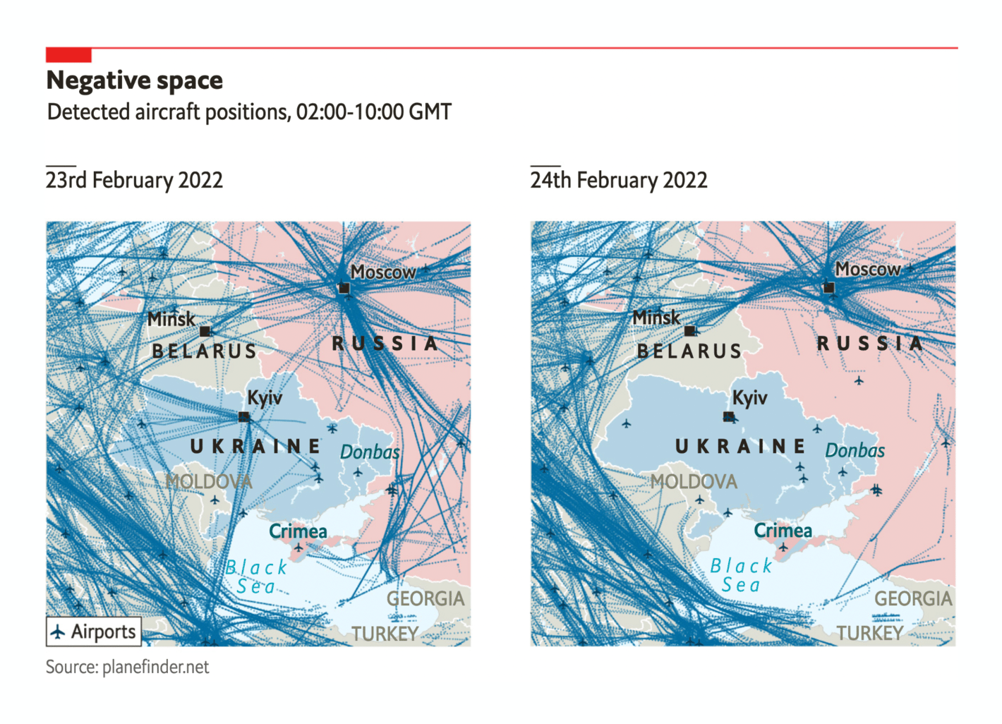
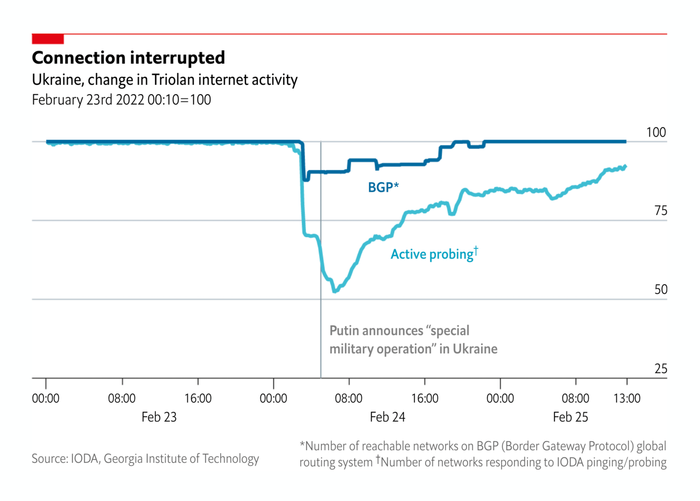
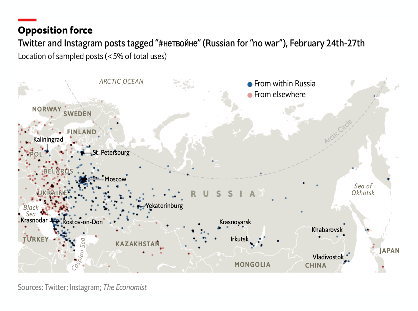
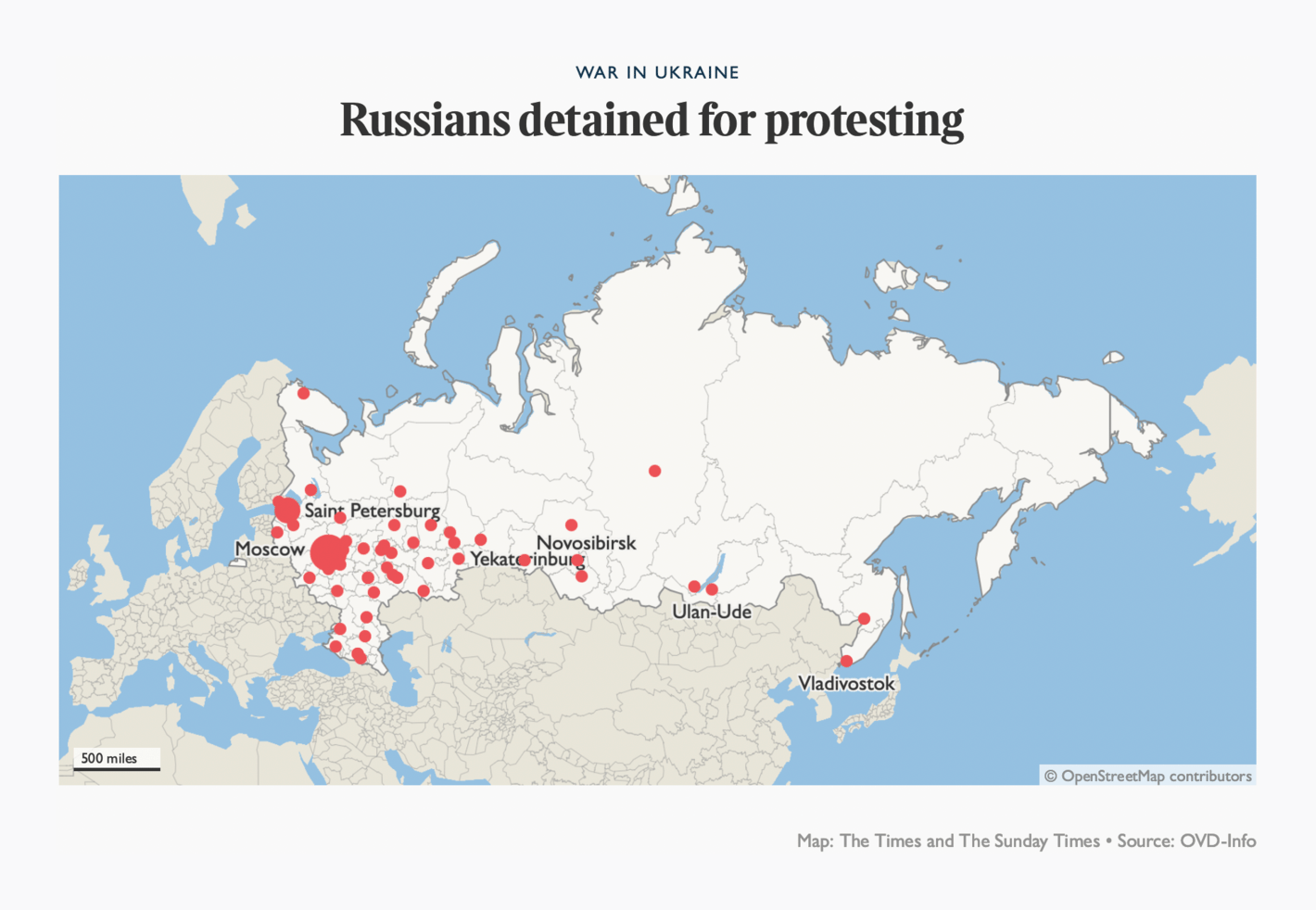
Bloomberg: A Visual Guide to the Russian Invasion of Ukraine The Washington Post: Photos and videos show long waits, traffic jams at border crossings as thousands try to leave Ukraine Wall Street Journal: Children and Belongings in Tow, Ukrainians Throng Borders Fleeing Russian Invasion The New York Times: Maps: Tracking the Russian Invasion of Ukraine NBC News: MAP: Half a million Ukrainians are fleeing their country. See where they're going. The Economist: “Active conflict zone”: flights over Ukraine diverted The Economist: Ukrainian cities are suffering internet blackouts People all over the world have protested and demonstrated against the invasion — including in Russia, where protesters are being detained by the police:
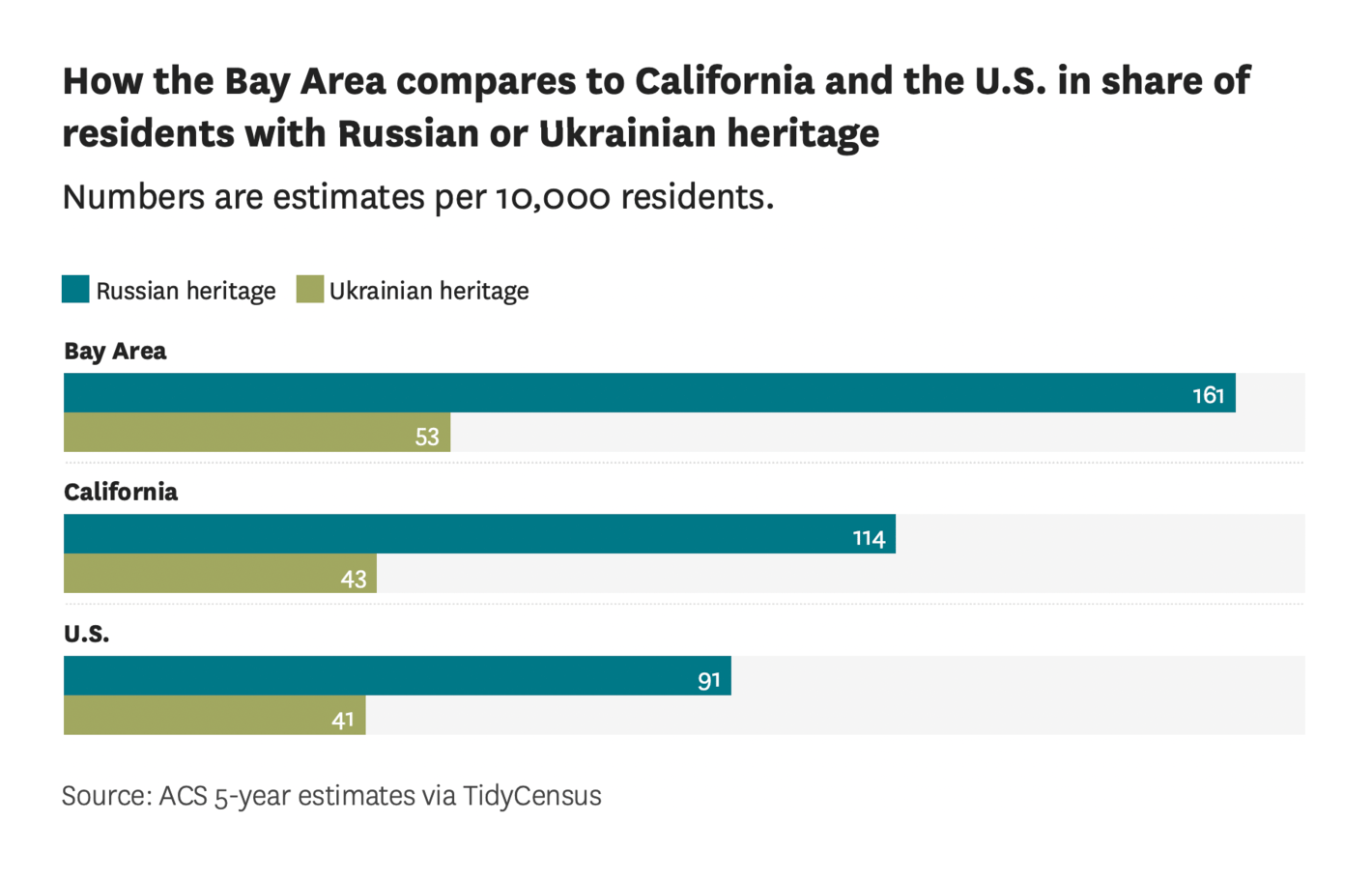
The Economist: Russians in every major city and region call for #nowar The Times: The Ukraine-Russia war explained in maps and charts San Francisco Chronicle: These charts show how many Bay Area residents have Ukrainian or Russian heritage Most Western countries immediately condemned Putin's invasion. Now of most interest are the consequences the war will have on the relationship between Russia and China :
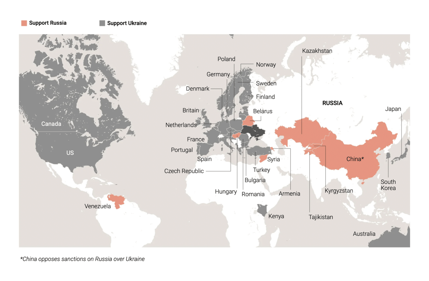
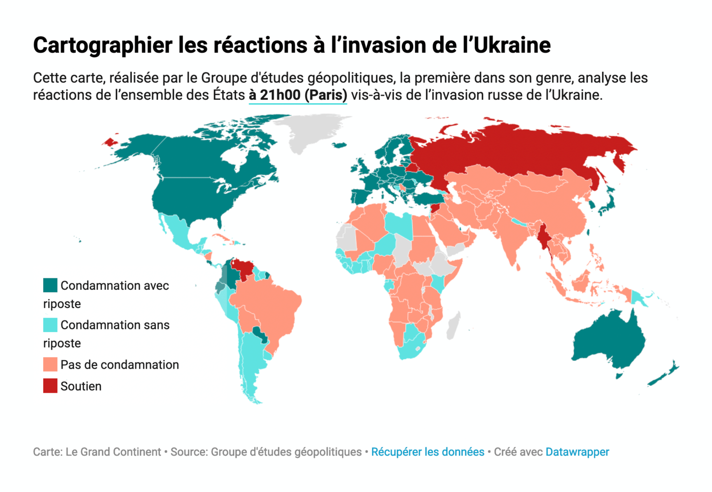
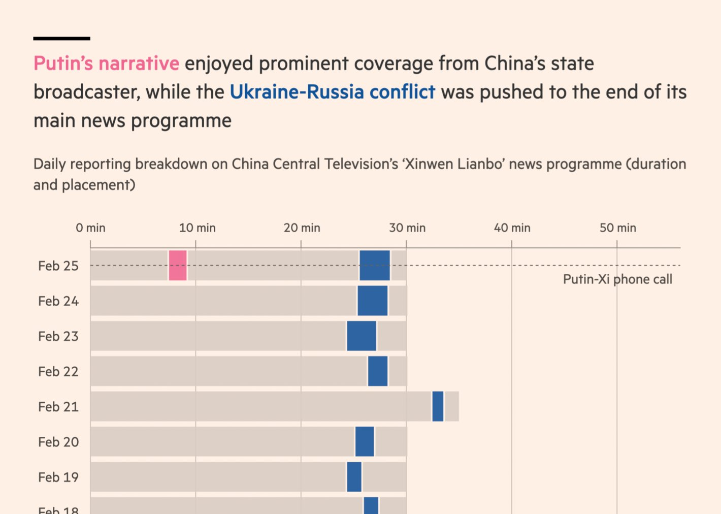
South China Morning Post: Russia attacks Ukraine Le Grand Continent: Cartographier les réactions à l’invasion de l’Ukraine Financial Times: Don’t mention the invasion: China spins Russia’s war in Ukraine CommonWealth Magazine: 俄羅斯、烏克蘭開戰,會殃及台灣嗎? Many countries were quick to impose sanctions on Russia . War and sanctions have already started to affect the Russian economy:
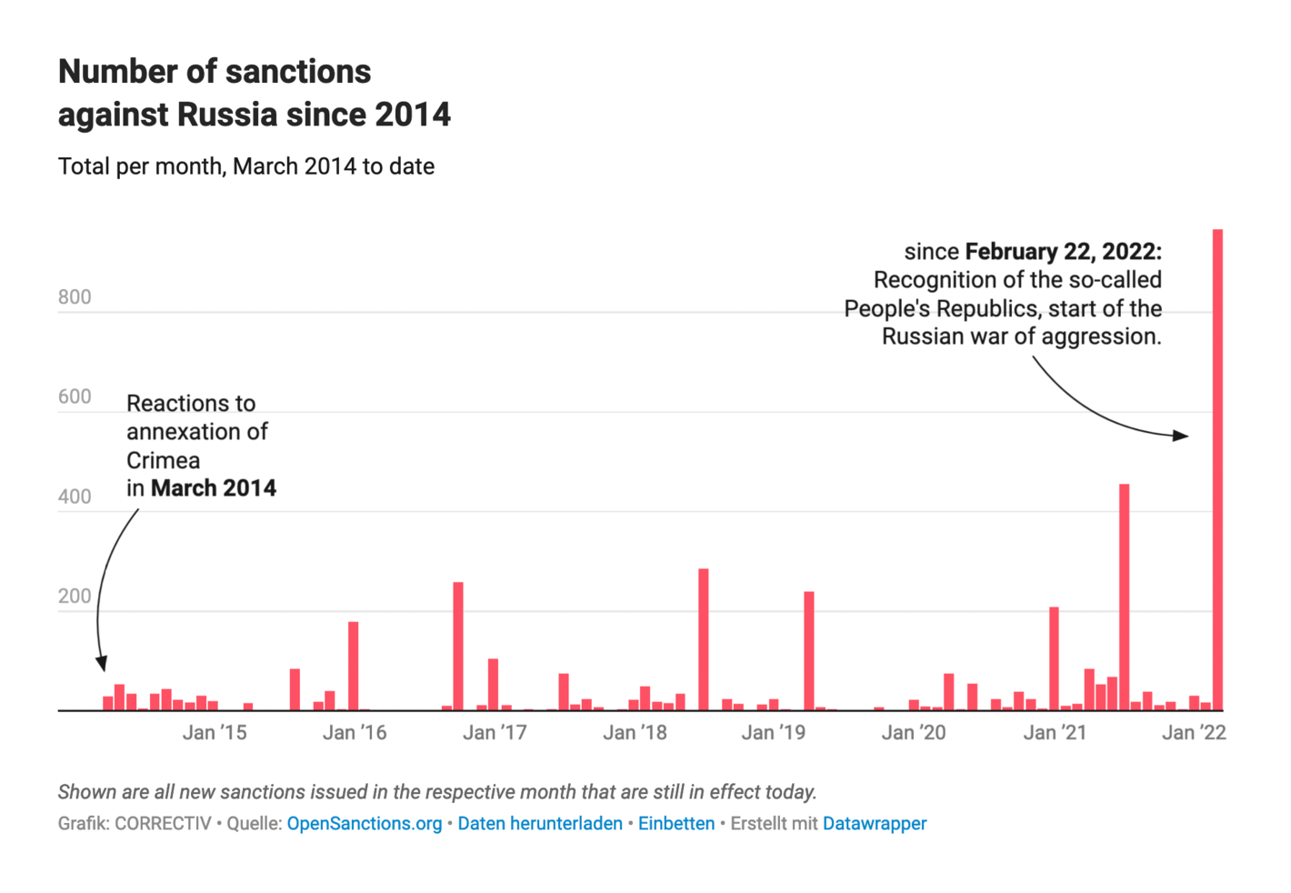
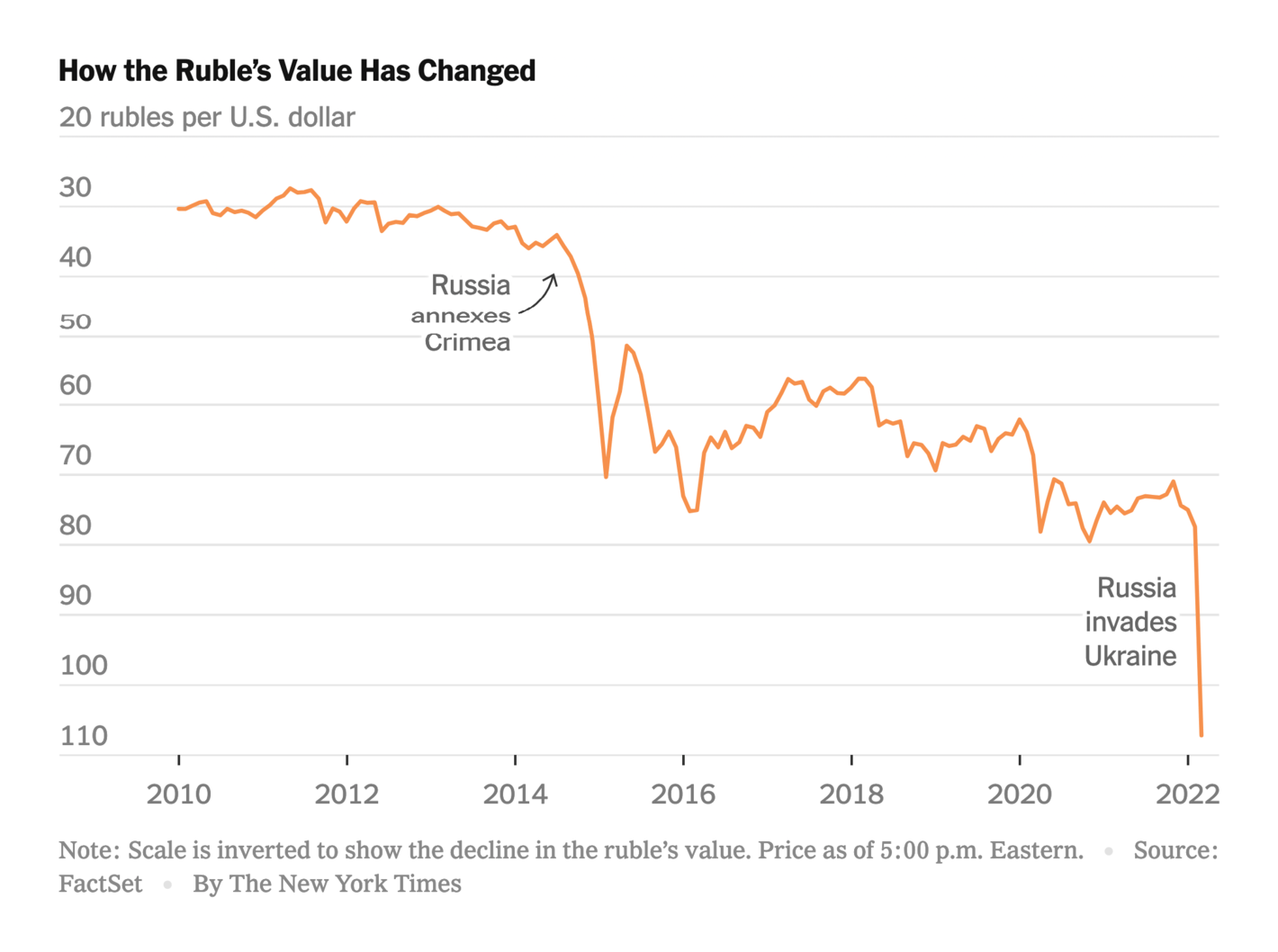
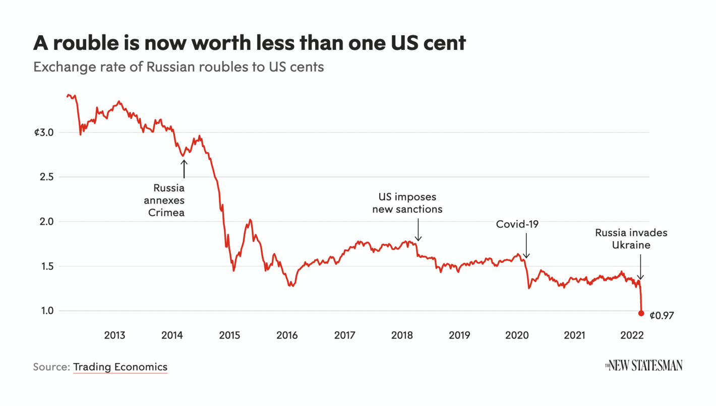
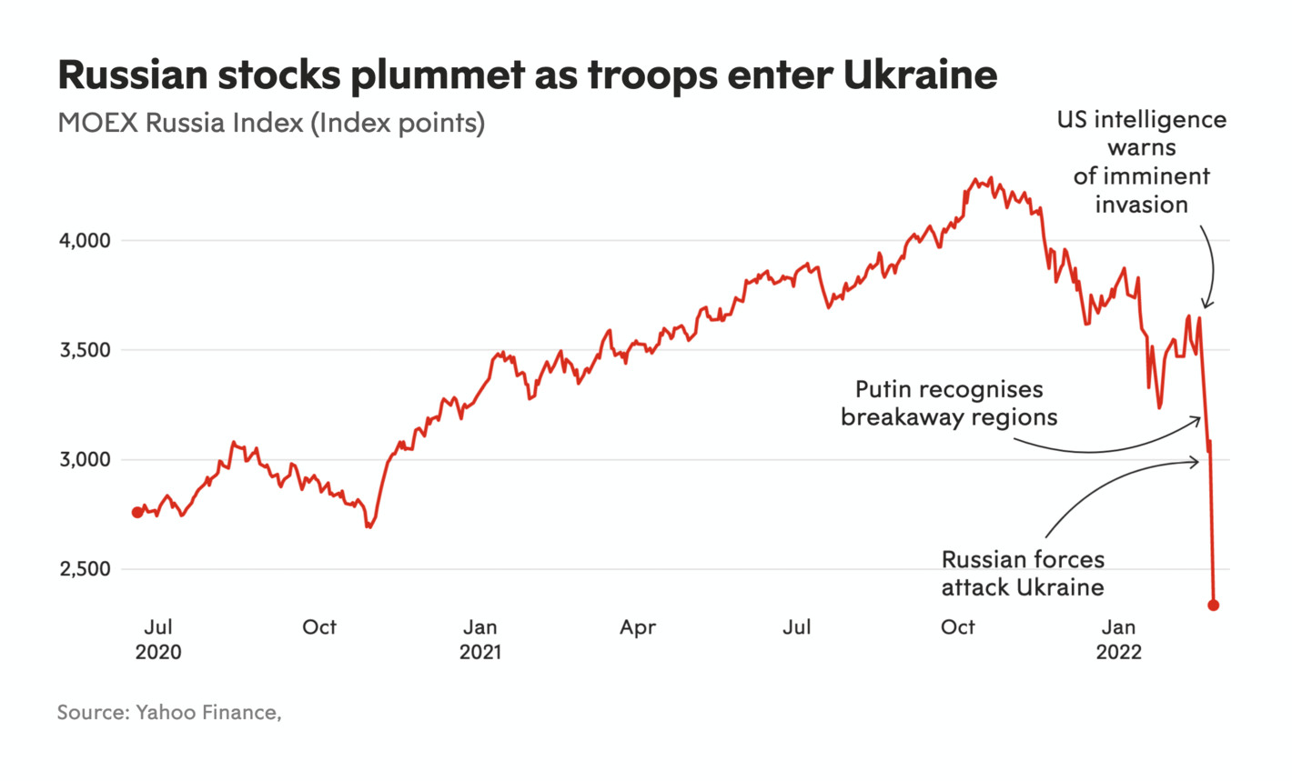
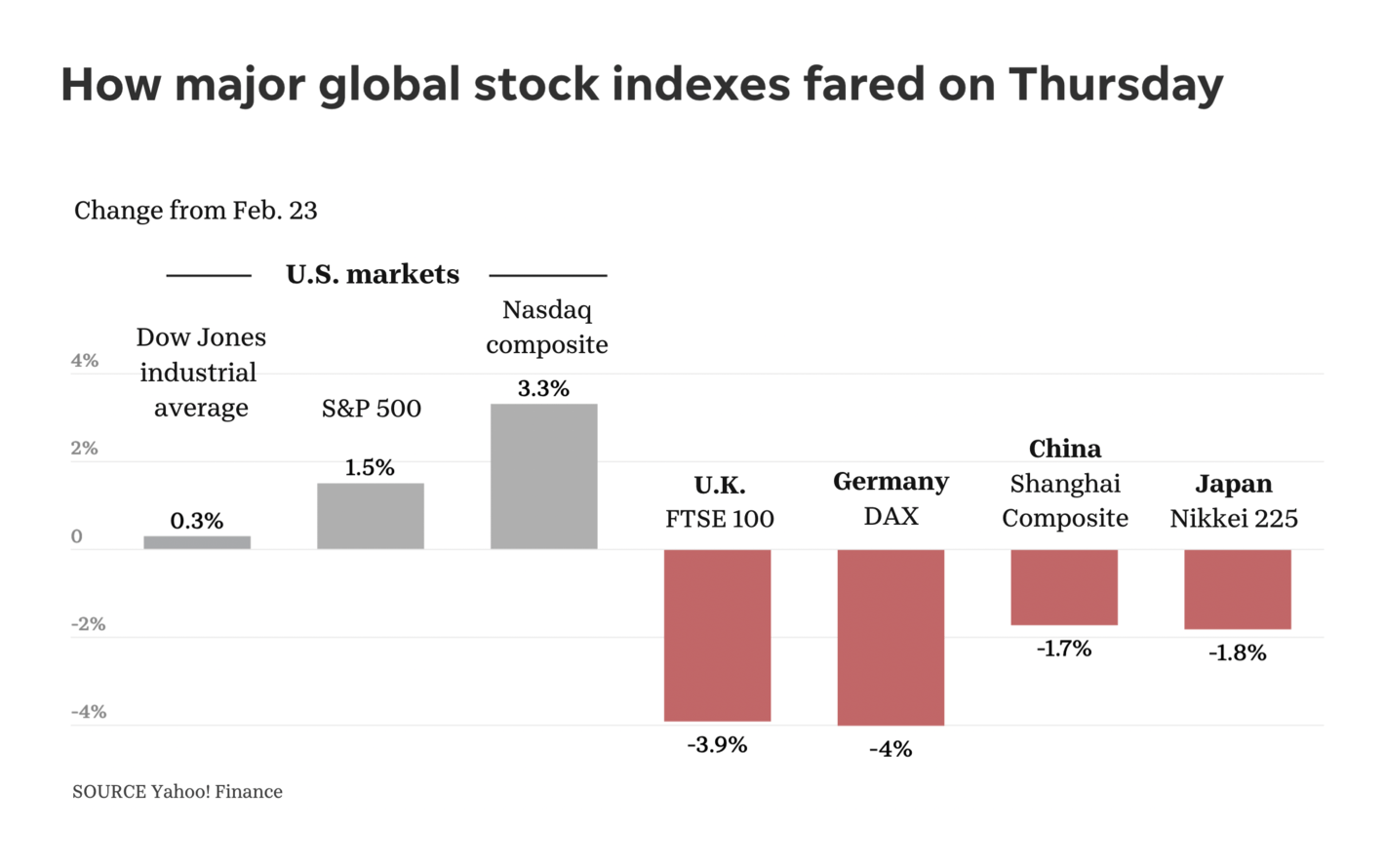
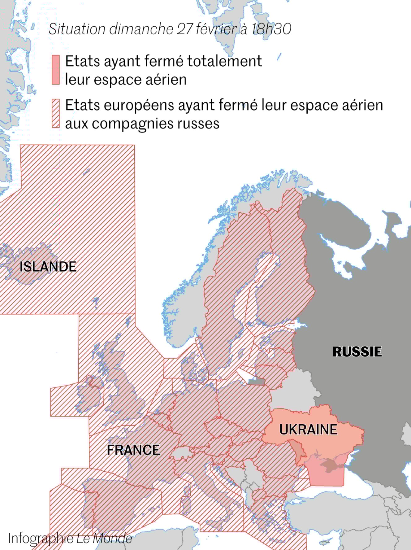
Correctiv: Live monitoring of all sanctions against Russia The New York Times: The West’s Plan to Isolate Putin: Undermine the Ruble The New Statesman: How the Russian rouble has plummeted to a record low The New Statesman: Russian stocks plummet as troops enter Ukraine USA Today: Stock markets, energy prices shaken by Russian attack Le Monde: Guerre en Ukraine : les avions russes interdits de survol dans la quasi-totalité de l’Europe But sanctions are not without risk for European countries that rely on Russian gas :
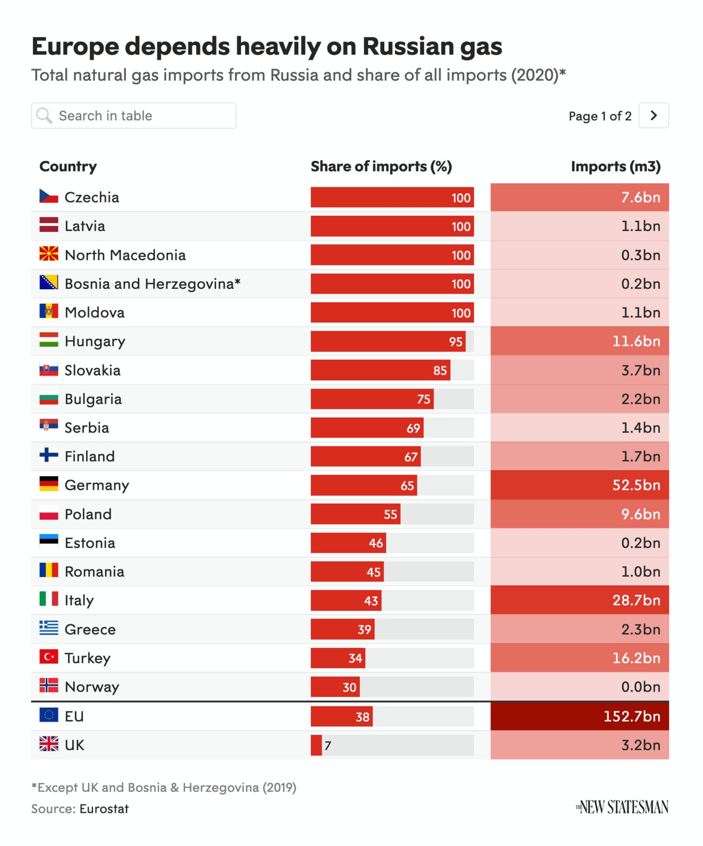
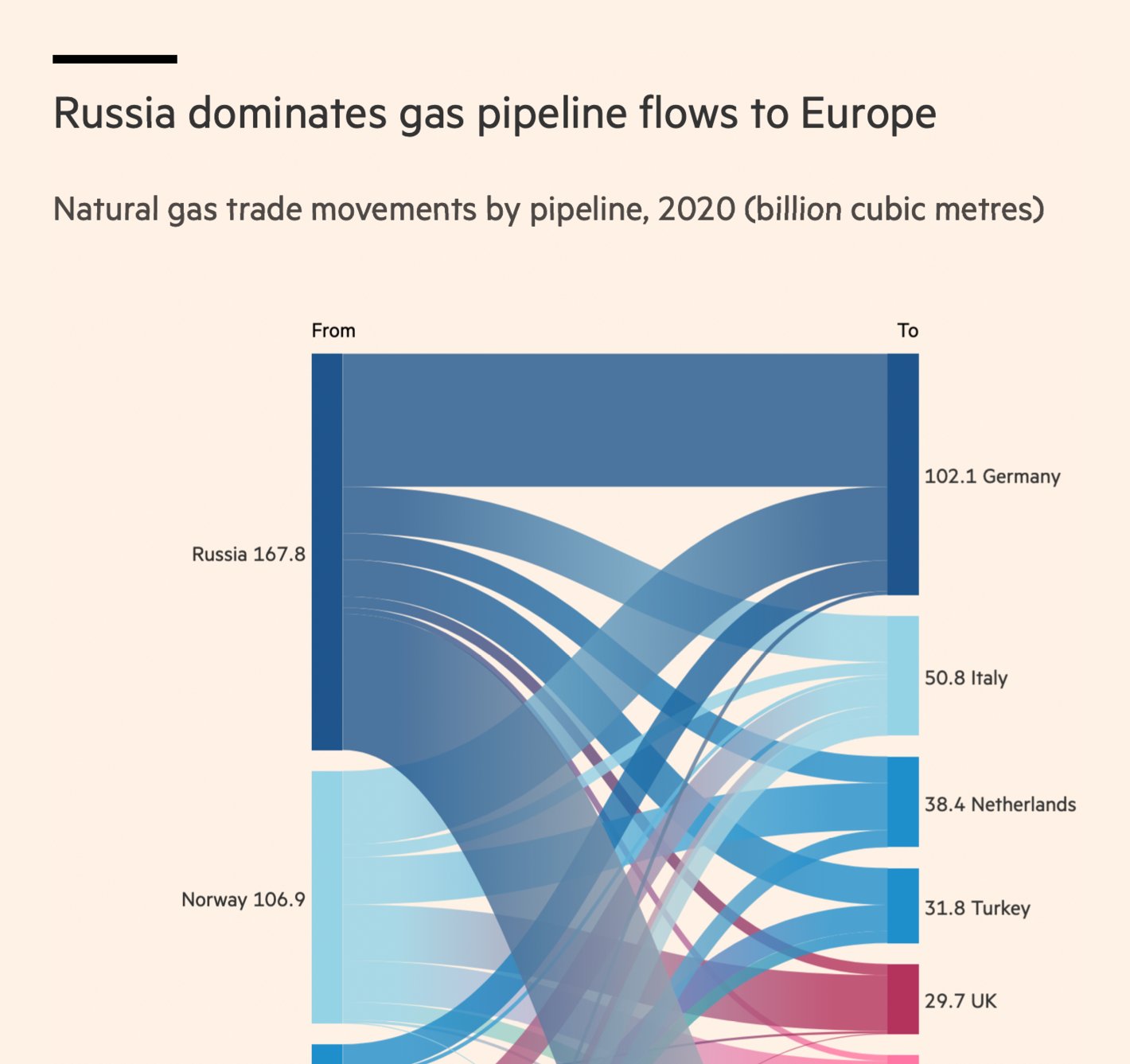
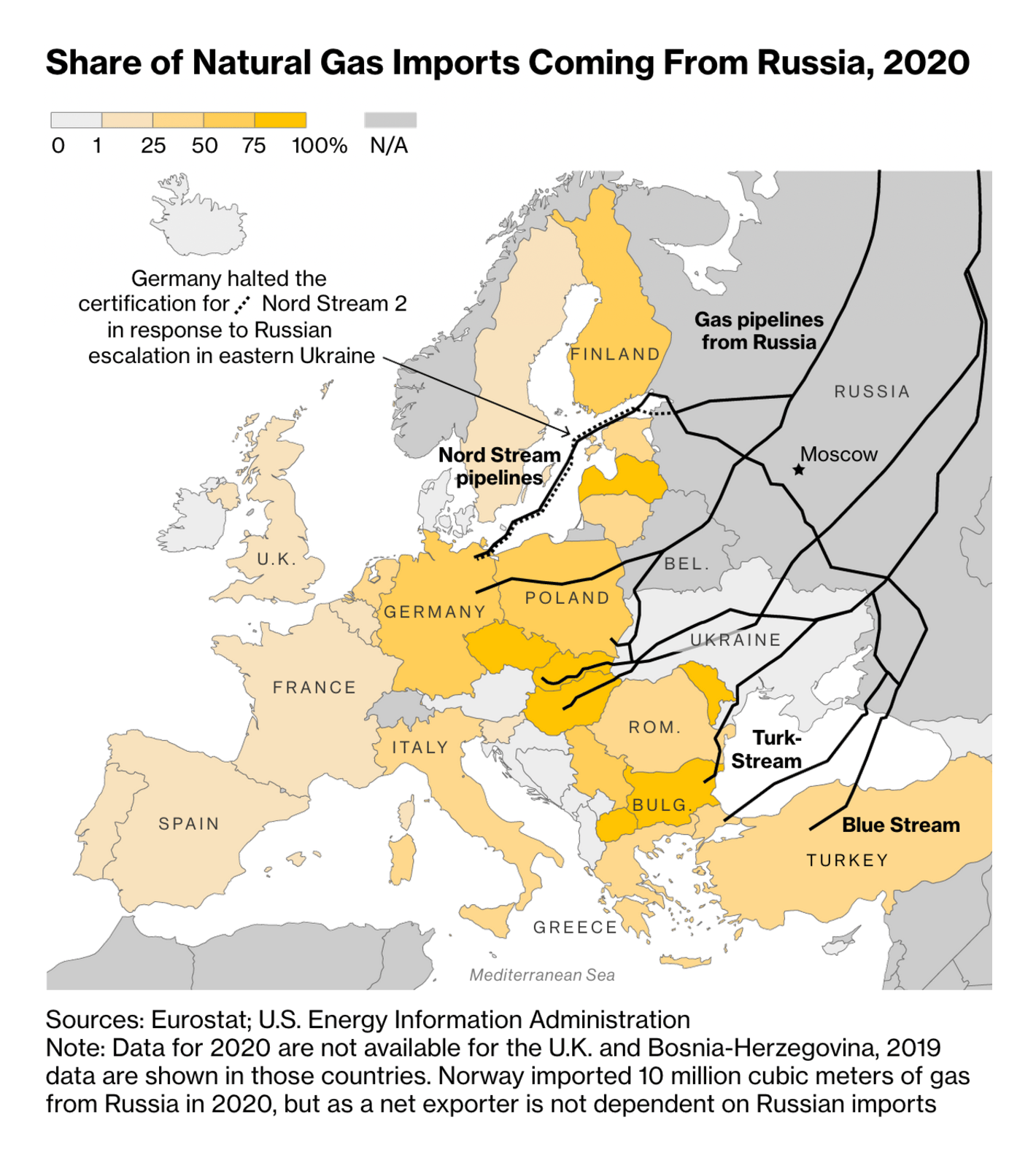
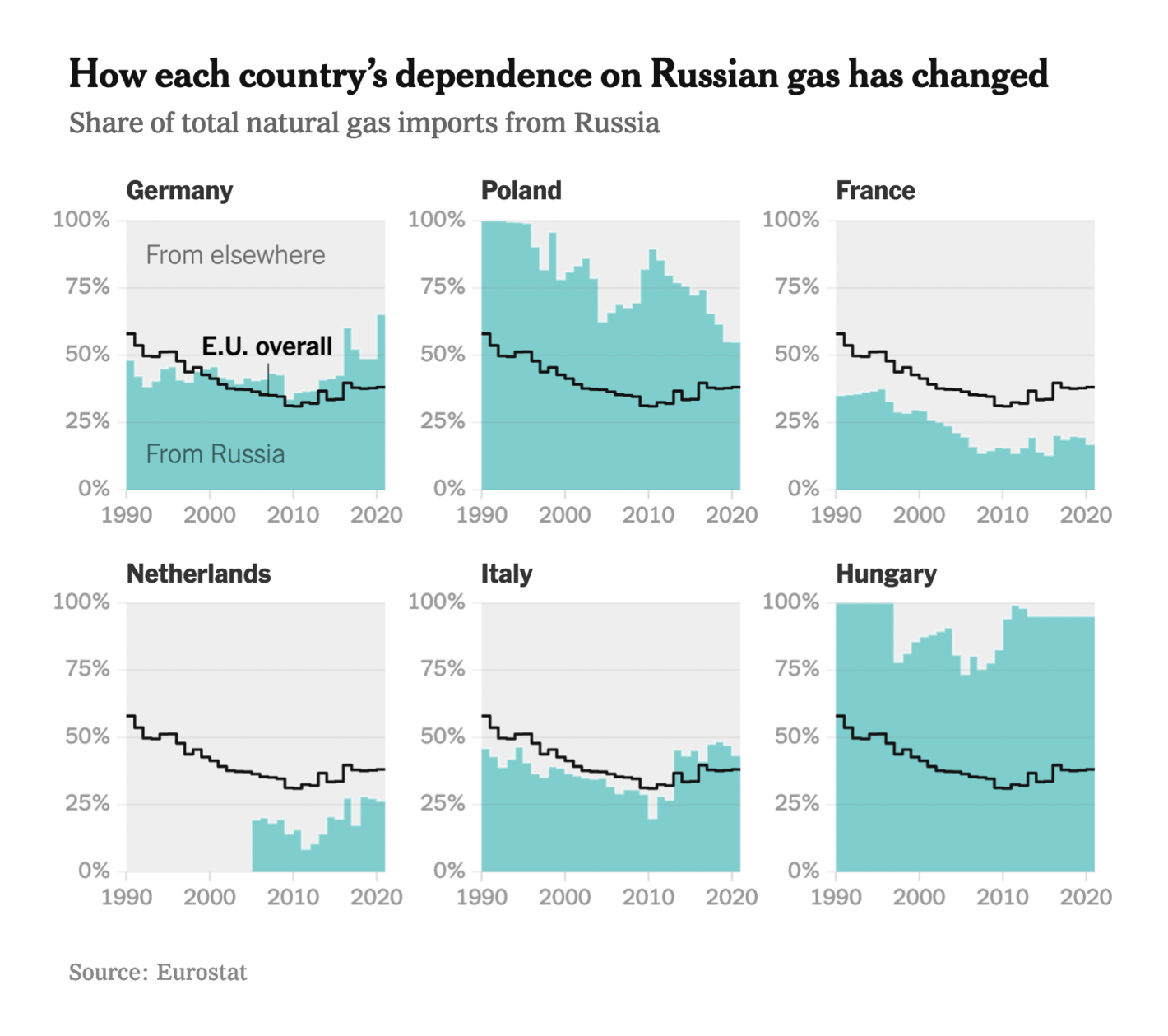
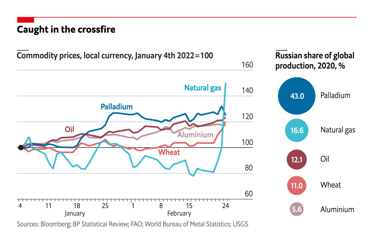
The New Statesman: How Europe is dependent on Russian gas Financial Times: The new energy shock: Putin, Ukraine and the global economy Bloomberg: Germany Backs New LNG Plants to Cut Russian Gas Dependence The New York Times: Why the Toughest Sanctions on Russia Are the Hardest for Europe to Wield The Economist: Commodity prices jump as Russia goes to war As Vox and Quartz explain, the war could also have consequences for countries that rely on imports of Russian and Ukrainian wheat:
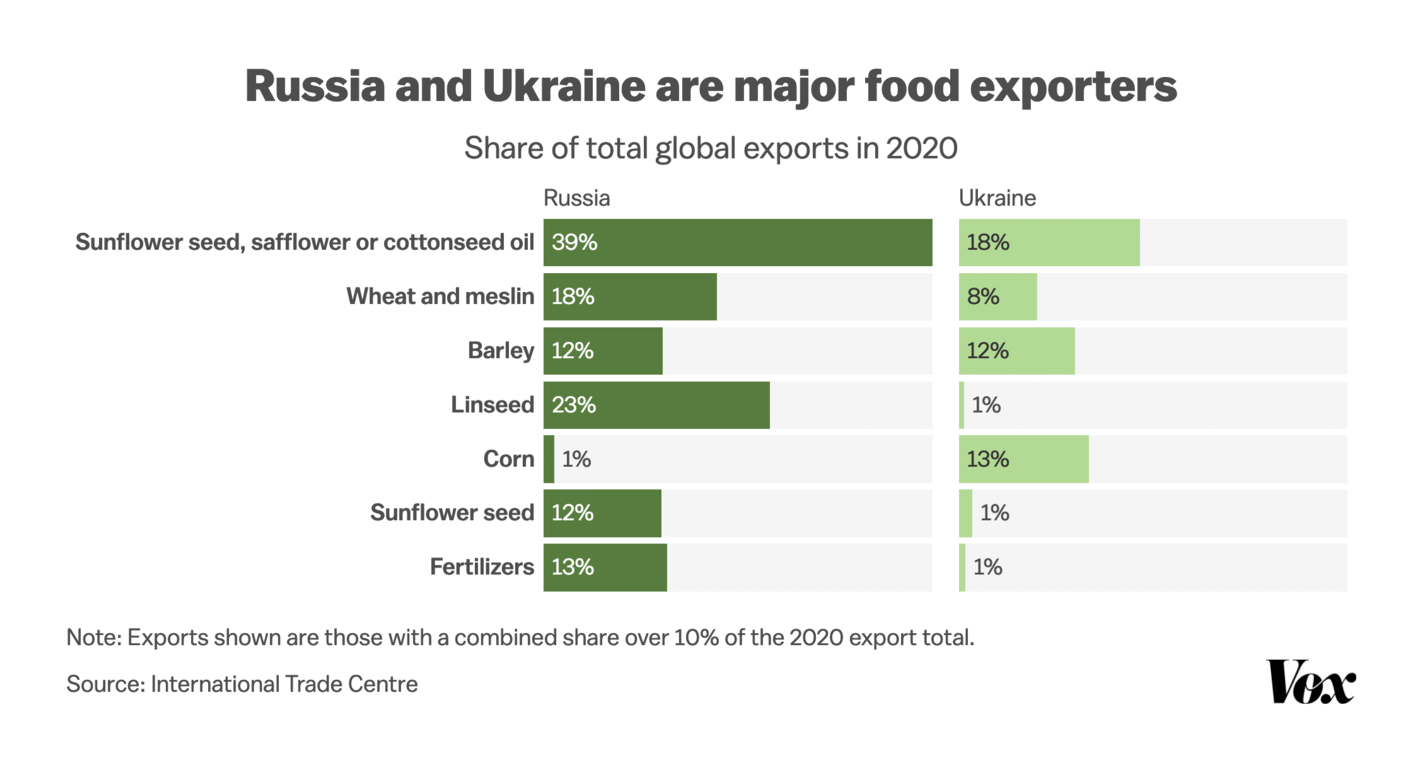
Vox: What the Russian invasion of Ukraine could mean for global hunger Quartz: Conflict in Ukraine could hit Lebanon’s food supply The pandemic hasn't stopped for the war. The New York Times shows new research on the origins of the virus, while others dug deeper into death numbers, why Republicans are less vaccinated, and how much Brits have saved in the past two years:
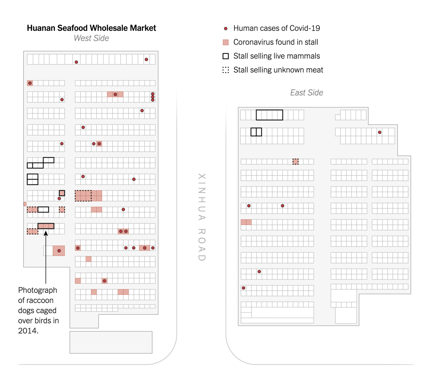
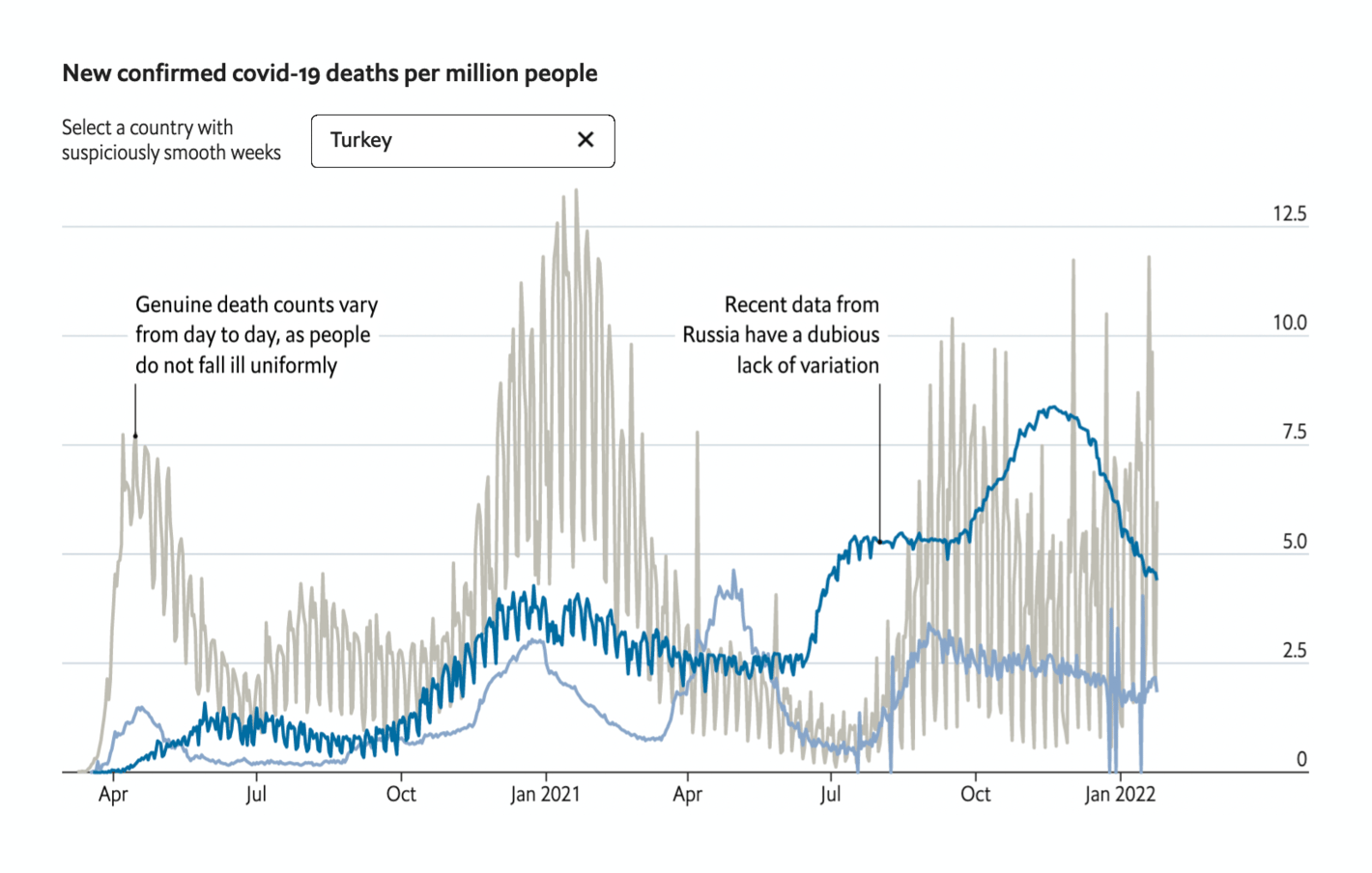
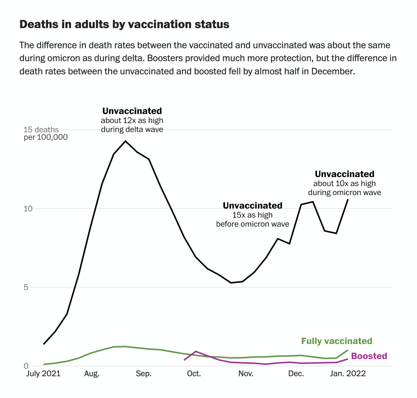
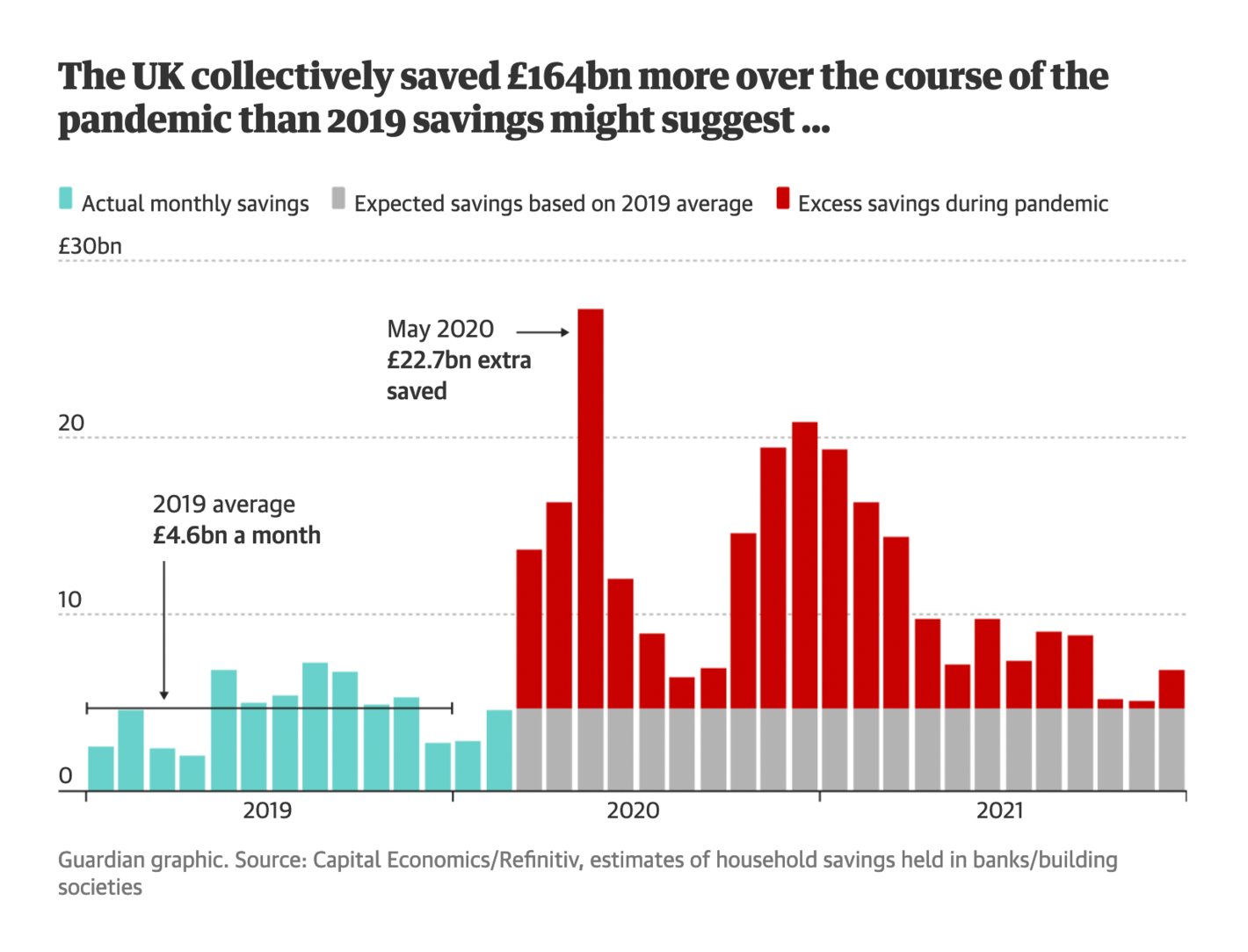
New York Times: New Research Points to Wuhan Market as Pandemic Origin The Economist: Are some countries faking their covid-19 death counts? The Washington Post: Coronavirus vaccine protection was much weaker against omicron, data shows Vox: How American conservatives turned against the vaccine The New York Times: Who’s Requiring Workers to Be Vaccinated? The Guardian: Lockdown lifestyles: how has Covid changed lives in the UK? In climate and environmental news, the IPCC released their latest report yesterday, and it's worth a read. We've also seen reports on more drought, more wildfire events, more gas flaring, and more clothing — yes, clothing — which, as Bloomberg explains , is "an environmental crisis":
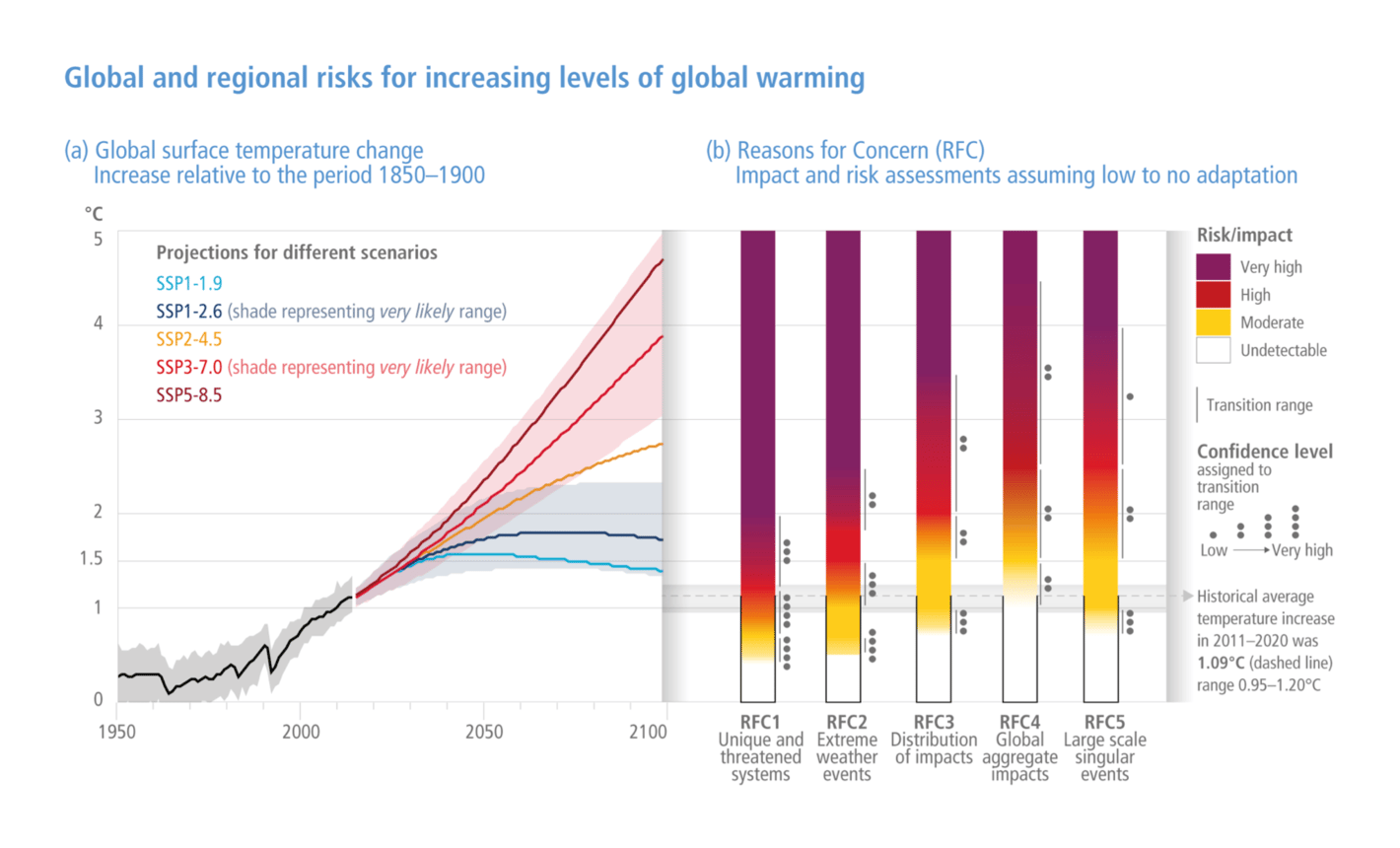
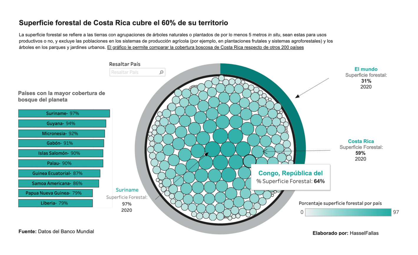
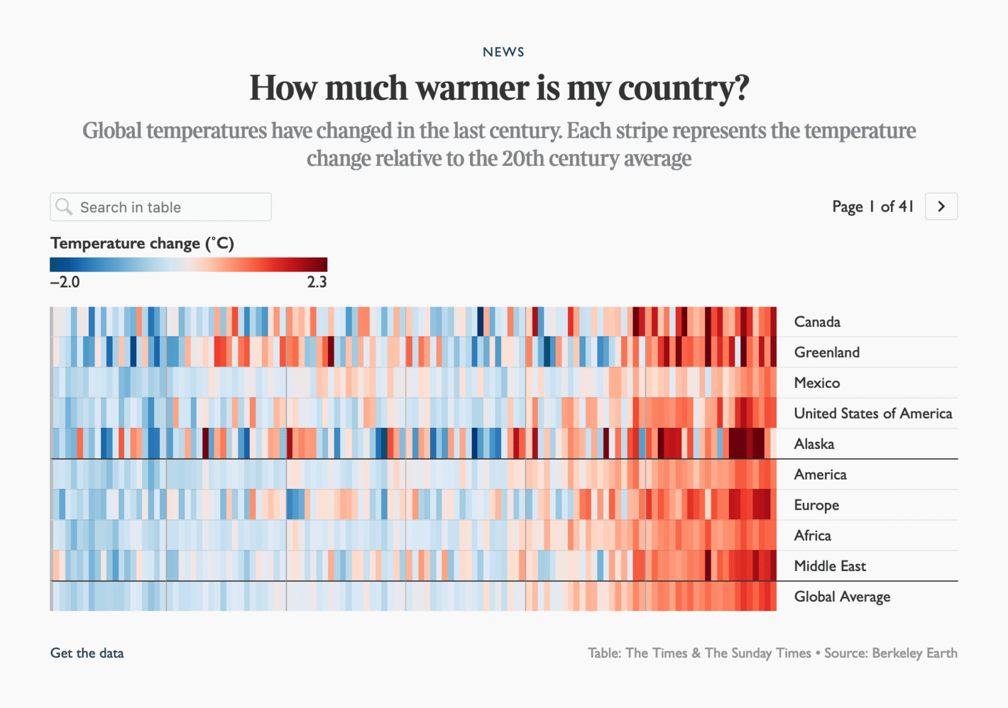
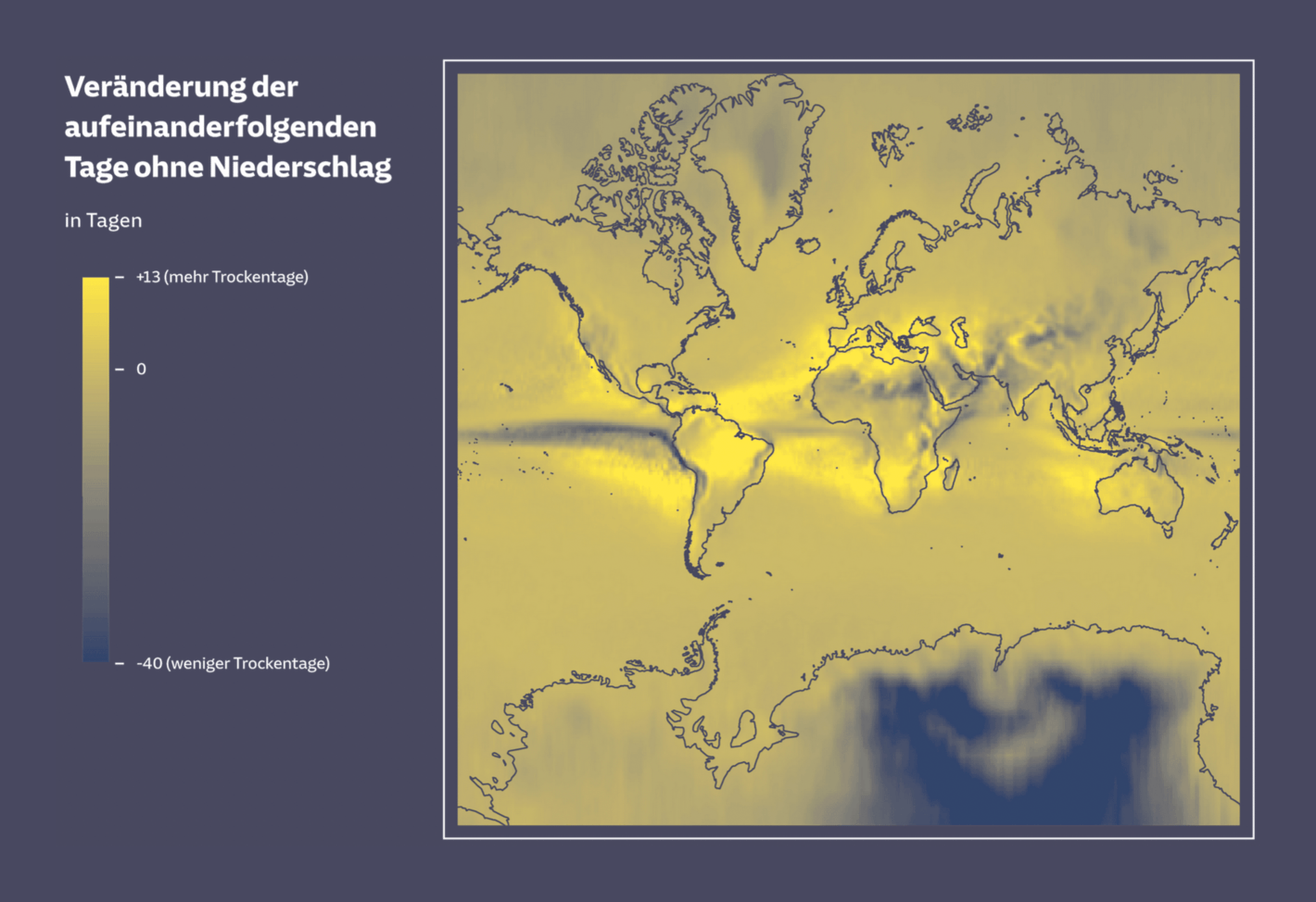
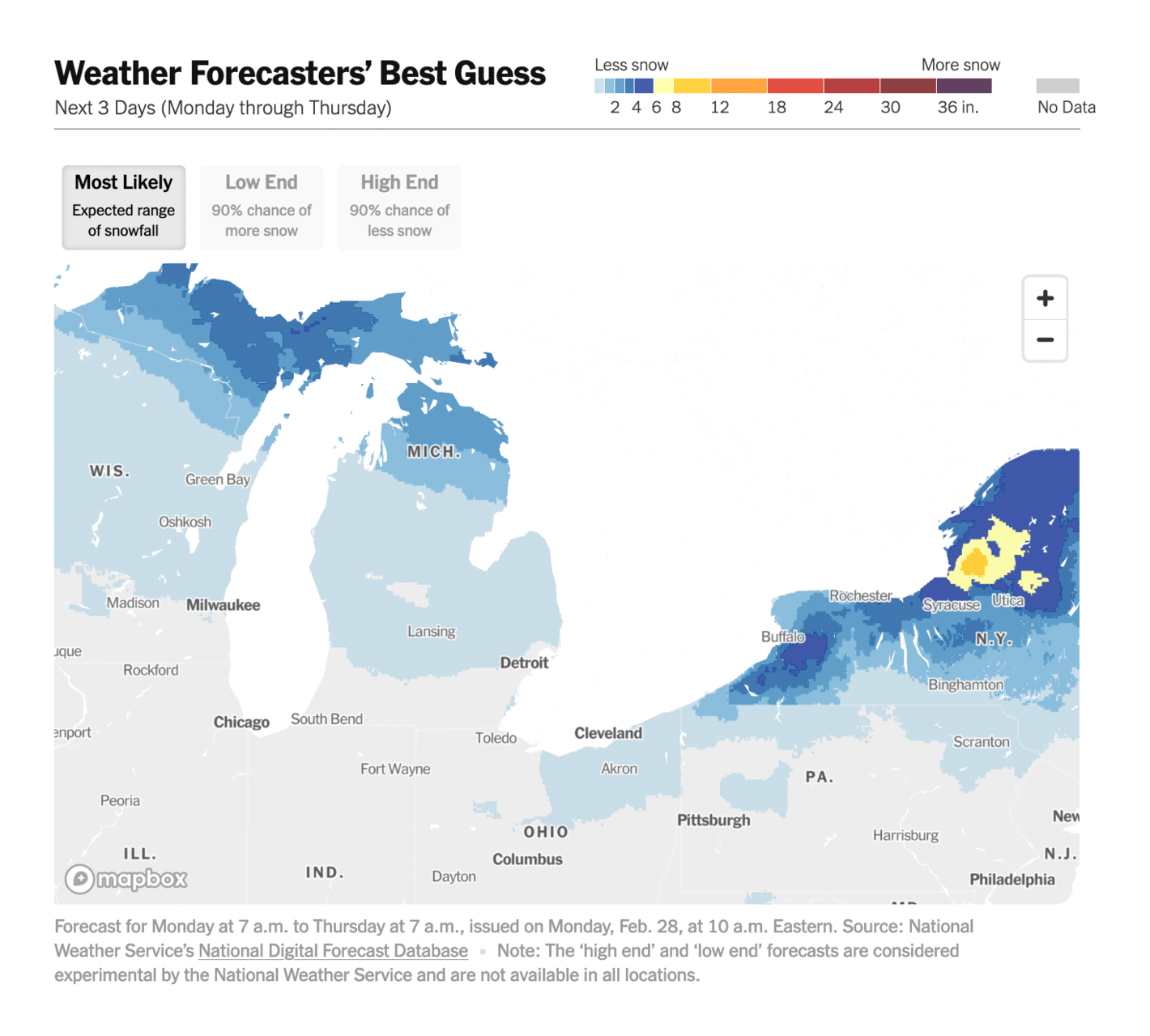
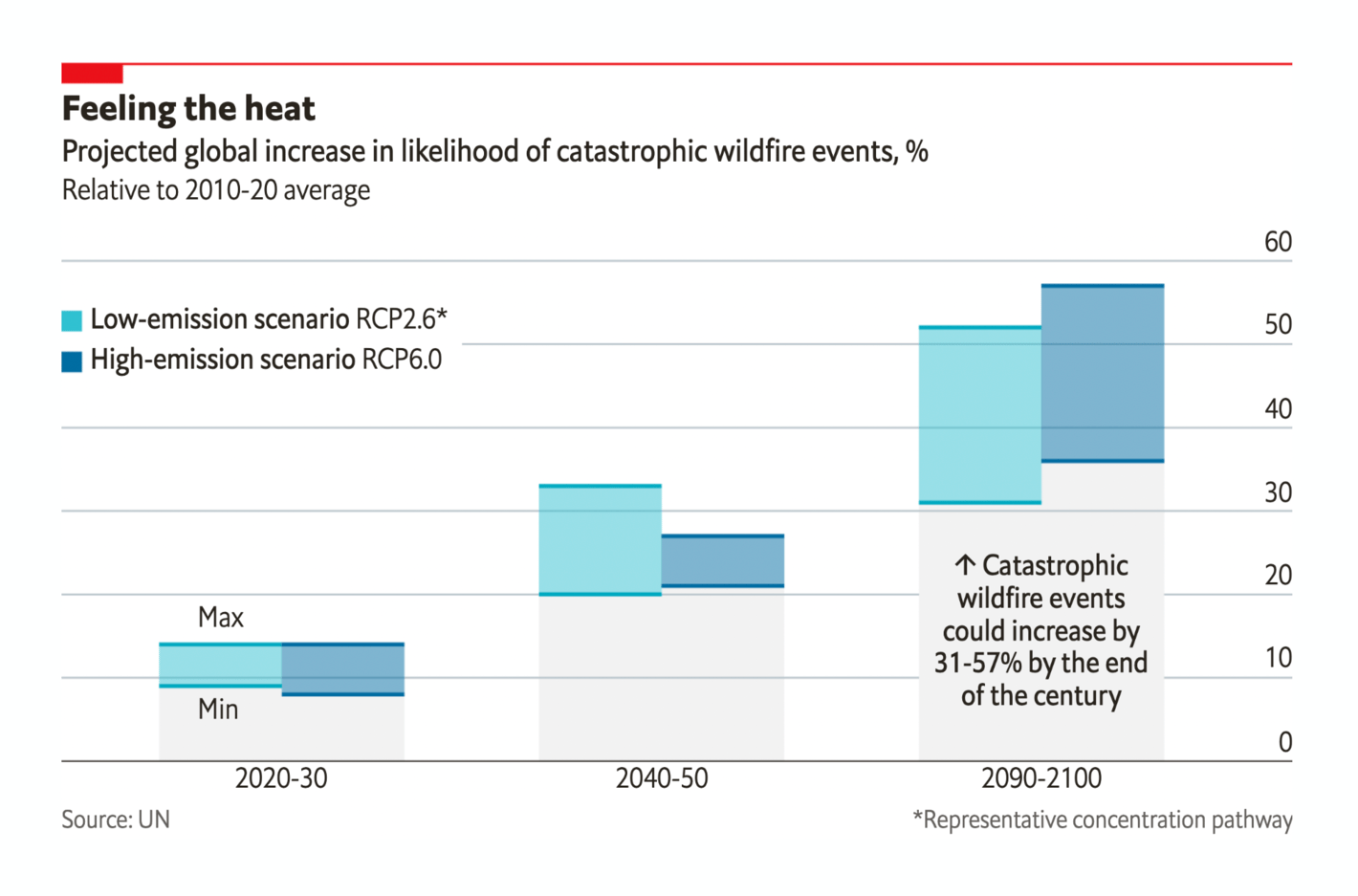
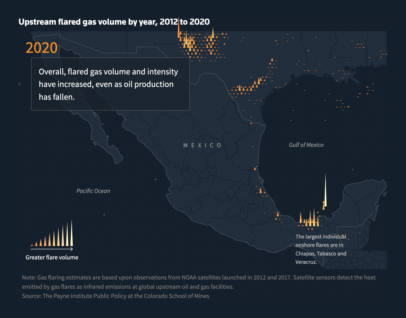
IPCC: Climate Change 2022: Impacts, Adaptation and Vulnerability La Data Cuenta: Costa Rica no es el mayor generador de CO2 del mundo, pero sus emisiones casi se duplicaron en tres décadas The Times: Chance of climate recovery vanishing Süddeutsche Zeitung: Das bedeutet der Klimawandel für Deutschland The New York Times: How Much Snow Will Fall Where You Live? The Economist: Extraordinary wildfire events are happening more often Reuters: Up in flames: Gas flaring soars in Mexico, derailing its climate change pledges as it seeks to boost oil output Bloomberg: The Global Glut of Clothing Is an Environmental Crisis In other news, the U.S. finds that drawing borders is hard:
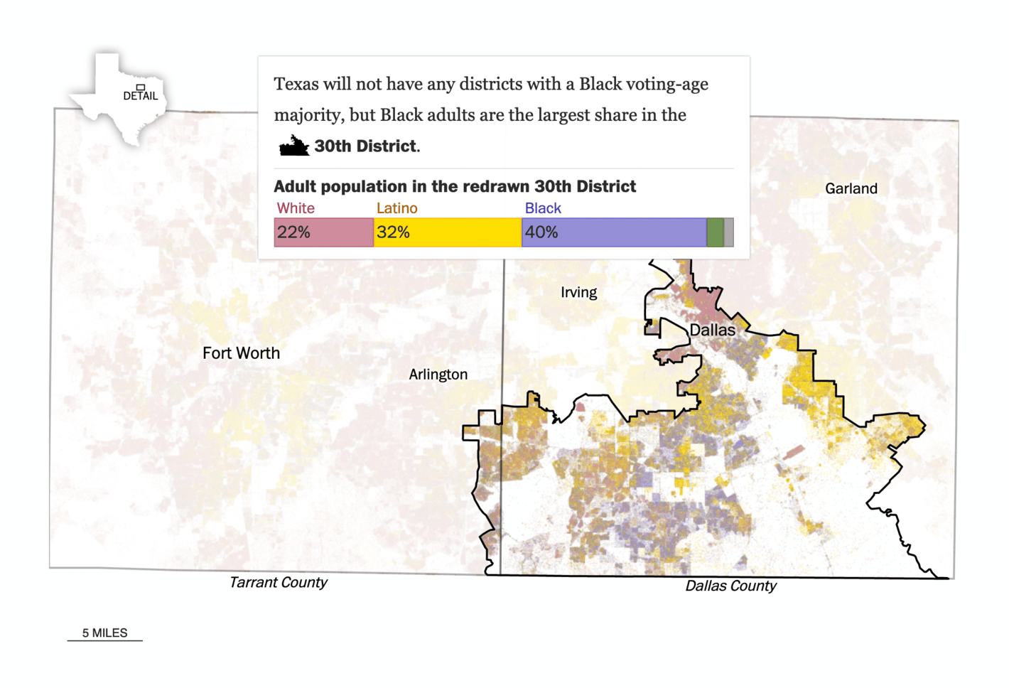
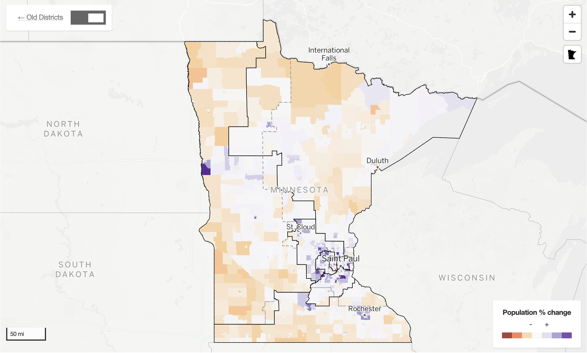
The Washington Post: Texas’s primaries are happening on a legally disputed congressional map StarTribune: Six maps that further explore Minnesota's redistricting San Francisco Chronicle: These maps show no one can agree on S.F. neighborhood boundaries — not even San Francisco city departments In politics , women are still underrepresented in most countries, French presidential candidates are still in campaign mode (which creates a lot of garbage), and Boris Johnson is still widely considered incompetent:
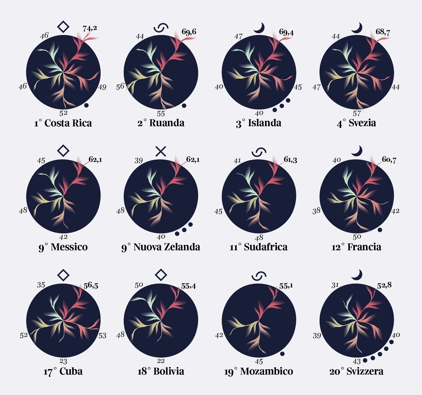
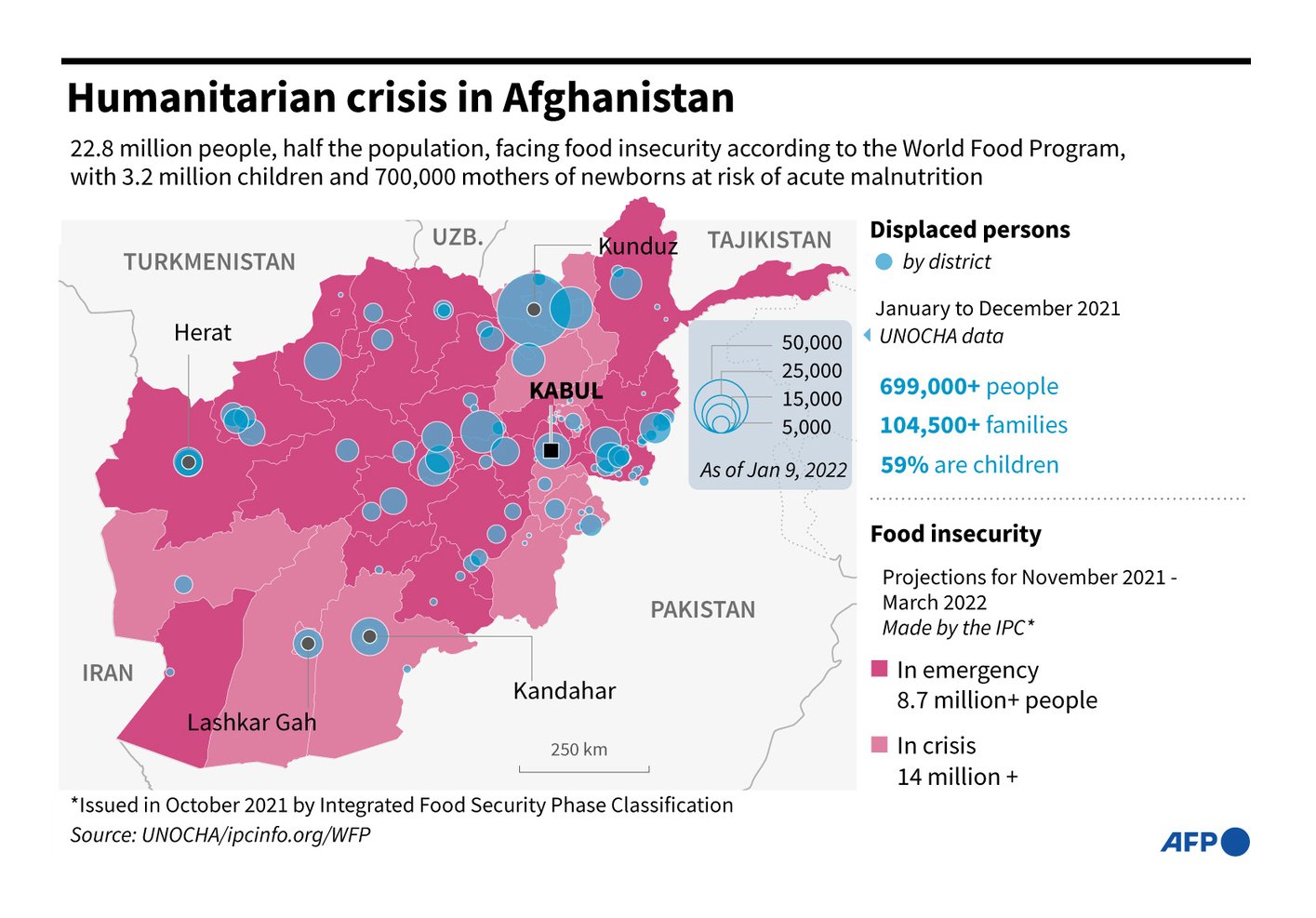
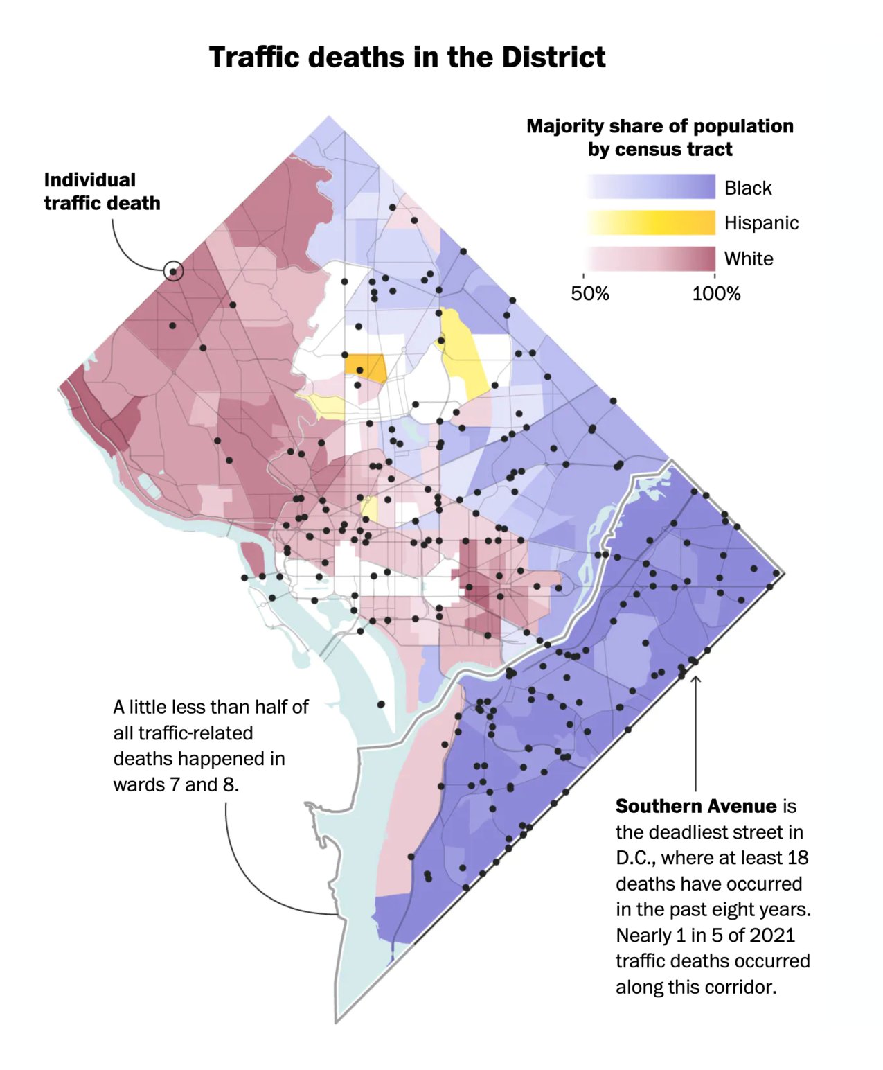
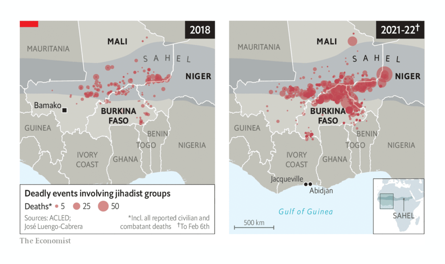
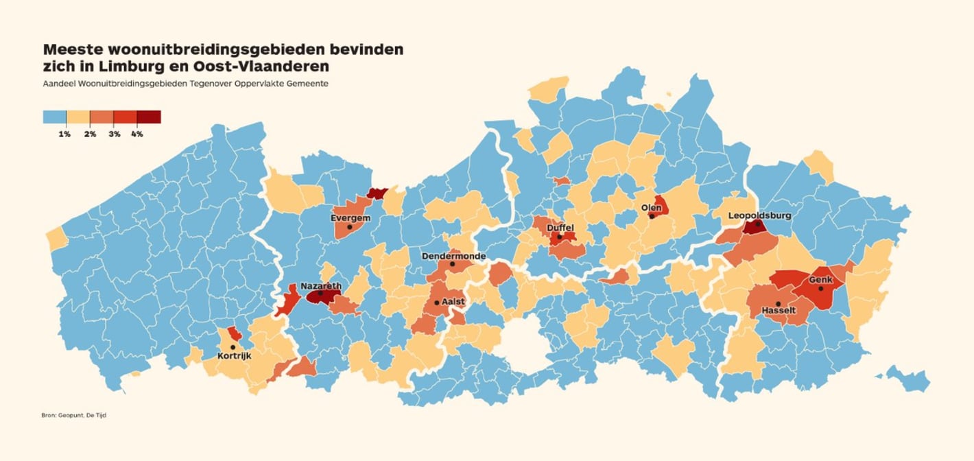
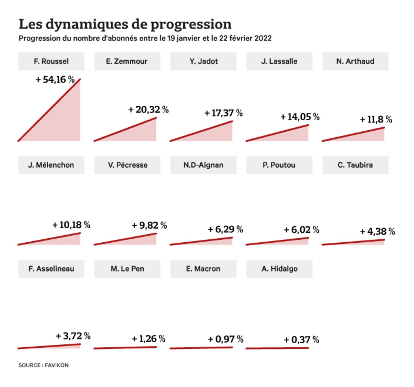
La Lettura: La Costa Rica si declina al femminile, February 27 (Tweet AFP: "Humanitarian crisis in Afghanistan. #AFPgraphics on projected food insecurity in Afghanistan, by province for November 2021 to March 2022, and location of internally displaced persons," February 28 (Tweet The Washington Post: D.C. traffic deaths at 14-year high with low-income areas hardest hit The Economist: West Africa’s coastal states are bracing for a jihadist storm De Tijd: Bouwshift ligt gemeenten op de maag Les Echos: Elysée-moi ! La dynamique des candidats à la présidentielle sur les réseaux sociaux SBS News: 선거 때 발생하는 쓰레기 얼마나 될까? Inkyfada: Loi de finances 2022 : une impasse budgétaire et des mesures vitrine Nexo: As funções e as receitas de municípios, estados e União Pew Research Center: State of the Union 2022: How Americans view major national issues YouGov: Public opinion of Boris Johnson’s competence and trustworthiness reach new lows That was a heavy Dispatch so far — let's end it a bit lighter. First: More Olympics ! (Probably for the last week for quite a while.) Two days after the Winter Olympics ended, three newsrooms independently released beautiful visualizations on how unrepresentative the games really are:
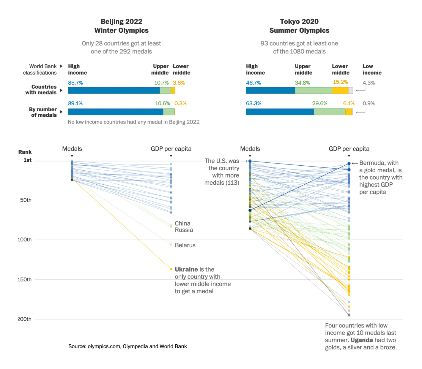
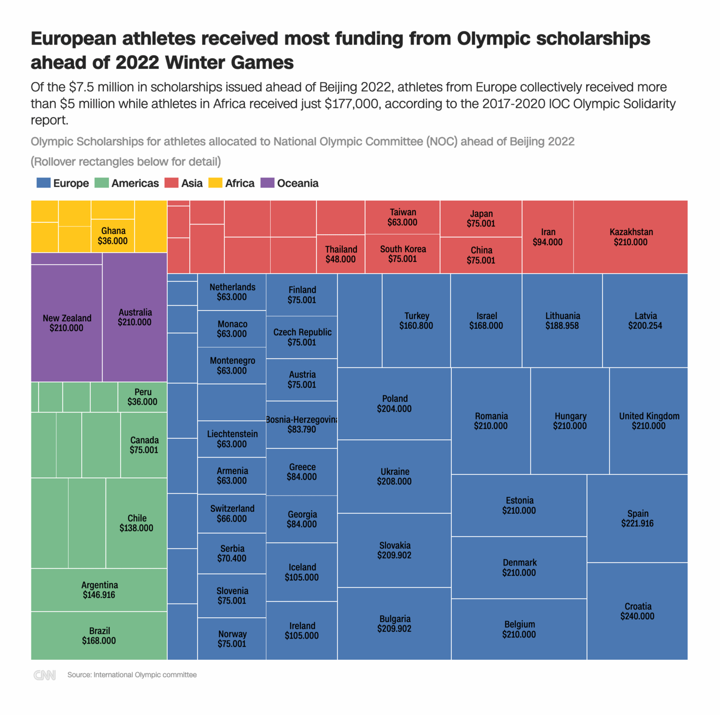
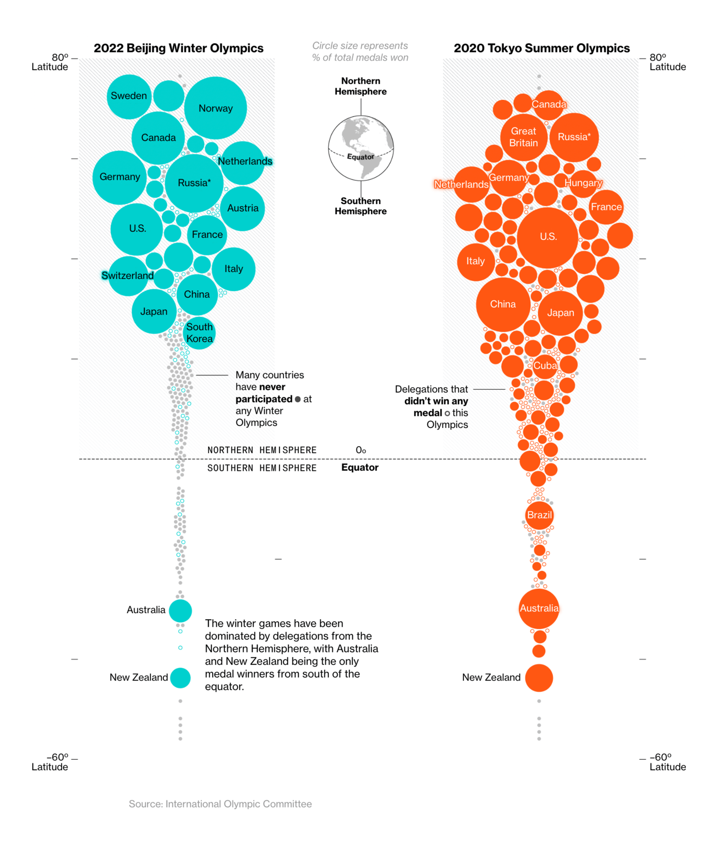
The Washington Post: Want a Winter Olympic medal? Pick a very chilly niche CNN: The Winter Olympics don't really represent the world: Costs, climate and quotas keep the majority off the podium Bloomberg: The Winter Olympics Are Won by a Small Circle of Countries, Over and Over And in our famous "data visualizations that just don't fit any other category" category (one of our favorites), we've seen how NBA teams should have drafted, and how to best solve Portugese Wordle . (For a fun data vis on English Wordle, visit Rose's Weekly Chart from three weeks ago!)
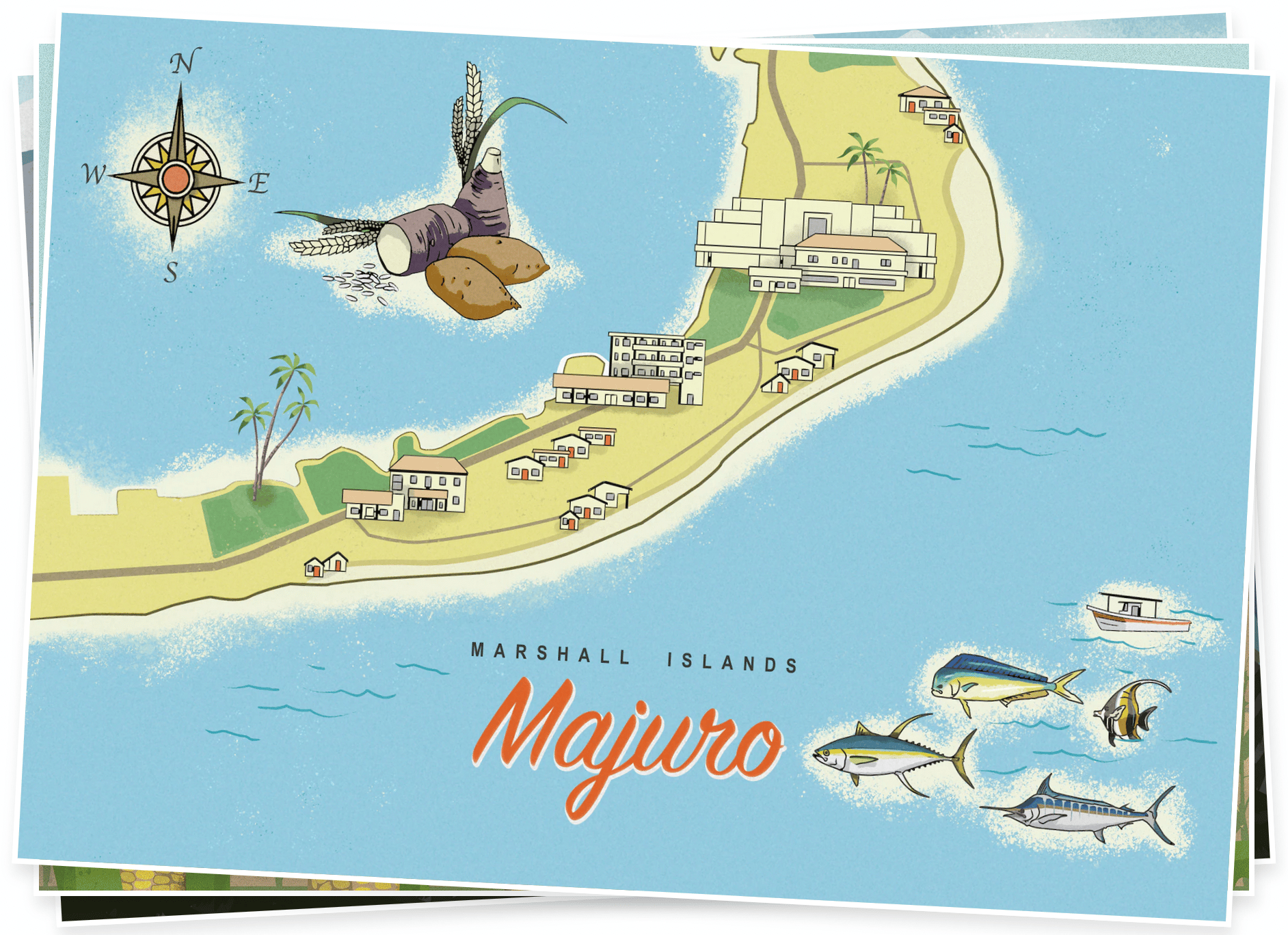
The Pudding: The NBA Redrafted Nexo: ‘Serão’ é a melhor primeira palavra no Termooo What else we found interesting The Washington Post: Opinion: The long-awaited date The Washington Post: Postcards from Earth’s climate futures Applications are open for...
Help us make this dispatch better! We'd love to hear which newsletters, blogs, or social media accounts we need to follow to learn about interesting projects, especially from less-covered parts of the world (Asia, South America, Africa). Write us at hello@datawrapper.de or leave a comment below.