We want to enable everyone to create beautiful charts, maps, and tables. New to data visualization? Or do you have specific questions about us? You'll find all the answers here.
The best of last week’s big and small data visualizations
Vivien Serve
Welcome back to the 133rd edition of Data Vis Dispatch! Every week, we’ll be publishing a collection of the best small and large data visualizations we find, especially from news organizations — to celebrate data journalism, data visualization, simple charts, elaborate maps, and their creators.
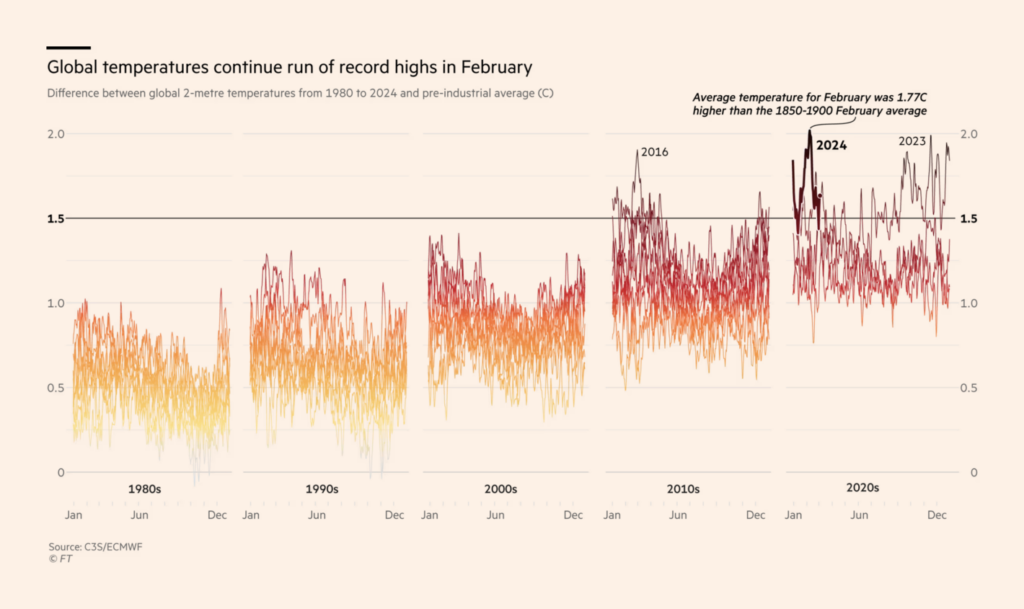
Recurring topics this week include include International Women’s Day, a missing plane, and the Oscars.
Ten years ago this week, Malaysia Airlines Flight 370 disappeared over the Indian Ocean. Two visual investigations focused on the unsolved case:
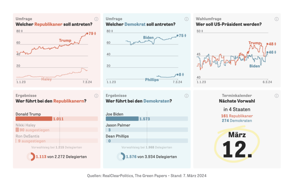
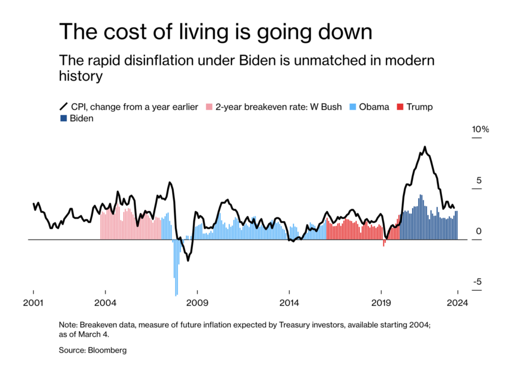
Nikki Haley dropped out of the Republican primary after Super Tuesday votes went clearly in Donald Trump’s favor. This means the U.S. is facing a second general election between Trump and Biden:
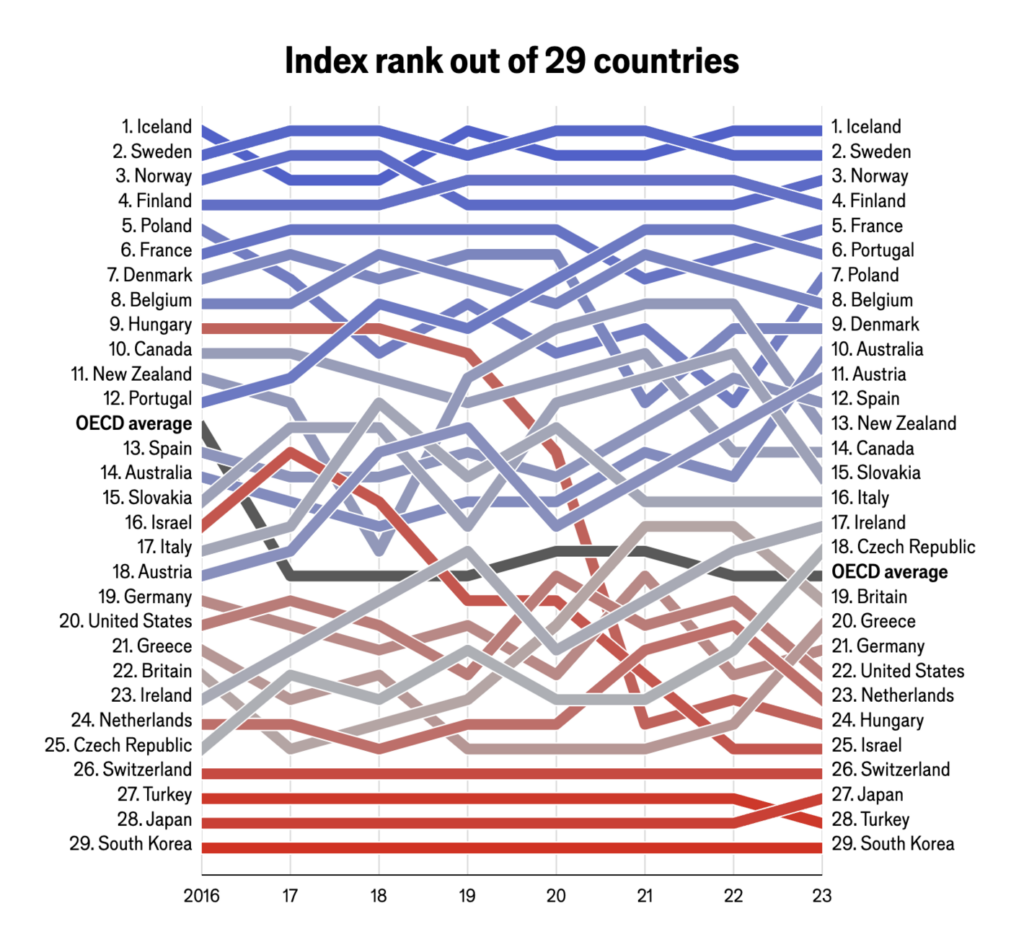
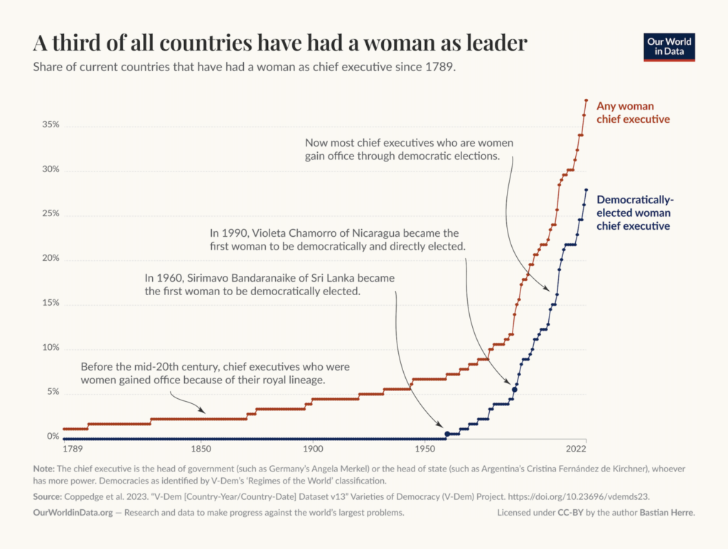
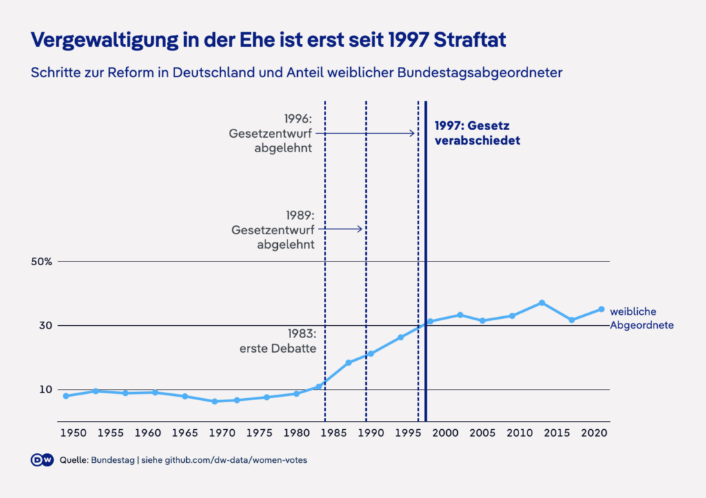
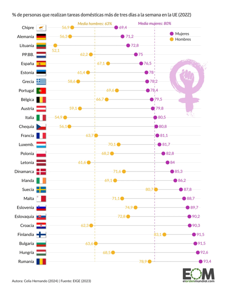
International Women’s Day on March 9 was the occasion for numerous visualizations on the role and influence of women in the worlds of work, politics, law, everywhere!
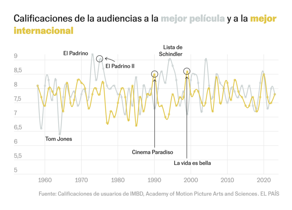
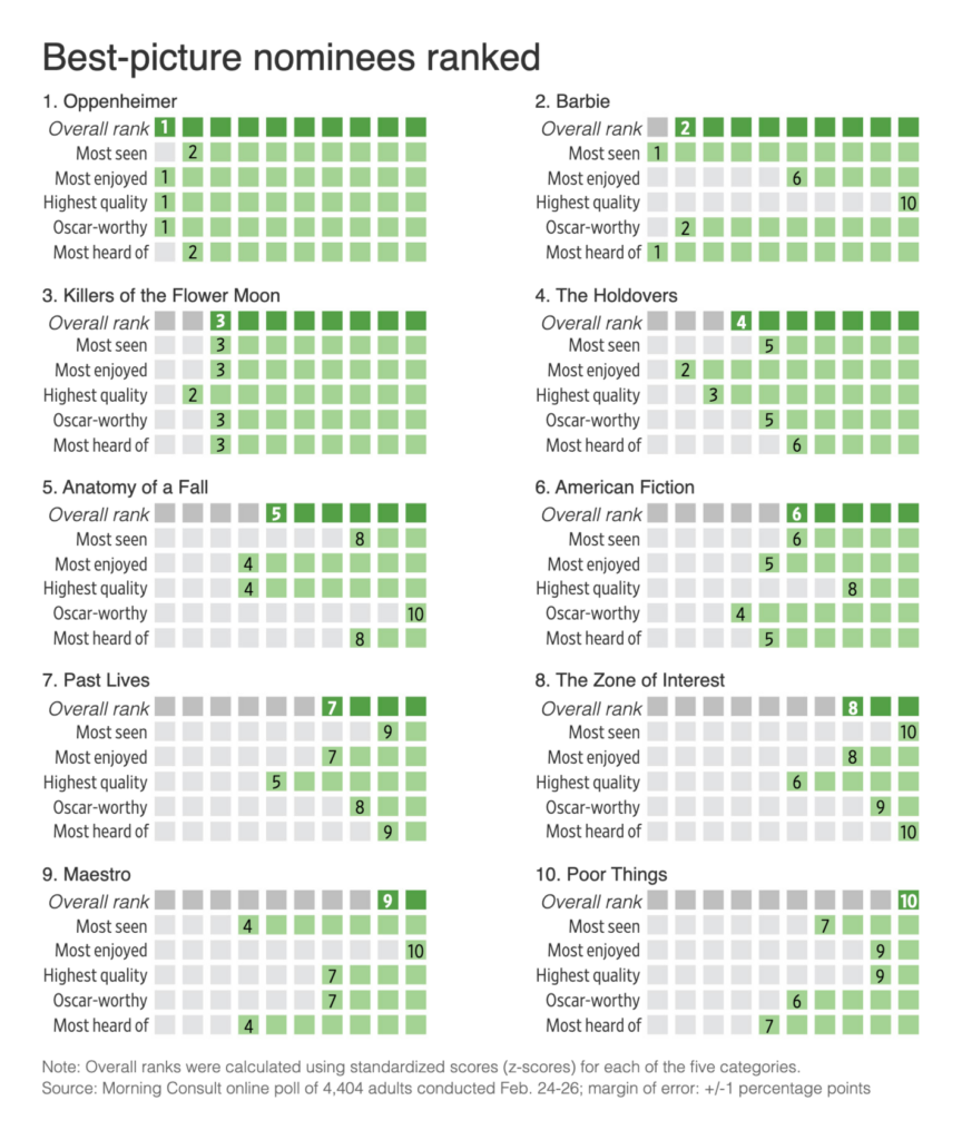
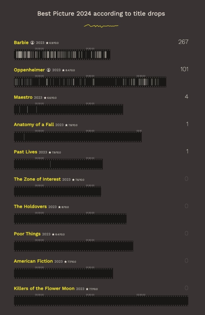
A week full of big days, and what’s still missing? That’s right, the Oscars. The 96th Academy Awards took place on March 10th, so we found several visualizations about movies:
In addition to being packed with important days, this week was also full of stunning animated visualizations that talked about the greatest albums of all time, the greatest people in history, and the greatest way to check resumes — not:
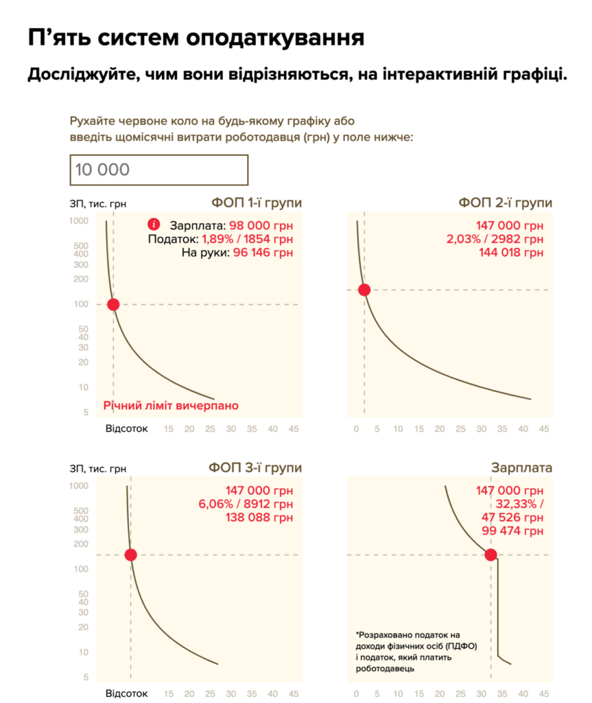
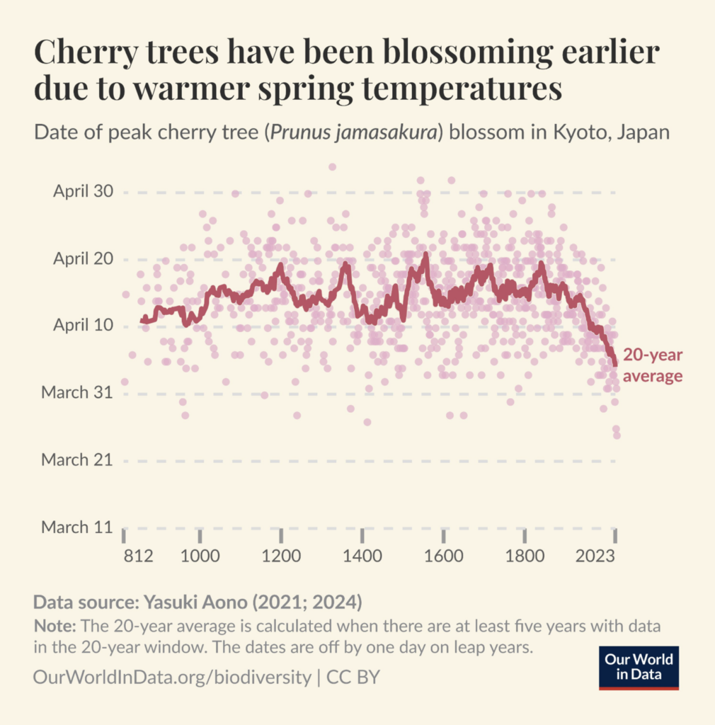
We love a good combination of beige, red, and pink, and this week we found it for a range of themes. Like the Ukrainian tax system or cherry blossoms:
Тексти: Чому ФОП мають платити менші податки, ніж інші? Не мають (Точка зору), March 5 Our World in Data: “The timing of the peak cherry tree blossom is influenced by spring temperatures. Based on data from Japan stretching back to the year 812 (!), we see that in recent centuries the peak blossom has gradually moved earlier in the year—due to higher temperatures from climate change,” March 6 (Tweet)
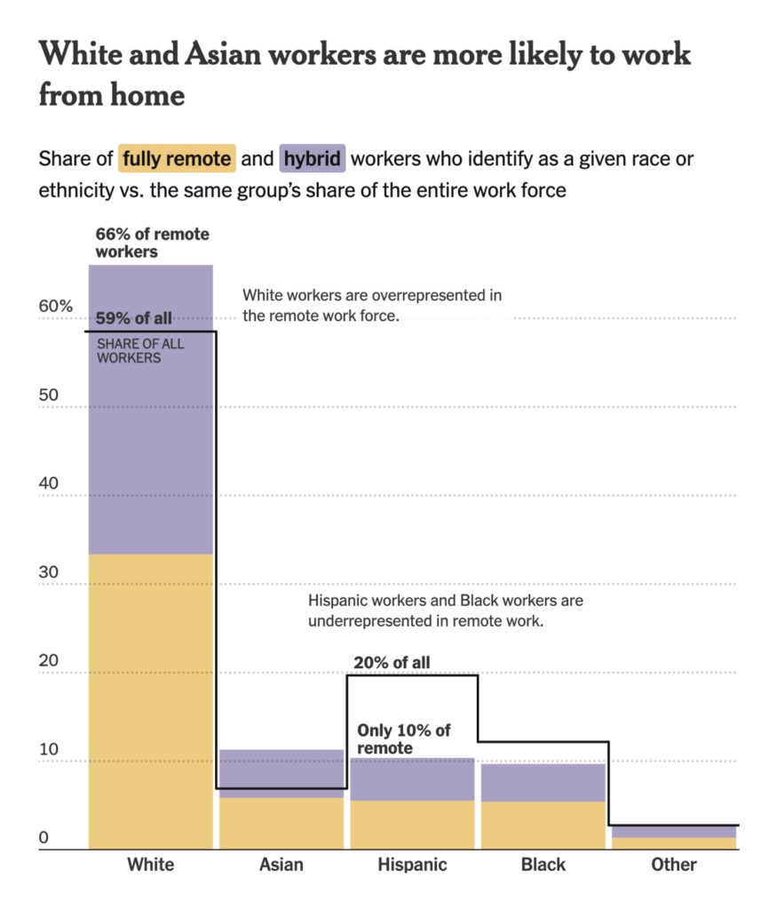
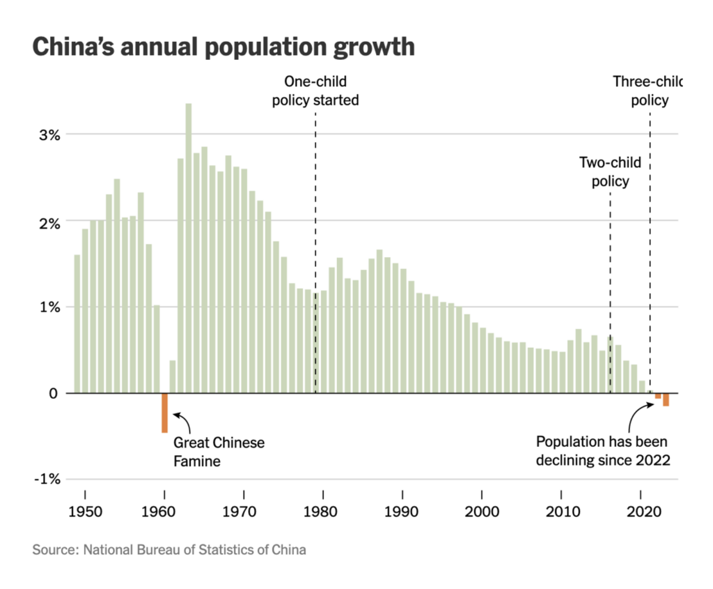
Let’s close this week with two column charts on remote workers and China’s population growth — or was it decline?
Help us make this dispatch better! We’d love to hear which newsletters, blogs, or social media accounts we need to follow to learn about interesting projects, especially from less-covered parts of the world (Asia, South America, Africa). Write us at hello@datawrapper.de or leave a comment below.
(she/her) is a working student on Datawrapper’s Communications team. She creates the Data Vis Dispatch to keep data visualization enthusiasts up to date on exciting new projects. When she’s not working, she studies interface design, and when she’s not studying, she’s planning a festival stage or soldering light installations. Vivien lives in Potsdam.


Comments