Data Vis Dispatch, March 12

The best of last week’s big and small data visualizations

Welcome back to the 133rd edition of Data Vis Dispatch! Every week, we’ll be publishing a collection of the best small and large data visualizations we find, especially from news organizations — to celebrate data journalism, data visualization, simple charts, elaborate maps, and their creators.

Recurring topics this week include include International Women’s Day, a missing plane, and the Oscars.

Ten years ago this week, Malaysia Airlines Flight 370 disappeared over the Indian Ocean. Two visual investigations focused on the unsolved case:

Le Monde: Disparition du vol MH370 : que sait-on dix ans après ?, March 8
Le Figaro: Vol MH370 : dix ans après, le mystère demeure autour de la disparition du Boeing 777 de la Malaysia Airlines, March 8

Let’s take a look at the wars in Gaza and Sudan:

Neue Zürcher Zeitung: Deshalb kommt so wenig humanitäre Hilfe nach Gaza – die wichtigsten Gründe grafisch erklärt, March 8
The Wall Street Journal: Ukraine Is Now Fighting Russia in Sudan, March 6

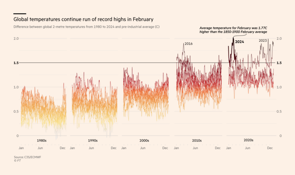
In the climate visualizations this week, we found extreme heat and the drought it causes:

Financial Times: Warmer, wetter, hotter, drier — February caps unending stretch of record temperatures, March 7
Bloomberg: Record Drought Imperils Food, Copper Output in Southern Africa, March 8

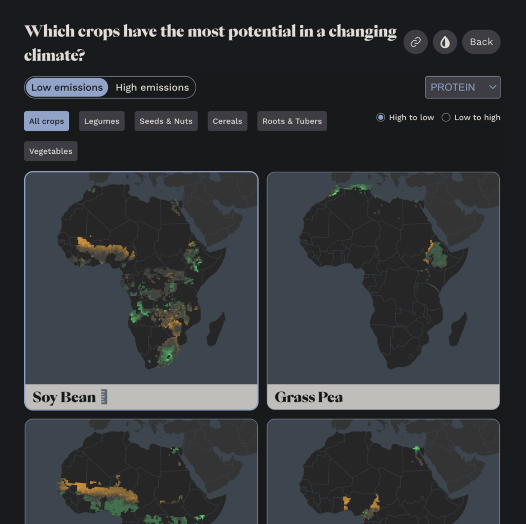
This exploratory dashboard on climate-resilient crops caught our attention:

Vision for Adapted Crops and Soils: Which crops have the most potential in a changing climate?, March 9

Nikki Haley dropped out of the Republican primary after Super Tuesday votes went clearly in Donald Trump’s favor. This means the U.S. is facing a second general election between Trump and Biden:

The New York Times: How Republicans Voted on Super Tuesday, March 11
Zeit Online: Wer wird Präsidentschaftskandidat?, March 6
Financial Times: Super Tuesday in charts: what the results reveal about Trump’s voters, March 7

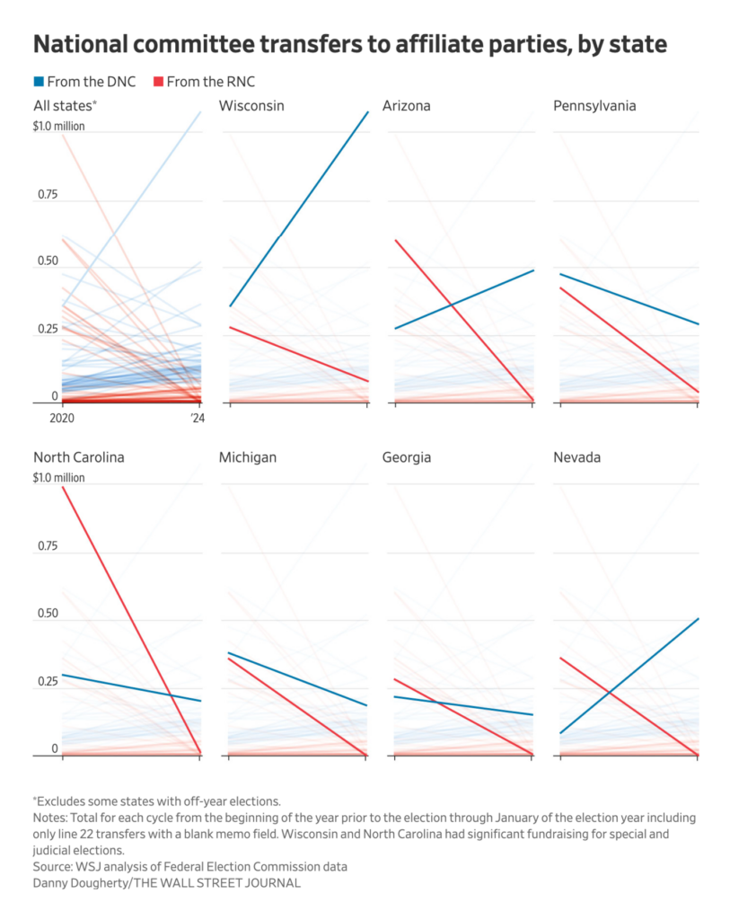
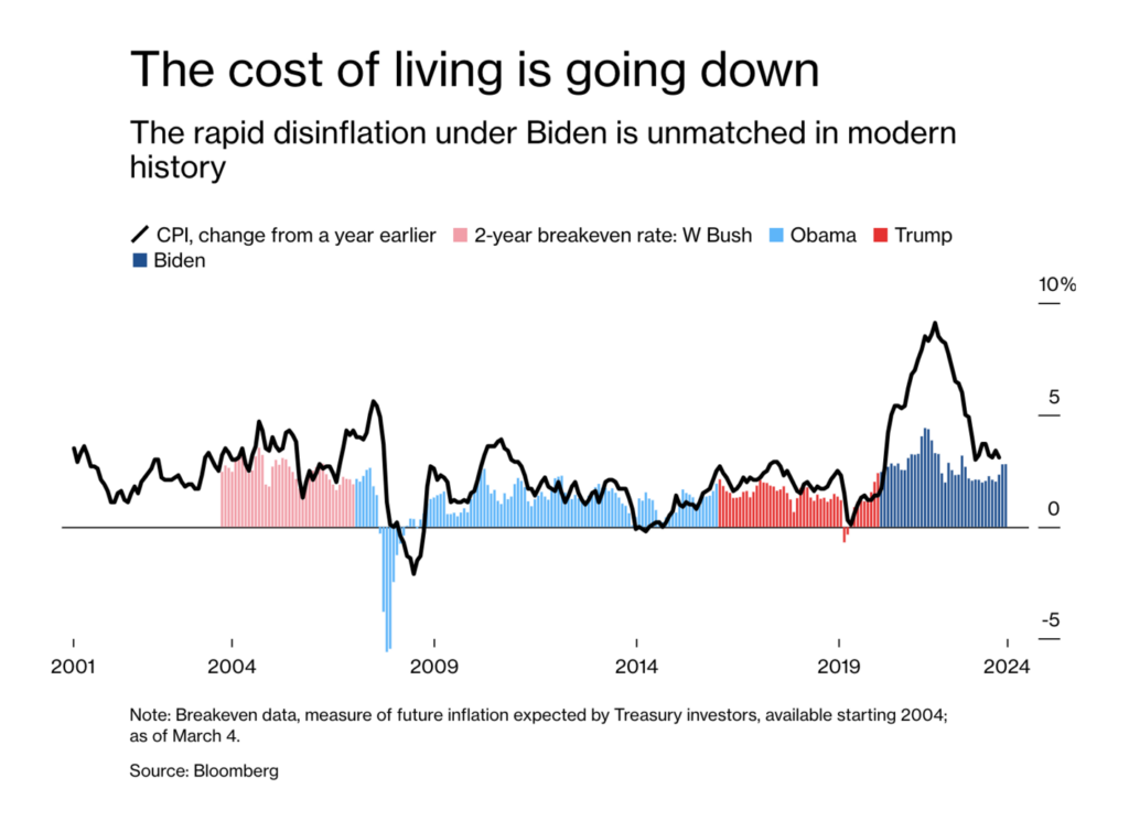
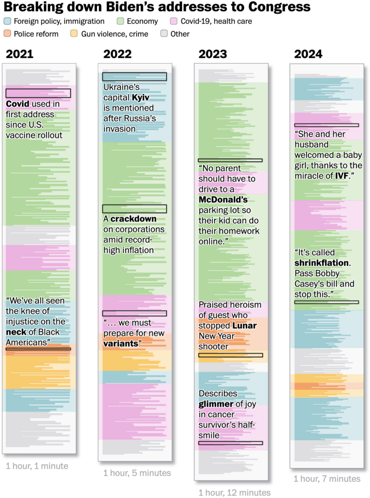
Speaking of the Trump and Biden campaigns, some visualizations have looked at the money in the parties, others acknowledged Biden’s accomplishments:

The Wall Street Journal: In Battleground States, Trump Is Ahead in Polls but Playing Catch-Up on the Ground, March 9
Bloomberg: What Has Biden Accomplished? Look at These 10 Metrics, Not the Polls, March 7

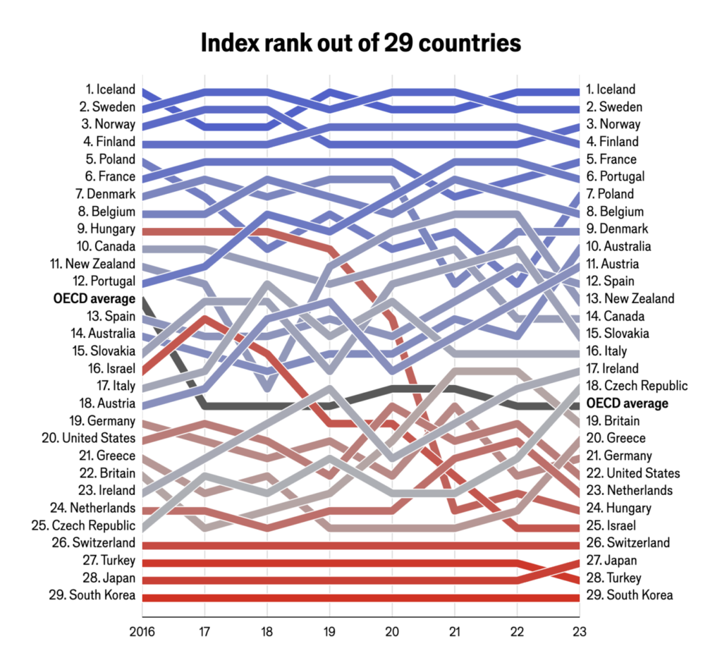
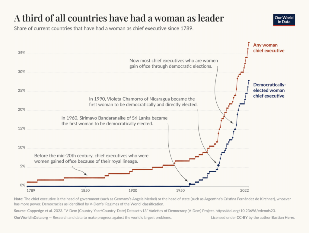
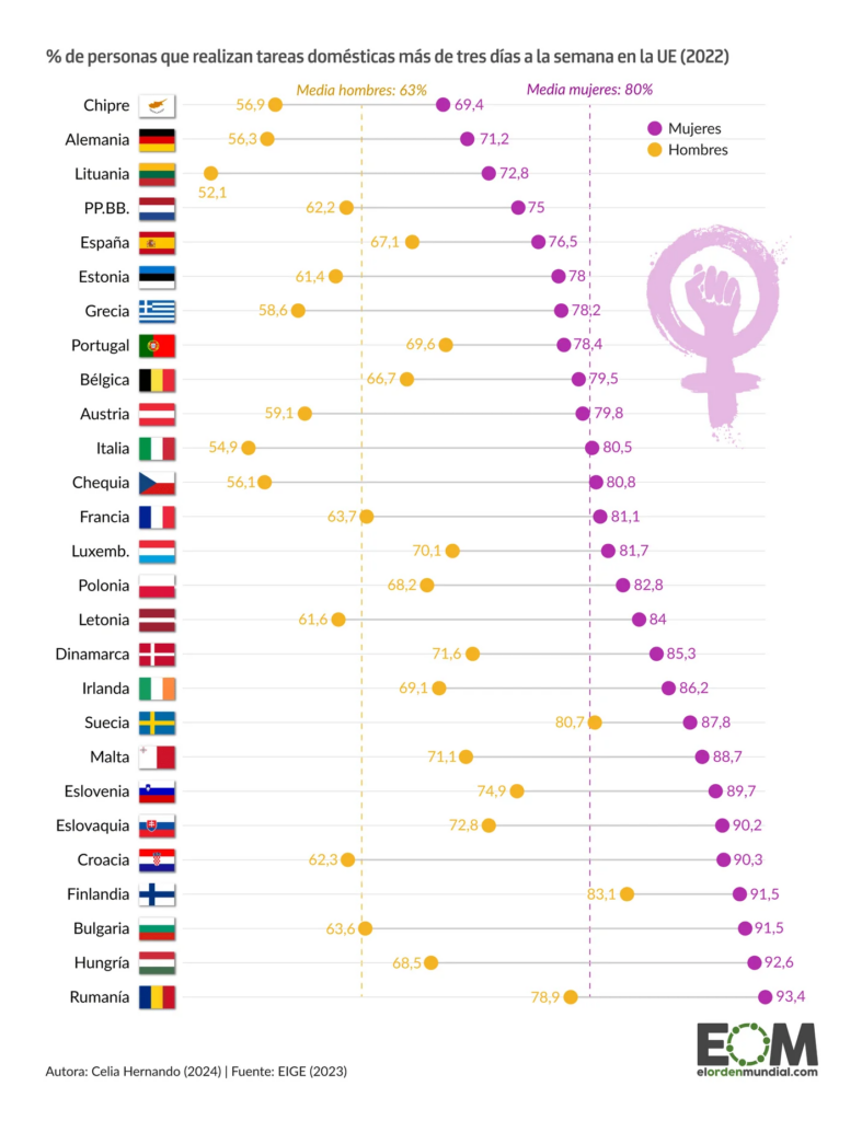
International Women’s Day on March 9 was the occasion for numerous visualizations on the role and influence of women in the worlds of work, politics, law, everywhere!

The Economist: The Economist’s glass-ceiling index, March 6
Folha de S.Paulo: Mulheres crescem no eleitorado e são maioria em 2 de cada 3 cidades, March 8
Our World in Data: Women have made major advances in politics — but the world is still far from equal, March 8
Deutsche Welle: Wie wäre Deutschland, wenn nur Frauen wählen würden?, March 7
Frankfurter Allgemeine Zeitung: Warum verdienen Männer immer noch mehr als Frauen?, March 8
El Orden Mundial: La brecha de género en las tareas domésticas en la Unión Europea, March 8

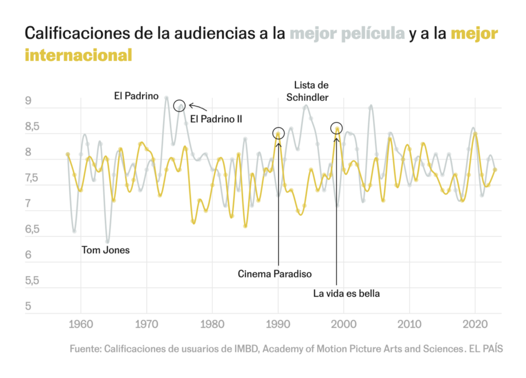
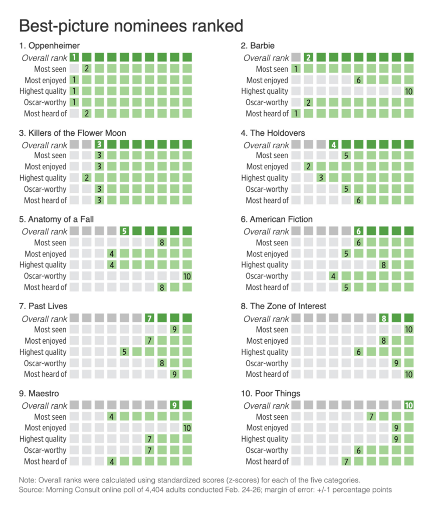
A week full of big days, and what’s still missing? That’s right, the Oscars. The 96th Academy Awards took place on March 10th, so we found several visualizations about movies:

El País: De ‘La vida es bella’ a ‘Amor’: las 25 veces que la mejor película internacional gustó más que la mejor película en los Oscar, March 9
The Wall Street Journal: What Do Moviegoers Really Think of the 2024 Oscar Nominees?, March 8
dominikus: “Best Picture 2024 according to title drops,” March 5 (Tweet, Article)

In addition to being packed with important days, this week was also full of stunning animated visualizations that talked about the greatest albums of all time, the greatest people in history, and the greatest way to check resumes — not:

The Pudding: What Makes an Album the Greatest of All Time?, March 8
JanWillemTulp: “Very quick and small #dataviz experiment: parallel-lives, an interactive timeline of nearly 5000 years of notable people in history,” March 6 (Tweet)
Bloomberg: Openai’s Gpt is a Recruiter’s Dream Tool. Tests Show There’s Racial Bias, March 8

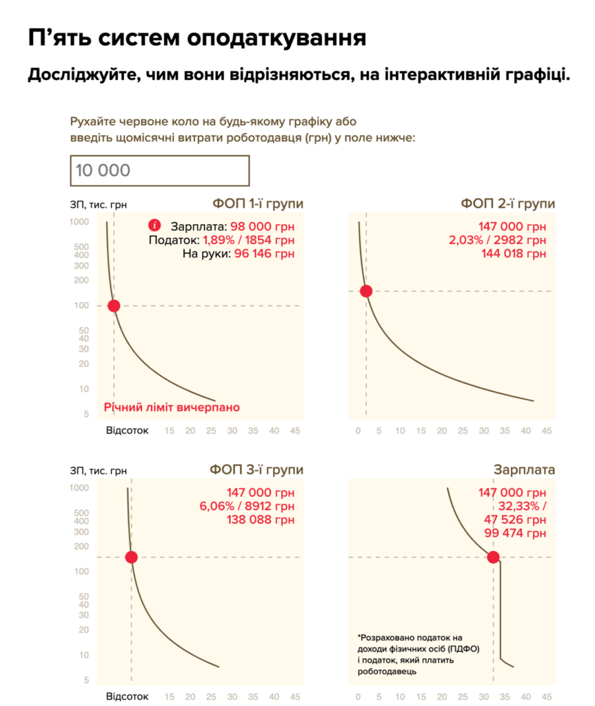
We love a good combination of beige, red, and pink, and this week we found it for a range of themes. Like the Ukrainian tax system or cherry blossoms:

Тексти: Чому ФОП мають платити менші податки, ніж інші? Не мають (Точка зору), March 5
Our World in Data: “The timing of the peak cherry tree blossom is influenced by spring temperatures. Based on data from Japan stretching back to the year 812 (!), we see that in recent centuries the peak blossom has gradually moved earlier in the year—due to higher temperatures from climate change,” March 6 (Tweet)

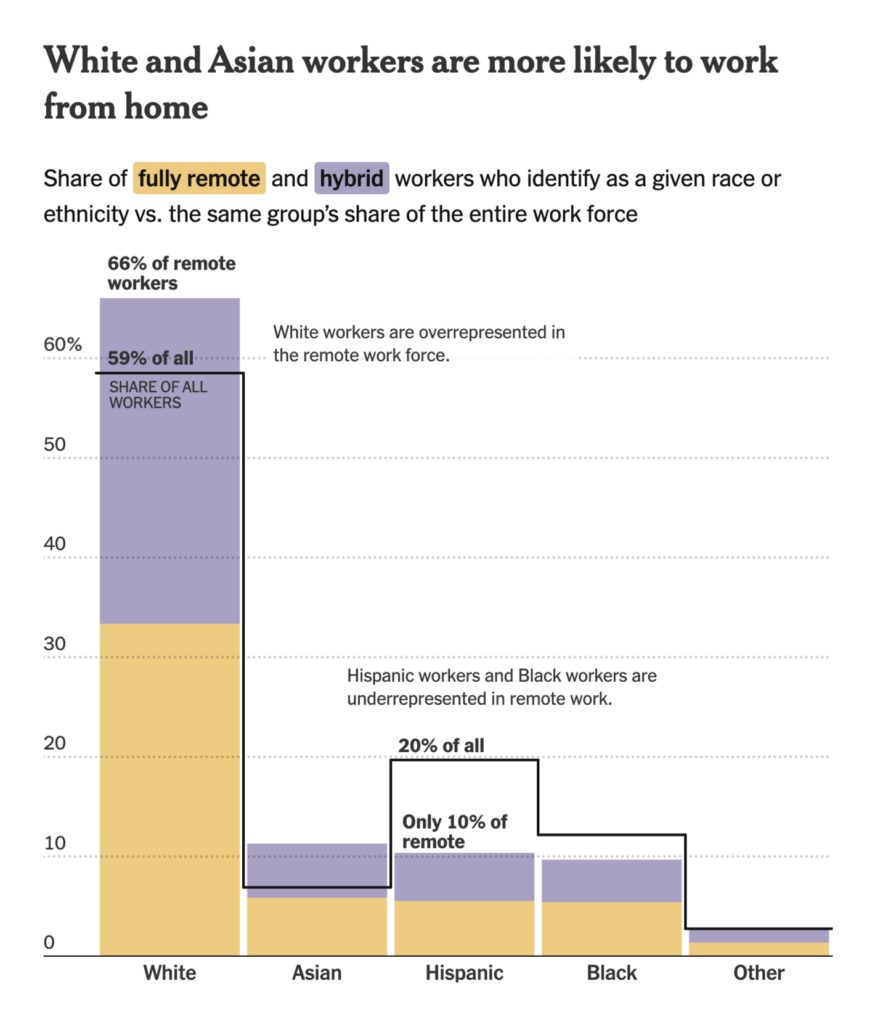
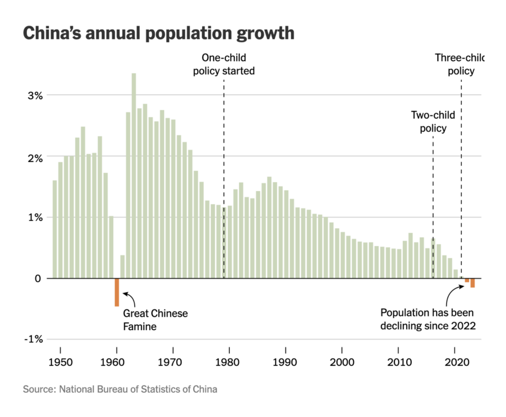
Let’s close this week with two column charts on remote workers and China’s population growth — or was it decline?

The New York Times: Who Still Works From Home?, March 8
The New York Times: One Three Is Best: How China’s Family Planning Propaganda Has Changed, March 8

What else we found interesting

Le Figaro: JO Paris 2024 : quinze détails insolites à découvrir sur l’affiche officielle, March 5
Jules Grandin: “Avant-hier, c’était l’anniversaire de Mercator […],” March 7 (Tweet)
The Washington Post: The words that hadn’t been said in a State of the Union until Biden said them, March 8

Applications are open for…


Help us make this dispatch better! We’d love to hear which newsletters, blogs, or social media accounts we need to follow to learn about interesting projects, especially from less-covered parts of the world (Asia, South America, Africa). Write us at hello@datawrapper.de or leave a comment below.

Want the Dispatch in your inbox every Tuesday? Sign up for our Blog Update newsletter!

Comments