Data Vis Dispatch, February 18: German election polls, corruption, and tariffs
February 18th, 2025
9 min
Datawrapper lets you show your data as beautiful charts, maps or tables with a few clicks. Find out more about all the available visualization types.
Our mission is to help everyone communicate with data - from newsrooms to global enterprises, non-profits or public service.
We want to enable everyone to create beautiful charts, maps, and tables. New to data visualization? Or do you have specific questions about us? You'll find all the answers here.
Data vis best practices, news, and examples
250+ articles that explain how to use Datawrapper
Answers to common questions
An exchange place for Datawrapper visualizations
Attend and watch how to use Datawrapper best
Learn about available positions on our team
Our latest small and big improvements
Build your integration with Datawrapper's API
Get in touch with us – we're happy to help
This article is brought to you by Datawrapper, a data visualization tool for creating charts, maps, and tables. Learn more.
The best of last week’s big and small data visualizations
Welcome back to the 85th edition of Data Vis Dispatch! Every week, we’ll be publishing a collection of the best small and large data visualizations we find, especially from news organizations — to celebrate data journalism, data visualization, simple charts, elaborate maps, and their creators.
Recurring topics this week include International Women’s Day, the collapse of a bank, and the Oscars.
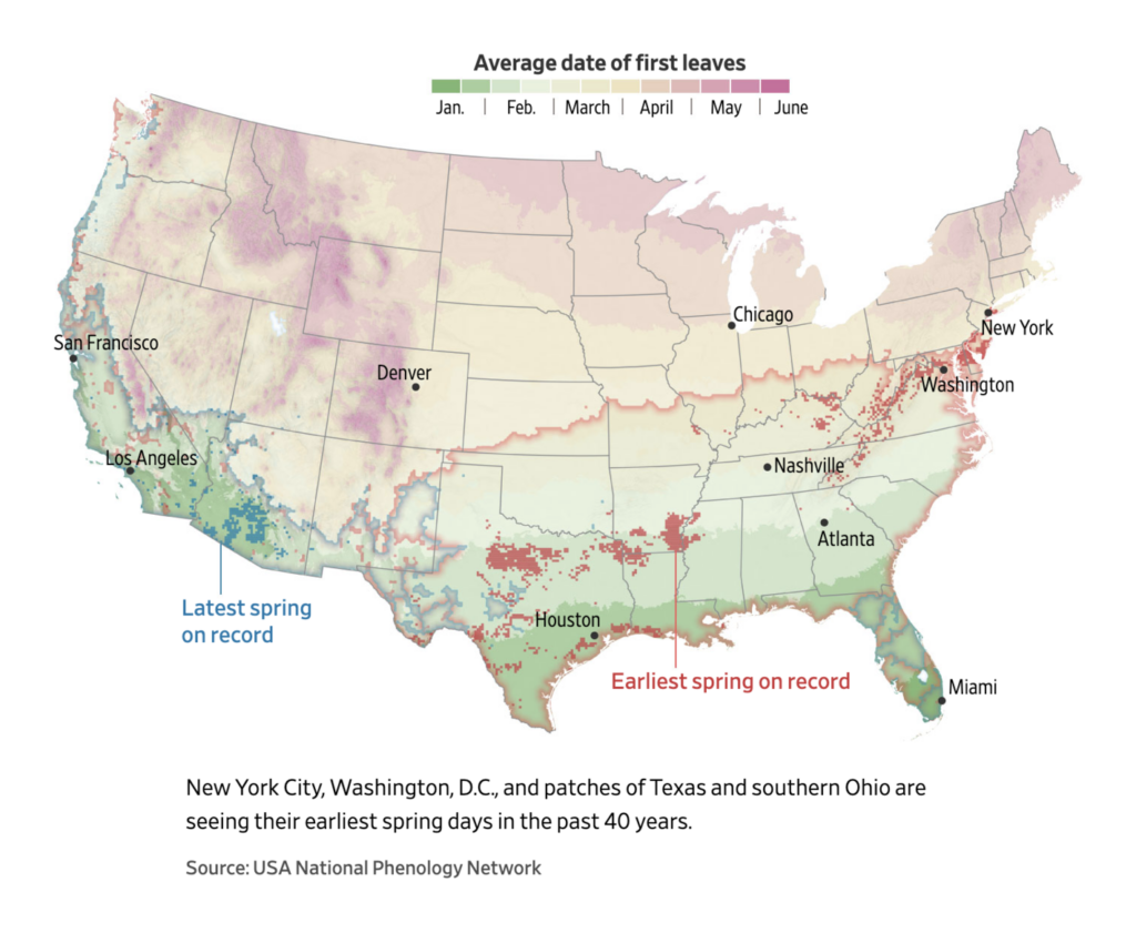
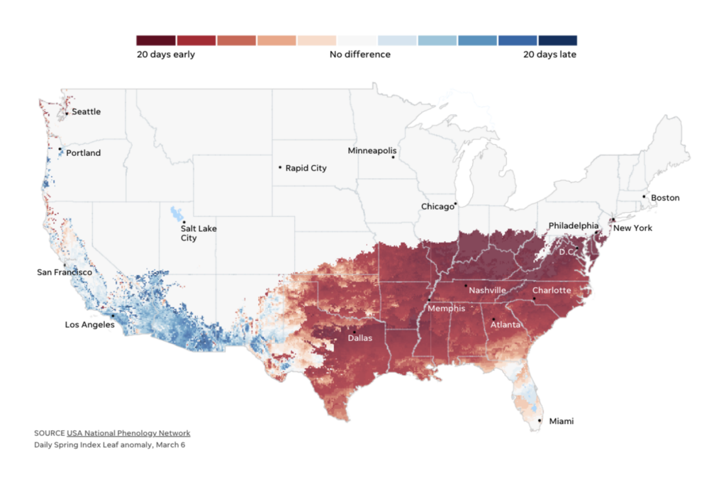
It’s almost the middle of March, and spring is beginning to show up in the Northern hemisphere, in some places much earlier than usual.
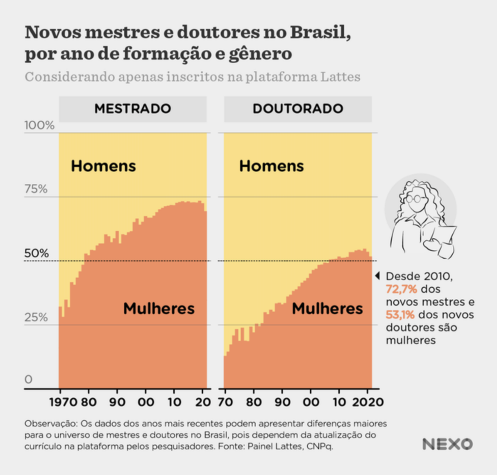
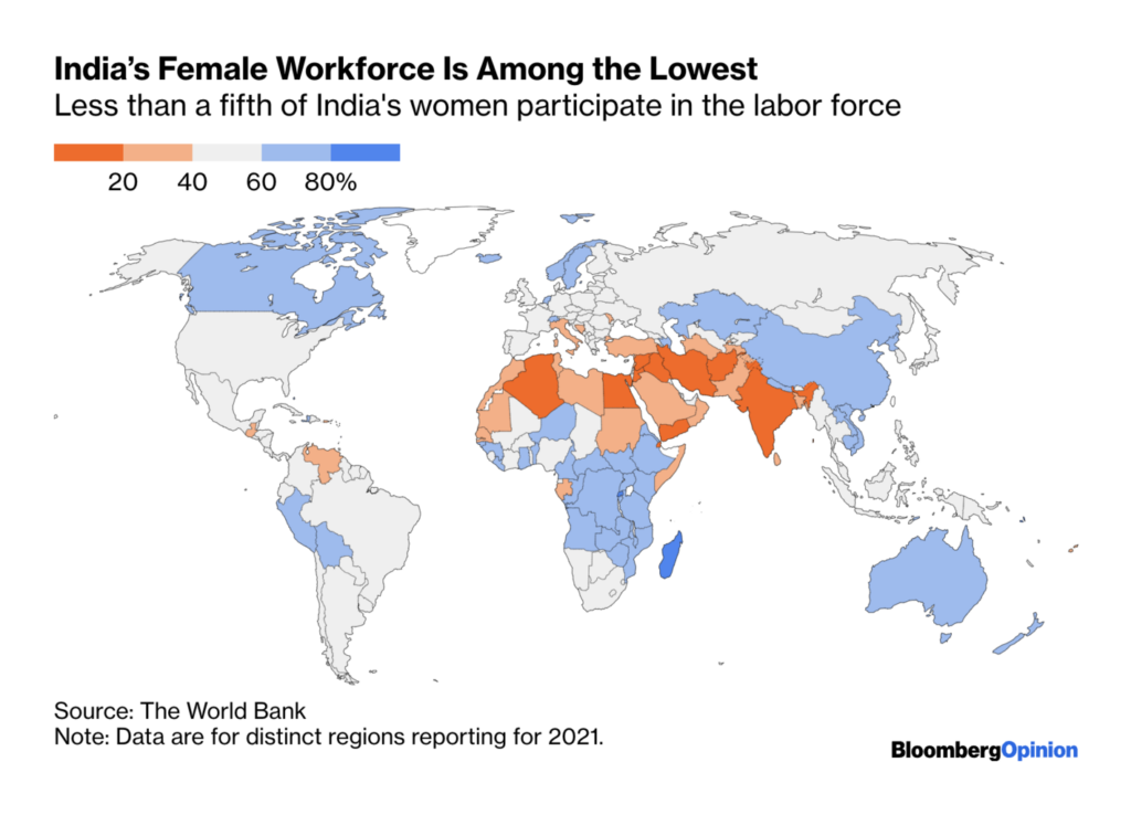
Last Wednesday, March 8, the world celebrated International Women’s Day, an opportunity to highlight women’s stories, both positive and negative.
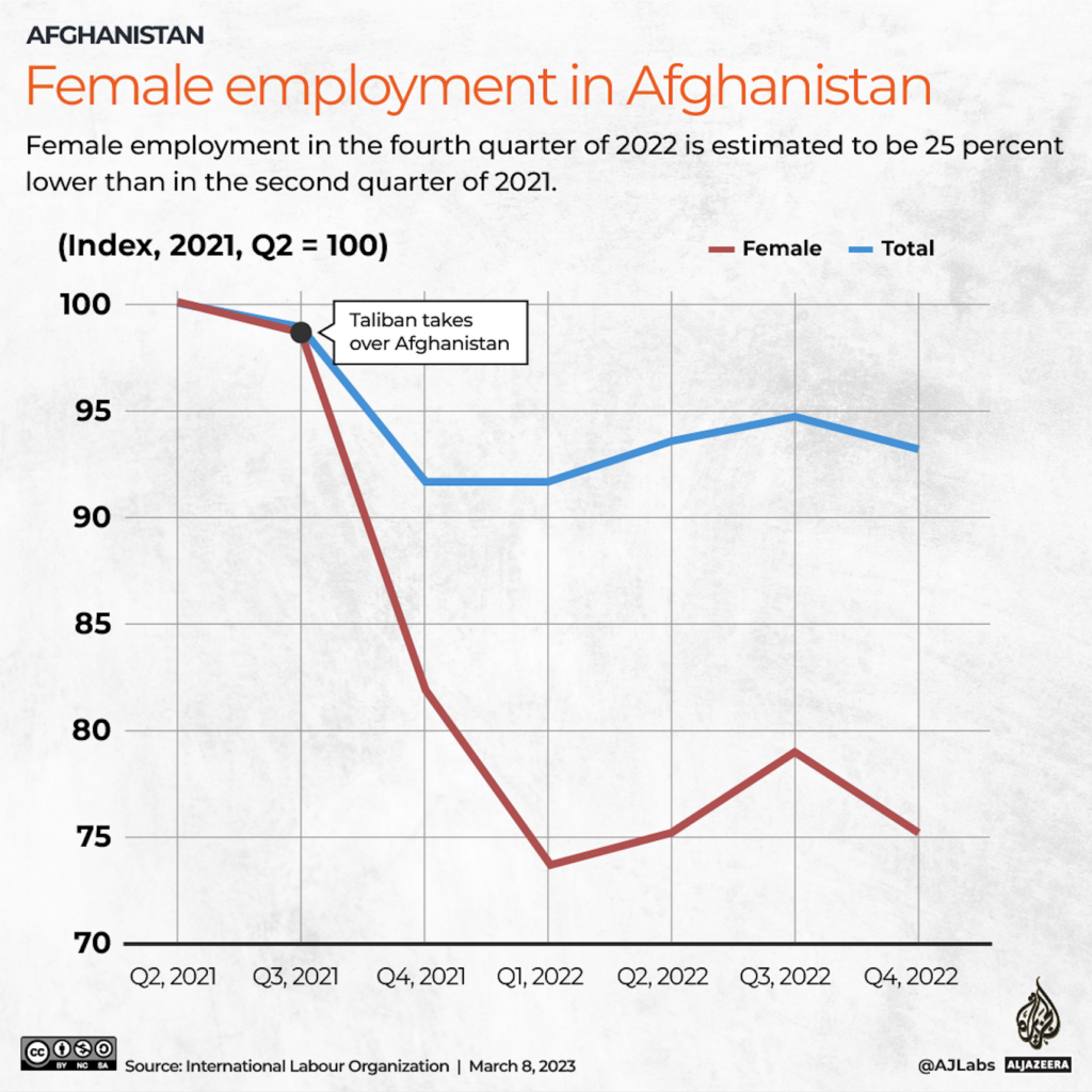
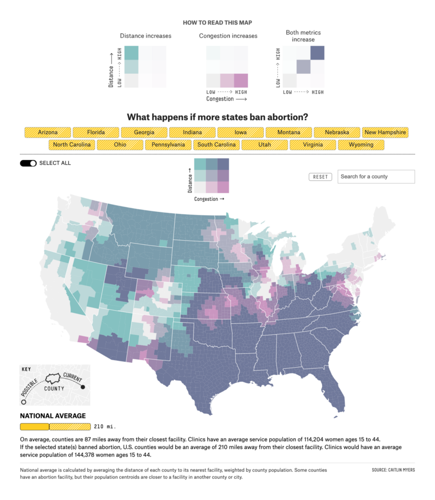
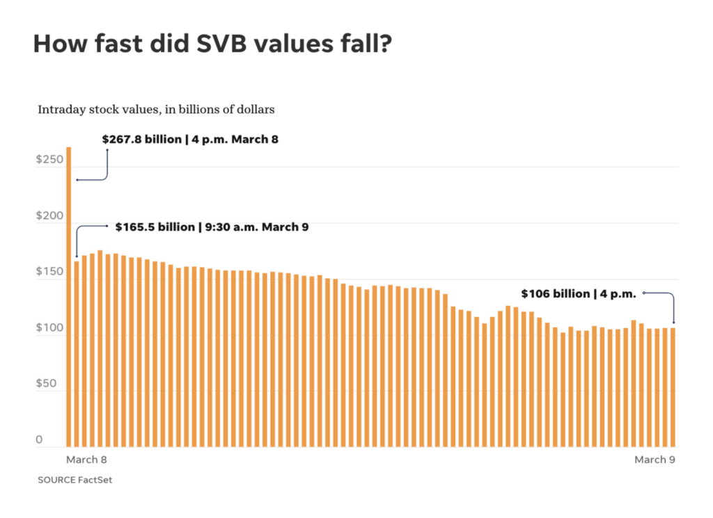
And a few days later, on Friday last week, the Silicon Valley Bank collapse became the second-largest bank failure in the history of the United States.


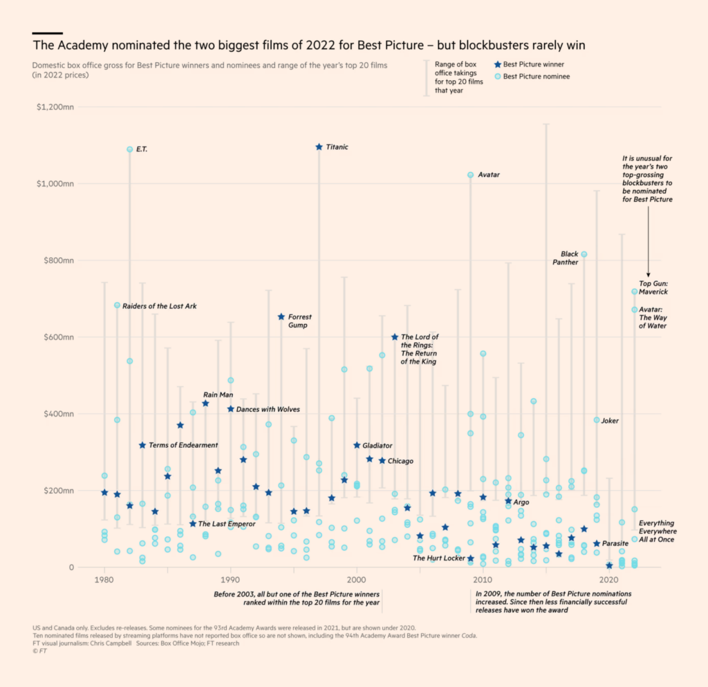
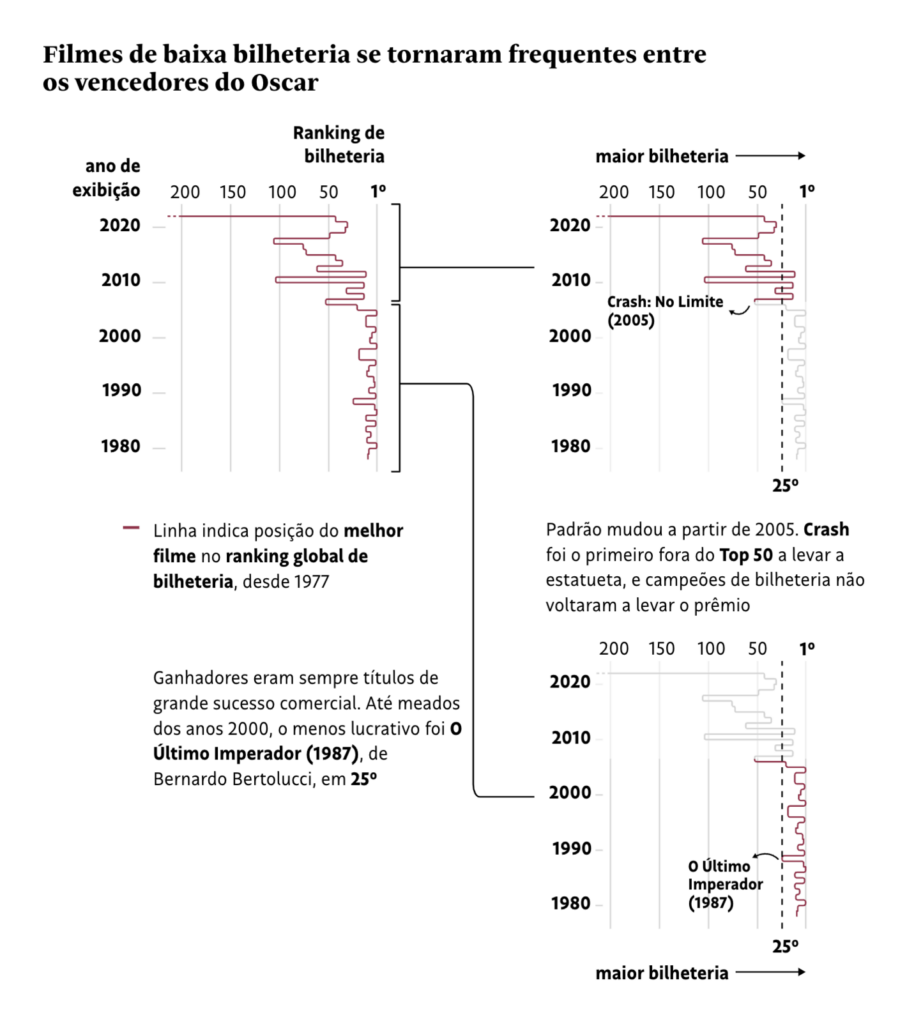
On Sunday, March 12, the 2023 Oscar winners were announced in what’s become one of the most-watched award ceremonies in the film industry.
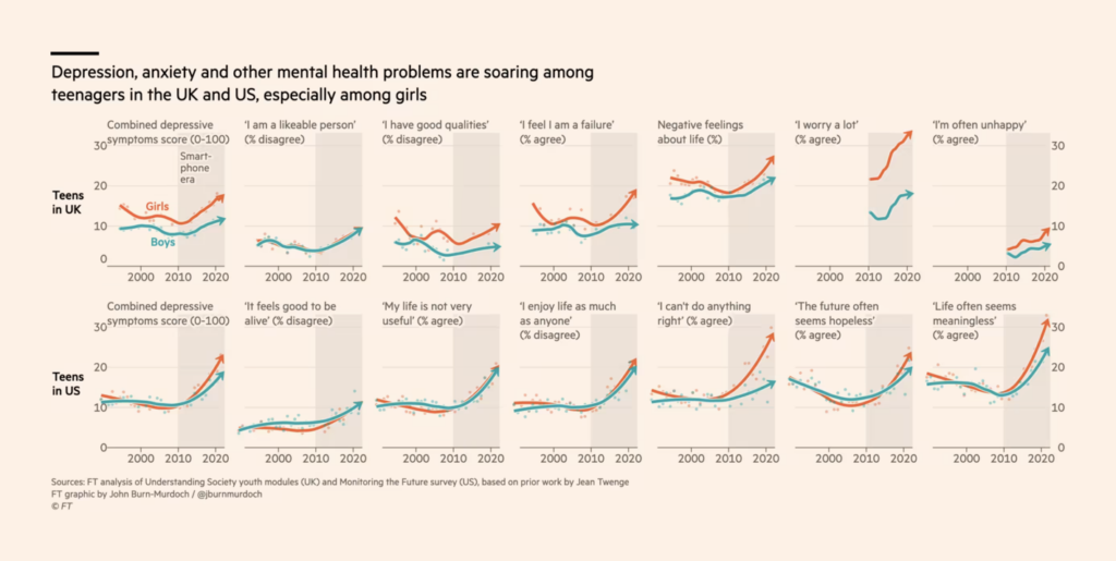
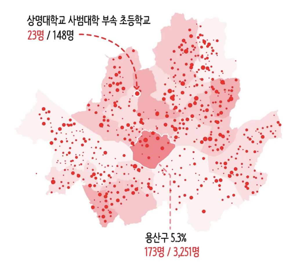
The following data visualizations all look at the lives of young people — mental health issues in the UK and the US, bullying in South Korea, and a growing interest in psychology courses in Brazil.

Meanwhile, Russia and China are protecting their strategic positions in the Arctic and the South China Sea.


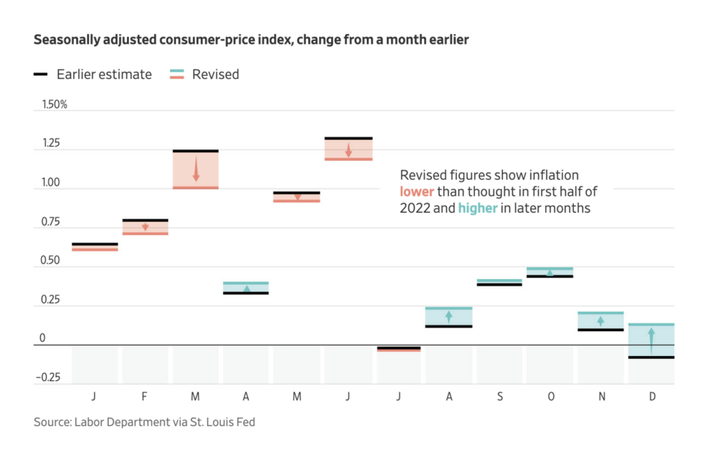
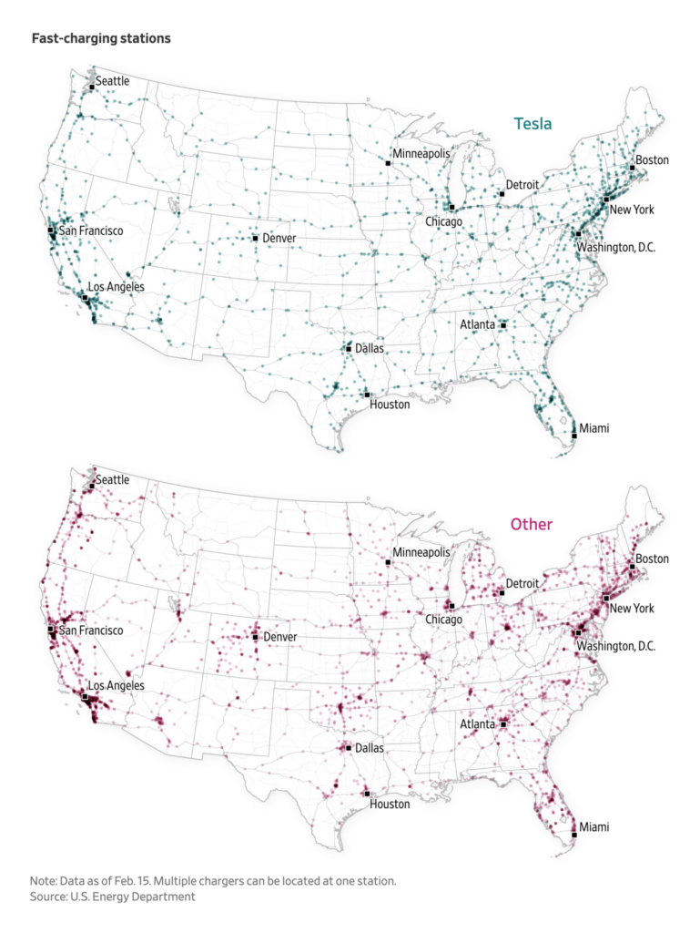
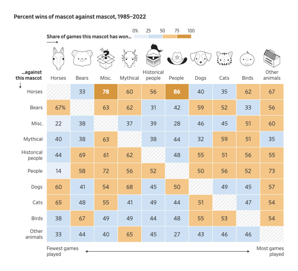
Other notable data vis of the week covers inflation, EV chargers, and the competition among basketball mascots.
Applications are open for…
Help us make this dispatch better! We’d love to hear which newsletters, blogs, or social media accounts we need to follow to learn about interesting projects, especially from less-covered parts of the world (Asia, South America, Africa). Write us at hello@datawrapper.de or leave a comment below.
Want the Dispatch in your inbox every Tuesday? Sign up for our Blog Update newsletter!
Comments