This article is brought to you by Datawrapper, a data visualization tool for creating charts, maps, and tables. Learn more.
Data Vis Dispatch, March 15
The best of last week’s big and small data visualizations

Welcome back to the 36th edition of Data Vis Dispatch! Every week (except last week, because we celebrated International Women’s Day in Berlin), we publish a collection of the best small and large data visualizations we find, especially from news organizations — to celebrate data journalism, data visualization, simple charts, elaborate maps, and their creators.
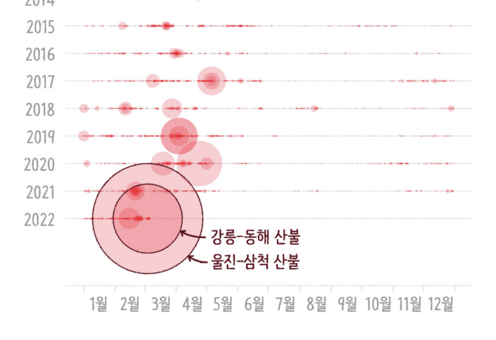
Recurring topics this week include the Russia-Ukraine war and the rising COVID cases in China and Hong Kong.
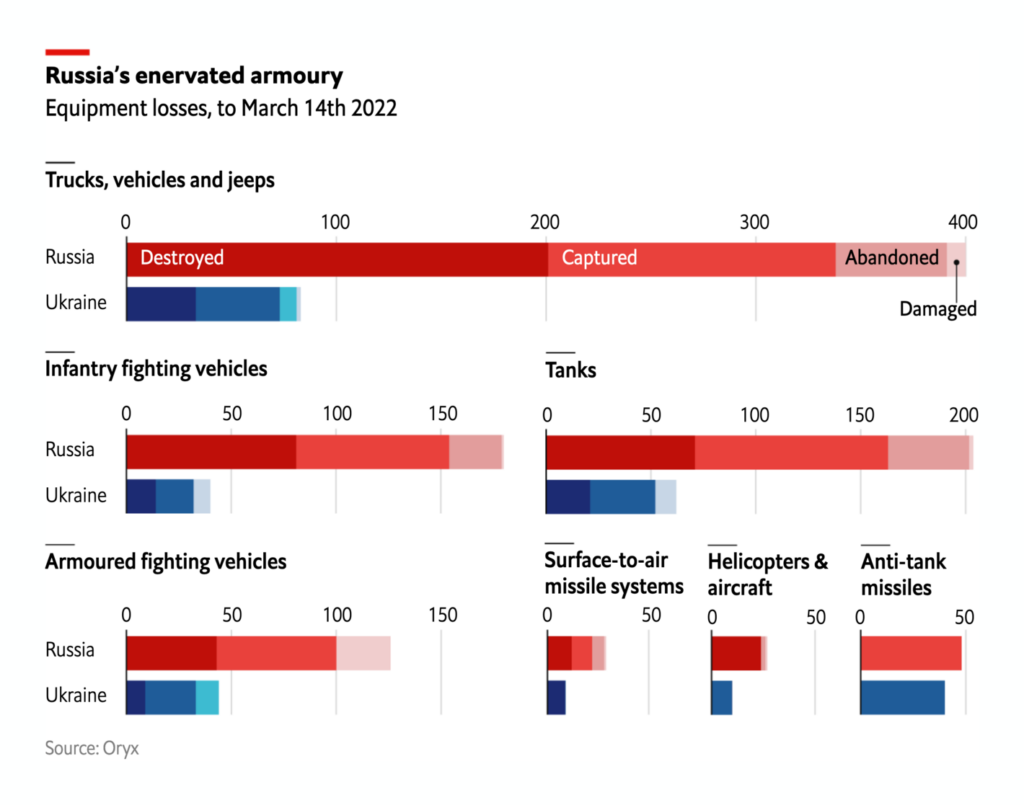
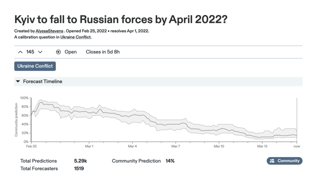
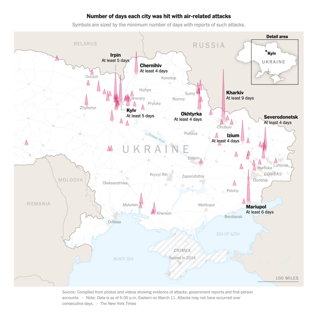
The war in Ukraine is in its third week. Many news sites are still updating the map collections and live blogs that we listened in the last Dispatch. Here are a few new visualizations:


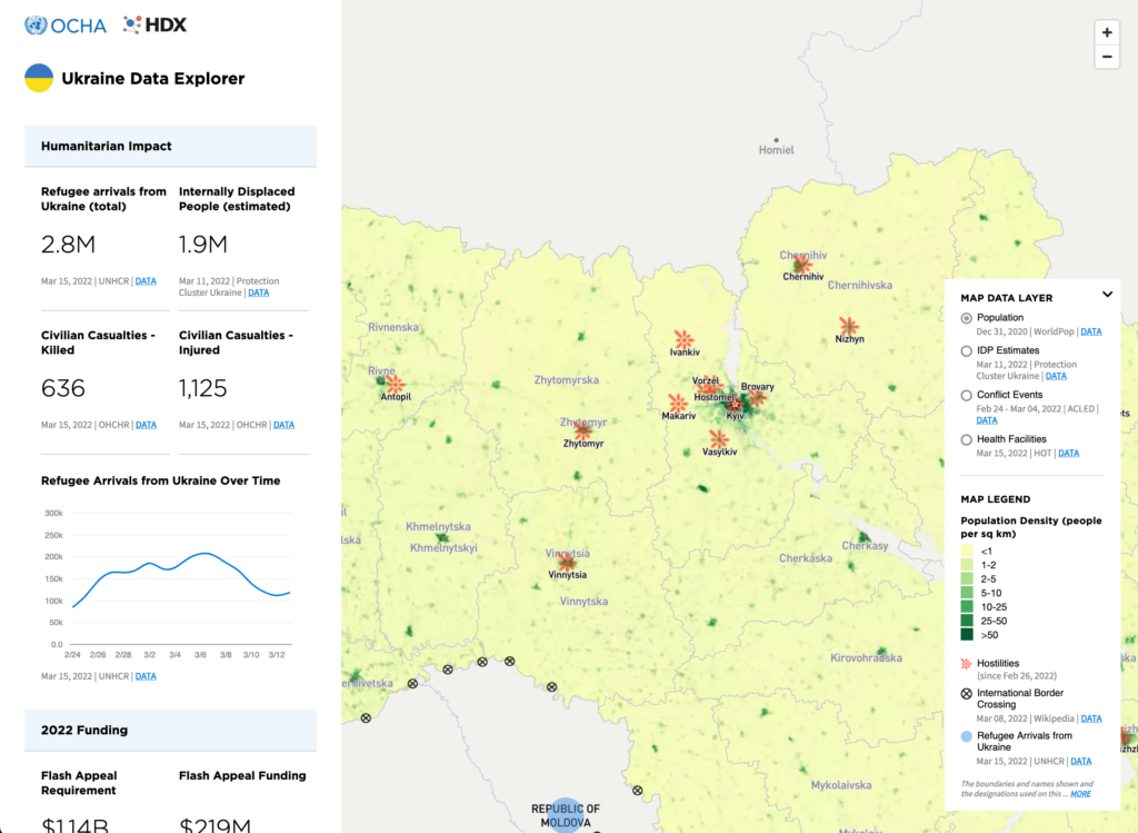
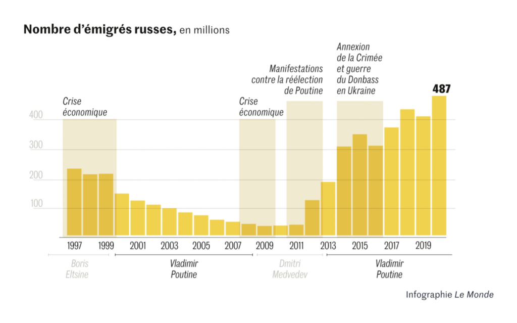
And while the war still goes on, people still try to get away from it. The high number of refugees who have left the country in such a short time is unprecedented, as reporters at The Times visualize. Within Ukraine, civilians try to leave occupied cities:


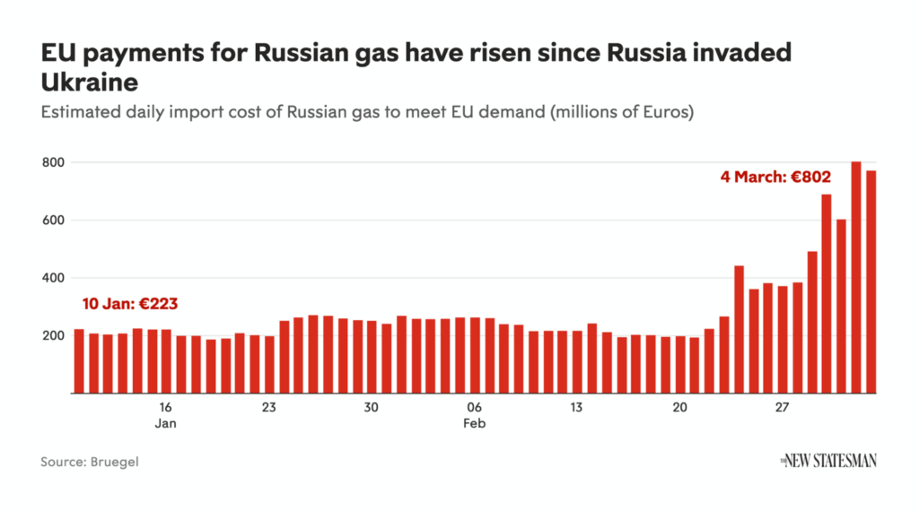
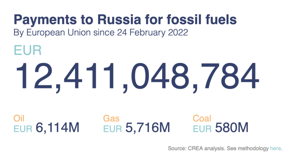
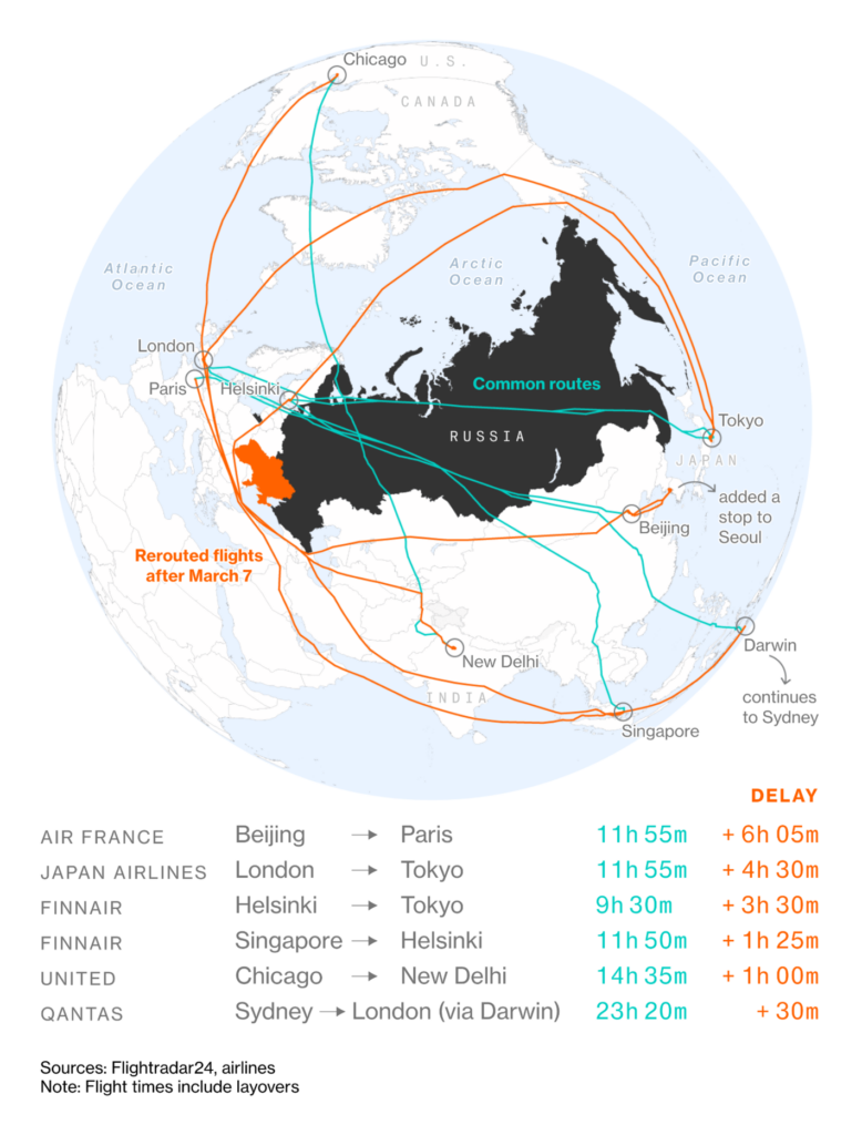
How should the EU and countries worldwide deal with Russia? The high dependence on Russian oil and gas doesn’t help…

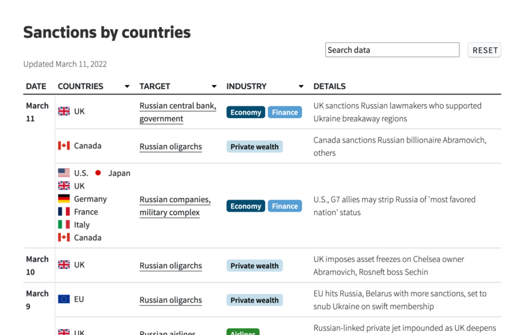
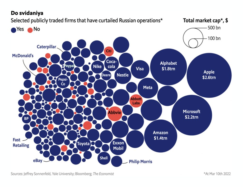
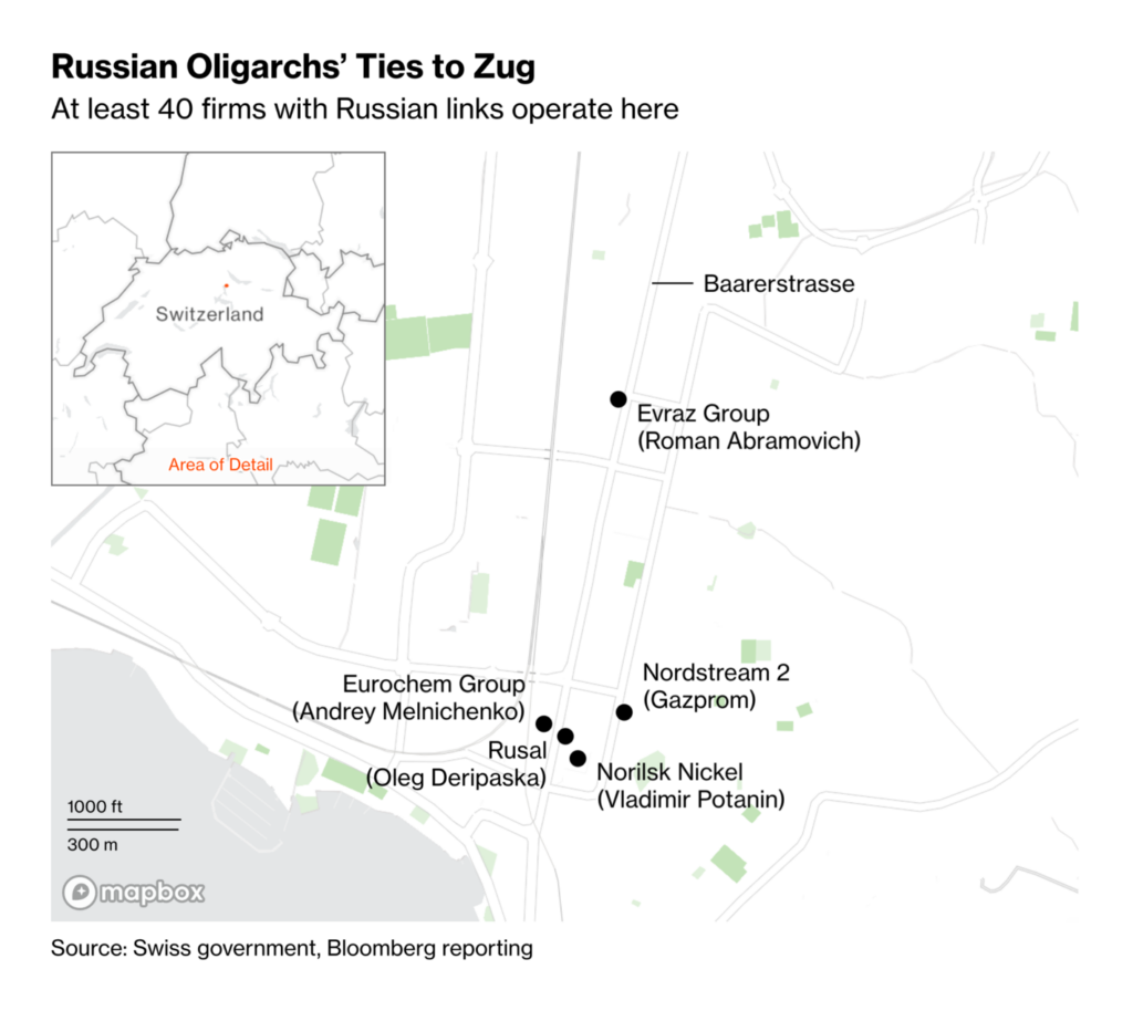
…but the consequences of the war for Russia are enormous. Sanctions are in place, and lots of companies stopped operations in Russia too:


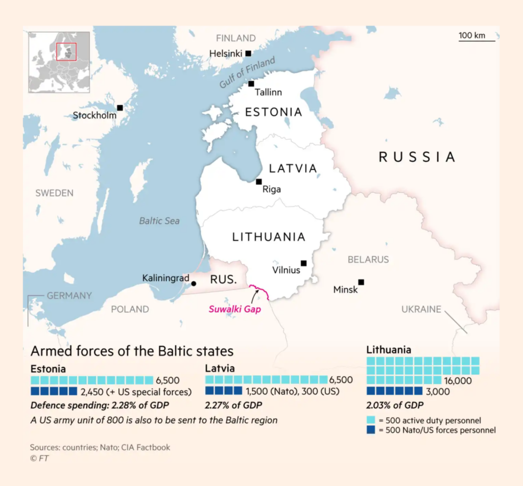
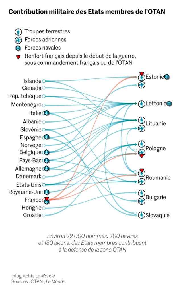
Articles also debated military spending and transfers:
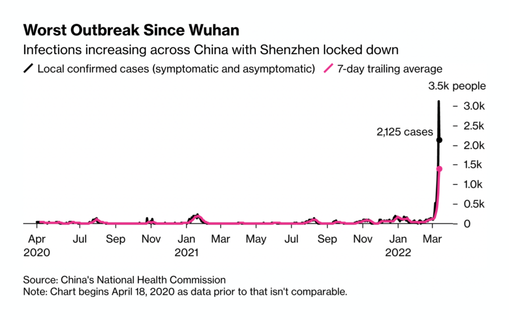
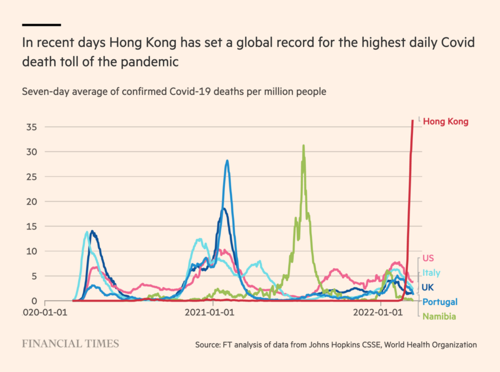
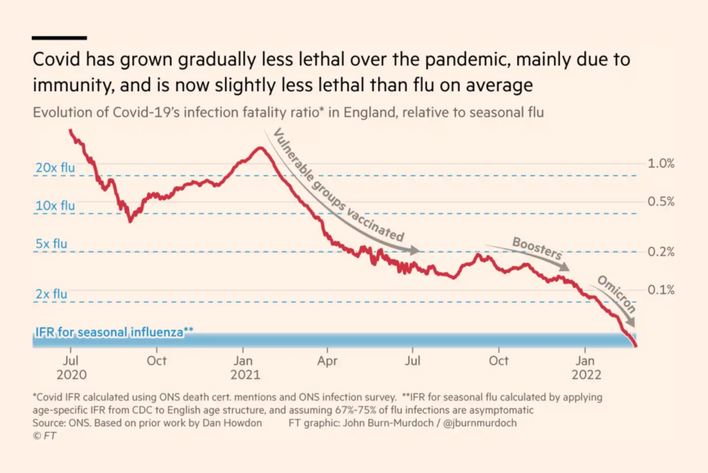
We’ve also seen quite a few COVID visualizations this week, thanks to both bad and good news. Some Asian countries like South Korea and Hong Kong have been seeing record numbers of cases and deaths. On the other side of the planet, in England, COVID became as lethal as the flu:

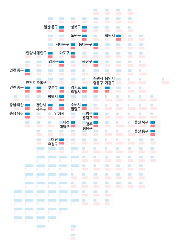
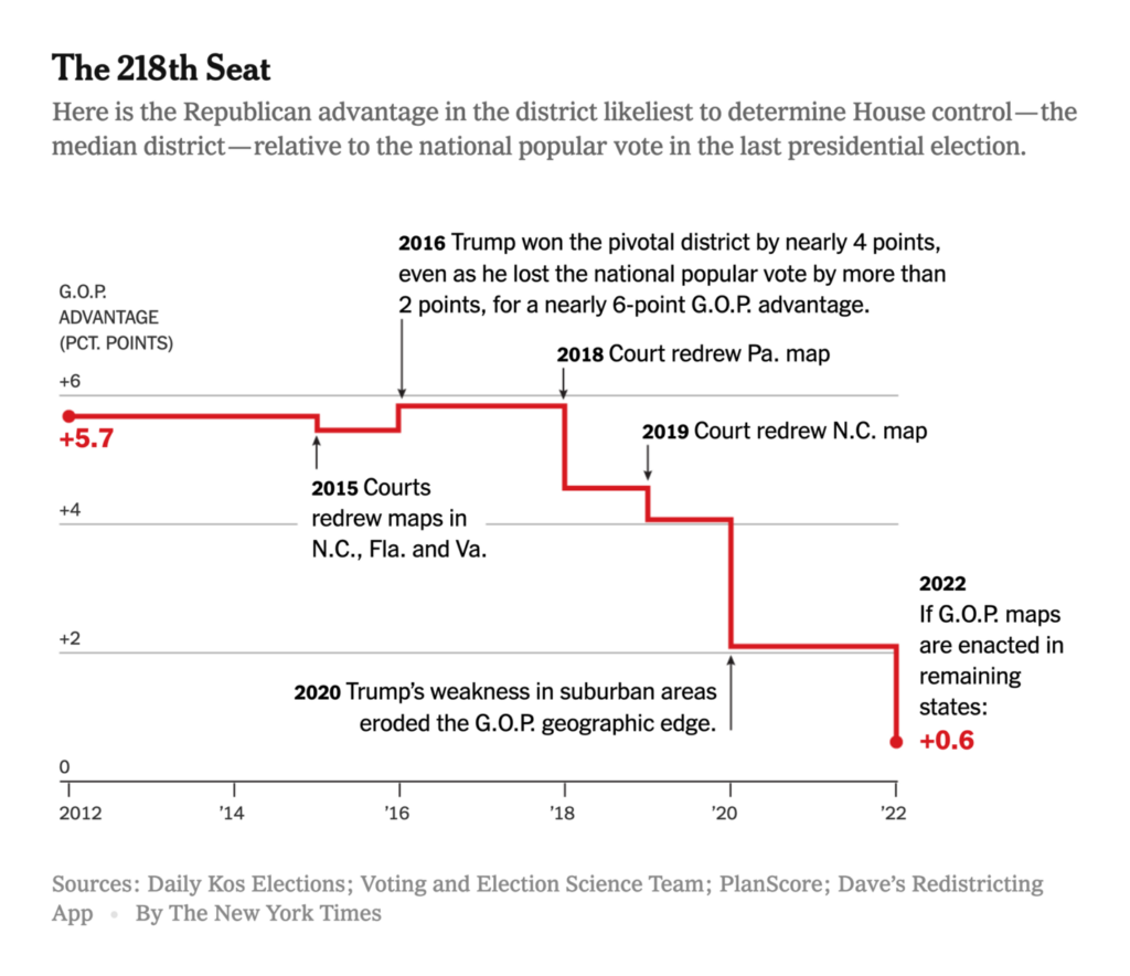
When it comes to politics, the stand-out event last week was the South Korean presidential election. Don’t miss the link to the animated election graphics at the very bottom of this Dispatch!


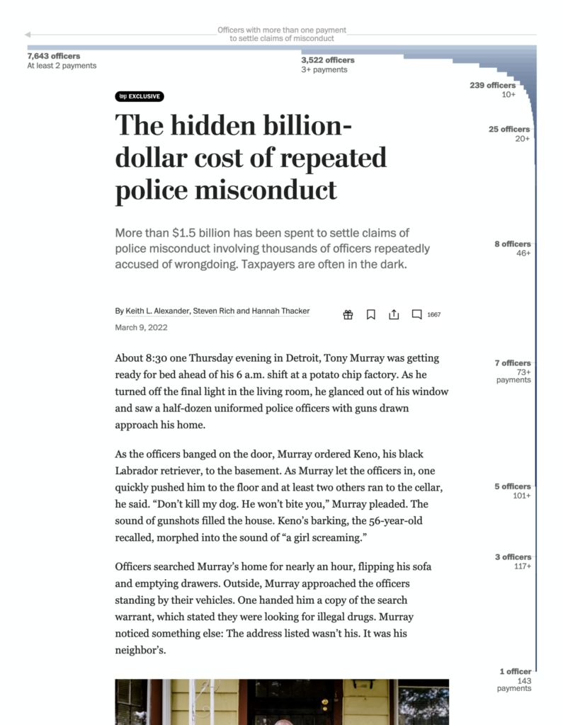
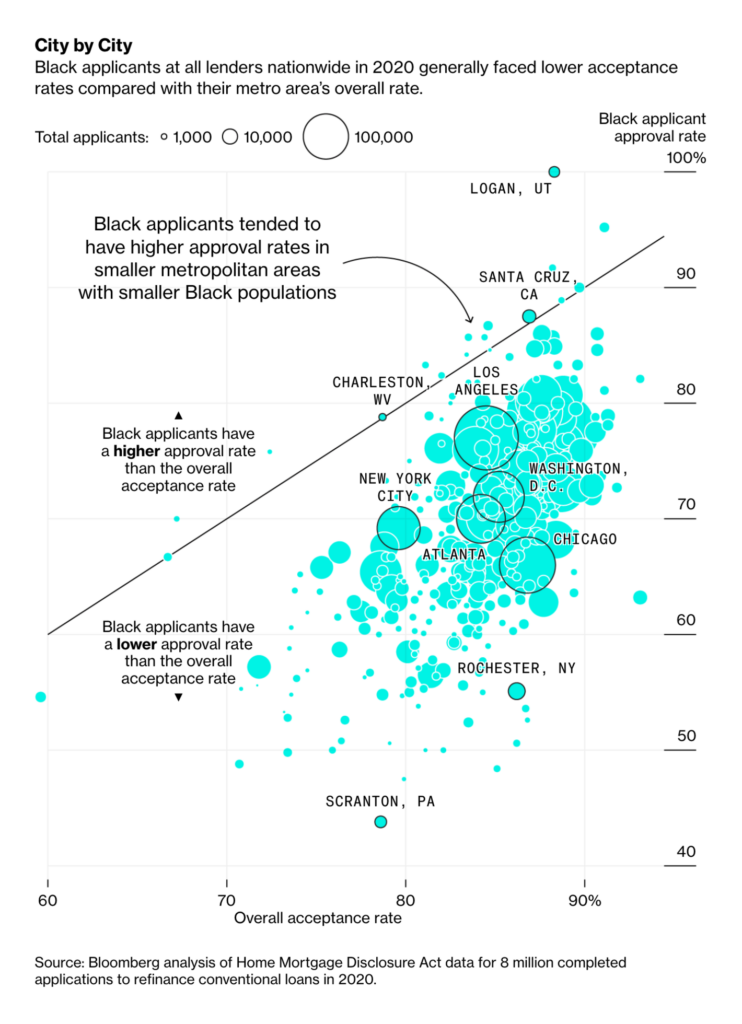
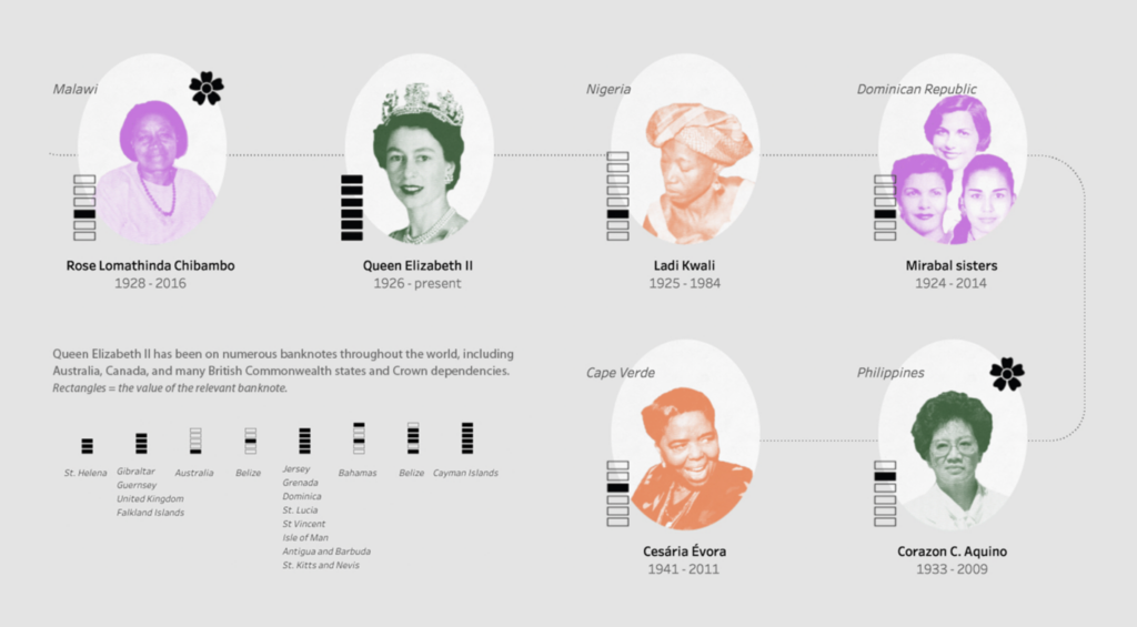
Graphics reporters were also busy visualizing inequalities in the past week — thanks to International Women’s Day and the release of a new study on the connection between historical racist policies and present-day air pollution, among others.


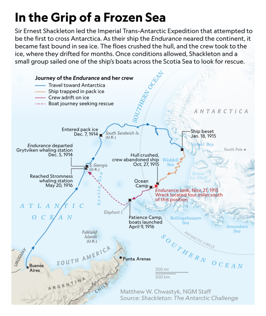
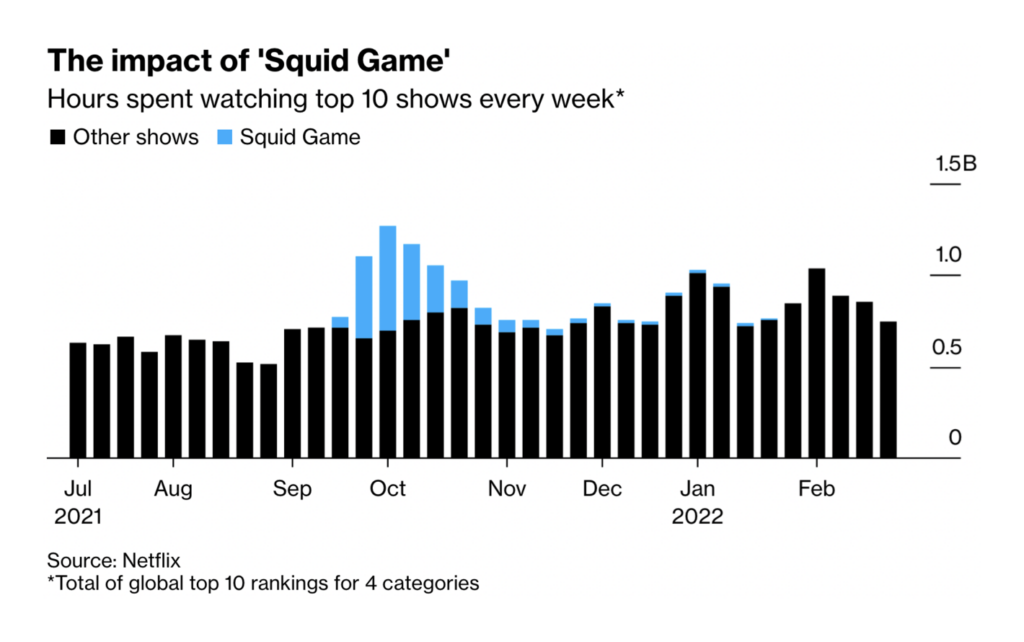
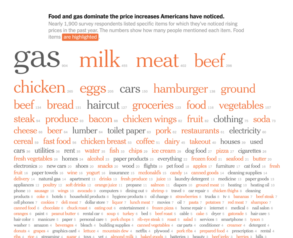
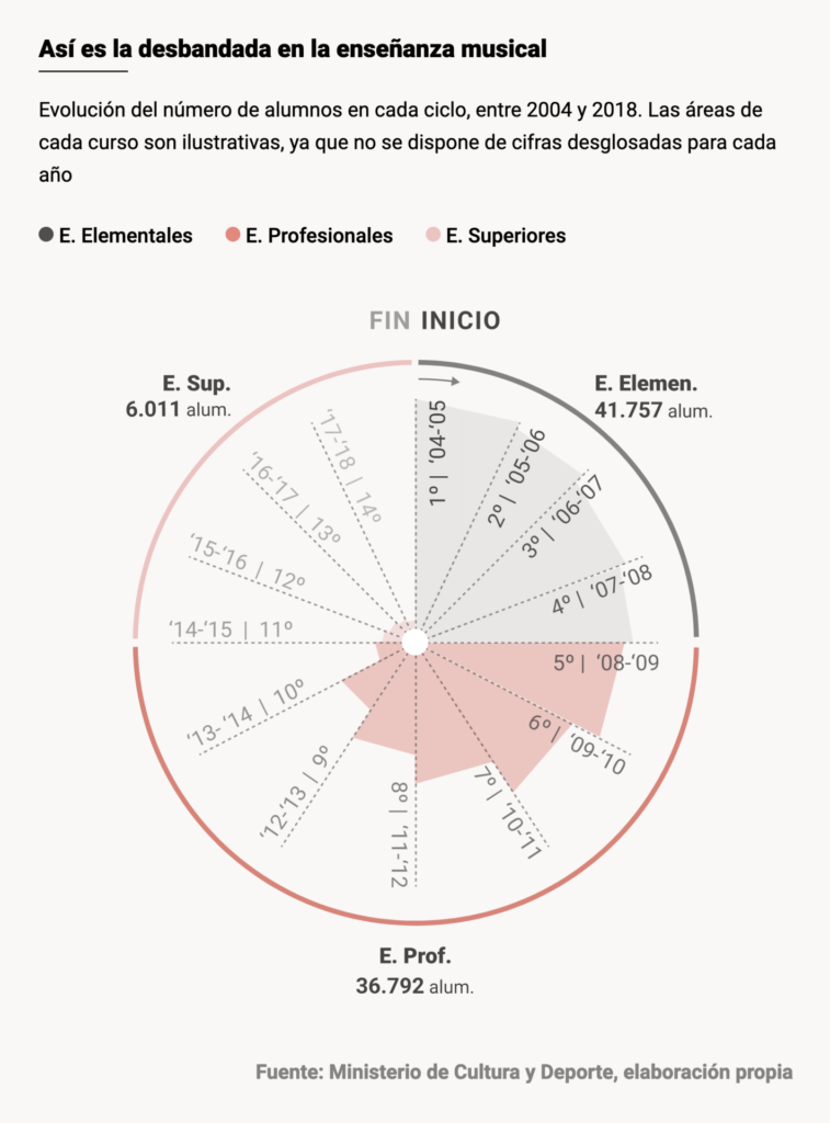
In our “the last but definitely not least exciting visualizations” category, you’ll find a sunken ship, inflation, music students, Wordle analytics, stats on siblings, and more:


What else we found interesting


Applications are open for a Digital Story Designer at SPIEGEL.
And: The Society of News Design announced their winners on March 11. Find them all on their Twitter account.
Help us make this dispatch better! We’d love to hear which newsletters, blogs, or social media accounts we need to follow to learn about interesting projects, especially from less-covered parts of the world (Asia, South America, Africa). Write us at hello@datawrapper.de or leave a comment below.


Comments