This article is brought to you by Datawrapper, a data visualization tool for creating charts, maps, and tables. Learn more.
Data Vis Dispatch, March 19
The best of last week’s big and small data visualizations

Welcome back to the 134th edition of Data Vis Dispatch! Every week, we’ll be publishing a collection of the best small and large data visualizations we find, especially from news organizations — to celebrate data journalism, data visualization, simple charts, elaborate maps, and their creators.
If you look closely today, you’ll notice Something new! We often come across articles that deserve a special shout-out or a closer look — maybe an especially cool interaction, or beautiful design throughout the whole piece, or just many more neat visualizations than we can show here. Now, from time to time, you’ll see these little gold badges pointing you towards more great charts!
Recurring topics this week include Gen Z, forecasts, and a world tour.
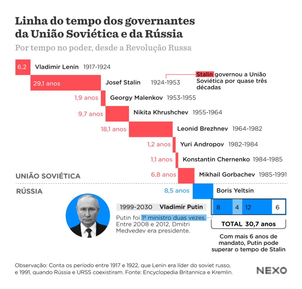
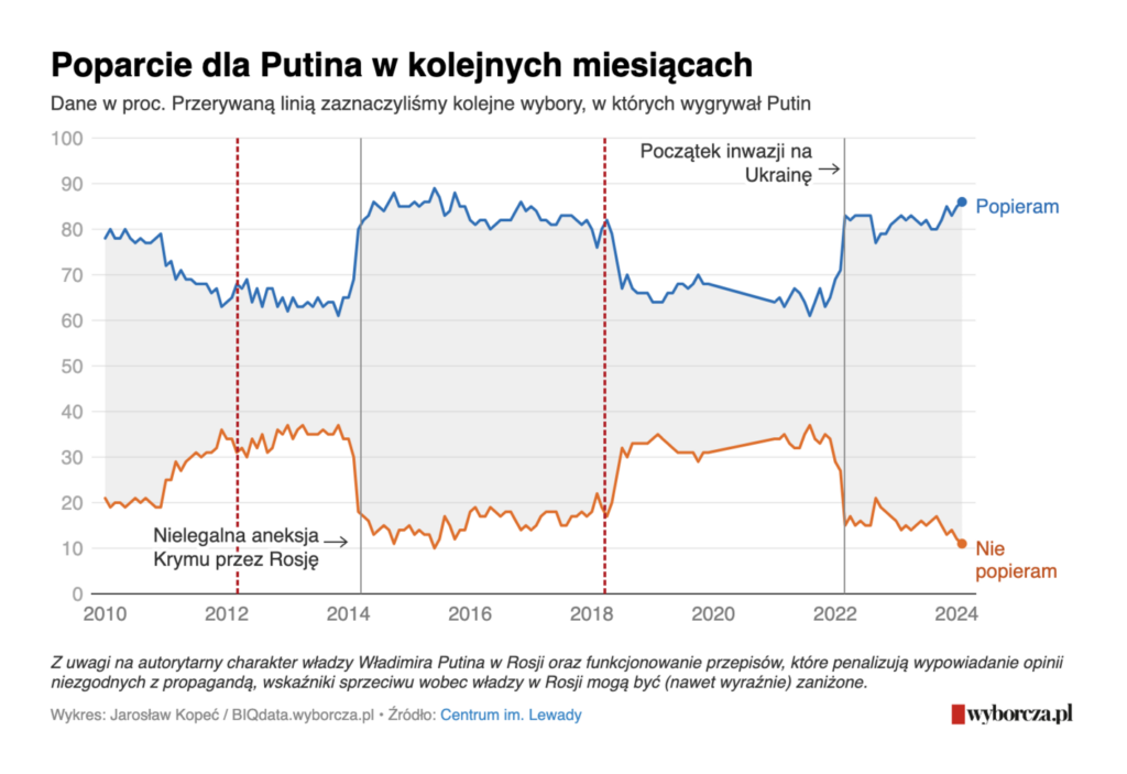
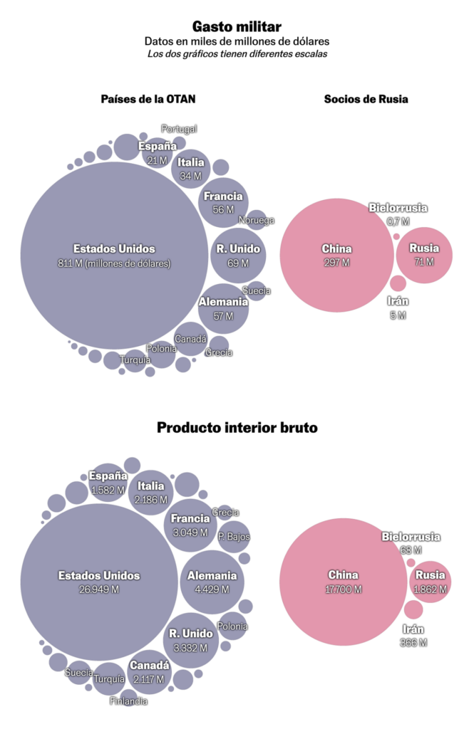
Today we’re going on a world tour, so please fasten your seatbelts. We’ll start in Russia, where Vladimir Putin was “reelected” as president on March 17. We found several visualizations about Russian political history, voter behavior, and allies:
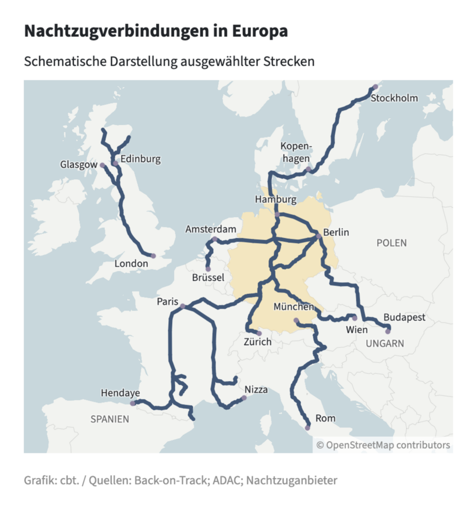
Let’s move on to Europe and ask: Where can I take the night train?
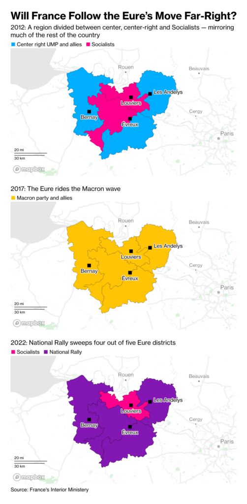
A brief zoom in on France. Two non-European media outlets have focused on the country this week, either because of the European Parliament elections or because of abortion rights:

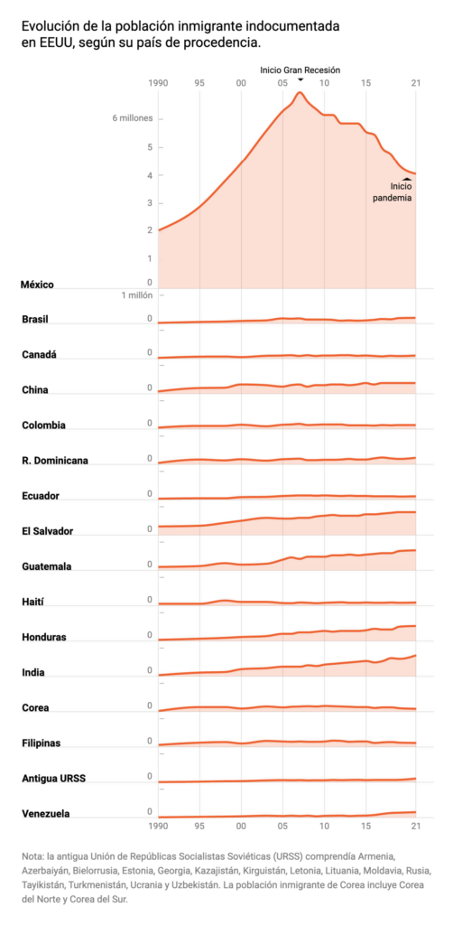
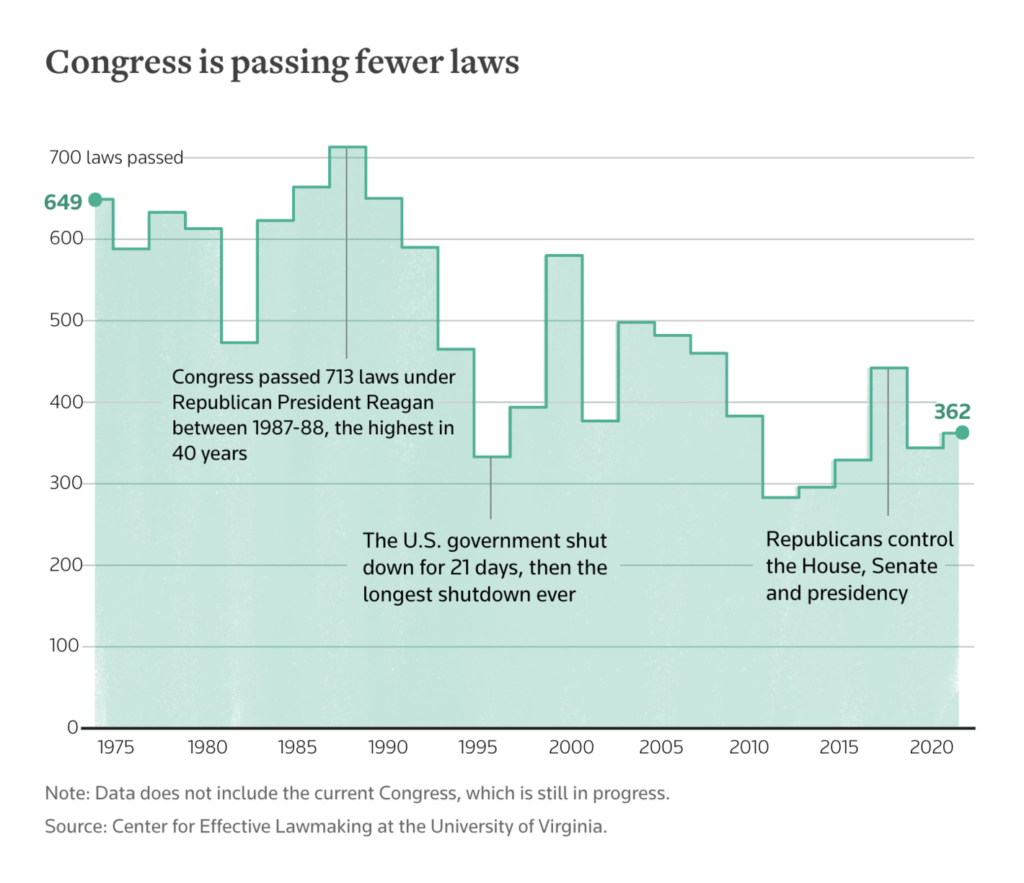
We cross the Atlantic to the United States, where we find visualizations of undocumented immigration and a slow-moving Congress:
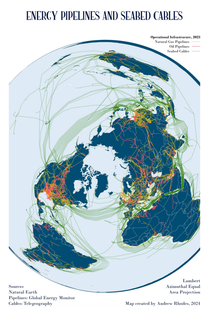
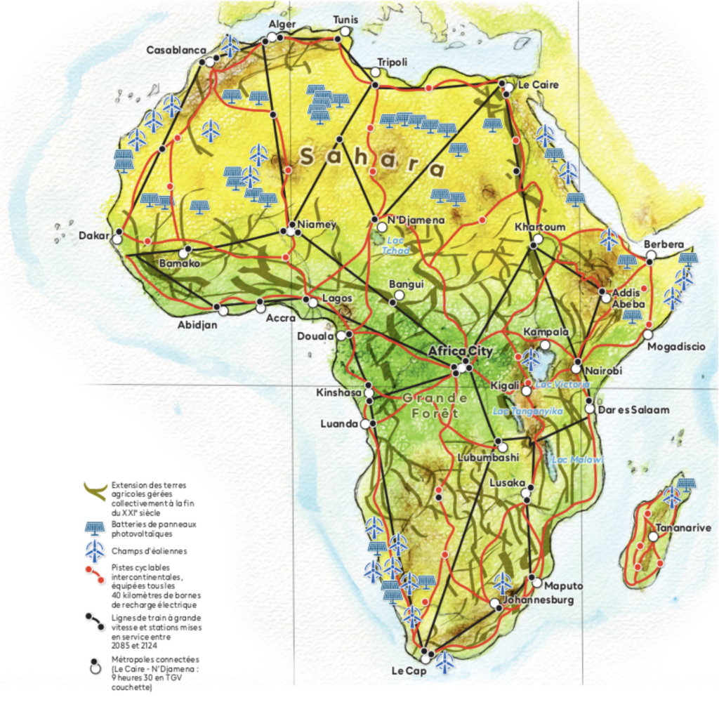
We end our tour with two stories about crossing the whole world:
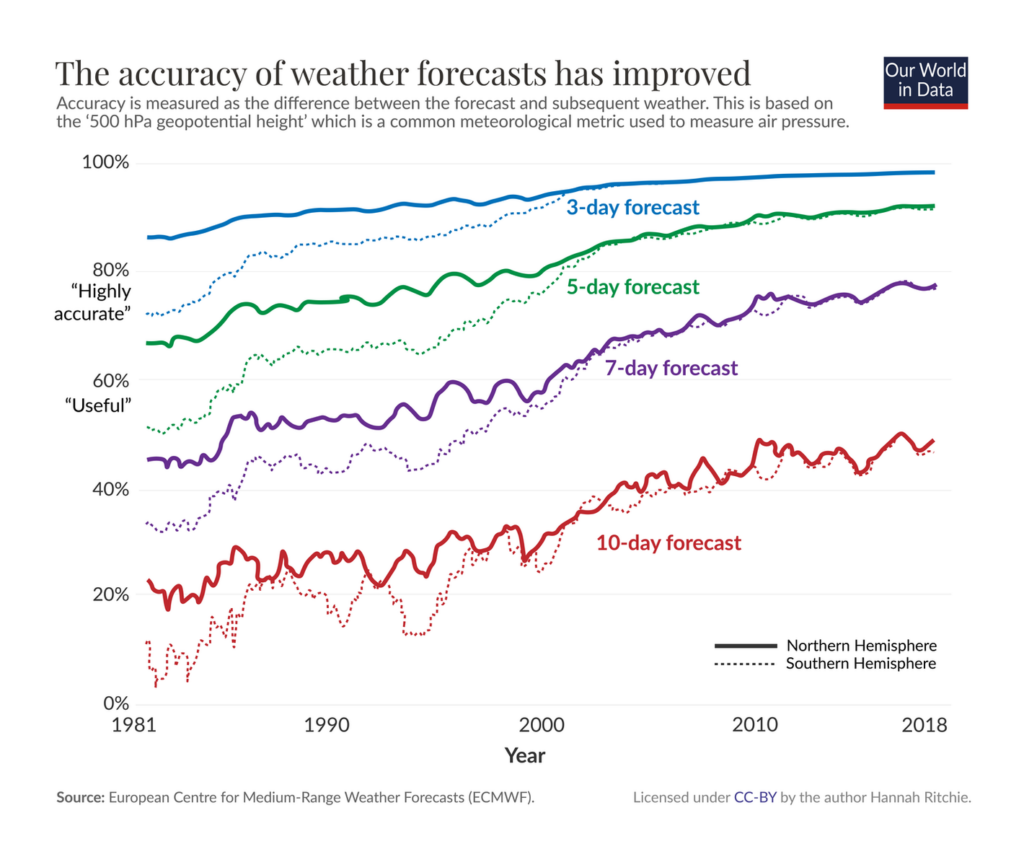
Weather forecasting has getting more accurate over time — even as the weather itself keeps changing:
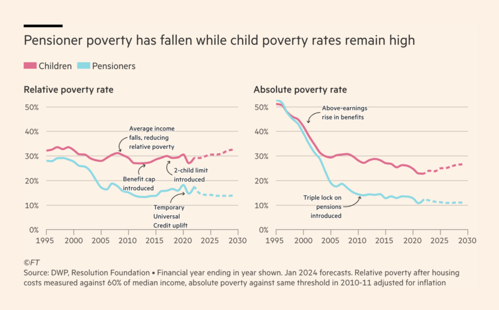
Financial topics ranged from the Alpha Architect 1-3 Month Box ETF to child poverty:
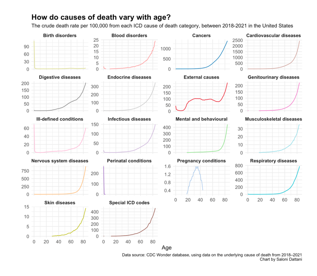
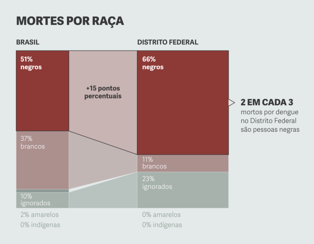
Death statistics made several appearances in this week’s visualizations:
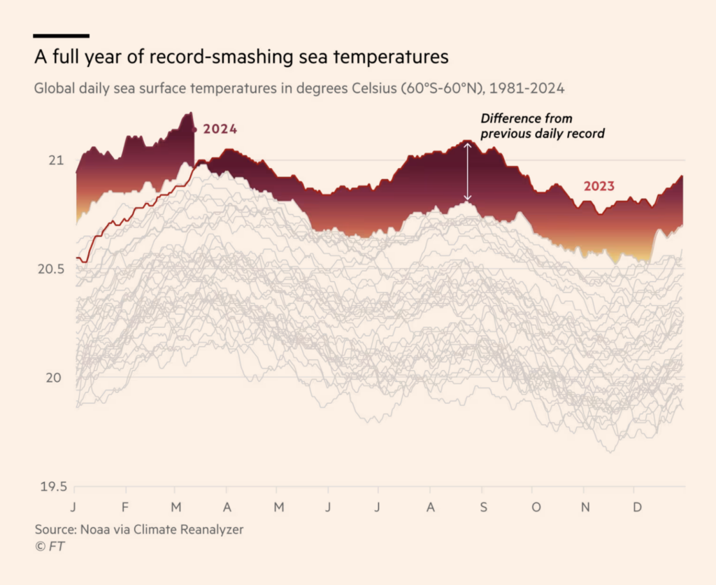
When would you use a warm color scale? In the following charts, they represent lottery jackpots and ocean temperatures:

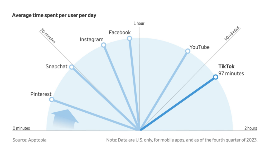
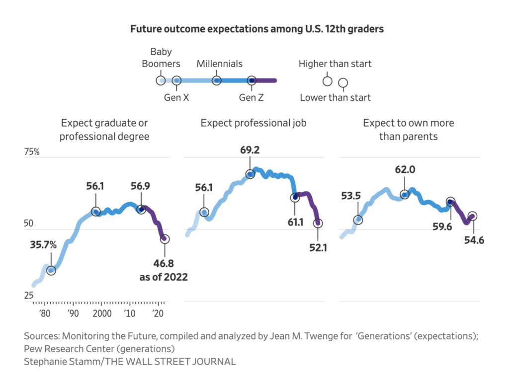
Gen Z, meanwhile, is cool (color-wise). Or maybe that’s just the Wall Street Journal, where two visualizations dealt with the future of this generation and of one of its favorite apps, TikTok:
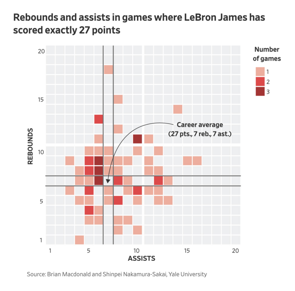
Once again, sports made it into the Dispatch:
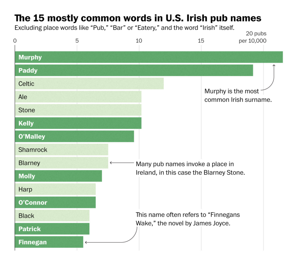
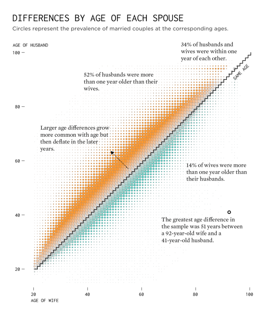
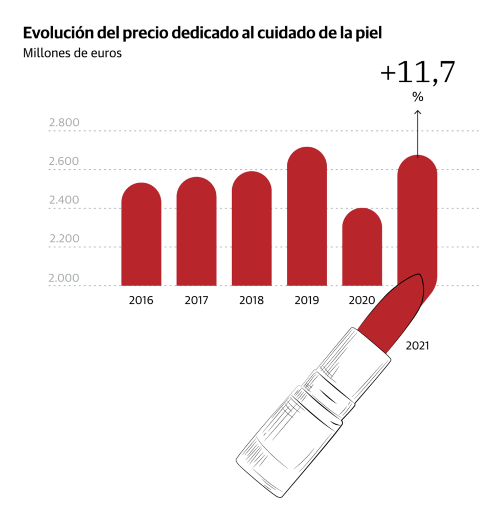
Last but not least, visualizations about Irish pub names (in the U.S.), age differences in married couples, and skincare:
What else we found interesting
Applications are open for…
- A data journalist at the BBC
- An editor at the Neue Zürcher Zeitung
- A designer/developer on the data journalism team at Handelsblatt
Help us make this dispatch better! We’d love to hear which newsletters, blogs, or social media accounts we need to follow to learn about interesting projects, especially from less-covered parts of the world (Asia, South America, Africa). Write us at hello@datawrapper.de or leave a comment below.
Want the Dispatch in your inbox every Tuesday? Sign up for our Blog Update newsletter!


Comments