Data Vis Dispatch, March 26

The best of last week’s big and small data visualizations

Welcome back to the 135th edition of Data Vis Dispatch! Every week, we’ll be publishing a collection of the best small and large data visualizations we find, especially from news organizations — to celebrate data journalism, data visualization, simple charts, elaborate maps, and their creators.

Recurring topics this week include water shortages, games, and gender inequality.

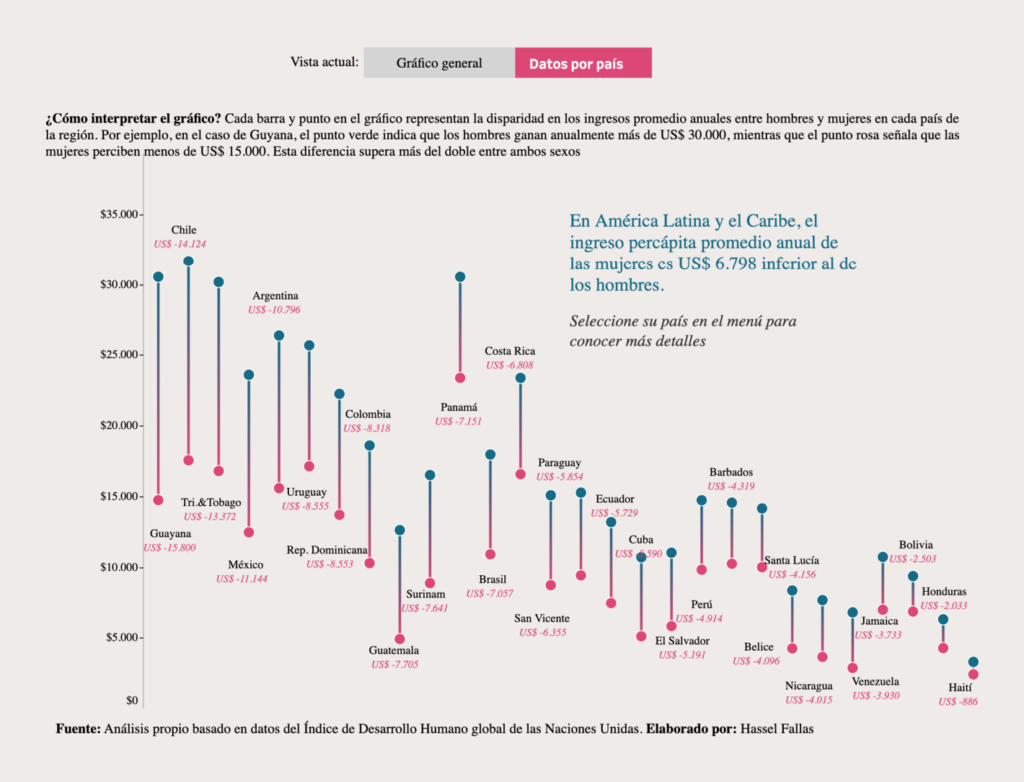
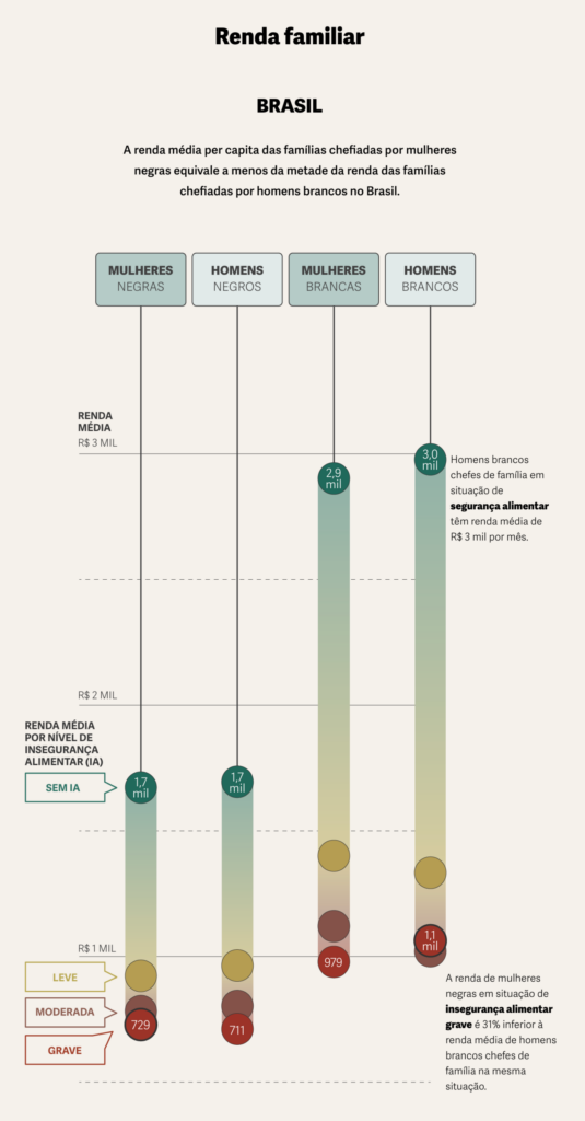
Two dot plots this week told a story of inequality between men and women:

La Data Cuenta: “La brecha salarial afecta más que los ingresos: impacta la independencia y decisiones vitales de las mujeres en salud, educación e incluso romper el ciclo de violencia en una relación,” March 25 (Tweet, Article)
Gênero e Número: Mais da metade das famílias chefiadas por mulheres negras está em insegurança alimentar, March 20

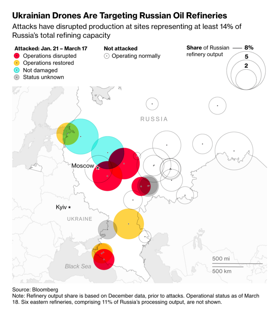
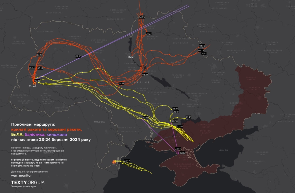
Charts on the Russia-Ukraine war paint a picture of drone strikes on both sides of the border:

Bloomberg: Ukraine’s Drone Strikes on Russian Oil Refineries Mark New Phase in War, March 20
Texty: Надскладні траєкторії. Як летіли “шахеди” і ракети під час масованих атак 23–24 березня (КАРТА), March 25

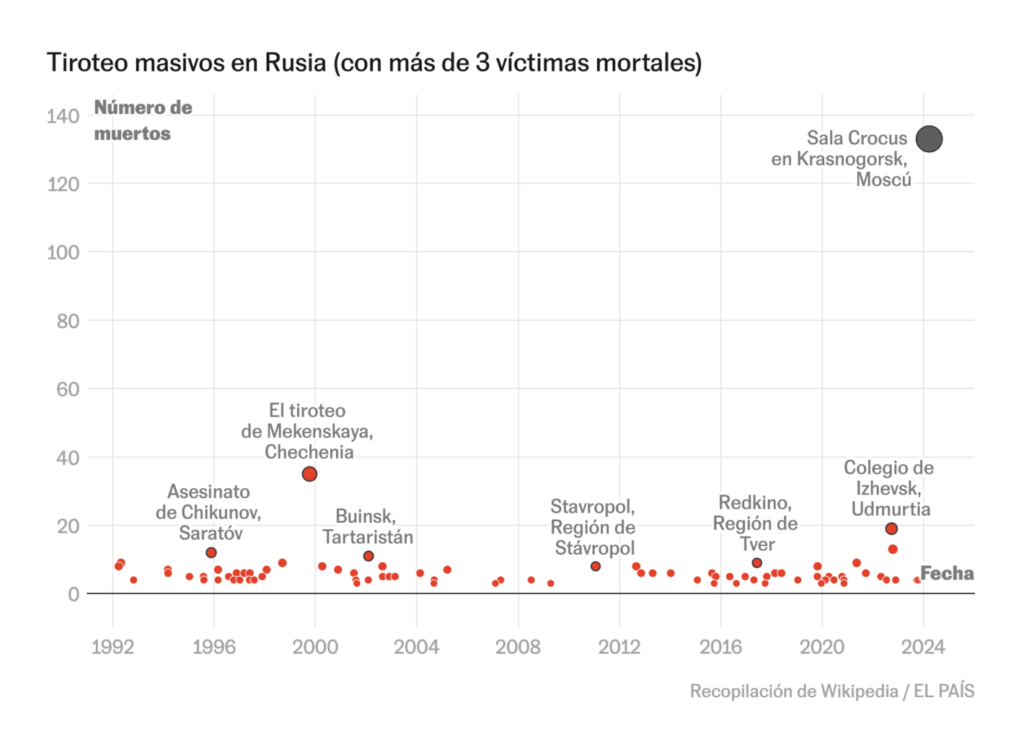
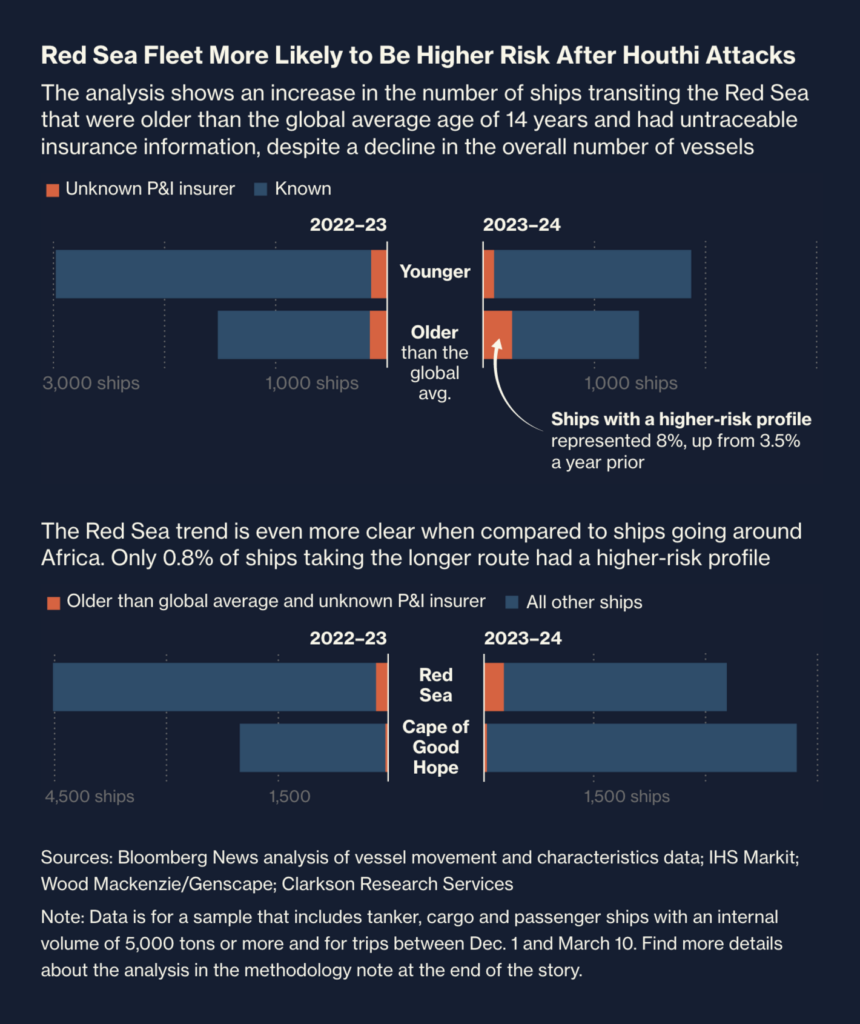
Other violence-related visualizations covered a terrorist attack in Moscow, the history of ISIS in Syria, and consequences of Houthi attacks in the Red Sea:

El País: Análisis visual | Así fue el ataque terrorista en la sala Crocus de Moscú, March 24
Le Figaro: Que reste-t-il de Daech ?, March 23
Bloomberg: The Red Sea Has Become a War Zone Full of Vulnerable Ships, March 21

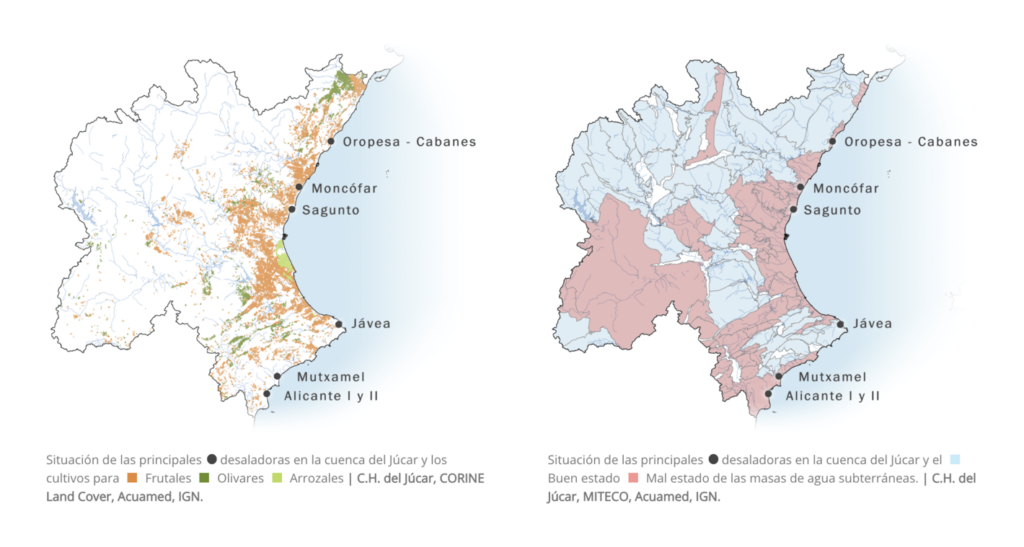
Water is our fountain of life, but it seems to be drying up:

ATLO: Felmelegedő Duna, March 21
elDiario.es: Desaladoras paradas, acuíferos al límite, March 24

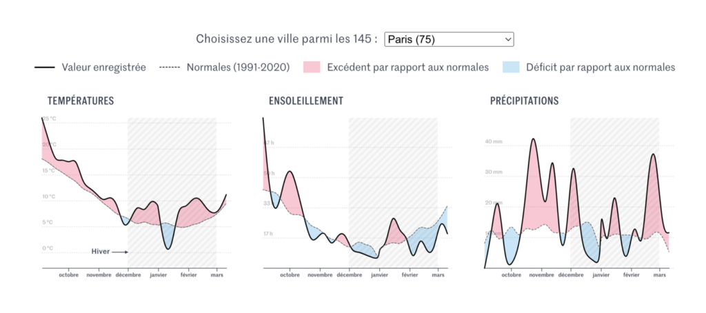
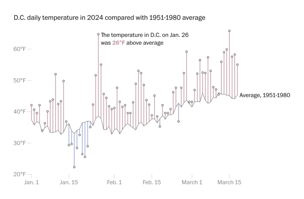
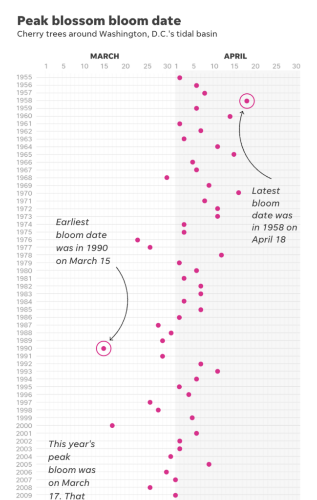
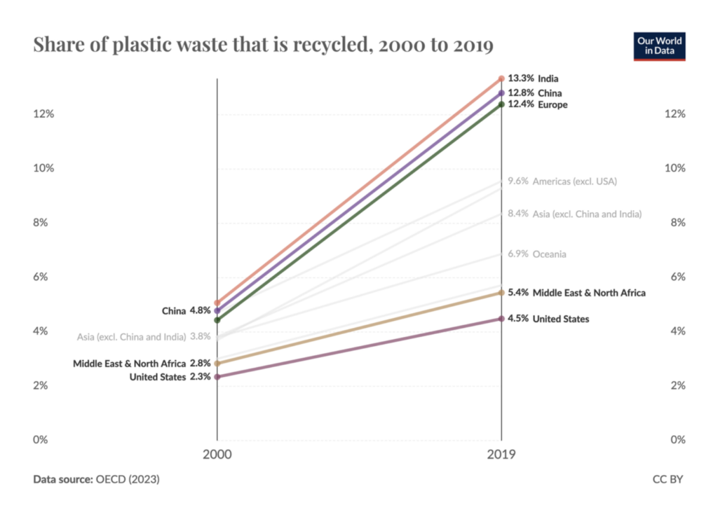
More on the climate and environment — temperature anomalies and their influence on cherry blossoms. Oh, and plastic recycling:

Le Monde: Vous avez trouvé l’hiver pluvieux, doux et sans soleil ? C’est plutôt vrai, vérifiez-le près de chez vous, March 24
The Washington Post: See one cherry tree’s rush to an early bloom, day by day, March 22
USA Today: Cherry blossoms peak earlier in DC, see the impacts of climate change in this visual story, March 21
Our World in Data: Plastic recycling rates are increasing, but slowly, in many regions, March 20

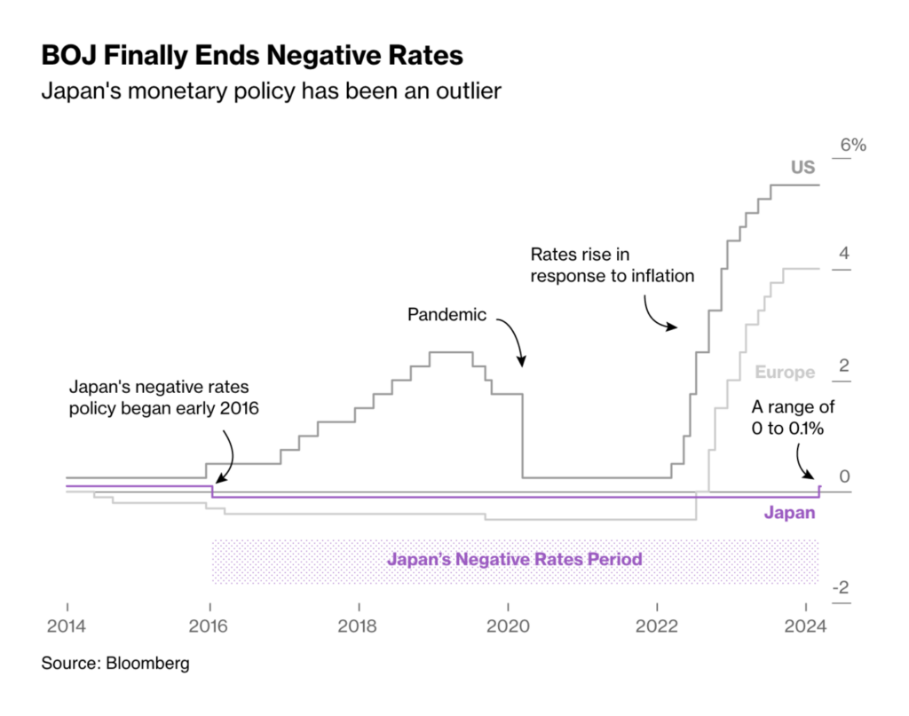
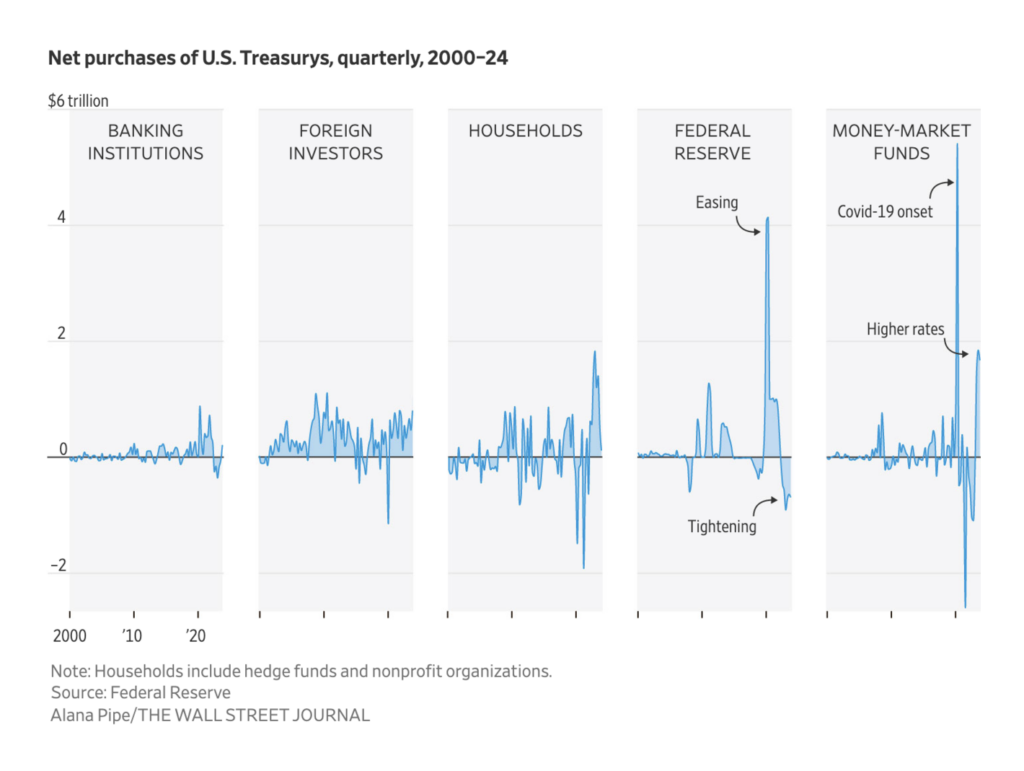
I’d summarize our next group as money, markets, and banks:

Bloomberg: BOJ’s Small Rate Hike May Have Big Ripple Effect Around the World, March 19
The Wall Street Journal: The $27 Trillion Treasury Market Is Only Getting Bigger, March 24

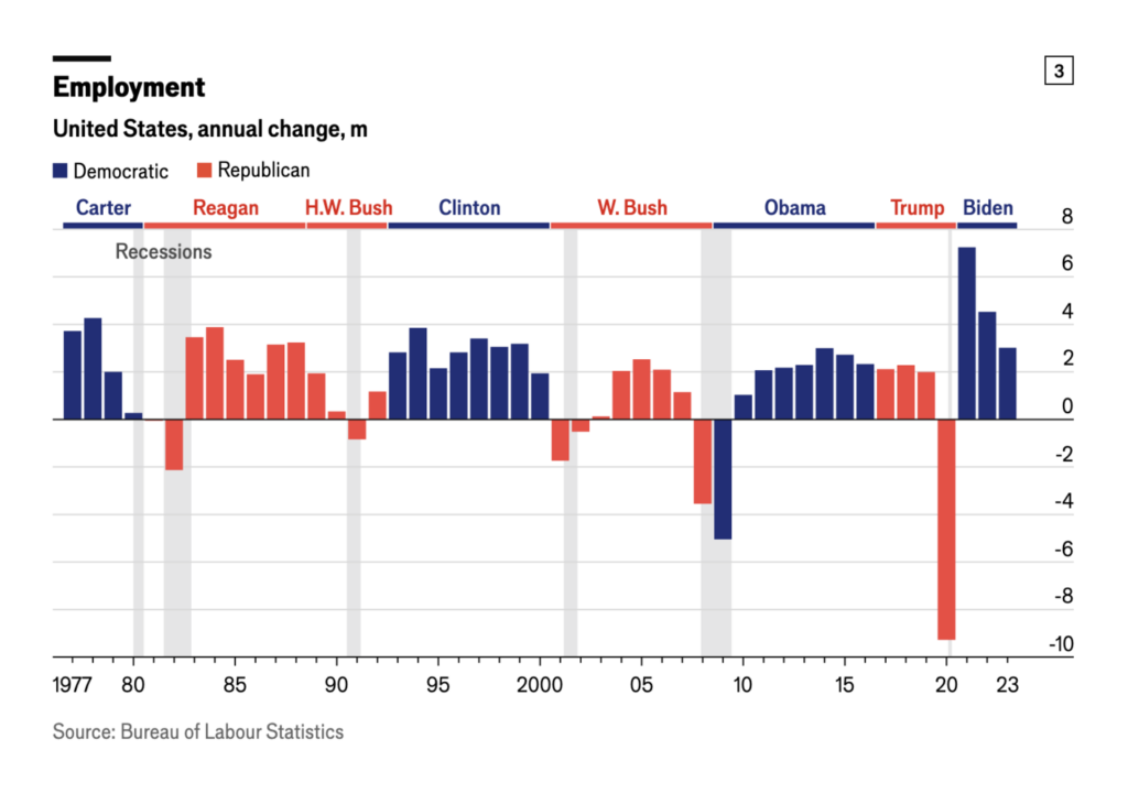
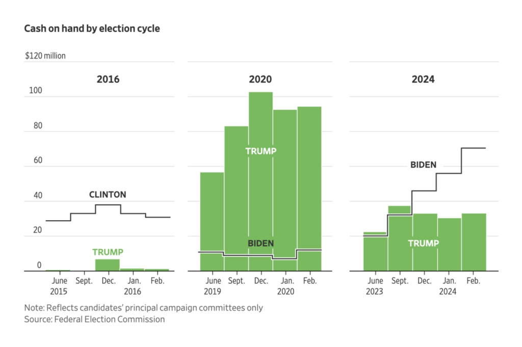
Two bar charts this week looked at underlying factors in the U.S. election:

The Economist: Five charts compare Democrats and Republicans on job creation, March 19
The Wall Street Journal: Trump Is in a Race Against Time to Protect His Fortune, March 22

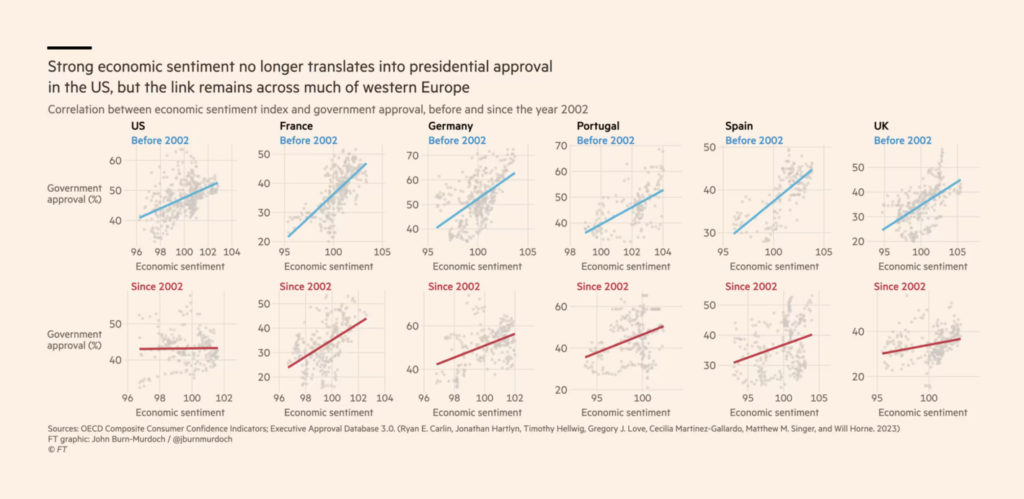
Also in the political realm, we found an analysis of the correlation between economic optimism and political happiness, as well as a detailed analysis of German right-wing voters:

Financial Times: It’s no longer the economy, stupid, March 22
Zeit Online: Das sind die Millionen, die AfD wählen wollen, March 21

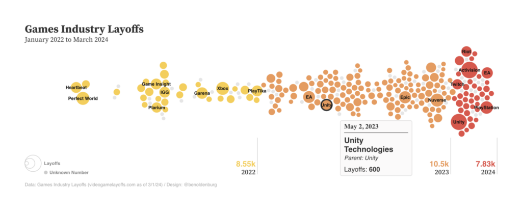
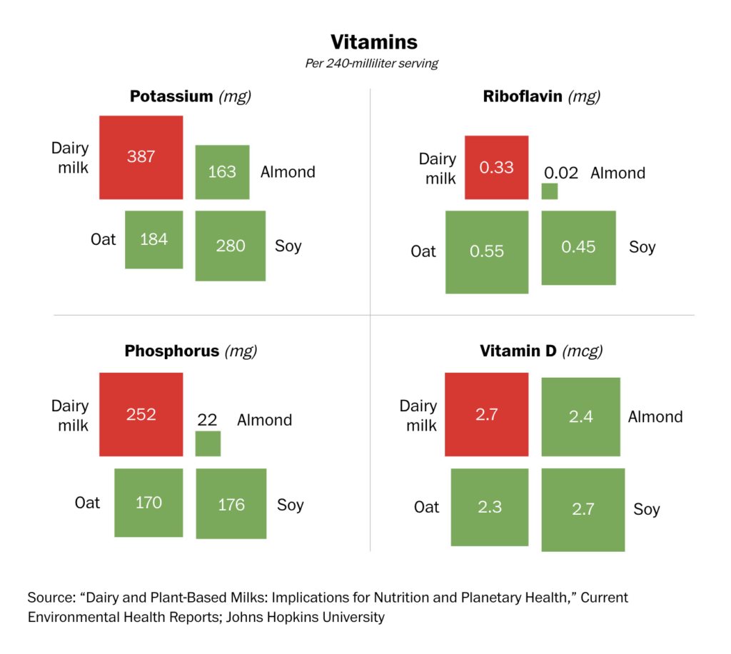
Layoffs, philanthropy, and plant-based products all revolved around one theme this week — games:

Ben Oldenburg: Visualizing Games Industry Layoffs, March 22
Bloomberg: Bloomberg’s 2024 March Madness Brackets for a Cause, March 25
The Washington Post: Dairy vs. plant milk: Which is better?, March 21 Funny storytelling

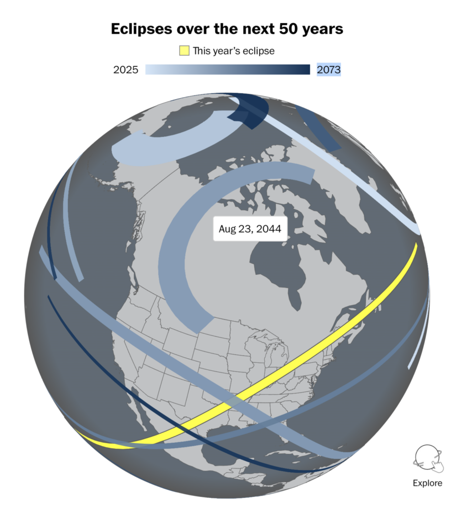
As this year’s solar eclipse gets closer, we’re seeing more and more visualizations:

Univision: Escribe tu ‘zip code’ y descubre cómo se verá el eclipse solar total de 2024 en tu ciudad, March 20
The Washington Post: See what the solar eclipse will look like in your city, March 21

Let’s close this week with a question: How many private jets do you expect at your wedding? Quick answer: Certainly fewer than Mukesh Ambani’s family!

Reuters: From slumber to spectacle. How India’s Jamnagar airport managed an unprecedented number of flights for billionaire Mukesh Ambani’s family event, March 22

What else we found interesting

Krisztina Szűcs: “I wanted to create a quick and fun #dataviz, so here comes the latest editable chart for PlotParade. I have never created a pie chart with d3.js before this,” March 21 (Tweet, Tool)
Maxwell Neely-Cohen: “THE BRAND NEW 2024 ISSUE OF THE HTML REVIEW IS HERE!!!,” March 19 (Tweet, Website)
Los Angeles Times: This mega-city is running out of water. What will 22 million people do when the taps run dry?, March 21

Applications are open for…


Help us make this dispatch better! We’d love to hear which newsletters, blogs, or social media accounts we need to follow to learn about interesting projects, especially from less-covered parts of the world (Asia, South America, Africa). Write us at hello@datawrapper.de or leave a comment below.

Want the Dispatch in your inbox every Tuesday? Sign up for our Blog Update newsletter!

Comments